The new design case study is up, and this time it’s literally uncommon and non-conventional. Welcome to check the design story behind the bright, expressive, and daring website created by tubik designers for Nonconventional Show.
Project
Nonconventional Show is the podcast hosted by Ela Crain, inviting visitors to dive into the unique set of interviews with amazing guests from all walks of life asked the questions that usually go unasked. It builds a bridge between the conventional and the nonconventional, ordinary and extraordinary, inspiring viewers and listeners to embrace their nonconventional side.
The task for the tubik team was to create a website that would uncover the mission and content of the project brightly and uncommonly, to inform and engage, impress and inspire.
The diverse creative team from our side for the project included Valeriia Bondarieva, Ksenia Lashko, Ernest Asanov, Marina Solomennykova, Lada Kunitsa, Ivan Shvindin, and Sasha Fesyk.
Process
Nonconventional Show is the project which is solidly determined by the manifold personality of its creator and host, Ela Crain, a person that explores every avenue open to her. The bio shared on the website tells that she’s lived multiple lives as a prolific writer, a high-profile video company owner, a student of archaeology, anthropology, digital media, and brain sciences, a life coach, and in this project, a podcast host. Her past adventures bring eclectic expertise to her new podcast, Nonconventional Show, which, coupled with her intense curiosity, drives the podcast to explore areas untouched by most people.
The podcast is based on the set of values that had to be transferred in the design approach:
- curiosity: it shares inspiring stories to encourage you to remain curious and open-hearted
- courage: it provides a safe space for you to gain the courage to express your thoughts and opinions
- empowerment: it empowers you to step out of your comfort zone at a pace that works for you
- transformation: it unlocks questions that help you transform yourself, your life, and your career.
In this project, the client came with a deep understanding of the goals and values behind the product, so it was a great basis for deep research and talks on details that had to lay the foundation of the website design. Grounded on the general idea of the podcast and even its name, the client strived for the maximum originality that would allow the product to stand out from the tight and growing competition.
The process of the color palette moved through several stages. It resulted in a bright, expressive, and boldly contrasting set of colors, which had to solve two major issues: let the product stand out and be memorable, as well as emphasize its modernity and uniqueness.
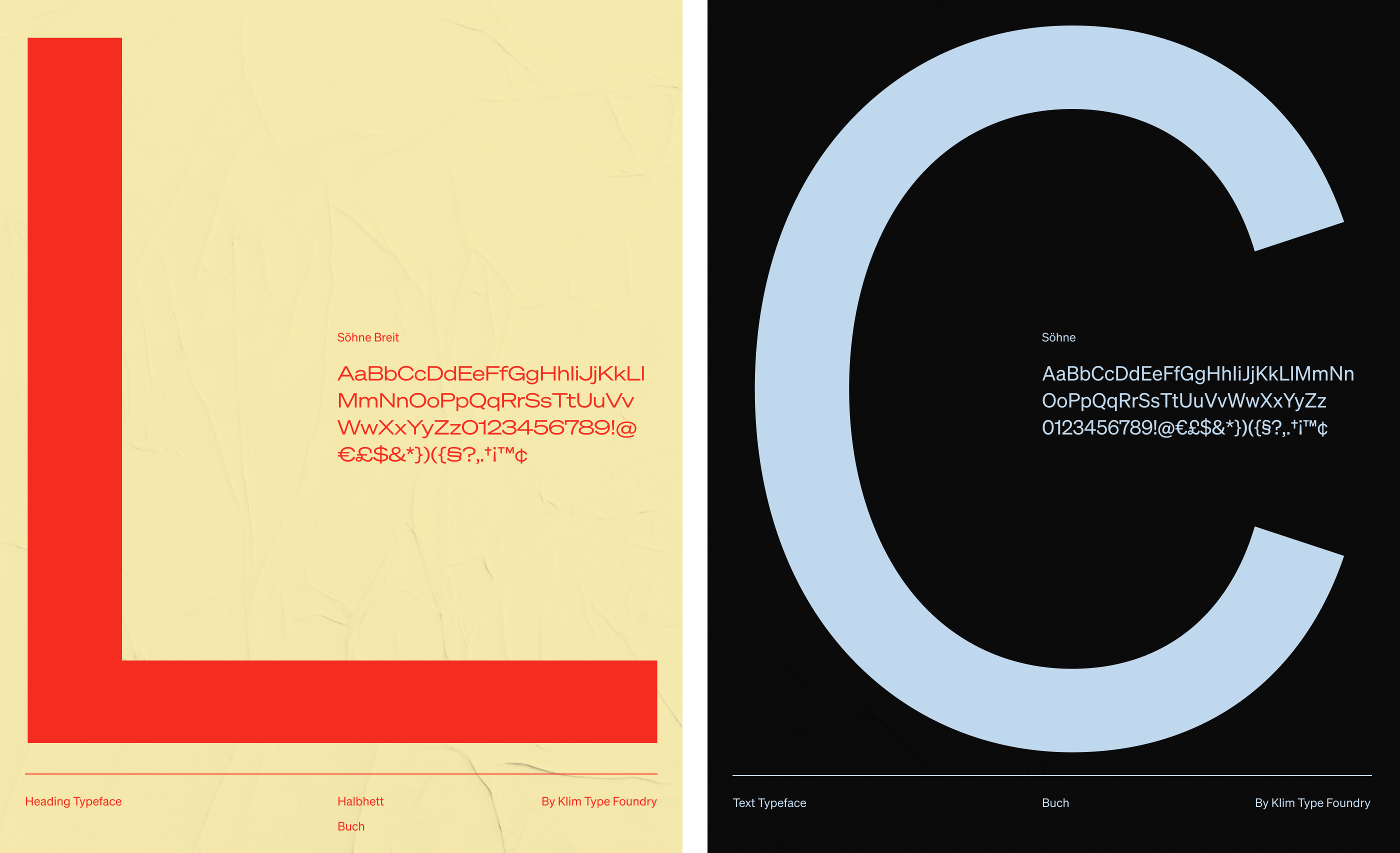
The next stage was the choice of typographic solution for the website. It also had a couple of significant objectives to target: the font had to work effectively in combining text and visual components to better convey the necessary impression, and it had to make the text content easy to read and encourage the user to take the targeted actions. At this point, it’s worth mentioning that for products and services based on information rather than physical or visual objects, the text becomes the basis of communication. Hence, the aspect of its readability and thoughtful arrangement contributes much to a generally positive user experience.
For Nonconventional web experience, the choice fell on the Söhne font family. The fonts have perfect kerning, excellent diacritics, and a set of arrows reminding the ones used in NYC subway signage.
At the initial stage of the web design process, when the search for a concept was in progress, the designers had an idea to use two different color themes, dark and light, for the website and let the visitors switch between them. However, having tried the combination of alternating sections with contrasting backgrounds, they found that such an approach looks more dynamic and stylish, so it was chosen.
In general, the website design uses:
- bold and prominent headlines and taglines becoming an instant starting point for the communication with visitors
- solid visual hierarchy making pages and sections scannable and skimmable, dosing information to provide a light, effortless experience
- photo content giving real-life, humanized emotional connection with the podcast host and guests
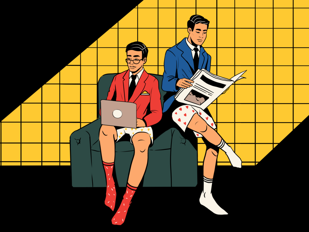
- catchy custom visual details and original collage graphics setting the solid ground for the visual originality
- vertical and horizontal scroll interactions for different groups of content
- the diversity of web animation supporting usability, navigability, and integrating special effects into the interaction process.
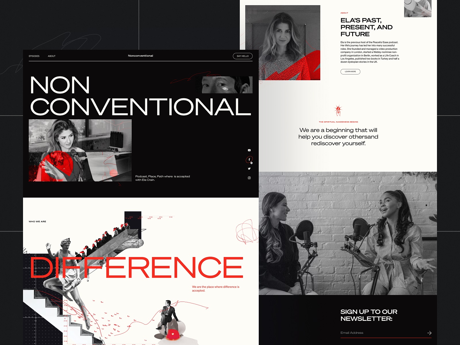
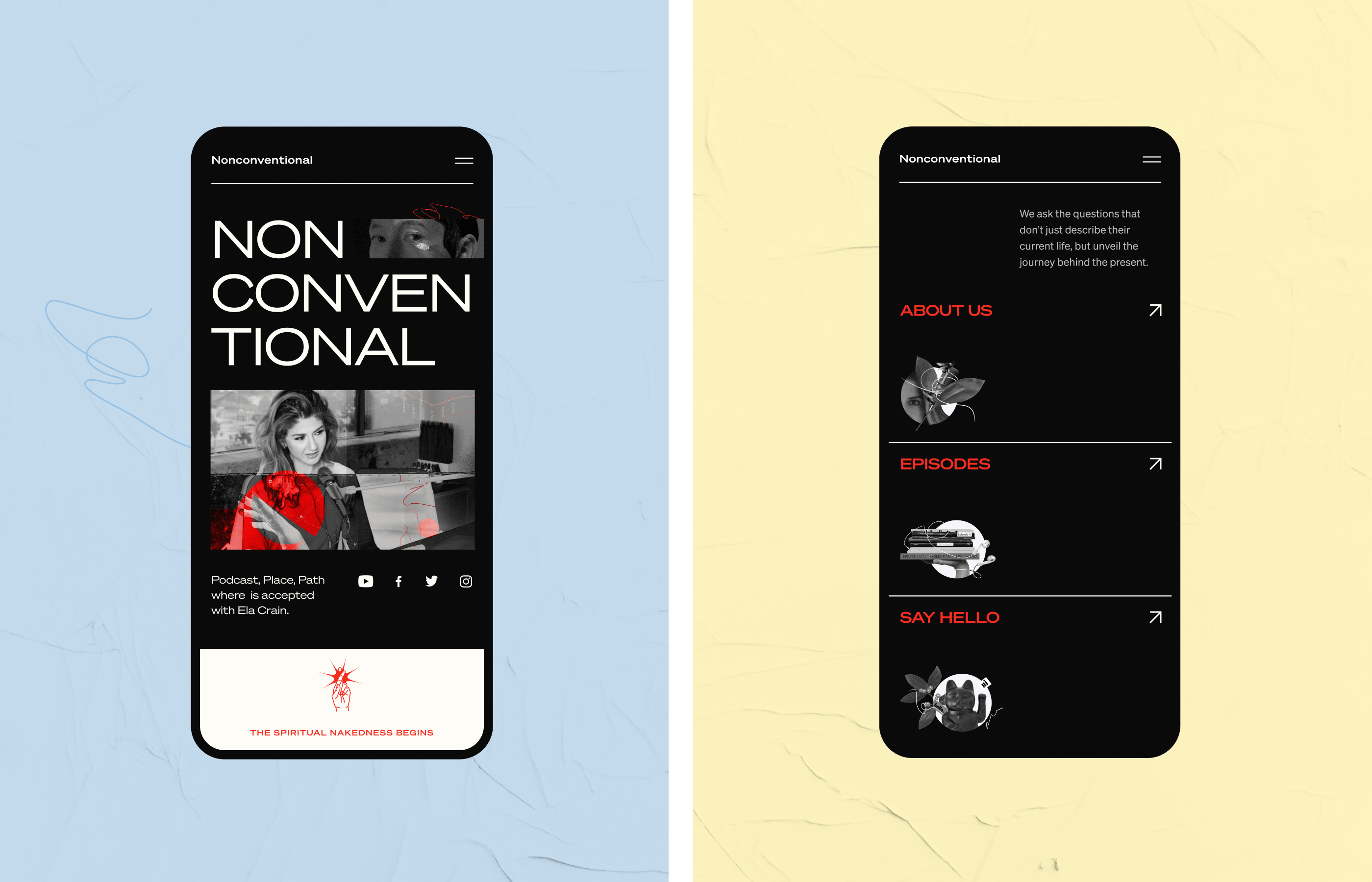
Here’s a glance at the home page design.
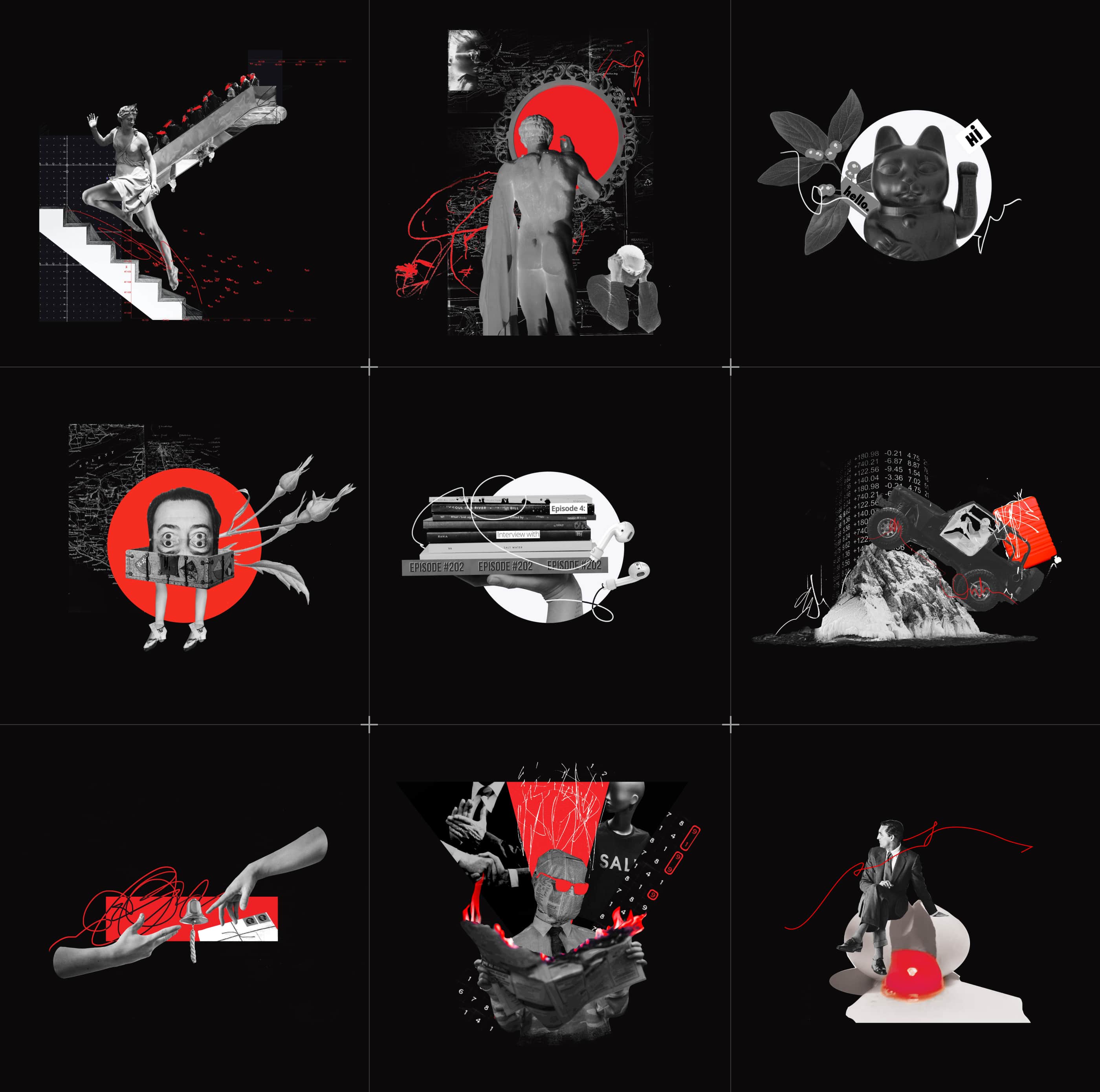
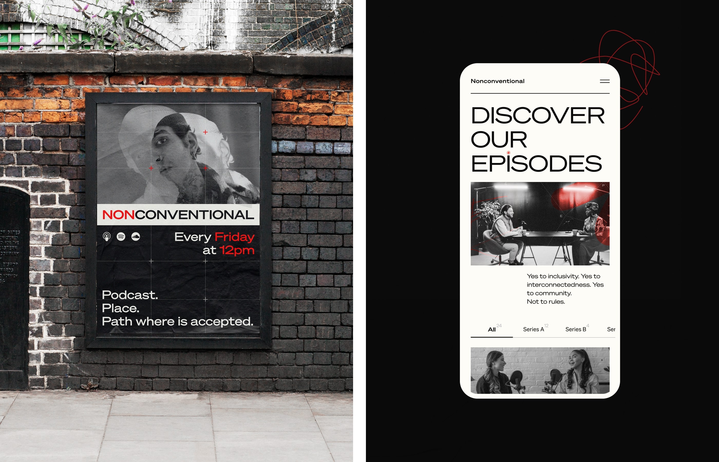
Integration of trendy artistic collages was discussed as a part of the visual design approach from the earliest stages. Among various types of images that can be applied on a website, this one was definitely the top choice for this project as it pushed the limits of creativity, catching attention, effectively sharing visual metaphors, and increasing the emotional appeal. Here are some of them developed for the different sections of the website.
And here’s how they work on the About page, visually supporting the message on values and principles behind the resource.
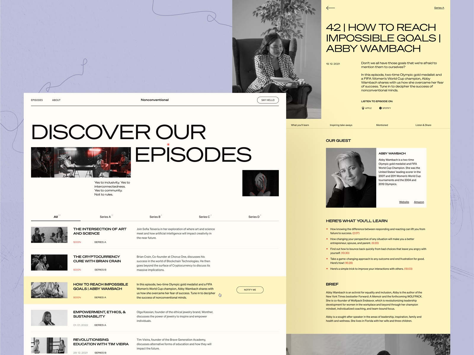
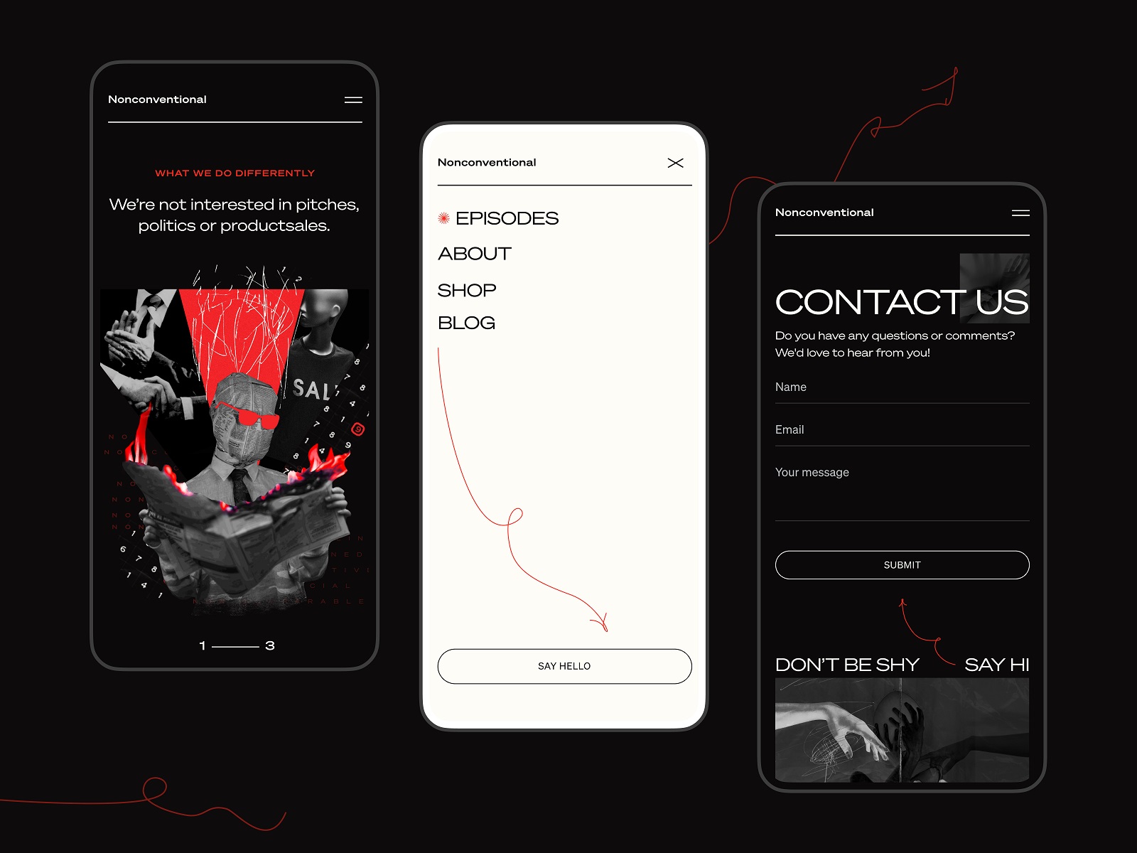
The Episodes page, the most informative and interactive page containing the content which makes the product go round, is all built on elegance and functionality. Here special effects give way to the thoughtful organization of different information blocks and smooth, intuitive navigation between them.
The website is filled with design details that make the process of interaction with the pages attractive and lively, retaining and engaging the visitor. For example, the hover animation turning over the preview tab of the episode or interactive response in the process of filling in the subscription form make the experience dynamic and fun.
And here’s a glance at one more minor visual detail, funny stickers that could become a sort of easter eggs or website response to visitors’ actions.
The minimalist, airy contact page features a sort of split-screen approach where the right half provides a neat and clear contact form supported with text prompts while the left part plays with a stylish metaphoric image and uses an animated visual accent, a red arrow, as a directional cue.
Having polished the details, the team also worked on the mobile version of the website to make it stick to the chosen approach and keep it catchy and efficient on any device.
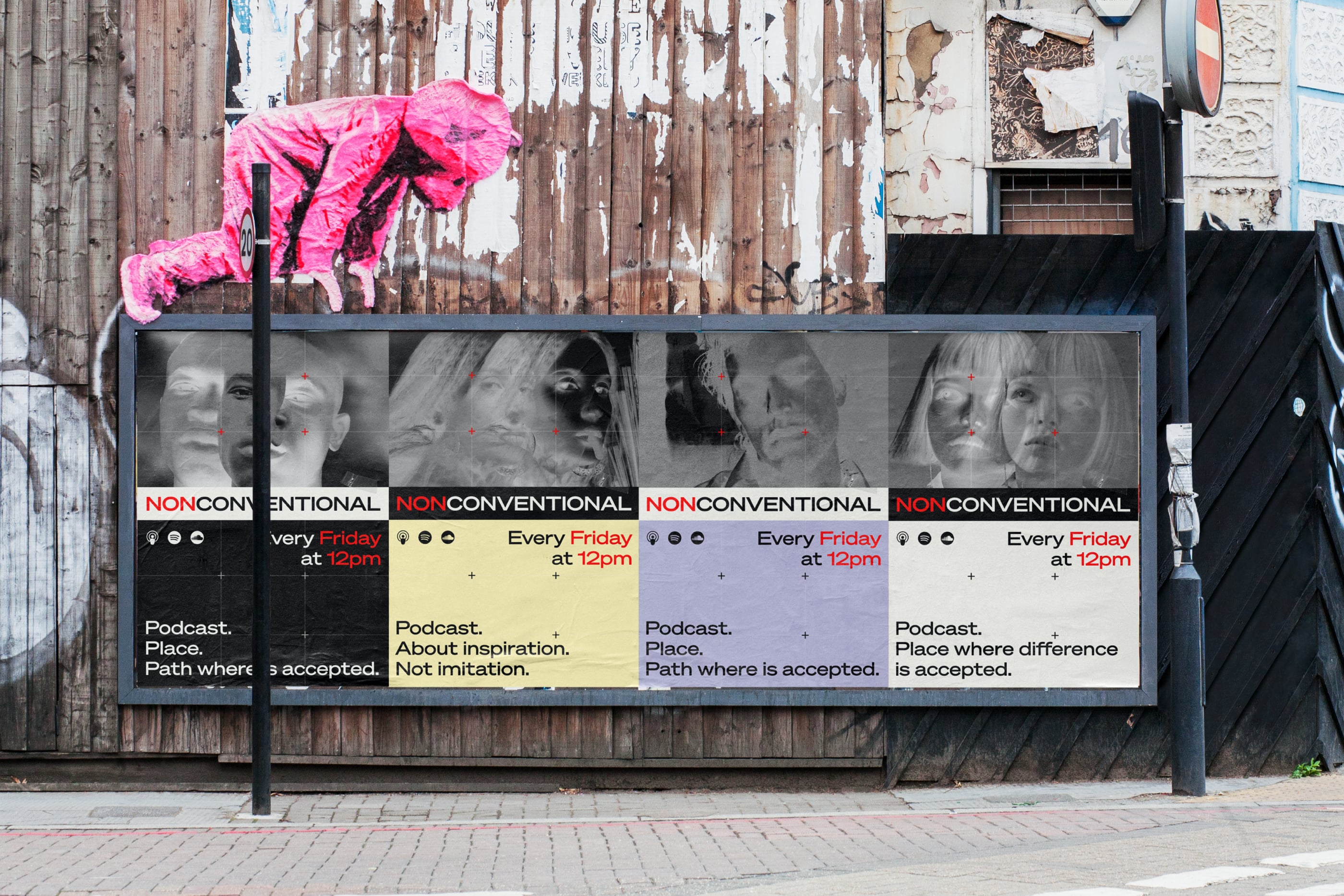
And here’s a glance at how the website design approach could be consistently stretched on marketing materials design, for instance, posters promoting new episodes.
For our team, working on the Nonconventional Show website design was a cool experience of creating a visual and informative web space that is thoughtfully organized, human-like, user-friendly, and, at the same time, highly emotional, captivating, and impressive.
New design case studies from our team are coming soon. Stay tuned!
More Design Case Studies
Here’s a set of more case studies sharing the design solutions and approaches for some of the design projects done by the Tubik team.
uMake. Branding and Website for 3D Design Tool
BEGG. Brand Packaging and Web Design for Food Product Ecommerce
Crezco. Brand Identity and UI/UX Design for Fintech Service
CUBE. Illustration Set for Video Production Company
FarmSense. Identity and Web Design for Agricultural Technology
Real Bitcoin. Creating Website Illustrations
Carricare. Identity and UX Design for Safe Delivery Service
OOP. Brand Identity Design for Online Flea Market
Otozen. Mobile App Design for Safe Driving