Good food is a good mood – for most people that has been true for decades and centuries. Taking up the big part of human time and activity, no wonder food became one of the hot topics in tech progress. There is a whole bunch of mobile and web interfaces solving a diversity of problems connected with food: websites and applications for cafes and restaurants, recipe apps and social networks, food ordering, and food delivery apps. Whatever is the goal behind UI design for a food app, that’s cool when it’s not only helpful but also delicious and attractive.
Earlier we have already shared numerous ideas on interface design for this theme. Today let us present a fresh food app design case study, this time concentrated on several recipe card concepts. In this project, Tubik designers Anton Morozov, Ernest Asanov, and Vlad Taran took a chance of UI experiments and analysis for a variety of approaches to content and navigation of recipe cards.
Project
UI design of a mobile application on cooking and recipes
Introduction
In general terms, the designers got the task to design a food app for users who love cooking. It included the recipe database which was constantly updated. Also, the application had a supplies manager. To make UX more extended, it allowed users to find the recipes on the basis of the supplies they currently had at home or create a shopping list to buy ingredients that were missing.
According to the brief which presented the client’s preferences, the food app design had to include the following functionality.
Required Features
1. Search bar
2. Filter button (Information about the number of results and applied filters)
3. Recipe cards (Recipe picture + Title)
Optional Ideas
• Ratio of ingredients you have to the total number the recipe requires
• Cook time
• Calories
• X button to hide that recipe and show fewer recipes like that
• Add to shopping list button
• Like / save button
• Recipe author and his/her profile picture
• Review score
• Favorite count
• Main ingredients
• Share
• Direct link to view the recipe source
• Consider what type of layout for the recipe feed will work best, grid vs single column.
Problem
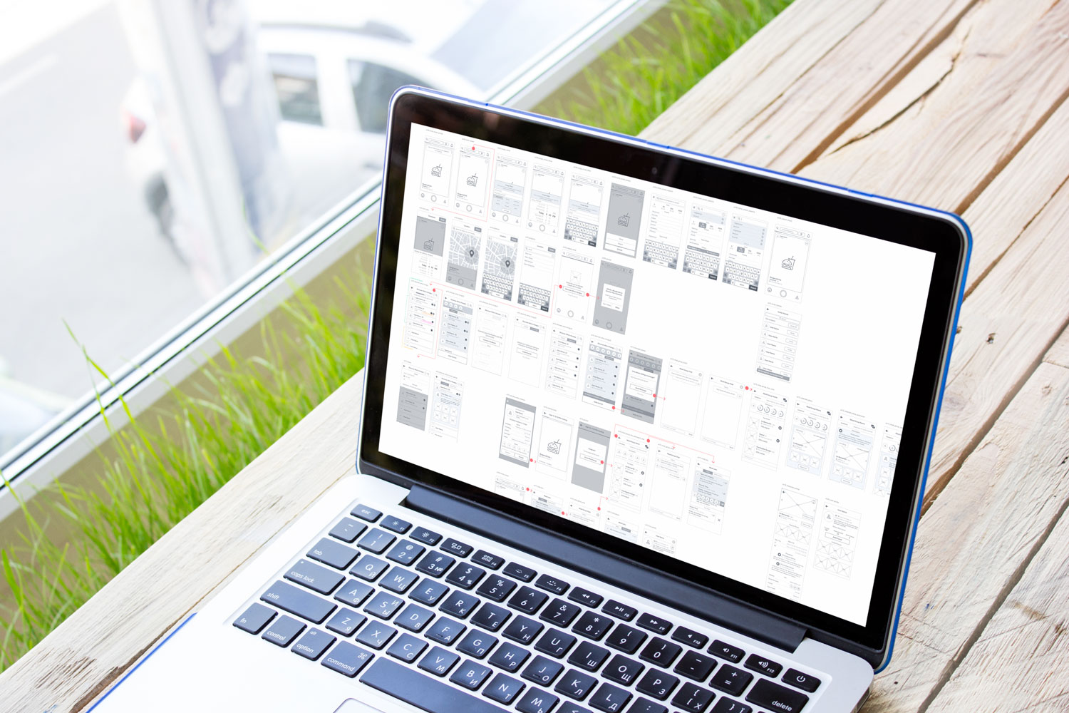
The client provided the team with a lot of information and ideas on the main screen. The designers had to analyze and prioritize all the points, as there was a high risk of overloading the screen. On the basis of research and analysis, the user scenarios were created to determine which information about the meal in the recipe is found the most important.
Solutions exploration: benefits and pitfalls
The designers worked out several options for recipe cards presentation which would effectively present the core data on the limited space of a mobile screen. Considering that the recipe card presented the key element of interaction in this app, the final decision had to be grounded on the balance of logic and emotion, effective navigation, and aesthetic satisfaction. Having tried different directions, the designers defined three various options of content and controls placement in the layout. Among them, the creative team had to choose the variant corresponding to target audience expectations. Here are the options.
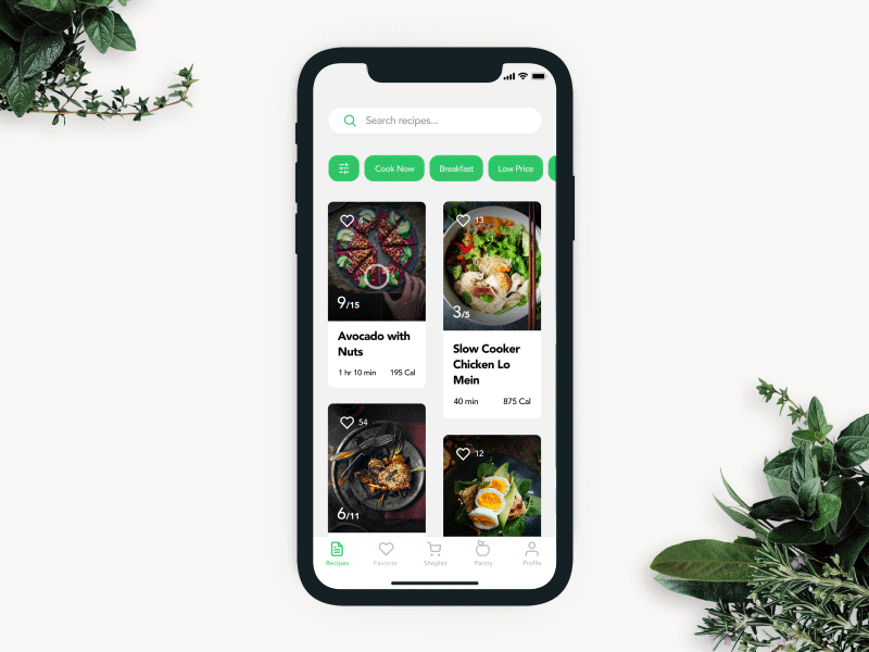
а) Recipes shown as a list
Benefits: more content can be shown on the screen.
Pitfalls: the photo content looks too small.
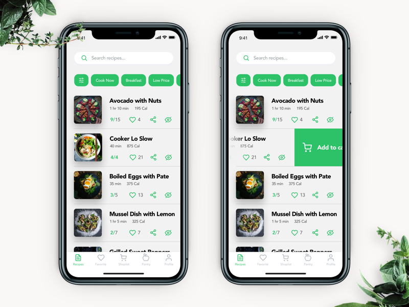
b) Recipes shown as cards (like Pinterest)
Benefits: the dynamic height of the cards allows for placing photos of any layout metrics and headlines of any length
Pitfalls: the column for notes and additional elements is too narrow. Card manipulations such as adding ingredients into the shopping list, hiding similar recipes and sharing the recipes to social networks led to applying the long-press/force touch which was not the most obvious solution for users.
c) Big recipe cards
Benefits: photo content attracts maximum attention
Pitfalls: the screen features only one recipe, the additional functionality still isn’t obvious for users.
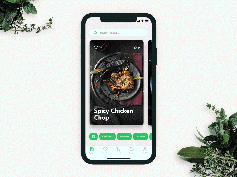
Final solution
The creative team preferred the emotional variant. Coming out to the market, the product has to be ultimately attractive. That will enable the creators to collect the feedback and analytics data which can be used as a basis for the next stage of the creative search for solutions enhancing user experience. Unobtrusive and elegant animation during the first interaction will prompt about the additional functionality that is hidden under the card and available on swipe down.
Additional details: filters placement
The filter panel allows a user to sort out the list of recipes. The user can apply pre-sets: for example the preset “cook” shows only the recipes based on the ingredients currently available for the user. Also, the filters can be manually customized. The panel is placed in the bottom part of the screen to add more convenience to the operations with the app by one hand.
Bottom line
In Apple, they say: “…the first thing we ask is what do we want people to feel?” Not everyone considers the issues connected to users’ feelings and emotions before they start creating a new digital product. Today most designers strive for functionality. However, when people’s feelings and emotions become a priority, the product gets the features and details which let the users love it.
Recommended reading
If you are interested to see more practical case studies with creative flows for UI/UX design, here is the set of them.
Watering Tracker. UI for Home Needs
Home Budget App. UI for Finance
Night in Berlin. UI for Event App
Big City Guide. Landing Page Design
Vinny’s Bakery. UI Design for E-Commerce
Upper App. UI Design for To-Do List
Health Care App. UI for Doctors
Wedding Planner. UI Design Concept