Design for e-commerce platforms is a special field of knowledge and practice. On the one hand, there are more and more users with an average or high level of tech literacy who trust this way of shopping and are open to buying online. On the other hand, the level of competition in the field is also becoming more diverse and comprehensive with the constantly increasing number of services and platforms for selling and buying via the Internet.
In one of the chapters of our e-book “Design for Business”, the success of e-commerce activity depends on several factors, among which:
- the quality of the product or service offered
- the quality of the content presenting the offer to customers
- the quality of design for the electronic platform — website and/or mobile application — via which the sales are going to be delivered.
So, it’s easy to see that UI/UX design for digital products of this kind plays a vital role. Thoroughly thought-out logic and transitions, simple and clear microinteractions, fast feedback from the system, attractive product presentation, easy payment flow and plenty of other details and features can directly influence increasing profits for the business involved in such a popular e-commerce game. This is the field where designers and business experts can work as one team for good of everyone, first of all of the target users.
Today’s case study is all about this theme: it presents the UI concept for Vinny’s Bakery website.
Task
UI/UX design of a website for a small elite bakery selling fresh hand-made bread.
Process
Designing an e-commerce website or mobile app, designers should definitely consider the following aspects:
- operational simplicity
- strong branding
- security of users’ data
- effective use of visual elements
- clear data presentation via menus, catalogs, etc.
- user’s ability to leave feedback about goods and services
- easily available general and contact information about the business providing goods or services
- design that supports the offer not overshadowing it.
Grounded on these general principles, Tubik designer Ernest Asanov studied the trends on the market and analyzed the potential target audience of customers who would actually buy the goods, not just watched the offers. On the basis of the obtained data, in UI design he followed the philosophy of minimalism which is user-friendly, attractive and informative.
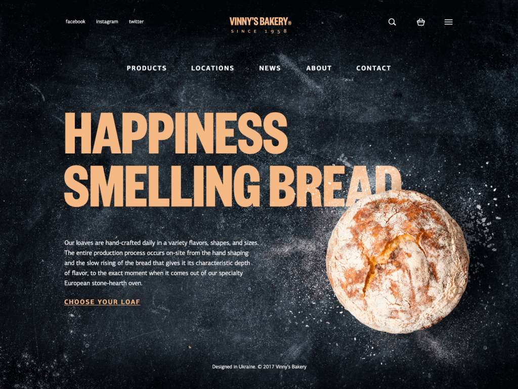
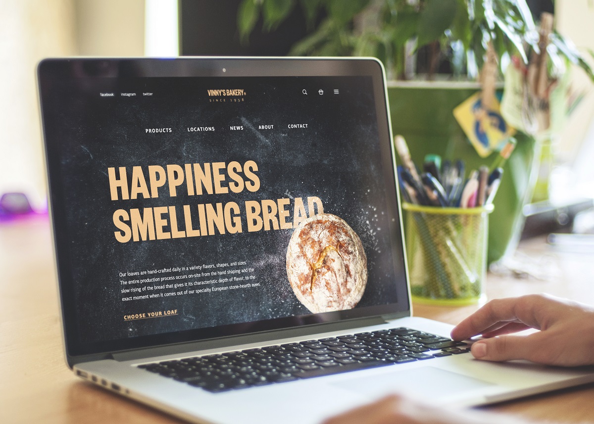
The website promotes a small bakery selling homemade bread. The home page presents the service, providing the links giving more information about the company and the items it offers as well as links to social accounts. The designer was keen to activate different techniques of visual perception via headline, images, background and copy block so that users could get the basic information immediately and got the warm feeling of freshly baked bread. On the basis of the design solutions, it is easy to assume that this is the service positioning itself as a producer and seller of upmarket products which are exclusively hand-made and presumably because of that reason cost higher than average bread in the supermarket. Harmony is the style provided by the webpage: dark background, branding element as a central element of a header, strong and clear headline establishing positive emotional message, visual elements enabling immediate perception of the theme and setting strong visual association with tasty pastry, short text block describing basic benefits of the product and clearly visible call to action.
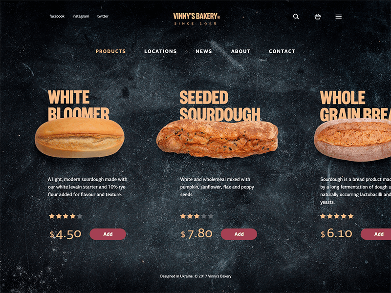
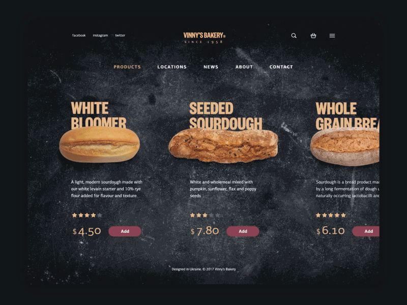
The next webpage to look at is the catalog of the offered products: again, it supports the user with the prominent and high-quality photos of actual products with brief core information on every position. Users can also quickly review the rating of every item and its price. Horizontal scroll is applied for seeing more positions, that’s why the last item is shown not in a full view to let the user see that this is the direction of scrolling. Call-to-action button, via which the user can add the item to the cart, is designed with a different color compared to all the other elements of the interface, and this technique allows making CTA prominent and seen immediately. Such an interface lets users add goods right from the catalog without the necessity to go to the page of this particular position. It’s a user-friendly way to go, especially for loyal customers who know well the quality and tastes of the presented bread and wouldn’t like to spend their time on additional transitions just to put the item into their cart. Still, if the user wants to know more about the particular item, it’s easy to do by just clicking or tapping on it in the list.
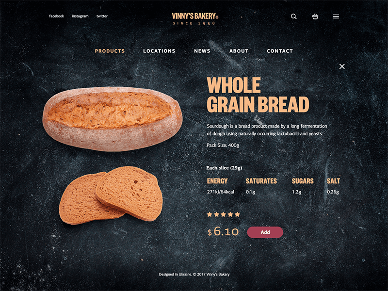
Clicking on a particular item, users get access to more detailed information about the bakery item, including the description, weight of the pack, nutritional rates, rating, price, and CTA button. The photo of the item remains the only pictorial element of visual support which makes the interface concise and non-distracting.
Here you can see the full set of the transitions: you can see that header and footer are fixed, the horizontal scrolling opens more positions in the catalog and strengthens the feeling of the minimalistic and focused interface. The interactions are supported by smooth and unobtrusive animation making the interface even more stylish via the imitation of interaction with physical objects in the real world.
Another aspect to mention generally about this web design concept is typography which set one more object of the thorough creative search for the designer and resulted in the combination of fonts, that are effectively contrast and easily readable. Color applied for headings, presented in bold and prominent font and applying uppercase letters echoes the color typical for the freshly baked bread, while the color of copy blocks sets the visual association with the flour on the baker’s table – the element which is used on the background imitating the cooking worktop. Therefore, all those elements get visually connected to each other and present the web interface which looks harmonic and consistent. These are the feelings playing a significant role in building up the positive user experience and attracting buyers to use the service again and again.

No doubt, a new day will bring fresh challenges which will result in practical case studies for Tubik Blog readers. Stay tuned, have a tasty day and don’t miss the new posts!
Useful Case Studies
Here’s the list of practical case studies for further reading on the theme of UI/UX design
Watering Tracker. UI Design for Home Needs
Manuva. UI/UX Design for Gym Fitness App
Cuteen. UI/UX Design for Mobile Photo Editor
Tasty Burger.UI Design for Food Ordering App
Slumber App. UI Design for Healthy Sleeping
Home Budget App. UI for Finance
Night in Berlin. UI for Event App
Big City Guide. Landing Page Design
Upper App. UI Design for To-Do List