
The cursor blinks. You’re staring at the top of the screen, wondering what’s supposed to go there. A logo? A CTA? A full-blown navigation party? That’s the quiet pressure of website header design best practices—a deceptively small strip of space with an outsized role. It’s the first thing users see, and sometimes the only thing they notice before bouncing. So no pressure, right?
This guide breaks down how to design a website header using UX research, real-world header web design tips, and practical logic pulled from live projects—not theory decks. Think craft over checklist, clarity over cleverness.
What Is a Website Header?
The header is the top slice of your webpage—often the very first thing that loads, shows, and gets judged.
It’s not there to decorate. It’s there to orient.
Technically, it might hold your logo, main navigation, search, and a call to action. But it also sets the tone. A handshake in pixels. The brand’s voice, personality, and structure—all condensed into one horizontal band.
While many folks casually call it a “menu,” the header does more than help users move around. It signals structure, confidence, and whether the experience ahead will feel intuitive or exhausting. Strong examples lean on header navigation optimization rather than visual noise.
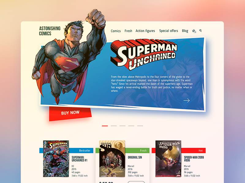
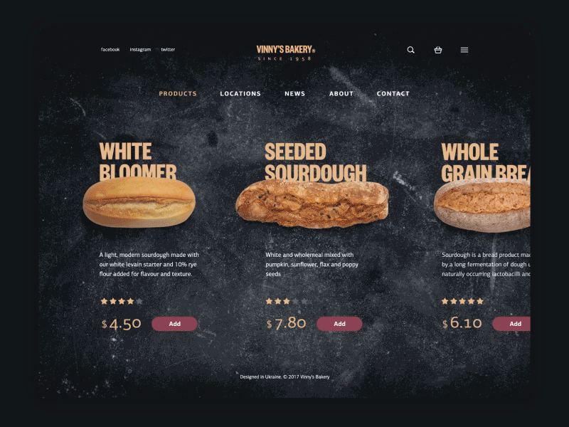
The presented concept shows the home page for the online bookshop selling comics. The top horizontal area aka header presents the logo lettering showing the name of the website and the core navigation around: links to the catalog of items, fresh and special offers, blog, action figures, an icon of the shopping cart typical for e-commerce websites, and the icon of search.
Why Website Header Design Matters (UX + SEO)
So why obsess over a few hundred pixels at the top of the page?
Because people’s eyes land there first—and bounce just as fast if things don’t click.
User Experience (UX)
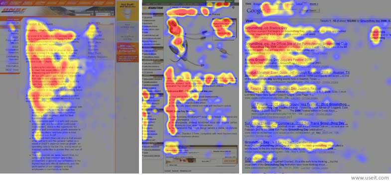
Eye-tracking studies (shoutout to Nielsen Norman Group) show users scan in Z-patterns or F-patterns, both starting at the top-left. A weak header breaks that rhythm, a strong one anchors it. This is where responsive header UX plays a critical role: clarity first, interaction second.
Conversion Optimization
A crisp, punchy CTA in your header can reduce bounce and boost conversions. Especially for new visitors who haven’t committed yet. Think of it as your elevator pitch—but make it clickable.
SEO Performance
Textual, crawlable headers help Google understand your structure—clean markup, readable text, and optimized assets all support search visibility. Paired with smart header SEO tips, your header becomes a structural asset—not an afterthought.
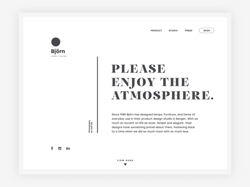
This is the website of an interior design studio. The upper part of the page presents the sticky header which stays in the zone of visual perception all the time in the process of scrolling. It is divided into two blocks: the left part features the brand logo while the right part presents the interactive area with links to several information blocks like “Product”, “Studio” and “Press” and call-to-action button “Shop” marked out with shape. The central part of the header uses negative space for the visual separation of these two blocks.
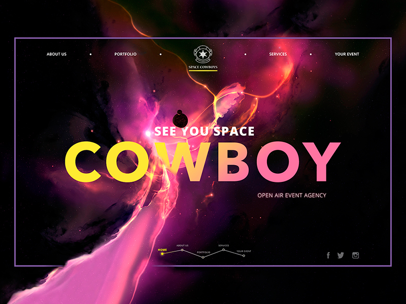
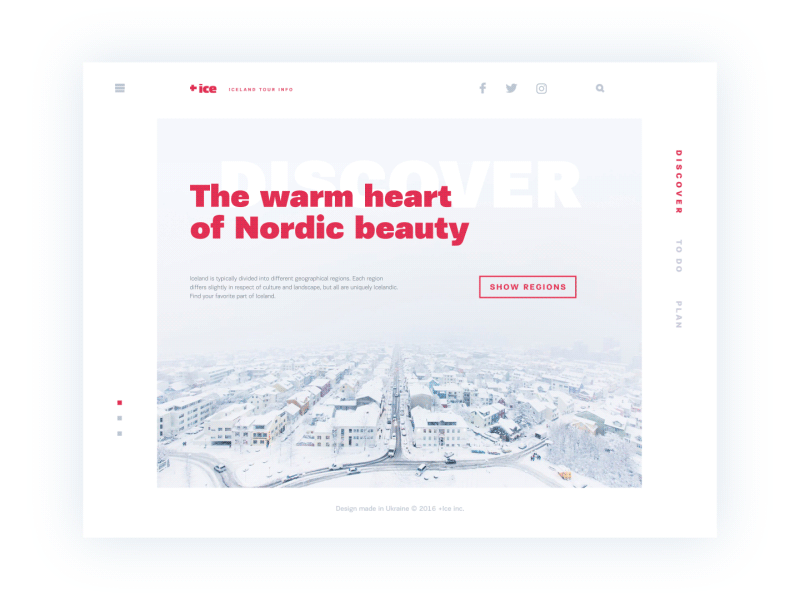
Here is another sample of the webpage with a bit different approach to the header design. This time the composition is built around the center featuring the logo and brand name. Left and right sides are balanced around it with two links each allowing users to scan quickly and move to the information blocks they are interested in.
10 Best Practices for Website Header Design
1. Prioritize Clear Visual Hierarchy
Let the eye breathe. Use size, contrast, and spacing to guide attention—logo first, then nav, then CTA. No visual tug-of-war. White space isn’t wasted space. It’s air. Use it.
2. Optimize for Mobile & Responsive Layouts
Over half your visitors are on mobile. Your header must adapt: hamburger menus, vertical stacks, and smart breakpoints. Poor responsive header UX shows immediately—and punishes fast.
3. Include a Value-Driven Call to Action
The button at the top isn’t there for decoration. Make the copy sharp and benefit-focused: “Try Free,” “Get Early Access,” “Book a Demo.” Use color to make it pop, not clash.
4. Keep Navigation Simple & Intuitive
Users don’t need to see everything at once. Tuck related links into dropdowns. Stick to familiar labels: “Pricing,” “Docs,” “Contact.” This isn’t the place to get clever and creative—header navigation optimization saves users from decision fatigue.
5. Use Readable Fonts and Contrast
No 9pt pale gray Helvetica on a white background. Please. Use fonts that are readable at a glance and contrast that works in both daylight and a dark-mode cave at 2 a.m.
6. Optimize Images & Media (SEO + Load Speed)
Keep it light. Compress those logos. Use SVGs. Avoid loading a full video background unless you’re also offering to pay for someone’s data plan. Page speed matters—for users and Google alike.
7. Include Crawlable Text for SEO
Text inside images? That’s a nope. Navigation links wrapped in JavaScript? Also nope. Use clean, semantic HTML that supports accessibility and aligns with core header SEO tips. Let search engines read what your users read.
8. Balance Branding with Functionality
Your header should feel like you—but also work like a tool. Use your brand’s colors, tone, and style, but don’t sacrifice usability to be cute. Think: “confident handshake,” not “jazz hands.”
9. Accessibility Best Practices
Add alt text to logos. Make sure menus work with a keyboard. High contrast for text. ARIA roles where needed. Designing for everyone isn’t radical—it’s basic decency.
10. Test & Improve (A/B, Analytics)
Don’t just guess. Use A/B tests to try different layouts, menu orders, or CTA copy. Tools like Hotjar and Google Analytics can show you what users click—or don’t.

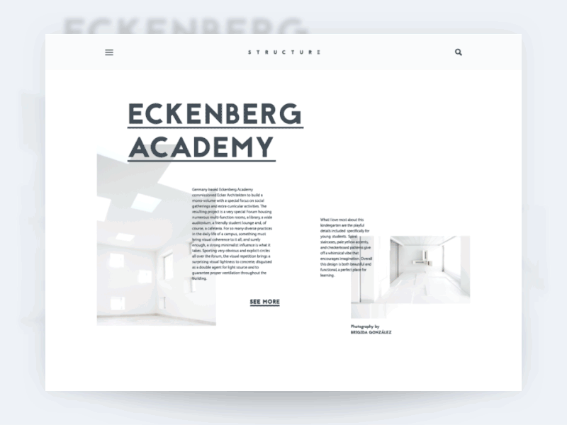
Another great example of a minimalistic, easy to understand header.
SEO Tips for Website Headers
Want your header to help with rankings? Here’s what to do:
- Use Keywords in Navigation: Swap vague terms for SEO-friendly ones. “Our Work” → “Case Studies.”
- Alt Text on Images: Don’t skip this. Make it useful and keyword-relevant (e.g., “22Bet logo – online betting partner”).
- Speed Optimization: Inline critical CSS, defer header scripts, and compress assets. Your bounce rate will thank you.
- Schema Markup: If your site has complex navigation, use SiteNavigationElement to give search engines extra context.
Examples of Effective Header Designs
Looking at real UI/UX header examples reveals patterns worth stealing:
Sticky Header with Minimalist Structure
The presented design concept of a website has a fixed header that doesn’t hide while the page is scrolled. However, it follows minimalism principles featuring brand name lettering as a center of the composition, magnifier icon marking search functionality, and hamburger button hiding links to navigation areas.
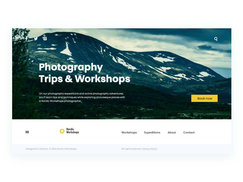
Here is one more design concept featuring a creative approach to the header design. The initial view of the home page includes the extremely minimalistic header: it shows only social icons and the search. However, scrolling down users get the sticky header with a traditional set of navigation items.
Center-Aligned Header with Balanced Navigation
 An art classes website places its logo dead center, with two a hamburger menu on the left and a sign-up button on the right. Symmetry makes it feel thoughtful and grounded—even before the scroll.
Double Menu for Layered Navigation
As you can see, the website also uses a sticky header which consists of two levels of navigation.
Hamburger Menu for Mobile & Clean Layouts
The presented web design concept shows the version of the hamburger menu. As the menu of the website contains many positions, the designer uses this technique by placing the hamburger button in the area of initial interaction – top left corner.
When there’s too much content to cram in, the hamburger menu steps up. Clean, tidy, and tucked into the top-left while branding stays center stage.
Summary & Next Steps
Strong headers don’t scream for attention, they guide. Website header design best practices blend clarity, performance, and intention. They introduce your brand, help users move with confidence, and support long-term search visibility.
A well-crafted header does three things:
- It introduces your brand
- It gives people tools to explore
- It makes search engines take you seriously
Whether you’re building a slick portfolio or a full-on eCommerce beast, your header is your north star.
So what now?
- Run a quick header audit.
- Test out a few CTA variations.
- Make it crawlable. Make it fast.
- Steal from smart examples—but build for your own users.
You’ve only got one shot at a first impression. Make the pixels count.
Recommended Reading
Curious to dig deeper into UX, SEO, and smart navigation design? Here are a few reads to keep the inspiration flowing.
How to Make Web Interface Scannable
How to Make User Interface Readable
Visual Hierarchy: Effective UI Content Organization
The Anatomy of a Web Page: 14 Basic Elements
Visual Dividers in User Interfaces: Types and Design Tips