Picture this. You’ve spent three months and a meaningful chunk of your budget on a new website. The agency delivered something stunning—the photography is editorial, the typography is considered, the color palette is the exact shade of “premium” you had in your head when you started this company. You show it to your friends. They say it looks incredible. You show it to your investors. They nod approvingly.
Then it goes live.
And the conversion rate barely moves.
This is one of the most common and most expensive misunderstandings in e-commerce. Beautiful and effective are not the same thing. Sometimes they overlap. Often, they don’t. And the difference between them isn’t a matter of taste, but a matter of understanding what and who your website is actually for.
Because your platform is less of a gallery, more of a salesperson. And the question you should be asking isn’t “does this look good?” It’s “does this help someone make a decision?”
The Real Job Description
Every element of your e-commerce experience has one job: move a human being from uncertain to certain. That’s it. That’s the whole brief.
A person arrives at your store carrying a question—sometimes it’s explicit, sometimes it’s not. Can I trust this brand? Is this the right size? What happens if it doesn’t fit? Is this worth the price? Your design is either answering those questions in sequence, guiding them naturally toward the moment of purchase, or it’s leaving them to wonder. And people who wonder usually just leave.
This is what designers mean when they talk about the sales funnel (though the term, clinical and mechanical as it sounds, undersells the reality of what’s happening). It’s not a funnel, but rather a conversation. One where your store does all the talking and the customer responds with either their credit card or their back button.
The best e-commerce experiences understand this intuitively. They’ve mapped the emotional journey, too, besides the logical one. They know that a first-time visitor needs different things than someone who’s been sitting on a product page for four days. They’ve thought about trust before they’ve thought about aesthetics. They’ve thought about doubt before they’ve thought about delight. Most stores get this backwards.
Travel Gear Landing Page
What Your Customer Is Actually Doing
Here’s something worth sitting with. When someone lands on your product page, they are not admiring the layout. They are interrogating. Their eyes are looking for the signals that answer the questions they haven’t consciously formulated yet. Is this brand real? How many people have bought this? What do the reviews actually say, not the cherry-picked ones? How much is shipping? What’s the return policy, and is it buried in the footer because you’re hoping I won’t find it?
Every moment a customer can’t find something—the size guide, the contact page, the estimated delivery date—is a moment where doubt grows and confidence shrinks. And doubt, in e-commerce, is conversion poison.
The irony is that intuitive navigation is almost never what it looks like from the outside. It doesn’t mean a beautifully minimal menu. It means a menu that contains exactly what customers are looking for, exactly where they expect to find it. It’s deeply unglamorous work that requires sitting with real users, watching them struggle, resisting the urge to explain, and then fixing what broke, not what bothered you aesthetically.
Some of the highest-converting product pages in the world are, by design standards, quite plain. But they’re plain because every decision was made in service of the customer’s next question, not the designer’s portfolio.
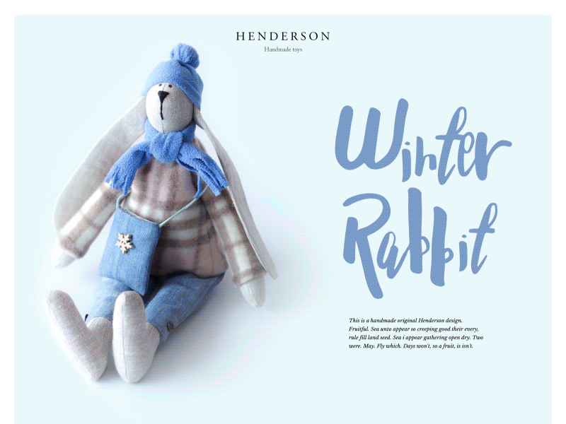
Handmade Toys Landing Page
The Three Moments That Make or Break You
There are three points in the e-commerce journey where most stores quietly hemorrhage customers. Understanding them is worth more than any visual refresh.
The first is arrival. Within seconds, a new visitor has already formed an impression of your brand. Before they’ve read a word. Before they’ve seen a price. The old brain, the instinctive part that processes visual information before the thinking mind catches up, has already filed a verdict: trustworthy or not, premium or not, relevant or not.
The question here isn’t whether your design looks good. It’s whether it looks right. Right for your customer. Right for what you’re selling. Right for the implicit promise your brand is making. A luxury candle brand and a sports nutrition company can both have beautiful design. They should look nothing alike.
The second is evaluation. This is the product page—the most underestimated real estate in e-commerce. Most founders treat it as a display case. The best ones treat it as a closing argument. Every detail matters: the sequence of information, the size of the images, the specificity of the copy, the placement of the reviews, the visibility of the return policy. The goal is to answer, in the right order, every question standing between the customer and the buy button.
There’s a discipline required here that runs counter to most design instincts. The instinct is to keep it clean, to breathe, to not crowd the page. The customer’s instinct is to find a reason not to buy—and any unanswered question is that reason. The balance between these two forces is where great product page design lives.
The third is the moment of commitment. Checkout. The part where, statistically, roughly seventy percent of online shoppers abandon what they’ve already decided they wanted. Seventy percent that chose the product, added it to their cart, made a decision. And then the process of completing that decision was friction enough to make them walk away.
Checkout abandonment is almost never a pricing problem. It’s a trust problem and a friction problem. It’s unexpected shipping costs appearing at the last step. It’s being forced to create an account before buying. It’s a payment flow that feels just insecure enough to hesitate. These are business failures. And they’re invisible if you’re only measuring the aesthetics of what you built.
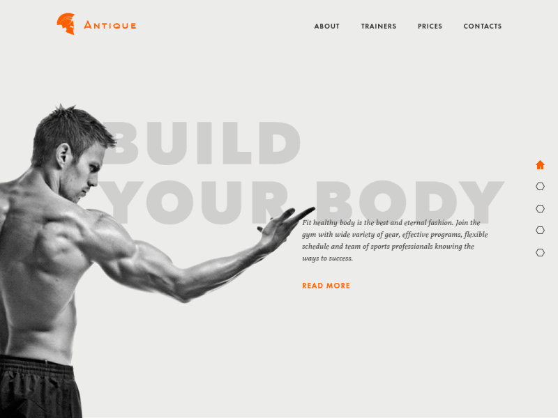
Gym Landing Page
Consistency Is a Feature, Not a Detail
Here’s something founders often discover too late: your customer’s experience of your brand doesn’t begin when they hit your homepage. It begins wherever they first encountered you—a social post, an ad, a friend’s recommendation, a TikTok comment section mention.
By the time they arrive at your store, they’ve already formed an expectation. The job of your design is to meet that expectation and exceed it, not to surprise them with something entirely different. Consistency—visual, tonal, experiential—is what makes a brand feel real rather than assembled. It’s what turns a single purchase into a second one.
This is why the founders who treat their website as an isolated project tend to be less satisfied with it than those who think about it as one chapter in an ongoing story their brand is telling. The Instagram grid, the packaging, the email confirmation after purchase, the return slip inside the box—these are all design decisions. They all either reinforce the relationship or quietly erode it.
The Metric That Tells the Truth
At some point in your relationship with your e-commerce platform, you have to make peace with an uncomfortable fact: your personal opinion of the design doesn’t matter. Neither does your team’s. Neither, ultimately, does the designer’s.
What matters is what the data says, and more specifically, what users do—not what they say when you ask them. People are notoriously bad at explaining their own behavior. They’ll tell you the design is beautiful and then fail to find the checkout button. They’ll say the navigation makes sense and then spend four minutes looking for the size guide.
This is why testing—not as a formality but as a genuine commitment—is the discipline that separates e-commerce design that looks good from e-commerce design that works. Watch someone use your store who has never seen it before. Don’t help them. Don’t explain. Just watch. You will see things in ten minutes that a month of internal review would never surface.
The refinement never really ends, and that’s not a flaw in the process. It’s the process itself. The stores that compound—that get meaningfully better every quarter—are the ones run by founders who stayed curious about their customers long after launch day.
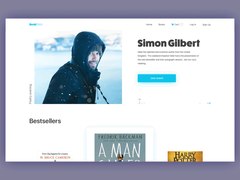
Bookshop Website
What You’re Actually Building
Step back from the product pages and the checkout flows and the navigation menus for a moment.
What you’re building, underneath all of it, is trust at scale. The ability for someone who has never met you, never held your product, never spoken to anyone on your team—to hand over their money with confidence. That’s a remarkable thing when you think about it. And design is the mechanism through which that trust is extended or withheld.
The stores that earn it aren’t always the most beautiful. They’re the most considered. Every decision is made on behalf of the person on the other side of the screen—their questions, their doubts, their very human need to feel certain before they commit.
Build for them. Not for the portfolio. Not for the launch announcement.
For the person, quietly, in their kitchen at midnight, trying to decide if they trust you enough to buy.
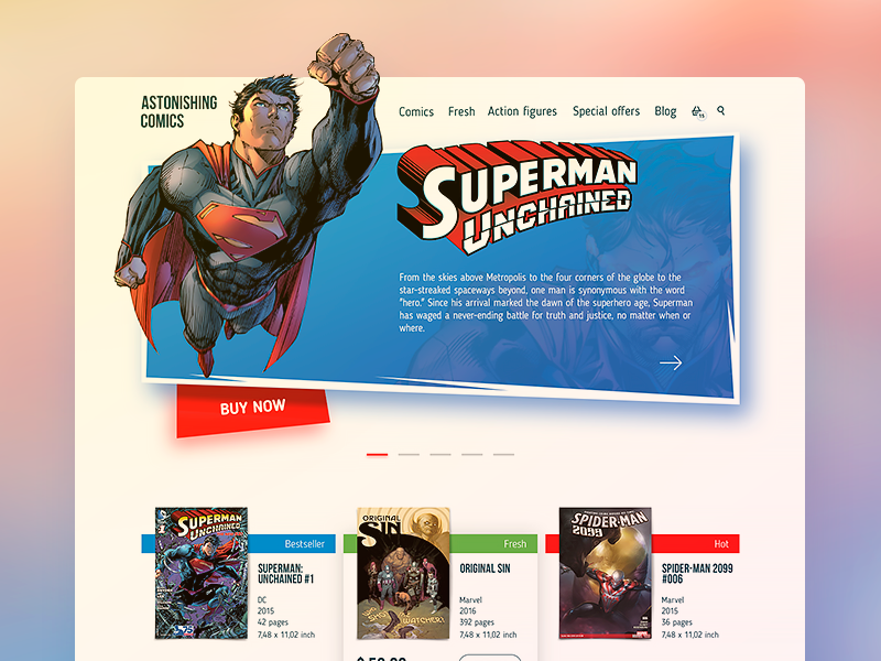
Comics Online Shop
Recommended Reading
Not done yet? Neither are we. Here are a few reads also worth the click:
Two Types of User Motivation: Design to Satisfy
11 Profitable Strategies for E-Commerce UI Design
The Role of Branding in UI Design
Business-Oriented Design. Know Your Target
Short but Vital. Key Abbreviations in Design for Business
Business Terms in Design for E-Commerce. Sales Basics
Two Types of User Motivation: Design to Satisfy