Ratings of e-commerce are booming and rocketing. People are getting more and more confident in buying things online. The report by BigCommerce on customers buying habits in 2016-2017 shows really interesting stats about online shopping:
- 51% of Americans prefer to shop online
- 96% of Americans with internet access have made an online purchase in their life, 80% in the past month alone
- E-commerce is growing 23% year-over-year, yet 46% of American small businesses do not have a website
- Online orders increase 8.9% in Q3 2016, but average order value (AOV) increased only 0.2% — indicating that transactional growth is outpacing total revenue.
The numbers above still haven’t stopped their increase. That wouldn’t be reasonable for any business to ignore such global trends having a great impact on profits and reaching customers. For the last couple of years here in Tubik we see the obvious and logical growth of interest from big and small businesses in establishing their presence online via websites and/or mobile applications. Based on our experience and the research of the sphere, today we offer you the article telling a bit more about strategies and best practices in UI design for e-commerce.
So, let’s start with the 11 points which are important to consider when you are designing e-commerce user interfaces.
1. Make the branding instantly visible
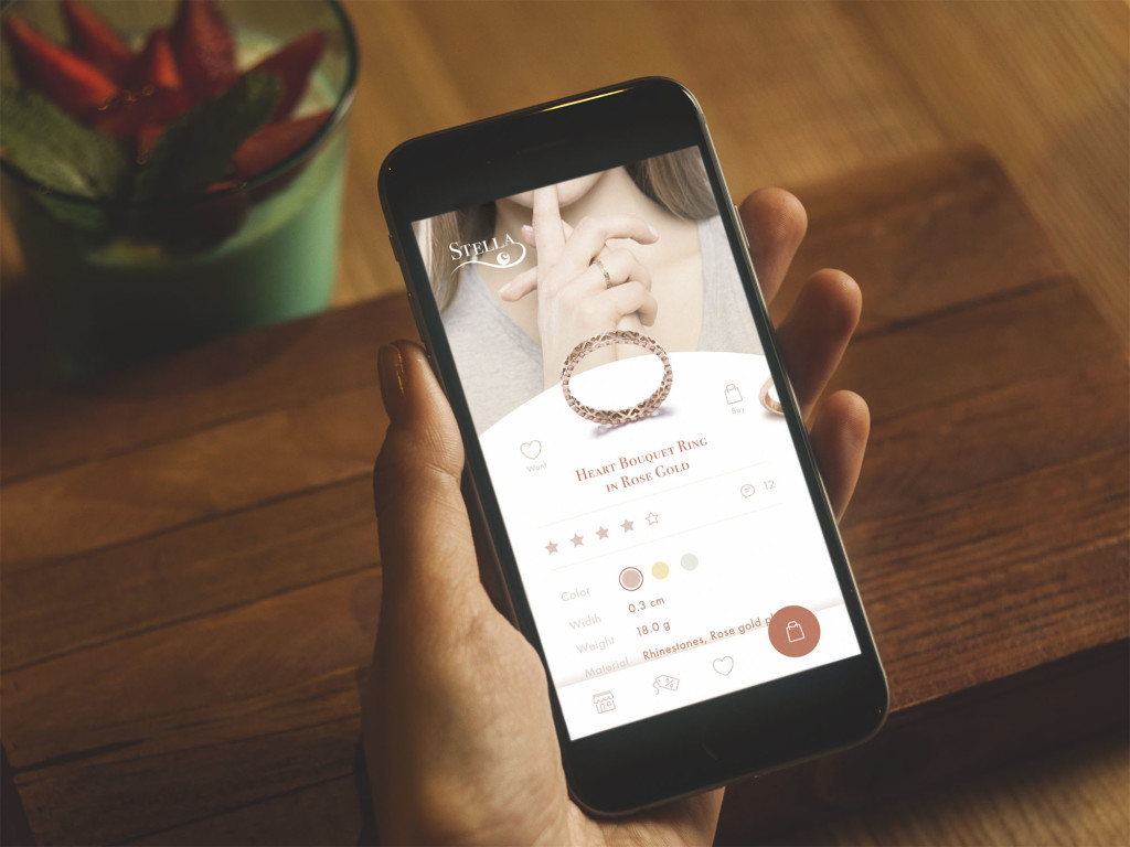
From the business perspective, branding is a crucial thing: it allows for providing a product, company, or service with a recognizable face and personality. In general terms, branding means a sort of image created via a set of distinguishing features and promoting awareness and recognizability of the product or service on the market.
Branding tends to be essential in an e-commerce user interface design, especially if stakeholders want to use the digital product as the additional flow of customer attraction. Moreover, identity integrated thoughtfully into the interface is an effective way to increase brand awareness. The time taken for proper market and user research, target audience definition, competition analysis and development of brand identity on the basis of all that data by a professional designer is a worthy investment. If that’s done before launching the process of UI design, the product gets higher chances of becoming recognizable faster and easier.
In this case, the UI designer working on the interface, its color palette, shapes, typefaces and fonts, illustrations, and icons, will consider design solutions appropriate and corresponding to the general branding concept of the product that will make them mutually support each other. It provides a more natural and harmonic feeling of the brand in general and the particular interface as an integral part of this brand.
There are numerous ways to add branding to the interface, still, some layout zones and elements have the highest potential in this issue:
Headers. In the article about website header design, we showed in detail that headers present an area of high visibility. So putting strategically important elements of branding in it is a good way to strengthen its memorability.
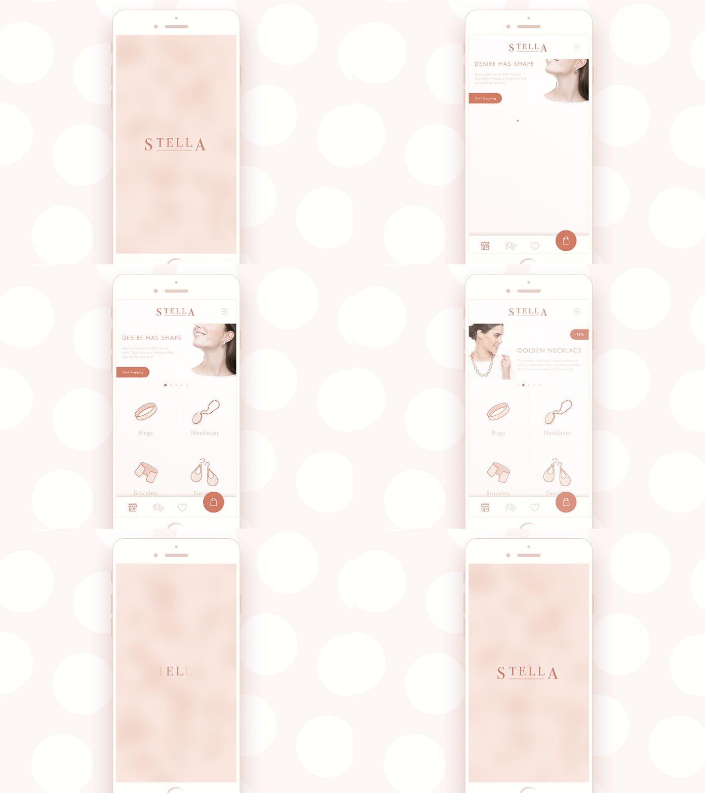
Splash screens. In mobile applications, a splash screen or welcome screen is the first screen seen by a user while the application is loading and starting. It’s a good idea to use a logo, mascot or any other thing to set an instant visual connection with a brand. Moreover, by adding a bit of wow-effect with slight stylish animation, it’s easy to make the sign even more attractive and memorable.
Preloaders and pull-to-refresh indicators. These are the elements that show the flow of the current loading process on the app or website. Branding applied elegantly in UI animation can add much to the consistency of both UI and identity design.
Mascots. Mascots are images, usually personified, which often represent the brand, product, or service identity and can be its symbolic convention across the whole application or website. Mascots push the limits of personification and give the chance to create unexpected combinations of elements or make fantastic and non-existing characters alive. A mascot becomes the element of identity and inter-connector between the user and the product. In many cases, it is the basic element of communication and interaction delivering the necessary message to the user.
2. Set clear and easy navigation as the core task
In the article on UX design for ecommerce, we stated: whatever an amazing website or app is, whatever the stylish and trendy design and breathtaking images it features, its success will be measured not by the number of «wows». The efficiency is analyzed simply – by the number of complete purchases. If users don’t buy, design means nothing while stakeholders lose their money. Clear intuitive navigation plays the premier violin here. At every step of interaction, users need to understand clearly plenty of simple things, like:
- what company or brand they are dealing with
- what page they are at
- where the menu is
- how they can get back to the home page or catalog
- where the search and filters are
- how long the page-loading process is going to take
- how they can see the detailed information about the item
- how they can choose between the option for the same item (color, size, etc.)
- how they can pay for the item
- how they can save the items they would like to get back to later
- how they can contact the seller
- how they can see the rating and reviews of previous buyers, etc.
3. Check the scannability of the page or screen
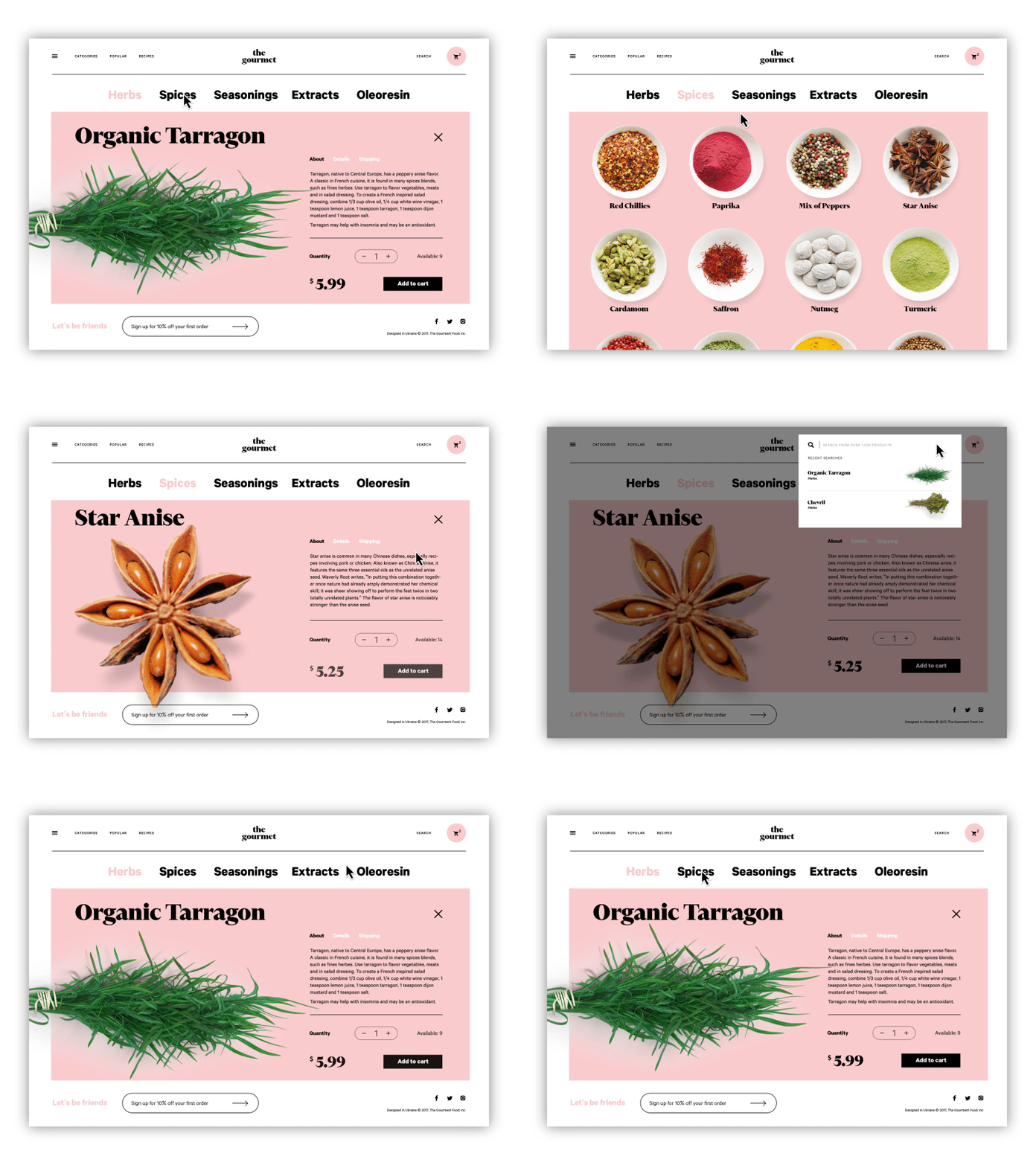
As was already mentioned, users don’t usually read and observe all the content on the page or screen from the starting point: instead, they start by quick scanning to understand if it contains something they need or want. Knowing the eye-tracking models, Gestalt principles and laws of visual hierarchy, designers and information architects can put the core data and interactive elements in the zones of high and natural visibility.
Calls to action (CTA), in particular, should be instantly seen in the first seconds on the page or screen. In the interfaces for e-commerce, CTA elements are the core factor of effective interaction with the product playing a crucial role in usability and navigability and therefore in getting profits. When all the path of interaction and transitions is built clearly for users but the CTA element is not thought-out, placed, or designed well, users can get confused and will need to take additional effort trying to achieve their goals. That increases the risk of poor conversion rates and general user experience.
4. Minimize user’s efforts whenever it’s possible
The respect for the customer lies not in pouring out your thanks. The real respect is in saving users’ time and effort day in and day out. Here are some design practices which can make the interface effort-saving:
Show related products. Seen on the item page as recommendations close to the features of this particular product can make the process of search and browsing much faster for users. However, it’s vital to check together with developers that this section really works according to the algorithm which shows suitable items, not random ones.
Strive for a minimal number of clicks. If going from page to page or jumping from screen to screen is not a part of the journey into the sales funnel, save every users’ click possible. Too many operations are tiring and annoying which is a kind of negative emotion. And emotions have a huge influence on user experience and make retaining users much harder. Minimize the number of clicks on the way of choosing and buying whenever it’s possible – this way you respect the user’s time better than the politest words of thanks.
Simplify the sign-in process. Imagine the situation when you got to the amazing website selling the goods of your dream, and they are presented in such a stylish way that you want to buy them at once. But when you click the button “Buy”, you are taken to the huge long contact form which you have to fill in to register on that website. That will cool down your hot wish to buy everything right here, right now, isn’t it? You change from the state “Take my money, give me that” to “Really? 20 points to fill in before I can buy?” in split seconds. Not all the users will survive that transformation and the website or app will lose a part of its buyers. So, it’s necessary to make the sign-in/log-in process as simple as possible.
User shape and color marking to group the items or types of content. Color and shape codes enable designers to apply the Gestalt principle of similarity not only on one screen or page but on the whole app or website. Color or shape markers simplify navigation and keep the consistency of design enabling users to remember the prompts and find the content they want easily. For e-commerce platforms which are usually full of numerous items, it can make the interface much more user-friendly.
Check that perception of the layout is natural and harmonic for the human eye. There are numerous things that have an impact on decision-making, and harmony is one of them. Eye-tensing color combinations, unreadable or not combining fonts, aggressive background, intrusive pop-ups or animations, annoying sounds, or pages loading for ages – any point of that stuff can spoil the experience quickly and move users away.
5. Don’t go too far experimenting
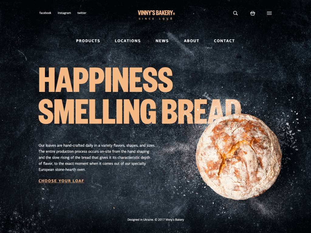
There are many articles and videos calling on creative people to hear their hearts, trust their guts and think out of the box. However, the design is not just pure creativity striving to show all the power of original solutions. First of all, it is a way to solve the problem and make users happier. So, it’s vital to look at the interface from the user’s perspective and find a way to make interactions that will provide a smooth and easy way to conversion. In the article on home page design strategies we mentioned: that the website is made not for creative contests or galleries of fame but for real users. The positive impact of habit in terms of user experience can be stronger than the wish of revolution. Surely, the dose of uniqueness is needed, but not so much to knock down the user. In e-commerce UI design, often aimed at quite a diverse target audience, too much revolution might confuse and scare: do I really need to buy this thing, a user may think if it’s so hard to get it? Study the interaction patterns and typical products for that particular target audience to make their habits their power. And don’t forget to check that all the icons on the screen don’t have a double meaning. Strive for the balance between innovation and traditions.
6. Use landing pages for specific purposes
For business aims and profits rate, this tip may bring crucial changes. E-commerce UI design principles are usually based on dealing with complex websites or apps which are filled in with a variety of information. So, the approach of directing all the traffic from outer sources to the home page can be a step in killing profitability and reducing conversion rates. Users might get overwhelmed, distracted, or even annoyed with the amount of data they have to process to find what they need, especially if they are focused on a particular narrow goal presented in the source they come from. Using landing pages when you need to concentrate the user’s attention on something specific can solve this problem efficiently. A landing page is focused on one item, to make it quickly found and reduce delays when the target user seeks specific operations, services, or items. This is the issue of especially high importance in the case of e-commerce websites when unwise design solutions bring poor user experience and financial losses.
7. Make the homepage informative
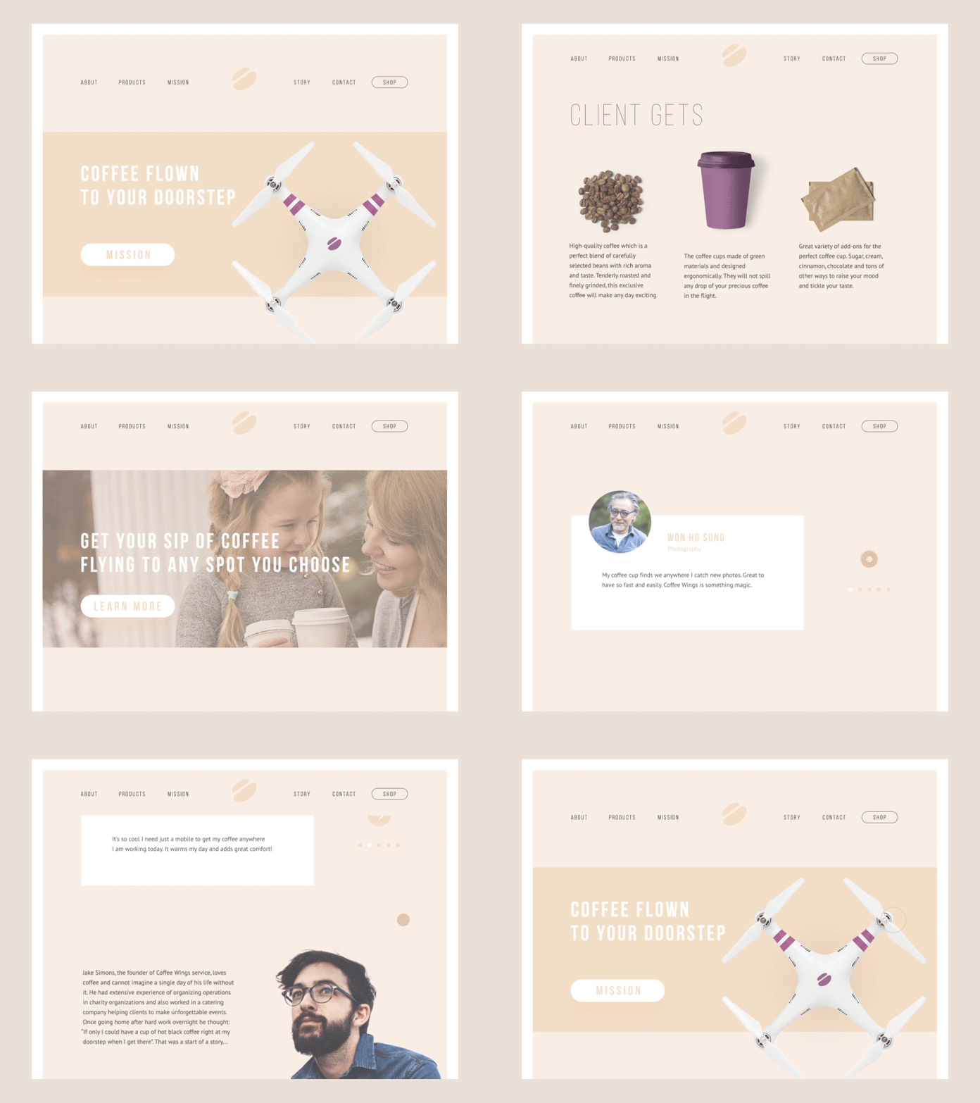
Home page can satisfy multiple functions: it’s a card of invitation, a starting point of the journey around the website, a storage of the vital links and data, and a strategic asset for marketing goals. In the majority of cases, it is the first visual and emotional touch on the website. Certainly, the design is one of the core ways to make this touch gentle, smart and helpful. With all the progress the World Wide Web has witnessed, this position doesn’t change: the home page often defines if a user goes further around the website, not only by beauty and style but first of all by information which is looked for. Making it accessible, noticeable, and clear, designers grow the chances of a positive user experience.
In general, a home page can include the following data:
- the nature of the website
- brand or company identity elements
- internal search
- links to the core interaction zones
- contact data and links to social networks
- signs of trust (testimonials, reviews, big numbers of presence on social networks, etc)
- for e-commerce websites, it can be a visual presentation of bestselling and/or exclusive items, for example, specific books, toys, clothing, equipment, etc.
The solution which of the mentioned points will be included and how they are going to be spread on the layout should depend on the goals set for the website and the research of the target audience.
8. Apply high-quality images giving the message
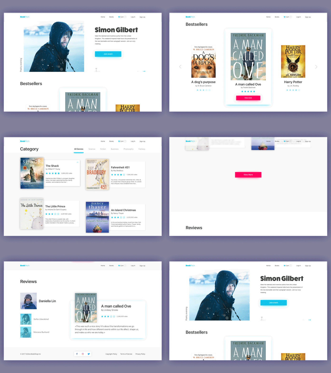
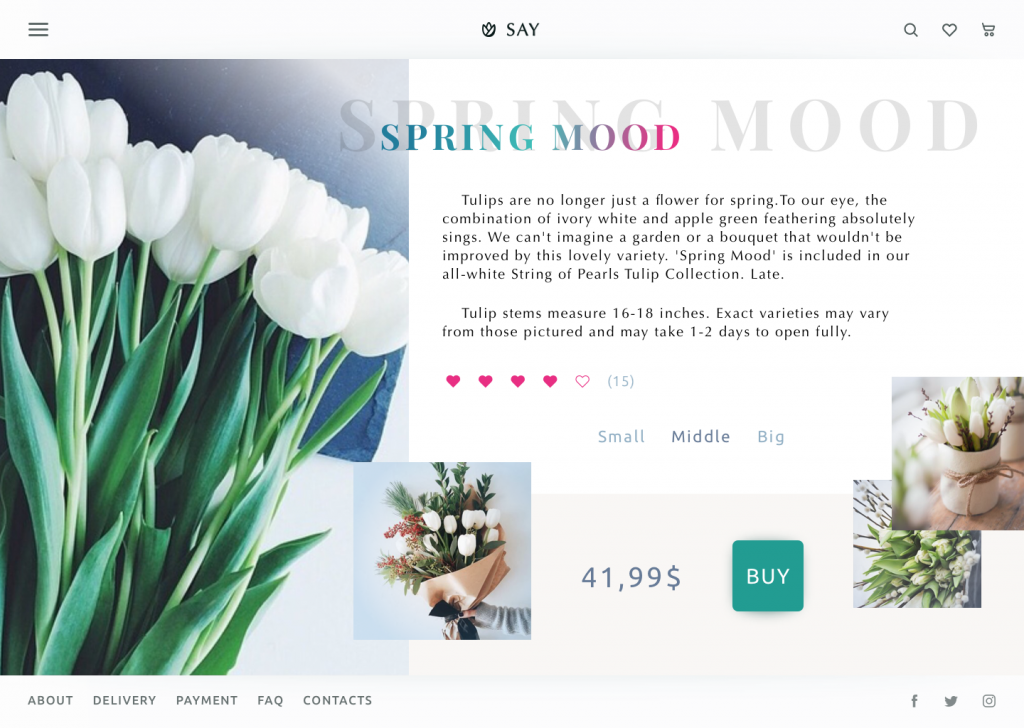
Images take a big part in usability: as the vast majority of users are visually driven, images become the hook points for getting basic data about the website or app. They present the part of the content which is both informative and emotionally appealing. The level of detail and functionality allow classifying the images in user interfaces into types, among which:
— photos: theme photos creating the appropriate mood and setting the message, demonstration photos, photos of the items, title photos for blog articles and pages of special offers, etc.
— illustrations: custom illustrations in graphic interface design can look both informative and original allowing the design to stand out from the competition.
— hero banners: applied mostly in web design, they are big images that are usually the first visual element catching the user’s attention in the initial seconds of interaction; they usually give an attractive visual presentation of the main content of the resource.
— icons: these are small but meaningful pictograms that are informative and support data exchange between the informer and addressee. Icons play a key role in providing clear and intuitive navigation, but they should be checked on proper clarity and the absence of double meanings.
— mascots: images, usually personified, representing the brand, product, or service identity.
— visual identity elements: various visual signs of branding like logos, custom lettering for brand name and/or slogan, etc.
9. Think about promotional videos of different kinds
There are several common types of promotional videos:
- introduction video (the first insights on the company, product, or brand showing its benefits for users)
- product presentation videos (details about the product’s features and advantages, special steps of interactions, and the problem-solving potential of the product)
- landing page videos (strengthening the message driving users to a particular call-to-action offered on the page)
- video testimonials (the reasons and signs of trust and loyalty to the company, brand, or product)
- entertaining and educational videos (rising emotional appeal and often presenting the material for viral marketing).
All the mentioned types can serve efficiently for marketing goals and increase brand awareness. A creative and catchy video is a good way of attracting customers’ attention and a proven method of informing them quickly and brightly. A video activates several channels of perception — audio, visual, sound — simultaneously and usually does it in a way of telling a story. People are daily overloaded with tons of information of all kinds, so most of them aren’t ready to devote much time to learning about products or services, especially the new ones. In these conditions, video can become a way of communication that is dynamic, informative, and attractive. However, the technical side should be double-checked so that the video was integrated correctly and didn’t overload the page.
MYWONY wedding brand website uses the full-screen promo video on its home page
10. Let the user contact the duty holders from any point of interaction
The most popular placement for contact information is a footer, the bottom part of the page. However, if any kind of contact data is core for conversion, it’s logical to put it in the pre-scroll area or even a header. For example, on an e-commerce website, which presents an online shop, users may want to call more frequently and this ability will have a direct impact on the conversion rate. Anyway, the contact data should be available at any point users may need it. Among others, it is one of the factors influencing the level of trust in the website.
Contacts can be presented in various formats. They can reveal the data such as a phone number and location, emails, links to messengers, contact forms, and an instant chat window. Making the phone numbers clickable is supportive as many users now browse from their smartphones and may want to call right from there. The address can be also clickable by opening the screenshot or map showing how to find the location. The solutions have to be based on thoughtful user research setting the target audience’s expectations, level of tech literacy, and ways of contact which are the most convenient for them. For instance, if your target audience is teenagers, just giving the phone number may be not effective as they really stick to messengers and social networks. At the same time, if your users are elderly people, social networks may not work in comparison to a phone number.
11. Add gamification
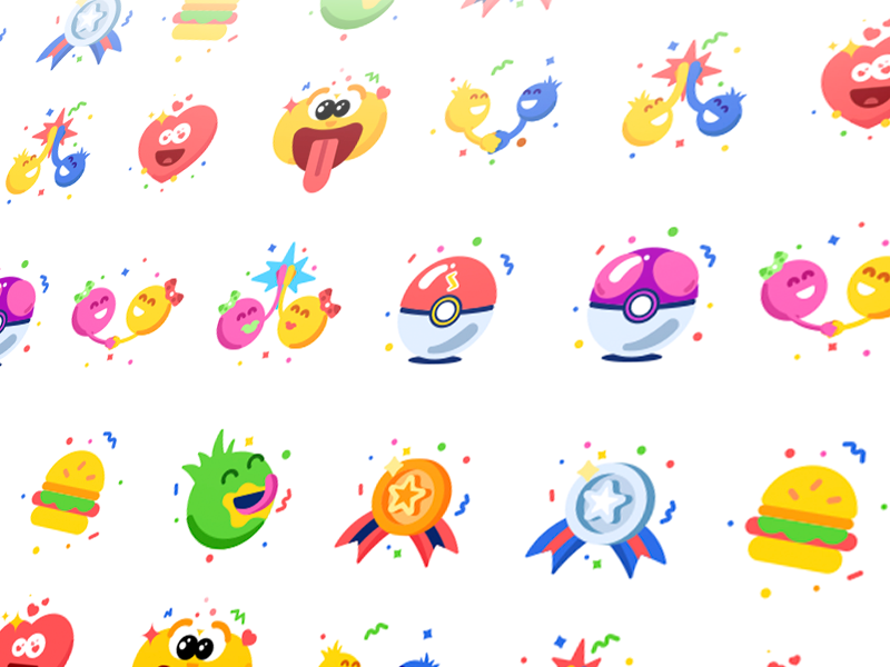
Gamification integrated into digital products is a great way to stimulate users’ extrinsic motivation, which is mostly a seeking of reward, which can be tangible (money, prizes, diplomas, certificates, trophies, medals, etc.) and intangible (praise, support, recognition, etc.). So, challenges, leaderboards, rewards for loyalty and big orders, discounts, badges, coupons, stickers, and all the other stuff of that kind can become great stimuli for users to not only start the interaction with a website or app but also stay there and buy regularly.
The offered e-commerce UI design examples and strategies, for sure, do not cover the whole scope of issues to consider in this field. However, they can serve as a useful checklist or a source of UI design inspiration for those who aim at creating user-friendly platforms supporting business goals. No doubt, the best UI design for an e-commerce website is the one that leaves a buyer happy and brings profits to the stakeholders.
Recommended reading
Take My Money: UX Practices on Product Page Design
UX Design for E-Commerce: Principles and Strategies
The Role of Branding in UI Design
Business-Oriented Design. Know Your Target
Short but Vital. Key Abbreviations in Design for Business
Business Terms in Design for E-Commerce. Sales Basics
Two Types of User Motivation: Design to Satisfy
Sell Like Hotcakes: UI Designs for E-Commerce
Feel Homey. Handy Tips for Home Page Design
Landing Page. Direct Flight to High Conversion
Welcome to read or download free e-books about Design for Business and Problem-Solving Web Design


