
Human brain is an amazing data processor whose broad capacity still hasn’t been explored at full. For designers dealing with user experience of any kind, knowledge of cognitive abilities and mechanisms is highly helpful in creating a user-friendly product. Today we offer you to continue our talk around this theme.
One of the previous articles here has started the series of posts devoted to Gestalt theory and ways to effectively apply it in UX design. For a brief reminder, Gestalt theory is based on the following idea: when people perceive the complex objects consisting of many elements, they apply conscious or subconscious methods of arranging the parts into a whole organized system instead of just the set of simple objects. It works on different levels of perception, but the visual part seems to be the most interesting for designers creating interfaces. We have already presented the definition of Gestalt theory, the principles of grouping in particular, as well as looked into the principle of similarity for user interfaces. This time let’s discuss the principle of proximity for UX design.
Principle of Proximity
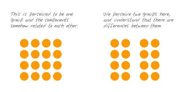
This principle is based on the cognitive tendency to perceive the objects close to each other as related, especially in comparison with those which are placed farther. Having the urge to organize a variety of data and objects around, people often group them this way automatically, much quicker than they start real thinking about it. So for designers, this is another good prompt on how to organize the interface along natural ways the brain absorbs and classifies data. The simple scheme by Andy Rutledge, given below, visualizes the principle of proximity.
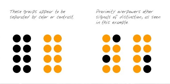
The important thing to bear in mind is that via research and experiment proximity proved itself more powerful than other distinctive features such as color or shape, for example. People tend to see elements as related if they are close to each other in comparison to other objects even if other features differ, like another simple scheme below shows.
In user interfaces, which are full of different content, the principle of proximity helps a designer to organize the layout to make it scannable and easily-perceived for users. It’s not a secret that users aren’t ready to spend much time learning how the complex interface works so intuitive screen which can be quickly scanned has much more chances to retain the users and give them the best features of the website or app.
In general, we could define two directions of applying proximity principle in user interfaces: for typography elements and copy content and for blocks of different content and controls. As well as in the previous article devoted to grouping principles, we will support them with examples by Tubik designers.
Typography and copy
One of the domains in which proximity plays a crucial role is the organization of copy content in user interfaces. Scannability of the copy blocks in the layout is vital because readers don’t usually stay on the pages which look like a long homogenous thread of text. First, most users scan the page and check the hooks like headings, subheadings, highlights, and keywords, and only then read more if they got interested. That is the reason why copy should be arranged according to the laws of both quick perception and aesthetic looks.
White space, also known as negative space, plays a great part in this process. It allows a designer to activate the power of nothing: the space without any content not only adds the air to the general layout but can be also used to organize its elements as groups and unities where it’s needed.
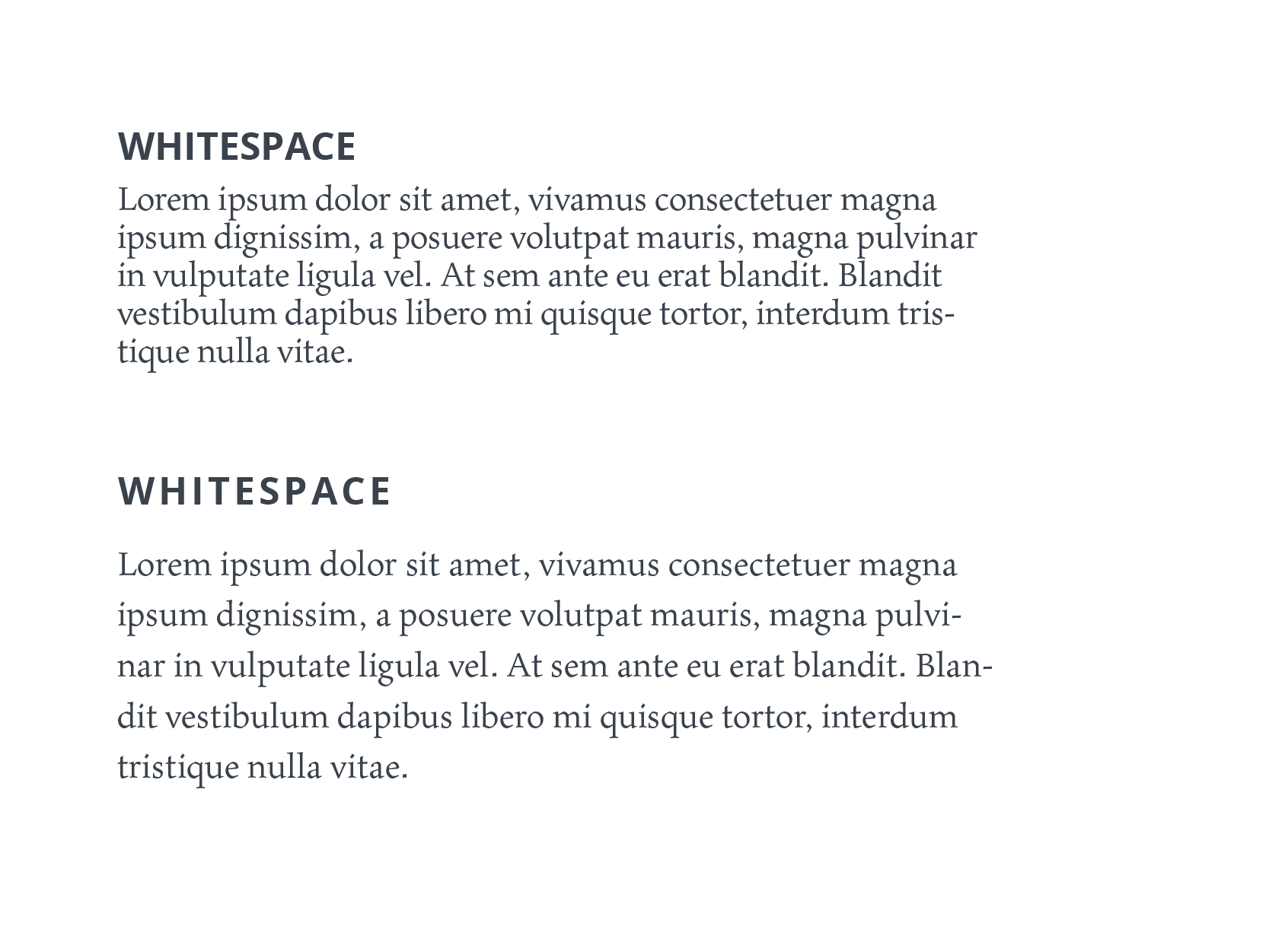
For copy content, it can be used in different ways. For example, with white space, a designer can harmonically separate the paragraphs in a big bulk of text to make it more digestible and visually pleasant for readers: this approach is often applied in blog articles and big copy blocks on websites. In this case, the principle of proximity signals that the copy lines which are closer to each other present the unified idea or piece of information and in this way makes all the text structured.
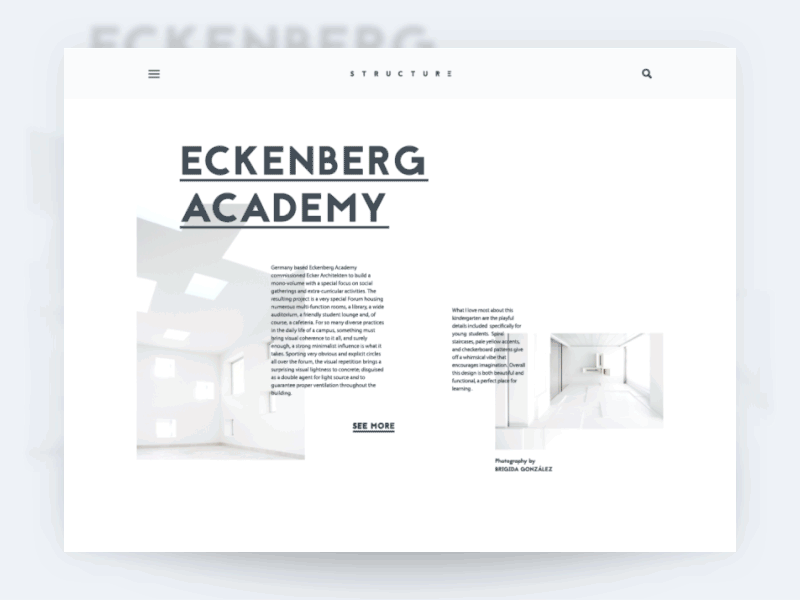
Here’s the interface concept of an architecture blog. The principle of proximity works in this UI on several levels. First, it unites the lines of one copy block to be decoded as one piece of information. Secondly, every copy block is placed close to the image it describes so even quick scanning lets the viewer understand that they belong to each other and present the single piece of content in the general layout. The call-to-action element – link “See more” – also works according to the principle of proximity being placed a bit farther than the body copy content but close enough to show that it is included in this particular content block. So, we can see that in this case, the designer activated proximity both inside and outside every particular block of content making them harmonically arranged while the general layout structured. Pieces of text are beautifully composed around the theme illustration and are scannable in split seconds.
This approach also works well for extended lists like menus and catalogs. Proximity applied thoughtfully becomes an effective tool to organize all the positions and group them effectively.
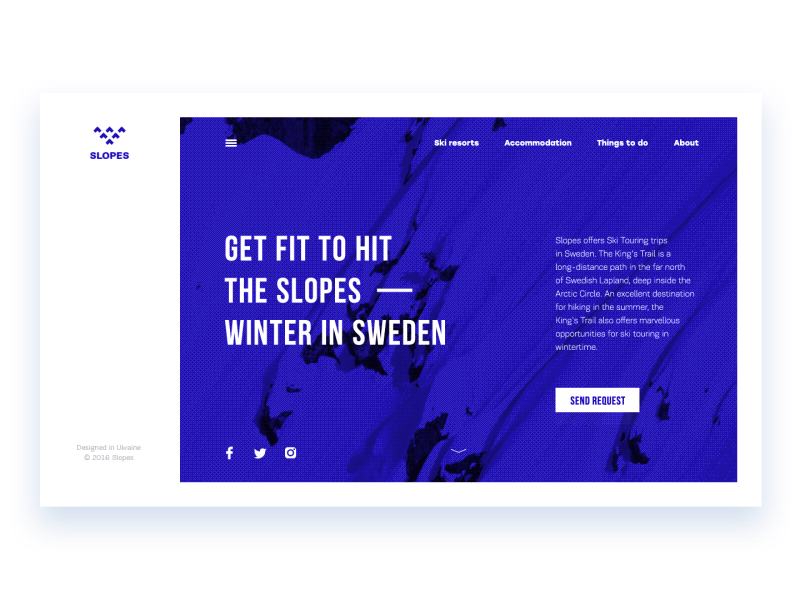
For example, let’s look at the Slopes website. The links to the core interaction zones of the websites in the header are quickly perceived as one unified group as they are placed close enough to each other and far from other content. The same works for the extended menu hidden behind the hamburger button: the links are organized in groups that are visually defined due to their close placement. Negative space used according to the principle of proximity strengthens the general visual hierarchy of the page.
Blocks of content and controls
One more domain where proximity can have a positive impact on user experience is the organization of diverse content blocks in the layout: except copy, these can be images, links, icons, controls, CTA elements, product cards and loads of other stuff. The principle of proximity allows designers to arrange these blocks in a way that most naturally corresponds to the natural human abilities of visual perception.
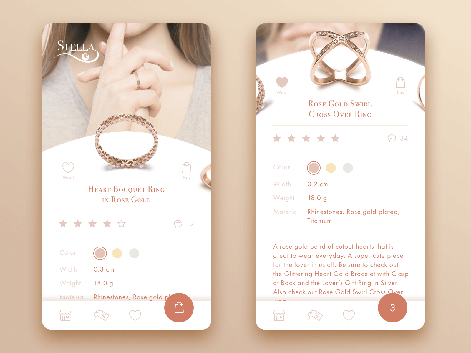
For example, here’s the e-commerce app for a jewelry store. The right screen shows the product card: we can see that the general data about the item – color, width, weight, and material – is given in several lines which are close to each other and therefore are naturally perceived as a unified piece of content. At the same time, the detailed description of the item presenting quite a considerable piece of writing is placed further and in that way separated a bit from the data file. So, these content blocks don’t merge and users can easily differ key data from the detailed description.
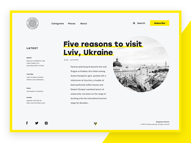
Here’s another example, grounded heavily on the principle of proximity – a layout of an online magazine. All the content and control blocks are arranged on the basis of the broken grid and without any frames separating them from each other. The proximity of the elements allows users to quickly define core content zones: the set of links in the header, the list of the latest publications on the left, the field of the preview for the fresh article and the block of social network links in the footer. Moreover, inside this global block, the principle of proximity continues to separate or unify the elements: according to it, the designer arranges the positions in the list of latest publications around different topics as well as separates the links to the web pages in the header from the controls of instant action such as search or subscription. This approach not only makes the layout elegant and scannable but also strengthens intuitive navigation for better usability.
Although we have just started revising Gestalt theory usage in design, it’s already obvious that knowing these simple yet effective principles can save much effort for users and support user-friendly interfaces with mechanisms that work according to human cognitive abilities and psychological patterns. Follow the updates to check the explanations and examples for other grouping principles: symmetry, continuation, closure, and others.
Recommended Reading
Gestalt Theory for Efficient UX: Principle of Similarity
Psychology in Design: Principles Helping to Understand Users
How to Design Effective Search
Error Screens and Messages: UX Design Practices
Visual Dividers in User Interfaces: Types and Design Tips
Directional Cues in User Interfaces
How to Make User Interface Readable
Basic Types of Buttons in User Interfaces
Negative Space in Design: Practices and Tips
Welcome to read online or download the free e-book “Problem-Solving Web Design”