What do you do if you want people to get to a particular destination? You do everything possible to show them the way. In user experience design, it should work the same way. Don’t expect that users come to your website or app ready to fiddle and learn the ropes. It’s designers’ job to make the way to the conversion as easy and intuitive as possible. Directional cues are among the key factors for reaching this goal. So, in today’s article let’s revise the popular types of directional cues in web and mobile user interfaces and find out why they are such an essential factor of positive user experience.
What Is Directional Cue?
Directional cue is any element of user interface that gives a visual hint on specific interaction or content to let the user see it faster and easier. As well as road signs and signposts do in the physical world. They guide a visitor or user to the key elements, text lines, and call-to-action elements, this way making the conversion reachable and users’ problem solved quicker.
As in most cases, you have only several seconds to convince users to interact with your product, making it clear while the core pieces of content and interactive zones instantly visible may be crucial for decision-making.
How Directional Cues Influence User Experience?
Directional cues:
- enhance the page or screen scannability
- strengthen the visual hierarchy
- improve navigation
- increase conversion rates.
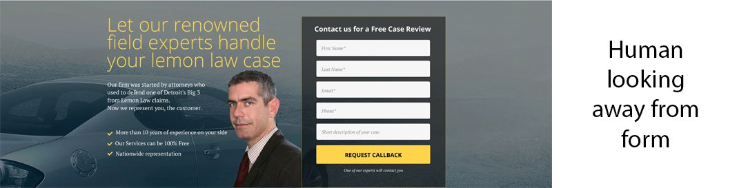
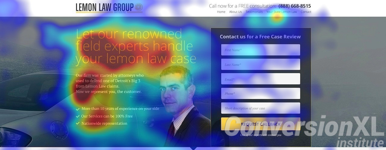
Perhaps, one of the most well-known practical experiments showing the power of directional cues and the effectiveness of their types was accomplished by CXL Insitute. They created several versions of the same landing page that only differed with directional cues, and then collected data of user interactions and analyzed it. Here’s how the options looked:

![]()
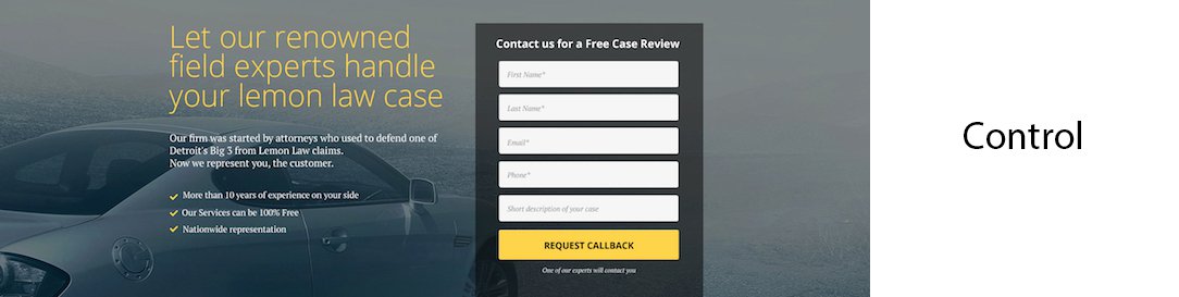
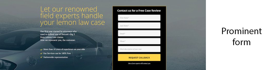
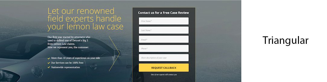
The experiment showed that the directional cues had a great impact on user experience, content consumption, and conversion rate:
- the page with a hand-drawn arrow got the longest time on page and the attention directed to the contact form
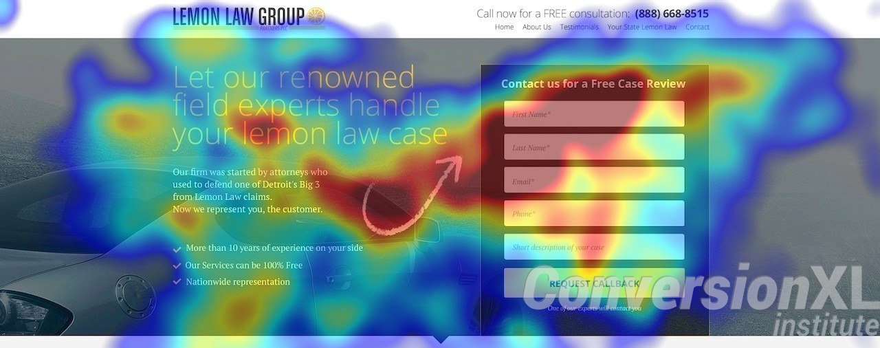
- the version of a page with a man looking away from the form got the least attention and interaction from users.
So, wisely applying directional cues, the UX designer enhances the visual communication of the interface with the user. Clarifying the way, we make it easier to achieve the destination, which is a factor influencing usability.
Popular Types of Directional Cues
Arrows
One of the most popular direction cues comes directly from the physical world. Perhaps, there is no more obvious and universal way to show the direction as with an arrow. That is the reason why a variety of arrows turn up here and there in interfaces to help the user not to get lost. It is the pattern of interaction that is clear for people of any age, culture, level of education and tech literacy – and the experiment described above proves it well.
The website on forest camping uses arrows prompting interactions with horizontal slides.
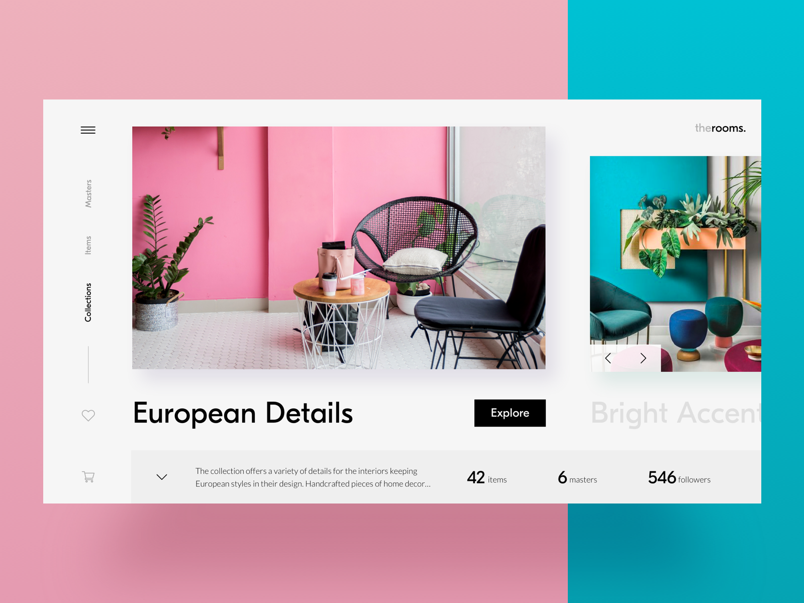
Home decor ecommerce website uses arrows as the visual prompts on interactive elements.
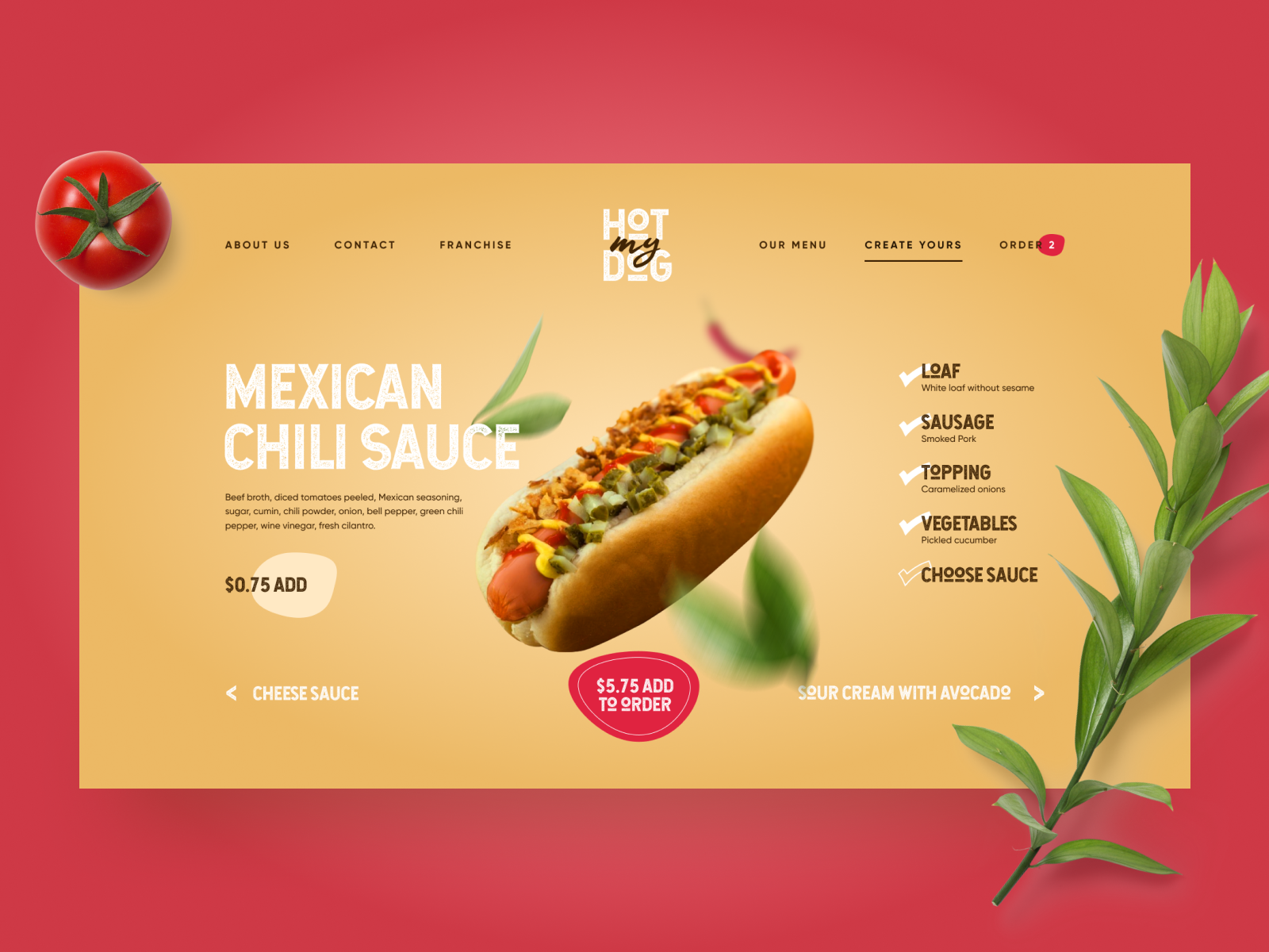
The webpage for the hot-dog delivery service that allows for creating custom hot dogs uses arrows to let users see the stage they are at.
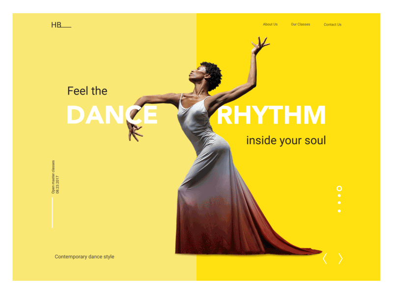
Dance Academy landing page uses arrows to prompt the users that there are interactions with a horizontal slider.
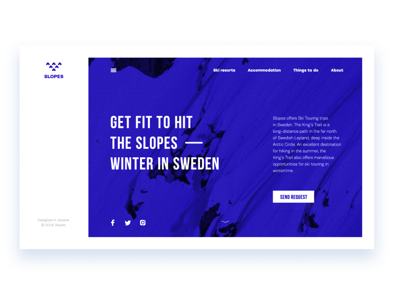
The animated arrow in the bottom area of the website for travelers invites users to scroll to see more.
Pointers
What if you don’t want to make the design look that direct and straightforward as arrows do? Then pointers can help. Again, it works as effectively as in real life: when someone wants to direct your attention to an object or person, it’s enough just to point at it. On the web pages and mobile screens, this trick works the same way, giving the reason for various visuals giving an elegant visual hint on the core information or interactive element.
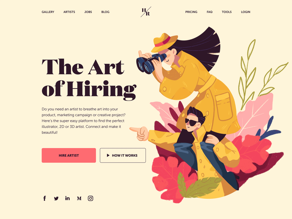
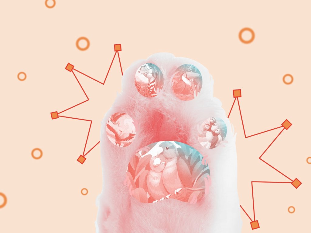
This landing page of the platform for hiring artists uses the hero illustration that not only transfers the idea and makes the page attractive. It also works as a pointer: the composition of characters points at the zone with information and CTA.
It may not look like a direct pointer but if you look attentively you’ll see that all the dynamic composition of the page leads you to the zone of the call-to-action button, even the details such as the paper plane.
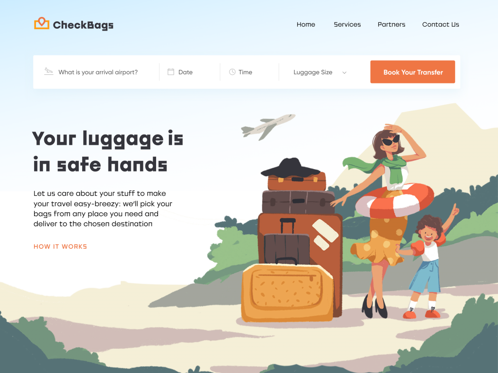
The hero illustration on the website of the luggage delivery service also uses the power of pointers: not only people but even the plane direct your eyes to the CTA button.
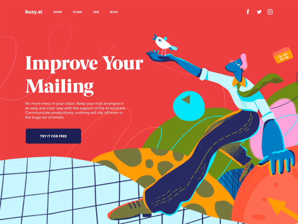
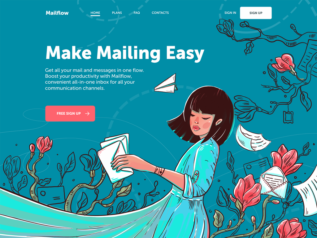
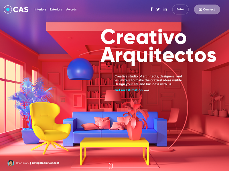
Hero illustration at the landing page of a productivity service also uses the composition and a character posture to make it a directional cue focusing users’ attention on the tagline.
Eye Line (Gaze Direction)
Eye direction is another powerful directional cue built on natural human reactions. When people see that someone’s eye is focused on some point or object, they have a natural urge of curiosity to check what it is. That why this trick is often used with visual content like photos or illustrations integrated into UI layout.
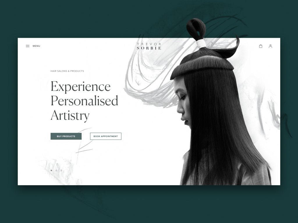
The hair beauty company website uses a hero image on the home page that works as a directional cue: the model’s eyes attract your attention to the zone of CTA elements.
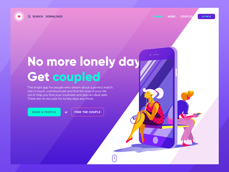
The landing page for a dating app uses the illustration with a character whose eye line is directed at the information copy block.
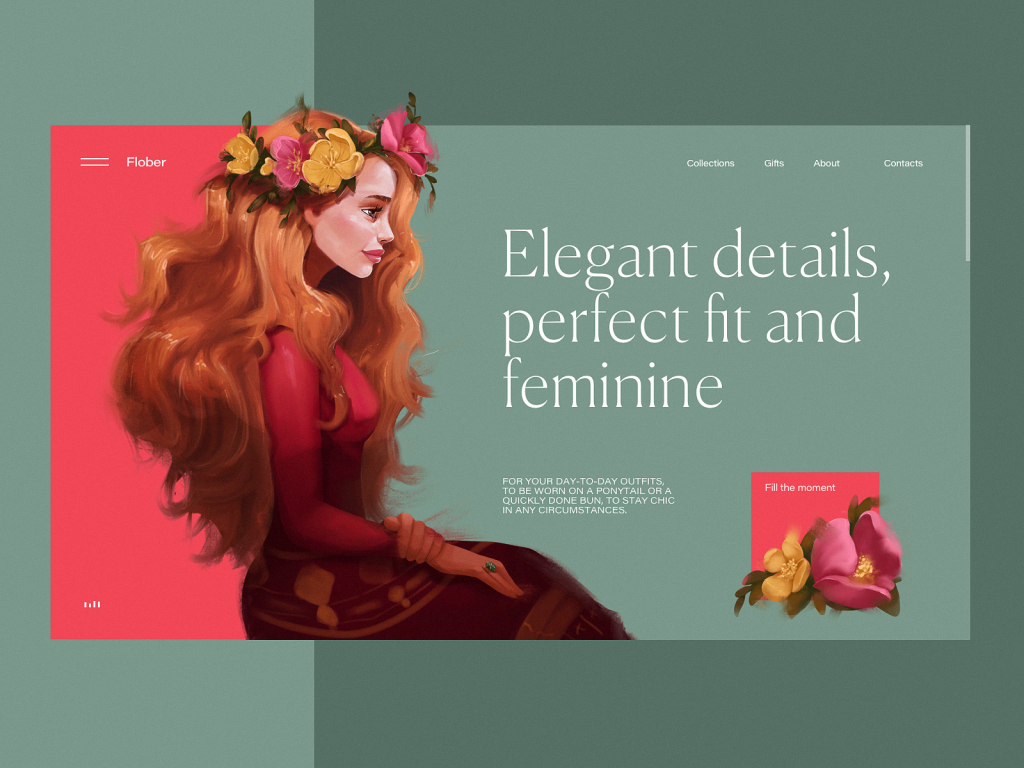
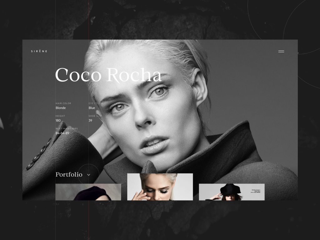
The ecommerce website selling exclusive hair accessories uses a sophisticated hero illustration that also plays the role of a directional cue as the eyes of a character are directed to the tagline.
The hero section of the e-commerce website uses the image not only demonstrating the product but also working as a directional cue focused on a tagline.
Visual Prompts
Not only arrows can give users a hint that interaction is possible. Other objects can provide some help, like icons or illustrations symbolizing the type of interaction. The mouse may mean that you can scroll, the hand animation will let you know that it’s possible to swipe and so on. This way the users don’t need to take additional effort to understand how the interface works.
The website for a design studio uses the icon of the computer mouse as a visual prompt to try scrolling down.
Part of the Following Content
One of the issues that may arise in the interaction process is the illusion of completeness. It happens when the layout seems to be complete and it’s not clear that scrolling you can open more content. So, showing the part of the content that will continue below the area visible on the screen works as a non-obvious but effective directional cue. This way users avoid the feeling that they have seen everything and the risk of missing important content gets lower.
The fashion model portfolio webpage features parts of the photos in the bottom area to give users a hint about scrolling to see more.
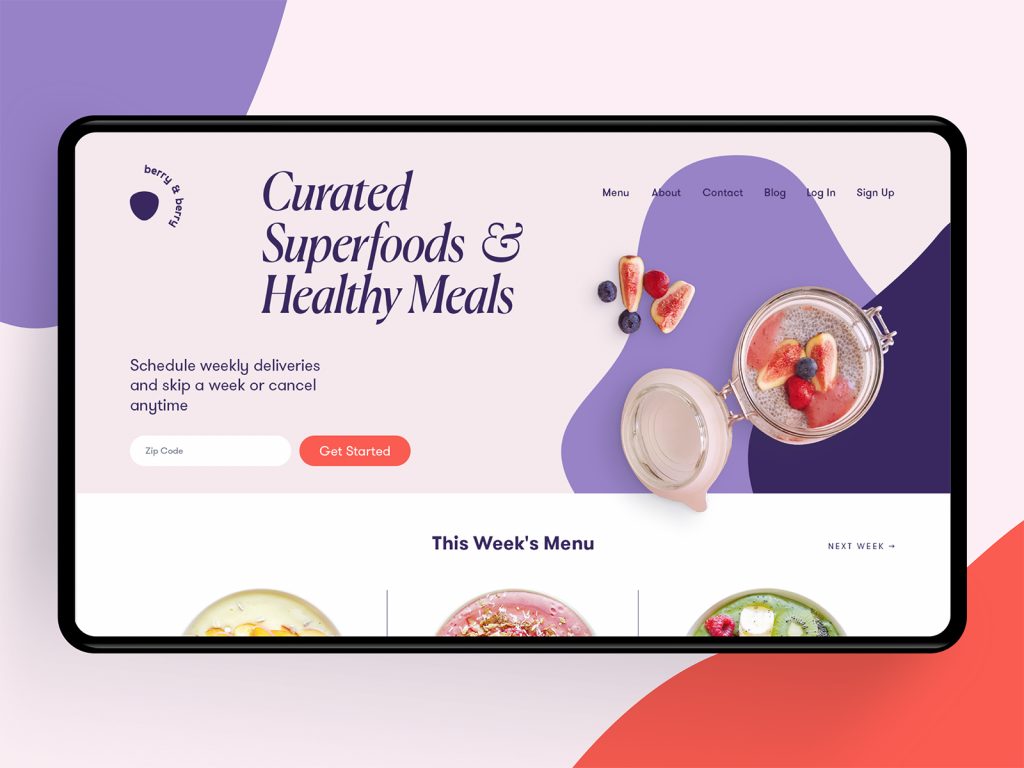
The home page of the food delivery service shows the part of the menu in the bottom part of the screen to show that there is more content in the below-the-fold area. Also, the layout uses arrows as a directional cue showing that horizontal interaction will open another information block.
So, it’s easy to see how differently directional cues may look. Whatever kind of dress and performance is chosen for them, the main thing is that they present another sign of respect for the users saving their precious time and effort and making interactions natural and easy.
Useful Articles
Welcome to check more articles devoted to the issues of user experience design for web and mobile.
How to Make User Interface Readable
Basic Types of Buttons in User Interfaces
UX Writing: Handy Tips on Text Improving User Experience
3C of Interface Design: Color, Contrast, Content
Negative Space in Design: Practices and Tips
User Experience: How to Make Web Interface Scannable