
Jack Kerouac once said, “One day I will find the right words, and they will be simple.” Although he was probably talking about life, or maybe jazz, he accidentally captured the secret sauce of UX writing—years before we came up with a name for it.
We’ve been trained to associate design with visuals: typography, layout, motion, color theory. But scroll through any app and ask yourself—what do you actually engage with most? Nine times out of ten, it’s text. From labels and tooltips to error messages and empty states, microcopy quietly drives the entire user journey.
Instead of being another preachy blog post about clarity or tone of voice, this article is about treating words like interface components—scalable, purposeful, friction-reducing design elements that just happen to speak human.
Let’s unpack what UX writing really is (and isn’t), what makes great interface copy, and how to improve your UI text so users actually understand what the hell is going on (and feel good while doing it).
What UX Writing Actually Is
UX writing is the practice of crafting text that lives inside digital interfaces—across web, mobile, wearables, you name it. Think: button labels, menu items, loading messages, onboarding prompts, 404 pages, and those little in-app nudges that either make or break your flow.
It’s not copywriting in the traditional sense. Copywriting sells. UX writing guides. One wants you to buy a camera, the other tells you your photo is uploading. They serve different gods, but they both serve a purpose.
Sure, some companies blend the roles—especially in smaller teams where the person writing your pricing page is also naming buttons and rewriting error messages in Jira tickets. But the intent differs. While marketing copy is about persuasion, UX copy is about orientation, navigation, context, and confidence. The moment something breaks, UX writing either saves the experience—or sends the situation off the rails.
Most people still call it “copy”—old habits die hard. But let’s not conflate goals. If copywriting is the velvet curtain, UX writing is the floor plan that keeps you from walking into a wall.
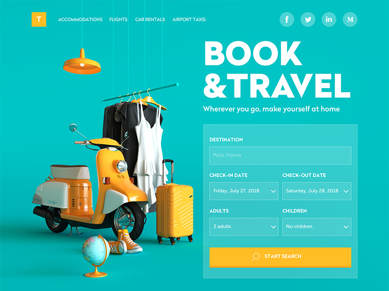
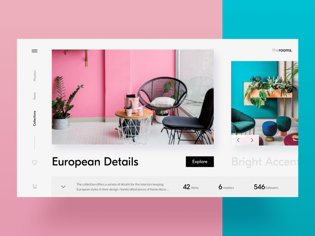
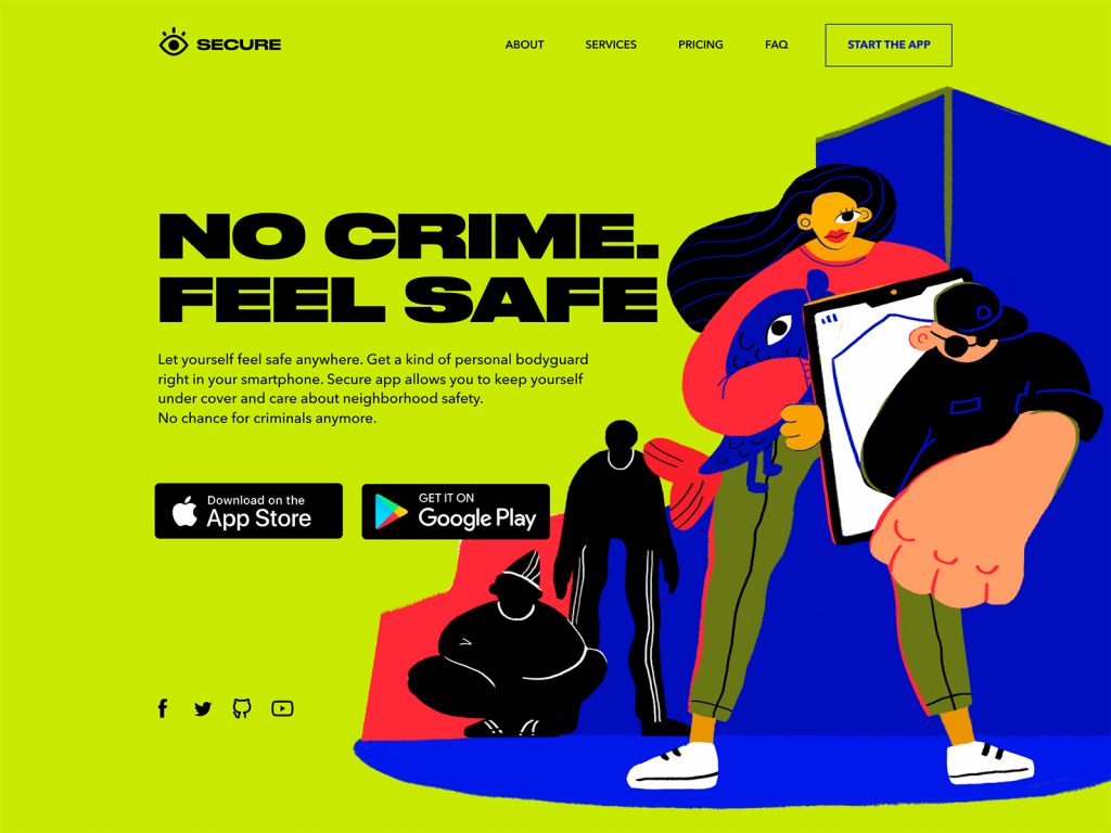
Booking Website
Icons Are Fast. Text Is Clear.
We’ve all had that moment: staring at an icon, wondering, “Is this…delete? Or archive? Or launch-the-missile?”
Designers love icons. They’re tidy, fast, fun to work on. They’re like cognitive shortcuts that slip straight into the visual cortex. The problem is, speed often has nothing to do with clarity.
Icons can mislead. A star can mean favorite, bookmark, save, or “look at this later and forget about it entirely.” That’s why even the most iconic UI patterns—magnifying glass for search, envelope for mail, gear for settings—are often paired with text. Because text grounds meaning.
In fact, some of the most usable interfaces out there pair every icon with a label, especially on mobile. Why? Because ambiguity is the enemy of speed. And when your users are swiping with one hand on a crowded train, you don’t want them guessing.
The best UI is not afraid of redundancy. It embraces the combo platter: icons for speed, microcopy for clarity. Text helps the brain commit the function to memory. That’s how familiarity is built.
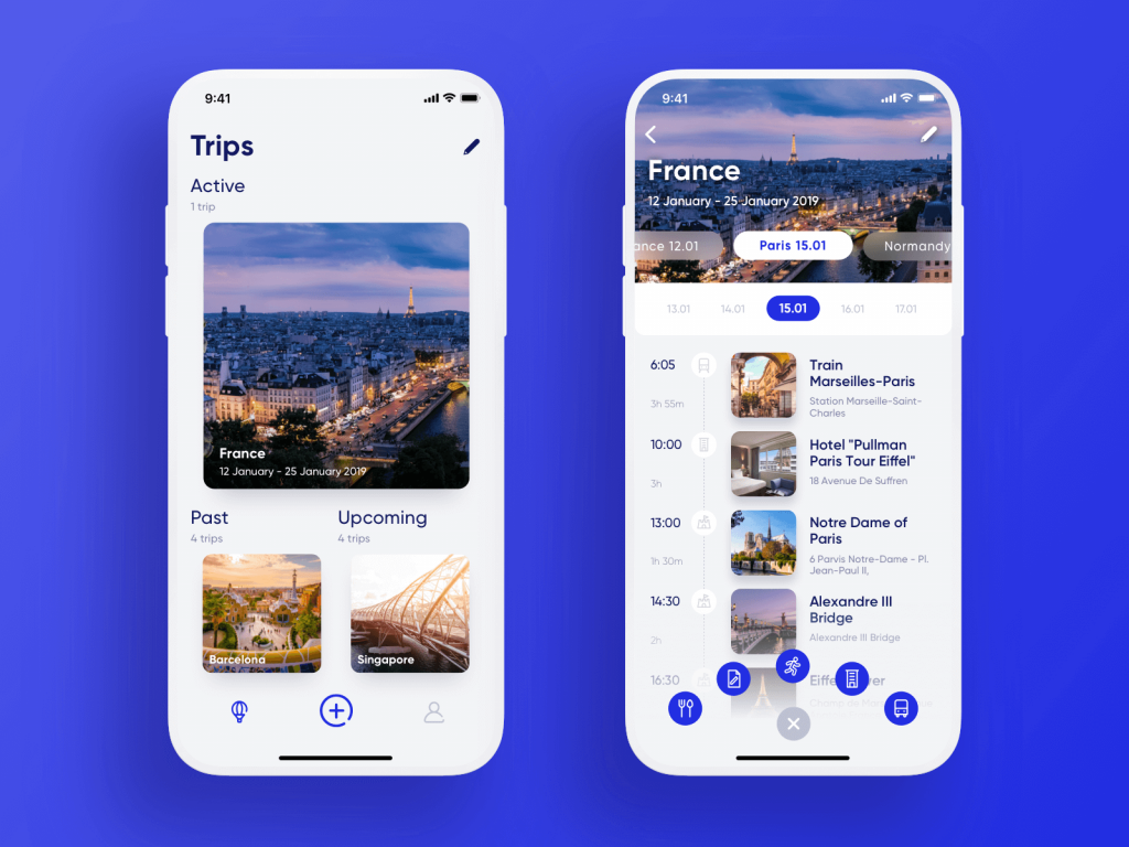
Travel Planner App
Great UX Text Does Four Things (At Least)
No matter the platform or product, effective UX copy sits on four sturdy legs:
- Clarity. The user shouldn’t have to read it twice. Or worse—Google what it means. If your tooltip reads like legalese, you’ve lost the plot.
- Brevity. You’re not writing a novel. You’re writing interface, where space is at a premium and users are impatient. Every word competes for attention, so make those words fight for their life.
- Usefulness. What’s the user trying to do? How does this text help? If it doesn’t push the action forward, it’s decoration.
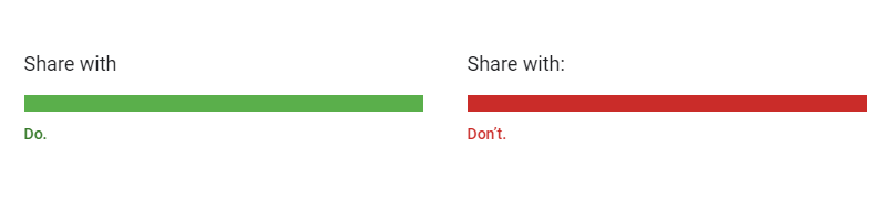
- Consistency. Call a thing the same thing everywhere. Delete is delete. Not “remove” on mobile and “erase” on desktop. You’re not writing poetry, you’re building cognitive patterns.
Now, let’s explore some tips helping to create texts that support the positive user experience.
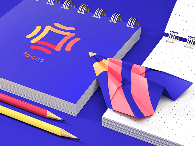
Perfect Bouquet App
Tip #1: Real Words, Real Early
Let’s talk Lorem Ipsum. The loremest of all ipsums. The classic placeholder text designers have been abusing since time immemorial. Harmless? Maybe. But also: misleading.
Real content has mass. Real labels are longer than you think. Real sentences wrap, break, scroll, and stretch your precious layout. That tagline you set in 20pt Neue Montreal Bold might not work once you swap “Lorem ipsum dolor” for “Free returns on all full-price preorders.”
You wouldn’t mock up a banking dashboard with stock photos of cats. So why use fantasy Latin for a CTA?
Using real UX copy from the start helps you:
- Stress-test your layout
- Expose real character limits
- See where the message and the medium misalign
Besides visual polish, it’s also about design fidelity. A UI that looks amazing with fake copy but breaks with real content simply isn’t ready.
So here’s a radical idea: write the real text early. Even if it’s a rough draft. Even if you’ll rewrite it later. Even if it feels weird. Because the sooner you confront the limits of space, meaning, and tone, the more intentional all your design decisions become.
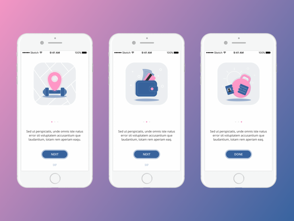
Onboarding screens for Manuva app at the UI design stage, using Lorem Ipsum for placeholder copy blocks
E-commerce platform for buying and selling home decor
Tip #2: Design Isn’t Read. It’s Scanned.
Users don’t actually read your interface. Sorry.
Instead, they glance, skim, flick, squint, devouring content like it’s a Tinder profile. And unless something screams relevance, they swipe right past it. In a world where apps multitask harder than we do, cognitive overload is the enemy, and scannability is your first line of defense.
The interface is a landscape of information architecture, and your text hierarchy is the topography. You need hills, valleys, and a few well-lit signposts. This is why typography is never just a visual decision—it’s a behavioral one. Bold headers don’t just “look good,” they anchor the user’s eye. They say: start here.
If the eye doesn’t know where to land, it won’t land at all. And when attention bounces, so does your conversion rate. That’s why we build text hierarchies like we build visual ones: with intentional layering. Primary message first. Supporting context next. Edge-case clarifications later, and ideally, collapsible.
Also: stop treating text and images like divorced parents fighting over page custody. They work best together. Let them collaborate, not compete. When a short line of copy harmonizes with a vibrant illustration or 3D render, that’s when users stop scanning and start believing.
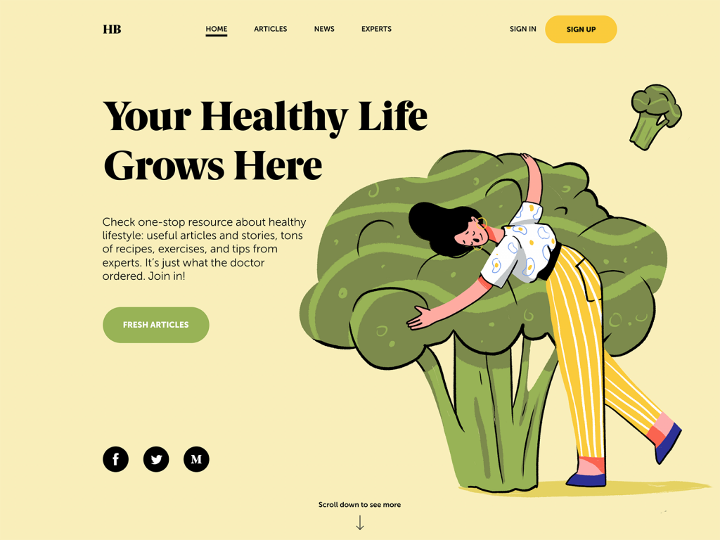
Health Blog Home Page where all the copy elements are connected to the hero image
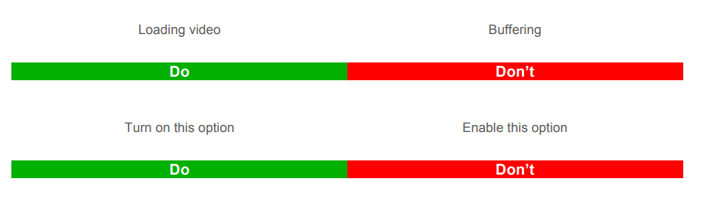
Tip #3: Numbers Are Visual Speed Bumps (And That’s a Good Thing)
There’s a reason a title like “3 ways to boost your app’s UX” always performs better than “A few thoughts on interface design.” And it’s not just clickbait magic.
Our brains are wired to treat numerals like cognitive anchors. They feel factual, useful. In the swamp of abstract UI promises, numbers are little rocks of certainty. They offer the illusion of precision even when the context is fuzzy. “Only 2 spots left” might be a lie, but it feels true.
And if you’ve ever stared at a long paragraph and only read the part that says “42%,” congratulations—you’re not alone. Eye-tracking studies from Nielsen Norman Group show that numbers stop the wandering eye. Even in text we otherwise ignore.
In UX writing, that means numbers are design cues. They break the rhythm and signal structure in a wall of text. And yes, this means breaking some old-school editorial rules, like spelling out numbers under ten, or avoiding digits at the beginning of sentences. Because “3 files deleted” beats “Three files have been deleted” every time, especially when your user is in a rush with 5% battery left.
Tip #4: Text Hierarchy is About Permission
Here’s another weird truth bomb: users don’t actually need permission to ignore your text. What they need is permission to engage. Every screen, every interface element is a negotiation of attention, and the best UX writing invites attention without demanding it.
Bold, italics, color cues, and inline highlights say: “Hey, this bit here? It matters.” But moderation is the key. If everything is loud, nothing is; if every tooltip is colorful, none are memorable. That’s the paradox of interface design: attention is a finite resource, and surplus creates scarcity. So design your copy like a lighting designer stages a scene—highlight the right things, dim the rest, and let the silence do some of the talking.
Construction company website with a typography-based design that marks the keywords with different color
Tip #5: Breaking Grammar Rules Makes Great Interfaces.
We get it. You were top of your class in English. You cry when the semicolon gets misused. But when it comes to microcopy—the tiny, high-friction moments of interface interaction—grammar is not the hill you want to die on.
Do your users really need to see “Would you like to save the changes?” when “Save changes?” gets the job done faster, cleaner, and without raising blood pressure?
Punctuation, too, is negotiable. Periods at the end of button labels? Unnecessary. Colons after field names? Distracting. Complex tenses and passive voice? Unhelpful at best, confidence-eroding at worst.
Material Design guide on writing advises to avoid unnecessary punctuation such as periods in copy for labels, hover text, bulleted lists, or dialog body text or colons after labels.
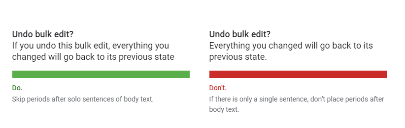
As well, for UX copy, they recommend using present tenses but in their simple forms.
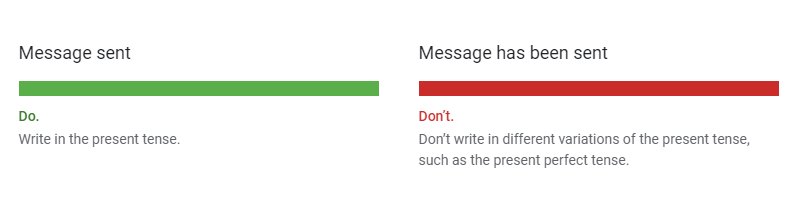
Blog App
The best UX text reads like thought, not writing. Present-tense. Active voice. Minimal preamble. Spoken, not dictated.
And no, this isn’t about dumbing things down. It’s about reducing friction. When your user is panicking about a failed upload or trying to onboard while half-listening to a podcast, you owe them clarity without condescension.
So if you’re clinging to “therefore,” “utilize,” or “enable” (more on that later), ask yourself: are you showing off your vocabulary, or helping someone get where they’re going? Here’s a quick litmus test: read your microcopy out loud. If it sounds like an instruction manual or a tech support email from 2006, rewrite it.
Tip #6: Button Text Is Tactical.
The humblest bit of UX writing—the button label—is also one of the most consequential. A few characters long, sitting quietly in the corner of your UI, and yet it can derail onboarding flows, tank conversions, or make users pause just long enough to abandon checkout altogether.
Here’s the trap most teams fall into: they spend hours debating color, size, and corner radius, and about 30 seconds on the words. Which is wild, considering that’s the one part users will actually read before clicking.
The text on a button is a mini-contract. You’re asking someone to commit—whether that’s “Submit Payment,” “Create Account,” or “Delete Forever.” And like any good contract, the terms should be clear, fair, and easy to agree to without second-guessing. That’s why A/B testing your button copy is always good. Color and layout matter, sure, but language is what flips the switch between intent and action.
Designing for a demographic outside your own? Even more reason to test. A 25-year-old UX writer designing a portal for retirees should never assume what feels obvious. “Get Started” might sound fun to you, but “Continue” could be more trustworthy to someone who’s never used an app like this before. Empathy isn’t always intuitive. Sometimes, it’s empirical.

Home page for the web platform to find and hire artists
Tip #7: Interface Choices Are Emotional. Write Accordingly.
Every interface is full of little crossroads—accept or deny, skip or snooze, sign up or sign out. And every time we make users choose, we’re nudging their perception of themselves.
Here’s the trick: people respond to identity cues. They want to feel competent, respected, and in control—even when they’re cancelling a subscription or ignoring your fifth reminder to turn on notifications.
That means the wording of your buttons and prompts should never feel like a guilt trip or a riddle. “No thanks, I prefer to stay in the dark” as a dismissive CTA for email opt-outs is only funny once.
A better approach: respect the choice. Acknowledge the action. Make the copy feel like a conversation with someone who knows what they’re doing, not someone being tricked into clicking the wrong thing.
Tip #8: Consistency Builds Trust. Inconsistency Breaks It.
Let’s play a game.
On Screen A, the action to remove a file is labeled “Delete.” On Screen B, it says “Remove.” On Screen C, it’s “Clear.” Are these different actions? Variations of the same? Is one more final than the other? Should I panic?
You get the point.
Synonyms are great in poetry. In product interfaces? Not so much.
UX writing thrives on repetition. Not out of laziness, but out of strategic clarity. When you call an action “Delete” in one place, call it “Delete” everywhere. Consistency isn’t just linguistic polish. It’s cognitive scaffolding. And when that scaffolding slips—even just a little—it erodes confidence in the interface. Users slow down, hesitate, and wquestion what should have been automatic.
Build a glossary. Agree on terminology early. Stick to it like your product depends on it—because it does.
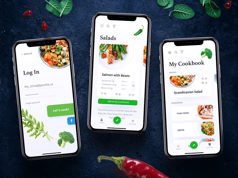
Mobile screens for a cookbook app
Tip #9: The Friend Test
The best UX writing feels like a helpful, slightly more competent version of your friend. Someone you’d text for help setting up a printer. Someone who won’t lecture, won’t patronize, and definitely won’t say things like “The system has encountered an unexpected error.”
Your user might be panicking (error message), celebrating (account created), or confused (empty state with 3 dropdowns and no guidance). In each of those moments, your product should sound like it knows what’s happening, and is meeting them there.
Sounding human is harder than it looks. It requires humility. It means recognizing that your user doesn’t owe you attention, time, or patience. You have to earn it—with language that respects them.
Tip #10: “Enable” Is Not a Human Word
Here’s a word that’s been haunting UI text since the early 2000s: enable. Enable notifications. Enable Bluetooth. Enable tracking. Enable death-by-jargon.
Nobody says “enable” in real life. When was the last time you enabled your toaster? Or enabled a friend to call you? “Turn on” is simpler. So is “Allow,” “Let,” or “Start.” Yes, “enable” sounds fancy. But fancy is not the goal, clarity is.
Overly technical terms often exclude the very people we’re trying to help. This is especially true in interfaces aimed at general audiences, low-tech users, or users navigating in a second language. Clarity, here, is accessibility.
The same goes for a whole family of problematic words: “utilize,” “configure,” “provision,” “authenticate.” These are words that sound like they came from a system requirements document, not from a person who genuinely wants to help.
Here’s the example from Alfresco Writing Guide.
So before you drop a five-syllable verb into your UI, ask yourself: would your mom know what that means? Would a tired commuter at 8:30am know what that means?
No? Then try something else.
Tip #11: Capitalization: The Invisible Cue
Capitalization seems like a small detail—until it’s not. Sentence case, title case, ALL CAPS: they each carry subtle emotional weight, and they all serve a purpose. The trick is knowing where and why to use them.
- Sentence case is calm, modern, and informal. It’s “Turn on notifications.” It feels like a conversation.
- Title Case feels more structured and formal—useful for buttons, menu items, and titles.
- ALL CAPS is shouting. Use it for short, urgent things like SUBMIT, DELETE, or OK. But never for whole paragraphs. You’re not making a billboard in 1997.
It’s about consistency, again. Decide on a case system early and apply it religiously. If your buttons use Title Case on one screen and sentence case on the next, you’re sending mixed signals—and in UI, mixed signals = mental load.
Typography, after all, is not neutral. It’s part of your product’s voice. And when the voice cracks, users stop listening.
Tip #12: Don’t Bury the Lede (Especially in a 2-Inch Popup)
Most UI messages are too long—and start in the wrong place. That error message that begins with “We’re sorry, but unfortunately…”? Cut it. Users don’t need an apology. They need a fix. Or at least a clue.
This is where journalistic structure works beautifully. Start with the must-know, follow with the nice-to-know. Save the softening language for the end, or skip it entirely if it’s just there to sound polite.
This is especially true in limited spaces like modals, alerts, tooltips, or mobile screens. When you only have two lines to earn trust, you can’t afford warm-ups.
Instead of:
We’re sorry, but your session has expired due to inactivity. Please log in again to continue.
Try:
Session expired. Log in to continue.
It’s faster, cleaner, and less annoying. Which means less rage-quit. Which means better UX.
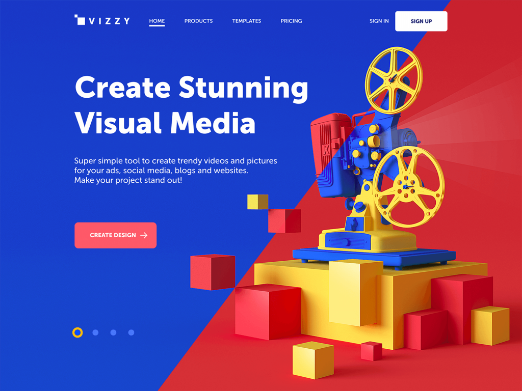
Home page design for visual media creator based on the 3D hero image and core functionality in the copy block above the fold.
UX Writing Is Design. Treat It That Way.
If there’s one thing to take away from all this, it’s that UX writing isn’t the frosting on your design, it’s part of the dough. It shapes the structure and defines the rhythm. And when done right, it makes the whole thing work.
The best interfaces feel natural not because they’re beautiful (though they often are), but because the words know their role. They don’t interrupt, don’t perform. They just quietly help.
So the next time you’re reviewing a UI screen, ask:
- Is this text clear at a glance?
- Does it sound like something a helpful human would say?
- Is it doing more than filling a gap?
Because if your interface is a conversation, UX writing is what makes it worth having.
Recommended Reading
Want to sharpen your UI instincts even further? Here’s a shortlist of reads we keep coming back to—witty, practical, and painfully relevant:
Copywriting for Mobile and Web Interfaces: Types of UI Copy
3C of Interface Design: Color, Contrast, Content
Inverted Pyramid: Writing for Comprehension
Interface Copy Impacts Decision Making
Tips on Applying Copy Content in User Interfaces