There are buildings you walk into and immediately know where to go. No signage study required, no confusion, no doubling back. You just navigate. That feeling—effortless orientation in an unfamiliar space—is what great architecture does.
Digital products can create exactly the same feeling. Or the opposite one: that low-grade anxiety of clicking through menus that don’t quite make sense, searching for something that should obviously be here but isn’t, sensing that the product wasn’t really designed for you. The difference between those two experiences isn’t always visual. Often it isn’t visual at all. It lives one layer deeper, in the information architecture that either holds everything together or lets it fall apart.
So what is it, how does it work, and why do designers lose sleep over it? Let’s find out.
What Information Architecture Actually Is
Information architecture (IA) is the practice of organizing, structuring, and labeling content in digital products—websites, apps, platforms—so people can find what they need and understand where they are. The term was coined by Richard Saul Wurman, an American architect and graphic designer who noticed, back in the 1970s, that the explosion of available information was outpacing humanity’s ability to navigate it. He was right then. He’s more right now.
Today, the Information Architecture Institute defines IA as the practice of deciding how to arrange the parts of something to be understandable. Simple sentence. Enormous scope.
Here’s what that means in practice: before a single pixel is placed, before a color palette is chosen, before any interaction is designed, someone needs to decide what content exists, how it relates to other content, where it lives, what it’s called, and how a user moves through it. That’s information architecture. It’s the skeleton. Everything else is built on top of it.
And like most skeletal systems, you only really notice it when something’s broken.

Why IA Is the Most Underestimated Investment in Digital Design
Companies routinely pour budget into visual design, motion, copy, and paid acquisition—then ship a product with navigation that confuses, labels that mislead, and a search function that returns nonsense. Users arrive, get lost, and leave. The traffic was wasted. The design investment was wasted. All because the underlying structure was never properly built.
The thing is, even genuinely good content, beautiful visual design, and compelling copywriting will fail if the IA is weak. A disorganized product is anxiety-inducing. Users who can’t find what they’re looking for don’t usually ask for help. They leave. And increasingly, they don’t come back.
Well-constructed IA, on the other hand, is one of the highest-leverage investments a digital product can make. It prevents entire categories of expensive problems before they exist. No redesign of the navigation six months post-launch. No user research revealing that “nobody can find the pricing page.” No engineering sprints to restructure content that was wrongly categorized from day one.
It takes more thinking upfront and saves enormous effort downstream.
The Four Components of Information Architecture
There are four systems that together form a complete IA. Understanding each one separately is useful. Understanding how they work together is where the real skill lives.
Organization systems define how content is grouped and categorized. There are three primary structures: hierarchical (content arranged by importance or parent-child relationships—the most common on the web), sequential (a guided path through content, step by step, like a checkout flow or onboarding process), and matrix (user-directed navigation where people can sort and explore by their own logic—date, topic, relevance). Most complex products use combinations of all three, sometimes within a single page.

Labeling systems are about representation—specifically, how to express large amounts of information using as few words as possible without losing meaning. A button that says “Contact” in a navigation bar is a label. It replaces a phone number, an email address, a physical location, and three social media handles. Done well, labels trigger instant recognition. Done poorly—using jargon, vague terms, or internally-logical-but-externally-baffling language—they create friction at every touchpoint. The discipline of labeling is part linguistics, part psychology, and entirely underappreciated.
Navigation systems define how users move through content. Global navigation, local navigation, contextual links, breadcrumbs, pagination, filters—these are the roads and signage of your digital space. Navigation design deserves its own deep treatment (and will get one), but the core principle is this: users should always know where they are, where they’ve been, and where they can go next. The moment they lose that orientation, you’ve lost them.
MoneyWise App
Searching systems become critical once a product contains enough content that browsing alone won’t cut it. A well-designed search experience—with smart indexing, useful filters, and results that surface the right content—can be the difference between a product that scales and one that collapses under its own information weight. The design of search results pages is itself an entire discipline, one that most products treat as an afterthought until the complaints start.
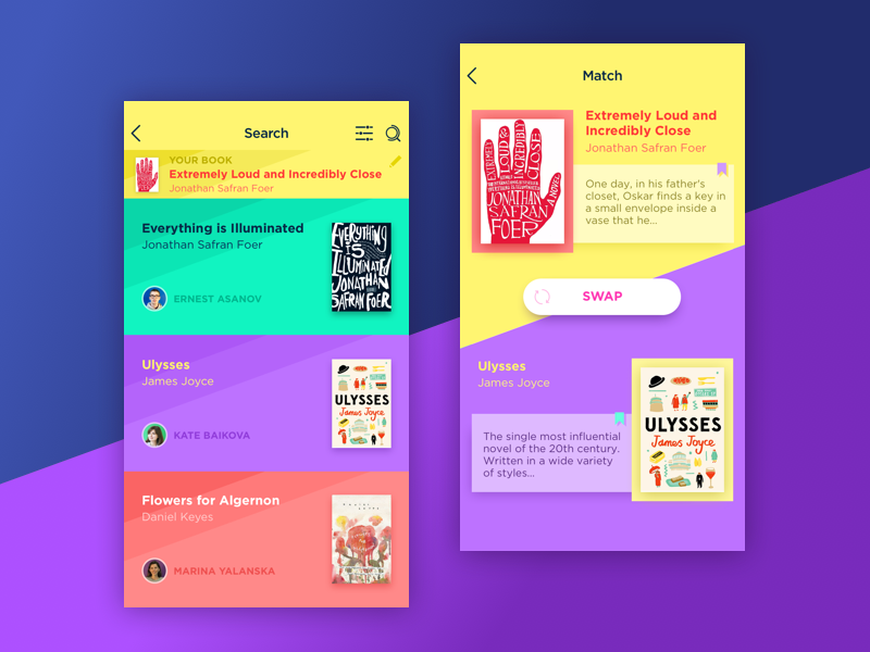
Book Swap App
IA and UX: Related, Not Interchangeable
This confusion is common and worth resolving clearly. Information architecture is not the same thing as UX design. It’s a foundational input to UX design.
IA produces the structural outputs: sitemaps that map content relationships, wireframes that establish layout logic, user flows that define the paths through a product. These are blueprints—non-visual, functional, structural. A UX designer takes those blueprints and works out the experience built on top of them: the interaction model, the emotional arc of a user’s journey, the micro-decisions that make using a product feel natural or frustrating.
Think of it this way: IA ensures users can get from A to B. UX design ensures the journey feels worth taking. Neither is sufficient alone—great UX built on weak IA is a beautiful building with broken hallways, strong IA with poor UX is a perfectly logical space nobody wants to spend time in.
The best designers hold both skills simultaneously—structural thinking and experiential empathy—which is exactly why learning IA fundamentals isn’t optional for anyone serious about interface design.
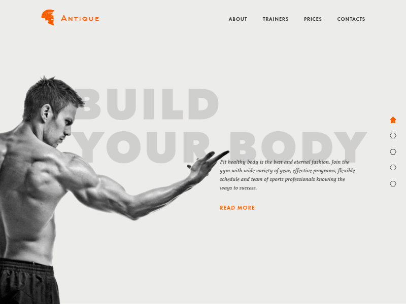
Gym Landing Page
What Good IA Looks and Feels Like in the Real World
Great IA reveals itself in negative space—in everything the user doesn’t experience. They don’t encounter dead ends, don’t second-guess link labels, don’t open a menu and feel overwhelmed by its logic. They just move through the product and accomplish what they came to do.
The practical markers of strong IA include: a navigation system that requires no learning curve; labels that match the mental models of users (not the internal vocabulary of the company); search results that feel almost predictive; and a content hierarchy where the most important information is always the most findable.
One particularly telling test—shared by IA practitioners and UX researchers alike—is the “trunk test.” Drop a user onto any random page of your product with no context. Can they tell what site they’re on? What section of the site? What they can do from here? What’s nearby? If yes on all counts: your IA is working. If any answer is no: you have a structure problem, not a visual problem.
The Connection Between IA and SEO That Most Teams Miss
Here’s a less-discussed dimension of information architecture that has direct business impact: its relationship with search engine optimization.
Search engines are, fundamentally, also trying to understand the structure of your content. A well-architected site—with logical content hierarchies, clear internal linking, descriptive and consistent labeling, and clean URL structures—gives search crawlers exactly what they need to index content accurately and rank it appropriately. Conversely, poor IA often manifests as SEO problems: orphaned pages that can’t be discovered, duplicate content created by unclear categorization, deep content hierarchies that crawlers give up on before they reach valuable pages.
When IA decisions are made early with both user navigation and search visibility in mind, the same structural work earns double returns. The users find what they need. The search engines understand what exists. The product performs better by every metric.
Building IA the Right Way
Good information architecture begins with research. Card sorting—where users group content items into categories that make sense to them—is one of the most reliable methods for discovering how your audience actually thinks about your content. Tree testing validates whether a proposed structure actually lets users find what they’re looking for. Both methods are cheap relative to the cost of restructuring a shipped product.
The work then moves to sitemaps (the macro view: what exists and how it relates), then wireframes (the page-level view: how content and navigation elements are arranged), then user flows (the journey view: how someone moves through the product to complete a specific goal). Each stage adds specificity without yet touching aesthetics—which is exactly the point. Visual design decisions made before the structure is solid are beautiful work built on unstable ground.
Bottom Line
Information architecture will never win awards. Nobody screenshots a sitemap and posts it to Dribbble. Users never compliment an app’s organizational taxonomy. No client has ever said “loved what you did with the labeling system.”
But here’s what does happen when the IA is right: people find what they came for. They don’t hesitate at intersections. They don’t backtrack in frustration. The product feels intuitive—and they attribute that feeling to the brand, not the blueprint underneath it. That’s the quiet power of structural thinking. It makes everything built on top of it look better than it would otherwise be.
So learn it seriously. Apply it early. Treat it like the foundation it is—because unlike visual design, you can’t renovate a foundation after the house is built.
Users notice—viscerally, immediately—when the structure is wrong. And when it’s right, they do something better than complimenting it: they come back.
Recommended Reading
Liked this article? Great taste! If this one got you thinking, the articles below are worth your time too:
Web Design: 5 Basic Types of Images for Web Content
How to Make Web Interface Scannable
Hit the Spot: Design Strategies for Profitable Landing Pages
From Zero to Hero: Look at Hero Images in Web Design
Visual Dividers in User Interfaces: Types and Design Tips
Directional Cues in User Interfaces