The well-known quote by Chinese philosopher Lao Tzu says: “A journey of a thousand miles begins with a single step”. When applied to numerous digital products, this simple yet powerful truth works the same way: the story of dealing with the app or a website starts from the first impression through the decision on trying to the actual interaction. All this process usually takes a little time, but it’s often crucial to set the bonds between the user and the product. So, today let’s look a bit closer at the onboarding process, starting from the popular technique of introducing the app to the user, the onboarding tutorial.

Social Network Tutorial
What is onboarding?
First of all, let’s look through the basic terminology. The concept of onboarding basically comes from the sphere of employment and HR: it is used to mark the number of steps and techniques aimed at helping newcomers to adapt to the new conditions and get comfortable to bring out good results. It’s not a secret that for many people trying something new is a sort of stress which demands some effort and consideration, so a little help could make the decision-making process easier and more harmonic. Special tactics enable to correct possible inconveniences and make people more confident in the new place, which means they become productive and socialized with their colleagues faster, bringing benefits to the company.
The advent of digital products as an integral part of everyday life absorbed this idea together with the term immediately. In this sphere, onboarding is the number of techniques and interactions whose objective is to comfort the user and give the first concise introduction to the product.
One of the important issues which should be made by a designer working on user onboarding is thinking over the clear priorities. Users have limited time they are ready to devote to learning how the product works before starting actual interaction with it. Moreover, people have limited capacities for working memory and setting priorities; creators of the product decide which dose of information is needed for this or that stage instead of trying to give a large amount of data at once, making the user confused or embarrassed. In one of the recent articles in Adobe Creative Cloud Blog, UX researcher and cognitive psychologist Rob Youmans, who is YouTube’s Head of UX Research Sciences, says, “When it comes to design, the place that I see primacy and recency, in particular, is in terms of onboarding. When you start to learn about a new product, there’s often a tutorial, wizard, instructions, or something. It’s wise for designers to consider primacy and recency in this context because you’re going to want to put the most important information first or last if you’re hoping that someone is going to remember them later as they use your product or system.”
What is an onboarding tutorial?
Onboarding tutorial is the set of screens that are shown to the user in case of the first interaction with the product. In the vast majority of cases, designers apply 3-4 screens telling the initial information about the product to the new user. App tutorial is a sign of respect to the user: it gives a quick insight into what problems the app solves, how it can help the user, and what benefits it gives. Surely, it is a good technique for boosting usability from the first minutes of interaction if it’s informative and clear.
Shauts App Tutorial
Why do you need the tutorial for your app?
Three basic functions of an app tutorial for easy onboarding could be described as follows.
Greeting
App tutorials set the first contact between the user and the app. It is an act of introduction, in most cases imitating real communication starting with a greeting like “Hi!”. It is especially actual when the app has a mascot or character which becomes a direct subject of communication with a user. Still, it’s important to be extremely careful and make the greeting as short and quick as possible not to distract users too much from the essential information.
Information
This is perhaps the most precious part of the tutorial mission for the user. First of all, the tutorial is a tactic of user onboarding, so it should inform users about the benefits they get using this product or the basic operations they are going to do. User research and clearly set USP of the product will help the designer and copywriter to find ways of providing the vital points quickly to the users.
Engagement
Another benefit of the tutorial is making a foundation laid for building the solid desirability of the product. Tutorials can quickly show the user the most beneficial sides of the products engaging them to try and tolerate possibly hard first steps into the unknown. Moreover, designed nicely, the tutorial provides the first insight into the style and appearance of the product, which is (should be) based on the target audience research and becomes another hook boosting interest to see more. In most cases, users are visually driven and even more – aesthetically driven creatures: we tend to get interested in what appeals to our ideas of beauty and harmony or sets particular emotions via visual performance. And tutorial becomes a favorable way to set this approach from the first seconds.
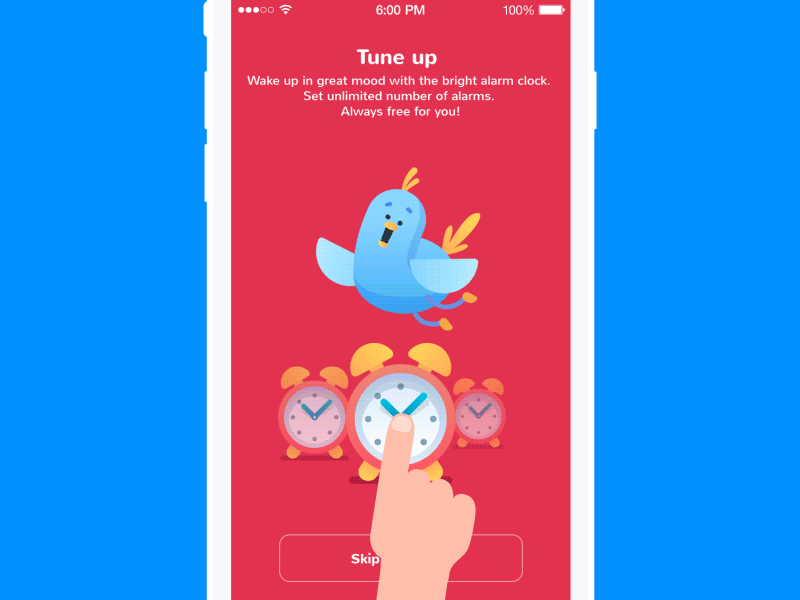
Toonie Alarm tutorial
What are the points to consider for tutorial design?
The structure and content of the app tutorial are surely highly individual for every particular project. As we mentioned in the articles devoted to UX research and creative stages of app design, there are numerous factors influencing the design solutions depending on three major perspectives: user needs/ wishes/ expectations, product nature, and business goals. Being the initial site of the introduction of the product to the user, the tutorial is also the point of analysis and creative approach to presenting the essential information in a way that is dynamic, edible, and attractive to the target user.
Custom images or illustrations
Most people perceive and decode images faster than words. It makes the usage of illustrations logical and rational for app tutorials which have to give the information quickly. In the article devoted to the benefits of illustrations in UI, we mentioned that in the case of tutorials, illustrations, be they photos or originally drawn images, fully reveal their potential in explanation and clarification. The options can be totally diverse, from simple icon-like to artistic and sophisticated artworks. Illustrations of this kind become a good way to boost usability, minimizing the necessity of using the copy on the screens. They are particularly efficient in apps for kids and youngsters as they usually feel this sort of explanation is more user-friendly.
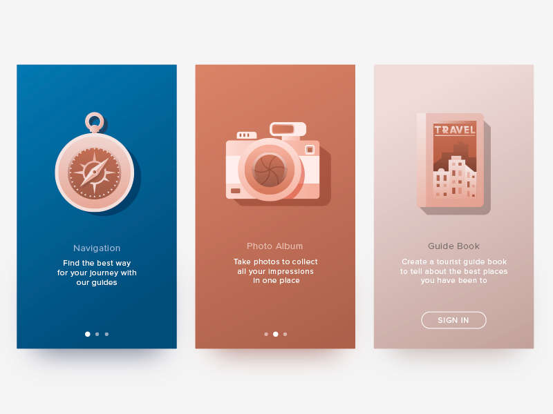
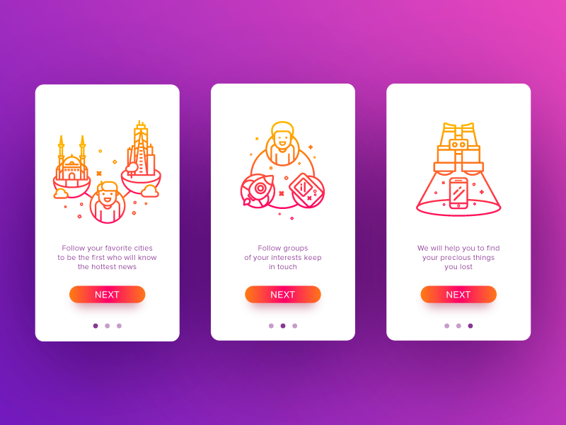
Travel App Tutorial
Design trends of the recent year have demonstrated the increasing popularity of custom illustrations created for specific interfaces. App tutorials became the favorable ground featuring a variety of styles and approaches. In many cases, illustration becomes the center of the composition, and its aim is to present a specific feature or benefit in an attractive and easily decodable way. Another popular approach is applying a mascot, which is a character imitating the flow of real communication with the user and setting emotional bonds.
Copywriting and typography
In the case of tutorials, words are power. However, there are two simple rules to support this power: tell them short and make them helpful. No secret, that writing a short informative sentence is much harder than writing a long one: you have to find an effective way not to waste those precious seconds which the user is ready to devote to reviewing tutorial screens. If it’s possible, involve a professional copywriter who will find a way to create copy for the interface that makes every single letter count. Do your homework, and take time and effort to create a concise, attractive, and clear copy that applies the language appealing correctly to the target audience and corresponds to the objectives set for the product. As well as designed solutions, the copy should be tested as much as possible to find the shortest ways of informing users.
One more aspect that designers should bear in mind is that copy is one more visual element of design. As well as the icons, fields, buttons, illustrations, toggles, and the like, it literally occupies the part of the screen or webpage as any other graphic component and influences the general stylistic presentation of the app or website. Furthermore, the success of the efficient copy directly depends on such design solutions as the choice of types and fonts, background, and placement of the copy. All the mentioned aspects greatly affect the level of readability, so when they are done inappropriately, the copy will lose the chance to get all its potential applied, even being highly meaningful.
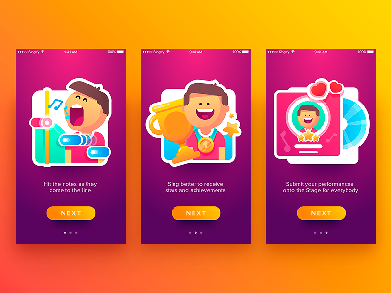
Singify App Tutorial
Animation
One more method to make tutorials not only informative but also attractive and engaging is applying animation. Motion makes interaction more dynamic; it is able to breathe life into the interface, amaze and catch the user’s attention. One more good point is that animation can make the important details more noticeable. On the other hand, motion can increase the time and traffic needed to get it loaded, so it should be wisely applied and discussed with developers in the aspect of its technical realization.
WaykeApp Tutorial
Clear page/screen indicator
Usually, tutorials consist of several screens, each devoted to one point or benefit to present. It’s vital to remember that from the very start of the interaction, users should know where they are and how long is the path. Page/screen indicator is a good and simple way to inform users about the flow of the process, and it shouldn’t be neglected.
Ability to skip
Another thing to consider is the choice of skipping the tutorial. Not all users need it, even using the product for the first time, so for some products, it could be reasonable to give them the ability to skip the tutorial. The decision on this function has to be made on the basis of testing and analysis of the target audience.
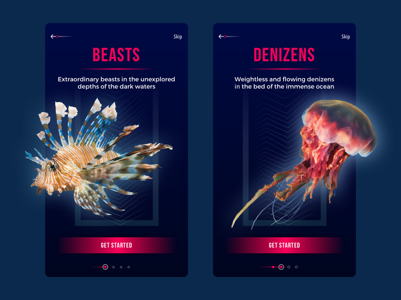
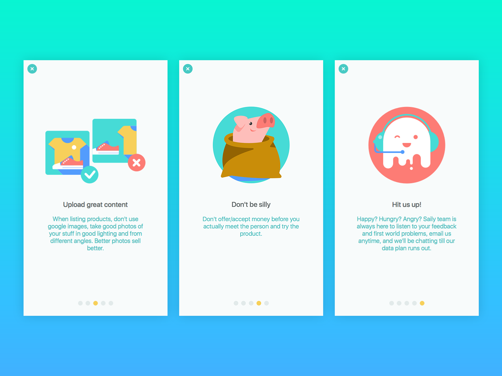
Underwater World Encyclopedia – section tutorial
In the bottom line, it’s vital to remember: in the interface, all the details count. A well-known proverb checked by many generations says: a good dress is a card of invitation, and a good mind is a letter of recommendation. Surely, if the presented product is nothing good or helpful for the user, whatever good the tutorial will be designed, it won’t save the situation. However, if the product is user-friendly and problem-solving, the app tutorial gives another chance to make the introduction smooth and pleasant. Good dress helps to impress – and a thought-out app tutorial can easily prove it.
Useful Articles
Here’s a bunch of articles to dive deeper into the theme of usability and user experience design.
How To Design User Onboarding: Tips and Practices
User Experience Design: 7 Vital User Abilities
Basic Types of Buttons in User Interfaces
Motion in UX Design: 6 Effective Types of Web Animation
How to Design Effective Search
UX Design: Types of Interactive Content Amplifying Engagement
Negative Space in Design: Tips and Best Practices
Types of Contrast in User Interface Design
How to Make Web Interface Scannable