
It would be impossible to define light if there was no darkness. It would be hard to feel the refreshing enjoyment of cold water if there was no heat. It would be difficult to enjoy the sounds if there was no silence between them. It would be challenging to read the words if there were no empty spaces between them. We couldn’t feel ourselves adults if there were no children around. Everything in the world exists and is perceived in contrast with something else, so no wonder it is one of the foundations of art and design. And that is the topic to discuss in our today’s article.
What Is Contrast
In general terms, the word ‘contrast’ is used to describe objects that differ from each other strikingly. Talking about visual perception, contrast is basically associated with the difference in color or light that allows an object to be clearly distinguishable.
Why is contrast important? Because the human eye naturally tends to catch the contrast. The highest possible contrast of an image is called contrast ratio or dynamic range. What’s more, for people with poor sight visual disabilities such as color blindness, the contrast becomes the core characteristic of objects they see and allows them to distinguish them.
In academic art, contrast deals with the arrangement of opposite elements and effects such as light and dark colors, large and small shapes, rough or smooth textures. Contrast, in this case, can be used to not only attract attention but also set the mood and atmosphere, create variety, visual interest, and drama in an artwork.
In design, contrast is one of the key factors influencing the scannability and visual hierarchy of a web page or a mobile screen. It enables the designer to present the layout in a way that informs users which points of interaction are vital and which are secondary. Contrast is effective in catching the user’s attention and drawing it to particular elements, so it plays a big part in supporting the intuitive navigation and usability of the digital product.
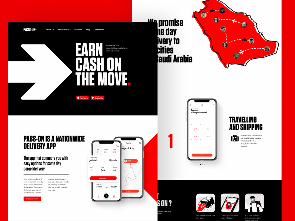
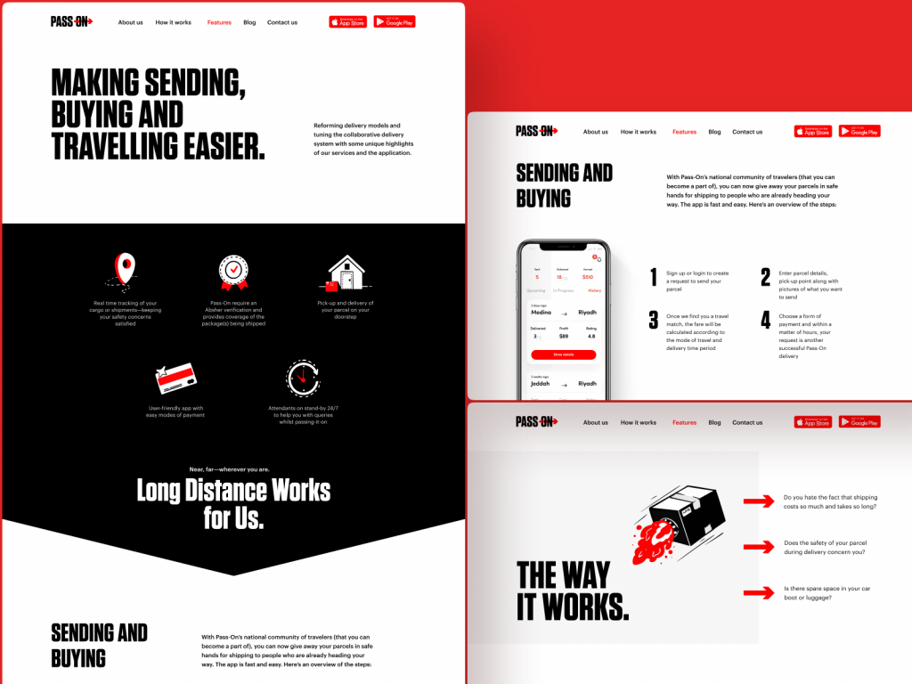
The design of the landing page for the Pass-On application shows the example of effective color and size contrast building up the solid visual hierarchy for the pages.
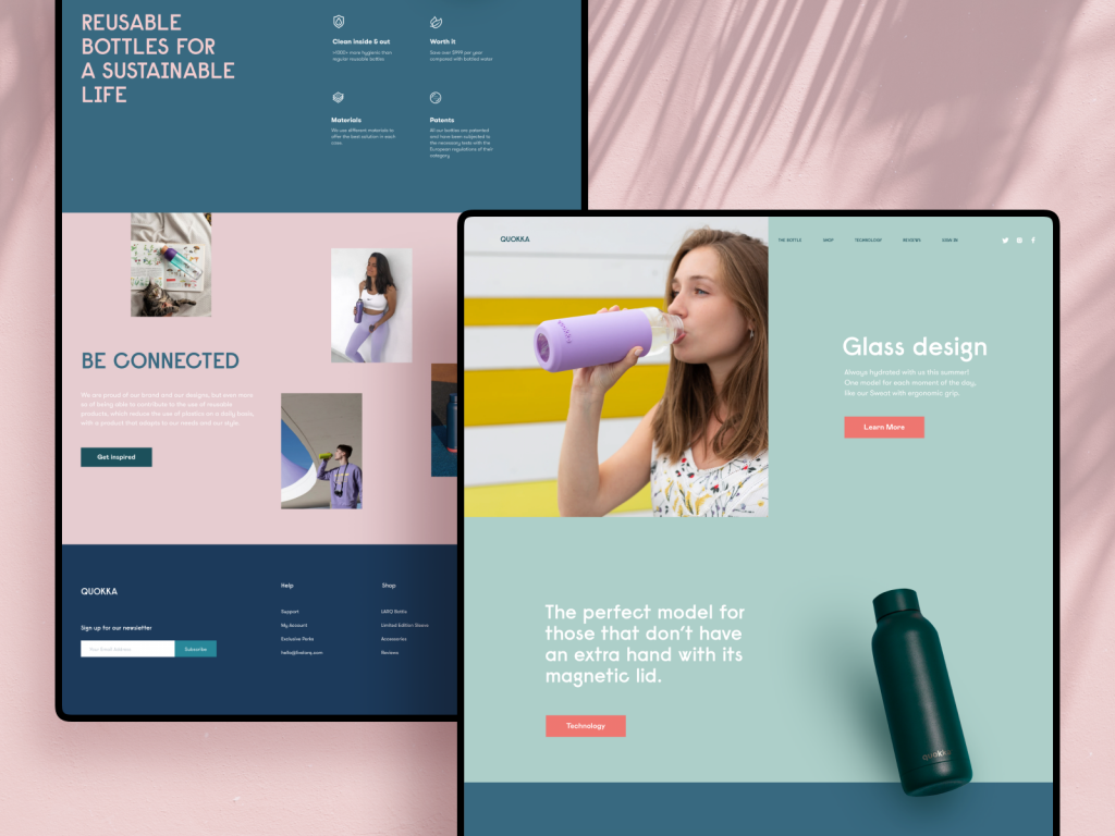
Eco-bottles brand website uses background colors contrast to separate different logical sections of the web page.
Types of Contrast in UI Design
Contrast can be based on different features of UI elements, including:
- color: this type is one of the most natural and noticeable for the human eye; it works when colors are sharply different, for example, combined by complementary, split-complementary, or triadic schemes (check more about them in our color theory review). This type of contrast is most widely used to make CTA buttons and other critical navigation elements instantly seen in the layout of the web page or an app screen, which supports clear and intuitive navigation.
- size: this type of contrast is based on making an element that should catch attention first noticeably bigger than the others
- shape: here, users’ eyes are caught by making the shape of one element different from the others
- position: in this type, designers change the position of one element in the row this way, making it look different, like, for instance, the new paragraph of the text piece is started with the indention.
- texture: here, the difference is built due to using textures that are clearly distinguished from each other
- direction (orientation): here, you change the physical positioning of the element, making it use other or unexpected directions, this way catching users’ attention with uncommonness.
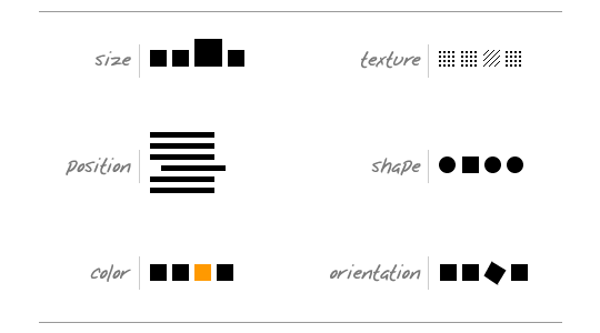
In his article Contrast and Meaning, Andy Rutledge put the types of contrast designers often employ in a simple yet informative scheme, shown below, visualizing each type.
The first idea that often comes to mind about contrast is something black and white. In the absence of shades and multiple colors, a monochrome image uses contrast as the main booster of expressive potential. And that works the same way in user interfaces. Even more, compared to the pieces of art or photography, contrast not only influences aestheticism but also has a significant impact on the usability and navigability of the layout. Therefore, well-thought-out contrast usage is a powerful method of making websites and apps user-friendly and easy to use.
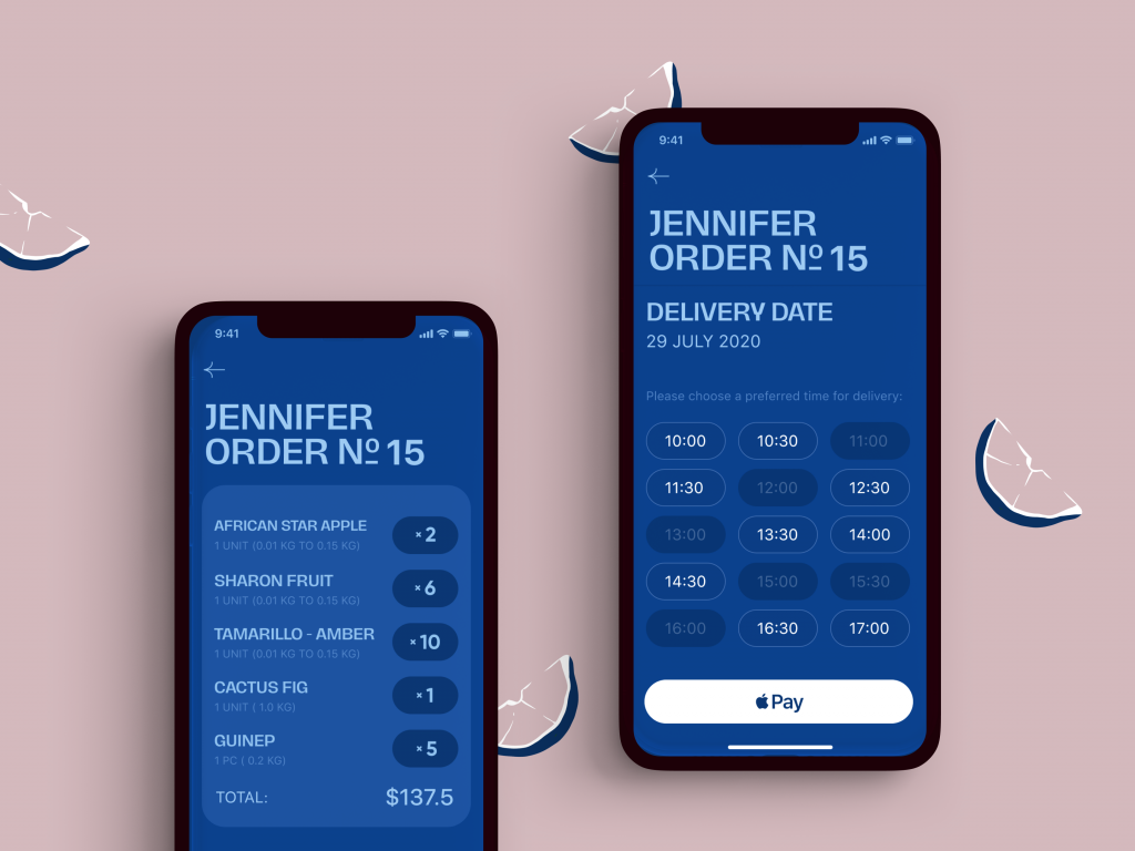
On the checkout screens of the Exotic Fruit app, color contrast helps to instantly define the call-to-action button as well as helps to distinguish active time slots from inactive ones.
The shipping company website with a limited color palette and trendy 3D graphics uses bright color accents making the design more dynamic and catching users’ attention
Surely, it doesn’t mean that only black-and-white UI is the most effective. It wouldn’t be wise to get limited so much when users globally present such a diversity of wishes and needs. However, “black-and-white” testing is highly helpful. Designers should keep in mind that colorful interfaces can look different on different screens and resolutions. Moreover, low contrast can make the interface hard to use for people with color blindness.
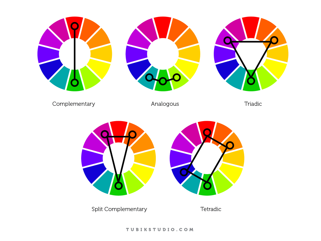
The color wheel helps designers to find the color combinations with the optimal level of contrast
Typographic Contrast
Another specific type of contrast is typographic contrast based on the difference in distinguishing features of the fonts used for the textual part of the design piece.
Canadian typography designer Carl Dair defined 7 core types of typographic contrast:
- Contrast of Size: it is about the physical enlargement of the basic pattern created by the form and the weight of the type used for the text. The most common case here is making the title or heading noticeably bigger than the text.
- Contrast of Weight: bold type stands out in the middle of the lighter type of the same style. It helps attract attention to specific parts of the text and lets the user know about their importance.
- Contrast of Form: form here means the distinction between a capital letter and its lowercase equivalent, or a roman letter and its italic variant, condensed and expanded versions, script types which harmonize with standard types – all of the mentioned can be used for a dramatic change of form. However, Carl Dair warns against using scripts and italics together as they are both versions of handwritten letters; they’re more likely to conflict than contrast.
- Contrast of Structure: structure means the different letterforms of different kinds of typefaces, such as a monoline sans serif versus a high-contrast modern, or an italic versus a blackletter.
- Contrast of Texture: this is about how the lines of type look together as a unity, which depends partly on the letterforms themselves and partly on how they’re arranged.
- Contrast of Color: here, Dair mentions that a second color is usually less emphatic than basic black on white (or white on black), so it’s essential to give careful thought to which element needs to be emphasized and to pay attention to the tonal values of the colors used.
- Contrast of Direction: this type is about the opposition between vertical and horizontal and the angles in between. As well, Dair points out that text blocks also have their vertical or horizontal aspects, and mixing wide blocks of long lines with tall columns of short lines can produce a contrast.
In addition, there are some other, less popular types of contrast, for example, the so-called contrast by isolation, when one word or phrase is placed away from the other elements, this way standing out from the crowd, as well as contrast by rhythm (intervals of space) – the parts, where it’s broken, set contrast and attracts attention.
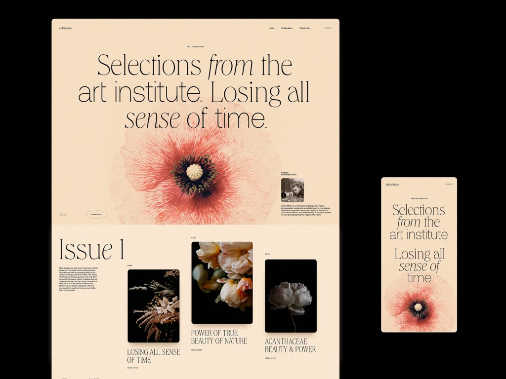
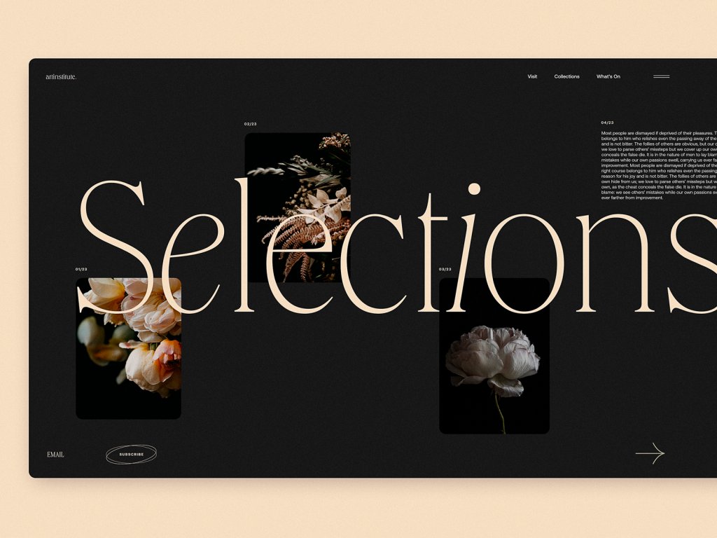
Art Institute blog concept demonstrates diverse types of typographic contrast as an impressive feature of the design approach.
Contrast Accessibility
Reading everything mentioned above, it’s easy to suppose that the rule of thumb here is the higher contrast, the better design. However, that’s not true: as well as any other design aspect too much doesn’t mean better. While low contrast makes the content hard to perceive and read, too high contrast provokes eye strain, making interaction much harder. So, again it’s time to find the golden medium.
According to the Web Content Accessibility Guidelines 2.0, the visual presentation of text and images of text should stick to a contrast ratio of at least 7:1, except for the following cases:
Large Text: Large-scale text and images of large-scale text have a contrast ratio of at least 4.5:1;
Incidental: Text or images of text that are part of an inactive user interface component, that are pure decoration, not visible to anyone, or are part of a picture that contains significant other visual content, have no contrast requirement.
Logotypes: Text that is part of a logo or brand name has no minimum contrast requirement.
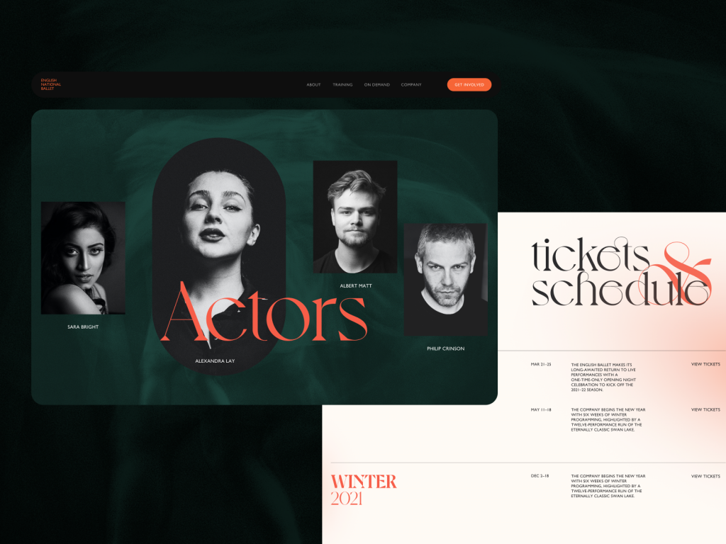
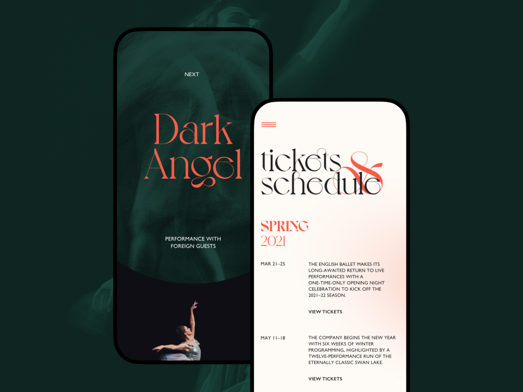
The ballet company website concept uses color contrast to distinguish text-based parts of the pages from image-based ones as well as make bright accents works, for example, to make the CTA button in the website header noticed at once. Also, the typographic contrast based on the difference in size and fonts makes the various text elements clearly distinguished and easily skimmed.
ShipDaddy website uses a contrasting color palette for good and accessible navigation and scannability. What’s more, it uses another level of visual contrast, combining real-life background with an animated cartoonish brand mascot, this way contributing much to making the website look original and atmospheric.
Dark-on-Light or Light-on-Dark?
One of the first questions designers usually have to answer in terms of color and contrast is what kind of general color scheme to choose: should it be dark-on-light or light-on-dark? Several vital aspects should be taken into account in this perspective.
Clarity: This aspect should include the ability of the user to clearly see and distinguish all the necessary details on the screen or page. The color scheme and combinations should support easy and intuitive navigation and make the most functional elements of the layout stand out effectively. When this aspect is neither considered nor tested properly, it can bring to the products that make a complete mess on the screen in which users do not see what they really should. One of the ways to check it is the widely used “blur effect” when you look at the screen or page in the blurred mode and check if everything vital is easily and quickly observed.
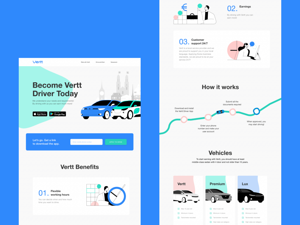
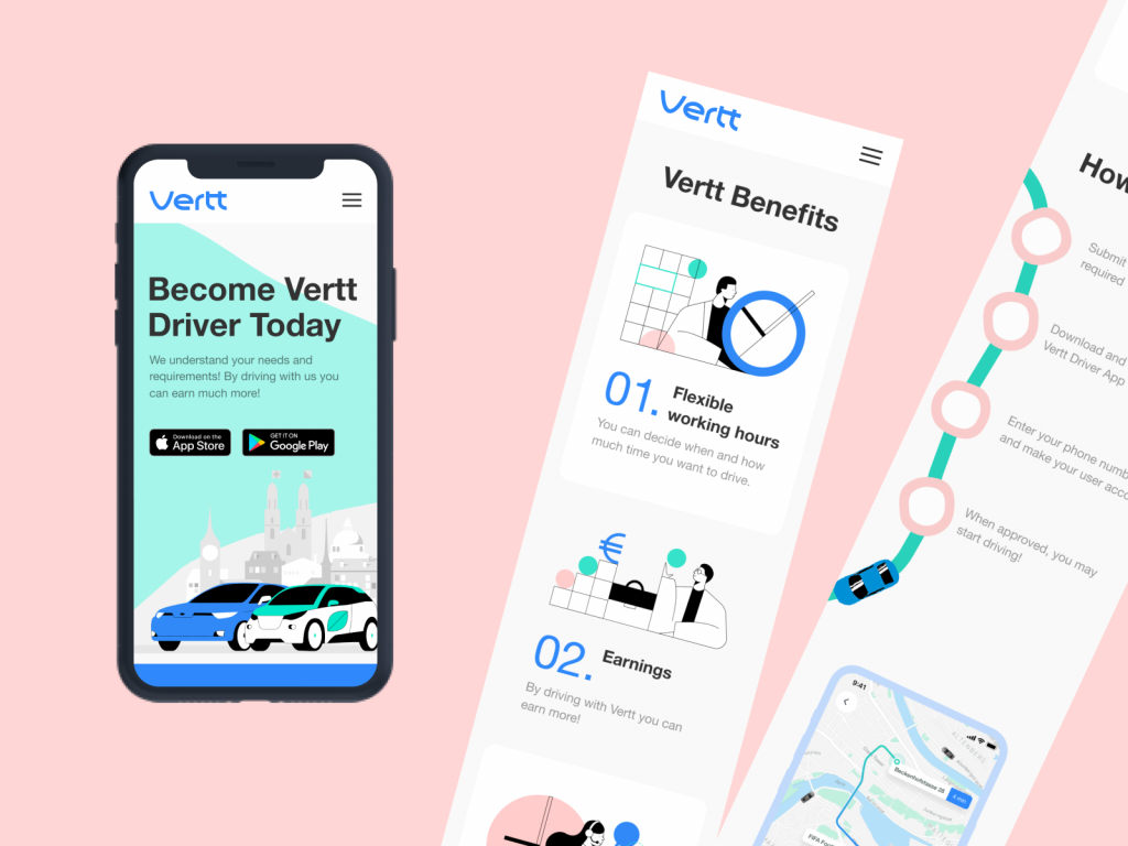
The landing page for Vertt car-sharing service uses light background allowing to activate the power of colors to make different navigation elements and information sections clear and separated from each other.
Readability: the ability of users to read text easily. This aspect is especially vital if an app or a website is text-driven: poor readability level can result in users missing key data or feel inexplicable tense using the product as all the way they have to struggle with the copy, which takes considerable effort to be read. Lack of readability can be a serious reason why users are not retained even with attractive products.
Accessibility: the ability of the product to reach as many people as possible. That means that the decision “to use or not to use” should be mostly based on users’ needs and wishes but not on their physical abilities. Color scheme issue is among the main factors affecting this aspect. A designer should think over the users of different ages, special needs, disabilities which can also determine the choice of color for the background and layout elements.
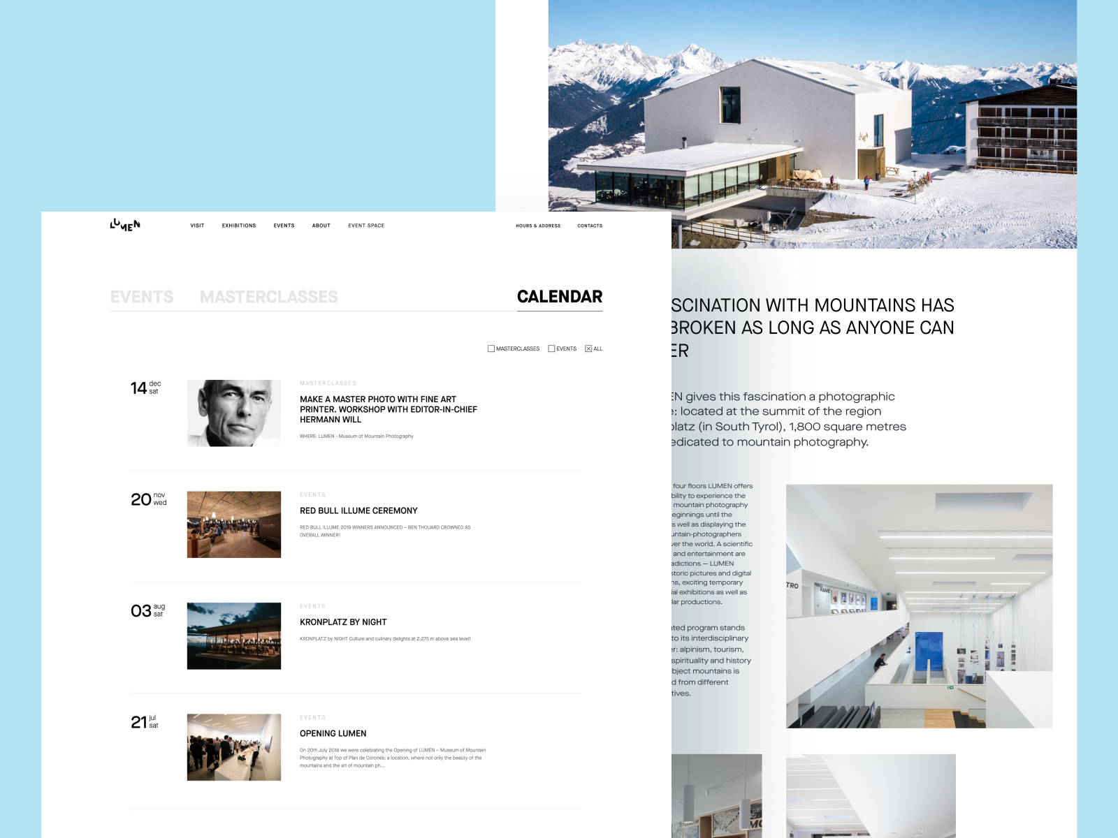
Light and airy Lumen Museum website focused on making each page accessible and easily scanned, information well-arranged, and photo content impressive
Responsiveness: the ability of the product to transform the layout flexibly according to the devices it is used on. That can have a crucial effect on usability. What looks slickly stylish, attractive, and clear on a high-resolution professional display can transform into a dirty stain on the small low-res screen. The color scheme and contrast level certainly influence this issue among the first.
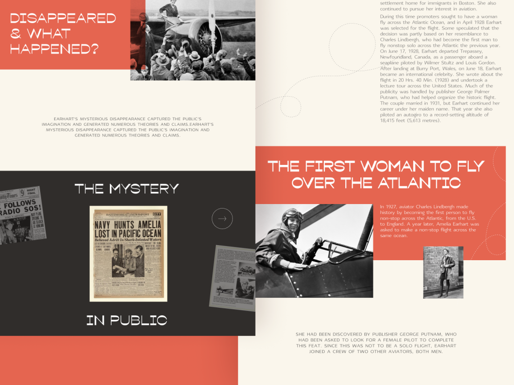
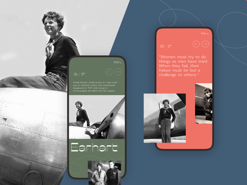
The design for a website devoted to powerful women in history shows careful attitude to different types of contrast to make it attractive and easy to perceive on different devices
Environment: choosing the appropriate color scheme and the type of background for potential environments in which users will use it regularly and frequently. In terms of constant use under natural light, a dark background can literally create the effect of reflection, especially on glossy screens typical for tablets and smartphones. On the contrary, in terms of regular use in a badly-lit environment, a dark background can take the light away from the screen, which negatively influences navigation and readability. So, the issue of color combinations, contrast, and shades draws big attention here.
Different types of contrast making the Habit Builder app interface not only beautiful but also easy to use.
Points to Consider
Here are a couple more things to consider in the aspect of contrast applied to the web page or app screen design.
Take care about high contrast in case of text overlayed on the image
Background images present a steady trend in web and mobile design due to the great ability of pictures to cover multiple functions. The approach makes the screens visually and emotionally appealing as well as informative, as the image instantly captures users’ attention much faster this way. Also, it supports the feeling of the integrity of all the layout elements. However, it requires much skill and effort to find the right contrast and integrate the navigation and text content properly so that the page wouldn’t turn into an illegible mess which often happens when the contrast is too low. Mind the recommended contrast ratio of at least 4.5:1 (or 3:1 for large characters, defined as an 18-point font or 14-point bold font). Try the Contrast Ratio tool to check how different color combinations work.
Geography blog applying full-screen background photos
Too high contrast is tiring and worrying
On the other hand, it’s important to remember that over contrast is also no good and can even be harmful to some aspects of user experience design. What works effectively as an accent to attract attention momentarily to a button or a directional cue may cause real problems on the pages that are aimed at long reading and have to care about keeping readers’ eyes not overstrained. Sometimes, app users or website visitors can’t even clearly define what’s wrong, but too sharp contrast makes them feel tense and tired and discourages them from using the digital product.
Too much contrast means no contrast
In his book Designing for Emotion, Aarron Walter shared a highly precious thought in the aspect of contrast in user interfaces: “As you increase the number of high contrast elements on a page, you proportionally increase the time needed to perform a task, learn a system, and remember pathways. Adding stuff pushes the human brain to its limits. Have you ever been to a party where everyone is yelling to speak to the person next to them? As the volume increases, everyone must speak louder to be heard, but that makes it even harder to have a conversation. Design works in the same way. If everything yells for your viewer’s attention, nothing is heard.” So, if you make the page or screen complex in this aspect and filled with various elements contrasting with each other, the risk is high the flow of interaction will get much harder, becoming more annoying and less usable.
Mind the negative space
Negative space (aka white space) is the layout area that is left empty, not only around the objects but also between and inside them. Negative space is a kind of breathing room for all the objects on the page or screen, so it greatly impacts the effectiveness of different types of contrast applied in UI.
Why Contrast Is Important
Summing up everything mentioned and shown above, let’s define several key benefits of contrast as a powerful feature of good user-friendly design:
- stronger visual hierarchy
- better focus
- originality vibes
- enhanced readability
- correspondence to the natural human perception and reactions
Let’s complete our today’s consideration of contrast and its role in user interfaces with the handy video by Nielsen Norman Group.
Life is full of contrasts, whatever facet of it you’ll take. For all life, we have to learn how to accept that and try to enjoy the life that is so diverse and unpredictable. Echoing the reality, design is also full of contrast and taking as much as possible from it.
Useful Articles
Here’s a bunch of articles to dive deeper into the theme of usability and user experience design.
5 Basic Types of Images for Web Content
How to Make Web Interface Scannable
The Anatomy of a Web Page: Basic Elements
How to Design Effective Search
Web Design: 16 Basic Types of Web Pages
Directional Cues in User Interfaces
Negative Space in Design: Tips and Best Practices
Error Screens and Messages: UX Design Practices


