The screen glows. You scroll. And somewhere between a hero animation and a charity CTA, something shifts—you actually care. That’s environmental web design done right: it turns abstract planetary grief into something tangible, beautiful, and worth clicking through.
Plastic Has Never Looked This Urgent
The StopPlastic website does something most awareness campaigns fail at—it makes you feel the weight of the problem before you’ve read a single statistic. A high-contrast color palette strips the experience down to its bones, while negative space lets the message breathe and land. Motion design carries emotional momentum through each scroll interaction, and the typographic hierarchy is built for skimmers and deep-readers alike. This is persuasive web design working at full capacity: every visual decision—collage-heavy imagery, bold type, restrained color—reinforces the urgency without tipping into panic. Landing page conversion principles usually belong to e-commerce; here they serve the ocean.
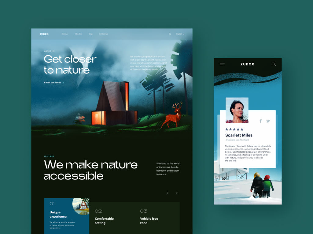
Ecotourism Looks Better With Mud on Its Boots
There’s a certain design challenge in selling stillness. The ecotourism website tackled it by leading with a hero illustration that feels handcrafted rather than stock—lush, specific, and earned. The Discover page layers photography with custom illustrations, giving users a visual language that shifts between aspiration and information without ever losing coherence.
Video integration on destination pages extends dwell time naturally, which matters for SEO signals, but more importantly, it works because the content actually earns the viewer’s attention. Meanwhile, responsive web design keeps the visual harmony intact from desktop to mobile—no awkward reflows, no collapsed magic. The typography choice walks the line between decorative and readable, which on a travel site, is everything.
Zero Waste, Zero Clutter, Zero Apologies
Minimalist web design has become something of a cliché, but when the brand philosophy is minimalism, the aesthetic becomes argument. The zero-waste lifestyle website leans into this with confidence: clean navigation, generous white space, and a product page architecture built around a single dominant image.
The little animated bird—a mascot threading through transitions and loading states—is the kind of UX detail that seems small until you notice its absence on lesser sites. It builds brand recognition across pages without adding visual noise. Blog layouts use split-screen presentation to make long-form content scannable, and the loading animation repurposes illustration assets rather than defaulting to a spinner. User experience design at this level feels less like interface and more like editorial craft.

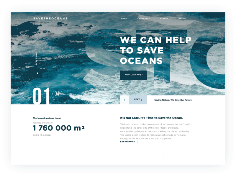
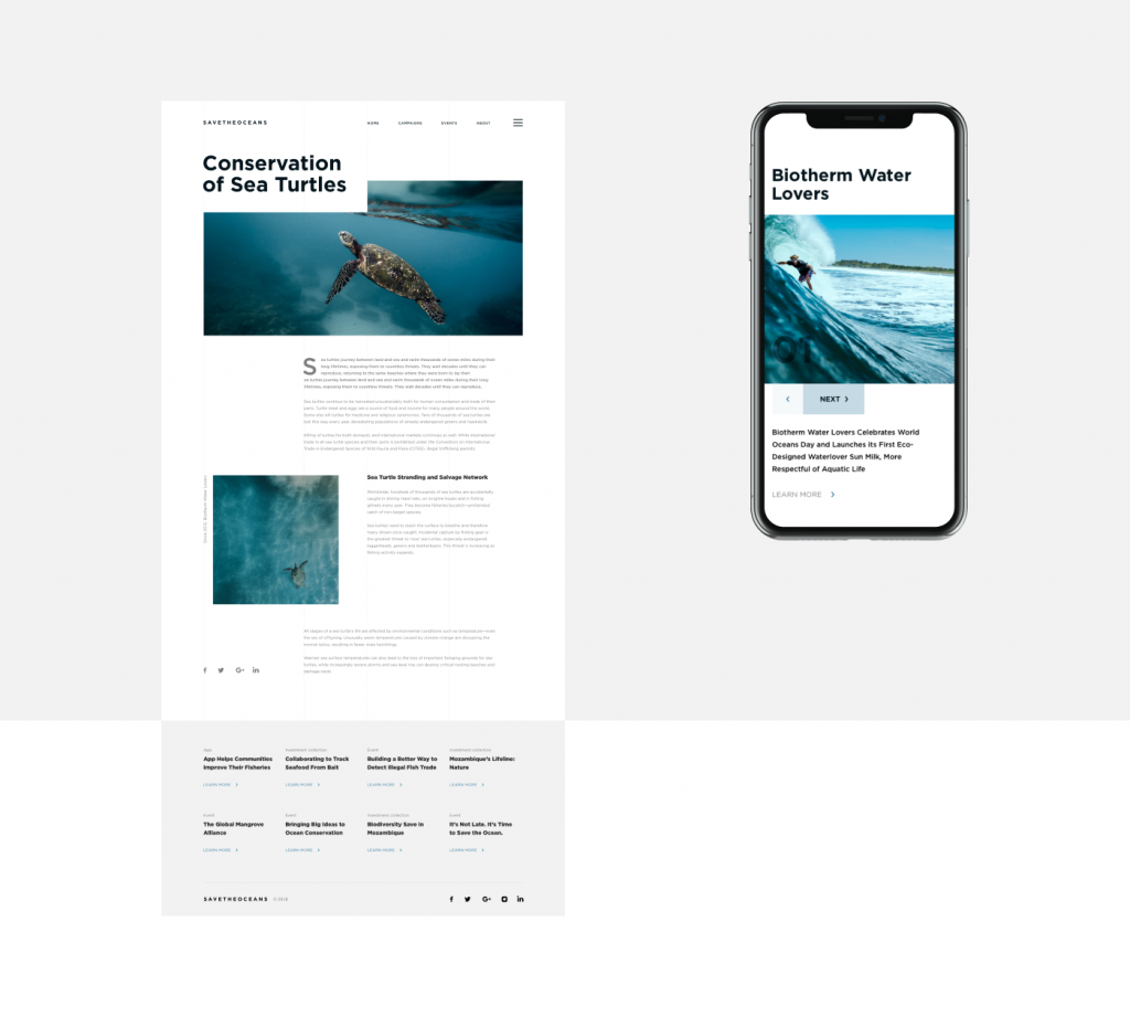
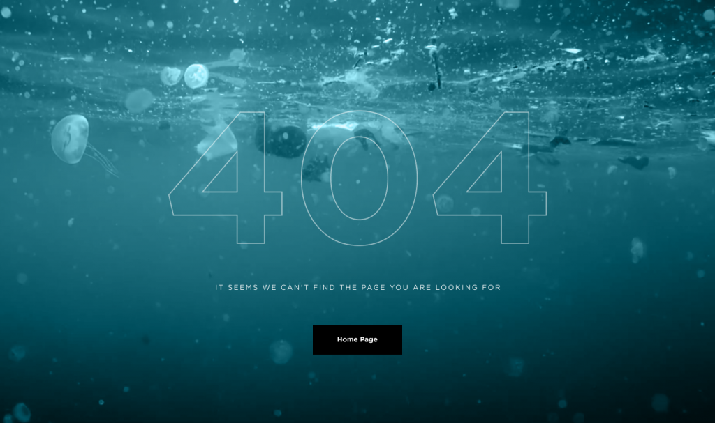
The Ocean Page That Makes a 404 Worth Finding
Save the Oceans could have been a worthy-but-dull charity website. Instead, it commits to atmosphere from the first pixel. The color palette—deep blues with deliberate contrast—doesn’t illustrate the ocean so much as invoke it. Bold typography and an airy layout create the kind of visual breathing room that makes content feel important rather than crowded.
The real standout, though, is the 404 page: rather than a dead end, it becomes a continuation of the site’s emotional argument, turning a technical error into a storytelling moment. This is conversion-focused design thinking applied to purpose-driven content—and it shows that nonprofit web design deserves the same craft investment as any commercial project.
Sustainable Energy Has Finally Found Its Visual Language
Alternative energy websites have long suffered from a stock-photo identity crisis—endless solar panels, suspiciously green grass. This innovative energy service concept breaks the pattern with a digital illustration that sets the tone above the fold before a single word of body copy appears.
The hero communicates scale, technology, and community simultaneously, which is a genuinely hard brief to execute. Good UX writing in the tagline sharpens the image’s message rather than competing with it. The visual system signals that sustainable technology can look as sophisticated as any fintech product—because the audience for clean energy solutions expects both credibility and vision.
Communities Need a Homepage Too
The environmental protection community site solves a design problem that civic and advocacy organizations struggle with constantly: how do you look credible to businesses and emotionally resonant to individuals at the same time? The hero illustration does most of the heavy lifting, establishing tone and theme in a single composed image.
Visual hierarchy does the rest—the CTA is visible without being aggressive, the information architecture respects the reader’s intelligence, and the overall UI design feels like an organization that has its act together. Which, for a group asking businesses to trust its environmental consulting, matters enormously.
The planet has a design problem. These studios are working on it—one scroll interaction at a time.
Recommended Reading
Curious where great design thinking leads next? Read more from our collection:
Design for Sales: 10 Creative UI Designs for Ecommerce
Steal the Show: Creative Web Design for Diverse Events
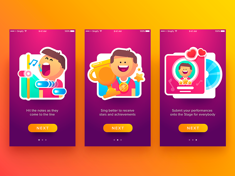
App Design Ideas: 7 Nifty Mobile Application Design Projects
Information Beautified: Media and Editorial Website Designs
UX Design for Traveling: Impressive Web Design Concepts
23 Impressive Web Design Concepts for Various Business Objectives
Mobile Design: 14 Stylish and User-Friendly App Design Concepts
Web Design: 26 Examples of Creative Landing Pages
UI in Volume: 3D Graphics in Creative UI Design Concepts
Logofolio: 16 Logo Designs for Different Business Goals
9 Eye-Catching Web Interfaces with Bright Graphics