There’s a particular kind of design decision that looks like a stylistic choice but is, in practice, a structural one. Dropping a fully rendered 3D object into a UI is one of them. It rewires the visual hierarchy, restructures how users read the screen, and changes the emotional register before a single word lands. The fact that it also happens to look impressive is secondary—or it should be.
The collection below covers a wide range of digital products that have integrated 3D UI design meaningfully, from e-commerce to education apps, and what each case reveals is less about trend-chasing and more about how depth, when handled well, does real compositional work.
The Bug Store: When the Product Object Does the Explaining
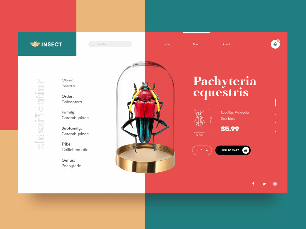
Start with the most literal use case. An e-commerce site for insects—a product category with essentially zero existing visual conventions—solves its interface problem by making a 3D rendered model of the item the central element of the product card. There’s no lifestyle photography to lean on, no cultural shorthand. The render steps in and fills that void completely. Product visualization at this level of precision earns its render time: the user immediately understands the offer, the scale, the morphology. The 3D model isn’t decoration here, it’s the entire argument for why this product is worth considering.
The Restaurant App: First Impressions Are Infrastructure
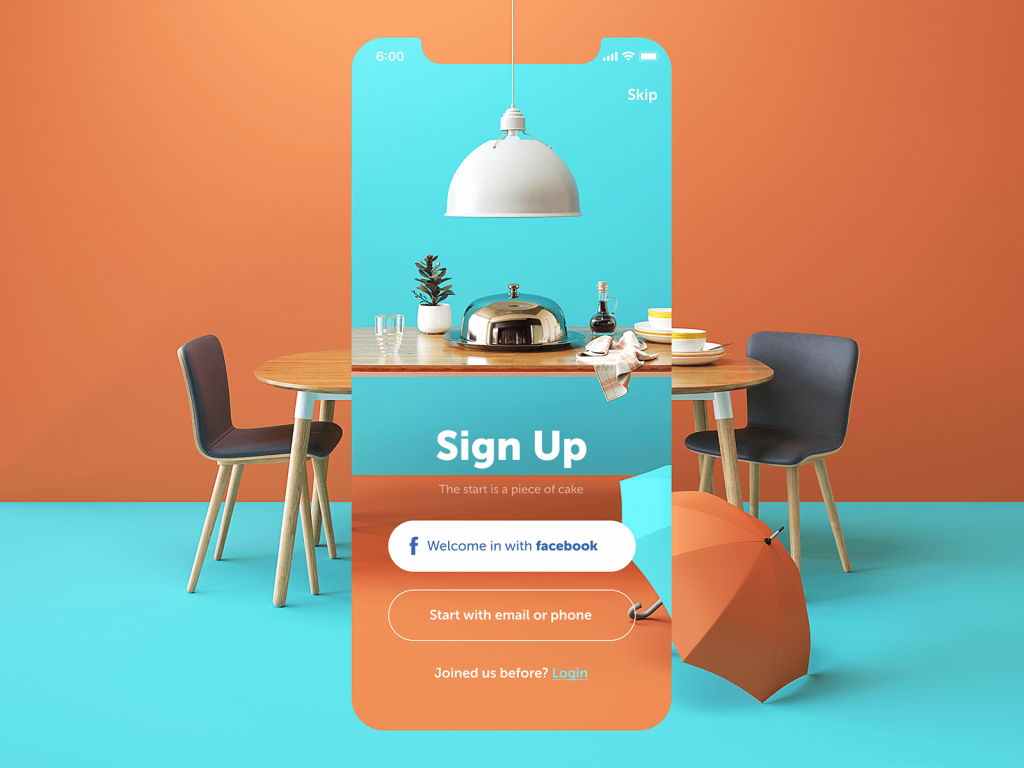
The assumption that utilitarian screens—sign-up, onboarding, log-in—can be visually deprioritized is one of the more persistent and costly mistakes in mobile product design. A restaurant app that applies elegant 3D graphics to its most basic screens understands something important: mobile app onboarding is where tone is set and trust is earned, and a screen that feels like an afterthought communicates exactly that. The welcome screen animation included in this concept demonstrates the point further—3D animation on arrival isn’t a flourish, it’s a declaration of what the product considers worth investing in.
Homes of the Future: Environmental Storytelling Through State Changes
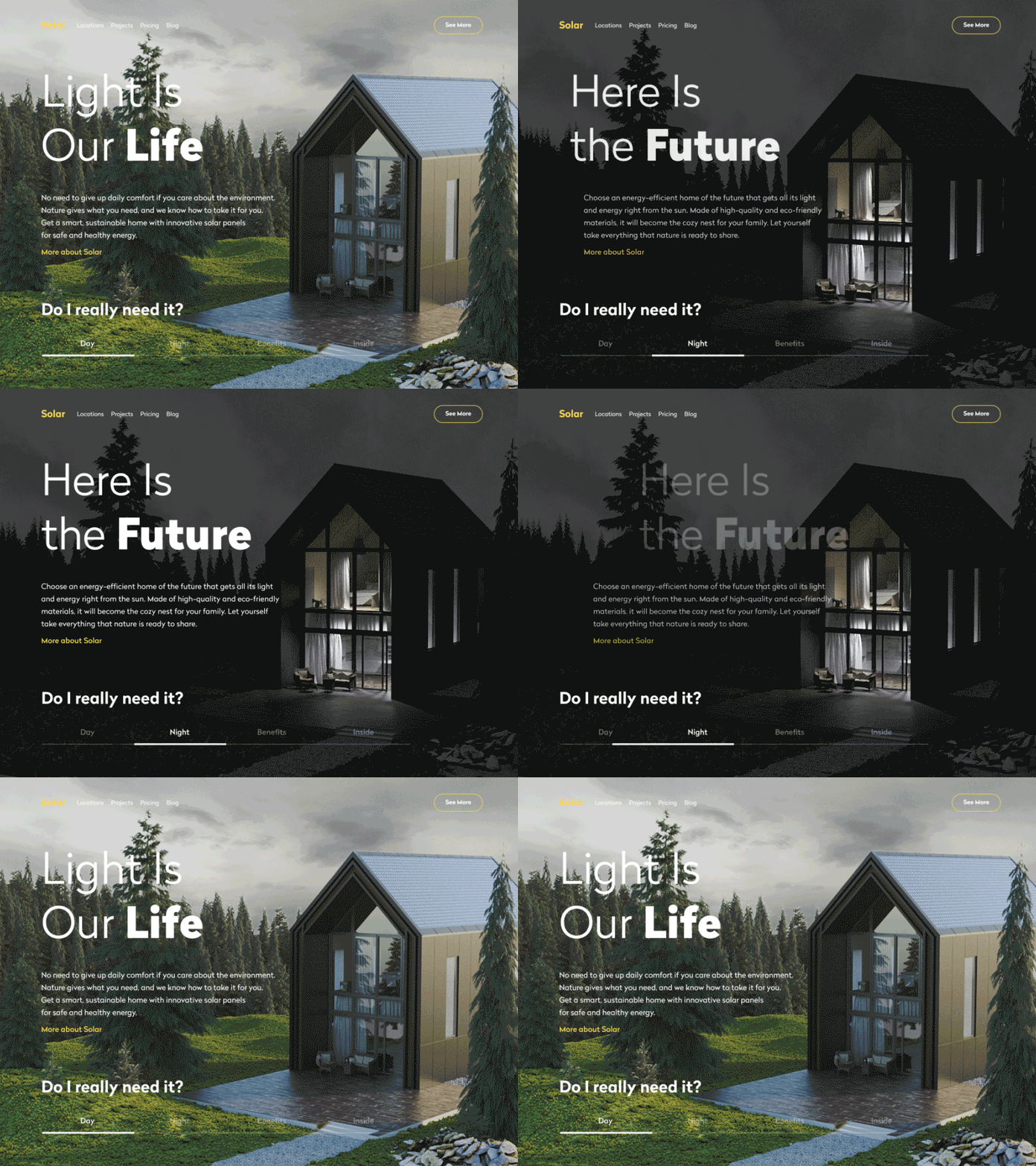
Sustainable architecture is a product category that has to convey something simultaneously tangible and aspirational—the actual house exists, but its appeal is largely philosophical. A website concept for a company building solar-powered homes solves this by using 3D rendering to show the same structure across different times of day and environmental conditions. This is sustainable design communication doing something photographs genuinely cannot: a photo fixes a moment; a 3D model can inhabit multiple moments without the seams showing. Each tab transition is a demonstration, not just a navigation action. The interface becomes the proof of concept.
Moon Creative: Mascots with Actual Personality
For an educational studio teaching design and animation to children and teenagers, the design challenge is partly about engagement and partly about credibility—the product needs to communicate “this is where people who take creativity seriously come to learn.” The splash screen of this app deploys a 3D-rendered astronaut with enough character and rendering detail to signal both. Character animation of this quality doesn’t happen by accident; it’s a deliberate choice to allocate production resources toward first contact with the user. The schedule screen continues the logic: a pull-down interaction that animates in cosmic terms makes a fundamentally administrative task feel like it belongs to a world the student wants to inhabit.
Kindergarten Website: Fur, Physics, and Trust Signals
A landing page for a chain of kindergartens is, at its core, a trust document. Parents are making consequential decisions, and every visual element on the page either builds or erodes confidence. An animated 3D mascot—dancing, with fur simulation detailed enough to catch light and move with the body—does something a stock illustration can’t: it signals investment. Animated mascot design at this fidelity level communicates care, which is precisely the brand value a kindergarten chain needs to establish above all others. The positivity the character projects isn’t incidental. It’s the product.
Vinyls E-Commerce: Physicality in a Digital Shelf
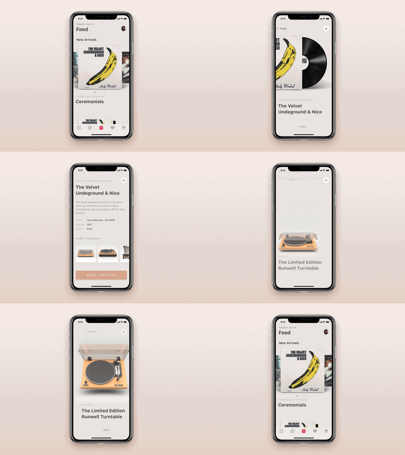
Vinyl records are objects with strong tactile associations—weight, surface texture, the ritual of handling them. An e-commerce mobile app selling records and players has a specific problem: how do you reproduce that relationship on a screen? This concept addresses it with 3D graphics that prioritize material realism over graphic simplification. E-commerce product design for physical goods lives or dies on whether the digital presentation activates the user’s existing physical memory of the object. The renders here are doing that work—realistic surface treatment, accurate proportions, a sense that these things have mass and presence.
Visual Creator Website: Hero Images as Product Demonstrations
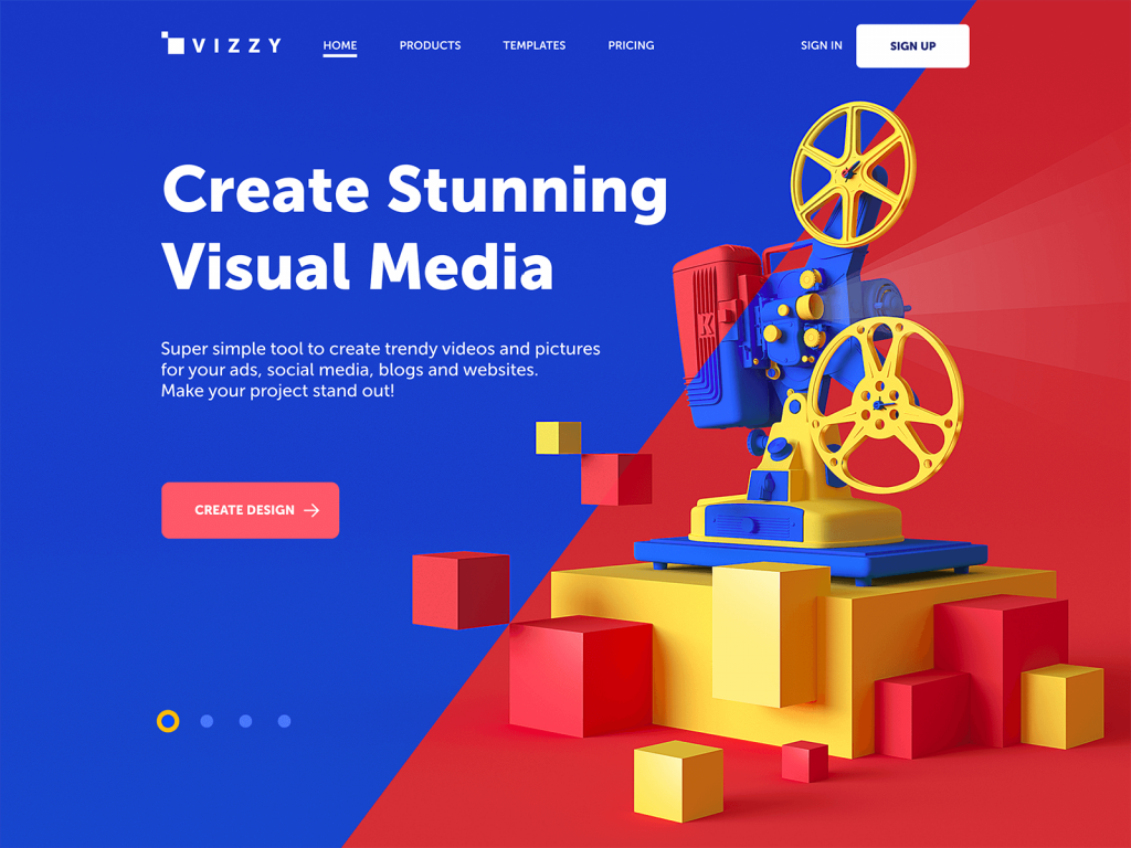
A landing page for an online tool enabling non-designers to create videos and images faces the classic SaaS problem: how do you show capability without showing complexity? The 3D hero image on this concept functions as a demonstration by proxy. It communicates “outputs of this quality are possible here” without requiring the user to engage with a tutorial or scroll to a features section. Landing page design that makes its central visual argument in the pre-scroll area is efficient in a way that compounding feature lists simply aren’t. The 3D choice here isn’t aesthetic indulgence—it’s the fastest possible proof of value.
My Baby App: Softness as a Technical Achievement
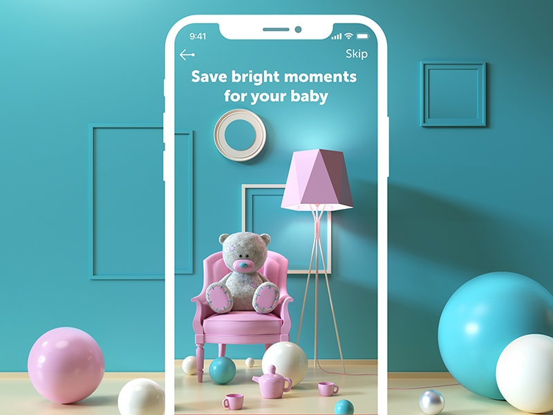
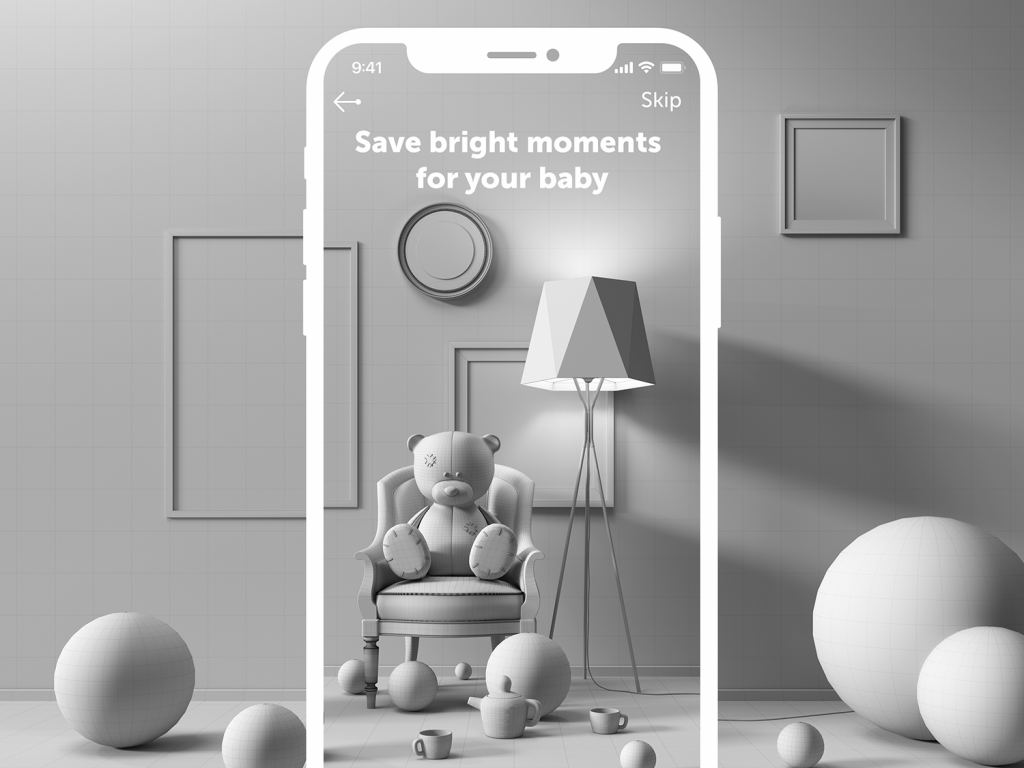
Not every 3D deployment is trying to impress through complexity. The onboarding screen for a mobile diary app for parents operates in a register of warmth and gentleness—and the 3D graphics here are calibrated specifically for that. Baby app UI design exists in a category where emotional tone is load-bearing: parents engaging with a product about their child’s milestones need to feel something specific, and clinical or generic visuals work against the product’s purpose. The 3D illustrations carry tactile softness; the included animation experiment extends this into movement with the same intentionality.
Design Studio Website: Full-Bleed as Editorial Commitment
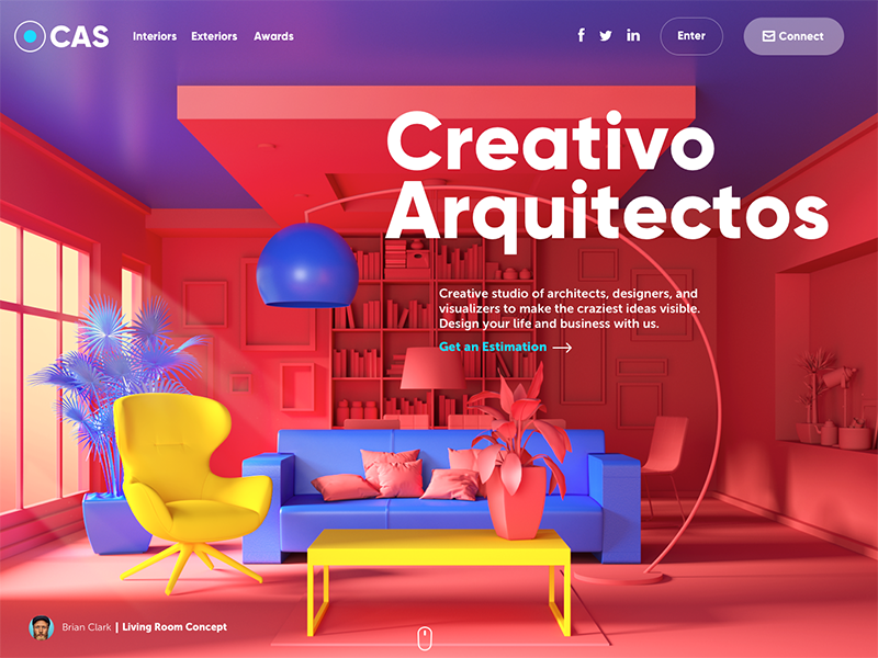
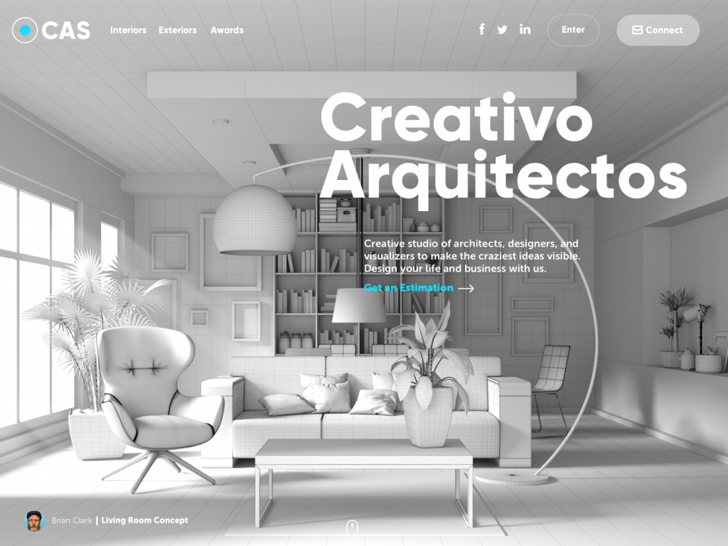
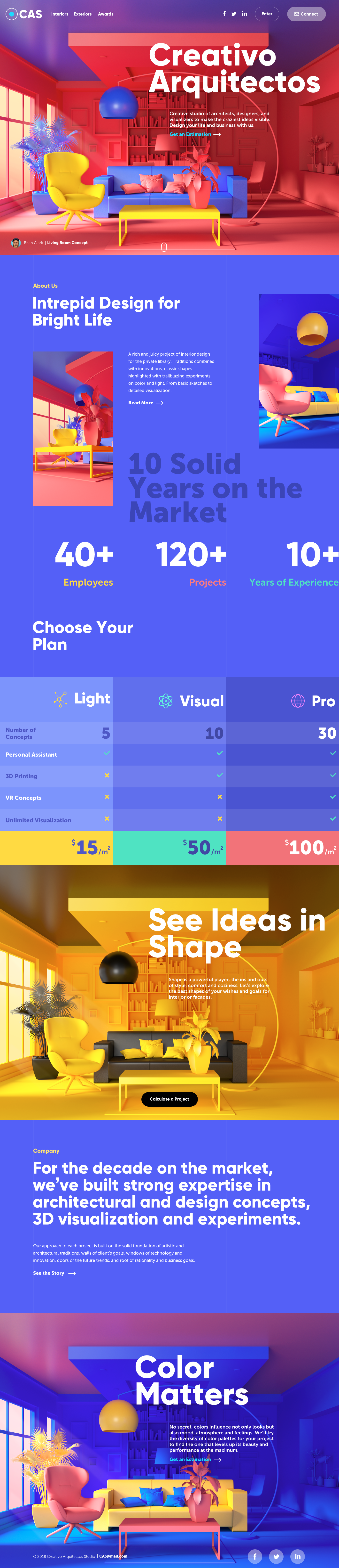
A website for a studio specializing in exterior and interior design visualizations is, inescapably, a portfolio of its own capability. Using full-screen 3D graphics as the background image is an obvious move in theory and a demanding one in execution. Interior design visualization websites succeed at this approach only when the quality of the render justifies the scale—when every pixel of that background image is working. The shape-versus-color tension that apparently inspired this concept lands not in the copy but in the visual itself: the composition holds both the formal precision of geometry and the emotional weight of color simultaneously. When it works, full-bleed 3D backgrounds aren’t covering negative space. They’re making the case.
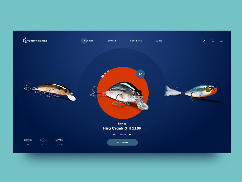
Fishing Online Store: Dark Mode as a Presentation Strategy
A slider deploying dark backgrounds to showcase fishing lures in 3D renders is a tight, practical demonstration of how environmental choices amplify content. Light backgrounds ask rendered objects to compete with the interface around them. Dark backgrounds create a contained stage. Outdoor e-commerce design for products with significant visual detail—surface patterns, translucency, metallic finishes—benefits specifically from this approach because the darkness eliminates visual noise and directs the eye. The lures here are genuinely compelling to look at precisely because nothing else is competing for attention.
Health Blog: 3D as Vocabulary Replacement
A health blog choosing 3D rendered body parts over conventional medical photography or flat illustration is making a vocabulary decision as much as a visual one. Medical photography carries specific associations—clinical settings, vulnerability, institutional authority. Flat illustration simplifies things toward accessibility. Rendered 3D models occupy a different register: medical content design that is precise without being clinical, detailed without being distressing, and visually unfamiliar enough to hold attention. This combination lets the blog maintain informational authority while signaling that it’s approaching health content from a contemporary, design-forward position.
Shopping Delivery Service: Color and Form as Competitive Positioning
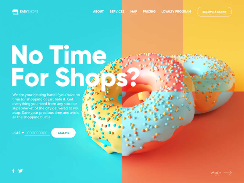
In a product category dominated by utilitarian interfaces—functional, forgettable, interchangeable—a delivery service website that leads with an experimental color palette and a catchy 3D image is doing something strategically deliberate. Delivery service app design conventionally deprioritizes visual identity in favor of transactional clarity. This concept argues the opposite position: that visual distinctiveness is itself a user experience advantage, because it gives users something to remember and return to. The 3D image here isn’t the whole argument, but combined with the color palette, it makes the interface feel like a considered product rather than a logistics tool.
Vintage Car Hiring App: Motion as Navigation Logic
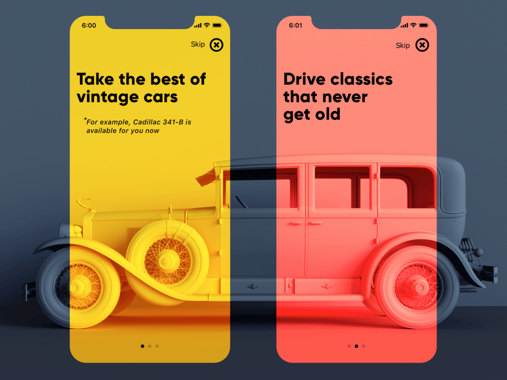
Three onboarding screens for a vintage car rental app use 3D positioning to create something genuinely structural: as the user swipes between screens, the car model in the background shifts perspective. Automotive app UI that ties visual motion to user gesture is doing more than looking elegant—it’s creating a spatial model in the user’s mind that maps physical action to screen transition. The experimental animation built from this concept extends the logic further. The minimalism of the interface framing is doing its job precisely because the 3D model is doing the heavy lifting of communicating the product’s emotional territory.
Booking Service Website: The Split-Screen as Practical Argument
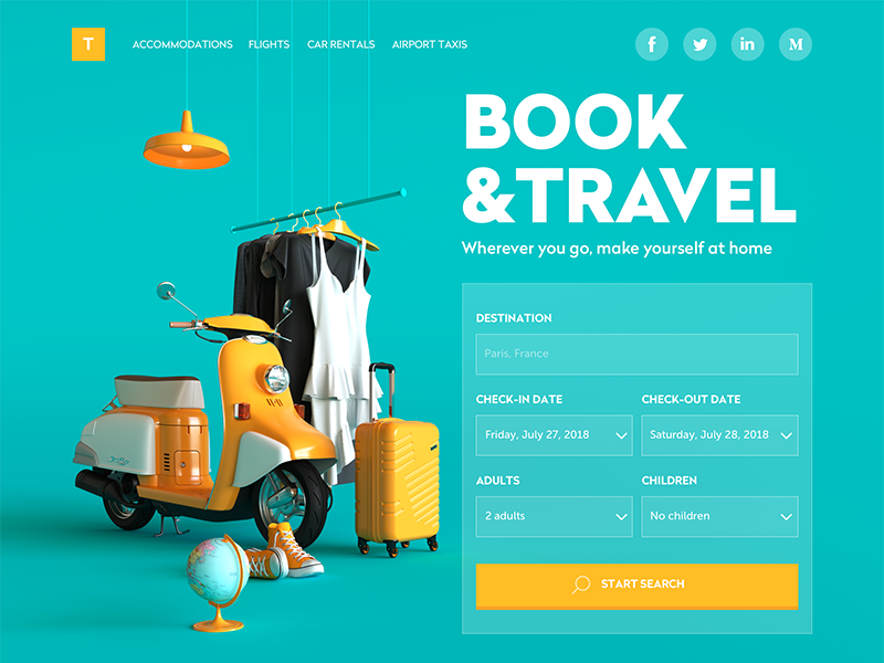
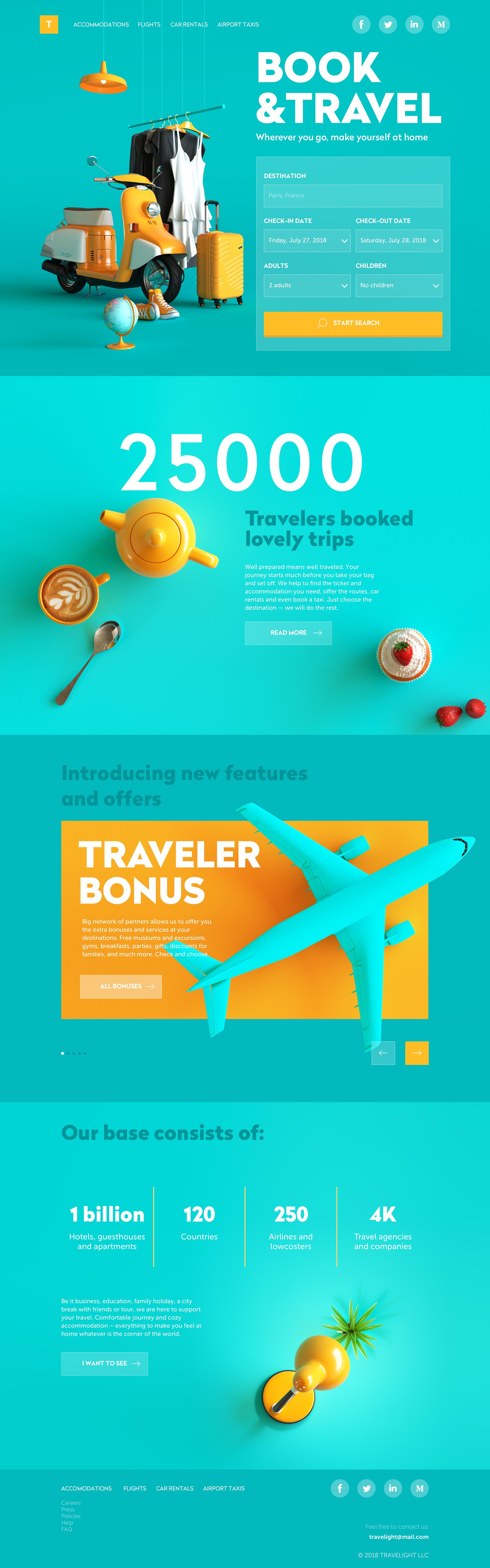
A travel booking concept that divides the screen between a 3D theme image and an immediately actionable search form is a layout that prioritizes conversion without sacrificing visual impact. Travel booking UX design typically forces a choice between atmospheric hero images and functional density. This layout refuses the trade-off: the image earns its left half of the screen by immediately communicating what kind of experience the service offers, while the right half ensures users can begin interacting before they’ve made a single scroll. The bold color contrast does the work of distinction; the tagline does the work of orientation. The form does the work of retention.
Museum App: Darkness as Atmosphere, Not Absence
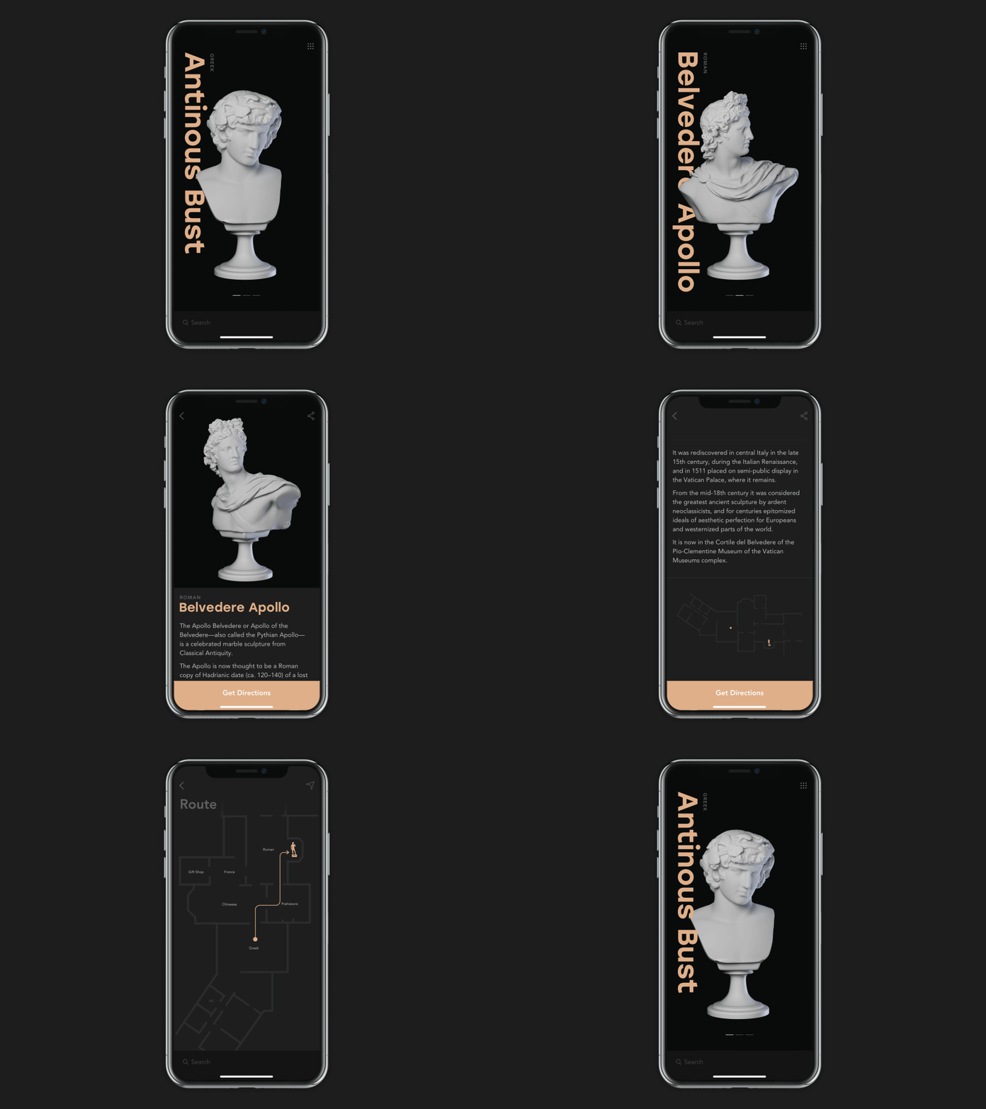
A museum app supporting visitors with 3D models of exhibits, supplementary information, and wayfinding is a legitimate information architecture challenge—and the UI concept here makes a specific choice about how to meet it. Dark backgrounds used consistently throughout the interface aren’t a stylistic gesture; they’re a positioning decision. Museum app design that uses darkness as its base registers differently than one that uses white or neutral tones. The exhibits feel precious, isolated, worth examining. History presented in this register becomes artifact rather than documentation.
Crypto Blog: Geometry as Epistemic Signal
A homepage for a cryptocurrency blog using geometric 3D animation communicates something specific about its relationship to its subject matter. The blockchain space has a complicated visual culture—maximalist to the point of incoherence on one end, VC-minimal on the other. Crypto content design that uses clean geometric 3D and a controlled futurist aesthetic is implicitly claiming a third position: technically serious, visually coherent, not trying to hype anything. The animation on the homepage is distinctive enough to hold attention but systematic enough to suggest that the people behind it understand the underlying structures they’re writing about.
Action Figures E-Commerce App: 360-Degree Views as Commerce Infrastructure
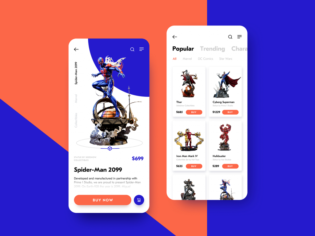
For collectibles and high-consideration physical goods, the e-commerce interface problem is one of conviction: how do you get users confident enough to purchase an object they can’t physically handle? A mobile app for action figures that integrates 360-degree 3D presentations solves this directly. Collectibles e-commerce UX succeeds when the gap between screen and physical object narrows as far as possible. A rotatable 3D model lets the user perform the same evaluation they’d perform in a physical store—checking proportions, surface detail, the quality of the sculpt—and the interface design here is specifically built to support that behavior.
VR Chatrooms Website: When the Interface Mirrors the Product
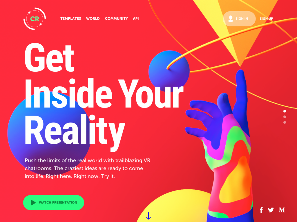
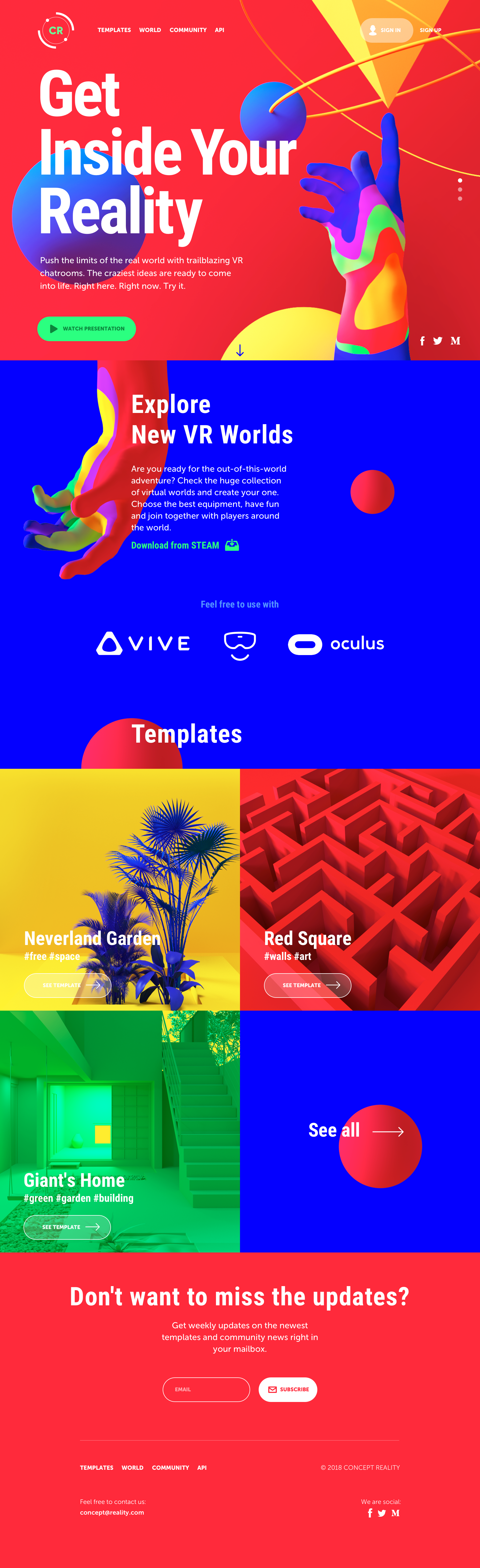
A platform for virtual chatroom templates has a self-referential design mandate: the website has to feel like it understands the spatial and experiential possibilities of its own product. This concept executes that mandate with psychedelic color combinations, 3D graphics bridging human and geometric forms, and a decision to front-load video content in the pre-scroll area. VR platform design that leads with demonstration rather than description is the right call for a product that’s hard to explain in static terms. The homepage is structured as a live argument for VR’s potential, which is exactly what the product needs before a user will click through to the templates.
Baby Translator App: Light Touch, High Commitment
Not every interface carries systemic weight. Some exist purely to delight, and executing that mandate well is harder than it sounds. A concept app translating infant babble to speech uses an animated 3D microphone as its central UI element—and the choice is precise. Fun app design of this kind requires a visual that’s immediately legible, tonally perfect, and capable of communicating system feedback in context. The recording-in-progress state reads through the animation naturally; the absurdism of the concept is supported rather than undercut by the visual. When 3D graphics are this well-calibrated to purpose, the question of whether they were “worth the effort” doesn’t really come up.
Ruby on Rails Company Website: Metaphor as System
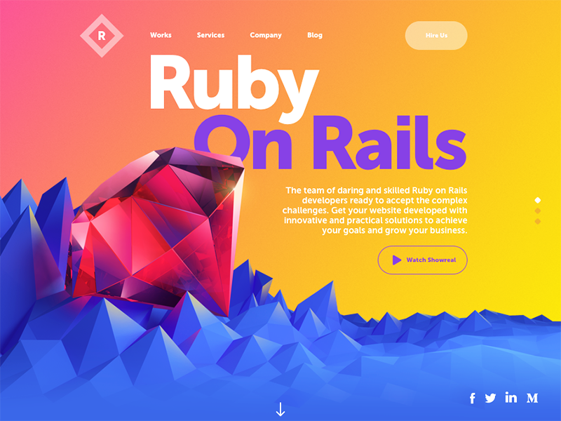
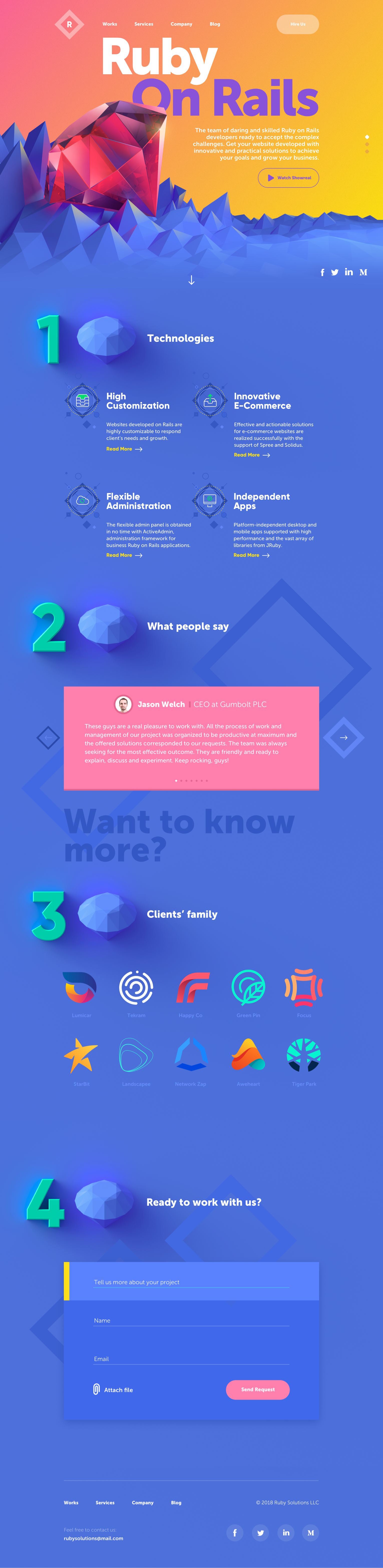
A web development company website that leads with a large 3D gemstone rendering is making a brand argument in visual form: the company name aligns with the Ruby language, the gem image activates that association immediately, and the rest of the pre-scroll architecture—navigation, CTAs, social links, video presentation button—is organized around that central image without competing with it. Tech company website design tends to default to either abstract code aesthetics or generic corporate photography. Neither says much. A fully committed visual metaphor, rendered at high fidelity and used structurally, does considerably more. The scrolling content—technologies, testimonials, client logos, contact form—all benefits from the visual frame established at the top.
Blog App: Category as Color Block
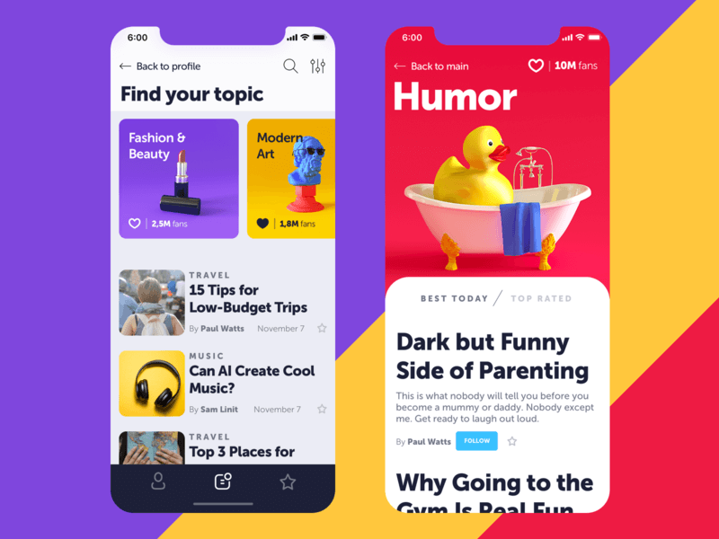
A mobile blog app that uses 3D visual content to differentiate topic categories is solving a specific navigation problem. Horizontal swipe menus with text labels work functionally but offer no visual incentive to explore. Content app design that anchors each category to a distinct 3D image creates a visual taxonomy that users can scan spatially rather than read sequentially. The top portion of the main screen becomes a browsable landscape rather than a list. The distinction matters for engagement: when categories have visual personalities, they invite curiosity rather than just directing attention.
Lodging App: Hybrid Photography and the Credibility Question
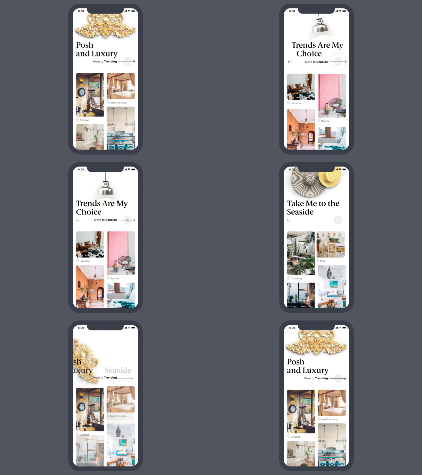
A travel lodging app that combines 3D graphics with high-quality photography is handling a tension that most travel products don’t address explicitly. Photography provides the immediate credibility of the real—these places exist, people stay in them. 3D graphics provide clarity of category and tonal consistency across wildly different visual source material. Travel accommodation UX benefits from this hybrid approach because the problem isn’t really about choosing between realism and idealization. It’s about ensuring that across luxury, trending, and seaside categories—each with its own visual register—the interface still reads as coherent and trustworthy. The animation transitions between categories demonstrate that the combination holds.
Kubrick 3D Animation: Biography as Provocation
A 3D animation created for a biographical website about Stanley Kubrick occupies a specific kind of design brief—the subject is a director whose films are exercises in controlled discomfort, deliberate pacing, and formal precision. Biographical website design for an artist of Kubrick’s stature can’t default to reverence or hagiography; it needs to carry some of the aesthetic intelligence of its subject. The animation described as “catchy and a bit provocative” is a reasonable description of what the brief requires. Adding innovative vibes to a site about Kubrick is a high-wire act. Getting it right means the design team understood the source material well enough to respond to it rather than merely illustrate it.
Bottom Line
The through-line across all of these is less about 3D as a technique and more about 3D as a decision about what carries meaning in an interface. Renders, animations, and immersive graphics aren’t interchangeable with other visual strategies. They impose specific production costs, make specific promises to the user, and create specific obligations in the rest of the design. The examples here—ranging from insect retail to Kubrick biography—show the range of what that decision looks like when it’s made well.
Recommended Reading
We write about design the way we practice it: with a point of view. More case studies and think pieces below:
Web Design: 5 Basic Types of Images for Web Content
Functional Art: 10 Big Reasons to Apply Illustrations in UI Design
UX Design: How to Make Web Interface Scannable
Negative Space in Design: Tips and Best Practices
Single-Page Website: Best Design Practices