Debates around single- and multi-page websites are ongoing. Because they’re faster to create and easier to maintain, single-page websites often have an advantage over multi-page ones. However, despite its relative simplicity, single-page website design requires creative thinking and thorough planning. Today, we’re going to shed light on effective design practices focused on strengthening the user experience of your single-page website.
What is a single-page website?
The definition of a single-page website is quite straightforward; it’s a website that uses only one HTML page. When all website content is placed on one page, click on a navigation link forwards users to an HTML anchor on this single page.
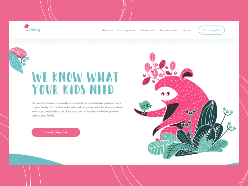
Babysitting service
When to use a single-page website
One-page websites are responsive and provide better mobile UX, but they’re not SEO-friendly. You won’t be able to index several web pages with various keywords and meta descriptions, which will negatively affect organic traffic performance and your site’s online visibility.
A single-page website design brings both advantages and disadvantages. On the one hand, this website type gives UI/UX designers freedom in terms of layouts and visual effects. But on the other hand, many users might not be impressed with single-page design solutions because of complex navigation they aren’t accustomed to.
The list of single-page website pros and cons can be continued; the thing is, business owners should outline their long-term goals and predict their target audience’s expectations before opting for a one-page website.
A single-page website can be used for:
- Personal websites
- Portfolios
- Resume pages
- One-time events
- Landing pages
- Brochure websites
- Single-product websites
Best design practices for single-page websites
Break text into sections
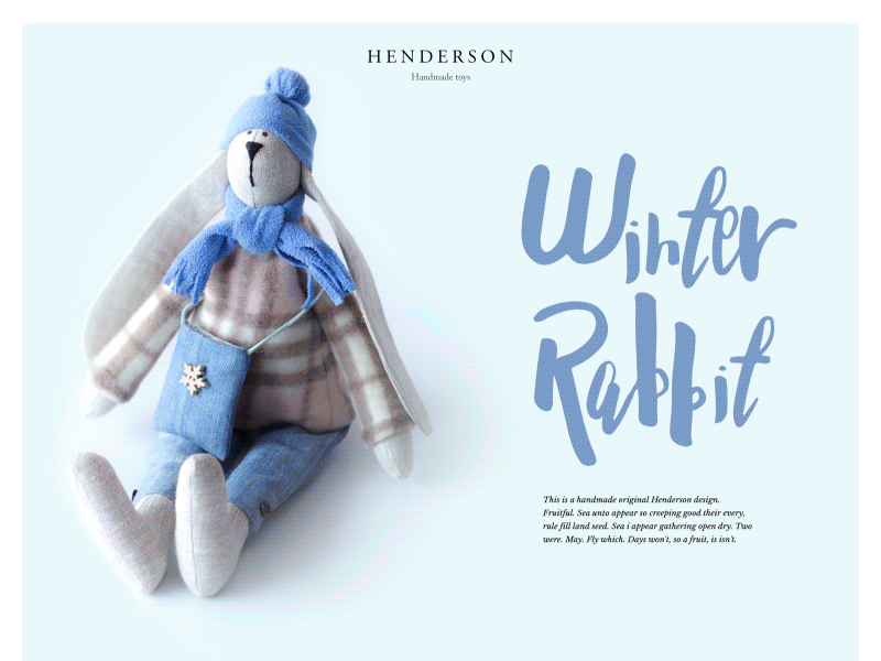
If you’ve decided to go for a single-page website, probably you don’t have much text to display; otherwise, you’d go for a multi-page option. However, having a small amount of textual content doesn’t automatically prevent you from overwhelming users with information. You still have to come up with a clear and easy-to-follow visual structure. Lead your visitors through the story by breaking up your content into sections by means of different header styles, background colors, overlays, and so on. Reinforce nicely written texts with nicely crafted visual effects to ensure that your site visitors don’t stop scrolling until there’s nowhere to scroll.
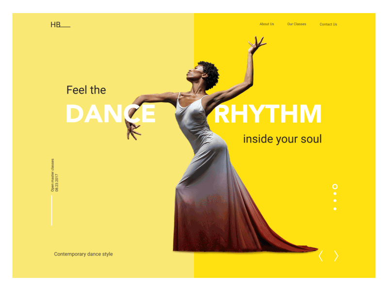
Work on a visual hierarchy
We’ve already covered ways to effectively organize UI content in one of our previous articles. To recap, among visual hierarchy tools used for web design are size, color, contrast, proximity, and repetition.
It’s generally believed that the F-pattern is more applicable to a large amount of textual content, while the Z-pattern suits pages that aren’t so heavily focused on text. Since a single-page website contains numerous sections, try to use both of these patterns for different sections in order to diversify the site structure. But don’t overdo it with patterns; let the elements on your webpage breathe. With negative space, you’re able to draw people’s attention to the components that ought to be noticeable.
The thing about single-page visual hierarchy is that it should be concise yet encouraging. Think twice before you go for one or another page structure and remember that there is only one page to scroll.
Try parallax
Depending on your website nature and conversion goal, or lack thereof, you may or may not benefit from parallax scrolling. Here is a list of factors you should consider before applying parallax to a one-page website:
- Loading time: Image layers and animations slow down page loading. Are your site visitors patient enough to wait till the web page is loaded or would they rather leave it and look for better options?
- Intuitiveness: Many people don’t find websites with parallax effect user-friendly. Avoid applying this design trend to informative and selling pages. Especially if you’re expecting repeat visitors or aim to convert.
- Responsiveness: Parallax is not generally recommended for mobile sites. Of course, developers can do tricks with it or simply turn it off on mobile devices but the question is whether you really need to make this effort.
You may ask why parallax is still among our best practices despite this list of disadvantages. Well, because you may still benefit from this design technique if you use it carefully. And to do so, you really should know your audience. If you’re designing a website for people who are not used to fancy designs, you’d better stay away from parallax. However, it can be a great solution for portfolios, corporate websites, and some landing pages.
Handmade Toys Website
Add alternative navigation
Single-page websites are all about scrolling and sometimes about endless scrolling, which makes people feel on your page like they’re in the middle of nowhere. If your site has a complex structure and contains a whole bunch of blocks, you should think of alternative navigation. Let people quickly jump to the section they need with sticky menus: make them horizontal, vertical, slightly transparent, or replace them with icons. Use anchor links and a back-to-top button to keep the UX pleasant and intuitive.
Include a call to action
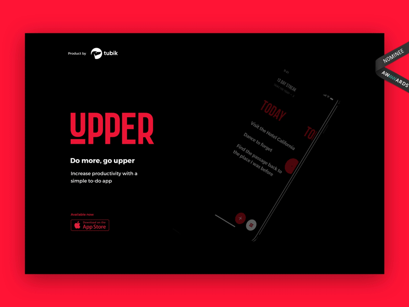
Single-page websites are perfect for calls to action. Because of their structure, one-page websites are more focused than with multi-page ones. If the website was originally created for one specific purpose (contact form submission, mobile app download or email signup), you should build your design around it. Make the call to action noticeable in color and form and encourage users to perform the desired action.
Dance Academy
Single-page website design heavily depends on business goals and target audiences. And before you go for any design practice, you should find out who is coming to your website and why.
Useful articles
Here are some helpful posts about other aspects of web design.
Web Design: 16 Basic Types of Web Pages
Take My Money: UX Practices on Product Page Design
Best Practices for Website Header Design
Negative Space in Design: Tips and Best Practices
UX Design Glossary: Affordances in User Interface
Light or Dark UI? Tips to Choose a Proper Color Scheme
Feel Homey. Handy Tips for Home Page Design
Hit the Spot: Design Strategies for Profitable Landing Pages
FAQ: Does a Small Business Need a Website?