
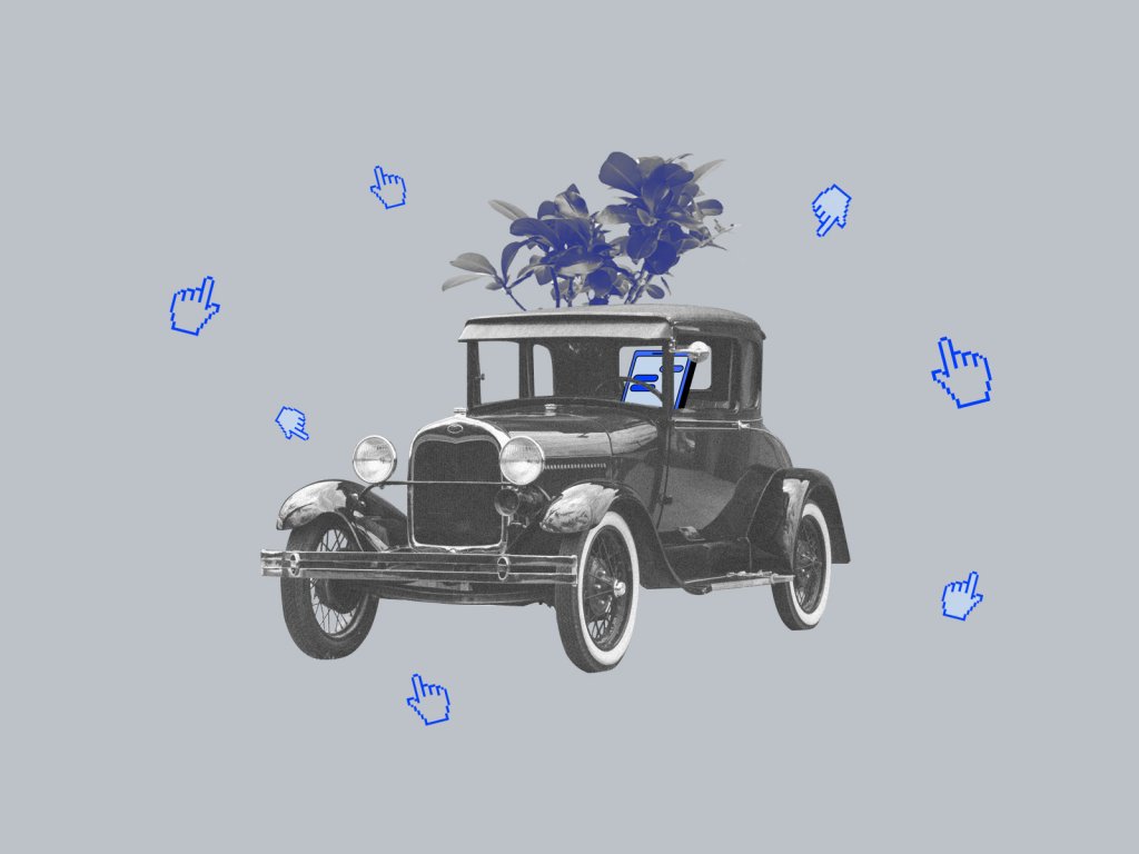
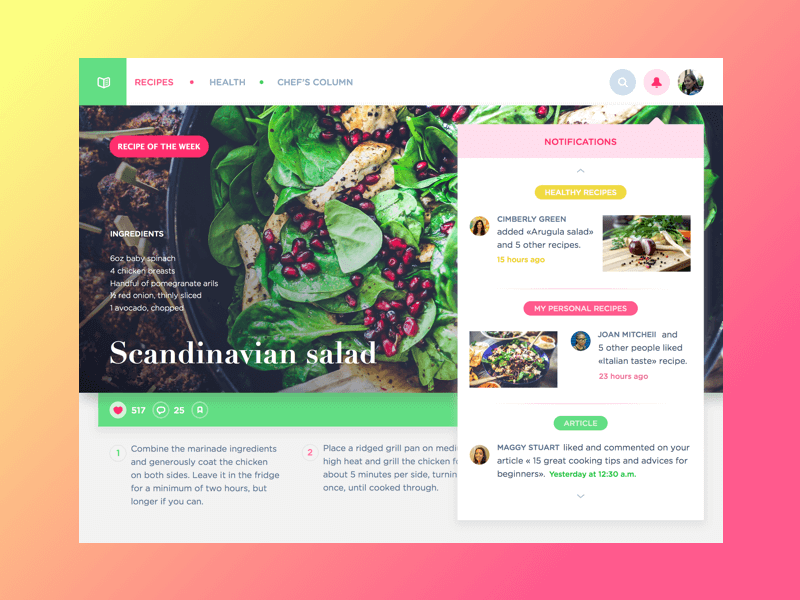
Obtaining professional knowledge and skills, designers face a variety of specific terminology. We have already published the posts with key terms for the topics of usability and web design, business terms and abbreviations, navigation elements, and color terms. The new article continues the theme of psychology in user experience design and adds a new issue to UX Design Glossary. Today we are talking about affordances, subtle cues that help users to interact with an interface.
What is affordance?
Affordance is a property or feature of an object which presents a prompt on what can be done with this object. In short, affordances are cues that give a hint of how users may interact with something, no matter physical or digital. For example, when you see a door handle, it is a prompt you can use it to open the door. When you see a receiver icon, it gives you a hint you may click it to make a call. Affordances make our life easier as they support our successful interactions with the world of physical things and virtual objects.
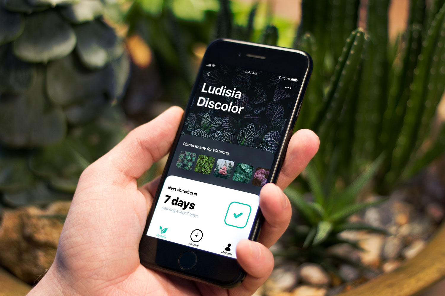
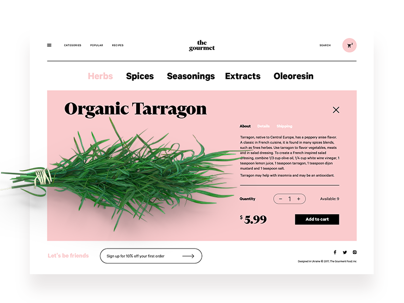
Check the screen of Watering Tracker below. In split seconds, you will understand that the needed action is done – the tick shows it. The icons in the tab bar will give you clues about what you can do with the app: check your set of plants (this tab is active as it’s colored while the others are not), add a new plant, or check your profile. These are affordances in action.
History of the terminology
The term was first introduced by the psychologist James Gibson who deeply researched visual perception. He first used the term in his book ‘The Senses Considered as Perceptual Systems‘ in 1966. In 1979 he clarifies the definition of his terminology in the book ‘The Ecological Approach to Visual Perception’: “The affordances of the environment are what it offers the animal, what it provides or furnishes, either for good or ill. The verb to afford is found in the dictionary, the noun affordance is not. I have made it up. I mean by it something that refers to both the environment and the animal in a way that no existing term does. It implies the complementarity of the animal and the environment.” According to Gibson, humans tend to modify their environment with a wish to make their affordances suit them better and make their life easier. Learning the affordances of the environment becomes an essential part of socialization.
Being applied to design, the term referred to only those physical action possibilities of which the user is aware of. In this perspective, the term got its further development in the explorations by Donald Norman in the 1988 book, ‘The Design of Everyday Things‘. According to the expert, “…the term affordance refers to the perceived and actual properties of the thing, primarily those fundamental properties that determine just how the thing could possibly be used. […] Affordances provide strong clues to the operations of things. Plates are for pushing. Knobs are for turning. Slots are for inserting things into. Balls are for throwing or bouncing. When affordances are taken advantage of, the user knows what to do just by looking: no picture, label, or instruction needed.”
With the advent of various user interfaces, affordances got a new vector of development. We did hundreds of operations with diverse actions, tools, and things. Now we also do tons of operations just clicking the mouse or tapping the screen. It makes UX designers work on the new ways of presenting affordances that accumulate patterns and knowledge people have from real life in digital interactions. This experience is dramatically different so the approaches change too.
Types of affordances in UI
Affordances in UI can be classified according to their performance and presentation. Anyway, their main goal is to actualize the knowledge and experience people already have to simplify the interaction flow.
Explicit (obvious) and implicit (hidden) affordances
Based on their performance, we can find obvious and hidden hints in UI.
Explicit affordances are based on widely known and typical prompts that direct the user to a particular action. For example, when you see a button designed as an obviously clickable element, aka visually similar to the buttons in the physical world, you understand you can click or tap it to interact. If it is supported by a text or icons the affordance becomes even more clear: it informs you what will be the feedback from the system.
A CTA button is clear as a clickable element and the copy says what this button enables a user to do
Implicit affordances are not that obvious. They are hidden and may be revealed only in a particular flow of users’ actions. The cases when we get tooltips or explanations hovering on a layout element are the ones. Other examples are diverse multilayered elements of navigation such as drop-down menus or expandable buttons that aren’t seen all the time or from the first seconds of interaction but are unveiled after a particular operation. Perhaps, one of the most debatable points here is the hamburger menu that hides the access to functionality behind the special icon.
Hamburger button in the header hides the extended website menu
Graphic Affordances
Graphic affordances are presented with visuals applied to an interface and helping users to scan its functionality. Graphics of all kinds are perceived faster and memorized better than copy so their importance cannot be overestimated. Among them, we could mention the following.
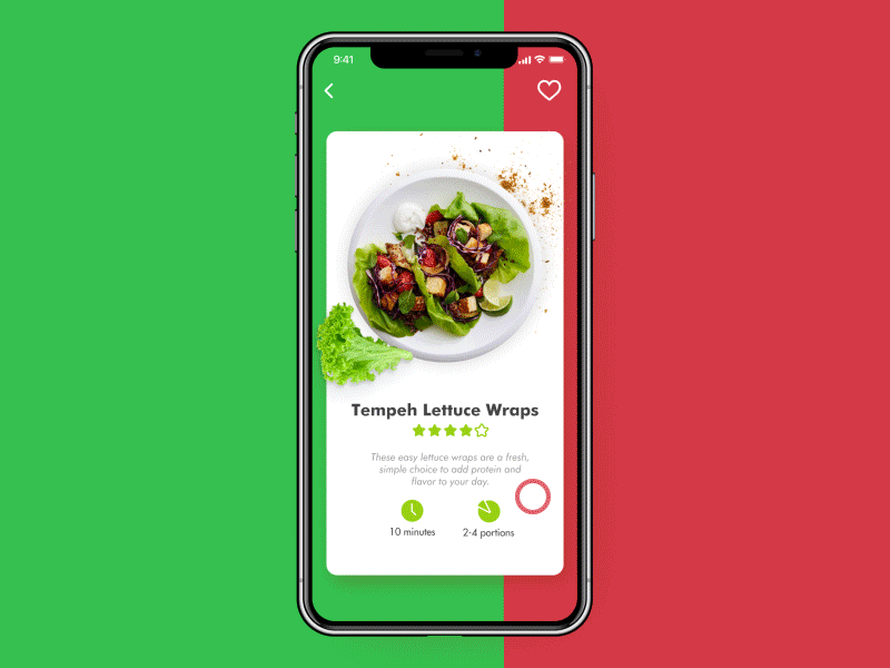
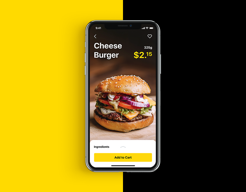
Photos: theme photos, items photos, avatars, and title pictures present the visual support, from information that generally users can do with the app or website (buy, communicate, show, watch, study, write, etc.) to specific features. Let’s say, if an app enables a user to save and share recipes, it’s cool to set the immediate association using appropriate photos like in the example below.
Branding signs: logos, corporate signs, and colors applied to the website or app present an immediate hint about the connection of the UI to a particular brand which may be a strong affordance for its loyal customers.
The logo on the splash screen and in the header sets the link to the brand
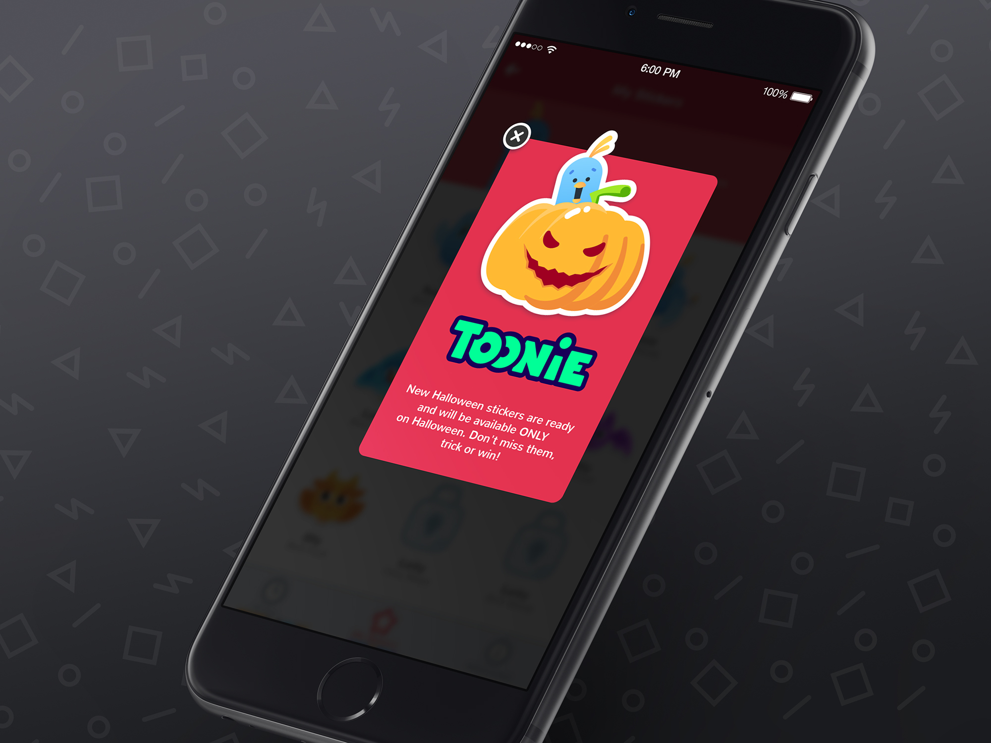
Illustration: theme illustrations and mascots have a big potential of giving clear prompts to users. Below, you can see a popup informing users about Halloween stickers in Toonie Alarm with a well-known visual prompt – a Halloween pumpkin.
Icon: interface icons present perhaps the most diverse group of visual affordances. These pictograms are highly symbolic and mostly use the hints taken from the real world so that users could understand them quickly. Even more, after some icons lose the connection with the original physical objects they still present productive affordances if remembered by a big number of users: a floppy disk for “save” is a good example. A heart or a star will immediately link you to favorites, a magnifier will prompt it’s a search and a camera icon won’t take you long to understand that it’s for taking a photo.
Icons are also used as effective hints for classification of the content: categories and sections work much faster with the support of proper graphics.
Button: being among the core interactive elements, buttons came to interfaces as a well-recognized element. Before the era of GUI, it was used in a variety of physical things from simple calculators to complex dashboards. We all know well what to do with a button. The point is to make it visible and obviously seen as a button in UI. Shapes, contrast, colors, and copy all present a great help here.
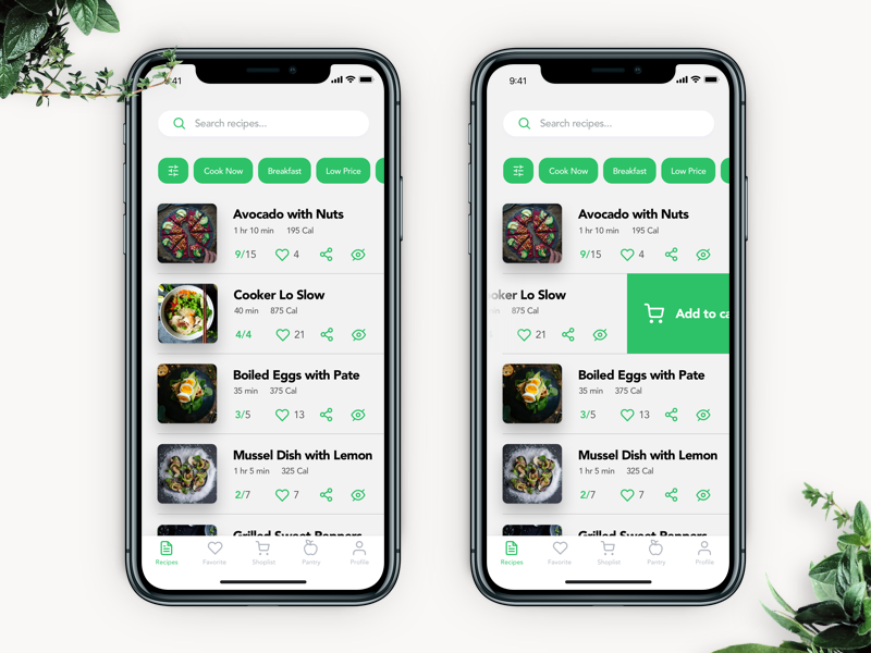
Field: basically, fields present spaces in which users can input the necessary data. To make them effective, designers also activate the power of affordance: fields should look interactive such a way that people understand immediately they can type in the text inside. The interface of Recipe App below shows the search field: it’s clear that the field is an interactive element due to the shape and contrast and also it is supported with a search icon and the text prompt giving an instruction.
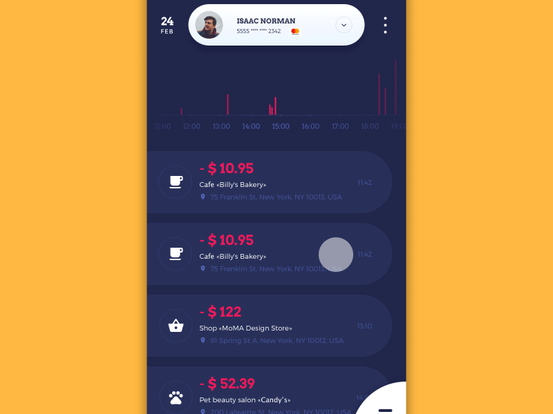
Notifications: there are numerous methods to hint the user that there is something missed or worth attention via notifications. Look at the cart icon in the interface below: a yellow dot on it gives a quick prompt that it isn’t empty.
Copy (Language) Affordances
Although users perceive images much faster than words, copy also doesn’t lose its positions having a great influence on an interaction flow. The point is that images sometimes need to be decoded with the help of the text so as to avoid misunderstandings. Another thing is that not everything may be shown in pictures. Finally, copy has an incredibly diverse potential in transferring information, labeling the instructions and calls-to-action, explaining the functionality, and supporting the efficiency of the layout with typographic hierarchy. However, the text should be given in a reasonable balance not to overload the interface.
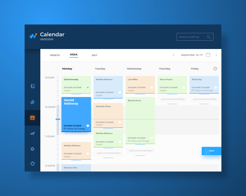
Interactions with copy are very natural for people in their everyday life, for much longer than graphical user interfaces exist. Copy clues and prompts help to understand what to do or what to expect, what information to keep in mind: we read many of them, from signs, adverts, and instructions to newspapers, manuals, and books. In digital UI, it works the same way. It is a straightforward way to communicate with a user. For example, the сalendar screen of HealthCare app shows the variety of language affordances: except for major information about patients, we can see the copy prompt inside the search field, the call-to-action copy on the button and a textual clue given in empty fields of the calendar showing that a user can add an appointment for the day just tapping the space.
Pattern Affordances
Pattern affordances are based on the power of habit and present a huge factor of effective interaction design. Their biggest advantage is saving users’ effort on keeping many things in memory simultaneously. As we mentioned in an article presenting mechanisms of human memory to UX designers, the capacity of short-term memory is limited. So, the more patterns users learn, the clearer is the navigation for them and the better they deal with new input. There are many typical affordances of this kind: for example, we are all used to the clickable logos in website headers which usually open a home page. From one interface to the other, we know that underlined piece of copy is usually a clickable link, the information about contacts and privacy policy of the website is often found in a website footer, and three vertical points in the app layout mean “more” showing additional functions. Saving these patterns means making users feel they understand the interface. So, if there’s a need to break the pattern affordances, think twice and test it well: originality should be reasoned and clear for users.
Animated Affordances
Animation applied in user interfaces creates a strong connection between the physical and virtual worlds. In most cases, it imitates interaction with real things: pulling, pushing, swiping, dragging, etc. So, interface animations both basic and complex present a group of powerful affordances.
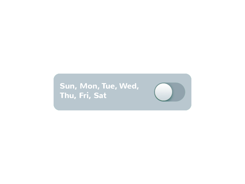
The example below shows the switch in Toonie Alarm app. When the switch is on, it changes several parameters together: the color of the tab, the color of the toggle, and the animation of the sun activated. This way it immediately informs the user and also adds emotional appeal to the operation.
Another example shows the notification that appears in the flow of interaction in the Home Budget app and reminds the user about particular limitations. Its animation features pulsation and this way attracts the user’s attention to the important warning.
Here’s one more case, a pull-to-refresh animation. Appearing on the screen, it informs a user that the UI is being updated and adds some fun to the process of waiting.
Negative Affordances
Whatever strange it could sound, negative affordances also play a big role in positive user experience: they root in the fact that negative result is also a result. The purpose of a negative affordance is to give users a prompt that some elements or operations are inactive at the moment. For instance, the interface of the Homey app given below shows that the “Bedroom” button is active while the buttons of other rooms are inactive – so they present negative affordances. The security level also features that level 5 is totally inactive.
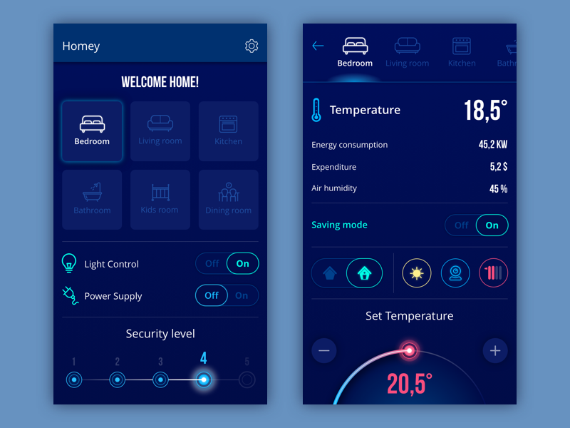
Here’s one more case: the tab bar shows the active button as colored while the others present negative affordances.
False Affordances
In a perspective of UX affordances, false and negative shouldn’t be seen as synonyms. No way. False affordance is what designers should avoid: these are the wrong prompts which lead users to the different action or result, not the one which is expected behind the prompt. Sometimes it’s done intentionally, but in most cases by mistake. For example, if the text in the web copy block is underlined, users automatically think it is clickable. So, they can be really annoyed to understand it doesn’t work – it means that they have been prompted the wrong way.
The brief introduction above lets us understand the significant role which affordances play in user experience design. We will continue this theme with more insights, tips, and examples in our next posts, so don’t miss the updates.
Recommended Reading
6 Types of Digital Affordance that Impact Your UX
How to Perfect UX with Design Affordances
UX Design Glossary: Navigation Elements
UX Design Glossary: Interface Navigation Elements. Set 2
UI/UX Glossary. Web Design Issues