
So you’ve done the hard part. You got someone to land on your e-commerce website. You lured them through the SEO maze, outbid someone on an ad, or maybe your social media finally went viral. Either way, the user’s here. Now what?
Now you don’t let them slip away. So how do you design a product page that convinces someone to stop scrolling, pull out their card, and say, “Take my money”?
Let’s break it down.
What Is a Product Page in e-Commerce?
In UX design for e-commerce, a product page is the screen that delivers everything a customer needs to decide if they want to buy the thing in front of them. Think of it as a stand-in for that helpful shop assistant in a physical store—the one who doesn’t hover, but somehow knows exactly when to answer your question about size, fit, or why this blender even costs 200 bucks.
Product pages are where the real decision-making happens. The homepage is a lobby; the product page is the sales floor. If your UX here isn’t clear, frictionless, and informative, all the clicks that got someone this far go to waste.
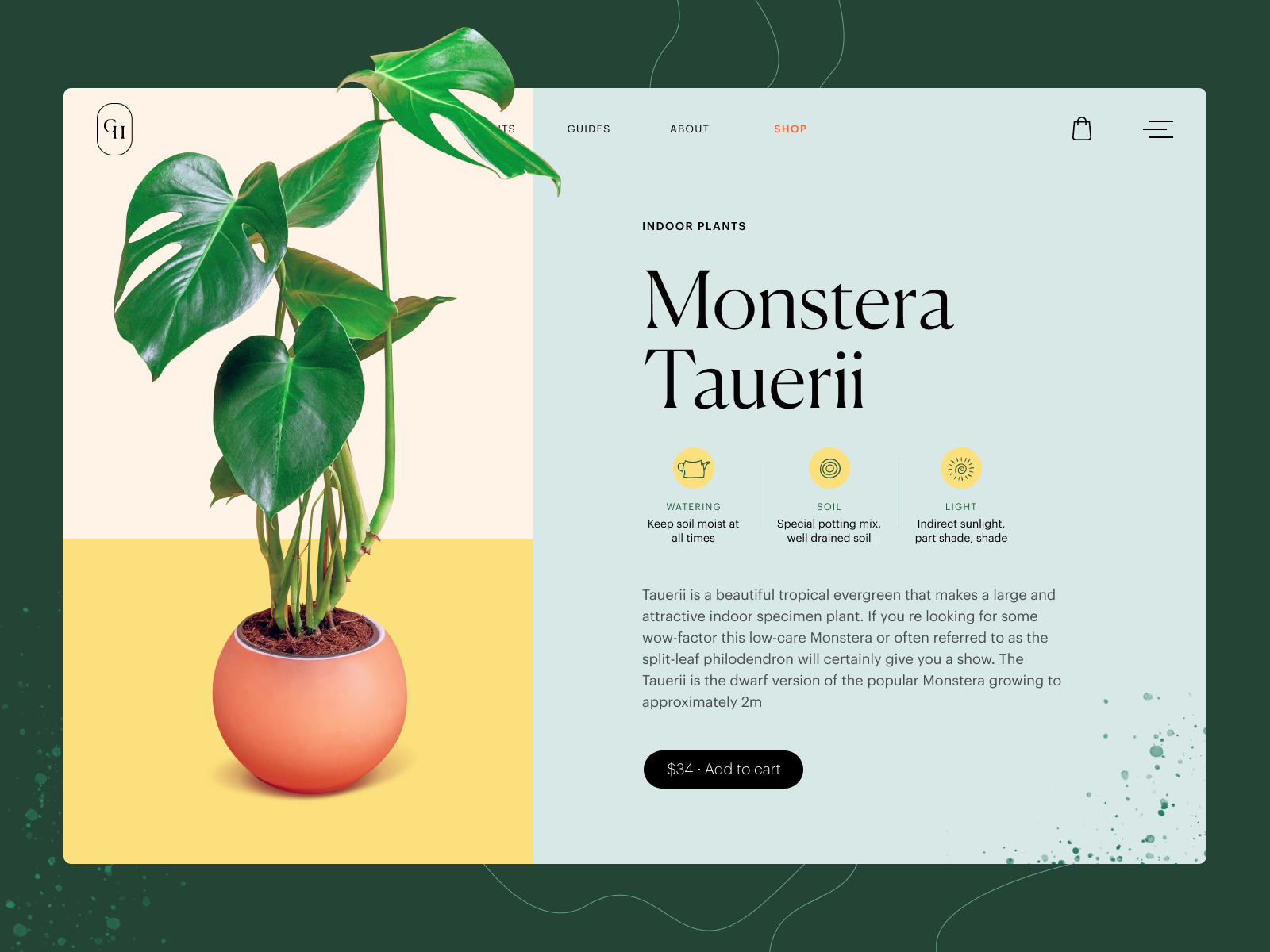
Product page concept for a gardening e-commerce website
What Elements Should a Product Page Include?
Here’s what most effective e-commerce product pages include, whether they’re selling sneakers, software, or a designer chair with too many vowels in the name:
- Product title
- Price and availability
- Product images (lots of them, from all angles)
- Add to cart / buy now button
- Wishlist or favorites button
- Color and size selectors
- Ratings and reviews (social proof)
- Product description (more on that later)
- Technical specs (materials, dimensions, weight, etc.)
- Size chart or calculator (for fashion and footwear)
- Quantity selector
- Compare feature (for electronics, gadgets, and side-by-side thinkers)
The exact mix depends on what you’re selling. Selling handmade pottery? You probably don’t need a comparison chart. Selling fridges? You absolutely do.
Don’t force all of these in “just because”—design is about prioritizing the right info at the right time, not throwing a checklist at the user and hoping for the best.
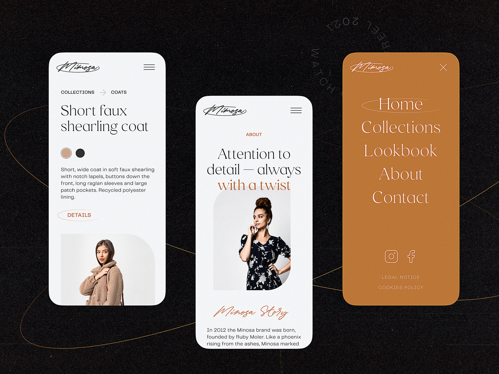
Product page interactions for Bennett, a tea brand e-commerce
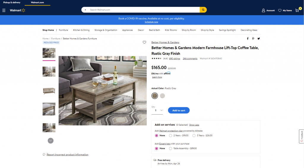
Product page first-screen view on Walmart
Best UX Practices for Product Page Design
1. Show, Don’t Just Tell: Product Images and Visual Demonstration
People don’t read product descriptions first. They look. So give them something to look at.
- Multiple images from different angles? Yes.
- Zoom functionality to get up close with texture and detail? Absolutely.
- Context shots—on a model, in a room, in real life? Always worth it.
Even better? Product videos. 360-degree views. AR previews. Show how the coat moves, how the couch looks in a small apartment, how the phone fits in a hand. These interactive visuals are UX gold—especially for high-ticket items where confidence is key.
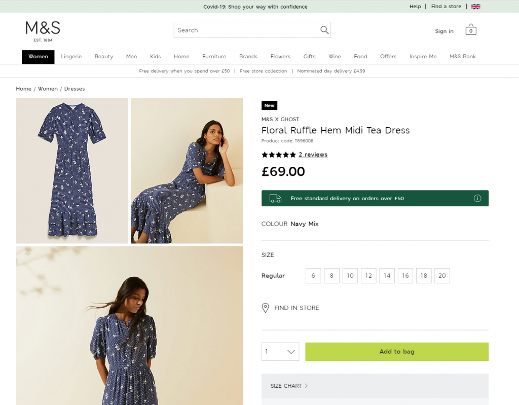
Product page first-screen view on Marks and Spencer: a combination of several photos shows the item separately and on the model
A good rule of thumb? The cheaper the item, the less convincing it needs. The more expensive or unusual, the more visual reassurance you should provide. Sell a $5 mug? Static photos are fine. Sell a $1,500 sofa? Time to get the film crew.
Oh, and optimize those images. No one’s waiting for your 8MB TIFF to load. Speed = UX = better SEO = more conversions.
Product page for the niche brand of underwear, using photo demonstration on model
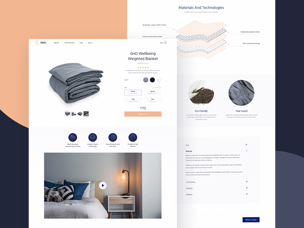
The product page of the GNO Blankets website uses video demonstration and graphics with detailed demonstration of product layers.
A creative product page concept for a website selling niche accessories applies special realistic effects to the functionality of a model choice.
The pet shop website uses video demonstrations of the items as a convincing way to see how the product works in the environment and set the needed emotional connection.
2. Write Descriptions People Actually Want to Read
Here’s a hot take: users do read. Just not if you’re boring.
When they’re about to spend money, people want answers:
- What is this?
- What does it do?
- Why should I care?
- Will it fit/work/look good?
So skip the marketing fluff (“a revolutionary new approach to hydration”) and get to the point. Use language your audience speaks. Be clear. Be useful. Be a little funny if the brand allows it.
And when you’re tempted to explain in 200 words that your jacket has an inside pocket… maybe show a photo of someone slipping a passport into it instead.
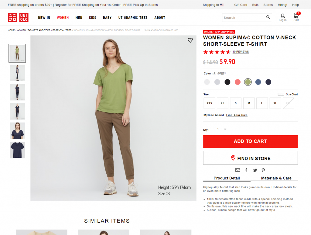
Product page first-screen view on Uniqlo: the page features a concise and informative description of the item and puts the details on materials and care in another tab, both in the pre-scroll area of the page.
The product page for the cosmetics website uncovers the information about the product gradually, with the core data above the fold.
3. Make CTAs So Obvious They Can’t Be Missed
UX design rule for product pages: if someone has to look for the “Buy Now” button, you’ve already lost the sale.
Your call-to-action button—whether it says “Add to Cart,” “Buy Now,” or “Get It”—should be impossible to miss. Consistent color, visible contrast, and present above the fold. CTA design is not the time to be subtle.
Misplaced, hidden, or low-contrast CTAs are silent killers of conversion. Don’t let them sneak in.
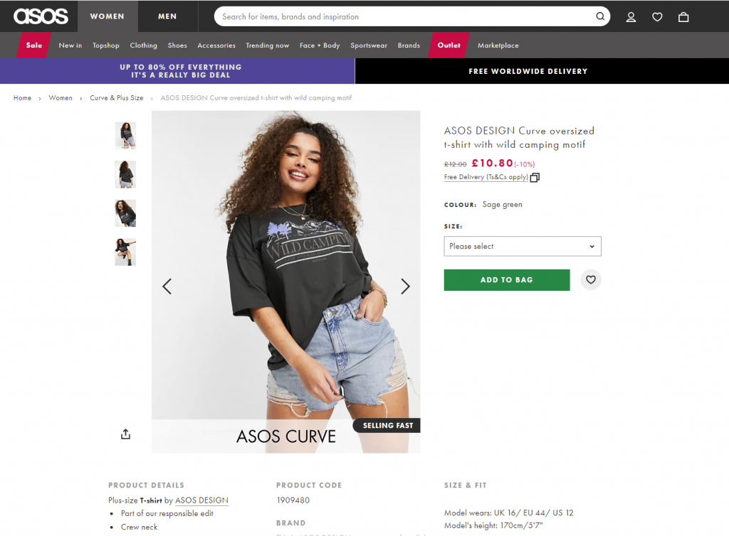
ASOS product page first screen: the CTA button differs from everything else on the page due to color contrast and is instantly noticed in the light, airy layout.
4. Keep the Focus on the Product, Not the Kitchen Sink
Ever designed a page and thought: “Let’s include everything! It’ll be so helpful!” And then watched users bounce because they couldn’t find the basic price?
Yep. We’ve been there.
There’s a fine line between informative and overwhelming. UX on product pages is about hierarchy—what people need to see first, what can wait, and what’s better off in a collapsible section or modal.
Use the inverted pyramid model: show the essentials up top (name, price, CTA, image), and stack deeper info (specs, care instructions, reviews) below. Respect short attention spans—but reward those who scroll.
Creative product page design for a niche perfume website focuses on item presentation amplified with an atmospheric video background and special effects.
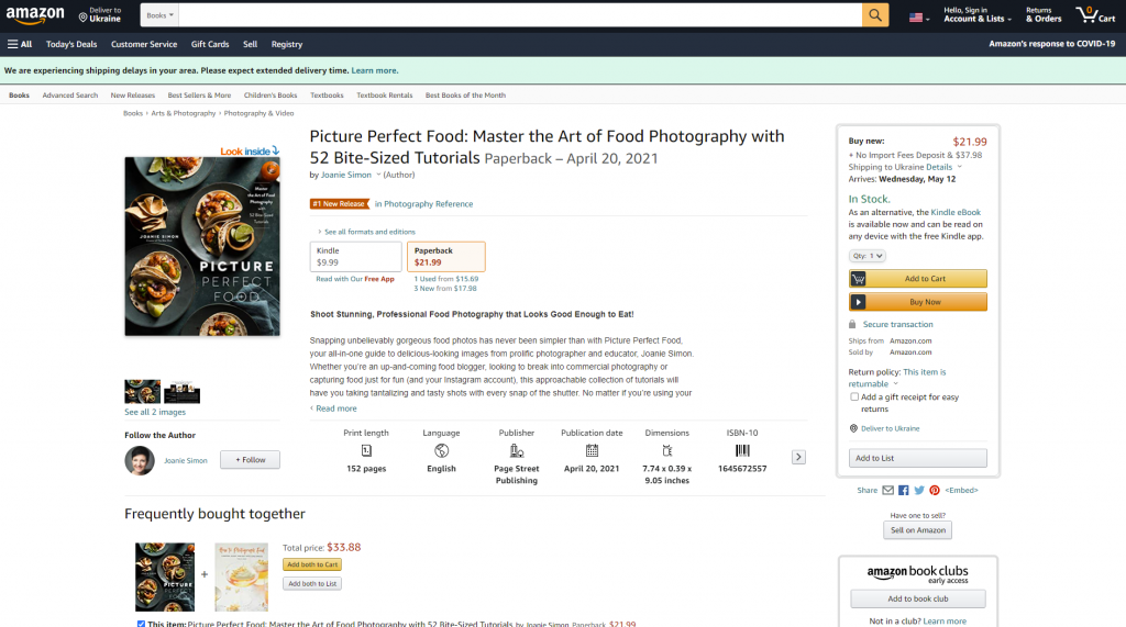
The product page on Amazon is based on the principle of the inverted pyramid: this above-the-fold view shows the core information and functionality buyers want and need to know about this type of product first of all. Engaging social proof is marked by the label of #1 New Release and shows what other products are often bought together with this one.
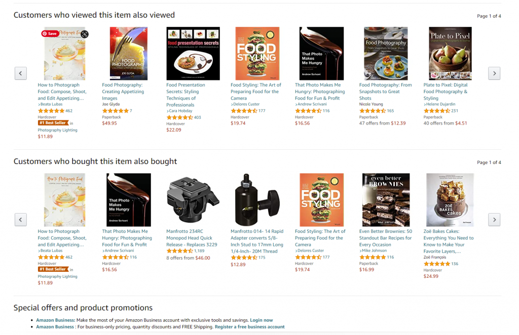
The second screen uncovers more about the actions of other customers interested in this theme: two sections, visually attractive due to the focus on product images, uncover other items customers view or buy.
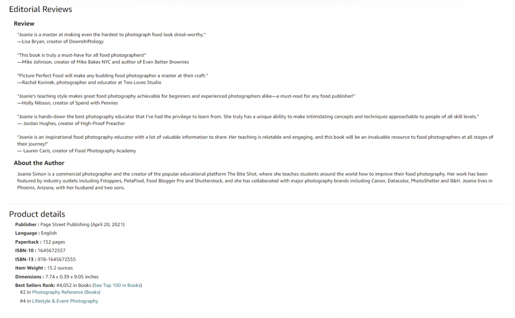
And only after that, when scrolling further, users can find extended information, editorial reviews, etc., based on text without visuals.
5. Design for Intuitive Navigation
Users should never ask, “Wait, can I click this?”
On a high-converting product page:
- Everything clickable should look clickable
- The cart icon should show item count in real-time
- Breadcrumbs should help people backtrack if needed
- The “search” icon is a magnifying glass. Not a flower. We’re not reinventing the wheel here.
Bonus: clear footer nav and smart use of visual dividers make skimming easier and build trust. Every tiny UX improvement counts in e-commerce.
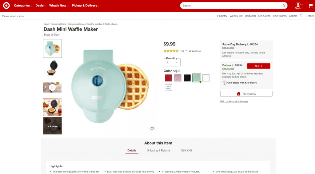
Product page first-screen view on Target: multiple photos of the item, both clean and integrated into the environment, clear and instantly noticeable controls for choice of color, the obvious search field in the header, breadcrumbs creating the secondary navigation level, social proof in the form of ratings and questions, and clear call-to-action element.
6. Consistency Is Invisible Until It’s Missing
Consistency in UX is like typography: you only notice it when it’s bad.
Internally, your product pages should have uniform behavior—buttons, layouts, transitions. Externally, they should match what users expect across the web. (Yes, even if you hate the cart icon.)
Predictable interfaces reduce cognitive load. When you change the rules, you slow people down—and slowing down kills conversions.
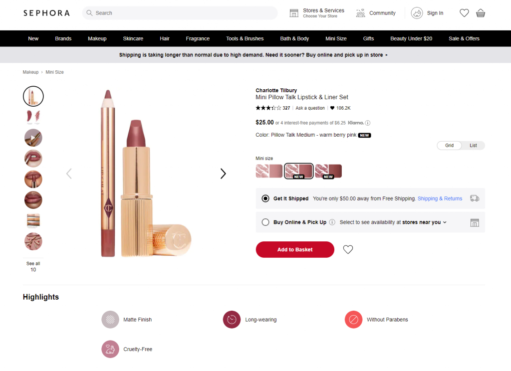
Sephora product page first-screen view: expected navigation in the website header, easily recognizable for e-commerce shoppers, super obvious call-to-action button, arrows used as the clearest directional cues for most users around the web, focus on the item presented in different visuals and highlights important and influencing decision-making for the target audience.
7. Use Familiar Patterns
We all love originality. But when it comes to UX for e-commerce websites, “creative” can sometimes be a trap. Users expect the magnifying glass to mean “search.” They expect the cart in the top right. They expect reviews under the product description.
These aren’t bad habits. They’re helpful ones. Break these patterns only if you’re ready to test—and if your users are ready for the change.
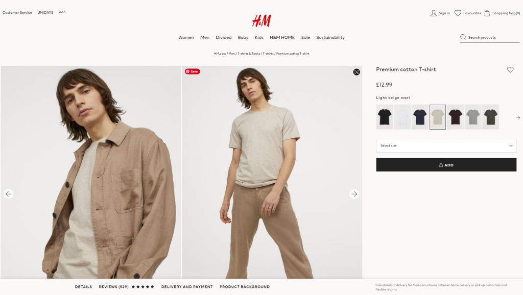
H&M product page design is based on a minimalist approach: the first-screen view is designed around prominent images, model choice options, elegant and readable basics (product title, color name, and price), a heart icon as a well-recognized visual trigger of adding the item to favorites and a noticeable CTA button.
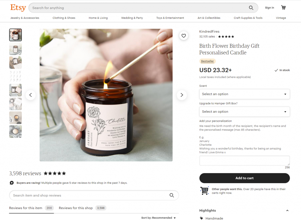
Product page above-the-fold view on Etsy marketplace
8. Make It Scannable and Skimmable
People don’t read product pages line by line. They scan for info: Is it in stock? How much? Is there a size guide?
Design your product page layout with that in mind:
- Strong headings
- Short paragraphs
- Icons with text (for quick recognition)
- White space to avoid visual fatigue
Think of it like a great restaurant menu. Easy to skim, easy to choose, no headache. If your product page reads like fine print on a prescription bottle, it’s time to rethink.
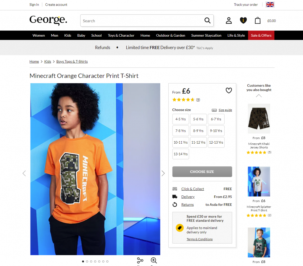
First-screen view of the product page on George: due to the light, airy layout, the page looks clean and simple, but at the same time it’s highly informative even at the stage of fast scanning.
Dark, elegant, and catchy product page for the neon signs shop, balanced and scannable
9. Minimize Clicks (Because Effort = Drop-off)
Every extra click is a chance for the user to bail. Make common actions like selecting a color or quantity as effortless as possible. If there are only three size options, don’t hide them in a dropdown. Show them upfront.
Minimizing clicks isn’t about dumbing things down—it’s about respecting your user’s time. And no, that’s not just polite UX. That’s good business.
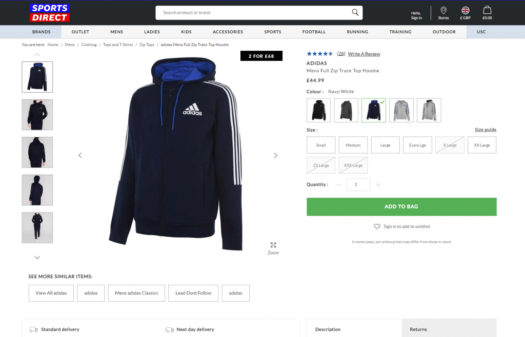
Product page first-screen view on Sportsdirect website: no information is hidden in dropdown menus, so it’s super easy to scan the availability of models and sizes, the CTA is seen immediately, the number of items is changed easily by typing or manipulating plus/minus controls, arrows show how to see more images, and breadcrumbs help to jump back to choosing other items easily.
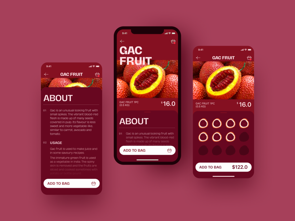
Exotic Fruit e-commerce app uses a tab for adding the needed number of products with a simple tap.
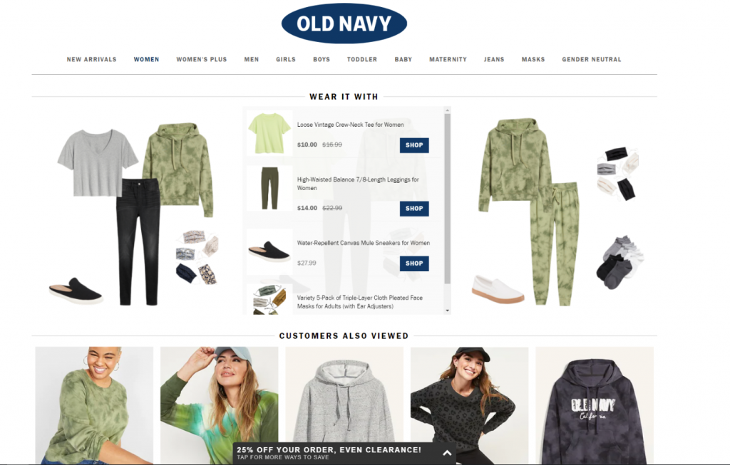
The OldNavy product page integrates the section of offered combinations with other items from the website, and it is not just an image to get buyers inspired: on hover, the shopper gets the list of links to items with basic information, which enables them to easily get engaged in further shopping and makes the relevant product accessible quickly.
10. Use Social Proof
Reviews matter. Not just for validation, but for relatability. Seeing that someone else wore the jeans, ordered the sushi set, or installed that complicated-looking projector gives others permission to do the same.
Social proof builds trust—and compensates for the fact that, online, you can’t touch or try. Sprinkle in:
- Star ratings
- Customer quotes
- Verified badges
- UGC (user-generated content)
Good reviews can answer hesitations before the buyer even articulates them.
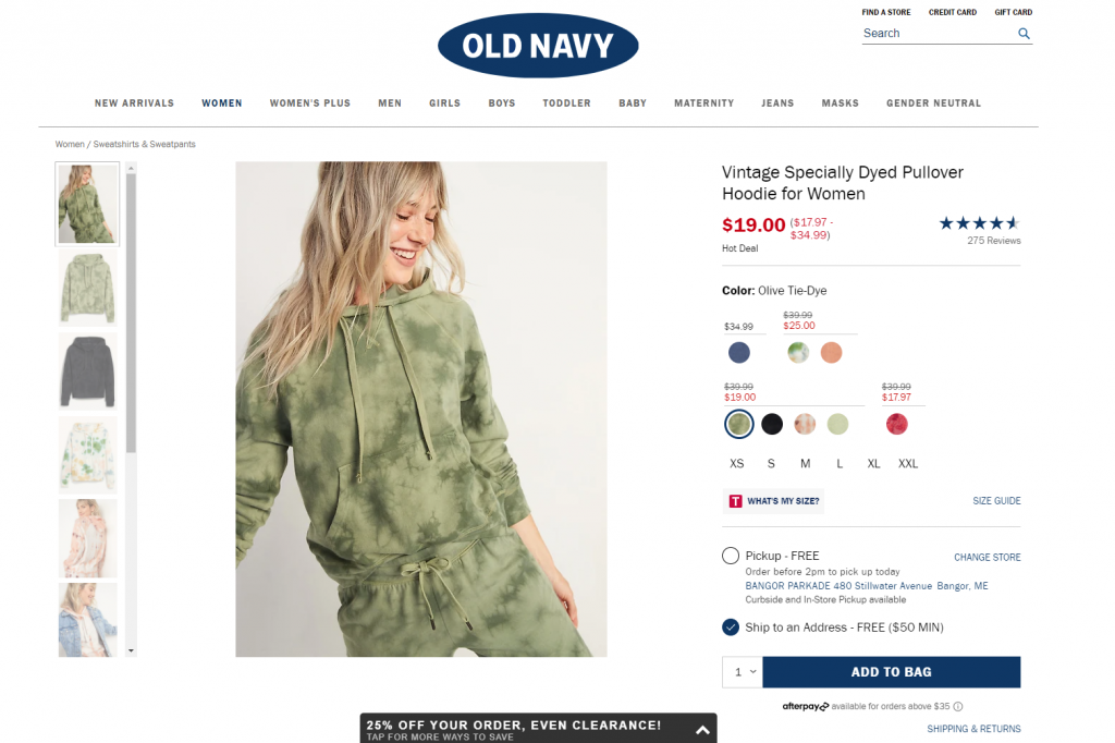
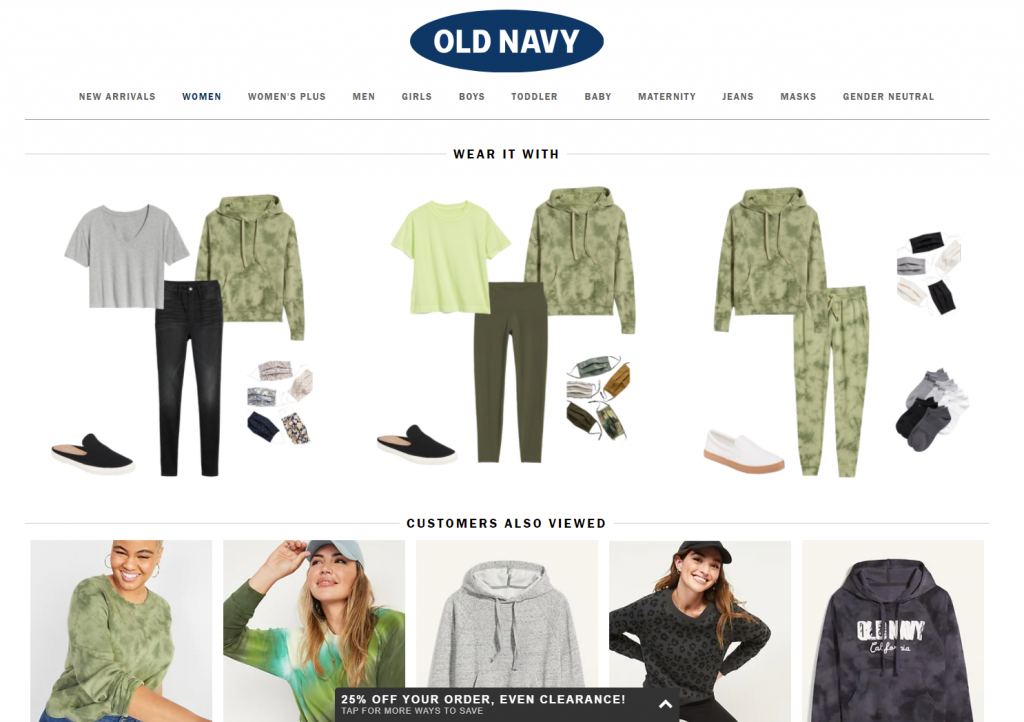
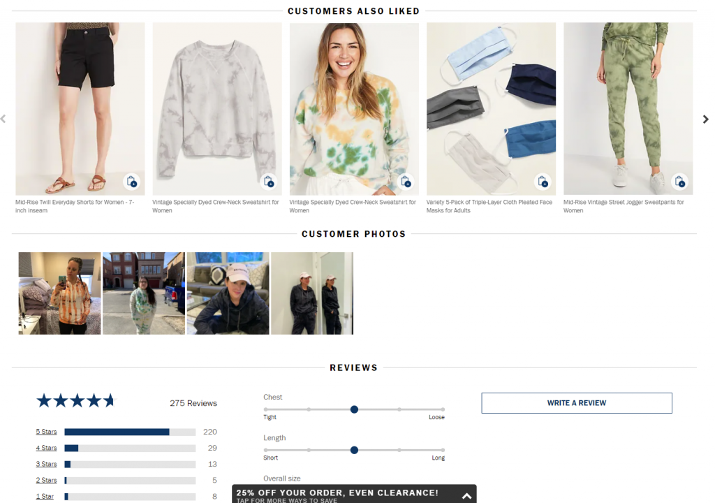
Here’s the product page on OldNavy: the first screen view, among all other details, includes the social proof showing the rating of the item with the number of people that marked it. Scrolling down, buyers are getting even more engaged: except for relevant products to combine this item with for the perfect outfit, the page uncovers the relevant items other customers looked at and liked, and further customers’ photos and details on reviews.
11. Embrace Interactivity (aka, Let People Play)
Today’s product pages are getting smarter—and more fun.
- Virtual try-ons
- Custom pizza builders
- Furniture previews in your actual room
Interactive product page features build engagement, clarify doubts, and create a memorable experience. Personalization tools (like choosing fabric color, engraving text, or bundling items) are also fantastic conversion boosters.
And no, these aren’t gimmicks. They’re UX upgrades grounded in user psychology and behavior. If you can make people feel ownership before they buy, you’re halfway there.
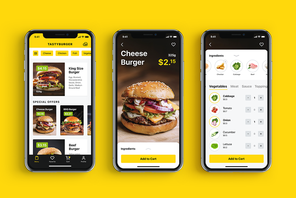
Tasty Burger app allowing for creating custom burgers to buy
12. Prioritize Mobile-First UX Design
Mobile still reigns. Your product page UX design should scale beautifully from desktop to tablet to phone. That includes:
- Tap-friendly buttons
- Readable text
- Images that load fast and zoom cleanly
- Menus that don’t feel like escape rooms
Bonus points if the entire shopping process—from browsing to checkout—feels better than scrolling Instagram. Because, in reality, that’s your competition.
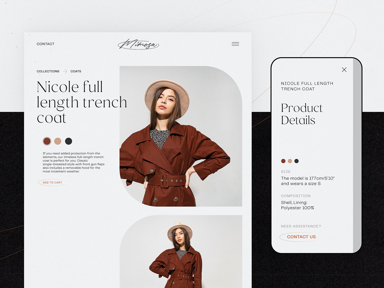
Minimalistic product page for a fashion brand e-commerce focused on photos, easy choice of color, and responsive to be used on any device
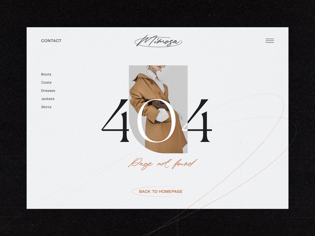
13. Handle 404s with Grace
Yes, even your error pages need UX love. When a product is out of stock or a link is mistyped, don’t dead-end the user. Offer:
- Similar items
- Popular categories
- A lighthearted message that feels human
It’s a small touch—but one that turns frustration into exploration. And sometimes, that’s all it takes to save a sale.
Final Thoughts
Designing e-commerce product pages isn’t about throwing shiny features at a screen. It’s about guiding people through a decision with clarity, ease, and trust. It’s about using everything—from button size to white space to familiar icons—to remove doubt and add confidence.
And yes, the product matters. Even the best UX can’t fix a bad product. But a good one? It deserves a page that makes it shine.
So give it one.
Recommended Reading
Don’t stop here. Here are some reads that go further into the weird, wonderful, and wildly practical world of digital product design:
UX Design for E-Commerce: Principles and Strategies
11 Profitable Strategies for E-Commerce UI Design
The Role of Branding in UI Design
Business-Oriented Design. Know Your Target
Short but Vital. Key Abbreviations in Design for Business
Business Terms in Design for E-Commerce. Sales Basics
Two Types of User Motivation: Design to Satisfy
5 Basic Types of Images for Web Content
Web Design: 16 Basic Types of Web Pages