Time for a new design case study, and this time it’s all about ecommerce and web marketing. Today we are unveiling the creative process on branding and web design our team made for GNO Wellbeing, the company producing and selling special weighted blankets that improve the quality of sleep.
The design team for the project included Vladyslav Taran, Ksenia Lashko, Vlad Radionov, Marina Solomennikova, and Max Dreshpak.
Project
Logo, identity, and ecommerce website for the brand of weighted blankets
Client and Story
It’s not a secret that healthy sleeping plays a huge role in people’s physical and mental health, productivity, and creativity. GNO Wellbeing company produces special and well-checked heavy blankets that present a reliable and comfortable way to wipe out anxiety and racing thoughts and sleep better.
First, GNO weighted blankets were sold only via Amazon, and people bought the product quite well there. However, to reach a wider audience and increase profits, GNO founders decided to build a solid brand and create an ecommerce website to expand their sales. As well, they strived for a new identity that would be both modern and flexible for various marketing goals.
Logo Design
Traditionally one of the core tasks in the branding design process is creating a logo, and this case was not an exception. The client gave a clear direction set behind the brand message: GNO Wellbeing is the brand that helps achievers to get a good sleep that helps them to achieve their goals. They wanted the logo to be fun, modern, and youthful and wished to think in the direction of a symbol logo rather than a wordmark.
As usual, the logo design process started with the creative search for a general visual idea. What the designer had to consider was the flexibility of logo usage for a diversity of surfaces, from blankets and packaging to website and social networks.
The first set of concepts played around letter variations.
Here’s the symbol featuring the letter G that covers itself. The curves and rounded corners give a cozy feeling. In addition, the covering gesture corresponds with protection from anxiety and sets the visual association with the blanket.
![]()
Logo concept
Label concept
Bag design concept
Another concept presented a curvy letter G with the wavy ending that refers to the flow of blanket when covering someone.
![]()
Logo concept
Label design
Bag design
One more logo design concept was inspired by the folds on the blanket. Also, it referred to ripples on the water which is associated with calmness.
![]()
Logo concept
Label design
Bag design
From this iteration, the style of the first variant was chosen for the further creative search direction to continue and dive deeper into searching a proper symbol that would be both attractive and informative.
The new set of logo concepts offered the variety of symbols that could be developed and polished for the final brand sign. The set included both color and outlined options; most variants featured recognizable symbols such as a sleeping cat, moon, dreamcatcher, and some more abstract signs.
![]()
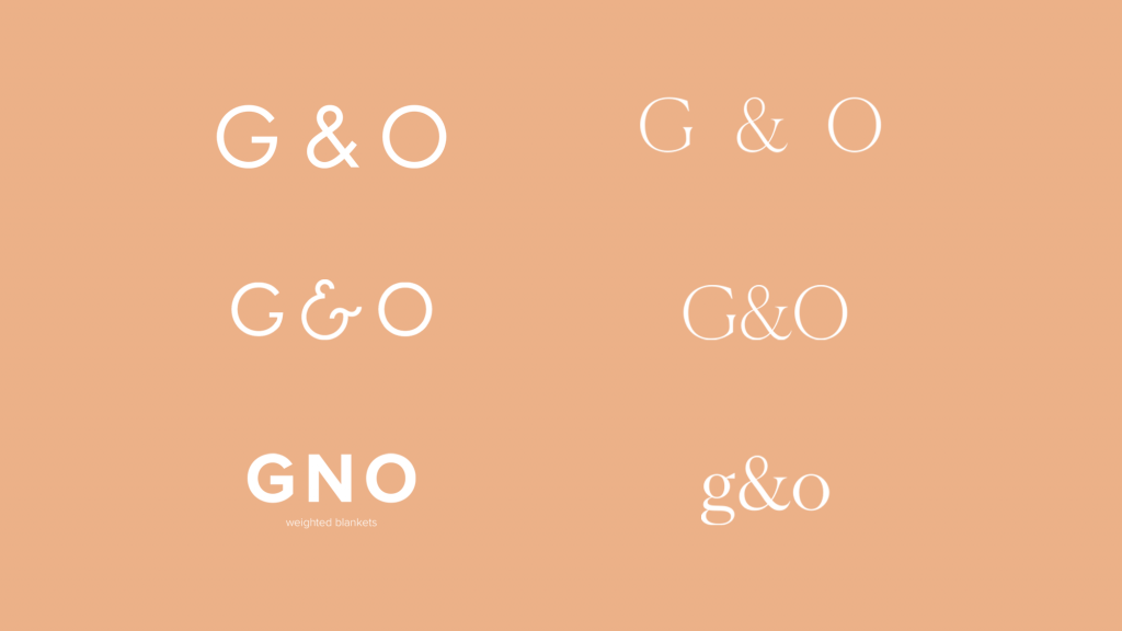
In addition, to get another angle of view, the graphic designer made the set of options for typography logos in different styles, from bold and minimalist to beautifying serif.
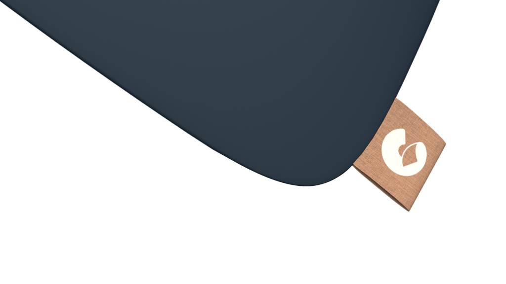
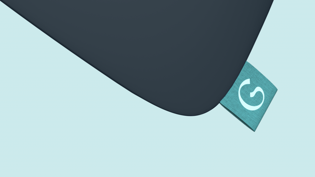
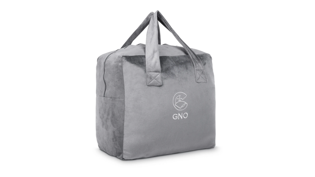
Having considered all the options, the symbol featuring a peacefully sleeping and smiling moon was agreed upon as the most effective for the brand goals.
So, this option was further developed as a brand sign for different goals. The choice of color had to be made, as well the designer offered two options for each color solution, outline and filled.
![]()
The choice of visual concept was made upon a beige outline logo symbol (variant 1) accompanied with a solid and simple typography part.
![]()
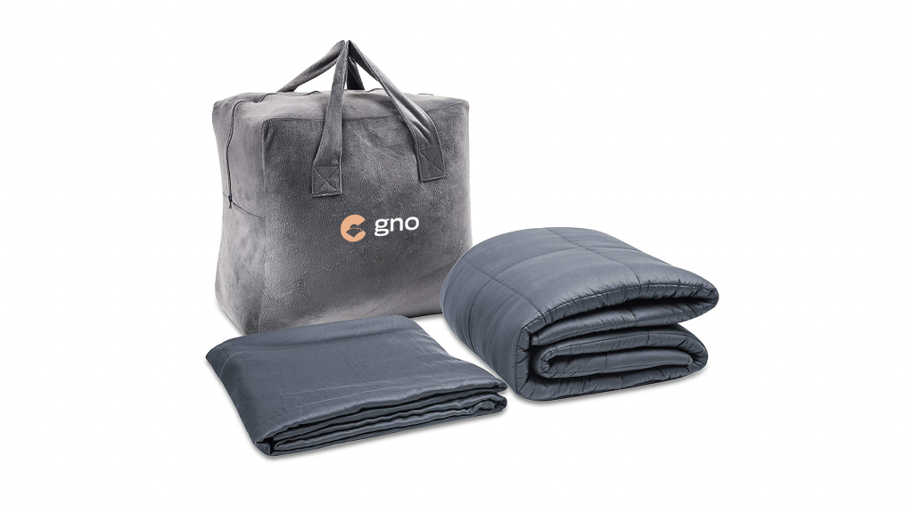
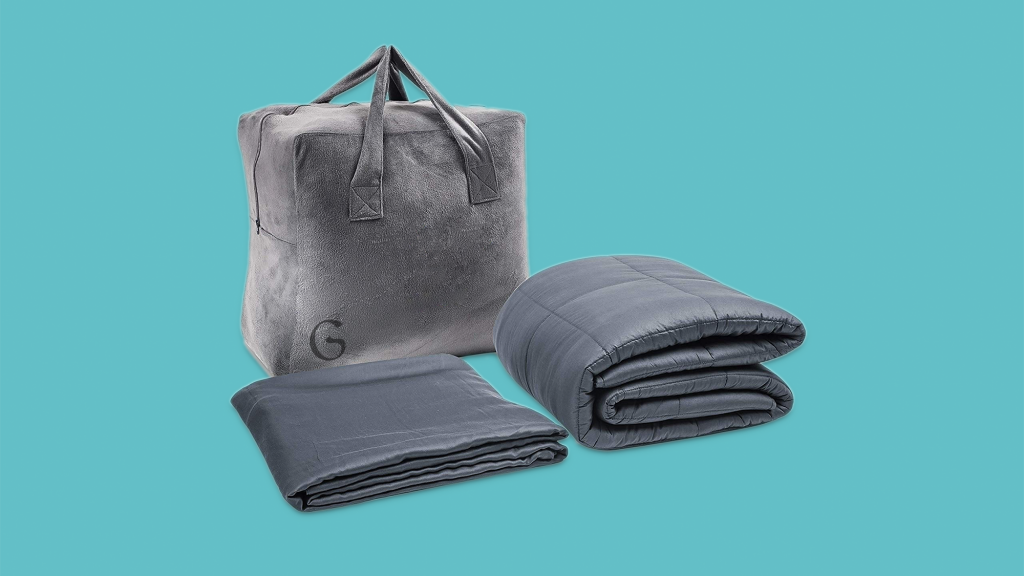
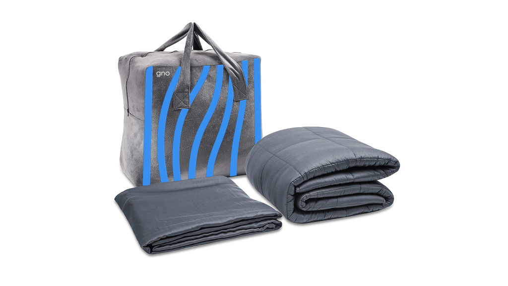
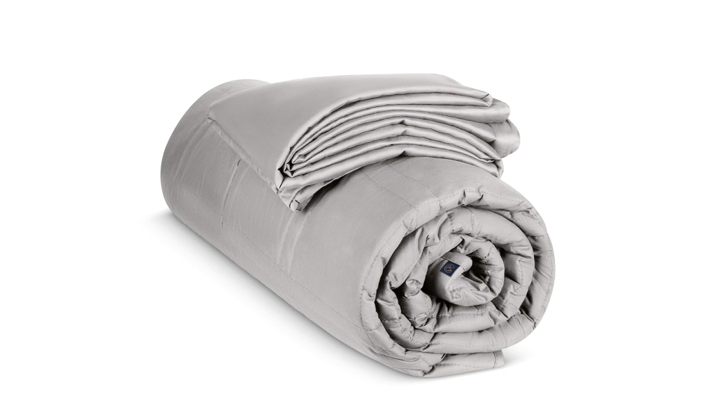
Then the approved logo was applied to the branded packaging and blanket label.
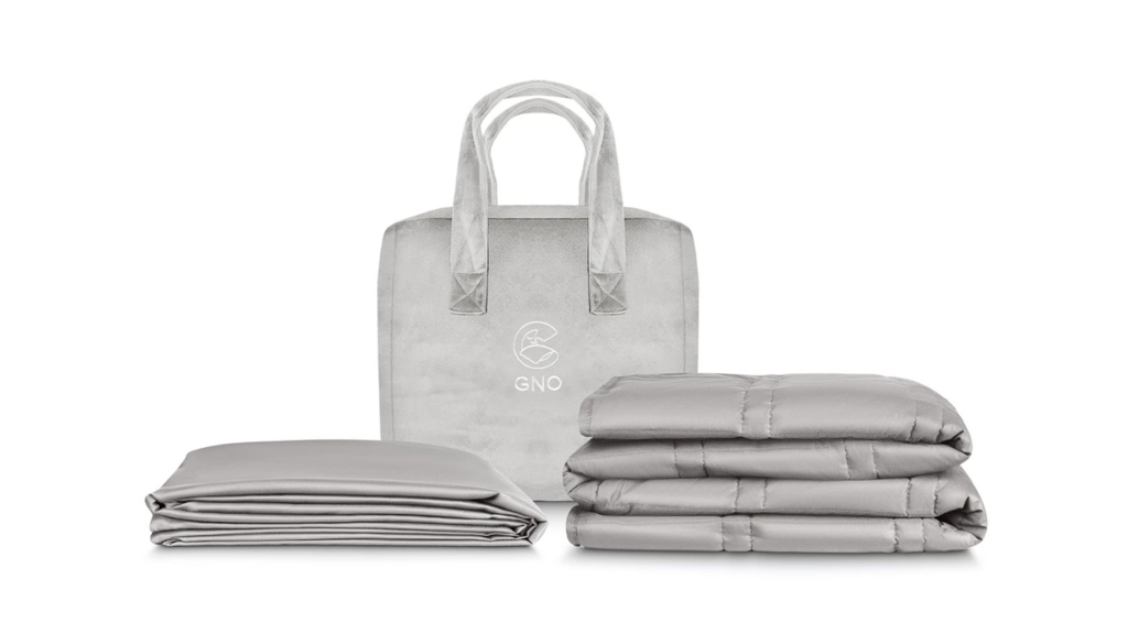
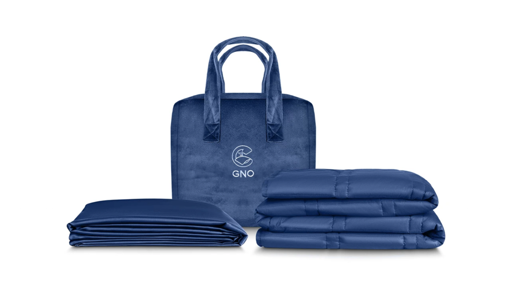
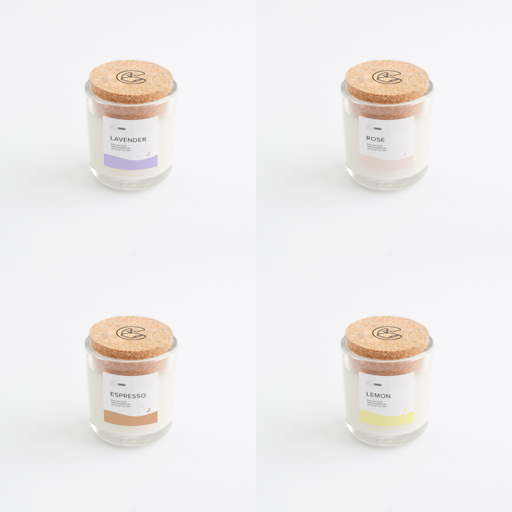
One more aspect to cover for the identity design was packaging solutions for branded candles. The minimalist and elegant solution for the candle with a branded cork featuring the outline logo and the readable label that used color marking for different scents and clear typographic hierarchy to let the buyer quickly skim the information.
Another point to consider was updating and improving the Amazon presentation as the company still continues using this sales channel as well. So, it was important to make the brand presentation consistent everywhere. We created new infographics for that goal that supported the design solutions for identity and web design.
Web Design
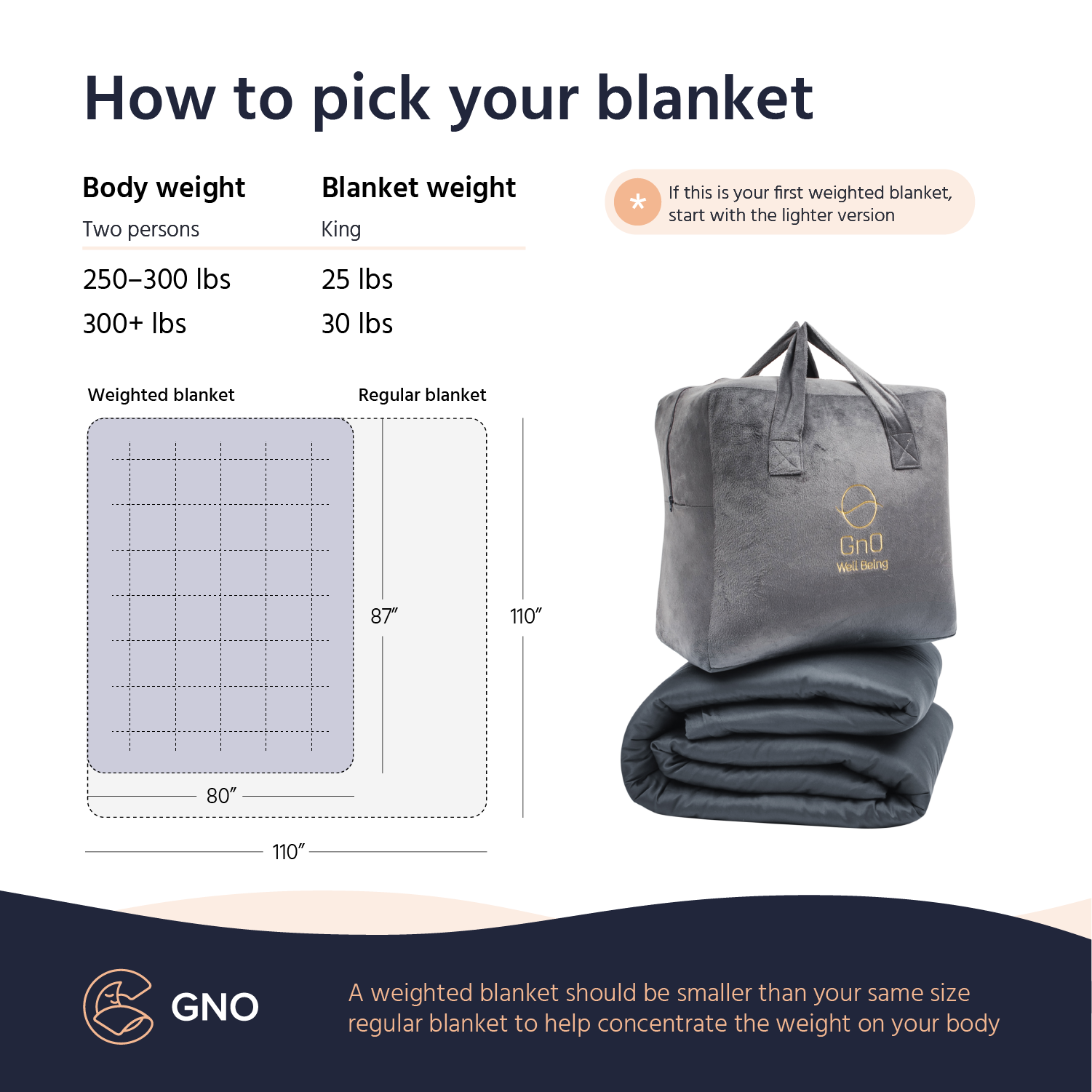
The website design for the brand had to keep visual consistency and harmony with the identity concept, let users quickly catch the message, review the benefits of the product, and make a purchase.
The web pages feature the well-balanced combination of airy light and deep dark backgrounds, high-quality visual content demonstrating the product outside and inside, clear visual hierarchy, readable fonts, and digestible information blocks make the website scannable and eye-pleasing.
The website uses the sticky header to make the core links and cart available from any point of interaction.
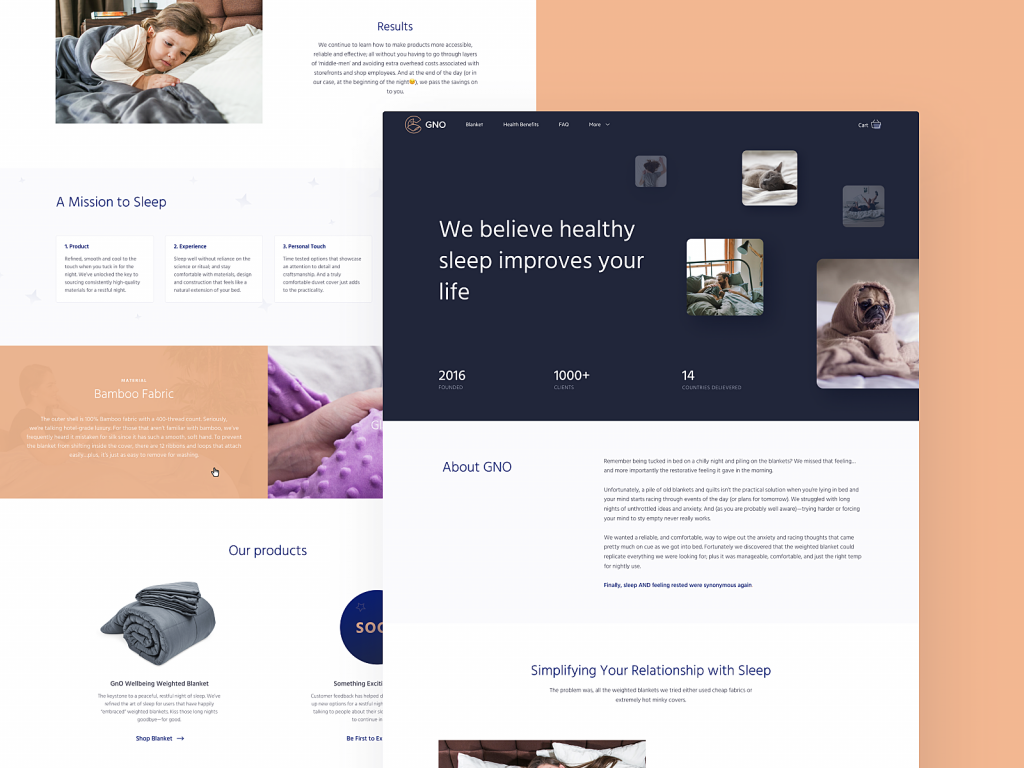
Here’s a look at the home page. Its mission is to inform visitors that weighted blankets are not just regular blankets, they help people to get over sleep disorders and reduce anxiety. To quickly demonstrate that benefit, designers integrated custom illustrations that add a good mood and emotional appeal to the website. The information is divided into clear digestible blocks in which background color works as a visual divider. The CTA button in the above-the-fold area echoes the color of the logo.
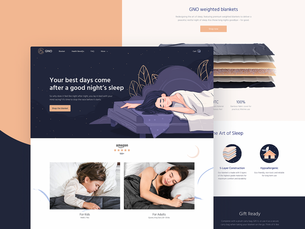
Home page for GNO Wellbeing website
Smooth scroll animation makes the interaction even more dynamic and attractive.
Except for the hero illustration featuring the peacefully sleeping woman and instantly setting the needed mood and atmosphere, there were some more custom 2D graphics integrated into the layout: a lovely sleeping cat character featured on the popup for subscribers and the section of reviews and original icons reflecting the benefits of the product.
![]()
Original icons visualizing the product benefits
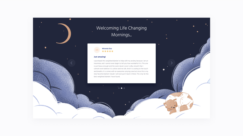
The reviews section integrated into a cozy night-theme illustration featuring a cat character.
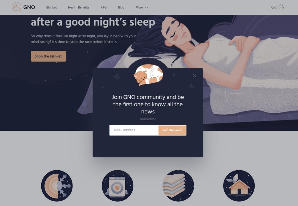
The Subscribe pop-up window with the custom illustration of a sleeping cat
The product page gives all the details about the product, includes the video presentation, and allows for choosing the needed blanket and adding it to the cart. The light background, balanced and thoughtful use of negative space, instantly noticeable CTA button and highly readable font create the solid visual hierarchy of the page and make it easy to scan and interact with.
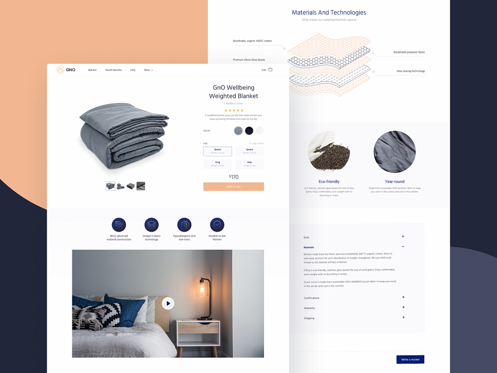
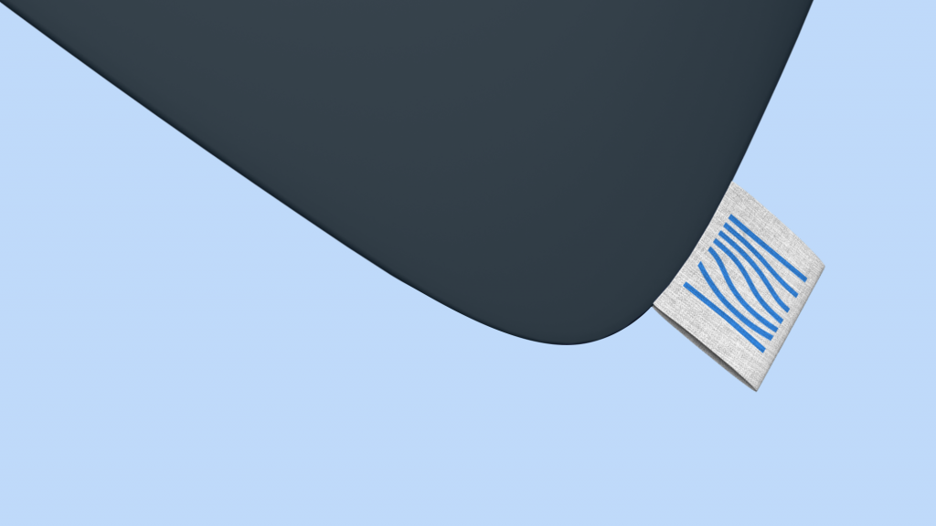
The GNO blankets are made with premium materials. It’s important to tell customers about it, but it’s even more effective to show it. So, a special 3D illustration of the blanket layers was created to give an impressive visual presentation to that aspect.
The About page also uses contrast blocks to present the pieces of content. In the pre-scroll area, it gives a quick message about the brand message with a clear and prominent tagline in combination with the important infographic-style numbers about the company and lovely photo content setting the needed theme. This block uses the dark background making the photos look deeper and the tagline even more prominent. The next block uses the light background, first of all for the sake of readability as it presents the bigger block of text telling about the brand.
So, the website for GNO features three different types of visuals: photos, 2D illustrations, and 3D graphics, harmonically combined and balanced together.
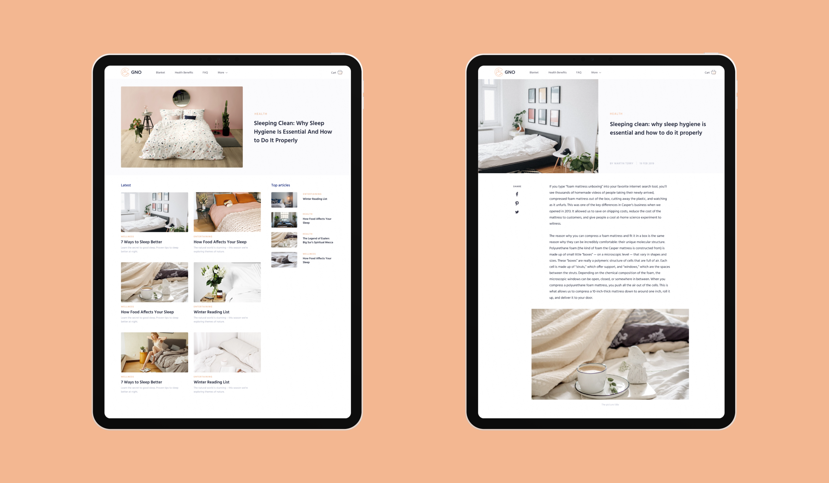
Blog pages designed for the website also feature the same approach: they are airy, calm, and highly readable, with the careful selection of photo content that sets the consistent visual atmosphere.
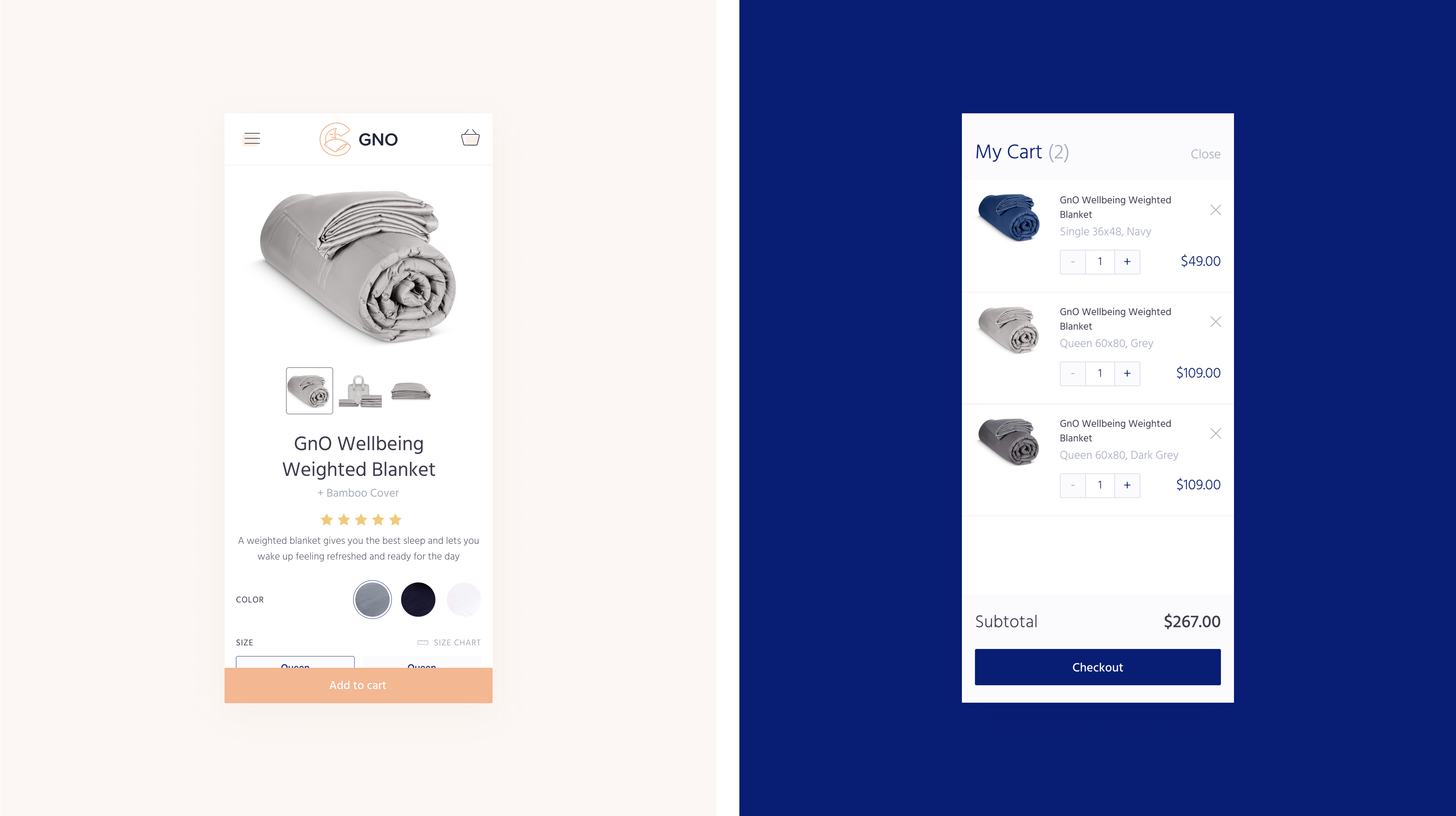
To make the website usable from any device, the team made the mobile adaptation of the pages considering the peculiarities of mobile interactions.
In general, that was the case of tight and fruitful collaboration with the stakeholders to clarify the business goals and finding ways to reach them by means of design appealing to the target audience and unveiling the benefits of the product.
Welcome to check the GNO Wellbeing website live.
More Design Case Studies
Designer AI. Dashboard and Graphics for Fashion Service
Pazi. UX and UI Design for Vehicle Safety Mobile App
CashMetrics. UX Design for Finance Management Service
Bitex. UX Design for Stock Analysis App
Inspora. Brand and UI Design for Virtual Stylist
Nature Encyclopedia. UI Design for Education
Perfect Recipes App. UX Design for Cooking and Shopping