When you start working on a new application as a UX designer, you never know beforehand what knowledge you might need this particular time. Of course, first of all, that’s knowledge of the various platforms, understanding the general principles of design, layout rules, the ability to design a complex user architecture, etc. But sometimes it may be completely unexpected things, for example, the knowledge of the cultural characteristics of an ethnic group or the understanding of Boolean algebra and the fundamentals of circuitry. That’s what happened in one of our recent UX design projects we will unveil in today’s case study.
Project
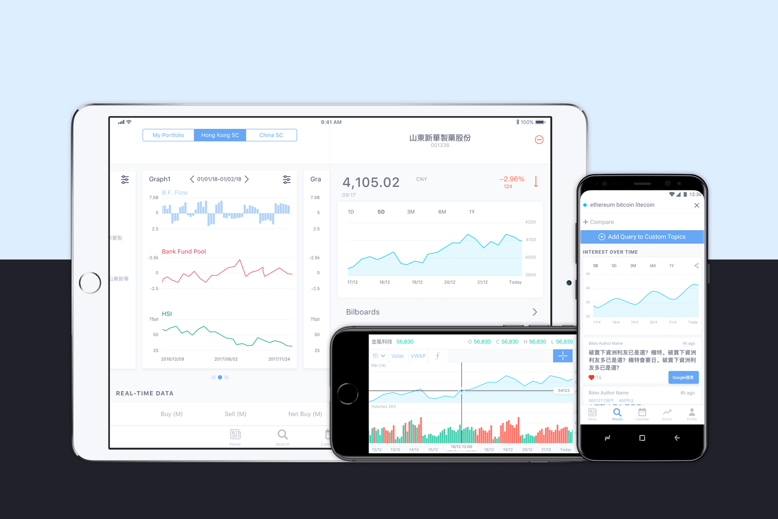
The task was set to make a complete redesign of a live application Bitex oriented initially to the Chinese market. The application is an aggregator that collects data from world exchanges, processes it, builds the necessary charts and diagrams and displays this information in a user-friendly and digestible way. The main goal of Bitex is to help the trader decide on investments.
The main shortcomings in the customer’s opinion were:
- non-compliance with iOS guides
- not successful design at the UX stage
- congestion with graphical elements and, as a consequence,
- high threshold for the user’s entry.
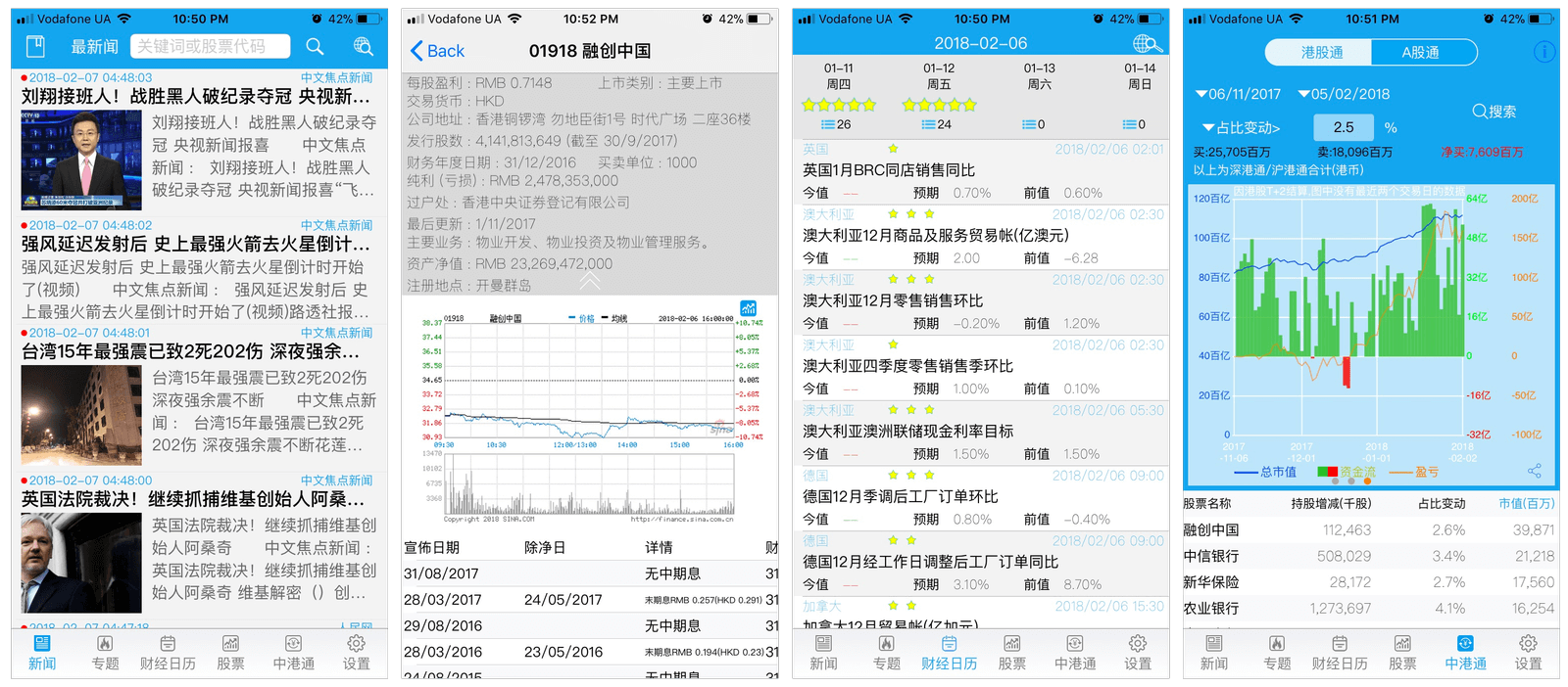
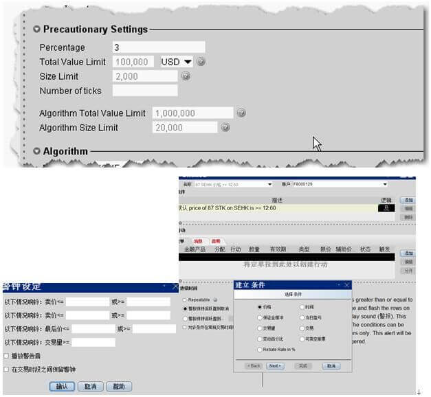
It looked like this:
The designer for the project was Sergey Kucherenko and the experience obtained in the process was really an unforgettable challenge for all the team.
UX Design
Solid architecture is built on the well-done foundation. So, first of all, we decided to completely rework UX, starting from splitting data into logical blocks corresponding to the tabs and ending with the logic of plotting.
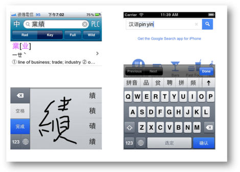
Already at this stage, we had to face the peculiarities of the visual perception of information by users from the countries of Asia. The fact is that many users from Asian countries believe that the more information is shown on the page, the better.
Some experts argue that this is due to the psychological characteristics of perception. Some say that these are cultural features that have remained since the low speed of Internet connection when users preferred to simply remember information, and later comprehend it.
Others explain it by the peculiarities of language and writing.
Check more on the issue of UX of Chinese websites in the articles here and here.
Whatever is the reason, we constantly had to make compromises regarding the ratio of the number of images and text, as well as the density of text layout.
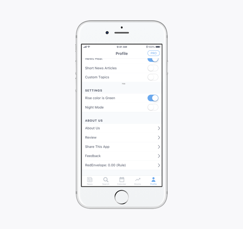
Also, an interesting feature was discovered in the subconscious perception of color coding. Here’s the simplest example: in Western resources about finance, the rise in the share price is indicated in green and the drop in red. Meanwhile, in Asian countries, everything is opposite. Since investors planned to enter the Western market, we were forced to add a switch “color growth price” to solve this problem.
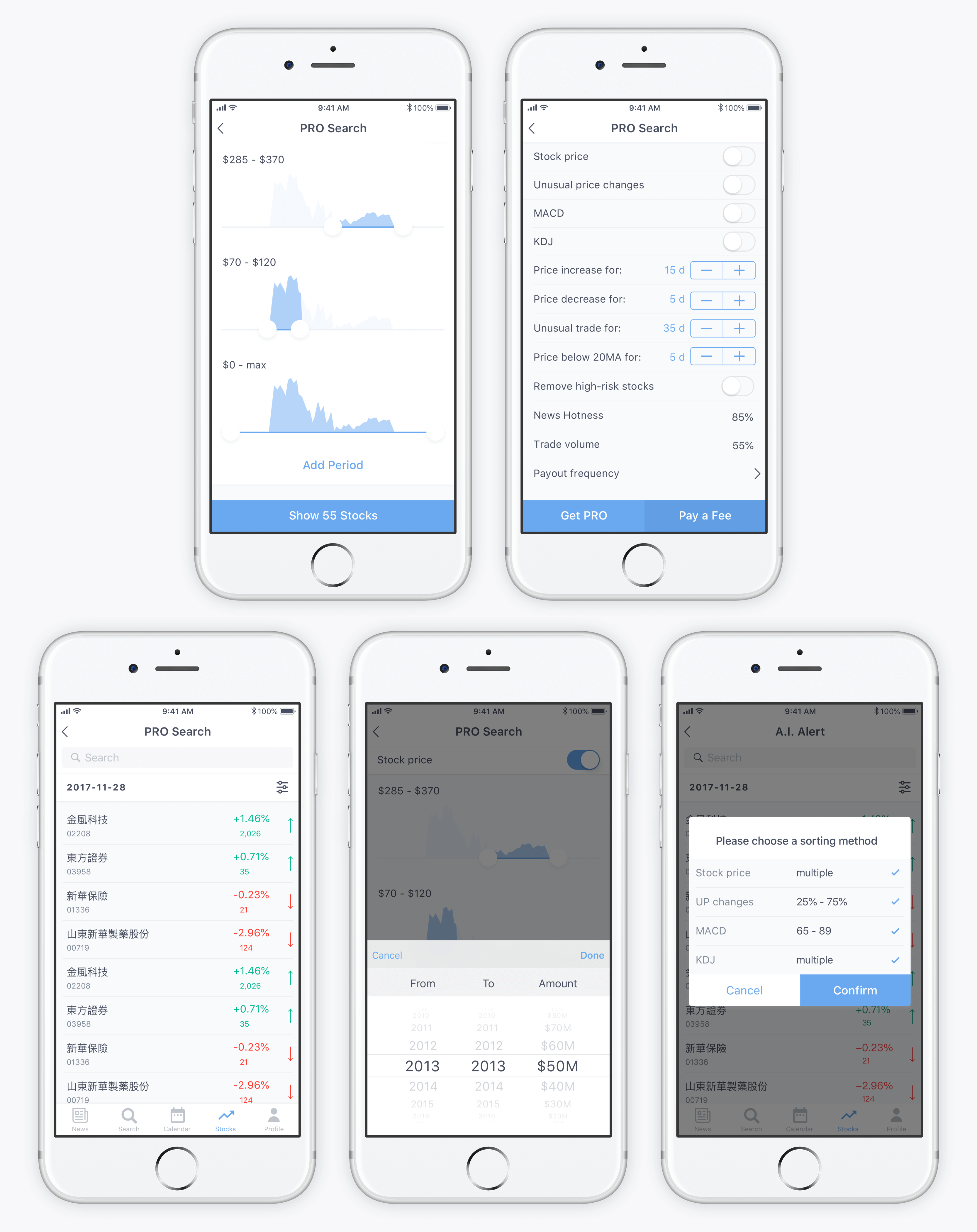
But the most interesting task at this stage was implementing a unique function that is a flexible filter that the user can fine-tune to achieve their goals. This filter consists of several simple characteristics and four characteristics that are specified by a range of values, whereby one characteristic can have any number of ranges that do not intersect with each other (from A to B, from C to D, etc.) Also, the range may not have a final point (from A to infinity). This issue was solved with the “Add Range” button and the “Maximum Value” formulations for the right slider of the slider.
But the main feature of the filter was that the user has the ability to put a logical “AND” or a logical “OR” between all characteristics of the filter (these operations are also called conjunction and disjunction, which are used in Boolean algebra.) Boolean algebra is the basis of circuitry and system engineering: without it, cybernetics would not be possible. Boolean algebra operates with only two concepts: “True” and “False.” Basically, it works the following way: if there is “AND” between all the variables in the equation, a user will receive the result of “True” only if each variable is “True.” In this particular case, the user will receive a list of only those stocks that meet all the specified parameters.
Logical “OR” will result in “True”, if at least one of the variables is “True”. In our case, the user will get a list of all the stocks that satisfy at least one specified parameter.
Summarizing, if you filter the result only by “AND”, you see a very short list of results. If you sort by “OR”, the list of results will be long. In fact, both options can be useful, but the customer has set the task to implement on the basis of iOS the ability for the user to apply both of these logical functions for any parameters.
Mathematically, the solution had already been programmed by Dr. Khan (he came up with the idea of creating this application). To illustrate his idea, Dr. Khan used screenshots of his working prototype.
Our task was to implement the principle using standard iOS controls and patterns understandable to ordinary users of mobile applications.
The solution was to initially filter out all the characteristics of the “AND” (i.e., to narrow the search circle to the user as much as possible). And after that, it allows the user to choose to which parameter “OR” is applied if the original result did not satisfy the request.
UI Design
For the visual performance of the application, we received clear instructions from the client to use light shades of blue and create a clean and accurate appearance for the application. The design had to use the minimum possible number of additional colors and images.
Our team decided to present two opposite color themes (light and dark) to choose from. But the customer liked both equally, so the dark theme was designed to be used as a night mode. In total, we collected 120 screens (60 for each version).
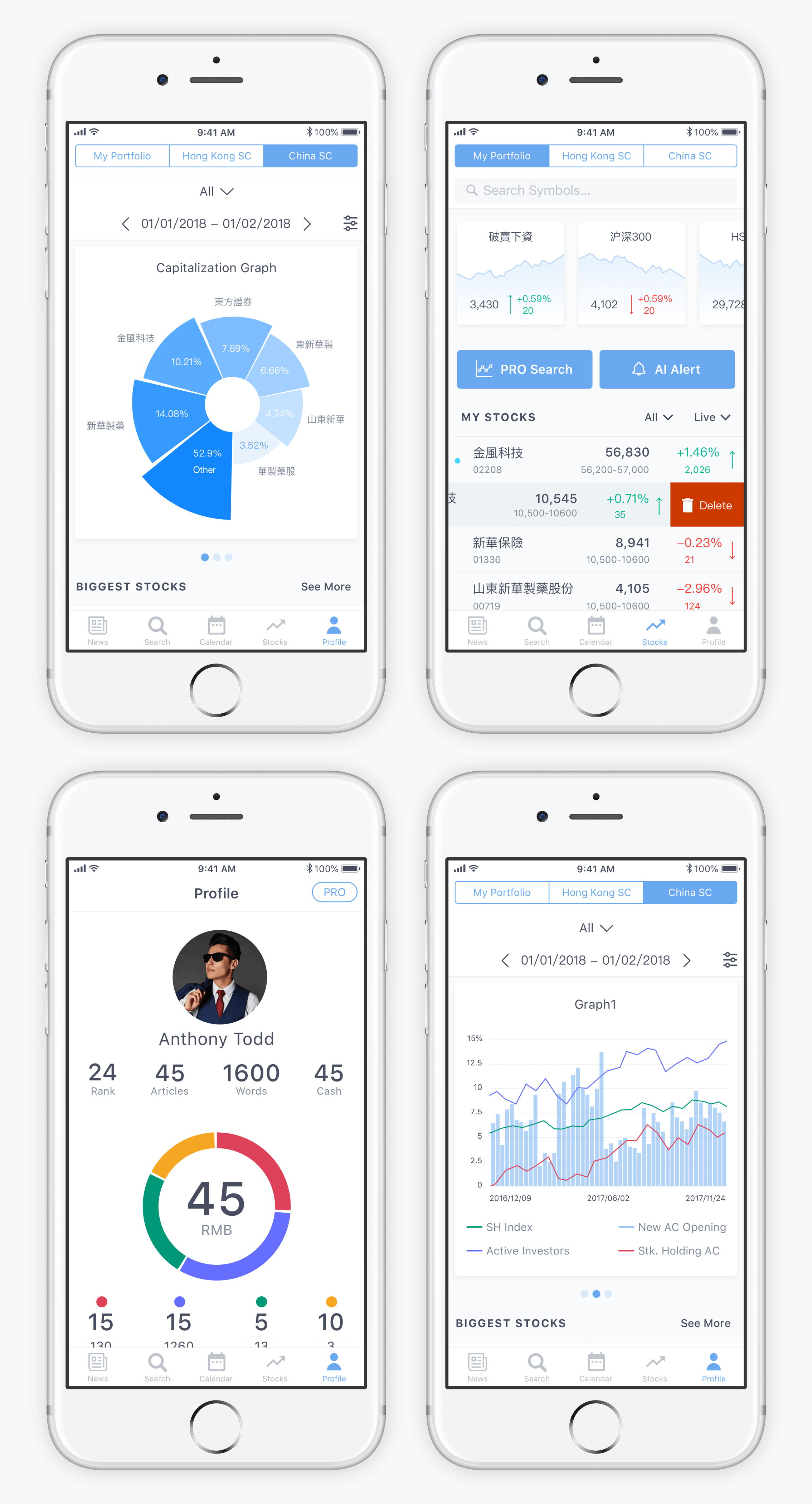
The UI concept based on the light background
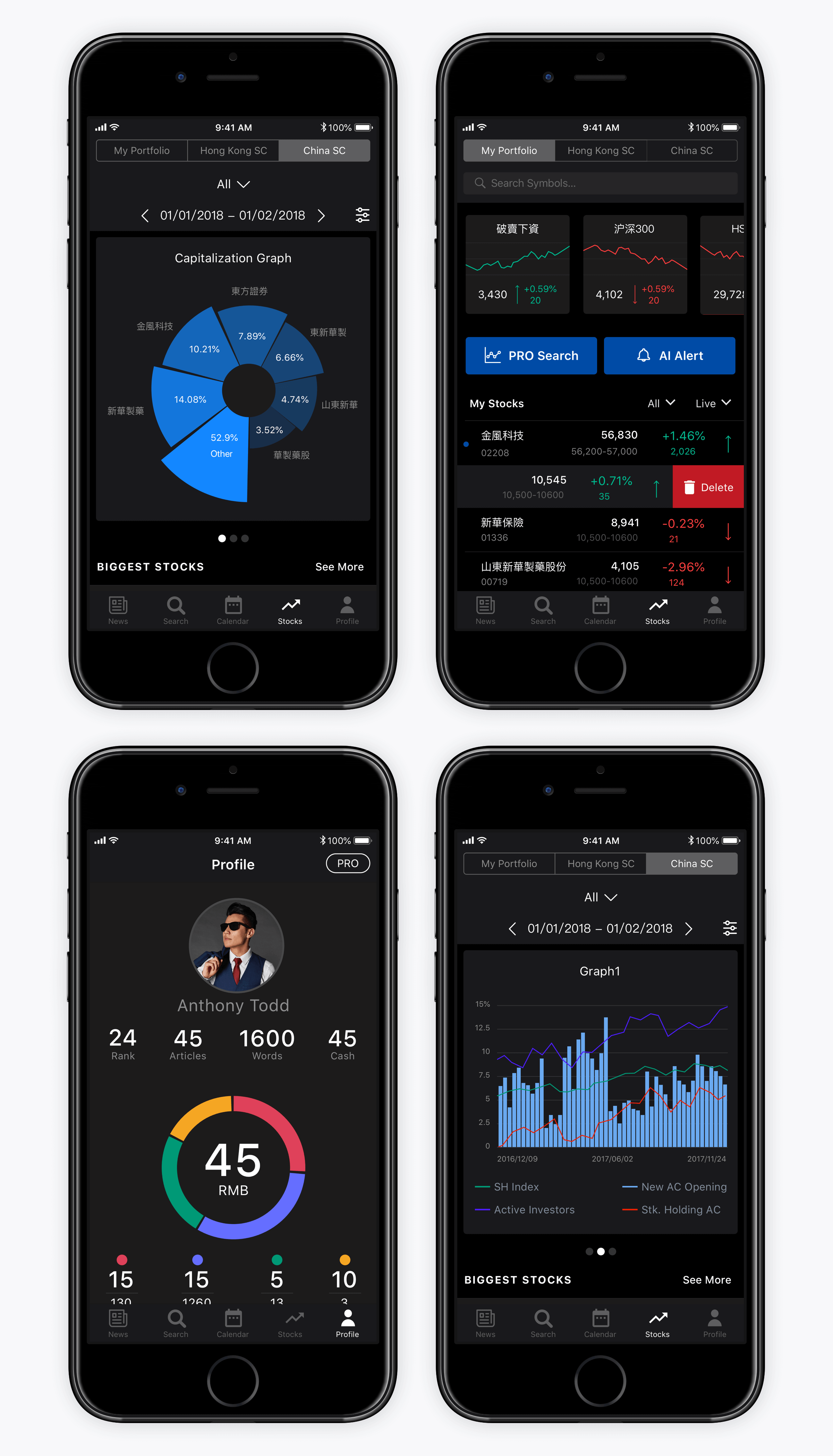
The UI concept based on dark background
Bright color accents allowed for building strong visual hierarchy and attracted the user’s eye to the most important interactive elements on the screen. Also, the choice of fonts for the user interface was another object of thorough selection and analysis as the screens were loaded with different information and demanded a high level of readability.
After all the details and transitions were agreed upon and tested, the application was adapted for use on iPad and Android smartphones.
Useful Case Studies
If you are interested to see more practical case studies with creative flows for mobile UI design, here is the set of them from Tubik.
Slumber. Mobile UI Design for Healthy Sleeping
Letter Bounce. UI Design for Mobile Game
Real Racing. UX and UI Design for Mobile Game
Real Racing. Graphic Design for Mobile Game
Manuva. UI/UX Design for Gym Fitness App
Cuteen. UI/UX Design for Mobile Photo Editor
Tasty Burger.UI Design for Food Ordering App
Watering Tracker. UI Design for Home Needs
Night in Berlin. UI for Event App