Another design case study is up, and this time it supports the idea of landing page importance in building a solid brand for a mobile application. Check the design process on the landing page for Pass-On, the application that helps people connect and organize deliveries conveniently across Saudi Arabia.
Project
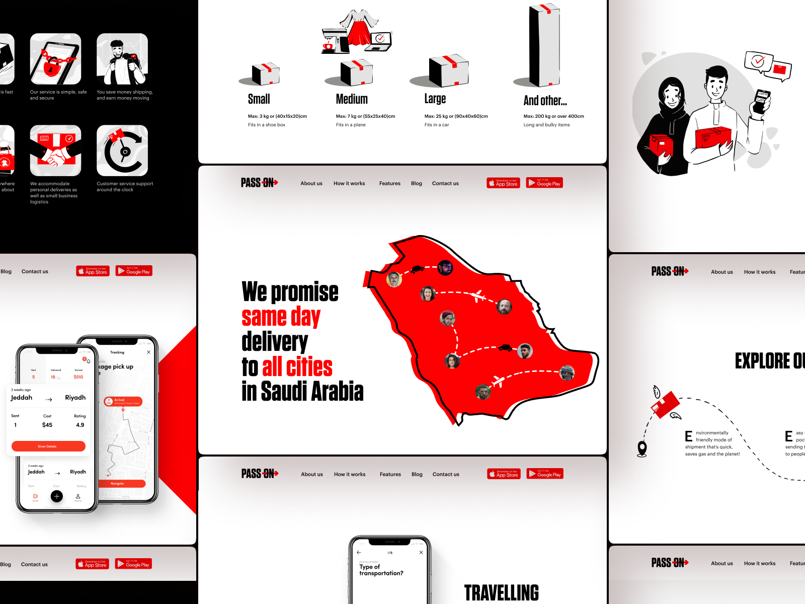
Landing page promoting the mobile application supporting convenient deliveries in Saudi Arabia.
The tubik creative team for this project included Anastasia Zhyltzova, Vlad Taran, and Olya Zakharyan.
Process
A well-designed landing page is a tool of great importance for building mobile app branding and amplifying its online presence. It plays a crucial role if the case is mobile-only and the app doesn’t correlate with a website. In general, it is a web page designed to focus on a specific, relatively narrow goal and a quick way of accomplishing a particular action. So, for a mobile app like the Pass-On application, the goal is app installation, and the landing page concisely covers its benefits and functions. In addition, creating a landing page based on geographic, gender, psychographic, demographic, and behavioral targeting is an effective way to reach potential app users and give them a quick presentation of the application, which will tell much more than just screenshots on the AppStore or PlayMarket and will make the brand communication more emotional and informative.
To uncover more about the essence of the app, Pass-On is a digital platform (native Android and iOS app) that aims to provide easy, economical, and fast courier service. It is positioned as a community marketplace that connects travelers with available boot space to the sender with a parcel to be delivered. The client wanted the web design to be vibrant and classy, simple and trustworthy.
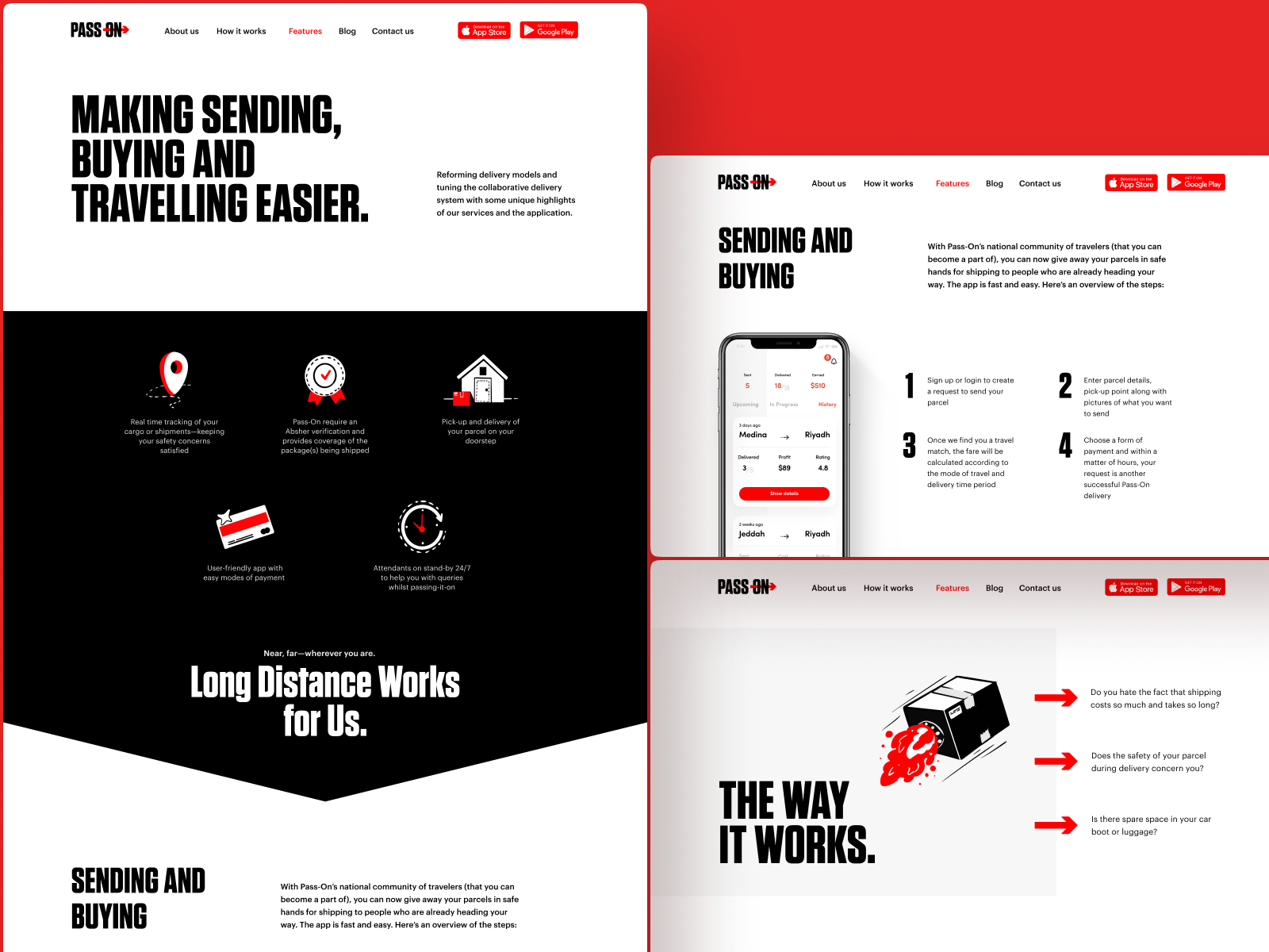
Let us give you a glance at the design solution for the landing page design for Pass-On, clean, bold, and scannable in the best traditions of design for web marketing. One more point to mention is that it had to be adapted for two languages, English and Arabic, as the application is used in Saudi Arabia.
The main design features that determine the general design concept for the Pass-On landing page are the following:
- color palette based on bold contrast of clean basic colors – white, black and red, echoing the main colors in the application; no gradients, no multicolored combinations
- background colors separating web page sections to make content more organized and clear
- readable typography with prominent catchy taglines
- custom illustrations and motion graphics
- mobile screens demonstrating the application’s user interface and functionality
- instantly noticeable call-to-action elements
- intuitive navigation based on well-established mental models of web interactions
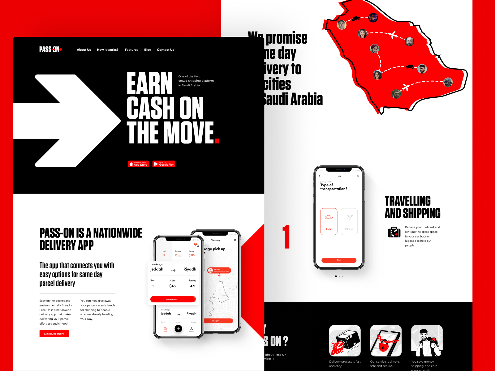
One of the catchy features of the landing page is the animated map used as a hero image that visually connects the visitor to the core idea of the service. Scrolling down, users see the section uncovering three primary benefits in a sort of animated interactive slider based on corresponding mockups demonstrating the particular screens of the application, enhanced with minor graphics giving visual hints to the text explanations.
Another section also lets the visitor dive deeper into the benefits in a set of short, concise headlines. When the headline is clicked or hovered, the more detailed description is open, and theme photos also change to give it visual and emotional support. Due to such an approach, the page looks airy and uncluttered, although it contains a lot of information.
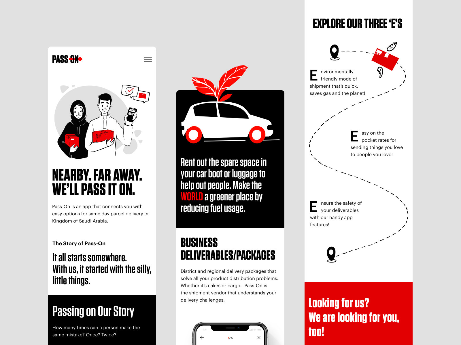
The landing page uses a diverse set of consistent illustrations. They support text information with visual hints and metaphors and make text content look neat, organized, and systematized. What’s more, the graphics add their two cents to make the whole landing page concept look more emotional and integral.
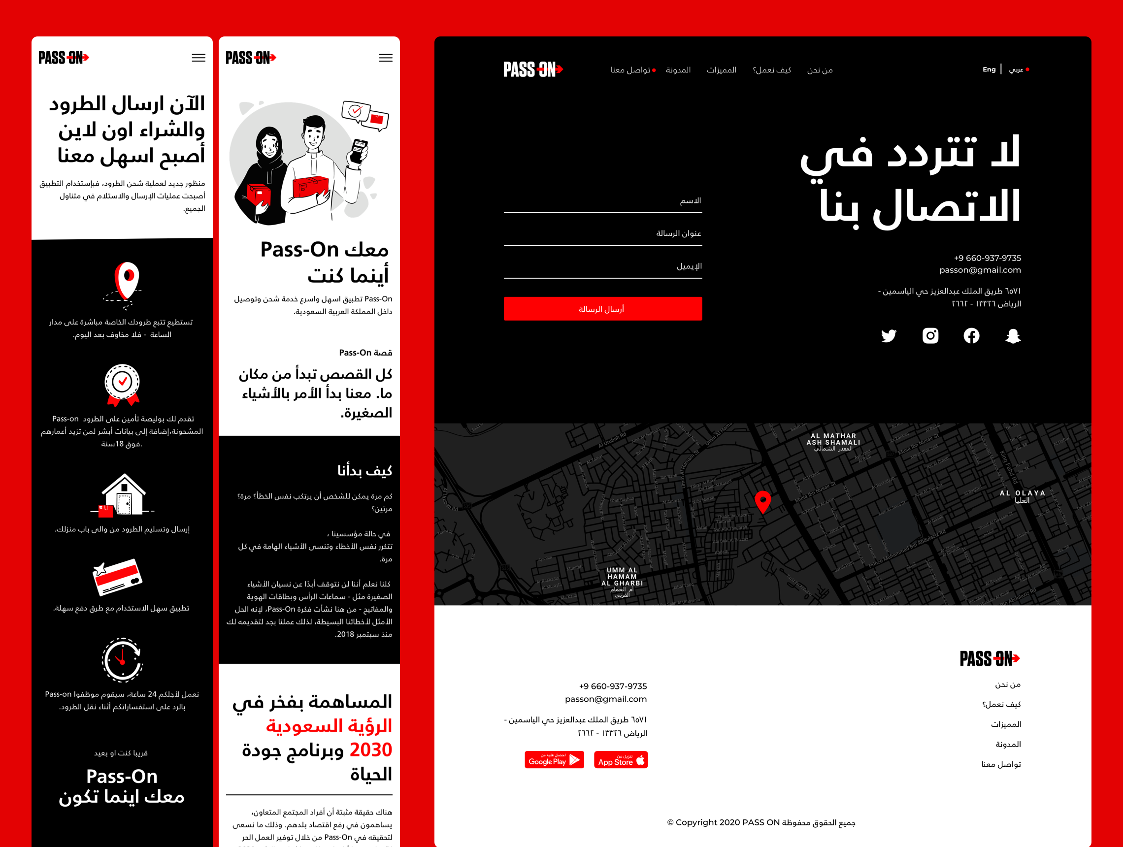
To make the landing page attractive and functional on any device users come from, the mobile version was also well-thought-out and designed with attention to detail.
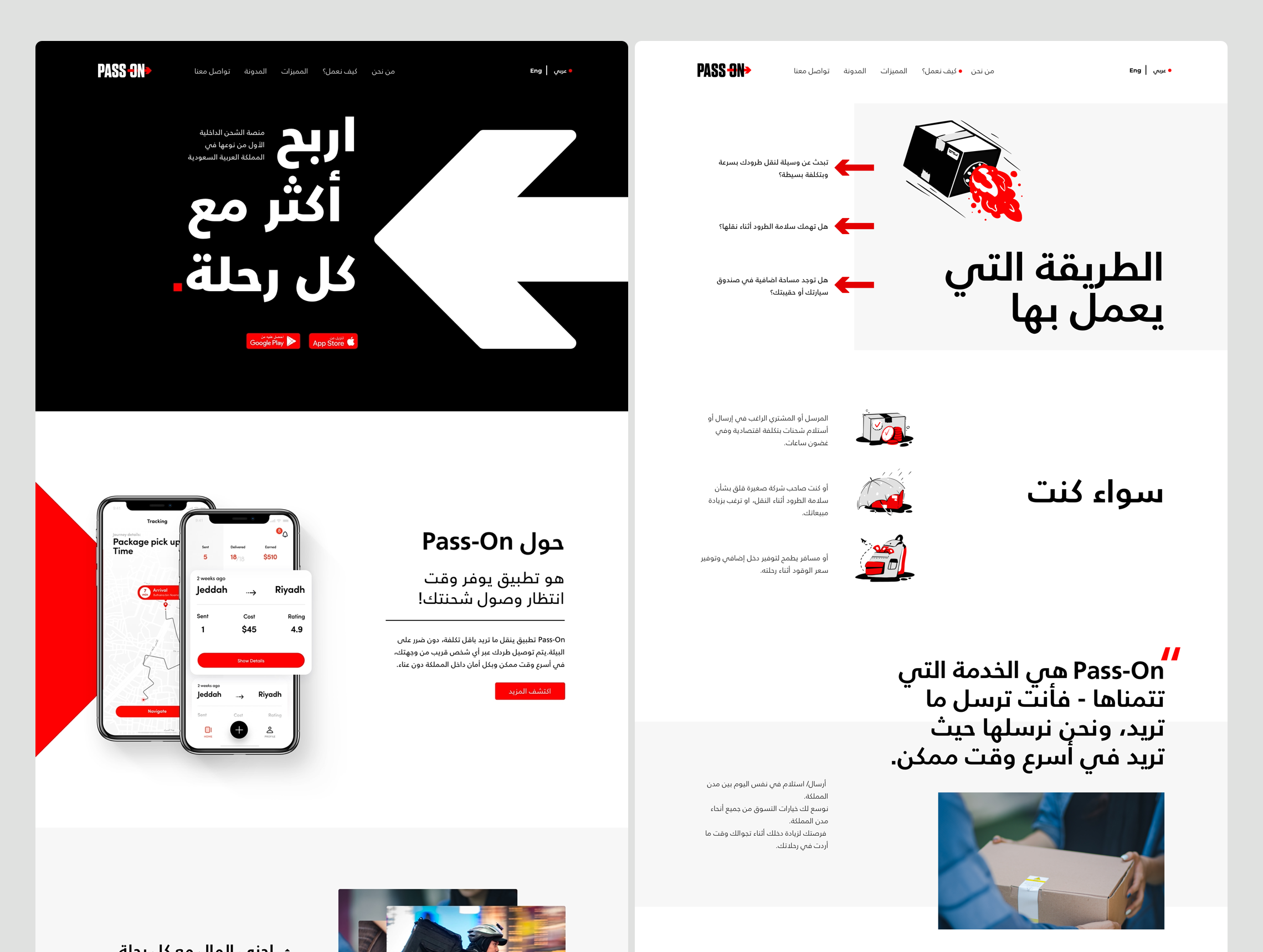
One more big challenge of this project was to think over the Arabic version of the landing page, as this language uses a different text direction in writing, the general perception of both copy and graphic content had to be inverted, and the text itself looks absolutely different. It means that in fact, the page needed not just localization, but a sort of new design and layout to make the text content and images work properly in totally different conditions. Take a look at the result.
New design case studies from our team are coming soon. Stay tuned!
More Design Case Studies
Here’s a set of more case studies sharing the design solutions and approaches for some of the design projects done by the Tubik team.
Carricare. Identity and UX Design for Safe Delivery Service
Real Bitcoin. Creating Website Illustrations
PackYak. Mascot Design for Shipping Service
Uplyfe. Identity Design for Health App
Devpost. Hero Illustrations for Hackathons Platform
ShipDaddy. Identity and Web Design for Shipping Service
Bennett. Identity and Website Design for Tea Brand