For the last decade or so, we’ve witnessed the rocketing rise of demand for diverse delivery services, getting even more popular in the world of online shopping. In this case study, we will unveil the story of our collaboration with one of them: welcome to check the creative process on identity design and mobile application for Carricare, the service that helps customers get their parcels delivered safely and in perfect time.
Client and Project
Carricare is a service based in the UK, its objective is to effectively connect couriers and customers expecting the order to set perfect conditions and timing for delivery. It is an instant and real-time notification platform for delivery couriers that helps clients with last-minute delivery notifications, allowing them to manage their time better. Therefore, it aims at solving a fundamental problem of courier delivery, when the parcels aren’t safe if brought at the wrong time and left just at the door – or leading the courier’s coming up with the idea of what to do. Automating different user scenarios, the service makes the delivery process smooth and effective for both courier and addressee.
The task for the Tubik team was to build a strong identity that reflects brand values as well as helps it get recognized easily and communicate with customers in a friendly manner. Also, we worked on developing a solid user experience for the mobile application to make it work in consistency with branding. The creative team for the project from the Tubik side for this project included Ernest Asanov, Olya Zakharyan, Roma Chornyi, Anton Morozov, Yaroslava Yatsuba, Kirill Erokhin, Marina Yalanska, and Anastasia Iliashevych.
Branding
The first stage of brand design was all about absorbing, sharing, and analyzing various information. We dived into discussions about the client’s goals, visions, and brand value, as well as researched the segment of the market to develop a solid brand approach before the actual design of its identity started.
The service mainly focused on two critical aspects appreciated by target users: the safety of all sides of a delivery case – couriers, clients, and the delivered parcels – and the high convenience of taking them for the addressees. That’s how the brand name, Carricare, was up, combining two major concepts – carry and care – and echoing the idea out into the tagline: we carry and we care about your parcel, your time, and your convenience.
In the research process, the graphic designer emerged into the topic of visual elements that support the delivery process in the United Kingdom, from history to the modern state. The mood board of diverse stamps and icons transferring important messages, like the parcel’s fragility or the need to protect it from wet conditions, inspired the general approach to the branding, echoing these well-recognized meanings and adding new ones to the set.
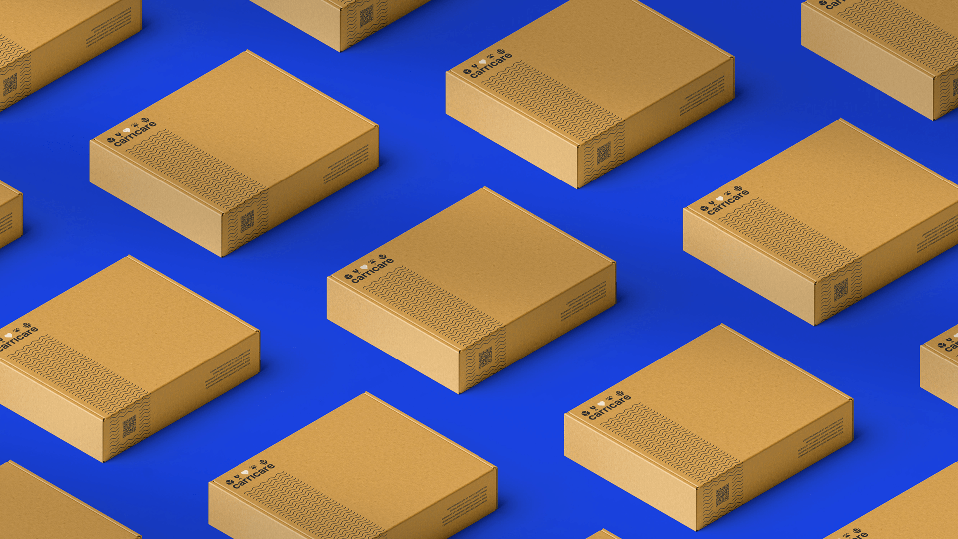
Another key aspect to consider was brand colors choice. In this case, the brand uses a bold and contrast combination of colors all well-grounded by the service essence: primary colors are blue and red that echo the UK flag colors, while additional color is cardboard color setting the apparent association with packaging and boxes used for parcels.
So, logo design presents a combination mark flexible for plenty of practical goals. The bold typographic part is supported with a set of informational graphics reflecting the parcel delivery theme:
- parcel symbol
- fragility symbol
- water protection symbol
- parcel in hands symbol, transferring the ideas of courier delivery and care for the parcel
- line waves adding association to the typical postal stamps
- the heart symbolizing care and using the color contrasting to the rest of the graphic elements.
Here you can take a look at the ideas of different logo options and elements’ placement to cover various brand identity goals.
![]()
To make the logo work in an even more dynamic way in the digital environment, we’ve also made the animated logo version.
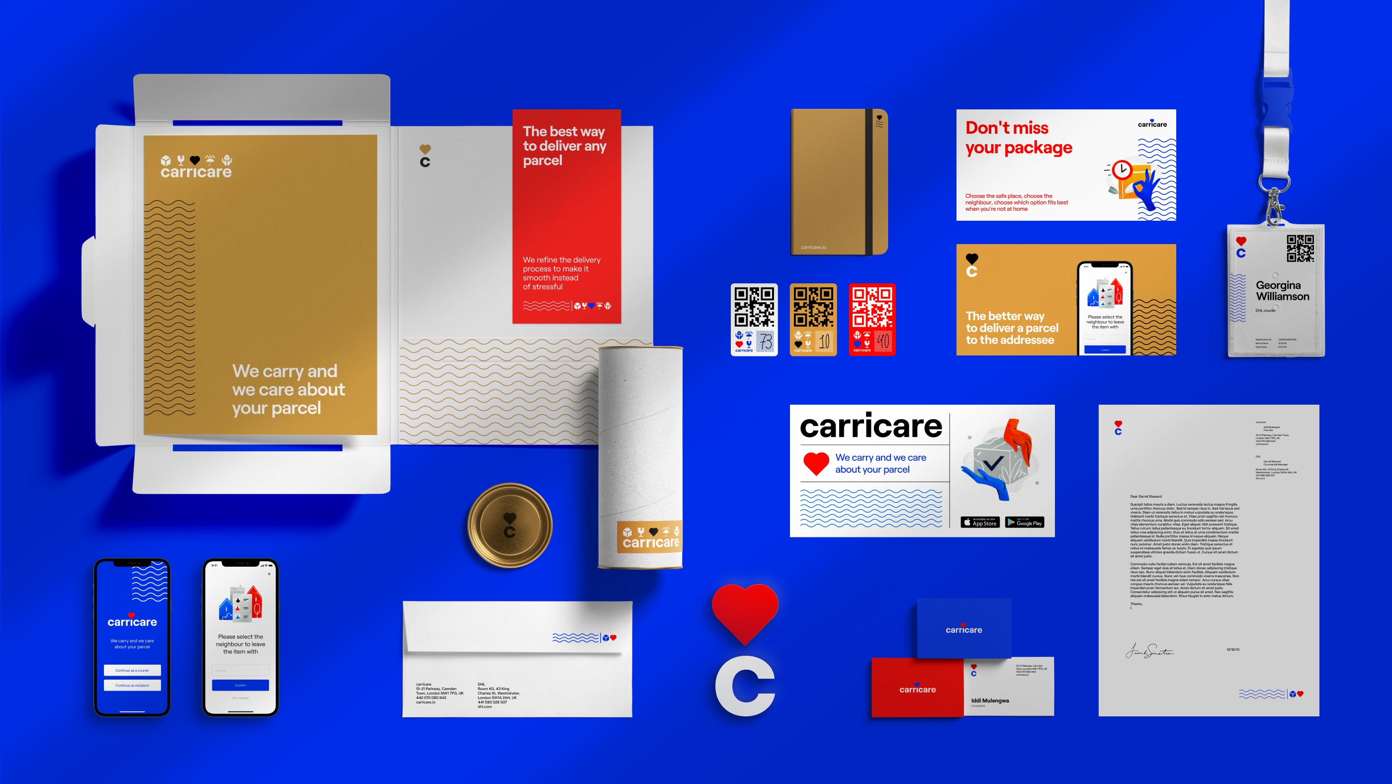
Here’s how the logo works on the branded boxes. Take a look at how QR-code presenting the primary interactive element is integrated into the wavy pattern.
And these are the stickers, another key element developed for the courier and addressee interaction.
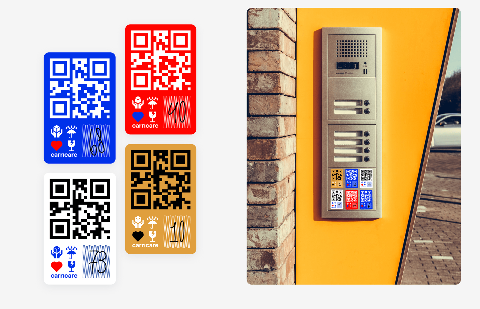
In addition, to satisfy the need for custom graphics, a special consistent system of icons was developed to link together branding and app design, also echoing the branded color palette and reflecting a variety of user scenarios that may arise.
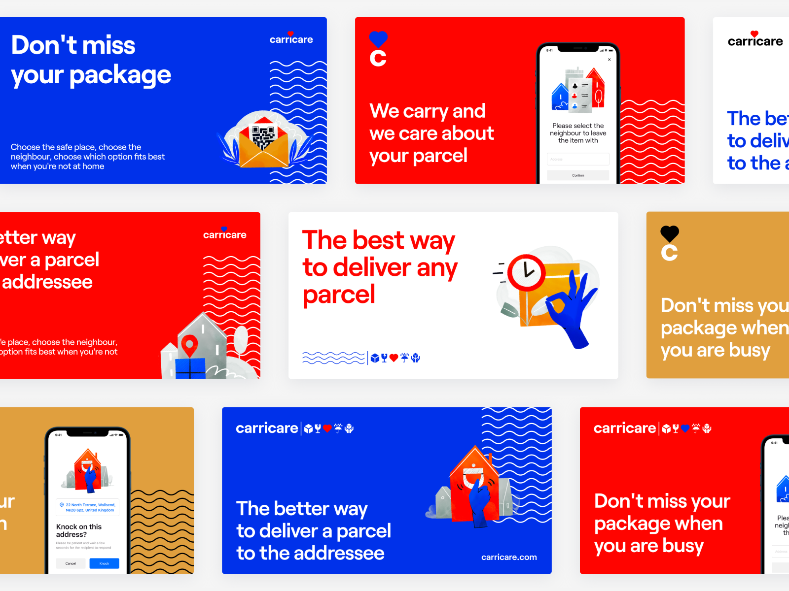
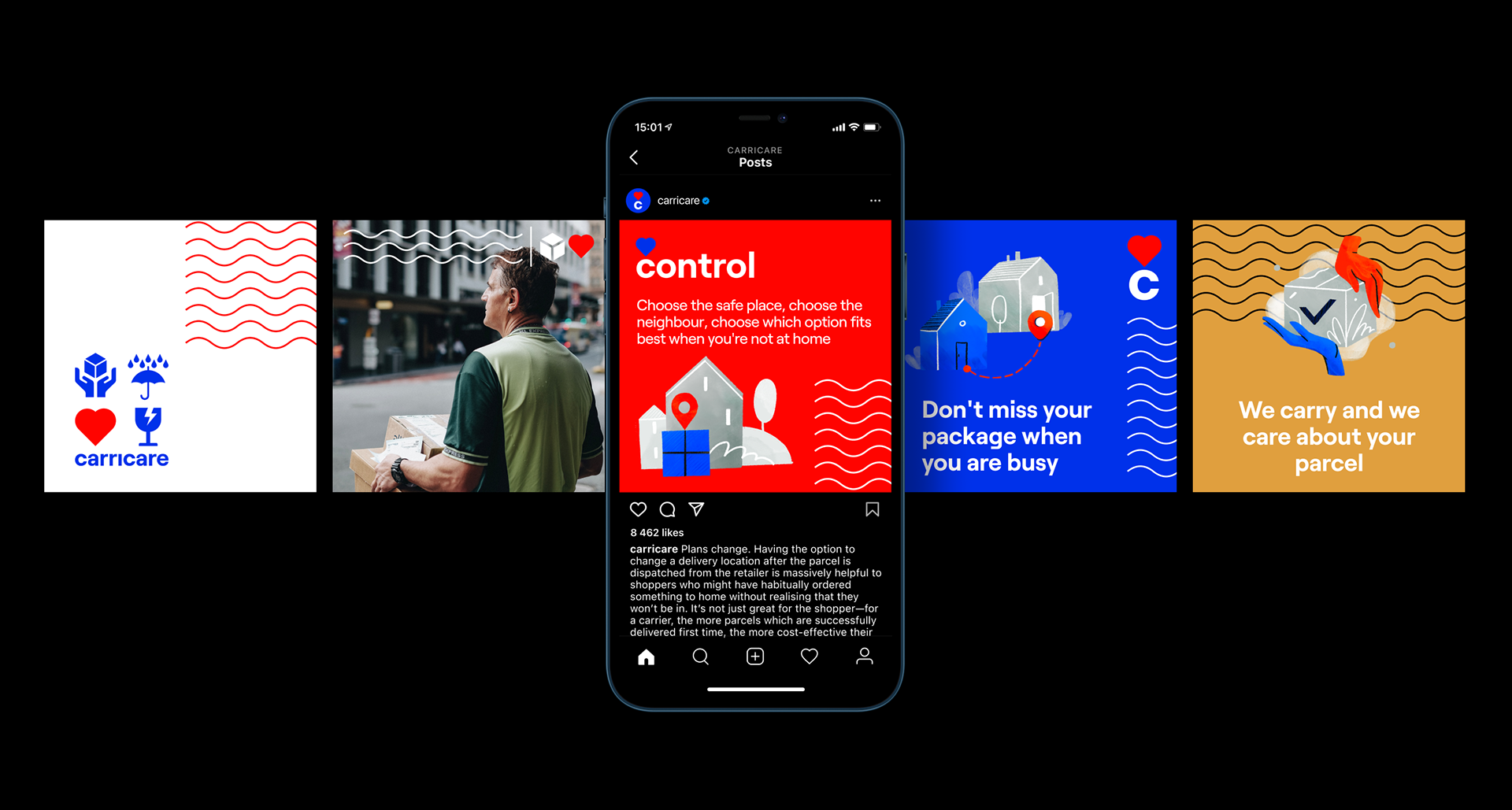
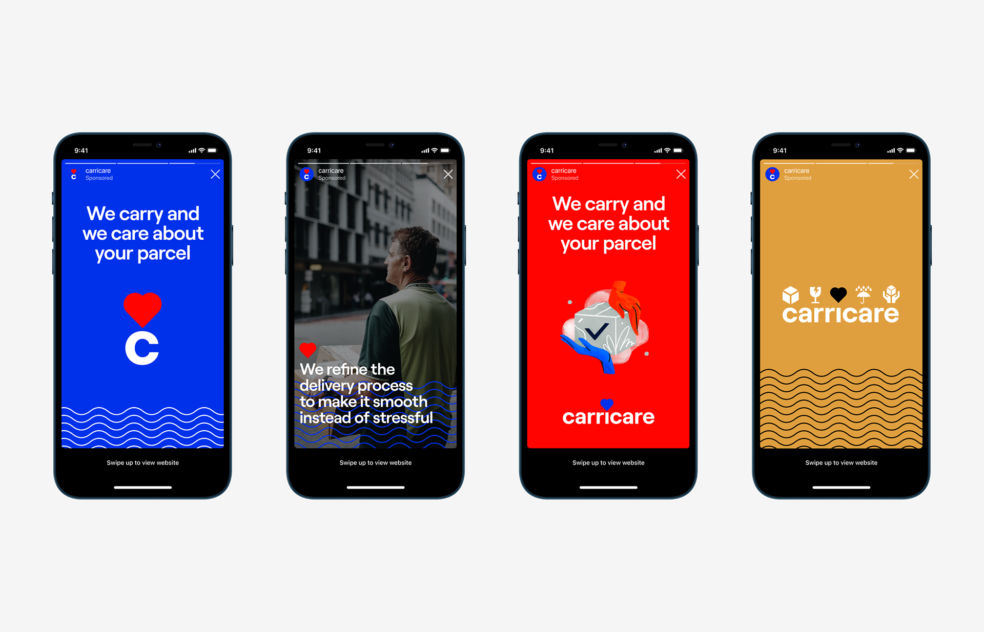
Another task for the creative team was to think over a variety of graphic assets for marketing goals and outdoor advertising, such as posters, billboards, city lightboxes, etc.
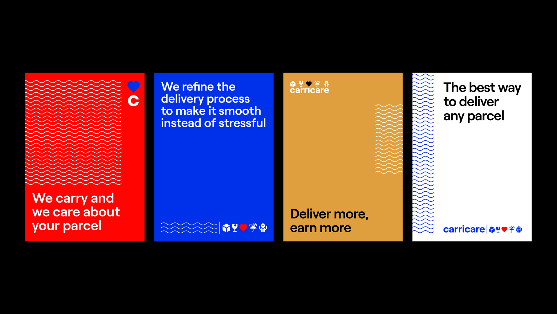
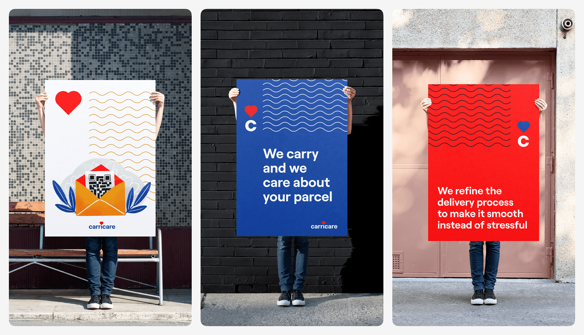
Posters design
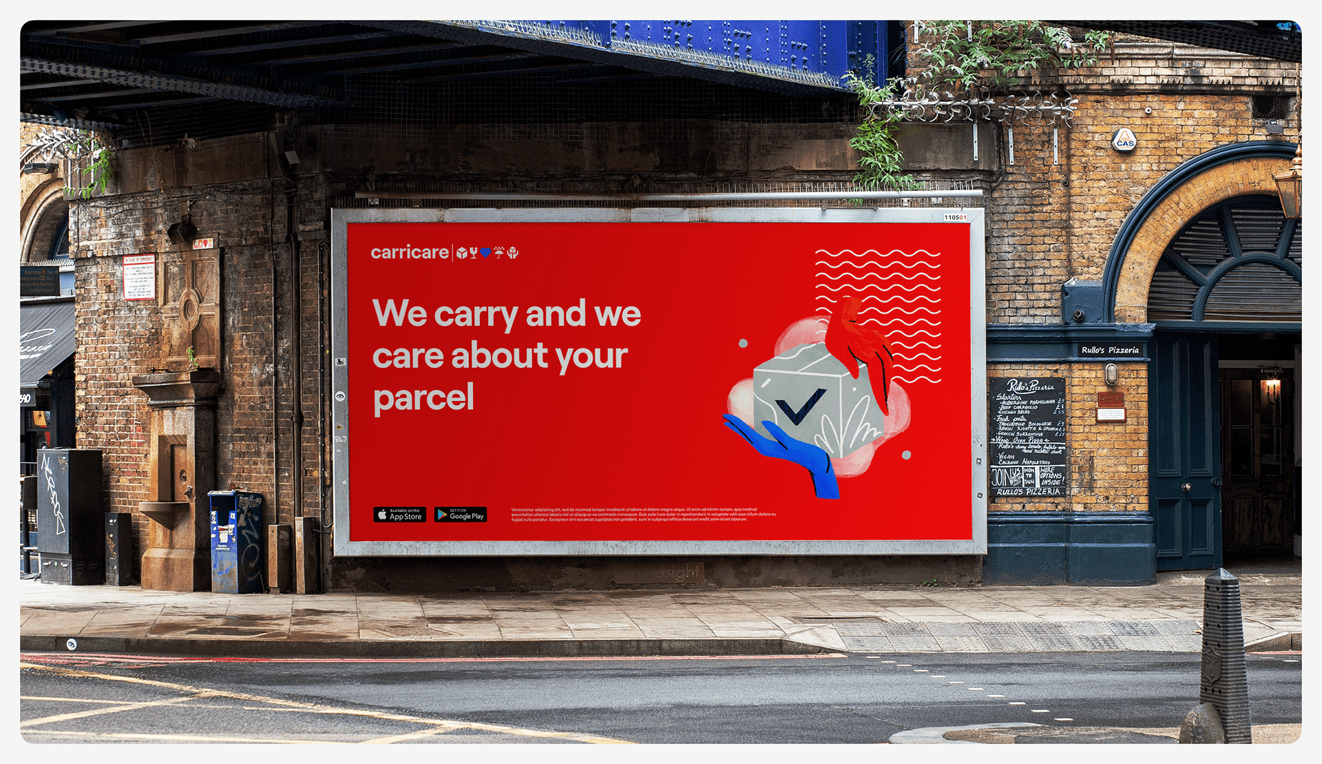
Billboard design
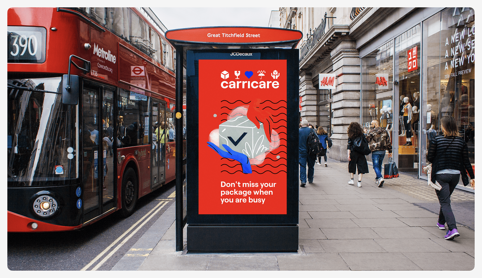
City lightbox design
Intending to strengthen online marketing and amplify brand recognizability, we’ve also worked on the general stylistic concept as well as the set of design templates and ideas for social media posting and advertising that would consistently reflect the identity.
So, this stage of the design process resulted in an eye-pleasing system of identity elements combining aesthetics and practicality, both essential for the service brand image.
UX Design
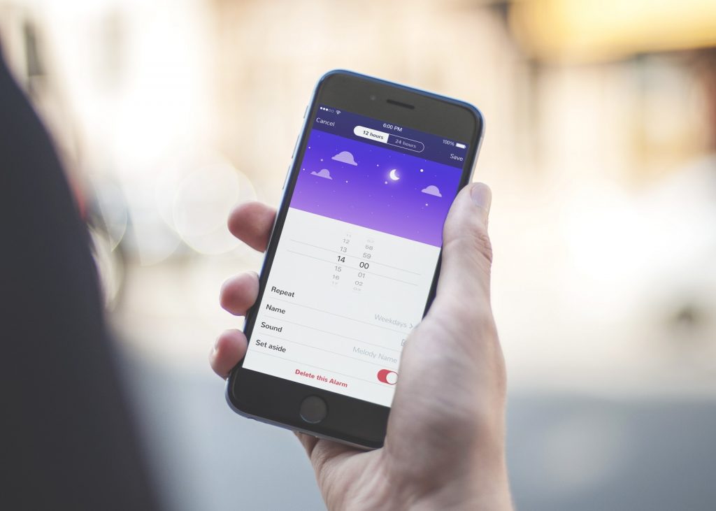
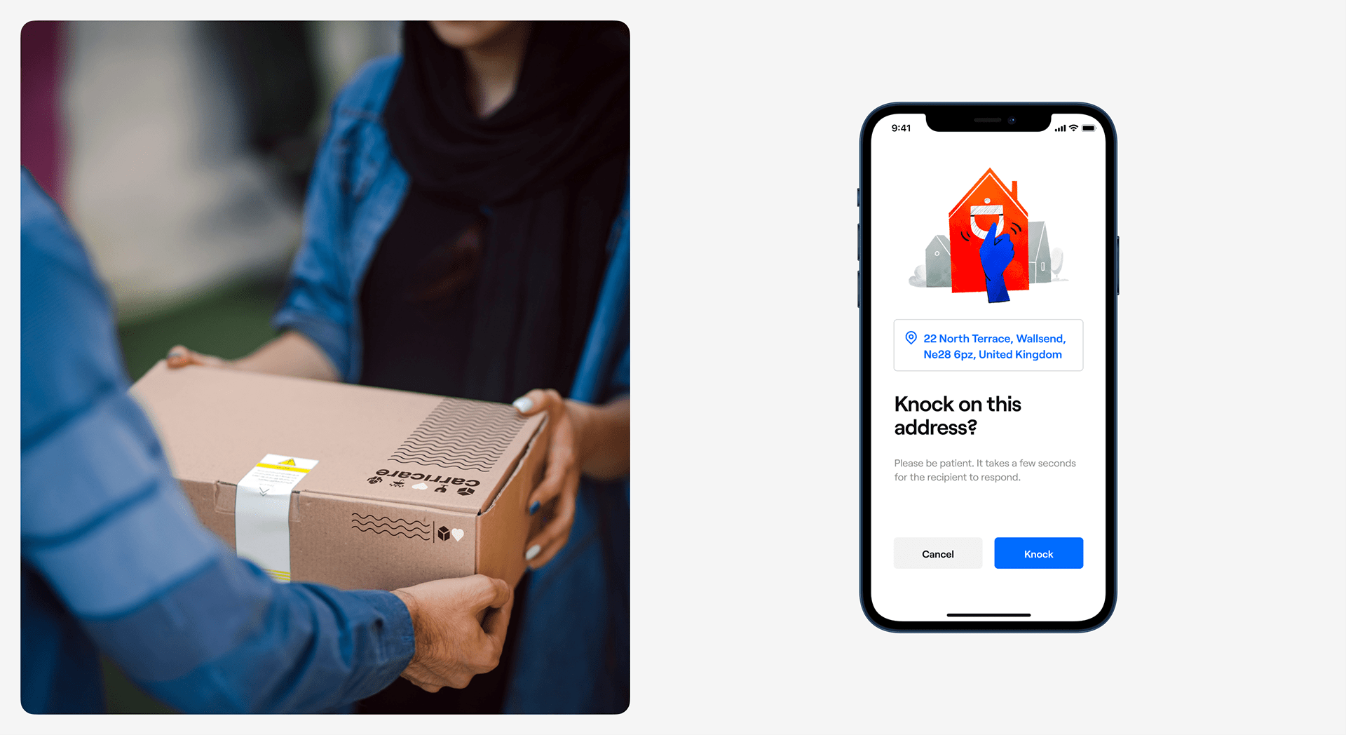
The mobile application was designed to meet the needs of two different categories of users: the courier and the recipient. The app offered several scenarios of delivery flow and was based on the delivery process improvement as a core feature: it aimed at providing successful parcels deliveries even when the recipient is away. Approved couriers scan the QR code, and the recipients get a notification and choose if they just open the door and get it when they are home, get the parcel back to the depot, leave with a neighbor, or ask the courier to leave it in a safe place.
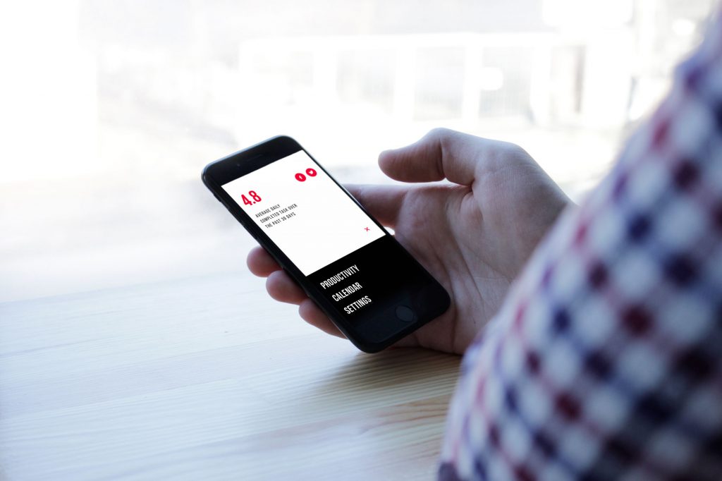
The user interface of the mobile application is nice and clean in the best traditions: minimalist and highly functional layout, readable typography, light airy background, and bright color accents make the app intuitive and easy to use on the go and for users of different ages. Custom illustrations help to not only enhance the messages but also add aesthetic and emotional appeal to the interface as well as keep the close bonds with the rest of the branded items.
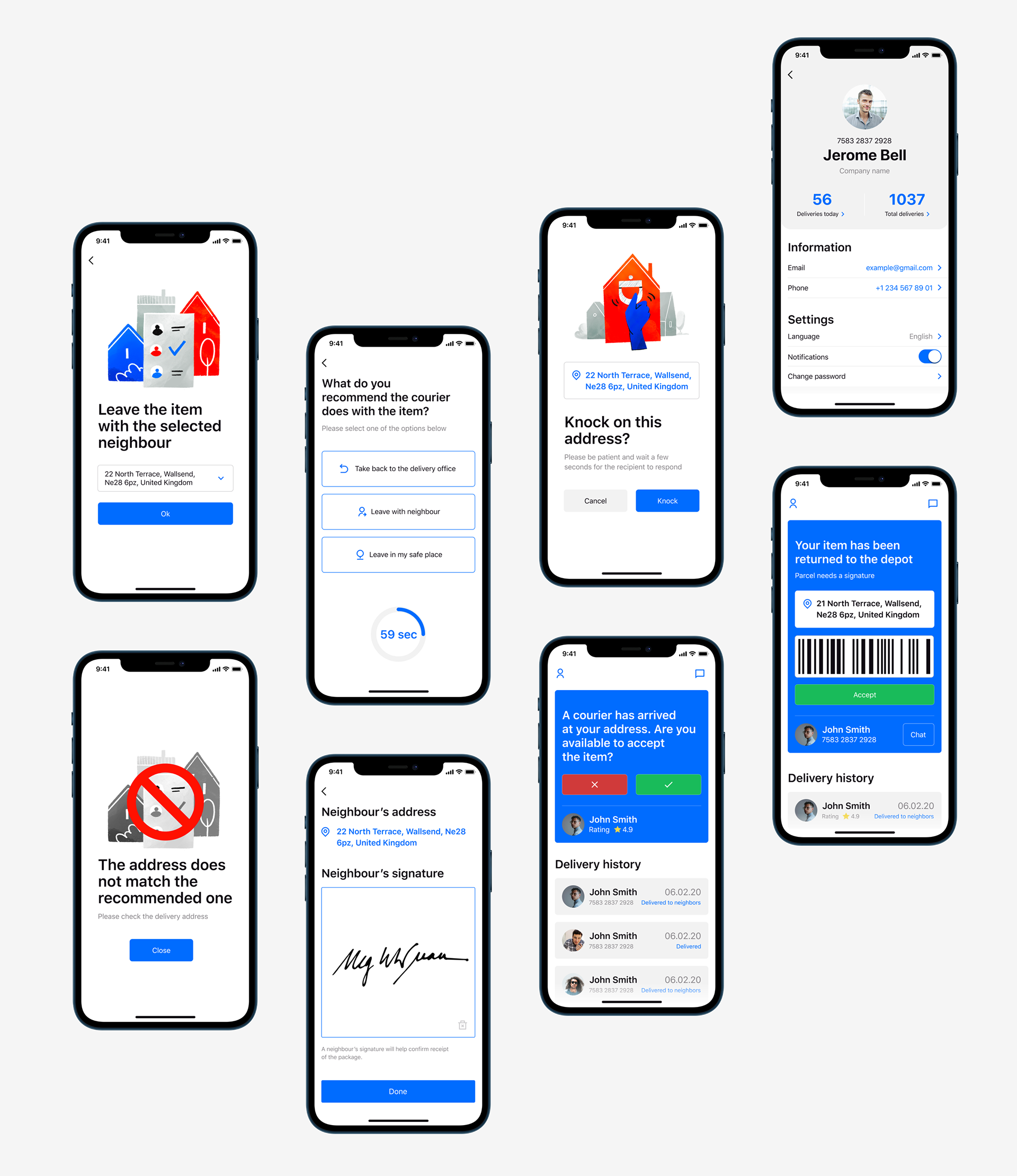
One more significant detail to consider was the app icon design that would be noticeable and digitally friendly, contributing its two cents to the general brand style of the service.
![]()
Working on the Carricare project, our team has got another great experience of connecting the physical and digital worlds by means of beautiful and functional design.
![]()
New design case studies from our team are coming soon. Stay tuned!
More Design Case Studies
Here’s a set of more case studies sharing the design solutions and approaches for some of the design projects done by the Tubik team.
Annual Awwwards. Website Design
Uplyfe. Identity Design for Health App
Devpost. Hero Illustrations for Hackathons Platform
ShipDaddy. Identity and Web Design for Shipping Service
Credentially. Website Creation with Webflow
Dicey. Logo and Mascot Design for Party Game
HUAWEI. Icon Design for EMUI 10
ABUK. Custom Book Cover Design for Audiobook App
Illuminating Radioactivity. Interactive Web Design for Education