There is a particular kind of design project that asks more from a team than just good taste.
When the product itself is still being shaped, when the brand is freshly minted, and when the client’s Sales team is already waiting at the door, every creative decision carries operational weight. That was the situation with Credentially, a SaaS platform built to automate the notoriously paperwork-heavy process of hiring, onboarding, and compliance tracking for healthcare professionals.
The Tubik team had already been working on Credentially’s brand identity and product redesign when the assignment arrived to build a website—one that would do real work in the world: educate visitors, generate qualified leads, and present a young company as a credible player in healthcare HR.
What followed was a full web design and Webflow development cycle, from wireframe review to live publishing. Here is how it actually happened.
The Client Arrived Prepared—And It Changed Everything
The Credentially team came to the table having already mapped out the basic site architecture and written the content. They had UX wireframes. They had thought through user flows. This is rarer than you might expect, and it meaningfully shifted the design process from discovery into refinement. The Tubik team reviewed the proposed structure, suggested usability improvements where the flows felt slightly off, and moved quickly into visual development.
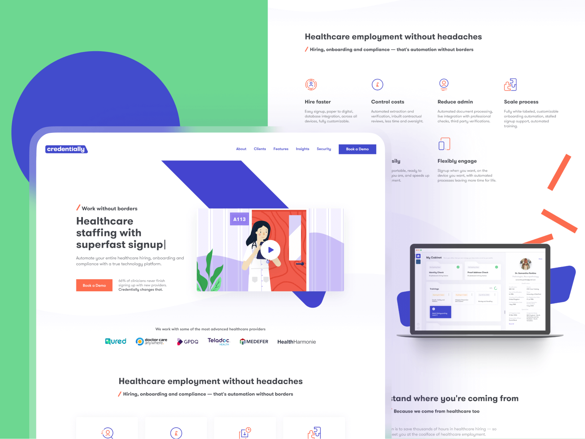
The final website structure comprised six core pages—Home, About, Clients, Features, Insights, and Security—plus supporting pages for Careers, Terms & Policies, and a company blog. Six pages sounds modest. In practice, each one carried its own interaction design challenges, content hierarchy problems, and visual storytelling requirements. The homepage alone went through more iteration cycles than most full projects.

A Brand Language That Travels from Product to Website
One of the more elegant aspects of this project was that the visual grammar already existed. During the branding phase, Tubik had developed a system of “folders”—container elements that appear inside the Credentially product as homes for user documents. The logo itself carries a conceptual statement: a blue tab breaking free from orange borders, visualizing the platform’s promise of working without limitations. Both of these ideas carried forward into the website, giving it a visual continuity with the product that stock illustrations or generic UI patterns could never achieve.
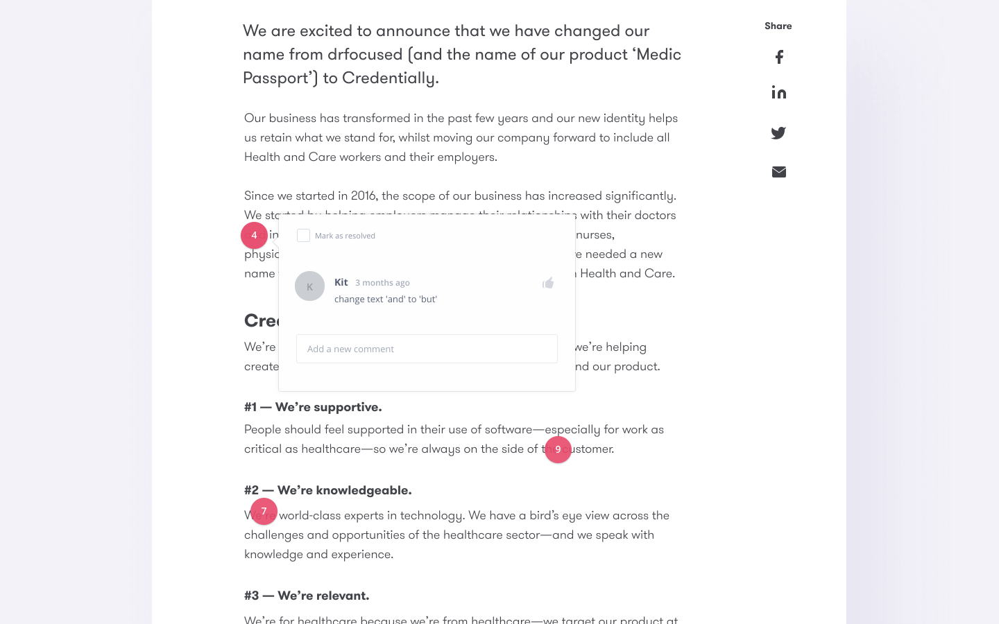
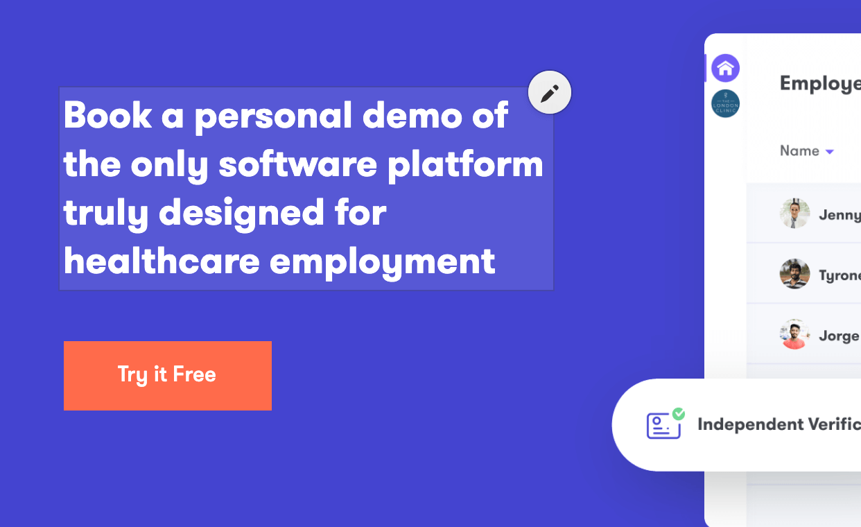
Custom illustration was chosen over stock photography deliberately. Two styles were proposed: one with stylized, non-standard character proportions and artistic textures, the other more universal and detailed. The client chose the latter. Every illustration was sketched, reviewed, and approved before being developed into a full color digital version—a process that takes longer but eliminates the expensive problem of late-stage visual pivots.
The Homepage: Where Most of the Thinking Happened
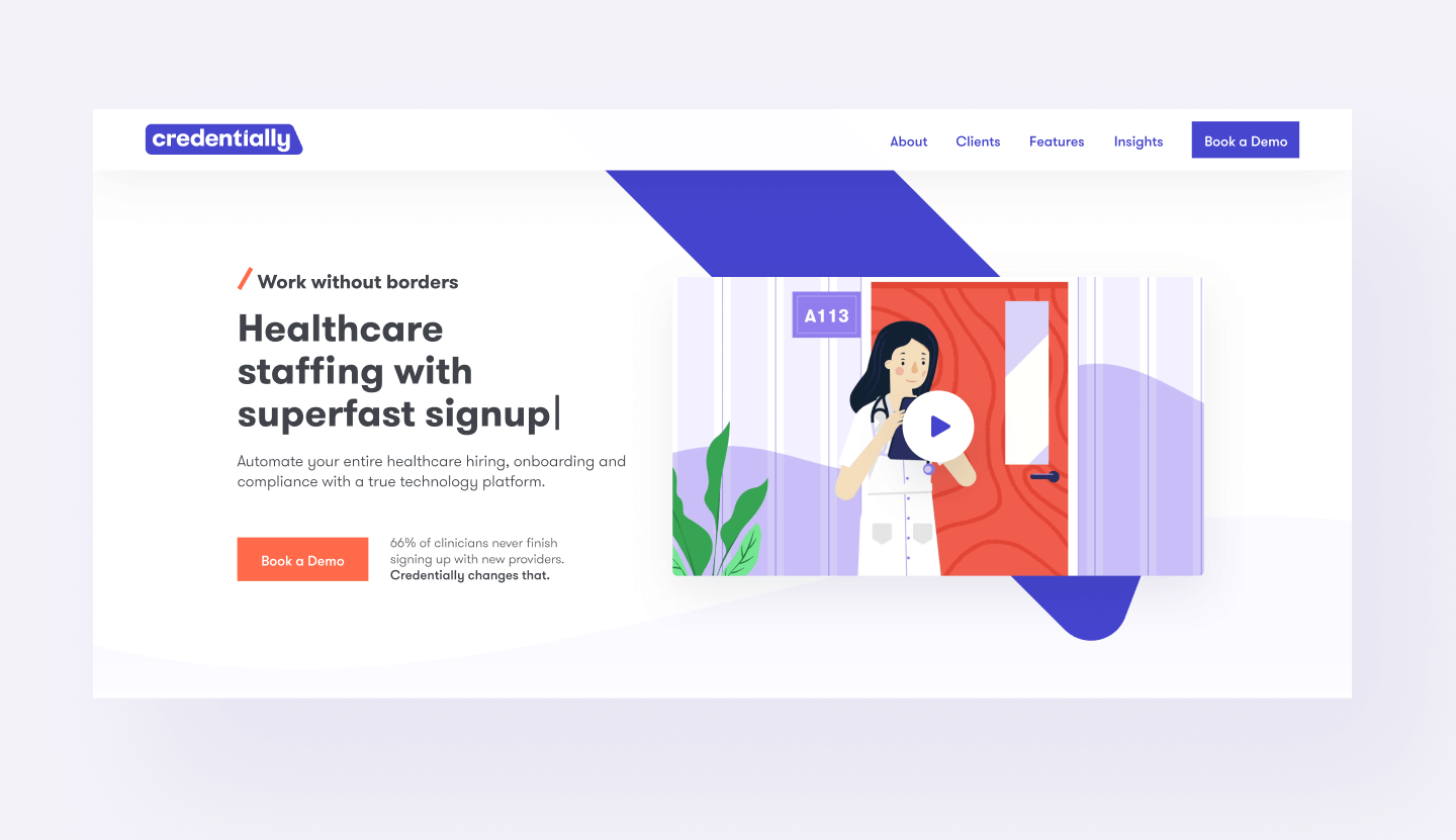
Hero sections carry disproportionate responsibility in conversion rate optimization. The Credentially hero had an additional layer: the brand slogan exists in multiple variations, and the team wanted all of them present without cluttering the layout. The solution was a typewriter effect using the open-source Typed.js script, letting the tagline retype itself through each variation. Clean, functional, and distinctly more alive than a static headline.
The hero section was also designed to feature an animated product video—but the video did not exist yet at the time of development. Rather than leaving a placeholder, the team built a section using product mockup screens with simplified UI, detailed enough to communicate the product clearly. This static version went live and stayed live until the video was ready. Interestingly, the client grew fond of it and briefly considered keeping it permanently. After testing several hybrid approaches, the creative team made the case for using a preview clip that plays automatically for a few seconds, inviting the viewer to click through to the full video. The goal was immediate engagement, not decoration.
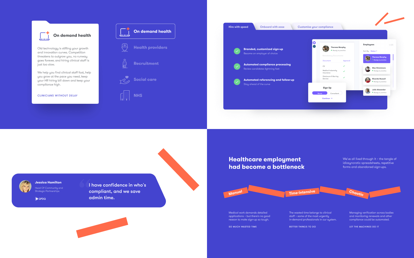
Further down the homepage, a section listing platform benefits went through a significant post-launch revision. Initial user testing and an SEO audit revealed that visitors were getting stuck at that section—a friction pattern that directly affected scroll depth and conversion metrics. The fix was architectural: the section was shortened, with secondary information moved into tabs. The redesign took a few hours. The behavioral data improved. This is the kind of iteration cycle that separates a living website from a launched-and-forgotten one.
Features Page: Visual Metaphors That Actually Work
The Features page contains one of the more conceptually satisfying design decisions in the project. Full-width “breaking lines” run across the page, each one labeled with a pain point in healthcare hiring: Manual, Time-intensive, Chaotic. As the user scrolls and each line reaches the center of the viewport, it breaks—a visual metaphor for the platform’s core promise of removing those barriers. It is the kind of interaction design that works precisely because it earns its complexity; the motion serves meaning rather than existing for spectacle.
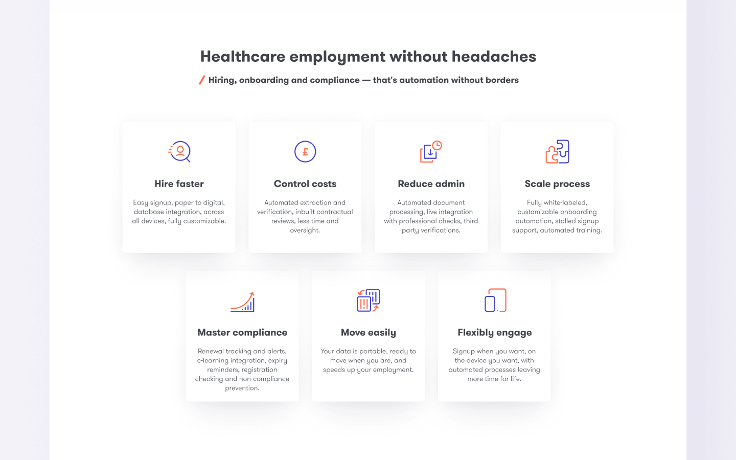
A second noteworthy element on this page was the toggle interface for showcasing 18 platform benefits split across two categories: “Stay Staffed” and “Stay Compliant.” The challenge with that volume of information is familiar to anyone who has worked on SaaS feature pages—too much at once overwhelms, too little undersells. The team iterated through multiple layout options before landing on a switchable tab structure with both toggles active by default, reinforcing the message that clients get both categories simultaneously rather than choosing between them.


Webflow as the Development Environment
The entire website was built in Webflow. This is worth addressing directly, because the platform still prompts skepticism in some corners of the development world. In practice, for a project of this scope and timeline, Webflow offered something that traditional front-end development cycles rarely provide: the ability to publish changes in seconds, manage animation triggers without writing bespoke JavaScript for every interaction, and hand over content management to non-technical editors without building a custom CMS.
The project began in the Tubik studio account while the client arranged their own paid plan, then transferred over—a process that takes a couple of clicks between paid profiles. The homepage was developed and launched independently before the remaining pages were complete, allowing the sales team to direct traffic to a live URL almost immediately. Navigation links in the header and footer were temporarily routed to anchor sections on the homepage until the full site was ready.
Animation on the Credentially website made use of Webflow’s native interaction system across most use cases: page load animations, scroll-triggered reveals, hover and click states, tab transitions, and time-based sequences. Where the native toolset hit its limits, custom code filled the gap. On the homepage, this meant integrating Typed.js for the tagline animation, scripting automatic video playback after the preview clip, and animating a statistics countdown that triggers when users reach that section. The About page used an open-source script to generate animated connection lines between a network of partner logos. The Features page required custom code for the auto-advancing hero slider and for the toggle functionality in the benefits section.
Repeating elements—the navigation header, footer, pop-up windows—were built as Symbols. Change a Symbol once and the update propagates across every page automatically. For a site with this many shared components, that structure alone saves hours of QA work on every revision cycle.
Integrations, Permissions, and the Infrastructure Behind the Interface
Third-party integrations were handled through Zapier, connecting Webflow form submissions to HubSpot and Mailchimp. When a visitor books a demo or subscribes to the newsletter, the data routes automatically to the appropriate service and triggers a Slack notification for the team. Form data is also stored directly in the Webflow account as a backup—a detail that matters more than it sounds when a sales team is working leads in real time.
Access permissions were configured so that blog editors and writers could manage content without touching the structural website. They can add and remove articles, create categories, and upload downloadable files—all without the ability to accidentally break a layout. This kind of role-based access is straightforward in Webflow but requires deliberate setup, and getting it right at the beginning saves significant administrative friction later.
The blog, called Insights in the site architecture, required several non-trivial solutions. Post previews needed different-colored photo overlays depending on category—achieved through CSS mix-blend-mode properties injected via custom code, with jQuery handling color assignment per post. Internal search was configured to index only blog content, excluding static pages and CMS templates from results. And downloadable file attachments were implemented using conditional visibility logic: a download block appears only when a file is attached to a post, and disappears otherwise. Small detail, clean execution.
What This Project Demonstrates About Modern Web Design Process
The Credentially website is a case study in several things simultaneously: the value of entering a project with clear content and structure already in place, the creative leverage that comes from having brand and product work precede web design, and the operational advantages of building in Webflow when iteration speed and content management matter. It also illustrates something about the design process that tends to get edited out of polished case studies—the homepage you see today is not the homepage that launched. It was improved based on real behavioral data, adjusted after real users got stuck, and refined through real disagreements between the creative team and the client that were resolved by testing rather than opinion.
That is how good websites actually get made.

Recommended Reading
Good design has layers. So does our blog. Dig into more case studies and process breakdowns below:
Illuminating Radioactivity. Interactive Web Design for Education
Lumen. Website for Museum of Mountain Photography
GNO Blankets. Branding and Web Design for Ecommerce
Designer AI. Dashboard and Graphics for Fashion Service
CashMetrics. UX Design for Finance Management Service