
Man’s fascination with mountains has been unbroken since time immemorial. Today we want to share another design case study and tell you the creative story about Lumen Museum, the charming place that gives this fascination a photographic home with breathtaking views and interesting insights. Welcome to see how the Tubik team designed their website to set a strong connection with the museum atmosphere on the Web as well.
Project
Modern website design for the museum of mountain photography.
Client and Idea
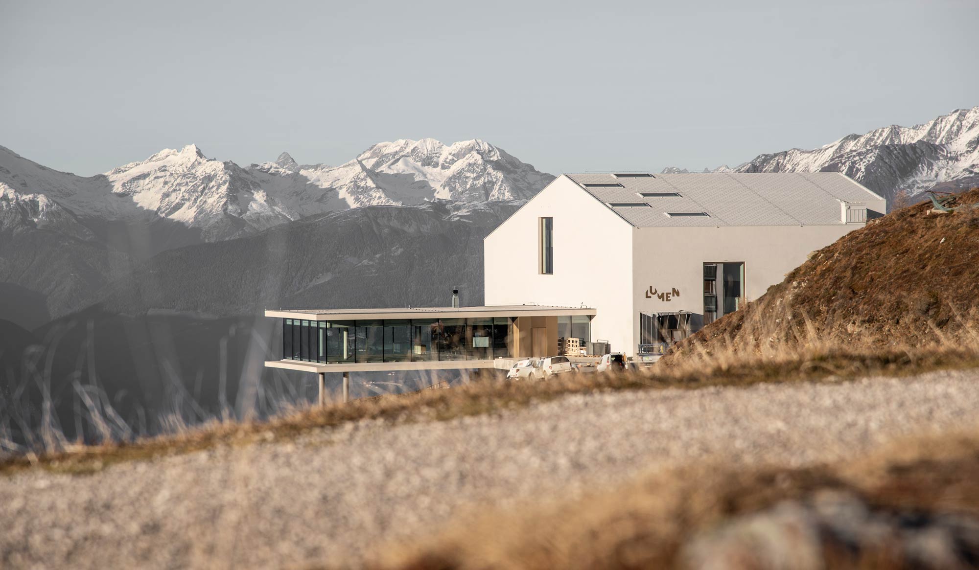
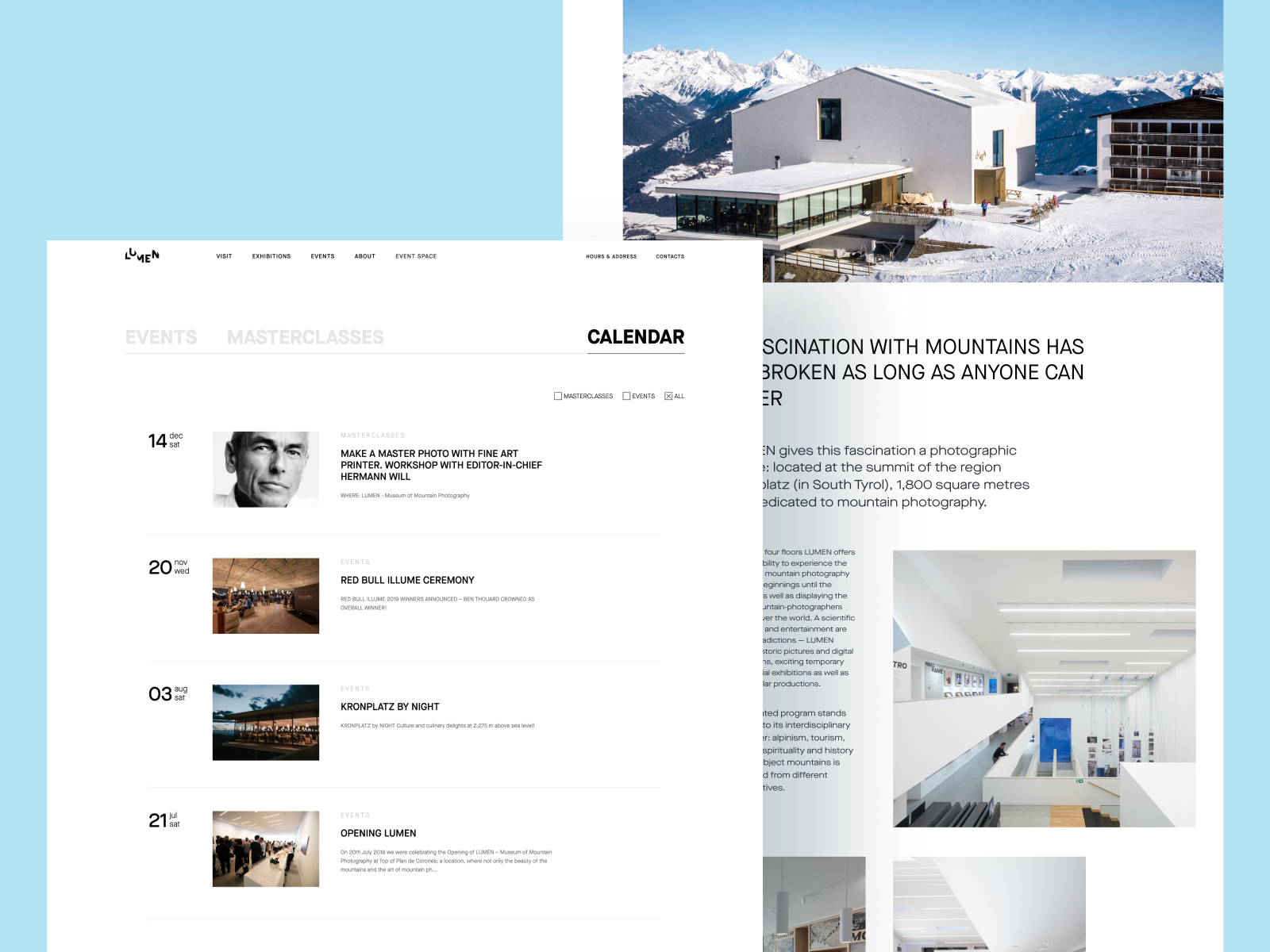
Lumen Museum is located at the summit of the region Kronplatz (in South Tyrol). It covers 1,800 square meters dedicated to mountain photography: the 4 floors impress the visitors with insights into the history of mountain photography from its beginnings and the art of mountain photographers from different corners of the world. The museum harmonically combines history and innovations, interactivity and exploration, covering the subject of mountain photography from diverse perspectives.
That what the museum team wanted to see on their website as well. It was important to make it modern and trendy but at the same time to preserve a strong and consistent connection of the physical museum with its online site.
The creative team from Tubik assigned for the project included Vladyslav Taran, Denis Koloskov, Andrew Drobovich, Kirill Erokhin, Alexander Petulko, Dmitry Shevchishen, and Polina Taran.
Website Design
Here we welcome you to take a glance at the website we designed and developed for the Lumen Museum. Variety of elegant pages, smooth animation, engaging scroll, video integration, and other design solutions to present the amazing museum content online.
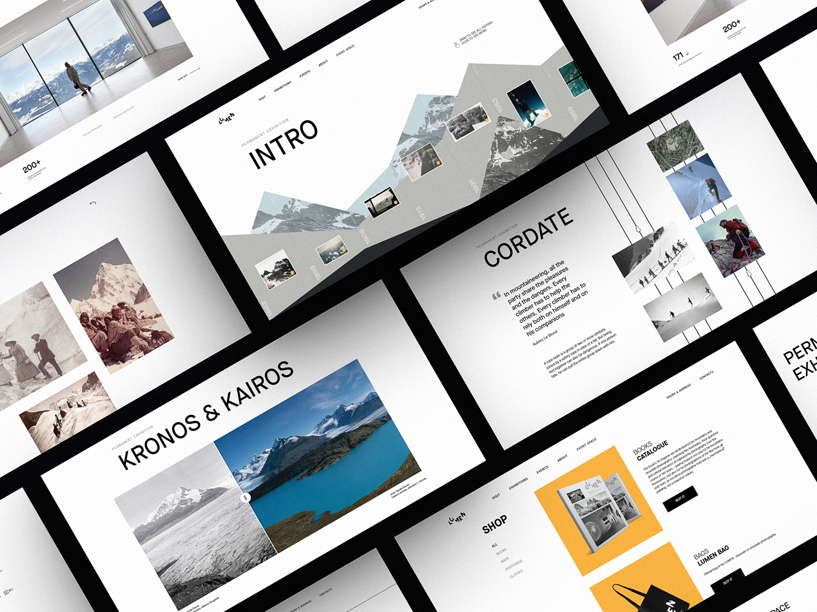
All the major pages of the website are based on minimalist layout, impressive visuals, a light background, and mastered negative space: that makes them full of air and freshness and let the visitors feel it from the first seconds. Also, such an approach ensures that all the diverse visual content, from archive black and white photos to modern shots and videos, will look good on the pages.
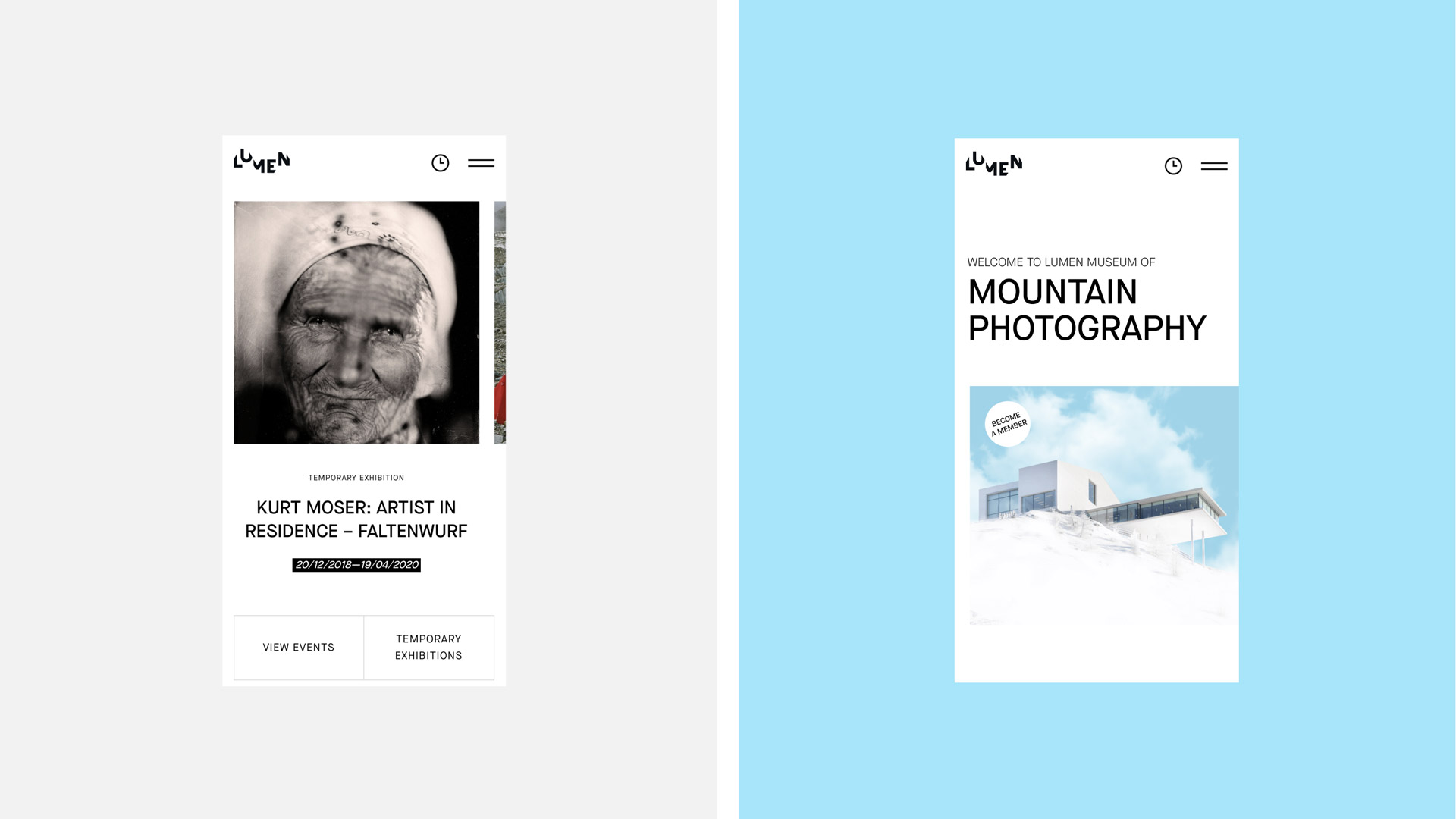
The home page features the hero section based on the beautiful view of the museum building with an animated flow of clouds that makes it even more lively and atmospheric.
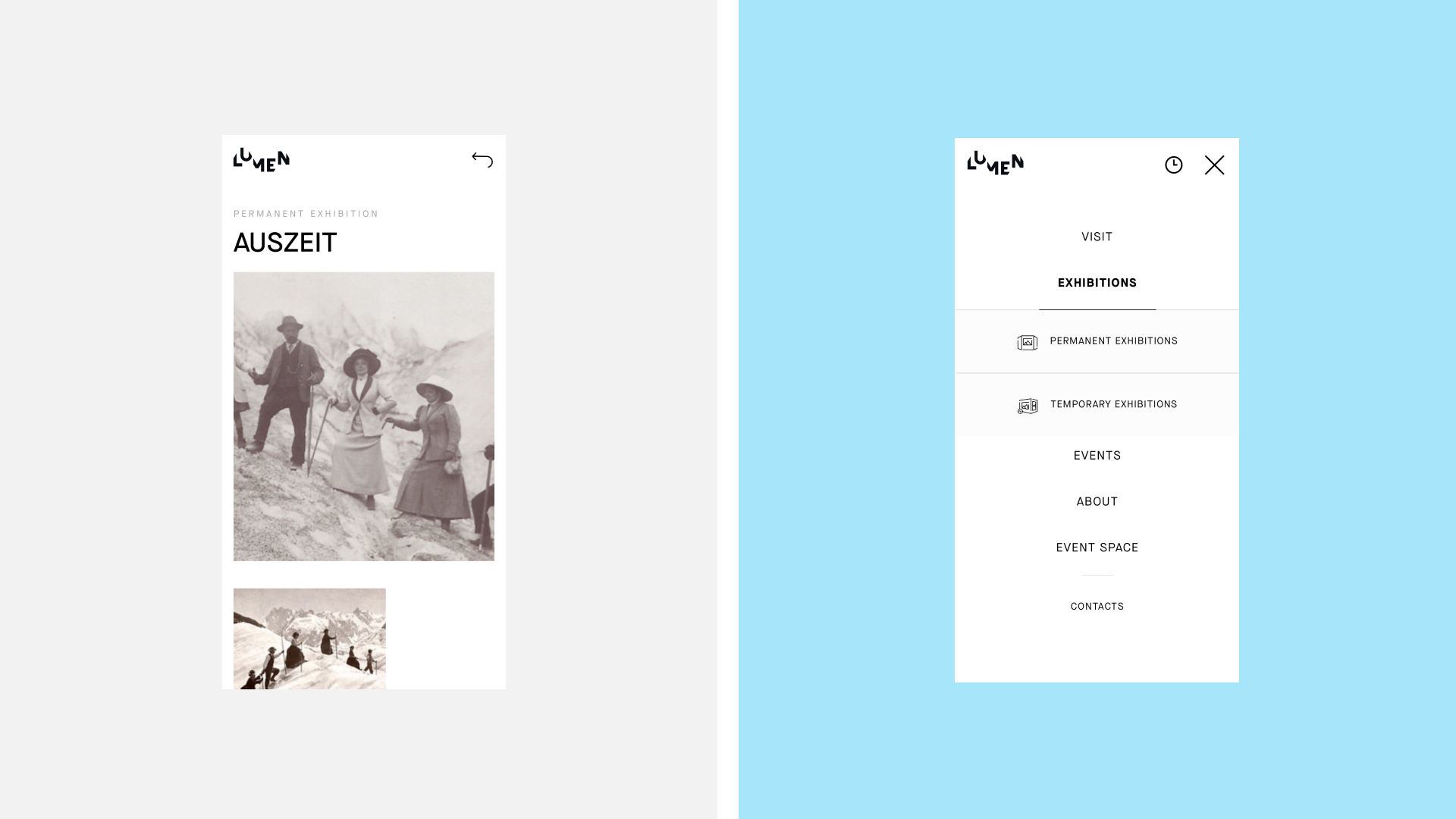
The typography solution didn’t feature decorative fonts; instead, the designers used the highly readable and solid sans-serif font that becomes the foundation of solid typographic hierarchy. The website header features the link buttons for the core navigation areas as well as contacts and information about the museum address and schedule. The header is sticky so the user can reach the core pages from any point of interaction or page scrolling. The pages demonstrate the well-balanced mixture of static photo content, animated photos, and videos integrated into the layout.
The transitions between the pages are supported with an animated counter featuring the height of the museum location and this way it adds some entertaining elements into the process of switching to another page. Negative space works as a visual divider for the text blocks making the content look more digestible, well-organized, and readable.
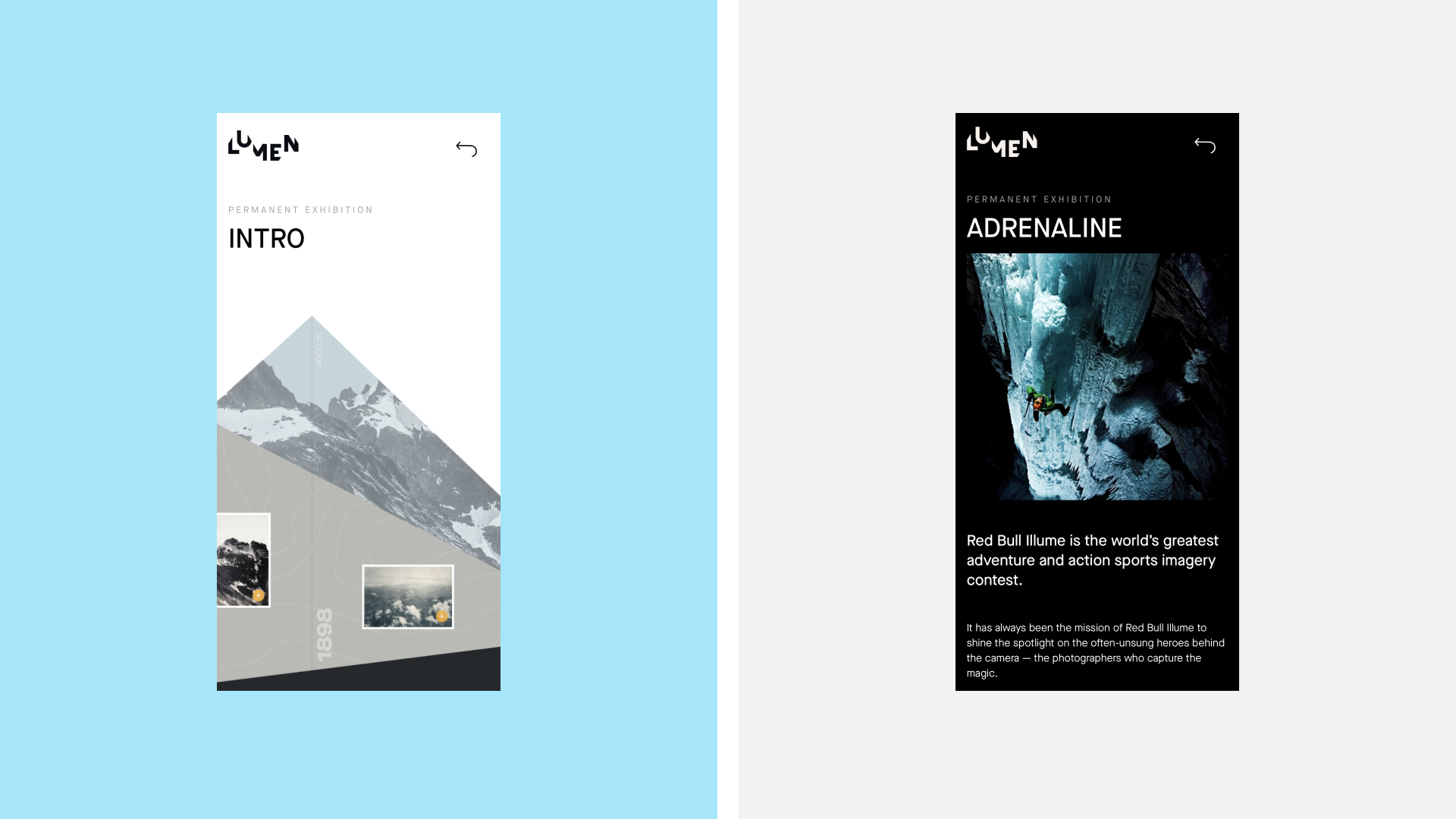
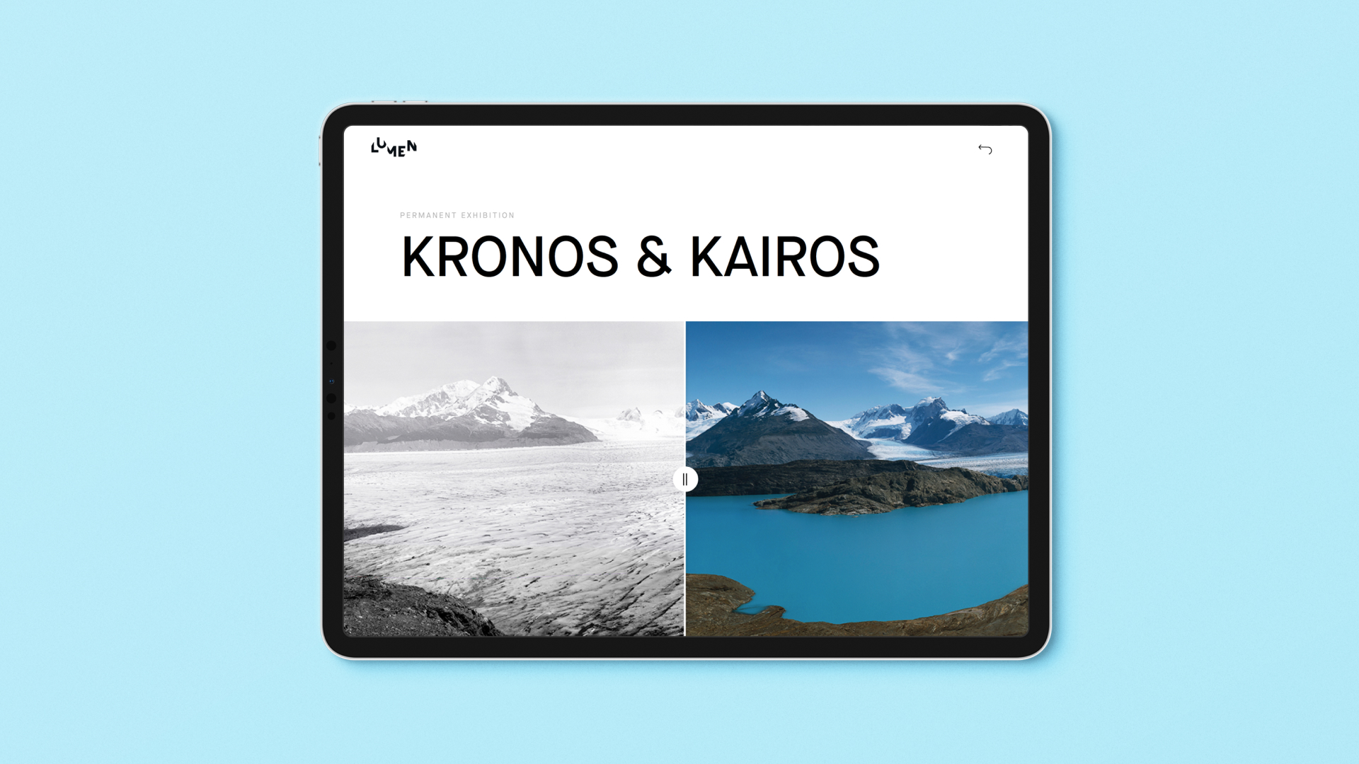
The museum offers two types of exhibitions: Permanent Exhibitions, which are always available and have their unique performance, and Temporary Exhibitions that are operating for a limited period. While the pages for temporary exhibitions employ the same page template, the pages for permanent exhibitions all have unique designs that reflect the most interesting points and interactivity of actual museum halls. For example, the exhibition page below features the organization and vertical animation of the photo collection that echoes the visual presentation of this interactive set in the exhibition hall of Lumen Museum.
The consistent integration of video content allows visitors to dive deep into the atmosphere of the museum and feel its refreshing nature. The section of testimonials supports social approval while the simple and scannable footer offers links to different website pages. The webpages implement both vertical and horizontal scroll to allow for more diverse and informative interactions without unnecessary clicks and transitions.
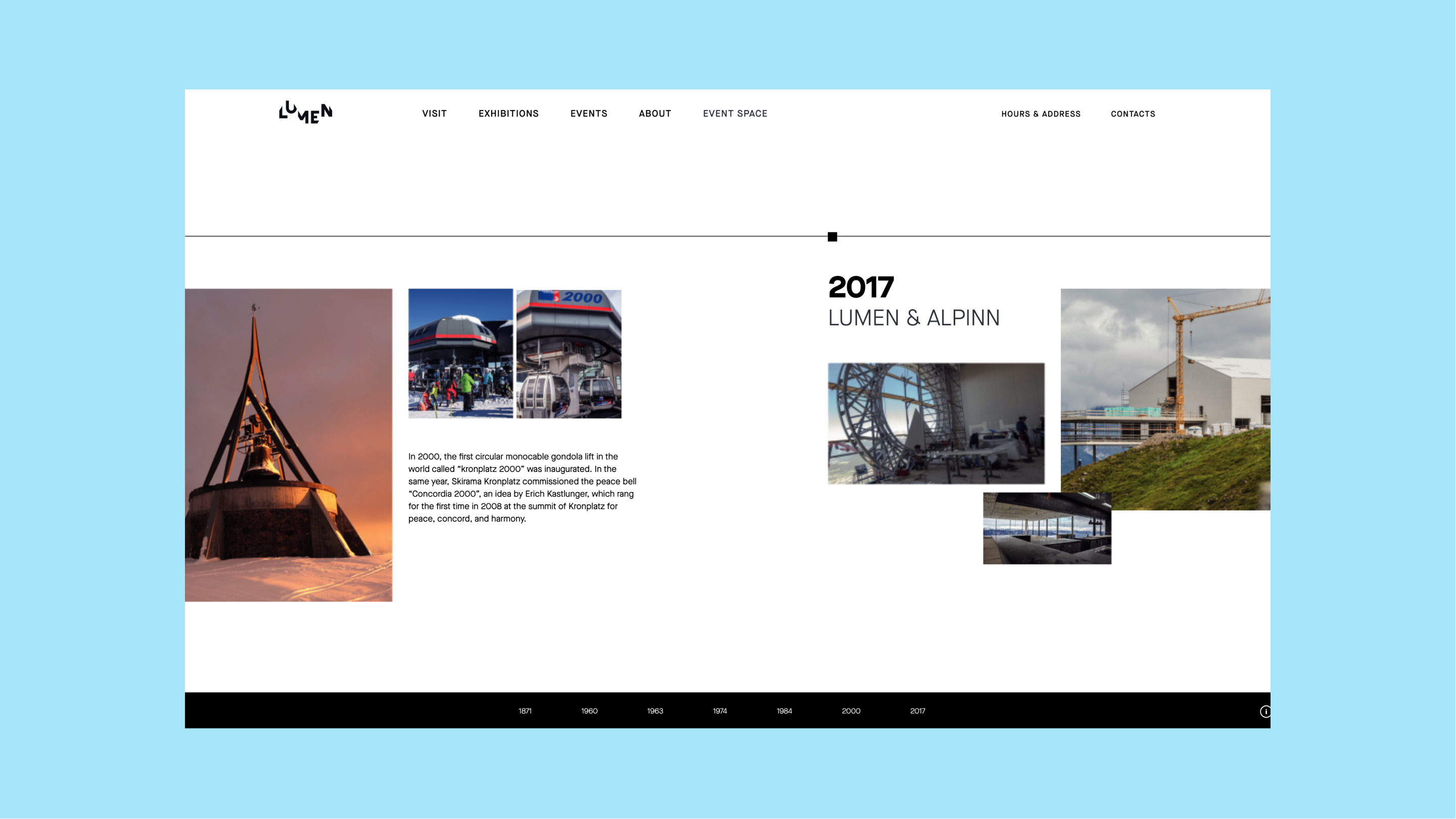
The history page implements the horizontal scroll to build up a solid timeline of photos and concise text blocks guiding the visitors through the different stages of the location, the museum foundation, and development.
The airy calendar page invites the visitor to check the upcoming events and exhibitions: each item is presented with a date, type of the event, its name, the secondary text block for additional description or information, and a photo setting a quick visual association. A simple checkbox filter allows for tuning the list while the visual dividers help to clearly scan the structure and distinguish the items. This way the solid visual hierarchy is built to make the webpage scannable, readable, and eye-pleasing.
Here’s an example of the webpage whose wow-effect is based on the animated image of a photo camera.
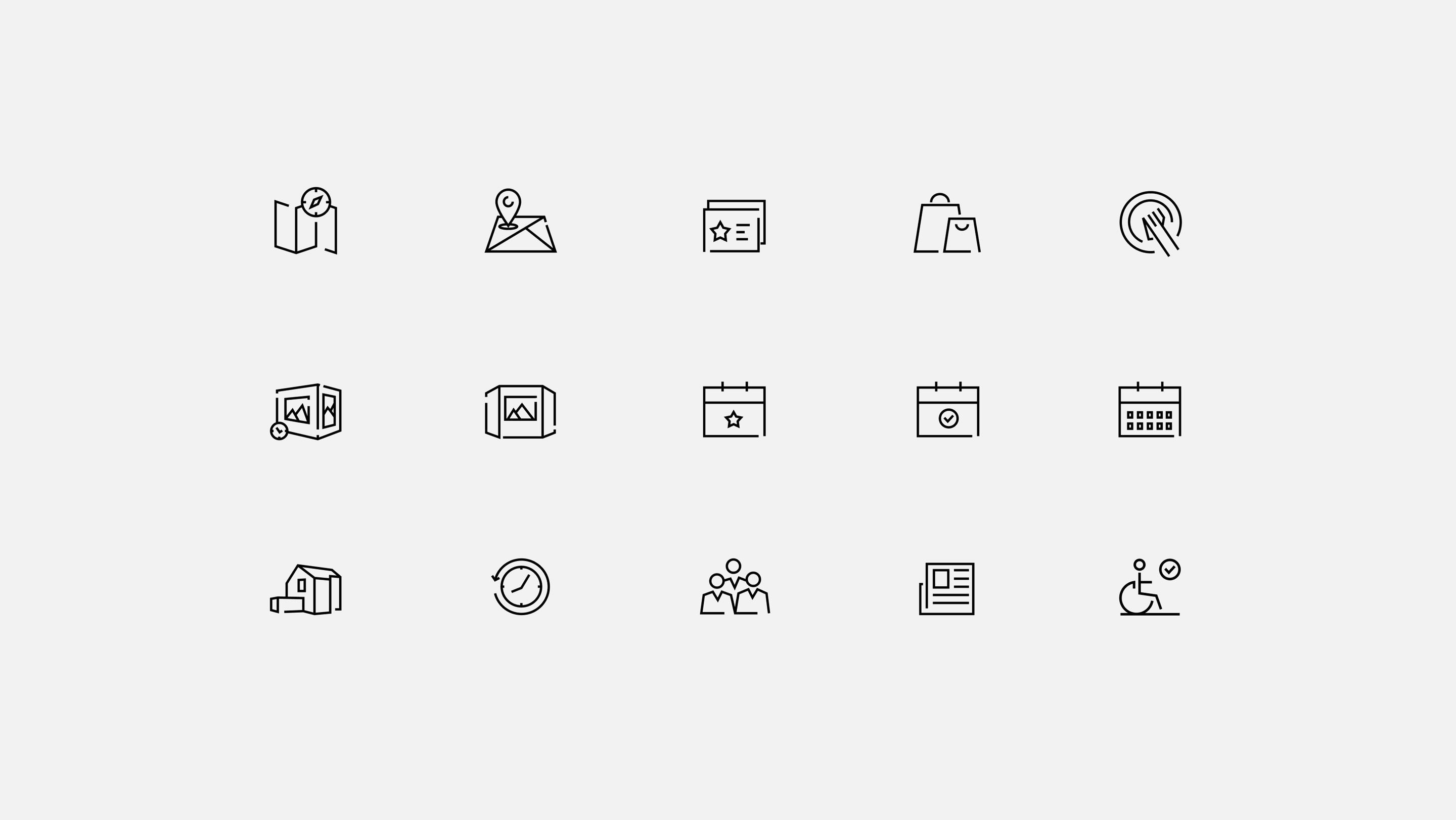
To fulfill the navigation needs, an original set of minimalist outline icons was designed for the website.
To make the website beautiful and consistent regardless of the device it is visited from, we also thoughtfully adapted it to the tablet and mobile versions.
This project for Lumen Museum was an amazing experience for our team and the story of the great collaboration with the museum team: altogether, we achieved the goal to create the museum a beautiful online home and connect it with its audience faster and easier.
Check the live website of Lumen Museum to see more details of design and development.
More Design Case Studies
Here’s a set of more case studies sharing the design solutions and approaches for some of the UX design projects done by Tubik.
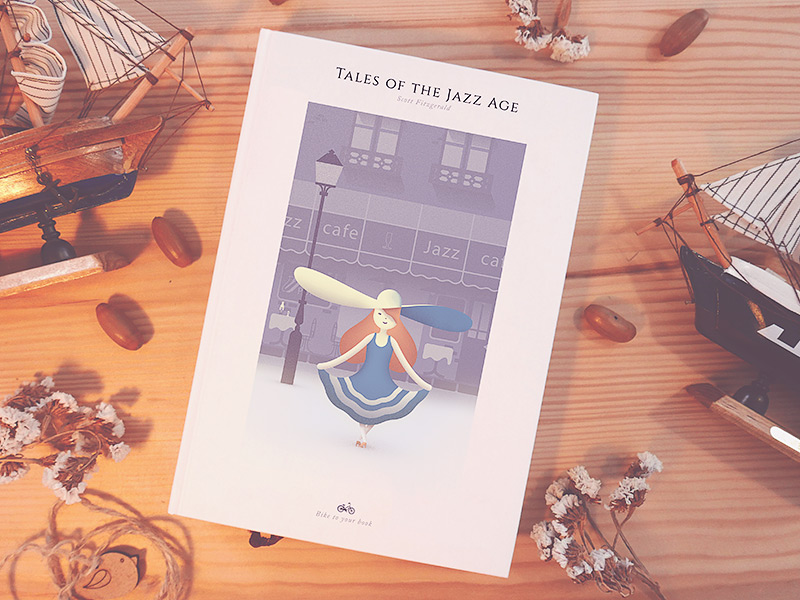
GNO Blankets. Branding and Web Design for Ecommerce
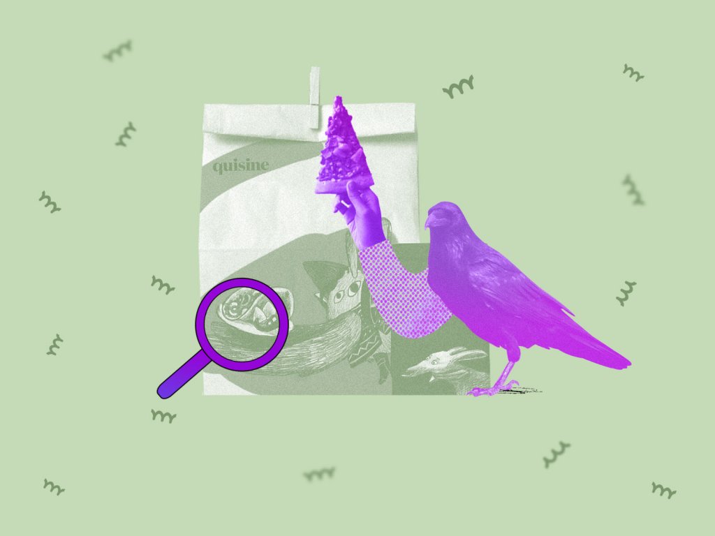
Designer AI. Dashboard and Graphics for Fashion Service
Pazi. UX and UI Design for Vehicle Safety Mobile App
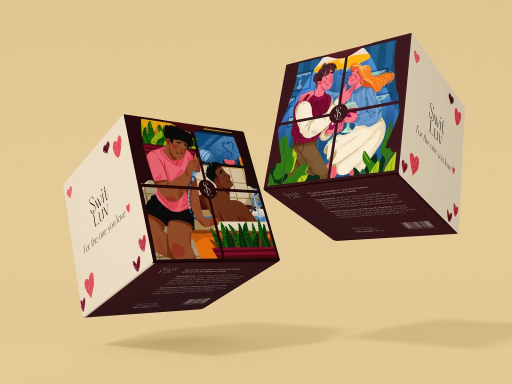
CashMetrics. UX Design for Finance Management Service
Bitex. UX Design for Stock Analysis App
Inspora. Brand and UI Design for Virtual Stylist
Nature Encyclopedia. UI Design for Education
Perfect Recipes App. UX Design for Cooking and Shopping