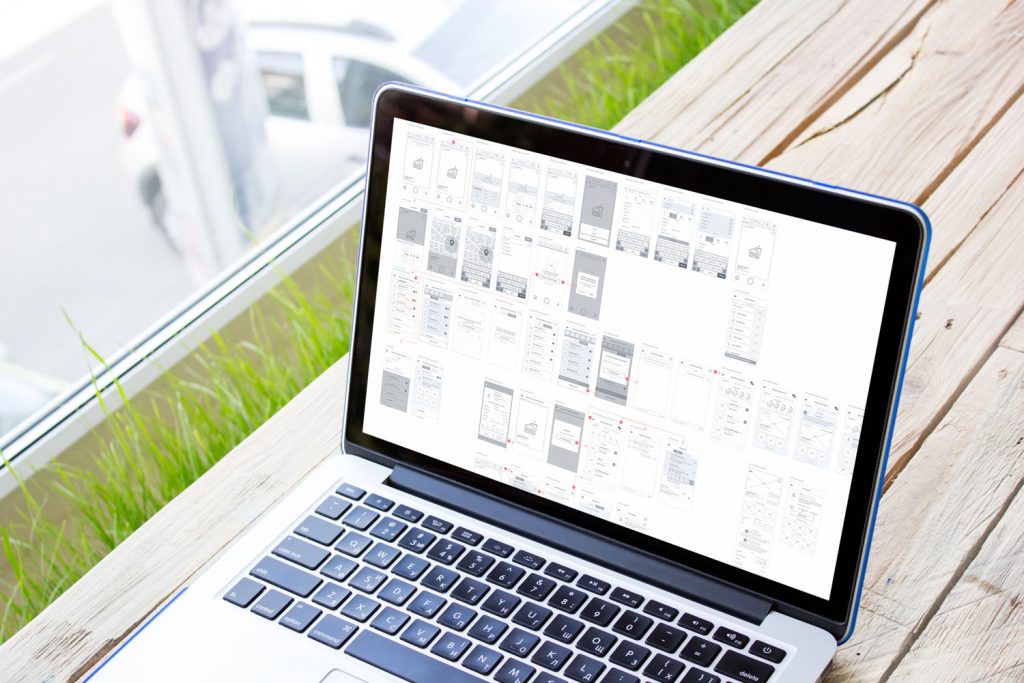
One of the global tasks that are successfully solved by digital products is various aspects of systematization, analysis, and accounting. Mobile and web applications help to effectively manage financial and communication issues, and this way, design directly supports the business. Today we offer you to see how the products of this kind are created: welcome to review the UX design process for one of our recent projects CashMetrics, the service that helps retailers manage their cash. The studio designer assigned to this project was Ksenia Lashko, whom you may remember from the case study on a biography website about Stanley Kubrick.
Project
UX and UI design for an admin panel and landing page of a finance management service.
Process
CashMetrics provides support for retailers, mainly in the fashion segment: it helps to organize their operations and monitor cash flows. It is aimed at simplifying operational processes, with a key focus on tracking profits, shipping costs, and fees. When it comes to financing, the first idea that immediately comes to mind is boring tables and complex calculations. So, the primary goal was to step away from dull, unclear and overwhelming data presentation and make the service eye-pleasing and easy to use.
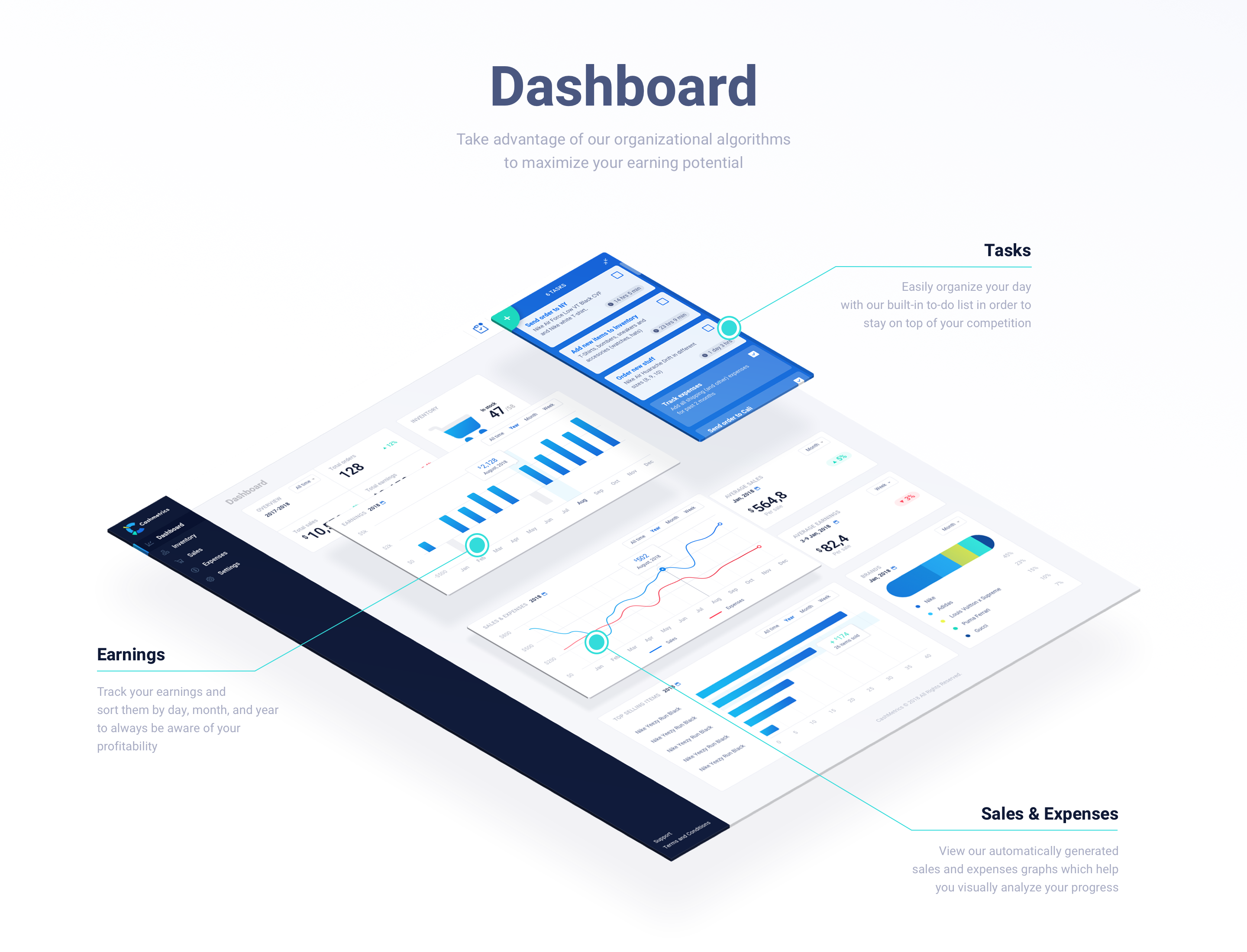
Dashboard
The first thing to focus the design effort on was a dashboard, the main page of the admin panel. That was one of the challenging pages as it had to consist of many statistics and graphics blocks. Besides those, a to-do list was also required on the dashboard.
So after the research was done, the creative team defined which stats would be the most useful and which of them required to be shown in charts for better perception. The designer ended up having 8 statistic blocks:
- Overview: the user can see general information about sales, orders, and profits for a selected period of time (year, month, or week) and watch the temps of growth.
- Inventory: the total quantity of items that the retailer has in the range and how many of them are in stock.
- Earnings: the chart that shows the positive and negative value of earnings.
- Sales & Expenses: the chart includes any costs incurred by the retailer and the number of goods sold
- Top-Selling Items: top 5 items ranged by the number of units sold. The user also can see how much profits he got from selling those items.
- Top-Selling Brands: shows which brands have more share in sales.
- Average Sales: average income and profit that the retailer make over a certain period of time.
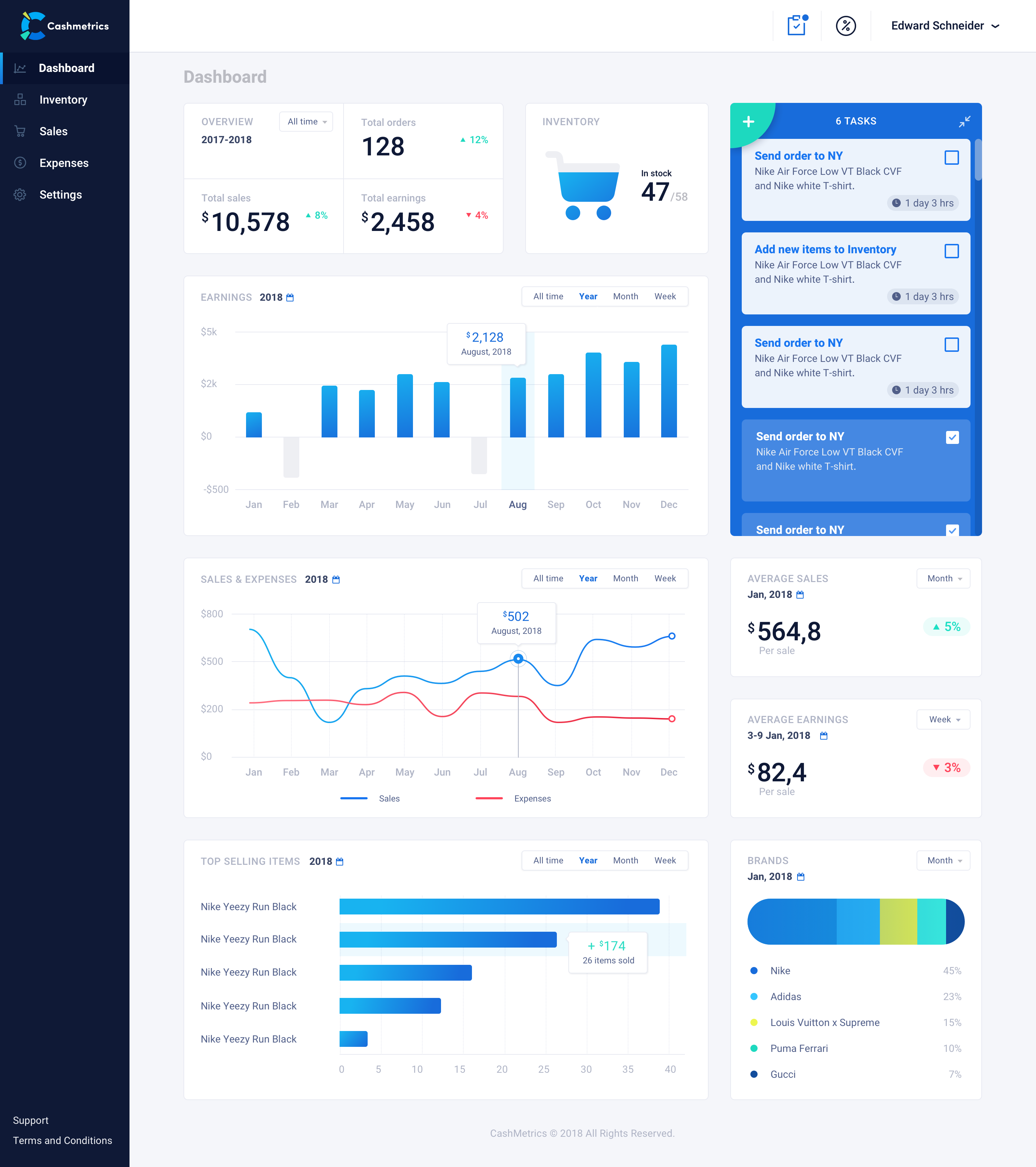
To bring a little fun into charts and numbers, the designer chose a vibrant color palette that creates an appealing and clean look. For primary colors, deep blue and vibrant blue was chosen; for additional accents, the turquoise color was picked. The choice of background color turned on light to make the layout airy and easy to scan.
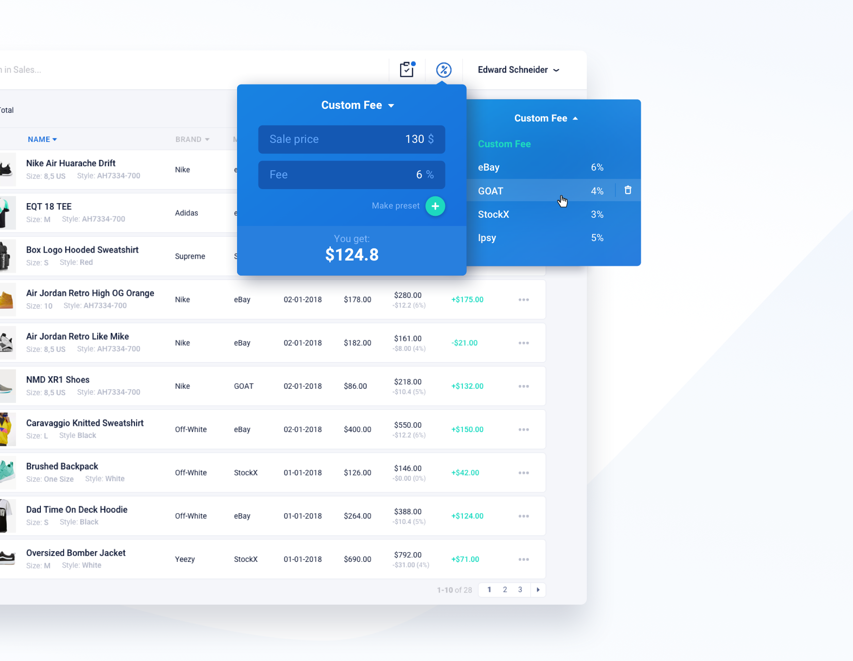
Also, one of the main requirements was to create a fee calculator to easily account selling fees for marketplaces such as eBay, GOAT, StockX, and others. For marketplaces that are used most frequently by the user, it is possible to make a preset.
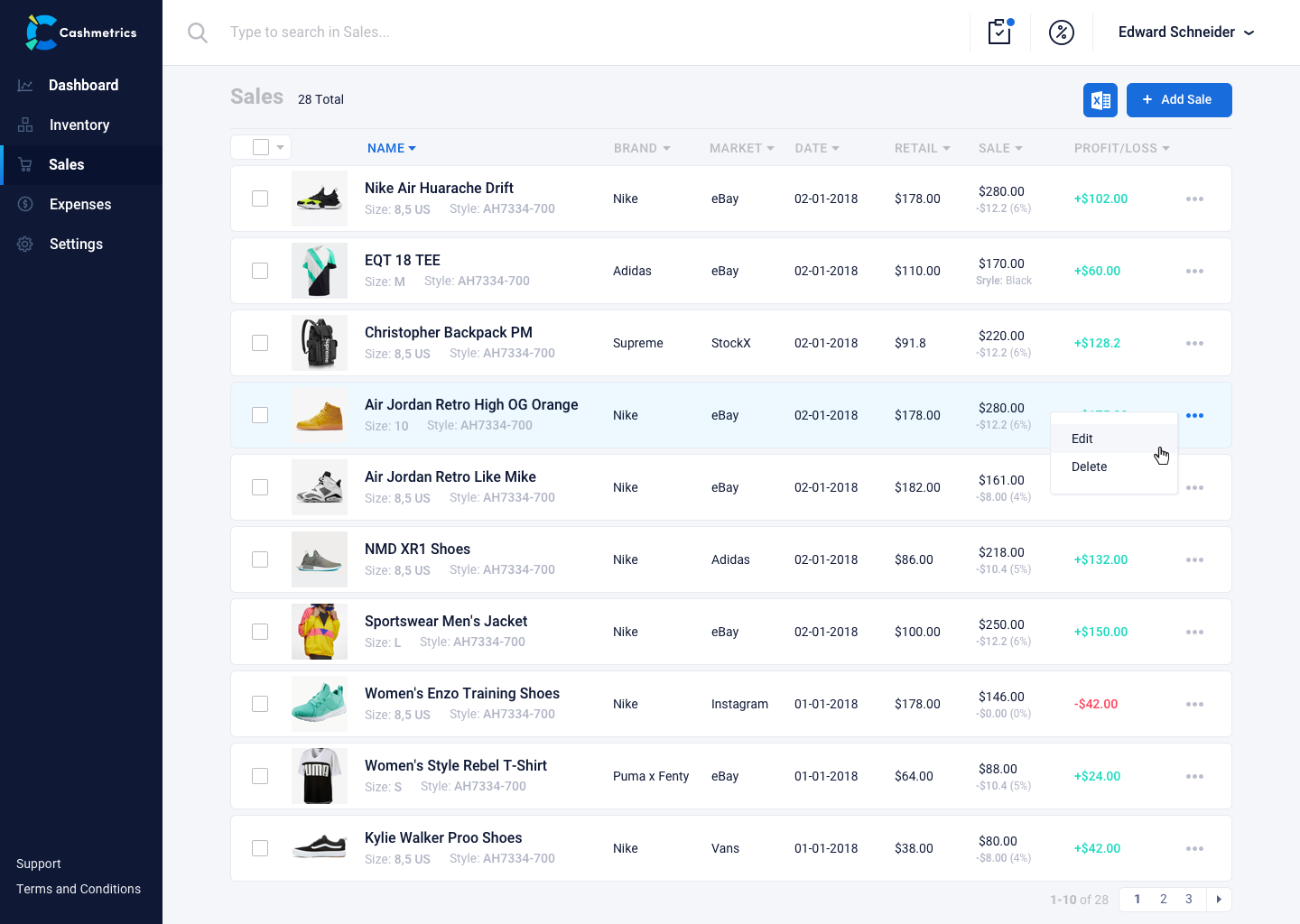
Inventory, Sales, Expenses
For tracking selling inventory and monitoring the status of the products, there is an Inventory page. It was important to make interaction with inventory and sales pages convenient and as clear as possible because these pages are the ones the retailer interacts with most often.
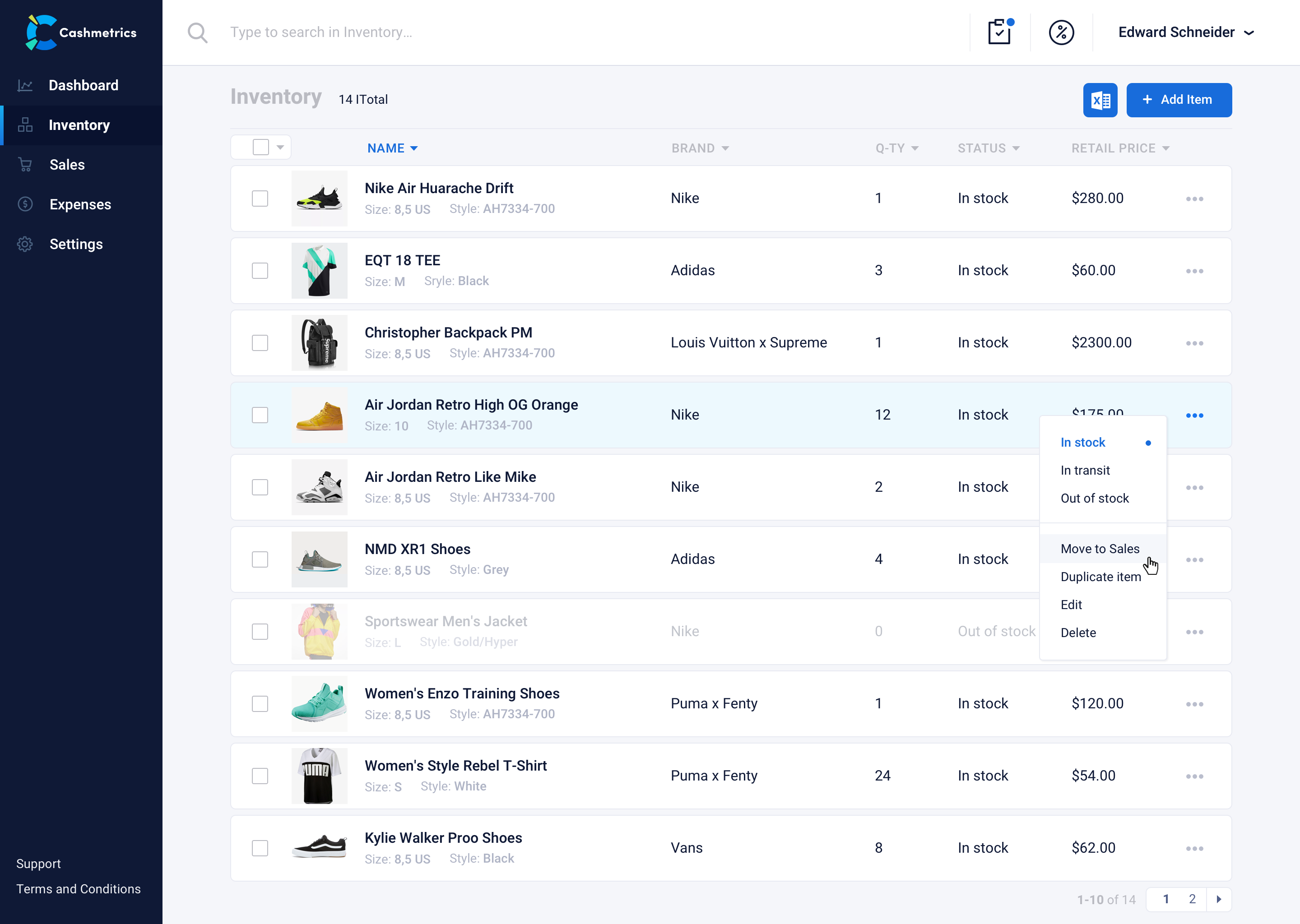
To create a new item, a user should specify a name, color, size, brand, quantity, retail price, and status. That helps to sort items and easily find one that is needed. The status of the item changes in one click in a dropdown with actions. When the last item has been sold, it is left in inventory with the status ‘Out of stock’. So when the item is in stock again, there is no need to put all the information down again; the retailer simply changes the status and quantity.
As there are a lot of properties that need to be filled to create a new item, the designer added a ‘Duplicate item’ feature. So, if retailers have similar items in different sizes and colors, they can just duplicate an existing item and change some of the properties.
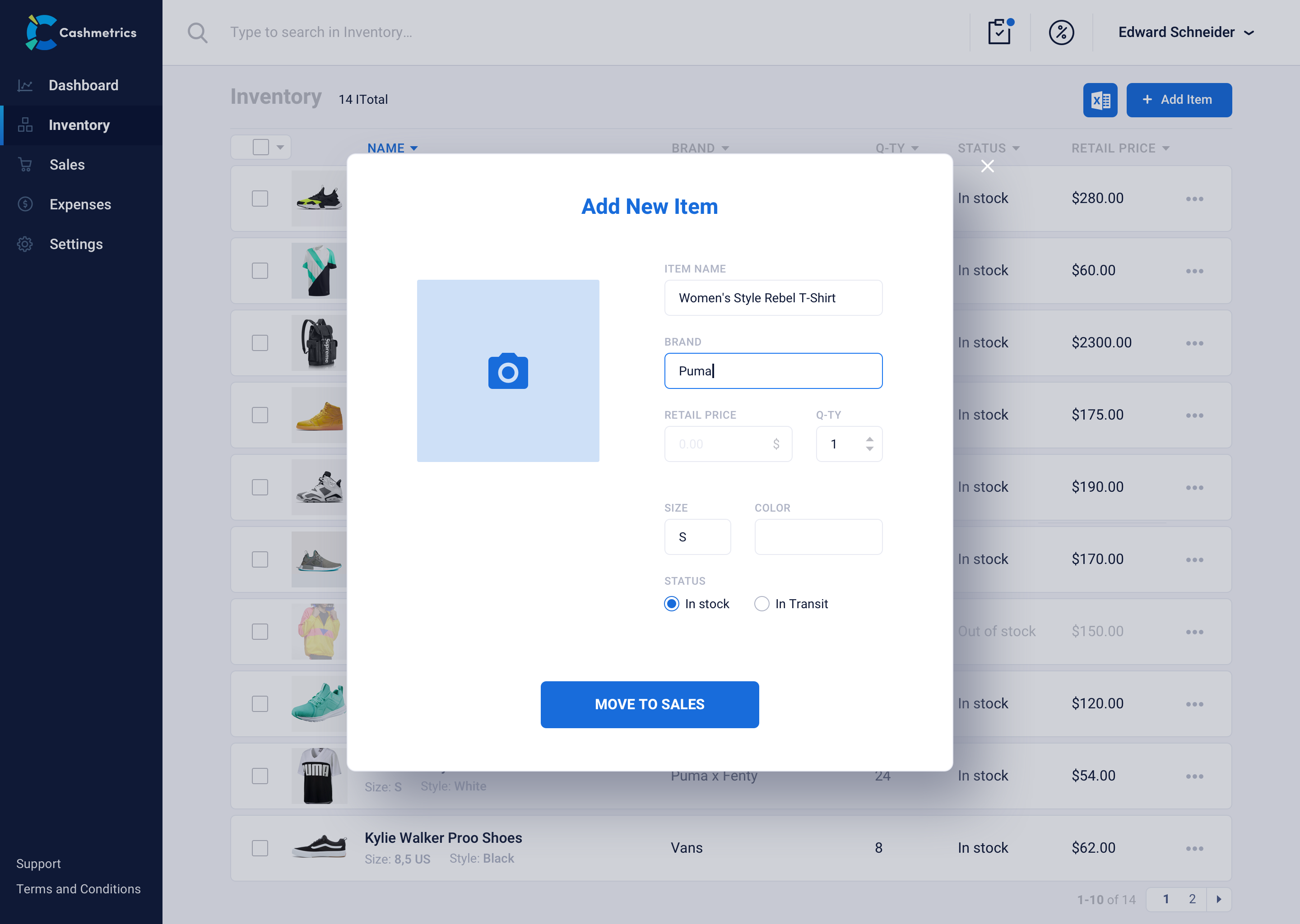
In order to simplify the transition to the platform for new users, the ability to import sales information from Excel has been added. So, in general, there are three ways to add information to sales:
- Excel import
- quick transfer from inventory
- enter the information manually.
In the Expenses page, there are data supposed to be uploaded automatically and also could be added manually. When the retailer adds some item to inventory, the specified retail price of it also been shown in the Expenses. The retailer can also track expenses such as shipping boxes, software expenses, etc. Along with the sales data, expenses are visually represented in the chart on the dashboard.
Landing Page
For the landing page user interface design, the designer kept the clean and simple style as in the admin panel. Simple soft shapes on the background are consistent with a line chart in the header and also emphasize the simplicity and user-friendliness of the product. In the blocks with information about the product, there are CTA buttons “See more,” which redirect the user to sign up form as well as “Join now” buttons.
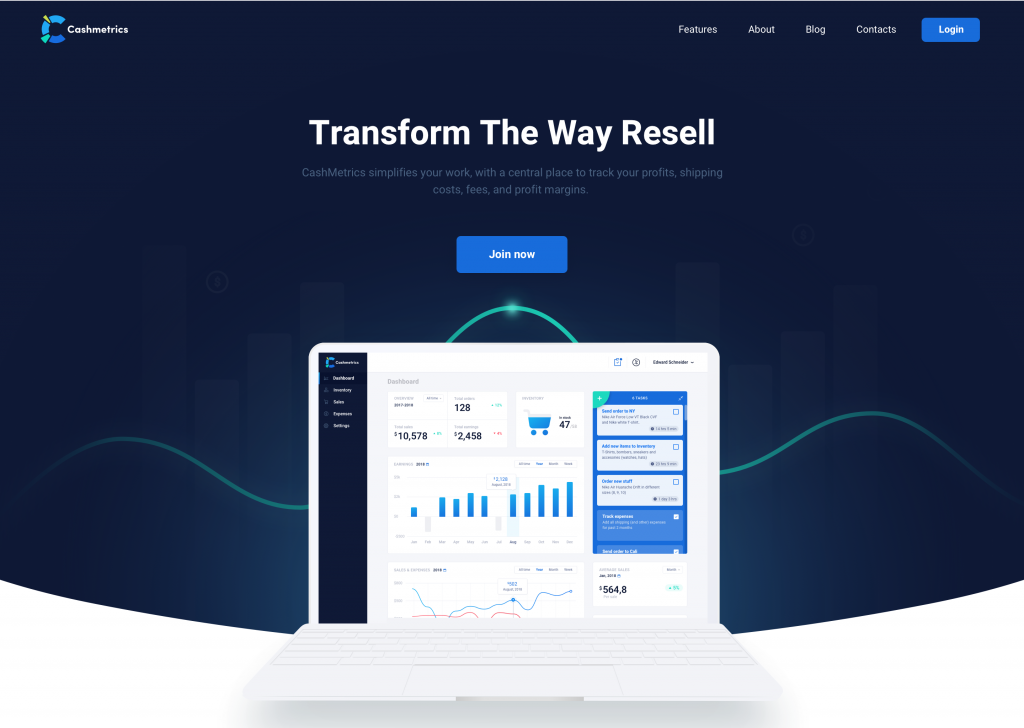
Also, we added a perspective view of the dashboard page, focusing on the main blocks.
To sum up, based on its high practical value, the product itself and its landing page are based on the principles of user experience design consistency and a high level of usability to support users at every step with intuitive navigation as well as clear and concise data segmentation.
UX Design Case Studies
Welcome to review other case studies on UX design process and solutions for a variety of digital products:
Bitex. UX Design for Stock Analysis App
Crezco. Brand Identity and UI/UX Design for Fintech Service
Inspora. Brand and UI Design for Virtual Stylist
Nature Encyclopedia. UI Design for Education
Uni. Landing Page Design for Fintech Service
Perfect Recipes App. UX Design for Cooking and Shopping
Tasty Burger. UI Design for Food Ordering App
Slumber. Mobile UI Design for Healthy Sleeping