Financial services have been undergoing incredible progress due to technological advances, yet, unnecessary costs and complications still exist, sometimes playing a crucial part for small businesses. Our today’s design case study tells the story of the fintech service Crezco which strives to solve this problem and make financial operations even easier at no additional cost. Welcome to check the details of the design process on brand identity and UX design for the website and the mobile application.
Project and Client
Crezco is a fintech product that employs technology to eliminate unnecessary expenses and frictions in trading for businesses, bringing suppliers and buyers together and supporting their growth. That is a creative and modern solution, especially for small businesses that focus on what matters most, while payment processes are all covered with Crezco. The service strived to set up a solid and trustworthy brand image and communication that would clearly transfer the idea of reliable and straightforward financial operations and business support.
The big creative team from tubik side for the project included Ernest Asanov, Vladyslav Taran, Olya Zakharyan, Vlad Radionov, Denys Koloskov, Kirill Erokhin, Olya Bazyaeva, Anton Morozov, Yaroslava Yatsuba, and Anastasiia Ostapenko.
Process
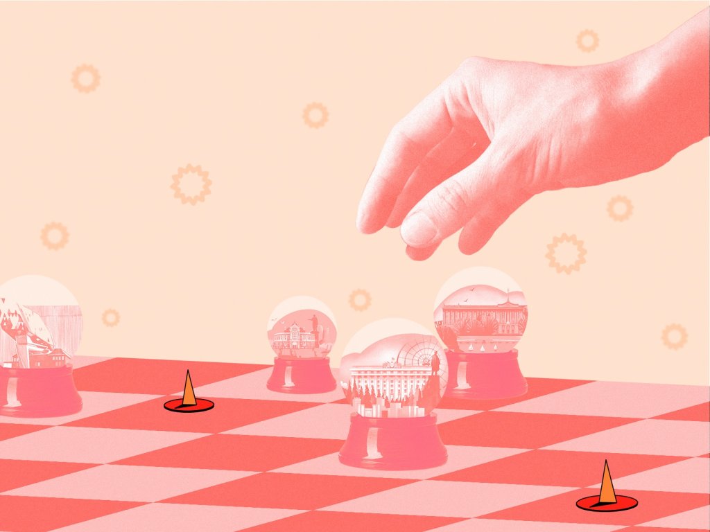
The creative team aimed to create an identity that would translate the key brand vision: to make inefficient markets efficient and speed up economic progress everywhere. Crezco’s identity becomes a communication tool that helps to address a broad and diverse community and conveys the product’s advantages.
The central idea that influenced the visual style of brand identity is the creative approach to the traditional bar charts usually used for financial reports and stats. They were transformed into a balanced and harmonic design system consistently used across all the brand touch-points with its customers, from logo design and animation to the diversity of both tangible branded items such as business cards, clothes, posters, billboards, and digital communication in social media.
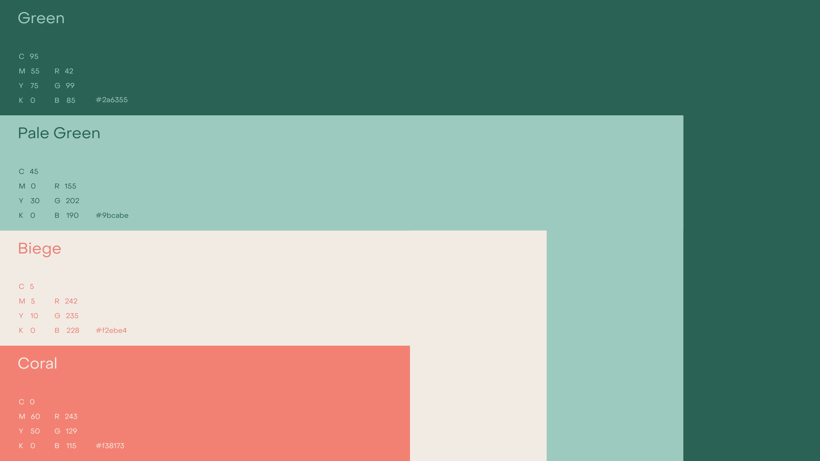
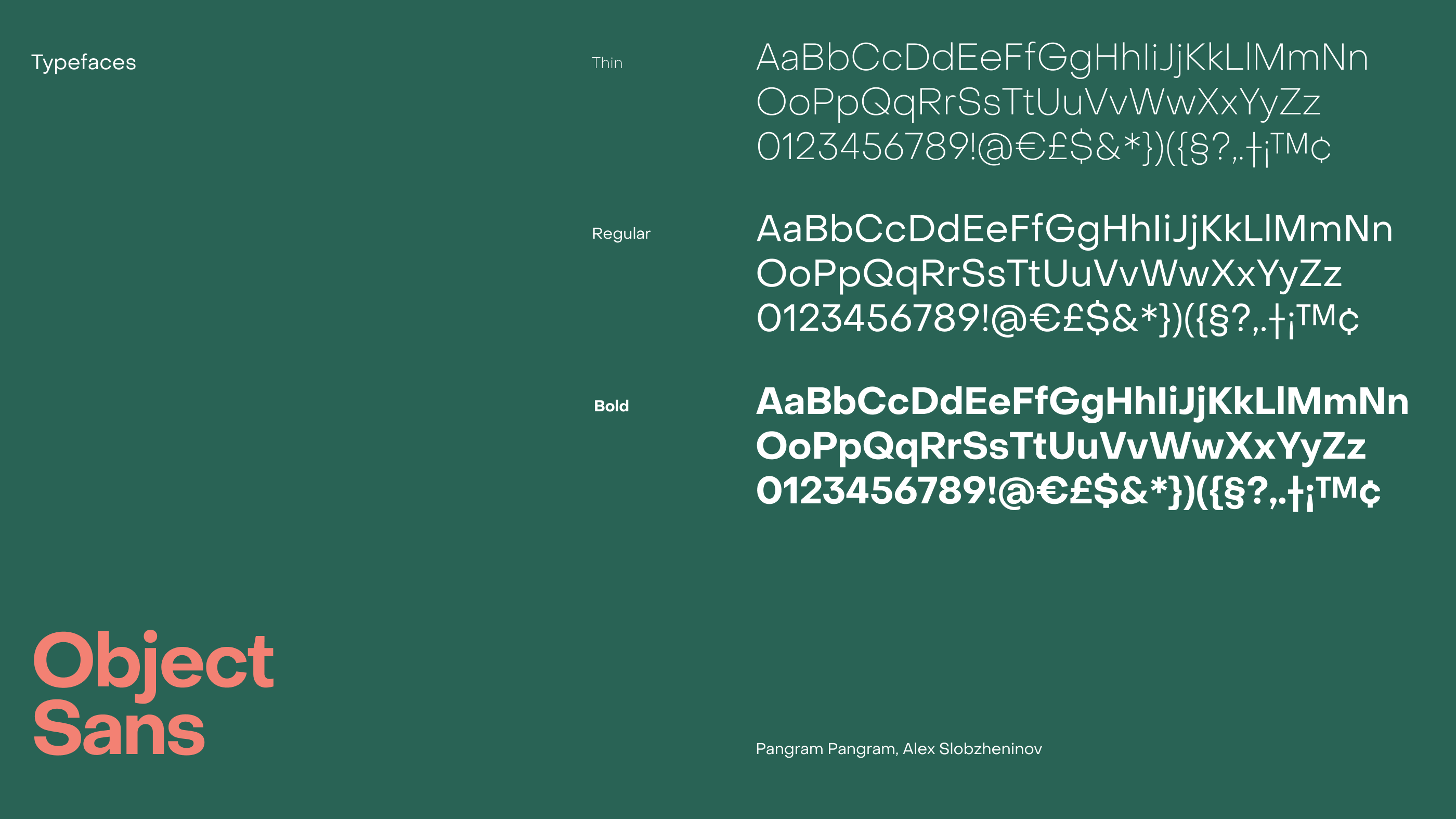
The brand color palette is based on several shades of deep green and pale green with accent colors such as coral and beige. Such a combination is flexible for playing with color contrast and setting solid readability and legibility for different channels and spots of visual communication. The choice of typeface fell on the elegant and readable Object Sans.
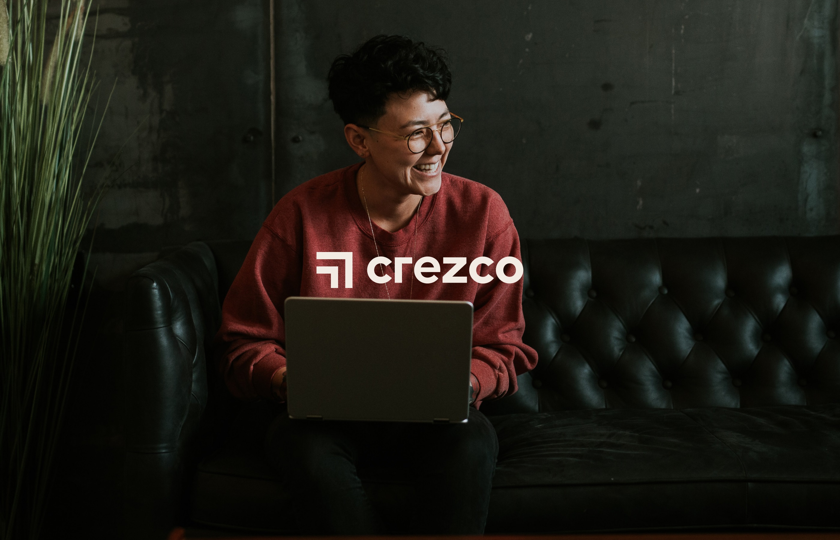
And here’s a closer look at the logo design based on that approach. It is a combination made up of a solid square symbol based on the ideas of transformable bar charts and the typographic part unveiling the brand name. What’s more, based on the shapes psychology, straight lines and right angles of a square give a sense of reliability and security, and people strongly associate squares and rectangles with buildings the reason why they bring the feeling of trust and authority, which was also a good association to set about the financial service.
![]()
The approach described above was developed into a set of branded and advertising items to grow brand awareness and recognizability via various customer touchpoints.
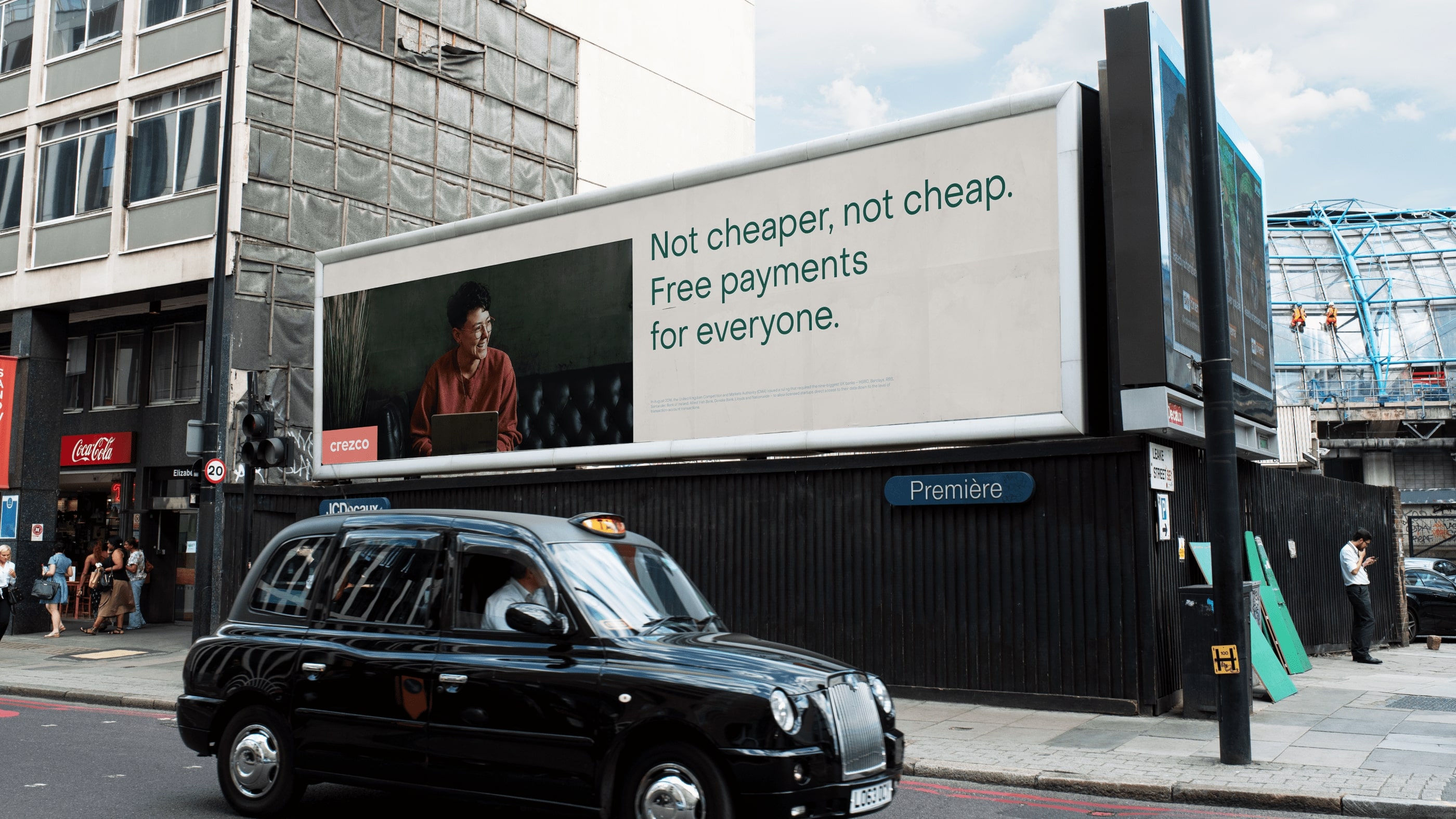
Outdoor advertising billboard design
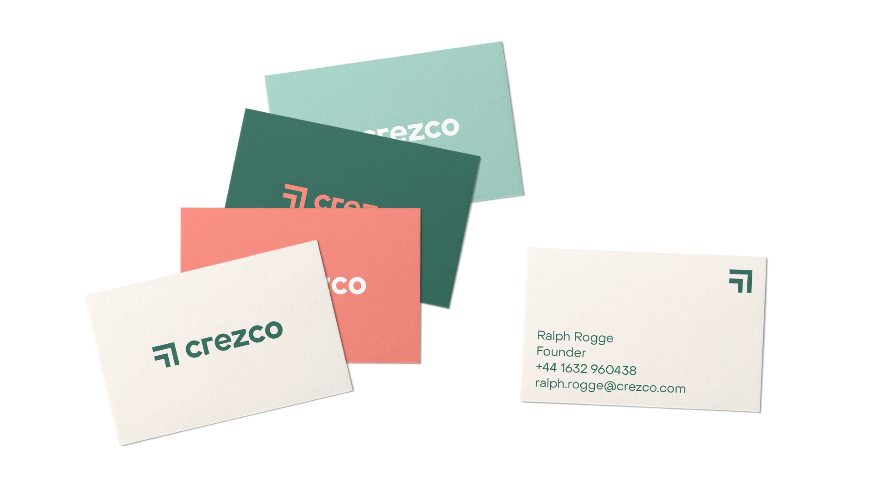
Business cards design
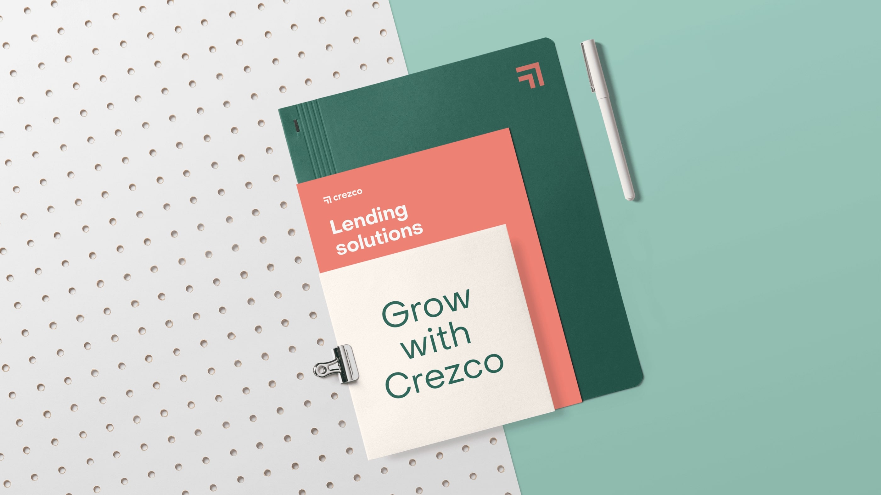
Booklet/notebook design
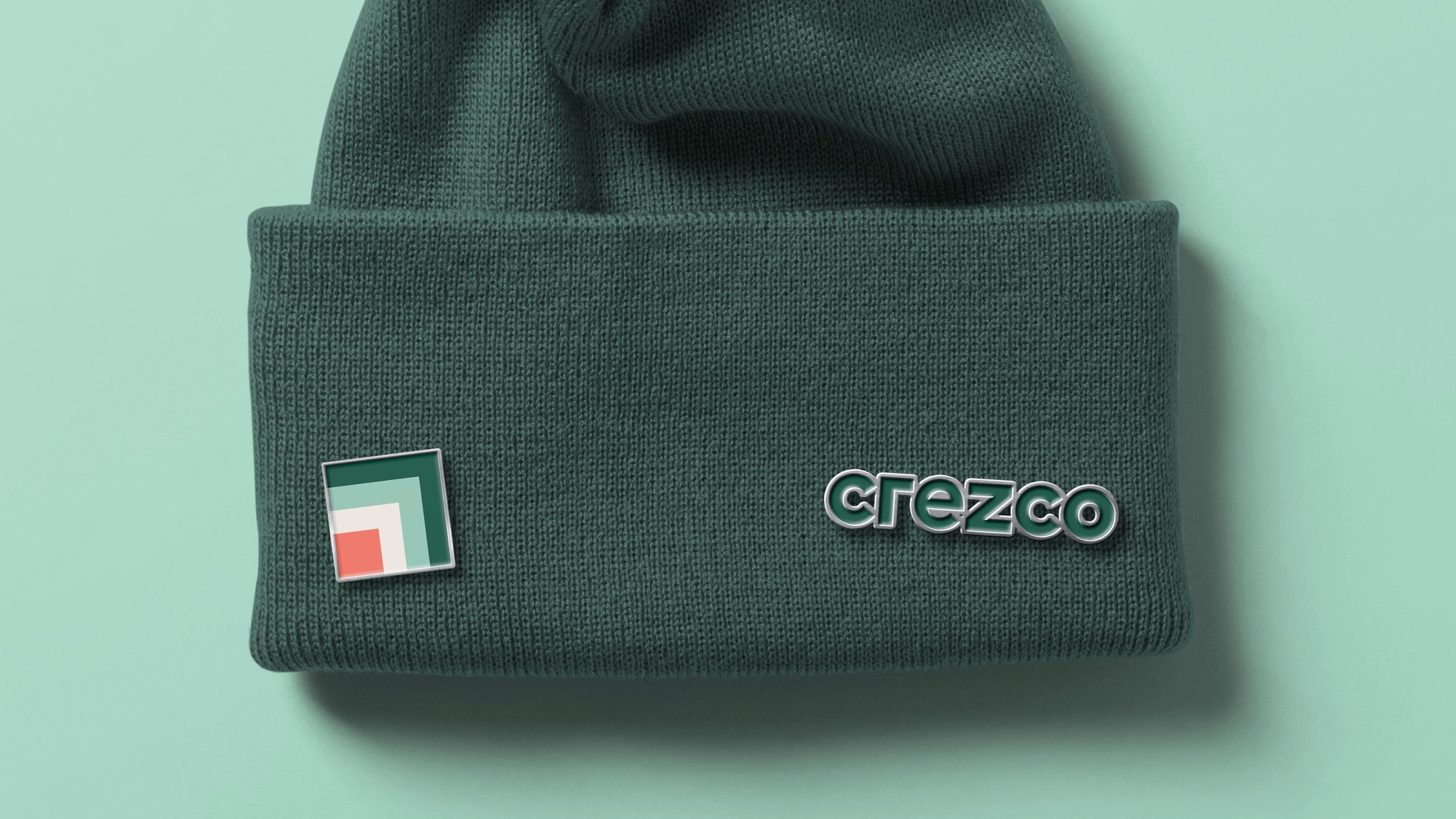
Branded badges
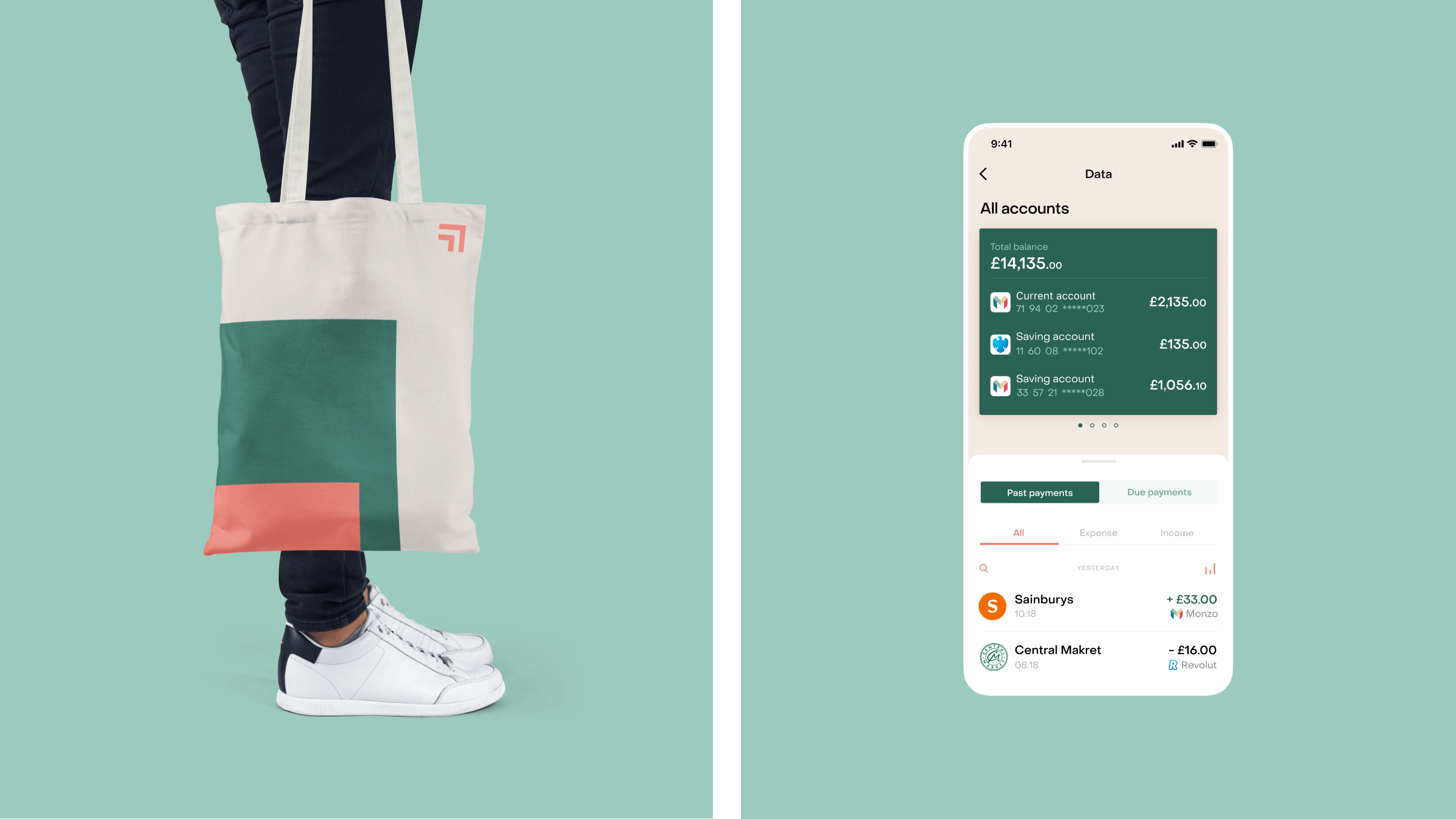
Branded tote bag design
Advertising poster design
Branded video commercial concept
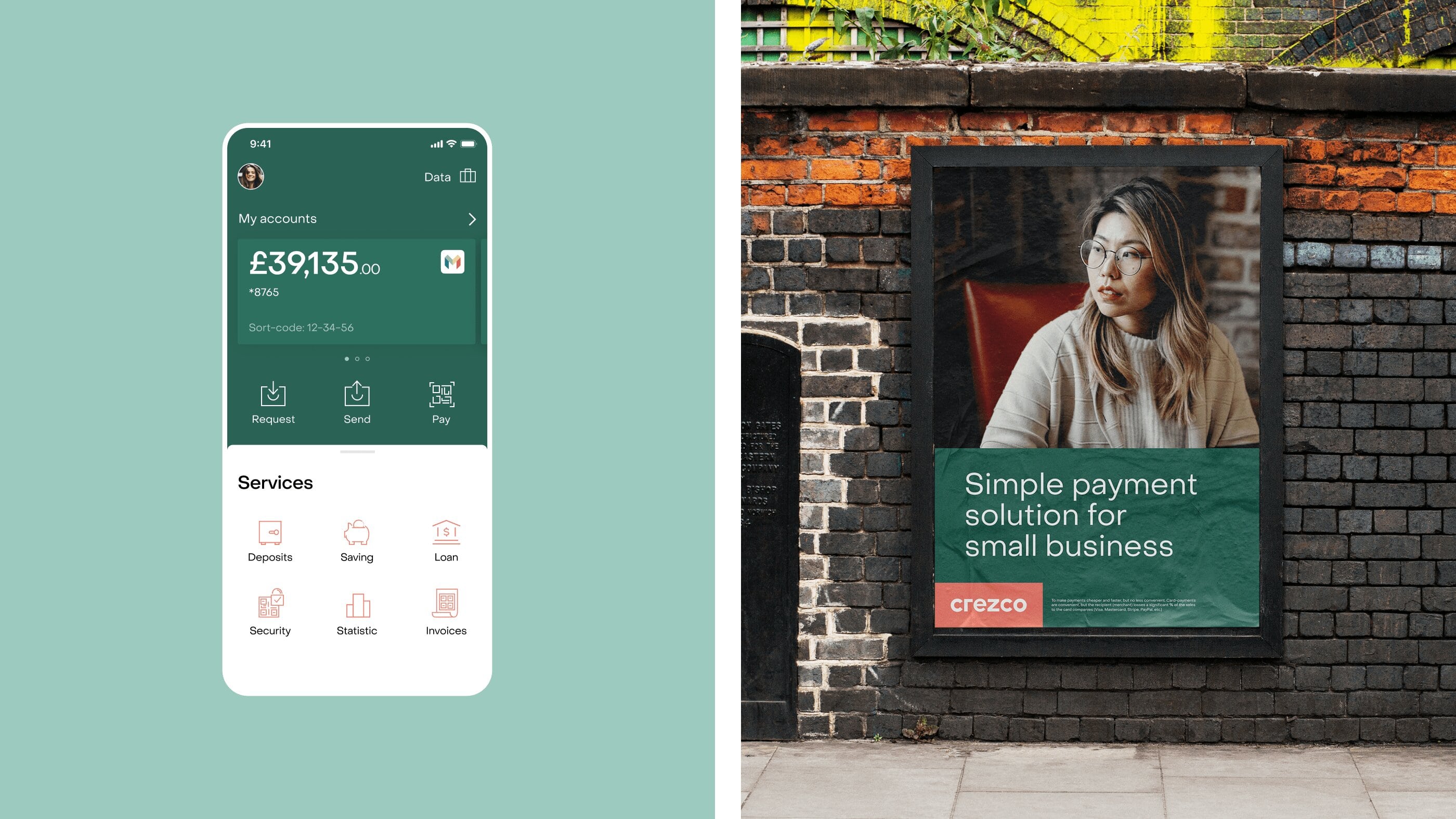
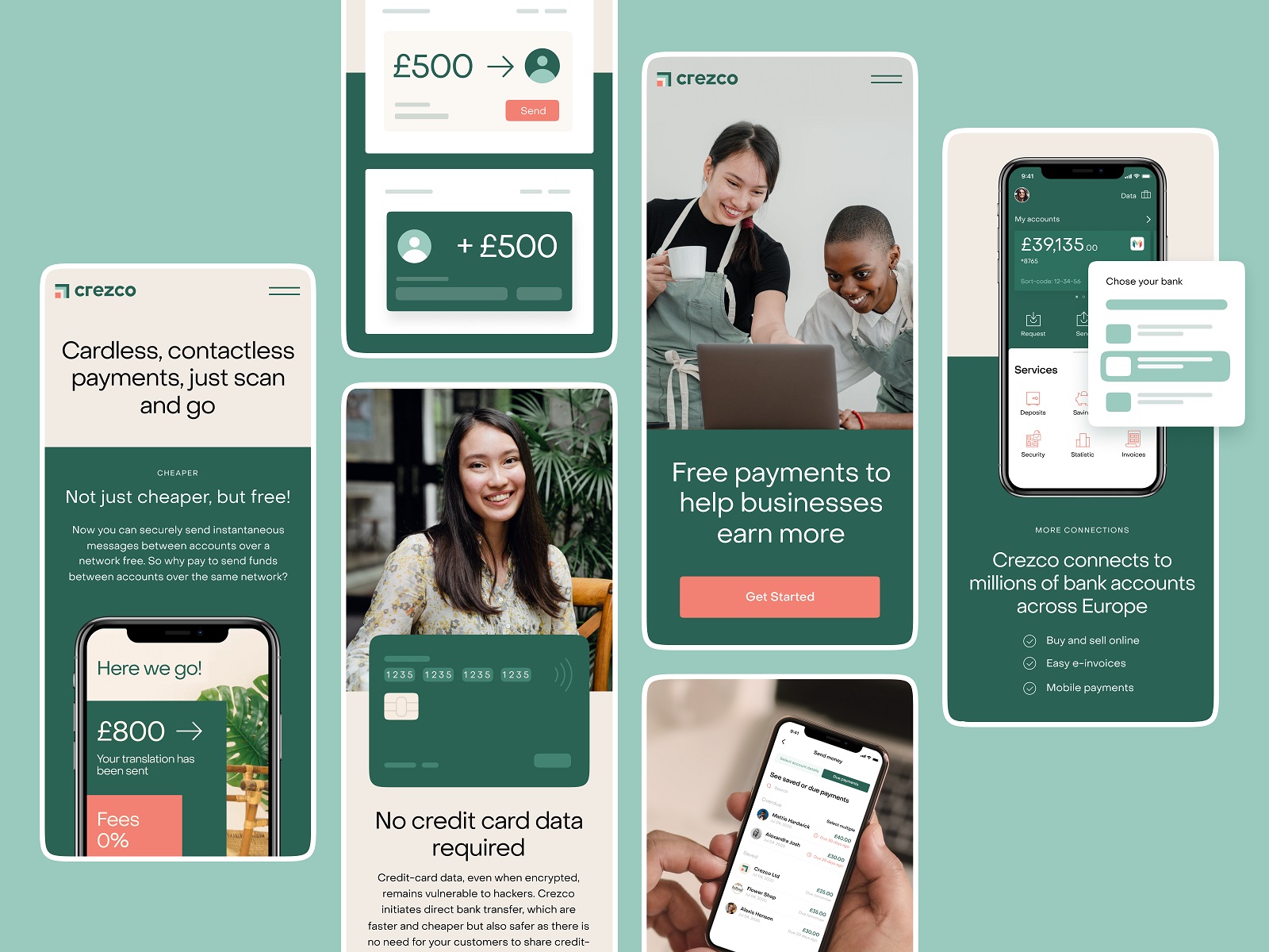
The design approach set for branding was also consistently stretched to the website providing information on the problem-solving potential of the service, answering the frequent questions, and engaging visitors to try its benefits to amplify their business. Light and airy web pages are built on wisely arranged content uncovered gradually, with easily reached CTA elements for each section. Also, the core navigation in the sticky header is easily reached from any point of interaction with a web page. Solid visual hierarchy and well-mastered negative space make the website balanced and easy to use while smooth and stylish web animation and vibrant visuals add emotional appeal to the user experience.
Obviously, being innovative, technological, and intangible, services like this need to use a lot of text content to introduce their benefits to the customers and convince them to try. So, the effective solution here was to divide content into small logical pieces that could be easily scanned and understood. The designers supported them with simple and clear graphics to make the content perceived and remembered even easier.
Two more small but important details to think over and design were favicon and app icon, which play a significant role in setting the consistent visual connection across channels.
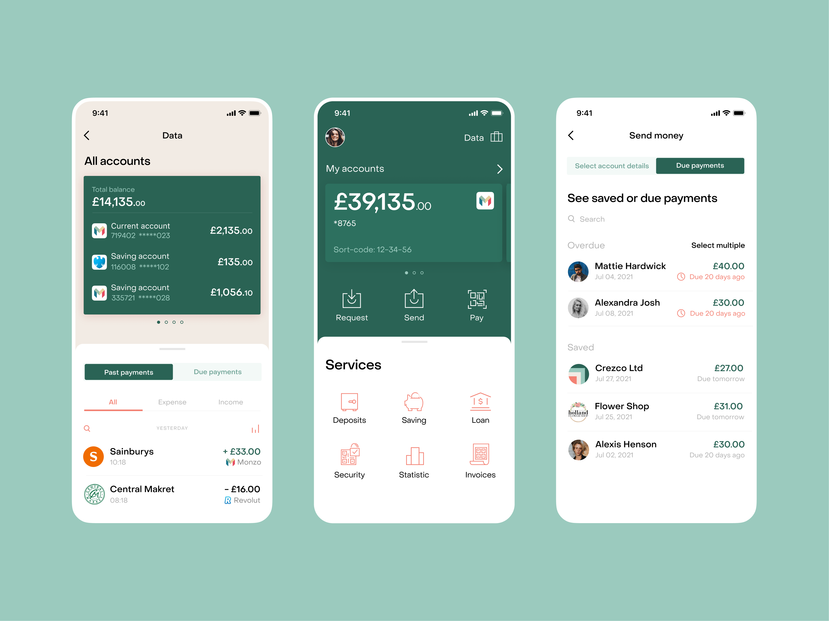
Considering the actual needs of such a fintech service, the team has also developed the concept of the mobile application, with functional and attractive screens, big noticeable numbers, neat icons, and intuitive interactions, keeping visual consistency with the branding and website design, this way making all the types of connection with the service feel like one integral customer experience. Take a look at the mobile screens below.
Taking into account the impact of digital marketing via social media channels, it was also essential to think over the social posting templates that would keep up with the general brand approach. Below, you can see some of them, setting the general idea of what could Instagram posts and stories look like.
So, for our team, this project was a remarkable case of collaboration with progressive financial technologies, while the Crezco brand obtained a well-developed and practical design system that supports creating a clear and informative field sharing its positioning as a reputable service that makes direct bank transfers as convenient as card payments but without the fees.
New design case studies from our team are coming soon. Stay tuned!
More Design Case Studies
Here’s a set of more case studies sharing the design solutions and approaches for some of the design projects done by the Tubik team.
CUBE. Illustration Set for Video Production Company
FarmSense. Identity and Web Design for Agricultural Technology
Real Bitcoin. Creating Website Illustrations
Devpost. Hero Illustrations for Hackathons Platform
Carricare. Identity and UX Design for Safe Delivery Service
OOP. Brand Identity Design for Online Flea Market
Otozen. Mobile App Design for Safe Driving
Uplyfe. Identity Design for Health App