There’s a cognitive bias researchers call “illusory superiority,” and nowhere does it show up more reliably than behind a steering wheel. Ask a thousand drivers to rate themselves, and the majority will land somewhere above average. Statistically impossible, and practically catastrophic. Mobile UX design for safety-critical applications lives and dies in this gap between perceived competence and actual behavior—and Otozen was built to bridge it without making the user feel lectured.
The Product: Safe Driving UX at the Hardware-Software Intersection
OtoZen is a mobile app UI/UX design project with a hardware backbone. A small device pairs with iOS or Android via Bluetooth—no wiring, no professional installation, no friction at the entry point. Once connected, it turns any car into a distraction-free driving environment. The system handles texting prevention, speed alerts, hands-free calendar management, mileage tracking, and a buddies network that lets you track family and friends without pulling anyone’s attention off the road.
The Tubik team—Anastasia Gurinenko, Marina Solomennikova, Kate Baikova, Ernest Asanov, and Arthur Avakyan—came in to audit, rethink, and rebuild the mobile application’s UI/UX, and extend the visual language into custom graphics and a marketing website. The client brought a prototype. The team brought questions, and a lot of them.
App Design: Starting with the Audit, Not the Aesthetics
Before a single screen was redesigned, the team ran a UX audit on the existing prototype. This phase is where real mobile app design work happens and where most agencies cut corners. Complex flows, ambiguous states, data that updates in real time, personal information that carries privacy UX design risk—these are structural problems. The audit produced graphs, decision trees, charts, and communication trails with the client. None of it looks impressive in a portfolio. All of it determines whether the final product works.
The core functionality breaks into three territories: distraction-free driving (texting prevention, speed alerts, emergency autodial), time organization (calendar integration, mileage tracking, expense reports), and social connectivity (live location sharing, ETA notifications, privacy controls). Three distinct mental models. One interface. Getting that information architecture design right before touching color swatches is what separates intuitive app design from a feature dump.
Information Architecture: Organizing Complexity Without Hiding It
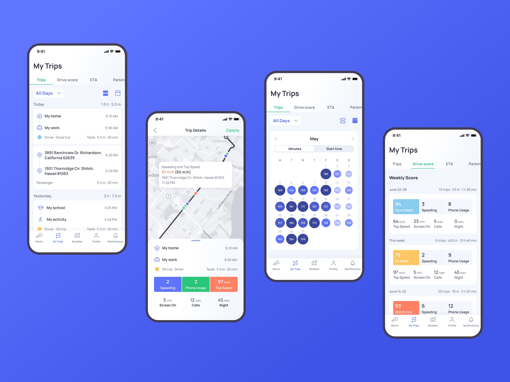
The tab bar navigation design carries five sections: Alerts, My Trips, Buddies, Profile, and Notifications. That’s a wide surface area. The decision to pair line icons with text labels is a mobile navigation design choice that reduces cognitive load on people who are, by definition, using this app while moving through the world. Icons alone demand interpretation. Text alone is slow. The combination makes each tab scannable in under a second, which is about as much time as a driver stopped at a light is willing to spend.
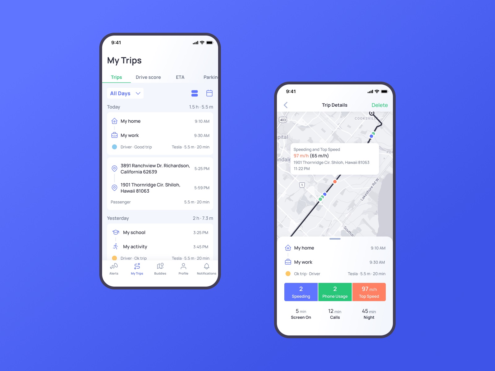
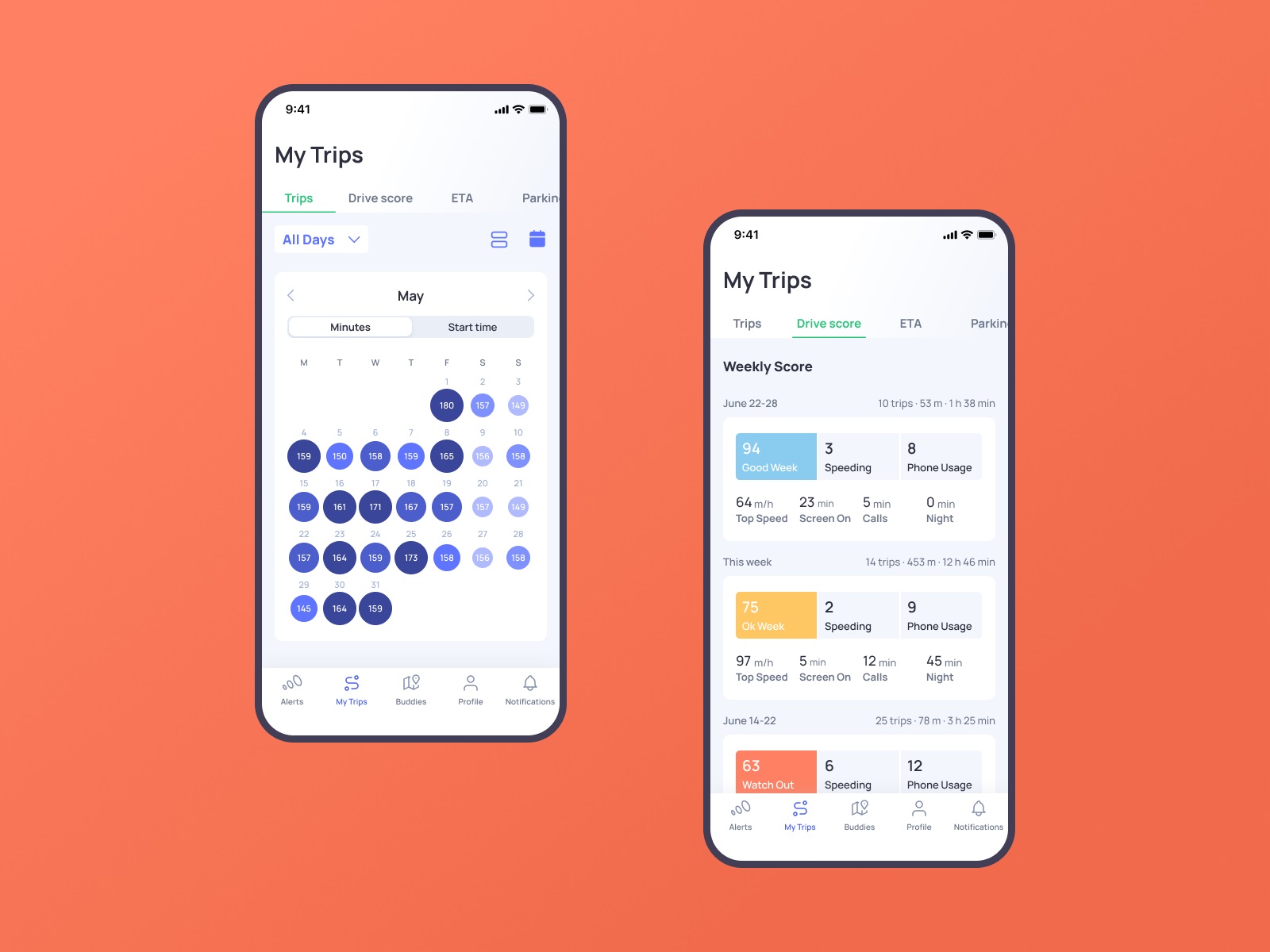
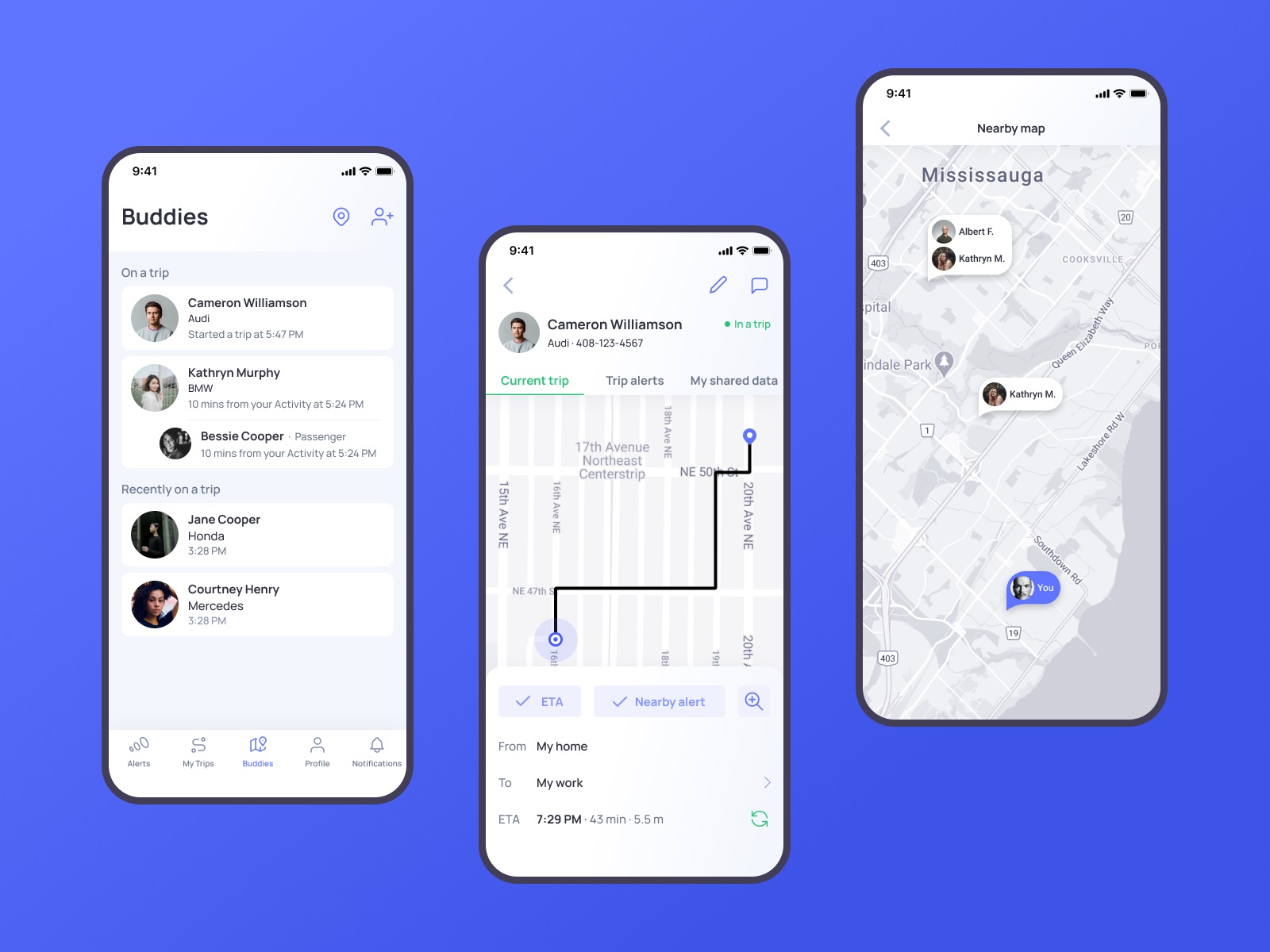
The My Trips feed gives users immediate entry into their driving data and lets them tune what they see. Driving data visualization here does something specific: the map screen uses color coding to mark incidents—speeding, phone usage—at the exact points they occurred on a route. This is data journalism applied to personal behavior. Showing someone where they picked up their phone on the highway is a different kind of feedback than telling them their score dropped. Location makes it real.
The Alerts section organizes all types of incoming alerts and helps to switch between them smoothly.
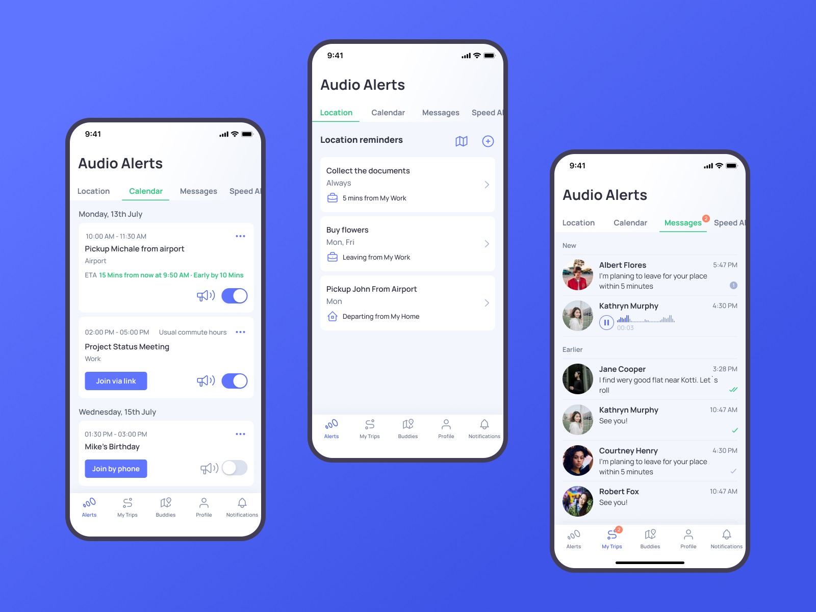
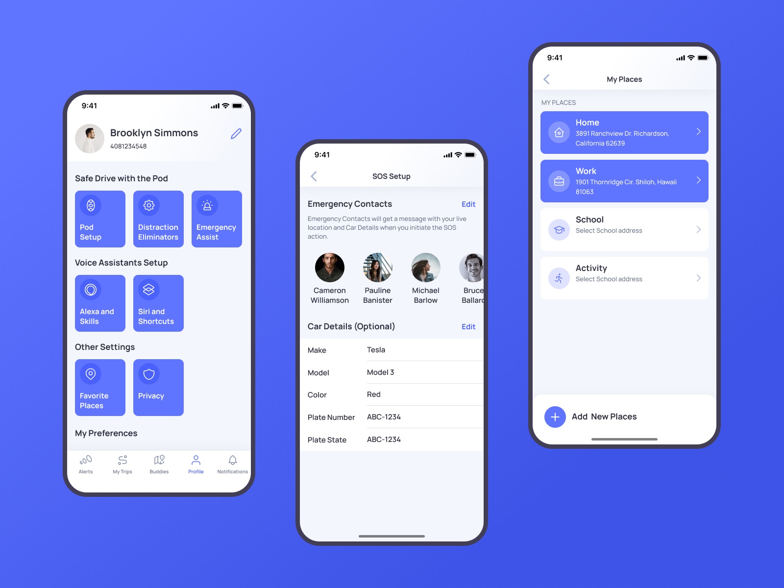
Profile screen shows different data about settings and preferences, neatly organized in groups. Here users also can add, edit, and review their emergency contacts, vehicle details, and places.
Onboarding Flow and Progressive Disclosure
Account creation is broken into steps with a progress indicator UI that keeps users oriented without overwhelming them up front. This is textbook progressive disclosure UX, and it’s textbook for a reason—asking for everything at once is how you lose people before they’ve seen the product. The OtoZen onboarding flow UX acknowledges that the device setup, account creation, and preference configuration are distinct tasks that deserve distinct moments.
The visual design system supporting all of this leans light and airy. Contrasting but unsaturated colors handle critical elements without creating visual noise. A highly readable sans-serif typography choice keeps screens legible in motion, in varying light, on small displays. These aren’t exciting design decisions. They’re correct ones, which is harder.
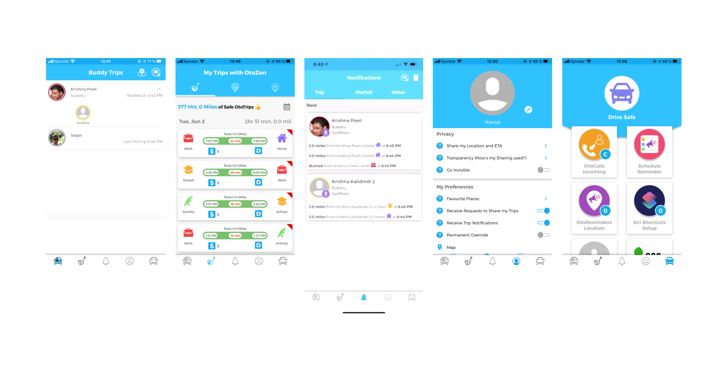
Buddies: Social Features with a Privacy Architecture
The Buddies feature is where OtoZen gets genuinely interesting from a social UX design standpoint. Real-time location sharing UX between drivers sounds simple until you think about the consent mechanics UX. Who can see what, when, and under what conditions? The design had to give users granular control without making that control feel like a legal disclaimer.
The result is a layered privacy UX design model that lets users decide exactly how much of their trip data is visible to a connected buddy—not a binary on/off, but a considered set of options. The goal is a specific kind of reassurance: you can know your family safety app member is safe without either interrupting their drive or surrendering your own privacy. Location sharing privacy done well is invisible. Done badly, it’s a reason to delete the app.
The driving calendar integration follows similar logic—surfacing information at the right moment, keeping the driver oriented without demanding active attention. Audio alerts, auto-join for meetings, location-based reminders: these are features that respect the fact that the primary task is driving, not operating software.
Web Design: Translating App Logic into a Landing Page
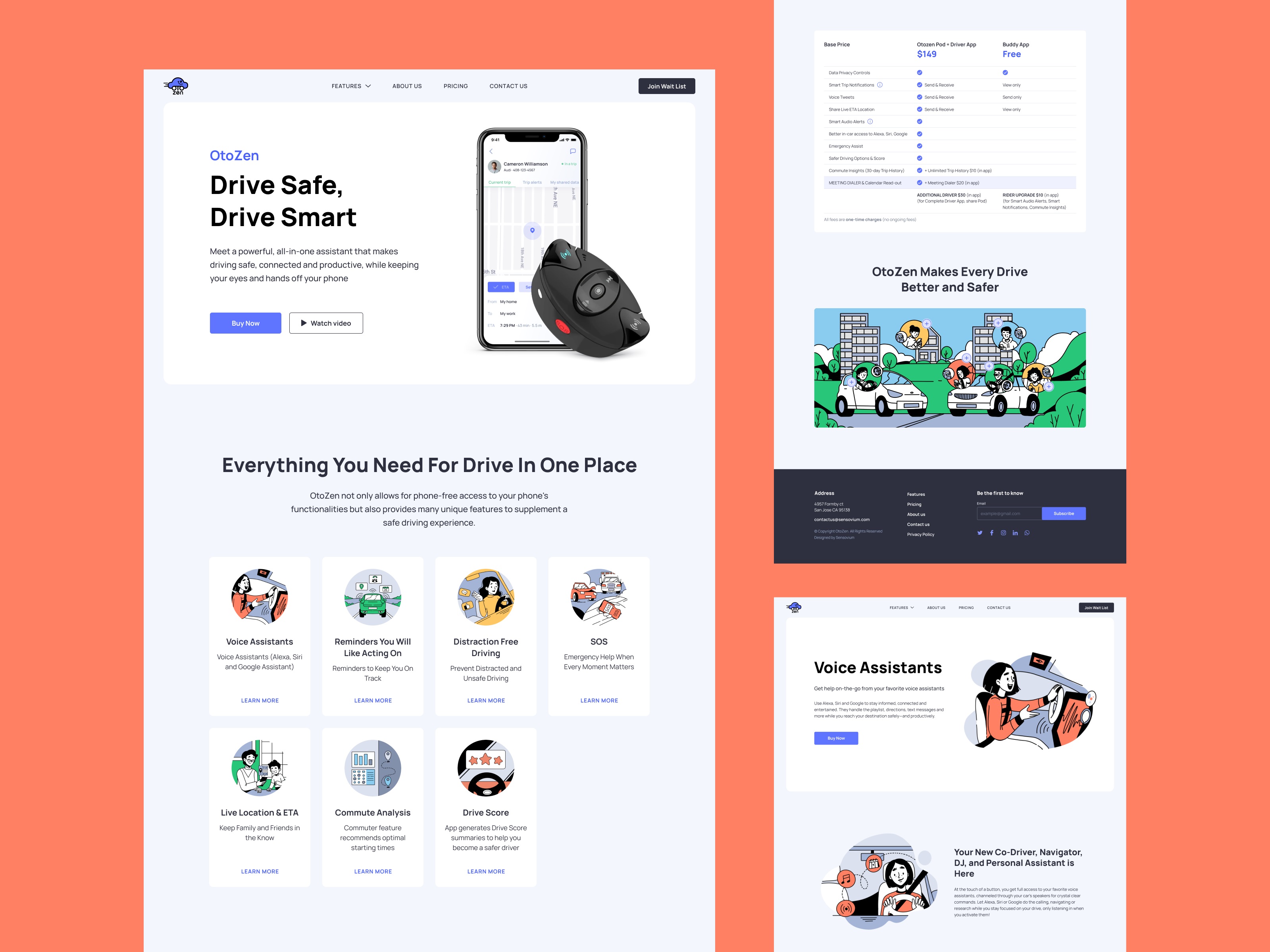
The website had one job—communicate what OtoZen does and why someone should care before they’ve installed anything. Product landing page design at this level means respecting the intelligence of a visitor who has about eight seconds of patience and no prior context.
The hero section does the necessary work efficiently: a device-and-app image that makes the hardware tangible, a tagline that communicates value, a CTA button with enough contrast to be found without hunting, and a ghost button for visitors who want the video before they commit. Two buttons, two user states, handled in the same visual zone. Clean.
The information is divided into scannable sections. No walls of text, no jargon-loaded feature lists. The website UX copywriting approach mirrors the app logic—give people what they need at the level of detail they’re ready for, and make it easy to go deeper if they want more.
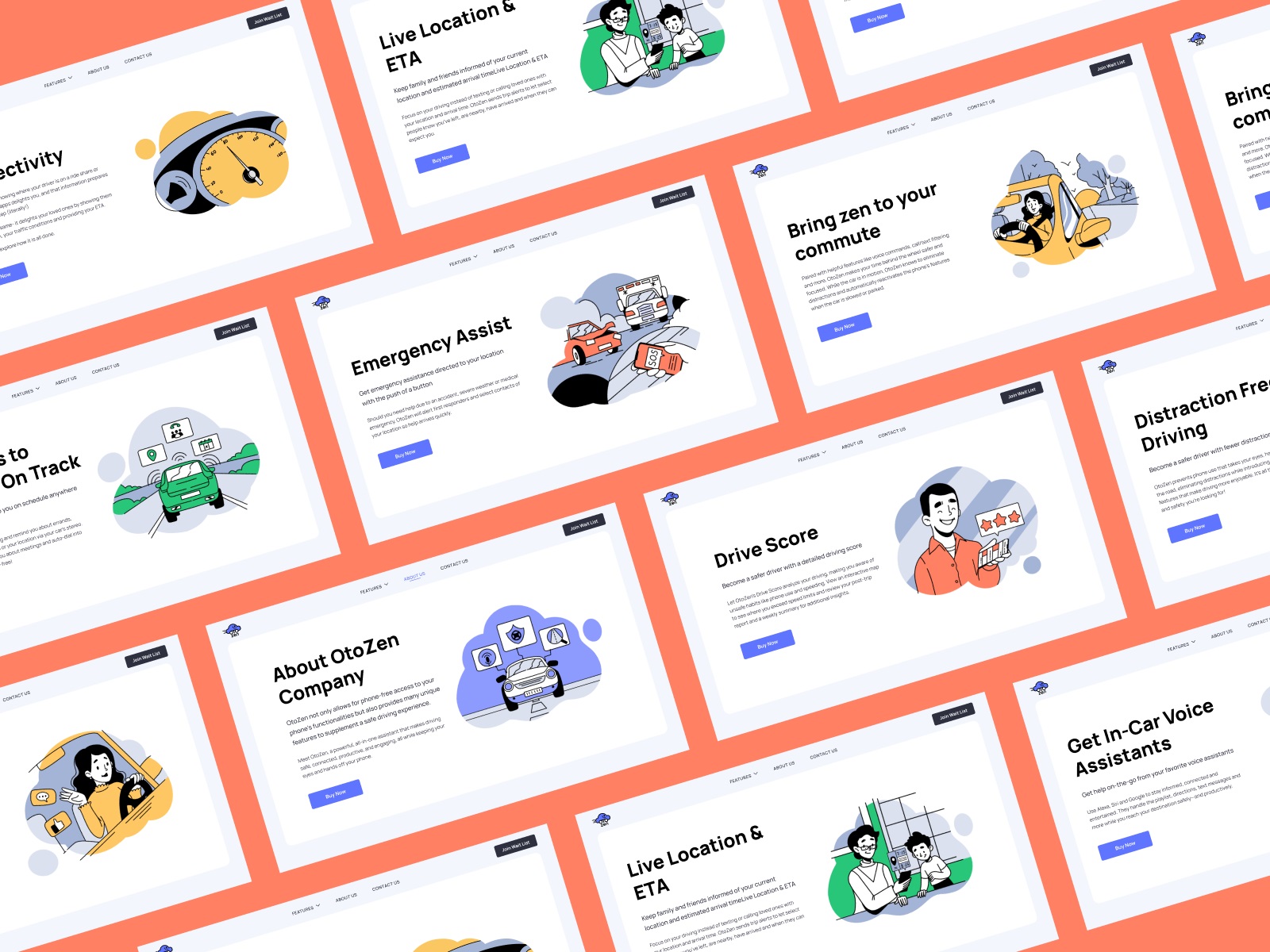
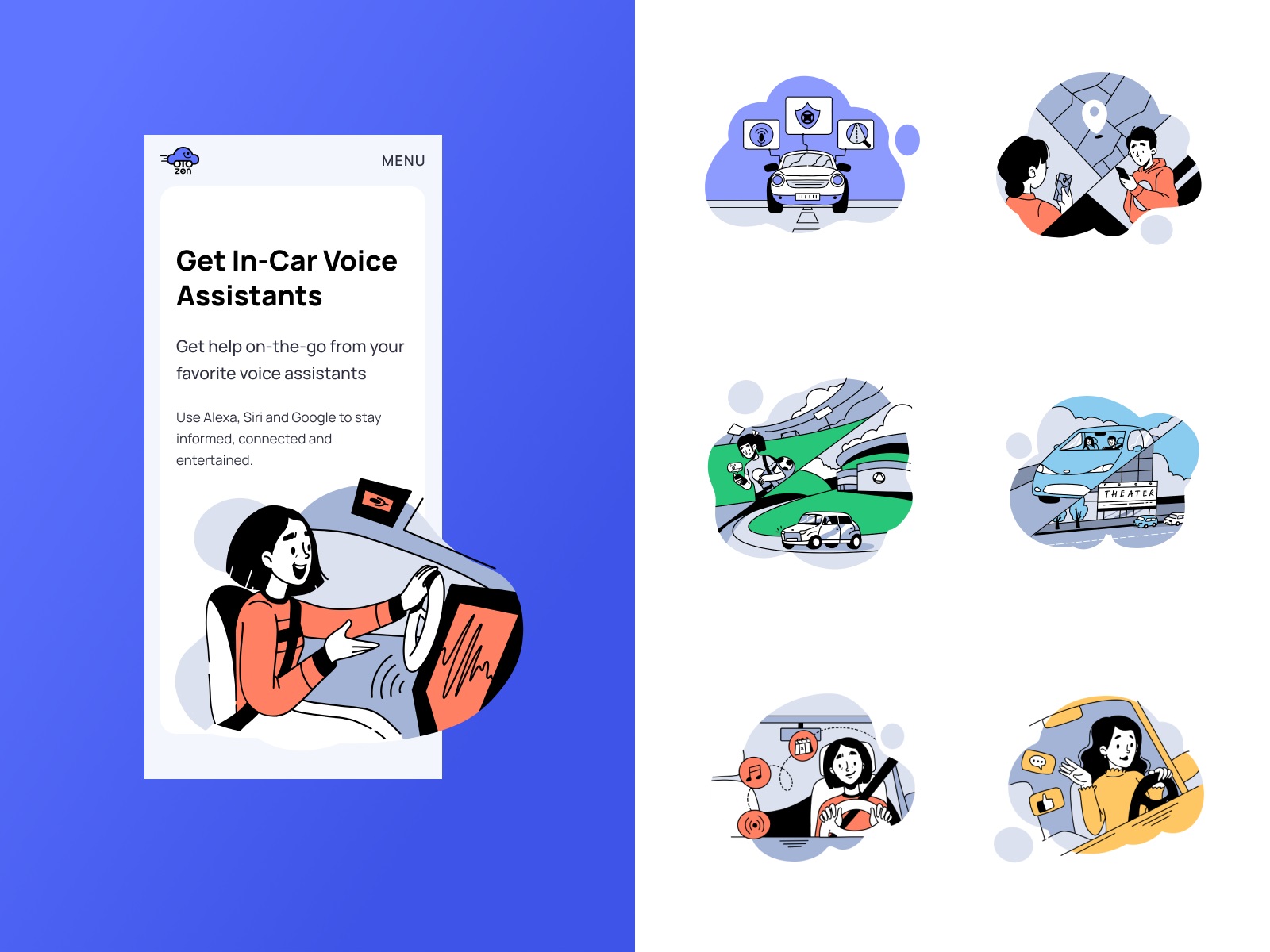
Custom Illustrations: When Stock Photos Admit Defeat
Highly technical products break stock photography. You either find images that are vaguely adjacent to your product and hope no one notices, or you build a custom illustration system that can show exactly what you need it to show.
OtoZen went custom. The illustrations maintain consistent style across sections—same line weight, same color palette pulled from the app’s visual design system, same general aesthetic register. Crucially, many of them feature people, which is a deliberate choice. A product about safe driving is a product about human behavior, human relationships, the person waiting at home for someone to arrive. Visual storytelling that ignores the human element of a safety product is missing the point of the product.
Mobile adaptation of the website extends this system without breaking it—same visual logic, responsive web design execution, works across devices. The responsive web design implementation here isn’t a technical afterthought; it’s table stakes for a product whose users are, almost definitionally, on their phones.
What the Work Proved
The CEO’s Clutch review mentioned that a consistent UI/UX design theme was maintained throughout development, and that working with the same designer throughout helped achieve it. That’s a quiet observation with significant implications. Consistency in complex digital products doesn’t happen by accident. It’s the product of decisions made early—in the UX audit process, in the information architecture design, in the definition of the visual design system—that hold their shape under development pressure.
OtoZen is a UX case study in product design systems thinking: the idea that good mobile UX design for safe driving isn’t a coat of paint applied to finished functionality, but a structural choice made at the level of how information is organized, how users are expected to behave, and what the interface needs to do when someone is doing sixty miles an hour on a highway.
Recommended Reading
Good design is worth talking about. Here’s more of our work, dissected:
Pass-On. Landing Page Design for Delivery App
Carricare. Identity and UX Design for Safe Delivery Service
Uni. Landing Page Design for Fintech Service
Uplyfe. Identity Design for Health App
Real Bitcoin. Creating Website Illustrations
Devpost. Hero Illustrations for Hackathons Platform
Vinaty. Website Illustrations for Wine Service
Bennett. Identity and Website Design for Tea Brand
ABUK. Custom Book Cover Design for Audiobook App
GNO Blankets. Branding and Web Design for Ecommerce
The illustrations in the post belong to their proprietors, are the object of copyright, and cannot be used by the third side for any goals.