
There is no second chance to make the first impression, and that gets even more crucial in the conditions of high competition. In the sphere of user interfaces, when you make the early interactions and product onboarding intuitive and engaging, it means higher chances of attracting and convincing the user to go further than just the first step. So, today we want to share a brief guide with tips on effective user onboarding for a positive user experience from the first step.
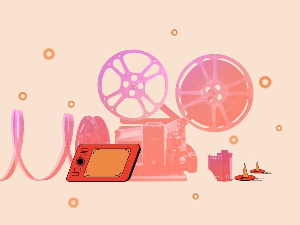
Onboarding tutorial screens for the Vertt application
What Is Onboarding?
Let’s start with the basic terminology. The concept of onboarding comes from the sphere of employment and HR. It marks special steps and techniques aimed at helping newcomers to adapt to the new conditions and get comfortable to bring out good results as soon as possible. For most people, a new job is a sort of stress which demands effort and consideration, so a little help can make the decision-making process easier, the emotional background smoother, and performance growth more harmonic. Special tactics enable to correct possible inconveniences and make people more confident in the new place, which means they become productive and socialize with their colleagues faster, bringing benefits to the company.
The sphere of user experience design for digital products quickly absorbed this idea together with the term. Here onboarding means the set of techniques and interactions whose objective is to comfort the user and give a concise introduction to the product.
Considering the fact that users, especially first-time ones, are not going to spend much time trying to understand how the product works, one of the vital issues on user onboarding is deciding upon clear priorities. Users have not only limited time which they are ready to devote to learning about the new product, but also limited capacities of working memory. Even if there’s much to tell about the product, don’t focus on overwhelming visitors with everything at once. Setting the priorities, designers and stakeholders decide which dose of information is needed for a particular stage: tutorial, wizard, tooltips, instructions and the like should feature the most essential information first.
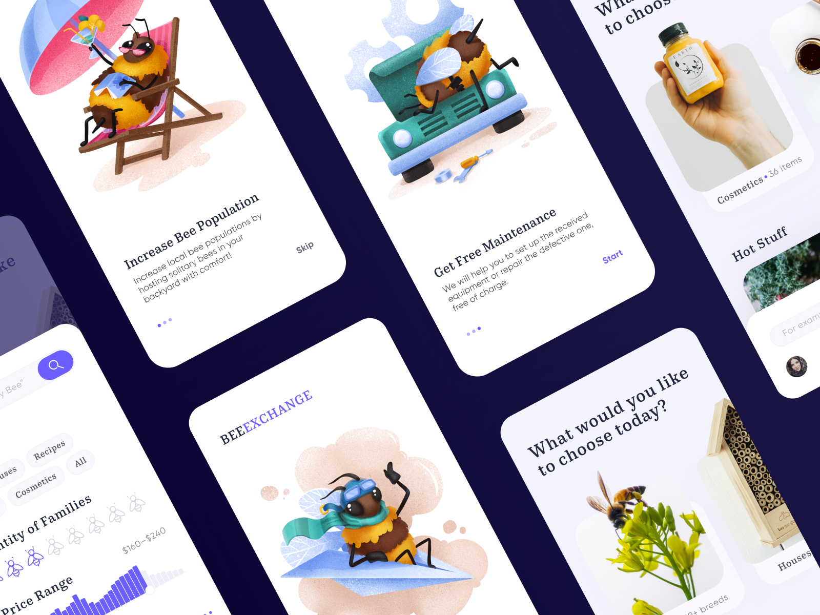
Onboarding screens for the app on bee-keeping
Onboarding Goals
There are three basic goals that UX designers strive to achieve with onboarding screens and functions.
- Greeting: well-crafted onboarding process starts the communication of the product with the user in a natural engaging way
- Information: at that stage, it’s crucial to tell users how the app is going to help them or make their life better
- Engagement: onboarding contributes much to set emotional appeal and encourage users to learn and try more
So, logically, you use onboarding screens and most elements for first-time users but not to annoy those who are already using it with the information they already know.
Flower Store application onboarding
Onboarding Elements
There are different elements and techniques of the general onboarding experience.
- app tutorial, aka first-look tour: a set of screens that quickly introduces the product to a newcomer and convinces the user to try it
- welcome messages: short messages on welcome/splash screens to greet the user and set the communication; quite a typical way to ignite the onboarding process; often feature a CTA element
- progress bars and indicators: the trick based on the natural human urge to complete the tasks. Progress indicators (dots, dashes, etc.) included in the user interface stimulate a user to complete the onboarding and creates an understanding of what stage of it is currently active
- explainer video: the video review of the product benefits and functionality explaining the major points to the user may work as a dynamic and effective way to quickly introduce the product.
The explainer video designed for OffCents App
- in-context and action-driven tooltips: prompting messages tied to particular layout elements or user actions, usually appearing in modal windows rather than separate screens
- empty state tips: these may appear in the zones which in the future will be filled with the content created by users, but while they are empty, space can be used for good and informative prompts
- checklists: as well as progress bars, this onboarding technique motivates users to complete the initial set of steps. Even more, it may become the element of gamification (for example, you complete the full list of points and get an achievement or open more functions)
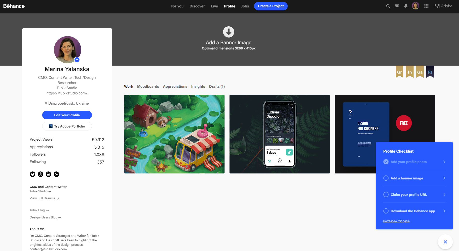
Behance uses a checklist strategy to guide users in completing their profile
- hot spots: this onboarding element attracts attention to important zones or controls that risk being missed or unnoticed by an inexperienced user
- personalized onboarding: the approach is built on setting user’s preferences from the very start and can be often found in products based on interaction with a lot of diverse content (like Behance or Pinterest)
Personalized onboarding experience for Perfect Recipes app helps users to set the goals and restrictions this way making the app performance tuned for their specific needs
Sure, this list doesn’t mean that all of them have to be integrated into any product. In each particular case, the user experience designer has to find the balance and pick the points that work for both users and business goals behind the product. What’s more, to organize onboarding right, explore the mental models of your target users via user research and usability testing: this way, you will be able to predict more precisely when and where users need help and prompt.
Onboarding Design Practices
Use Images in App Tutorials
Most people perceive and decode images faster than words. It makes the usage of illustrations logical and rational for app tutorials that have to give the information quickly. In the article devoted to the benefits of illustrations in UI, we mentioned that in the case of tutorials, illustrations, be it photos or originally drawn images, fully reveal their potential in explanation and clarification. The options can be totally diverse, from simple icon-like to artistic and sophisticated artworks. Illustrations of this kind become a good way to boost usability, minimizing the necessity of using the copy on the screens. They are particularly efficient in apps for kids and youngsters as they usually feel this sort of explanation is more user-friendly.
Cute and funny 3D animation created for the onboarding experience in the app for the studio for children holding classes on 3D modeling and animation.
3D animation for the Status App onboarding
Design trends demonstrate the increasing popularity of custom illustrations created for specific interfaces. App tutorials became the favorable ground featuring a variety of styles and approaches. In many cases, illustration becomes the center of the composition, and its aim is to present a specific feature or benefit in an attractive and easily decodable way. Another popular approach is applying a mascot, which is a character imitating the flow of real communication with the user and setting emotional bonds. What’s more, you can make the images work as directional cues helping a user to understand the navigation and layout easier.
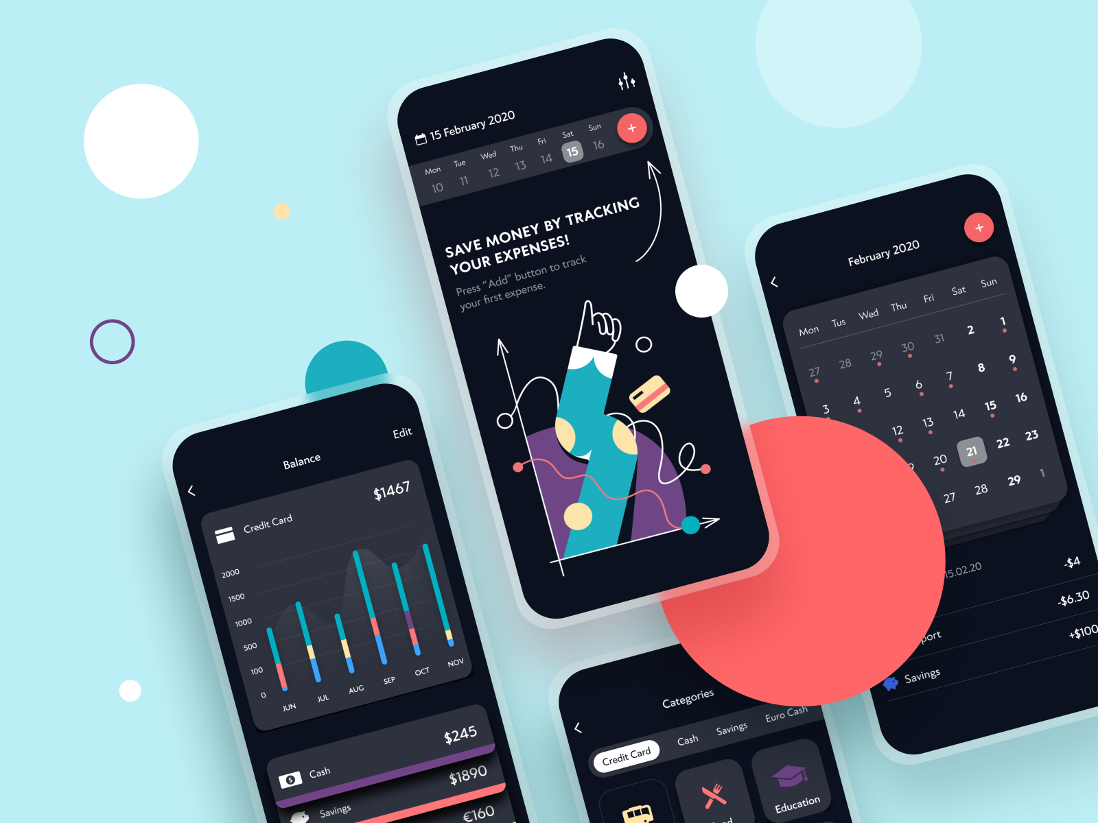
The onboarding screen for the Finance Tracker application features a custom illustration that is not only trendy and eye-catching but also works as a directional cue together with an arrow to attract users’ attention to core interactive elements
Don’t Be Wordy
In writing for user interfaces, words are power. However, there are two simple rules to uncover that power in the best way: say words short and make them helpful. Here’s the time to realize that writing a short informative sentence is much harder than writing a long text. You have to find a proper way not to waste those precious seconds that the user is ready to devote to tutorial screens or tooltips. Some creative teams involve a professional copywriter for this task to create texts that make every single letter count. With the writer or not, anyway, take time and effort to create a concise, attractive and clear copy that applies language appealing to the target audience and corresponding to the objectives behind the product. As well as design solutions, the copy should be tested as much as possible to find short ways of informing users.
“The main thing you need to know about instructions is that no one is going to read them—at least not until after repeated attempts at ‘muddling through’ have failed.” Steve Krug once mentioned, and that’s the point to remember. When you are tempted to manifest your eloquence, just don’t overdo it here: tooltips, tutorials, and instructions are not the place for it.
Another thing to remember is that any text is not only an informative part but also a visual element of design. As well as the icons, fields, buttons, illustrations, toggles, and other layout elements, it literally occupies the part of the screen or webpage like any other graphic component and influences the general stylistic presentation. The success of the efficient copy directly depends on not only the message and content but also design solutions as the choice of types and fonts, background, and even placement of the text. All that affects the level of readability, so if these points aren’t thought-out well, the copy risks getting much weaker, even being highly meaningful.
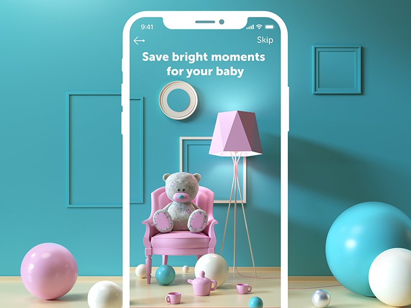
The short tagline for the My Baby App onboarding screen expresses the essence of the problem it solves and leaves most of the screen space for the beautiful 3D illustration
Focus on User’s Needs
Have you ever dealt with parents introducing their children? When they start telling about the kid’s achievements, strong points, and features, it’s not that easy for them to stop. The same happens when you introduce your product to a new user. For you, it is the clot of ideas, iterations, effort, time, money, benefits, valuable functions, and much more else. No doubt, telling about it, you want to share that feeling, to unveil as much as possible. That’s a natural temptation, but sticking to it is a mistake. For a user, it’s just another app, tool or website, a bit of a step into the unknown. So, decide what benefits and functions are the most needed by a target user and tell about them in a focused and effort-saving manner instead of trying to overwhelm the user with everything possible at once.
Even the quite concise textual content on the onboarding screens of the app devoted to bees and honey is organized with a clear visual hierarchy, with the most essential information in headings and a bit more details in body copy
Add Life with Animation
One more way to add not only meaning but also fun and engagement is animation. Motion makes interaction more dynamic; it breathes life into the interface, creates wow effects, and catches the user’s attention. Even more significant point is that animation can make important details more noticeable. On the other hand, motion can increase the time and traffic needed to get it loaded, so it should apply it wisely and discuss with developers the aspect of its technical realization.
Emotional and eye-catching 3D animation designed for the onboarding interaction with My Baby app
Allow for Skipping
Another thing to consider is the choice of skipping the tutorial. Not all users need it, even using the product for the first time, so for most products, it could be reasonable to give them the ability to skip the tutorial. The decision on this function has to be made on the basis of testing and analysis.
Mind the Context
In-context tooltips are a good way to support the users in the process of trying the interface functionality. They appear in the process of interface exploration one after another, feature after feature, in one-time dismissible modal windows to explain the ways to use a particular function or highlight a certain benefit.
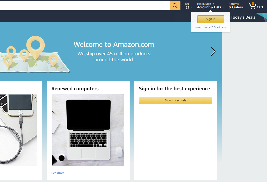
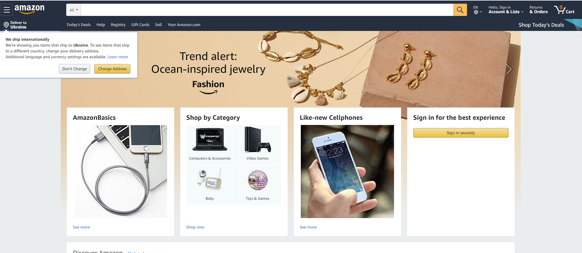
Amazon uses tool-tips to drive the non-registered users to sign in, and the same way informs about the vital benefit (international shipping) that may have a great impact on decision-making
Use Empty States
For the products, where users interact with content actively, at the early stage they quite often deal with the spaces that are empty because the user hasn’t filled them with personalized content yet. For example, these can be the screens of a wishlist, projects, collections, etc. While they are empty, using them for onboarding prompts and further engagement is a good idea.
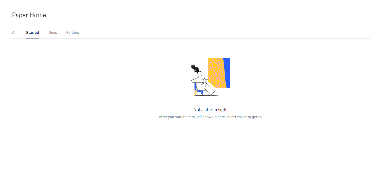
The Dropbox empty page for starred items features a funny illustration and a short, well-written prompt on how and why to use this function
Mind the Emotion Level
Making a digital product emotional is an essential aspect of setting a solid connection with the target users, and design is one of the most flexible ways to do it. Yet, make sure you find the right way to set the needed emotion and learn what works for your audience: user research plays a super important role at this perspective. Don’t design onboarding and write the copy for it until you have a clear vision of the tone and voice of the product’s communication with its users. Don’t go too far with humor, especially with a product aimed at users from various countries: what sounds funny for you can be not funny or even offensive for your users. Make onboarding emotional but do it carefully.
Don’t Overplay
Honestly speaking, many users don’t need instructions or help all the time. So, don’t overplay in your trying to be helpful. Onboardings elements start playing on the bad side when:
- there are too many of them
- they are too distractive
- they are unclear
- users aren’t able to skip them or dismiss (like “don’t show me that anymore”)
- they aren’t bearing any useful information.
So, keep a good balance of user support and never miss a chance to check it with user testing.
Summing up, it’s easy to see that well-crafted onboarding is the way to set the bridge between the product and the user, create the emotional background, quickly present the core benefits, and make a good first impression.
Useful Articles
Here’s the set of articles on more aspects and best practices of user experience design.
Visual Dividers in User Interfaces: Types and Design Tips
Directional Cues in User Interfaces
How to Make User Interface Readable
Basic Types of Buttons in User Interfaces
3C of Interface Design: Color, Contrast, Content
Negative Space in Design: Practices and Tips