
We’ve all opened a product that looked polished in screenshots and somehow exhausting in use. The layout is technically correct. The type scale is there. The spacing follows an 8-point grid. And yet reading it feels like chewing cardboard. Nothing is broken, nothing is really ugly. But it’s still exhausting to interact with.
You open the staging link on your laptop at 10:47 PM, brightness slightly too high, posture slightly too bad, and suddenly that “clean” layout feels dense. The paragraph you thought was elegant looks like a slab. The button label sounds formal in a way no human actually speaks. The contrast that passed design review starts is nauseating on a cheaper external monitor.
That’s when readability stops being a theory and becomes a responsibility.
Readable interfaces aren’t about making text larger and layout simpler. They’re about reducing friction at the exact moment someone is trying to understand something. And in product design, understanding is the whole game.
Let’s unpack what actually shapes readability in UX design, from typography and contrast to hierarchy, writing, and interaction logic—and how to make it better.
Legibility vs. Readability (Yes, It Matters)
Designers often throw these words around as if they’re interchangeable. They’re not.
Legibility is about recognition. Can I distinguish the characters? Does “1” look different from “l”? Does the “6” collapse into the “8” in a tight font at 12px on a mid-range Android device?
Legibility lives at the level of glyphs. Typeface choice. Weight. Pixel rendering. Hinting. Contrast. Kerning pairs that don’t collide in small sizes.
Readability is about comprehension. Once I can see the words, can I process them without effort? Is the sentence structured clearly? Is the line length humane? Does the hierarchy tell me what matters first?
Legibility is optical. Readability is cognitive.
You can have one without the other. A beautifully rendered typeface can still be exhausting to read if the paragraphs are endless and the hierarchy is flat. Conversely, a well-structured article set in a low-contrast gray on a trendy beige background is simply hard to see. Yet in digital products, the two are part of the same system.
Typography: Where Most Mistakes Hide
If readability is a system, typography is where it quietly falls apart or holds together. Let’s look at the pressure points.
1. Size Is Relative, Not Absolute
There is no universally correct body text size. There is only context. 12px on a dense analytics dashboard might be functional. The same size inside a content-heavy onboarding screen will feel cramped. Designers often fixate on pixel numbers instead of perceived comfort.
Readable interfaces consider:
- Viewing distance
- Density of surrounding elements
- Expected reading duration
- Device type
Long-form text demands more generosity than transactional microcopy.
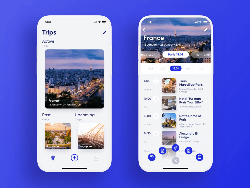
Travel Planner app
2. Line Length Shapes Comprehension
Extremely long lines slow down reading. Extremely short lines create visual choppiness. When paragraphs stretch across wide desktop layouts without constraints, reading becomes a lateral eye workout. On the other hand, narrow columns that break every few words disrupt rhythm.
A balanced line length creates flow. It allows the eye to move predictably without conscious effort.
A healthy rule:
- For long-form text, keep line length between 60–80 characters.
- For mobile, lean closer to 35–45 characters.
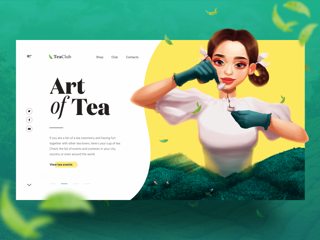
The webpage for the Tea Club website.
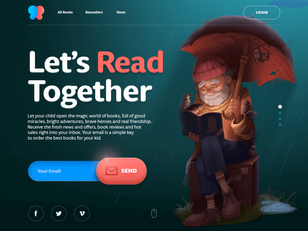
The page for a bookshop website
3. Line Height Is Not Decoration
Too little vertical space between paragraphs, and the page feels claustrophobic. Too much and it fragments into isolated islands. The relationship between font size and line height determines whether paragraphs feel breathable or suffocating. Slight adjustments here can transform dense content into something approachable.
4. Weight and Contrast Require Discipline
Ultra-light text on muted backgrounds is fashionable. It looks beautiful in mockups. In real use, it fades. Readable interfaces favor clarity over subtlety. Secondary text can be quieter, but not at the cost of visibility. If users have to focus harder to decipher metadata, you’ve already increased friction.
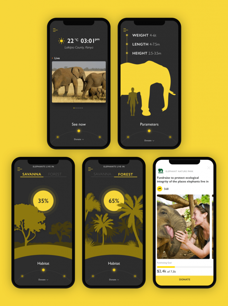
In the Nature Encyclopedia App the designer chooses readable sans-serif font to make the text easy to read; what’s more, for the charity pages, that feature more text, the background is changed to light. This contrast both enhances readability and marks the different nature and goals of the screens.
5. Fonts: Expression with Restraint
Every project has that moment. A new typeface appears in the file. Looks stunning at 72px. The moodboard approves. The brand team smiles.
Then someone adds a 600-word article into the layout.
Long-form content exposes everything: awkward letter spacing, uneven rhythm, cramped counters, overly expressive terminals. What felt bold in a hero headline becomes exhausting in a knowledge base.
We treat type selection like infrastructure. Headlines can carry personality. Body copy needs endurance. Screen-optimized families, tested across weights, predictable rendering across operating systems.
Once the choice is made, discipline follows. Random font swaps for a “special campaign page” may feel harmless, but they erode trust. Users sense inconsistency even when they can’t name it. A stable typographic system builds familiarity. Familiarity reduces friction.
Visual Hierarchy: Designing for Scanners, Not Martyrs
No one reads interfaces linearly. Users scan, filter, and decide. Hierarchy makes that possible.
When hierarchy works:
- The eye knows where to land first.
- Secondary information supports instead of competing.
- Density feels structured rather than overwhelming.
When it fails, everything shouts at equal volume—and nothing is heard.
Effective hierarchy relies on deliberate levels:
- Primary: decisive headlines
- Secondary: guiding subheads and markers
- Tertiary: supporting body text
We test hierarchy without sentimentality. Zoom out. Squint. View it on a smaller laptop. If the structure collapses visually, it was never strong.
The home page of the innovative service of sustainable energy production gives out the content in portions and organizes it in a clear hierarchy of elements.
Structure: The Mechanics of Comprehension
Hierarchy sets direction. Structure sustains it.
Numbers and Lists
Open any analytics panel or pricing table and watch where your eye lands first. It’s almost never the paragraph. It’s the number.
“4 pending approvals” scans faster than the spelled-out version.
“48h left” feels immediate.
Numerals create visual anchors; they interrupt the gray texture of text. In dense interfaces—admin tables, release notes, comparison grids—they act like signposts on a highway. You don’t read them, you register them.
Lists work the same way, but they require restraint. We use them when the content genuinely contains discrete items: requirements, steps, features, risks. If a section can’t survive being broken into bullets, it probably isn’t a list. It’s a thought. And thoughts deserve full sentences.
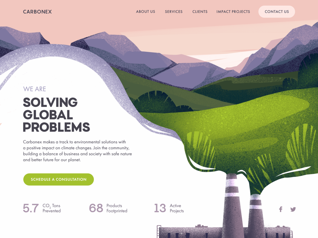
Website design for the environment protection community uses numbers as a part of the design layout and this way attracts attention to important data.
Negative Space
Spacing defines relationships. If a caption sits too close to the wrong image, it changes meaning. If a button hugs a paragraph without breathing room, it feels like an afterthought. Micro-spacing—between letters, between lines, between elements—shapes reading flow more than most designers admit.
We think of spacing as part of the content system. Margins and paddings are part of comprehension.
When there’s enough air:
- Text blocks feel approachable.
- Sections are clearly segmented.
- Cognitive load drops.
When there isn’t, even good writing feels dense.
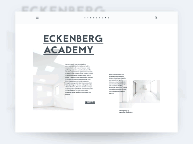
The architecture blog uses negative space as one of the core solutions enhancing the perception of content in the web interface.
Writing: The Interface Speaks
In many teams, copy is still an afterthought. A placeholder gets replaced at the end of the sprint. A product manager drops in a sentence the night before release. A developer shortens a label because it breaks the grid.
Then everyone wonders why the interface feels inconsistent.
Readable interfaces start with disciplined language. If an action is called “Archive”, it stays “Archive.” Not “Hide.” Not “Remove.” Not “Move to Storage.” Terminology is part of the interaction model. Every synonym forces users to pause and confirm meaning.
That pause is friction.
We’ve seen entire flows slow down because primary actions were phrased as polite sentences instead of verbs. “Proceed with Payment” becomes “Pay” not because it’s trendy, but because short verbs are scannable. Buttons are not essays.
From a product standpoint, this means:
- Defining a content style guide early
- Aligning naming conventions across design, dev, and support
- Documenting microcopy patterns inside the design system
Readable UX copy is clear, concise, useful, and consistent—but those words only matter if they’re enforced structurally.
Contrast and Accessibility: Beyond Compliance
Accessibility checkers give you a pass or fail. Real life is more nuanced.
A color combination that clears WCAG on a pristine studio monitor can fall apart on a scratched office display with night shift enabled. Mid-range Android screens render saturation differently. Older devices compress contrast in ways design tools don’t preview.
So we test outside the happy path. Low brightness. Battery saver mode. Bright afternoon glare through a window. Dark mode on an OLED panel where pure black swallows thin dividers whole.
Dark themes are especially unforgiving. Stroke weights need reinforcement. Secondary text often needs more lift than designers expect. Spacing sometimes has to breathe wider because dark surfaces visually compress content.
Readable design isn’t about hitting a ratio; it’s about surviving context. If a system only works in ideal lighting on a calibrated display, it’s fragile. And fragility is the opposite of good UX.
The landing page for the kindergarten uses a playful but highly readable font, organizes the information in a clear list, and marks the clickable elements.
Personalization and Control
People don’t read in lab conditions. They read in kitchens at 7am, in offices with overhead lighting that hums, on aging laptops with matte screens, on devices set to 125% system scaling because that’s what makes spreadsheets tolerable.
Your interface enters that reality whether you planned for it or not.
Respect system settings. If someone increases the OS text size, your layout adapts. Relative units. Flexible containers. At 130%, headings shouldn’t collide, buttons shouldn’t split awkwardly, tables shouldn’t unravel into chaos and guesswork.
Dark mode demands recalibration, too—heavier strokes, stronger contrast, spacing that compensates for visual compression. Data-heavy tools may tighten density, but never at the expense of line height or tap targets.
Most users won’t touch a single setting. That’s fine, too. The system must stretch without tearing. Readability that survives scaling, theme shifts, and imperfect hardware is engineered, not accidental.
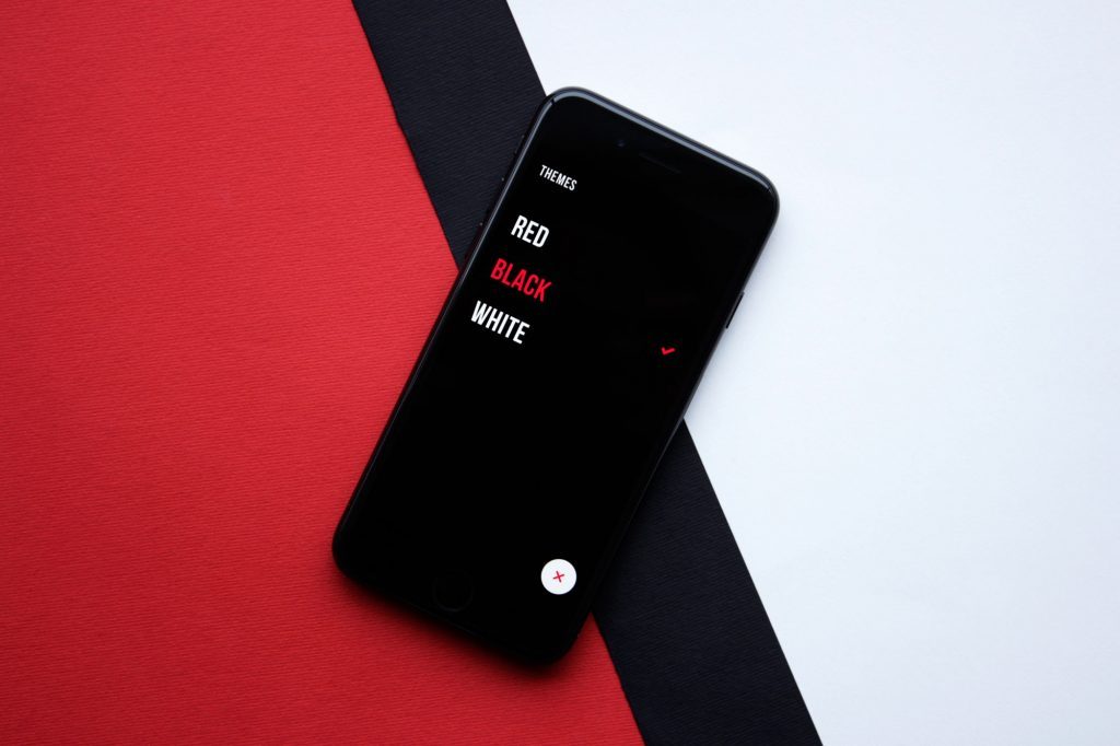
Upper App allows users to choose the theme color that is the most convenient for them
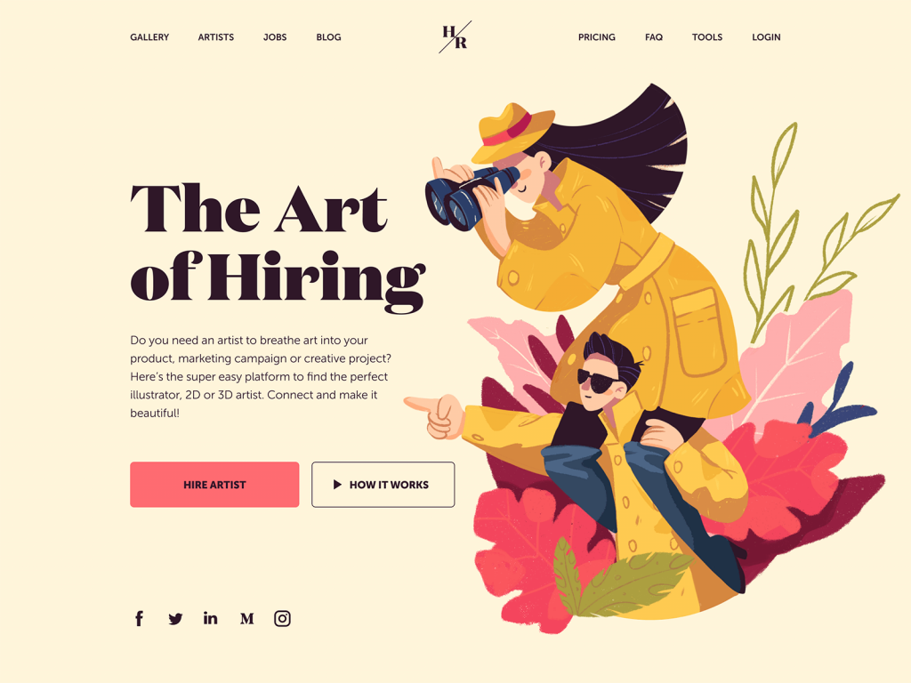
And this landing page features the choice of a serif font Domaine for the tagline. It visually reflects the style of the hero illustration. Yet, for the description copy block, the designer chooses a sans-serif font that is highly readable.
The Real Test
You don’t know if something is readable because it looked clean in the design file at 200% zoom. Open the product after a full workday. On a device that isn’t top-tier. With notifications popping in. Skim a settings page quickly. Try to extract one piece of information from a dense table.
If your eyes move without strain, if your brain doesn’t stall, if you never have to re-read a line to decode it—the system is doing its job.
Readable interfaces don’t announce themselves. They don’t ask for admiration. They let you move through information without friction. When text feels like effort, users disengage. No gradient, no easing curve, no immaculate grid compensates for cognitive drag.
Readability is discipline. It’s decisions made in favor of clarity when nobody is watching. In mature products, that restraint separates surface polish from real craft.
Recommended Reading
If this resonated, explore our other articles—strategy, systems, visuals, and the messy reality behind polished screens.
UX Writing: Handy Tips on Text Improving User Experience
5 Pillars of Effective Landing Page Design
The Anatomy of a Web Page: 14 Basic Elements
3C of Interface Design: Color, Contrast, Content
Negative Space in Design: Practices and Tips
User Experience: How to Make Web Interface Scannable