Most websites open with a beautiful lie—a sweeping full-width image that looks confident but says nothing. A stock photo of a woman laughing at a salad. A mountain range for a SaaS company that has never seen a mountain. Pretty? Sure. Purposeful? Rarely.
The hero image—that big, bold, above-the-fold visual that greets every visitor before they’ve read a single word—is the most valuable real estate on your entire website. And the design industry, by and large, treats it like a decorative throw pillow. It’s time to fix that.
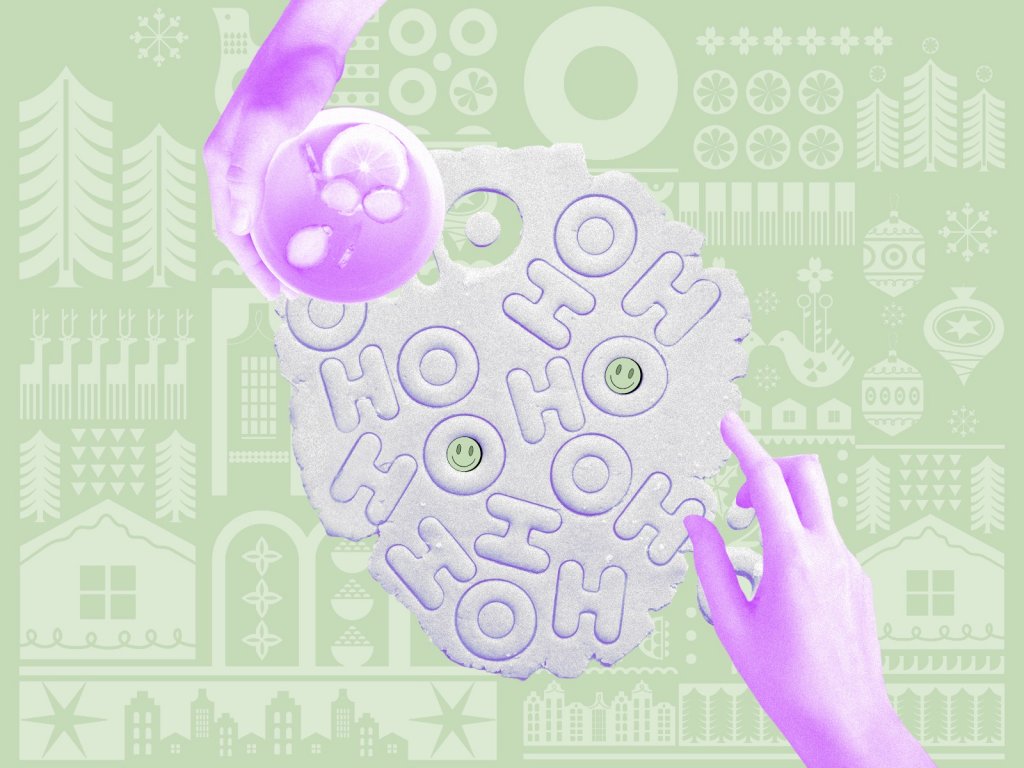
Landing page design for a photo service using a hero illustration
What Is a Hero Image, Actually?
Let’s get clinical for a second. If you’ve ever asked what is a hero image on a website, here’s the answer: it’s the dominant full-width visual sitting just below the site header. It commands almost the entire pre-scroll viewport. Everything else—your CTA, your tagline, your navigation—orbits around it like planets around a sun.
The word “hero” trips people up. They think it means a face, a person, a character. It doesn’t. A website hero section design can be a landscape, a product, a texture, three words set in 300pt type on a black field. The only actual requirement is that it makes someone feel something in under three seconds, before they’ve consciously decided to pay attention. On mobile, with coffee in hand and four other tabs open, that time window is even shorter.
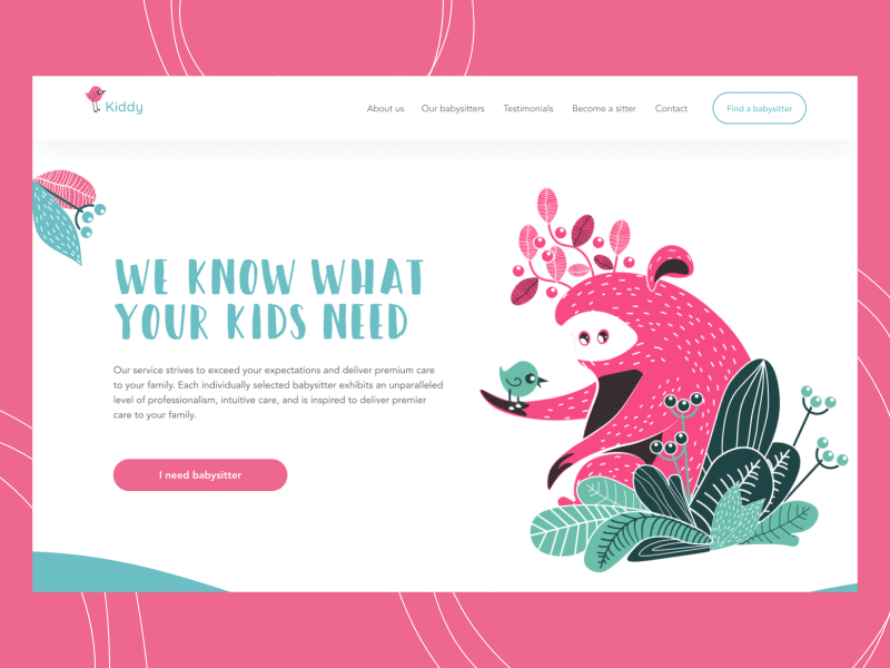
This landing page for a babysitting service applies an animated hero image with funny characters
Why the Hero Image Isn’t Optional
The human brain processes images roughly 60,000 times faster than text. And when it comes to website first impression design, people decide whether to stay or leave before they’ve read a single word. The visual registers first. Always. The hero image is therefore not decoration applied after the real design decisions have been made—it is a real design decision, probably the most consequential one on the page. Which can be both exciting and terrifying.
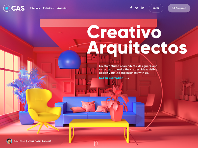
The website of the design studio uses full-screen hero images to both impress the visitors and inform about professional abilities.
Attention and First Impressions
You know the first-impression cliché? In web design, it’s law. User attention peaks in the first moments of a page load and drops fast. Hero image best practices start here: your opening frame either earns the next thirty seconds or it doesn’t. Make it count, or accept that most of your visitors mentally left while your page was still technically open.
Information Architecture, Disguised as Beauty
A good hero image is compressed communication. It collapses what would otherwise take paragraphs into a single visual argument. Studying strong hero image examples makes this obvious—a children’s learning platform that opens with warm, slightly chaotic illustrated characters has communicated its values, its audience, and its philosophy of education before the headline loads. That’s design doing the work that copy usually gets credit for.
Navigation and Conversion
Most designers think about the CTA after they’ve designed the hero. This is exactly backwards. A hero section that converts is built the other way around—the compositional logic of your layout, where the light falls, where the eye travels, what sits in the negative space, should be pulling attention toward whatever you need the user to do next. The hero section CTA design and the image aren’t two separate design problems. They’re one.
Three Ways to Build a Hero Image (And Where Each One Can Go Wrong)
Photography: Powerful Until It Isn’t
Photography’s advantage is that it looks real, and real things get trusted. For anything where the product is the thing—food, fashion, physical objects, spaces—a great photo is almost always the right answer. There’s a reason every good hotel website opens with a photograph and not an illustration. The bed has to look like a bed you could actually sleep in.
The problem is the word “great.” Knowing how to choose a hero image for a website means knowing what stock photography can’t do. Most of it is generic—the user has seen it before, processed it as noise, and unconsciously filed your brand under “does not have enough of a point of view to show me something real.” Harsh? Yes. Also: correct. If you can’t shoot original photography, at least choose stock photography alternatives—unusual angle, unusual moment, unusual subject. The photo equivalent of avoiding eye contact is a smiling person looking directly at the camera against a white background.
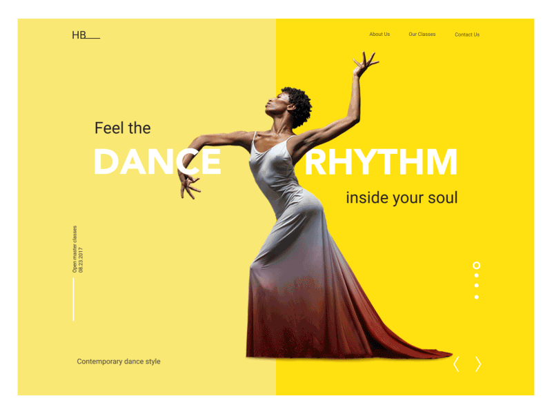
The landing page designed for Dance Academy applies animated hero images on the dynamic slider that instantly connects visitors to the theme of dancing and informs about the closest classes.
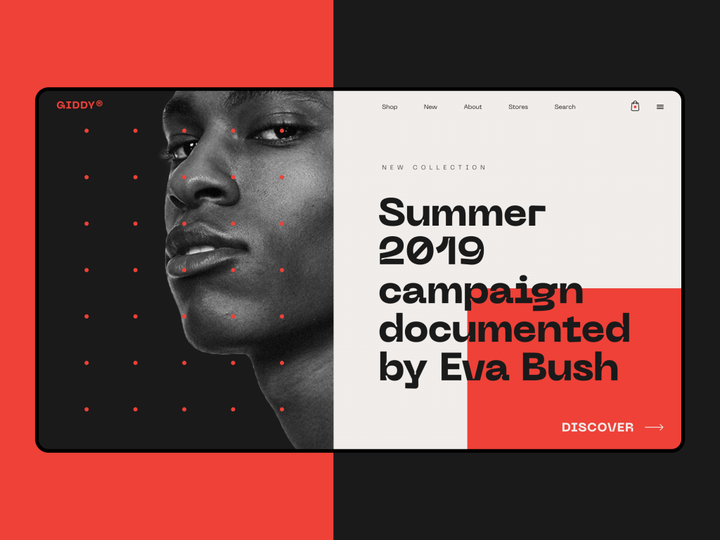
Fashion e-commerce website uses photos as hero images catching attention and setting the proper visual style.
Illustration: Total Control, Total Responsibility
Custom illustration website header design is the medium of brands that have decided who they are. Every color, every shape, every character is a deliberate call—there’s no reality to hide behind, no happy accident of good lighting. The whole visual world is yours to build, which means you own every decision including the bad ones.
The failure mode is the fintech beige people. You’ve seen them. Limbless, vaguely humanoid figures in a palette of warm grey and muted sage, gesturing meaninglessly at each other. They emerged from a very specific Slack-era design culture and they’re now so common they’ve become invisible. Which is worse than wrong. When comparing hero section photography vs illustration, the illustration path demands more commitment—commit to something specific enough that it couldn’t belong to any other brand, or you’ve paid more for the stock photo problem.
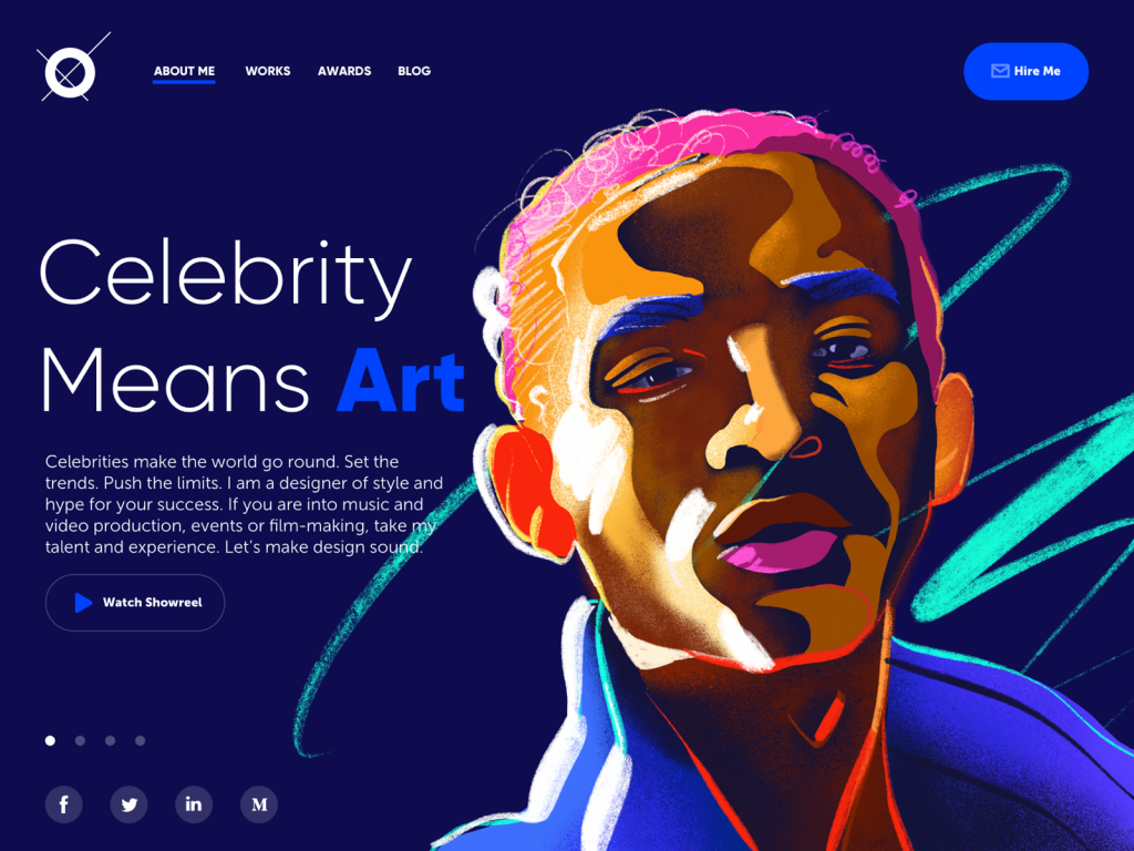
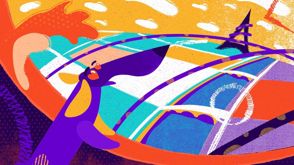
A concept of a portfolio website for a designer that specializes in projects for celebrities, entertainment, music, and film production. The dark background in combination with the custom hero illustration looks more vivid and sets the association with the atmosphere of a concert stage.
3D: The Medium That Earns Its Difficulty
Good 3D sits in interesting territory between photography and illustration—it has the precision of one and the control of the other. You can photograph a product that doesn’t exist yet. You can light a scene that’s physically impossible. For hardware brands, automotive, architecture, anything where the object itself is the whole story—3D renders done well are genuinely irreplaceable. Done badly, they look like a video game cutscene from 2011. The gap between those two outcomes is large and mostly made of budget, so go in clear-eyed.
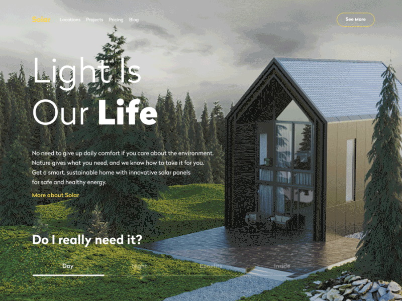
That’s a website of a company that designs and builds sustainable homes using solar power to get all the needed energy. The 3D-rendered model of a house allows users to see the photorealistic image of the offered service and even manipulate it to see the view in day and night mode.
Making It Work: What Actually Separates Good from Generic
The Tagline Is Half the Image
A hero image without language is a mood board. Language without a hero image is a press release. Together they do something neither can manage alone—the image sets a feeling, the words give it a name, and the user walks away with an impression that feels complete. The mistake is treating them as separate deliverables. “We picked the image, now write something to go with it”—that’s the brief that produces taglines like Empowering people to do more. The image and the copy need to be conceived as one thing, because that’s what the user experiences them as.
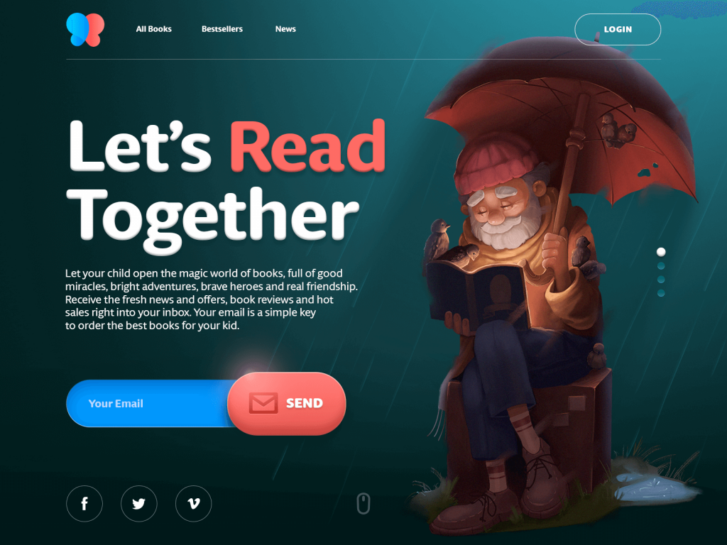
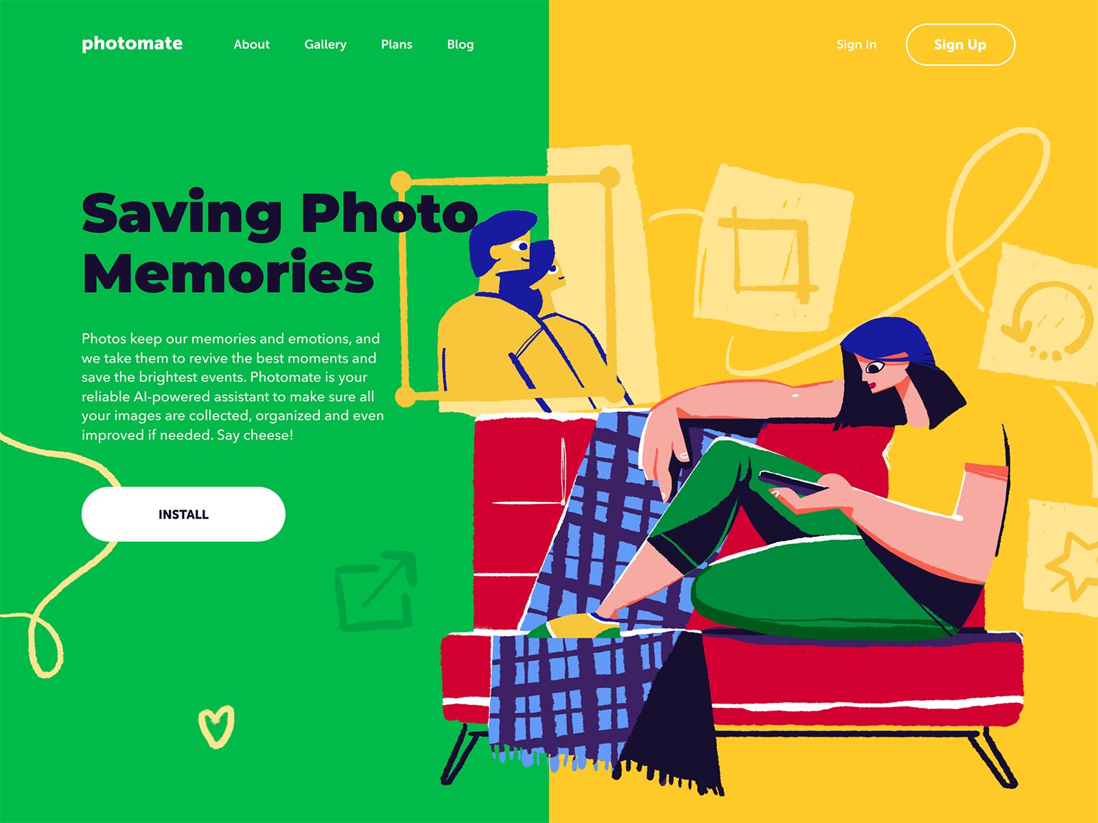
Here’s the webpage for the online bookstore selling children’s books. The hero illustration instantly creates the proper atmosphere and together with a simple tagline encourages users to subscribe.
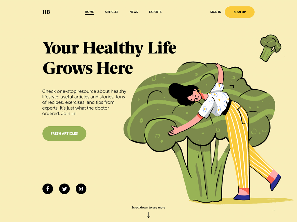
Another example of the web page where hero image and copy content present solid composition, set a positive atmosphere and inform users about the theme of the content the Health Blog provides.
Type Is a Visual Argument
The typeface sitting over your hero image is not neutral. A compressed sans-serif set tight and large says something. A loose, slightly irregular editorial serif says something different. Hero image design tips almost always underweight this: the scale relationship between the type and the image—whether the text whispers or shouts—is a personality decision, and personality is exactly what most hero sections are missing. Make it one of the first calls, not the last.
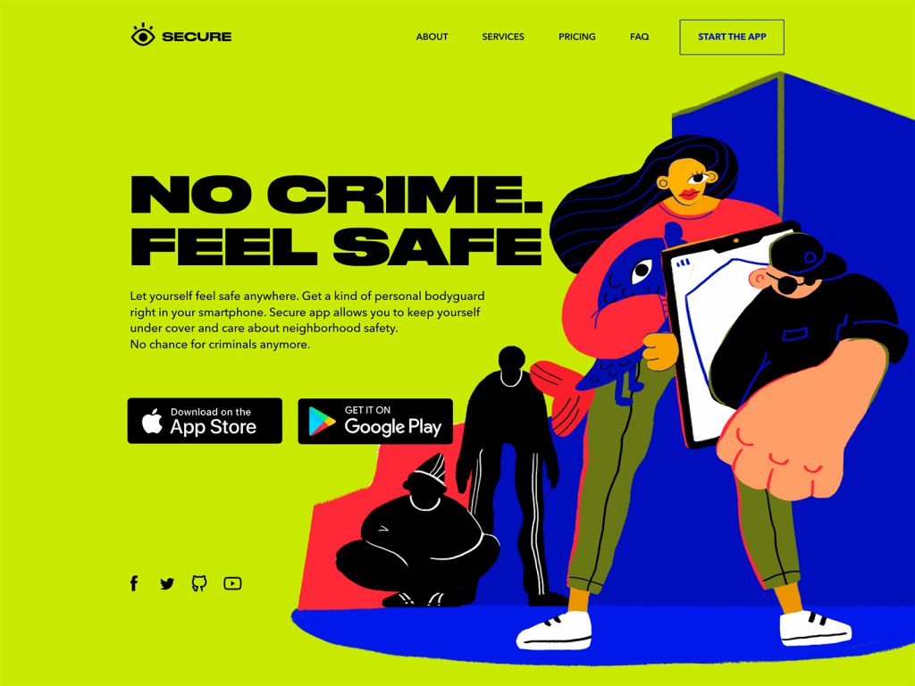
The landing page for the security application uses the visual contrast of a hero illustration full of irregular curves and thin lines and bold solid Druk font.
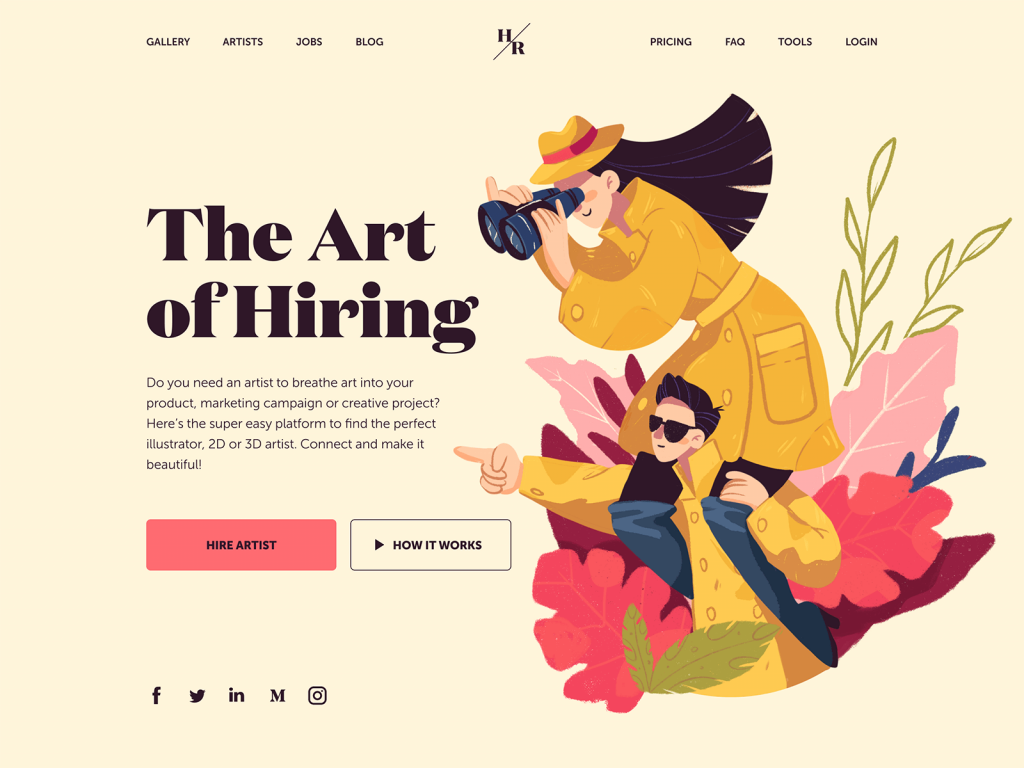
And this landing page with a hero image features the choice of a serif font Domaine for the tagline. It visually reflects the style of the illustration. Yet, for the description copy block, the designer chooses a sans-serif font that is highly readable.
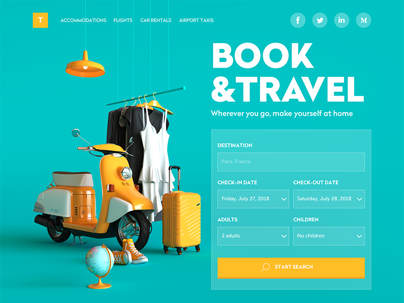
This design of a booking service website uses a prominent hero image in the form of 3D graphics. To make the composition of the layout not only aesthetic but also effective, the designer uses the same shade of yellow color both as a basic color of the hero image and an accent color for interactive elements: logo button and CTA button.
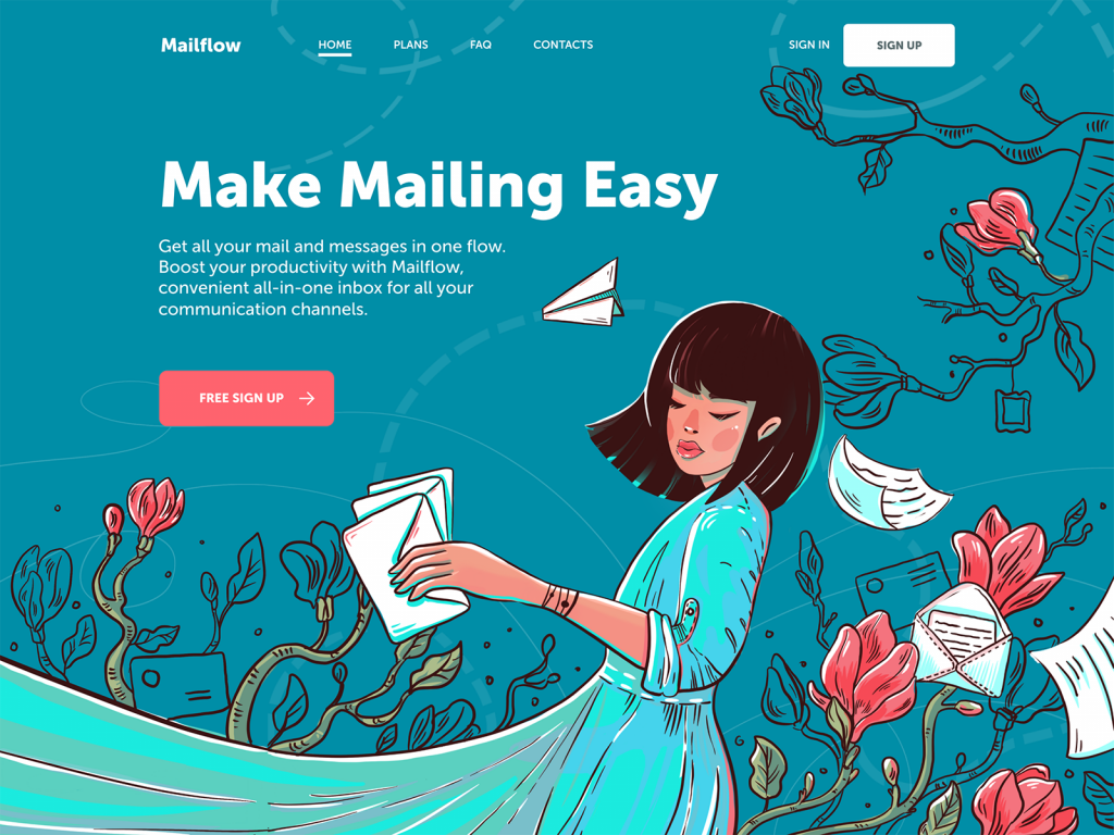
The landing page for the mailing service features another hero image used as a full-screen illustration and combined with navigation elements by color accents.
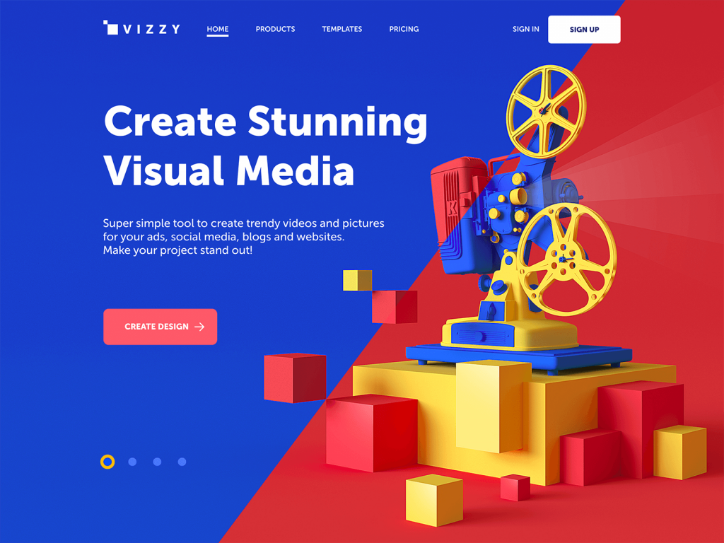
The landing page for the visual media tool uses 3D graphics as a hero image and the split screen making the geometric composition even more expressive. The color accent used for the CTA button makes it instantly visible and visually united with the image.
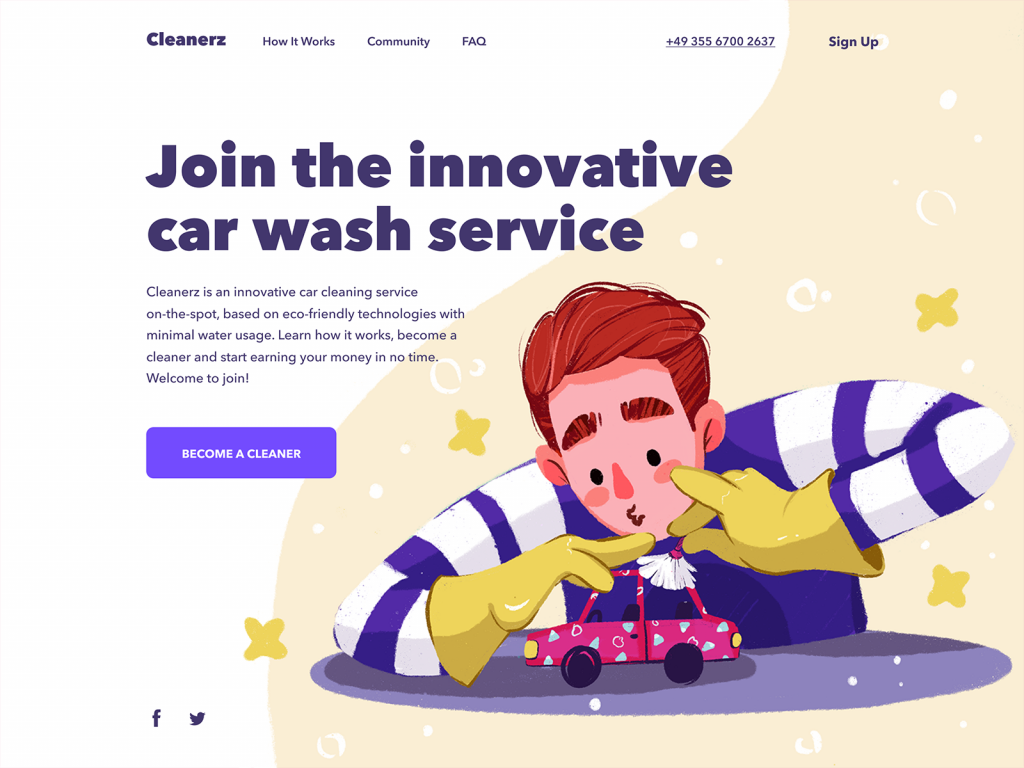
The landing page for the car wash service website also uses the color as the main tool uniting visual details of the hero illustration, the copy content and the CTA button.
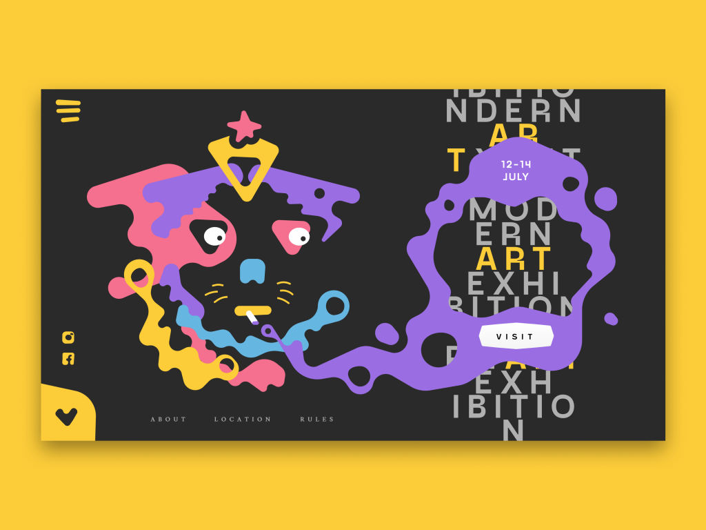
This landing page for the modern art exhibition features the experimental integration of typography into the hero image this way setting the original visual composition.
Motion Has to Mean Something
Hero section animation best practices come down to one question: what does this movement communicate that stillness can’t? A subtle, almost imperceptible parallax that adds depth without announcing itself—good. A full-bleed video loop of people looking productive in an open-plan office—the motion equivalent of the salad photo. If the answer to that question is “nothing, it just looks cool,” it’s probably not cool enough to justify the distraction.
The website of the innovative energy service quickly grabs attention and informs users about its nature and values with a nice animated hero image.
The landing page for the illustration conference builds the composition on the original and eye-pleasing animated hero image.
The design for the Crypto Blog uses the abstract geometric 3D animation as a hero image and visually unites them with the layout via the color accents and split background.
Artistic Risk Is Not a Luxury
The safe choice in homepage design mistakes is near the top of the list—and playing it safe with your hero is the most common one. When everyone’s hero section looks like a variation on the same four templates, safety reads as absence of thought. The brands winning visually right now made a call—a strange one, sometimes—and executed it with enough confidence that it reads as intentional rather than accidental. An experimental hero image executed with full conviction beats a conventional one executed perfectly. The conventional one disappears. The experimental one is remembered, even if not universally loved.
The landing page of the kindergarten uses a big funny and cute monster designed and animated as a hero image to entertain users and set the needed emotional background.
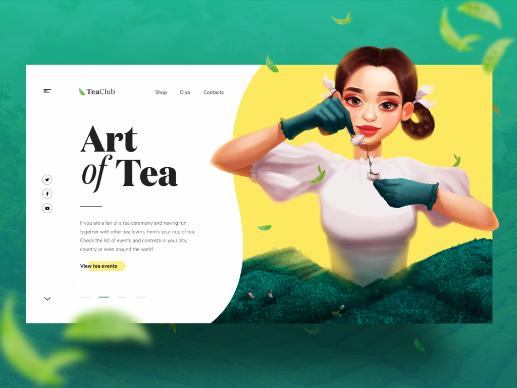
The cartoonish hero illustration for the page of tea events on the Tea Club website quickly sets the visual connection to the theme and transfers the great atmosphere of tea ceremonies.
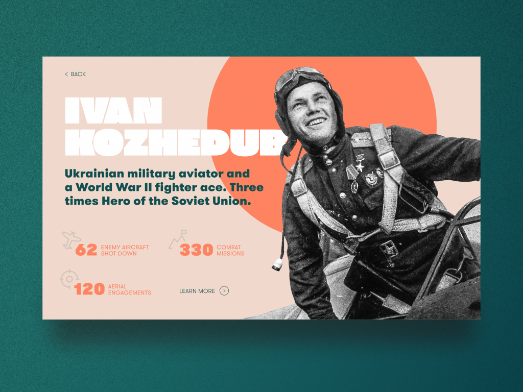
The page designed for the education website devoted to the Second World War also sets the emotional background with a hero image – this time hero in its literal meaning as it’s an archive photo of the personality presented on the page.
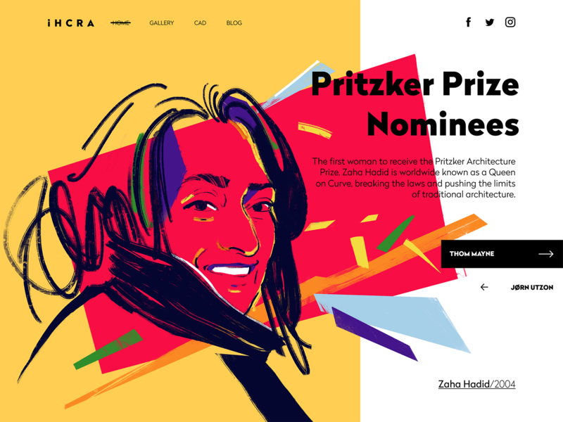
The web page of the gallery of Pritzker Prize winners and nominees in the online architecture magazine features the artistic digital portrait of Zaha Hadid.
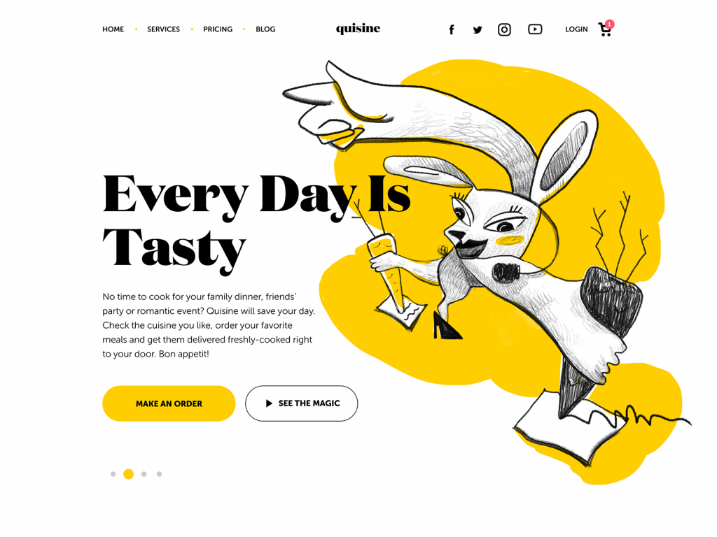
The experimental illustration is used as a hero image on the website for the food delivery service. You may like it or not, but it will definitely catch your attention.
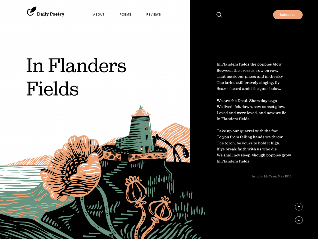
The web page designed for the Daily Poetry website uses hero illustration integrated into the page and this way strengthens the poem with visual images and melancholic palette.
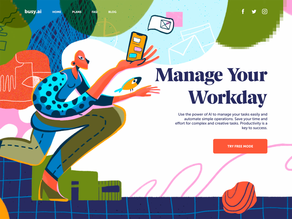
The landing page promoting the productivity service features the hero illustration inspired by the high art.
Conclusion
A hero image is a design argument compressed into a single frame. It argues for what your brand is, what your user should feel, and what should happen next. Most sites make that argument badly—not because they don’t care, but because they’ve treated the hero image as a container for content rather than content itself.
The ones that get it right understand something simple: this image is the opening of a relationship. It sets the terms. It either earns the next thirty seconds of attention or it doesn’t, and nothing below the fold can fully recover from a hero that failed.
Recommended Reading
Liked this piece? There’s more where this came from—explore more articles from our studio on design, digital products, and the ideas shaping modern experiences:
Web Design: 5 Basic Types of Images for Web Content
The Anatomy of a Web Page: 14 Basic Elements
7 Basic Goals Behind Photo Content in User Interfaces
Functional Art: 10 Big Reasons to Apply Illustrations in UI Design
UX Design: How to Make Web Interface Scannable
Negative Space in Design: Tips and Best Practices
Single-Page Website: Best Design Practices