Landing page is one of the most powerful and flexible digital marketing tools these days, proving its efficiency with more and more cases. In this article, we invite you to consider the must-have points that make a landing page design both user-friendly and effective for the business goals set behind it. Let’s look into the five fundamental pillars of a landing page and check plenty of web design examples demonstrating mentioned practices.
Clear Offer with CTA
What makes a landing page different from all the other types of web pages is its narrow focus on a particular goal. Its primary purpose is to allow the visitors to land right where they need and get what they want – and what the business can give them according to the specific query. Creating special pages means giving users clear directions. This approach sounds especially effective for big e-commerce platforms, where it’s easy to get lost around hundreds or even thousands of items. Directing all the traffic to the home page, especially in the cases of leads coming from particular marketing campaigns in external resources, can result in a poor user experience. The risk is high that on the home page, their attention will be driven away. And the more you distract a person, the lower is the chance of their going all the way to the checkout.
Dynamic and interactive landing page for a brand of party drinks
What’s more, there are many other cases apart from e-commerce when landing pages work well. They can:
- promote the mobile applications
- present educational resources
- promote pre-sales and special offers
- promote events and meetings
- make announcements
- introduce the communities
- give access to whitepapers, etc.
Landing page design for Pass-On application
Whatever is the goal set behind a landing page, it demands setting a clear and concise objective that should be achieved with its help. Reaching that page, the visitors need core things: to understand what you offer and to see how to get it if they want. That’s why the design should be done in a way to satisfy this need.
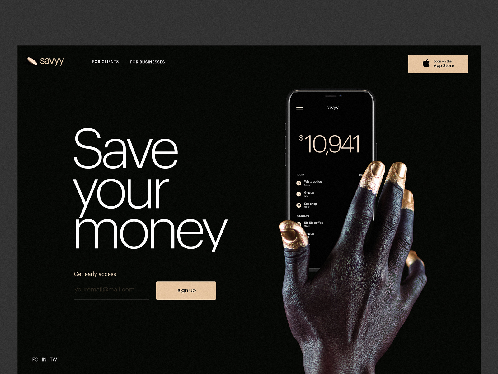
Give a clear and super concise answer to two fundamental questions.
Firstly, what does the business, product, or person behind the landing page offer the visitor? Pack the answer into a short tagline and/or image visible from the first seconds and transferring the needed message.
Secondly, what should a visitor do to get what is offered? Formulate it in a precise word or phrase (Download, Learn more, Buy, Subscribe, etc.) and place it on the call-to-action element that is immediately noticeable in the webpage layout. A CTA element can be a button, link, contact form, subscription field, etc. It presents the strategic interaction element of a landing page as it is actually the spot where conversion happens. It should be instantly visible, which can be done via color or shape contrast, and informative, which is usually achieved with a proper microcopy or icon, or both.
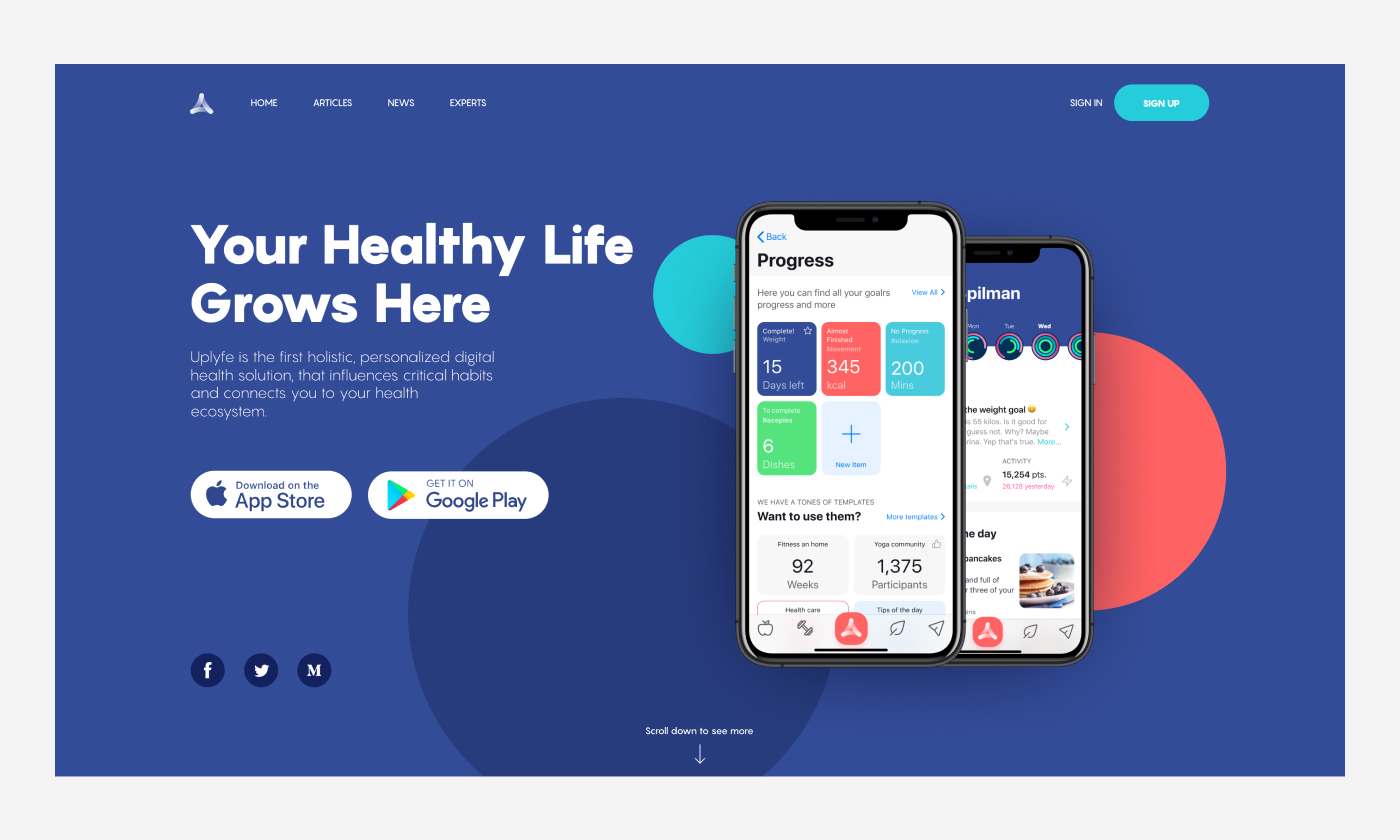
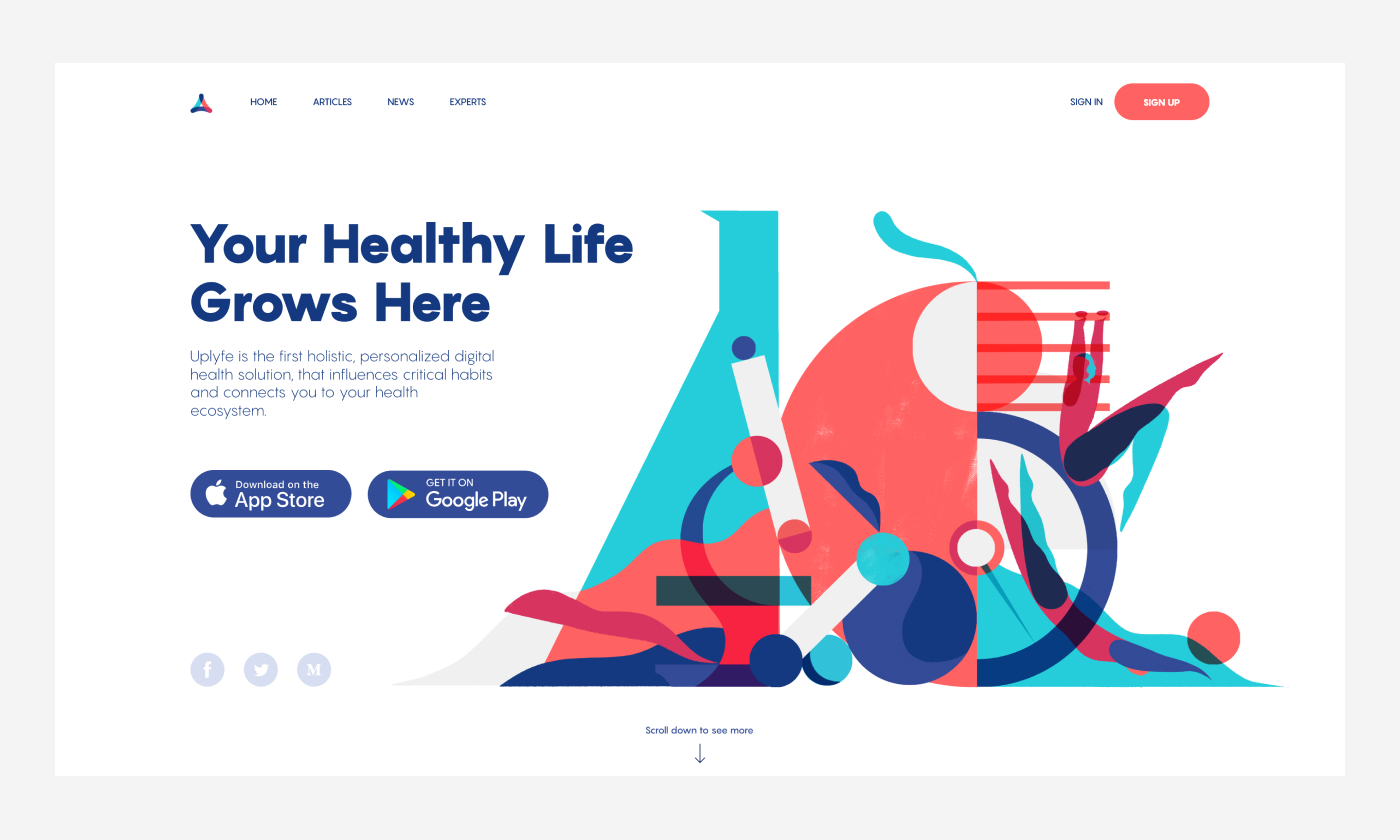
Landing page design concepts for Uplyfe application
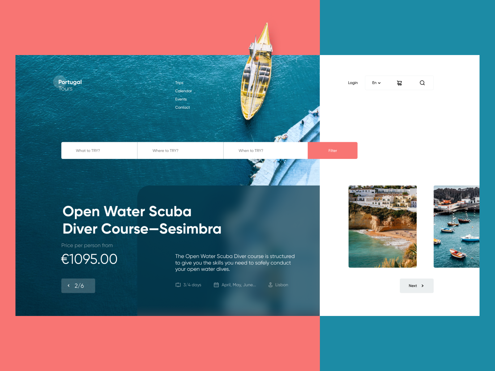
Landing page for the scuba diving course
Needless to say, that the mentioned two elements should be seen at once when you scan the landing page.
Visual Media
No secret, most people are visually driven, and they scan the web page in a couple of seconds, perceiving images much faster than text. And in the web world, where tons of pages compete for users’ attention in a kind of knock-out-drag-out way, each and every second matters. So, that’s really the case when the picture is worth a thousand words as it covers multiple options, being informative, emotional, and impressive at the same time.
Landing page design for Vertt application, employing custom illustrations
First and foremost, it’s essential to set a strong visual connection to the promoted brand. In each particular case, design and marketing specialists decide with a client if the landing page should fully keep consistent with the rest of the website pages or other channels via which the brand communicates with its users – and in many cases, they may decide to step aside and let the landing page differ and shine another light; that is often the main reason why it is created, to make a specific campaign look and sound differently. Yet, whatever level of originality is agreed for the particular landing page design, it should clarify what brand, company, or person communicates to a client via it. The identity design elements may include a logo, brand colors, and typography, or anything else that sets a fast and solid connection to the brand.
Landing page promoting a habit builder app
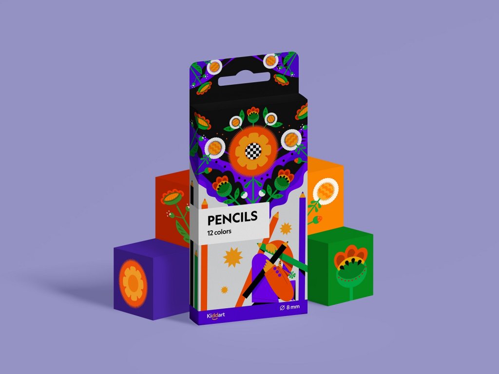
One more aspect to consider is imagery. An appropriate image is a good way to catch users’ attention and get them interested. Independently or in combination with the tagline, images also fulfill the objective to inform the landing page visitors about the nature of the promoted offer. Pictures save users’ time, send them a quick and appealing message, and last but not least, contribute to the aesthetic side of the presentation. These can be:
- theme illustrations or photos setting the atmosphere and mood
- product photos demonstrating the offered items
- 3D graphics, providing a deeper visual connection to the idea
- custom icons helping to reflect main features or benefits
- mascot adding fun and human nature to the page
- minor graphics uniting different sections into one single piece
Landing page enabling visitors to download a report uses stylish abstract 3D graphics
A common approach to landing page design is applying a prominent hero image in the above-the-fold area: it sets a strong emotional association to the offered product or service and becomes the central part of the layout composition.
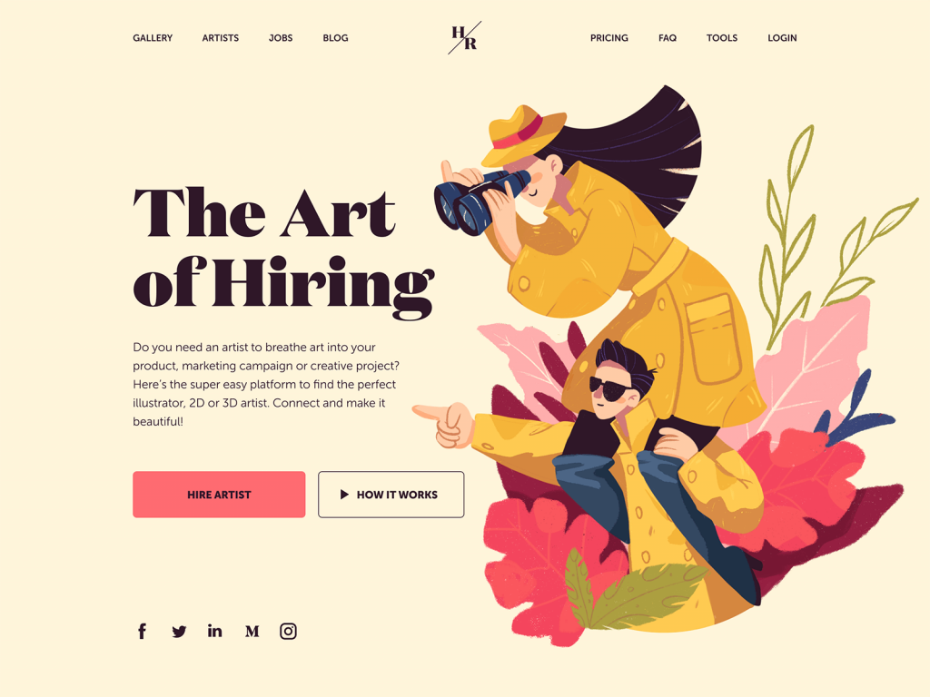
The landing page for the service allowing for hiring artists uses the hero image to set the theme and idea, as well as a directional cue attracting attention to the CTA button.
This funny and bright landing page for the private kindergarten uses a big animated mascot as a hero image to set the playful atmosphere and unite two parts of the page.
One more option becoming more and more trendy is using video content on landing pages. These can be animated videos telling about the benefits and features of the offer, short videos giving a fast connection to the needed atmosphere, or setting the needed mood.
Whichever type of visual content you choose, the rule of thumb here is that any visual selected for the landing page should be relevant and informative, not just filling the part of a page.
Landing page for a newcoming product with trendy and catchy 3D graphics
Text
Textual content is another aspect to be well-thought. The known guru of advertising David Ogilvy said: “Every word in the copy must count.” That is a simple but unavoidable truth if you deal with a landing page. The decision on the volume of text on the page should be the aspect of thorough research and testing as it directly and highly influences conversions.
A designer’s task here is to think about edible copy presentation framed into a clear visual hierarchy:
- sizes and placement of copy blocks,
- instantly scanned taglines or headlines
- short call-to-action microcopy for buttons.
Landing page designed for Pass-On application, with deep attention to text content and visual hierarchy
The length of text on landing pages is a debatable issue. Make no mistake, focused goals behind the landing page don’t always mean that it should contain a minimal number of words each time. If it presents a famous company product or service or informs about special offers, a short and robust copy can be enough to encourage users. On the other hand, if a new unknown product or service is presented, it is often helpful to provide users with more information persuading them to follow the call to action.
Anyway, the presentation of the copy has to be designed for good readability and scannability of the page.
Landing page promoting a conference using typography as the primary visual element of design and providing detailed texts on the event
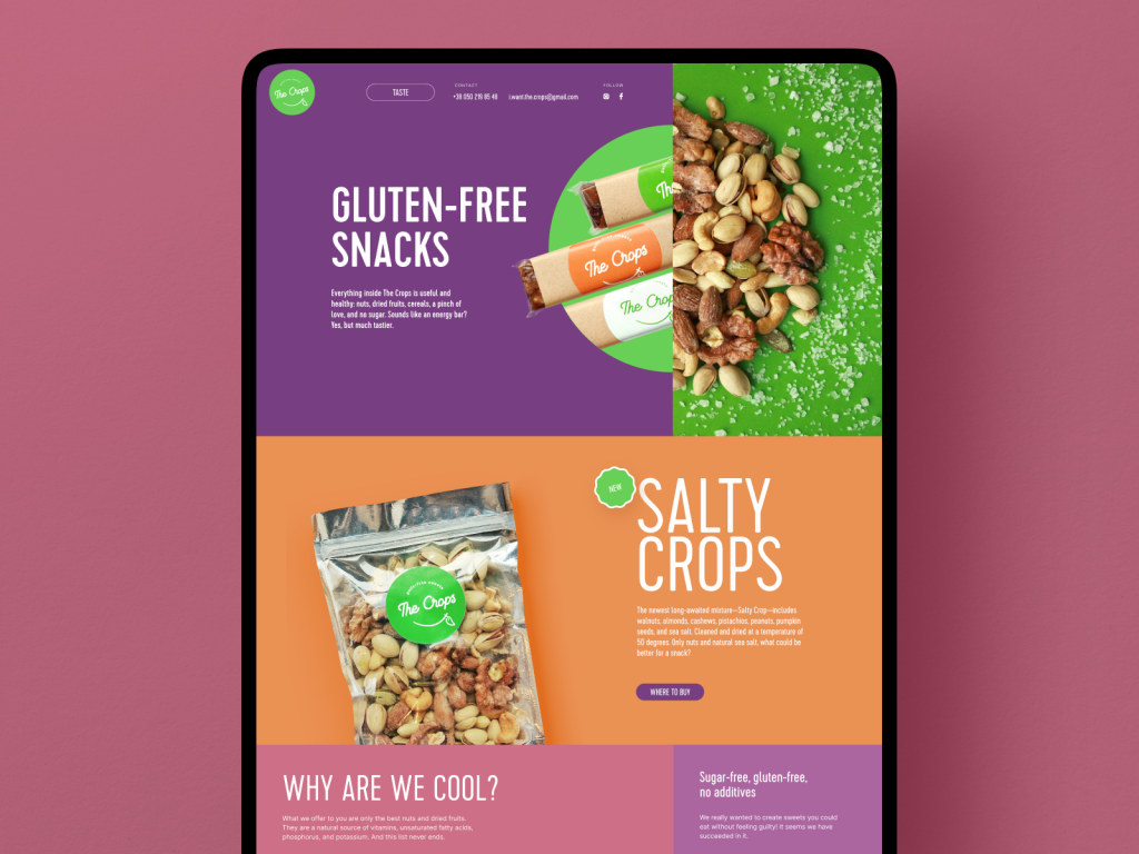
Landing page for the brand of healthy snacks, with minimal text and focus on product photos.
CyberMonday landing page for Designmodo steps aside from using images and focuses attention on typographic part with catchy glitch effect.
The well-checked recommendation for UX designers working on a landing page is not to use the so-called Lorem Ipsum. It’s a popular placeholder text that looks like Latin but really doesn’t mean anything, which is often applied to with the aim to create a naturally looking piece of text in the layout of a page or screen. As we mentioned in our article about UX writing, in the design process, especially early stages of the creative search for the general concept, it’s really tempting to just copy-paste the nonsense text into the places planned for copy blocks. Why isn’t it a good idea?
Firstly, the text is a part of the design. Different letter combinations look different. Words have different volumes and structures. It’s particularly true for a tagline that presents one of the most catchy elements of a webpage’s visual hierarchy. What pleases your eye in Lorem Ipsum may not work with real text to be used on the page.
Secondly, using the realistic text you make a prototype feel genuine and natural. Let’s say, if you design a landing page promoting cooking equipment, you won’t use photos or illustrations of agricultural machines or cosmetics for placeholders, even at the earliest stages of the design process, will you? Why? Because it won’t connect the design concept with the goals set for that product. The same happens with the text part of the layout. The copy you use should create a united image and experience with all the other elements of the layout. What’s more, you can spend hours working out the great looks for taglines, webpage text blocks, and microcopy – and all that effort will be wasted when you realize that real text to be used on this page is different in its length, structure and perhaps even message. So, strive to apply realistic and relevant text content from the earliest steps of the design flow.
One more important point is text and numbers presenting signs of trust. People tend to trust more what is already used or tried by others and recommended as worth attention. Reviews, testimonials from clients, awards, and certificates can significantly impact the conversion rate. Apart from other people’s opinions, the facts and numbers also present a substantial factor in increasing trust, for example, how many projects were completed, how many countries are covered, what big applications mentioned the products, etc.
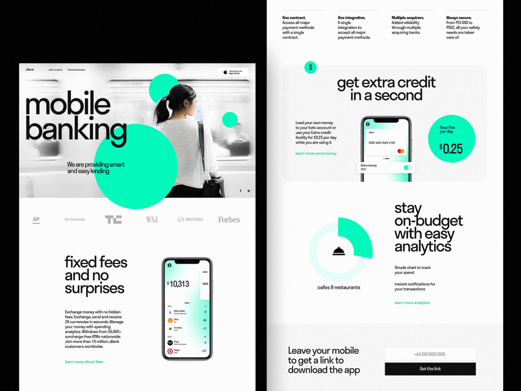
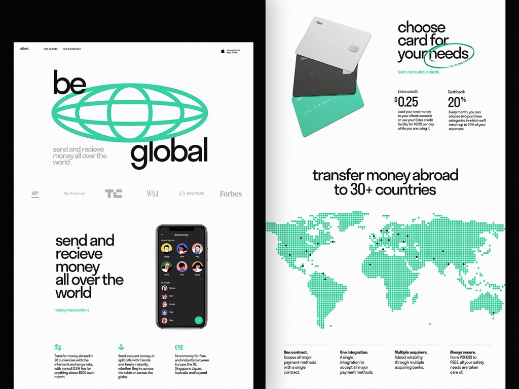
Landing page for the mobile banking app using the visualization of the map to share the countries it covers
Focus
The attention ratio is the level of concentration on a particular task or goal. No need to explain that for a landing page, it should be as high as possible. Too many interaction elements will provoke distraction, reducing the chances of conversion: the more options users have simultaneously, the harder it is to make a choice.
Concentrate people’s attention on a particular action. Get rid of elements that can distract the user’s attention and highlight the parts directly influencing the conversion. The fewer additional links are used, the better. Call to action elements should get the fastest and highest level of attention. In this case, the user will get the best navigation to the goal.
Based on the previous points, a creative team working on a landing page – designers, copywriters, marketing specialists, etc., should agree on the priorities and define the core benefits visitors need to see. Trying to overload the page with all the possible data about the offer, you risk overwhelming them so much that they can start hesitating or even get annoyed. Core information fields on a landing page usually cover:
- the general introduction of the presented offer (tagline, heading, etc.)
- the concise and informative description of benefits solving user’s problems
- testimonials, convincing features, or signs of trust
- a clear call to action.
Landing page for innovative fintech service Uni
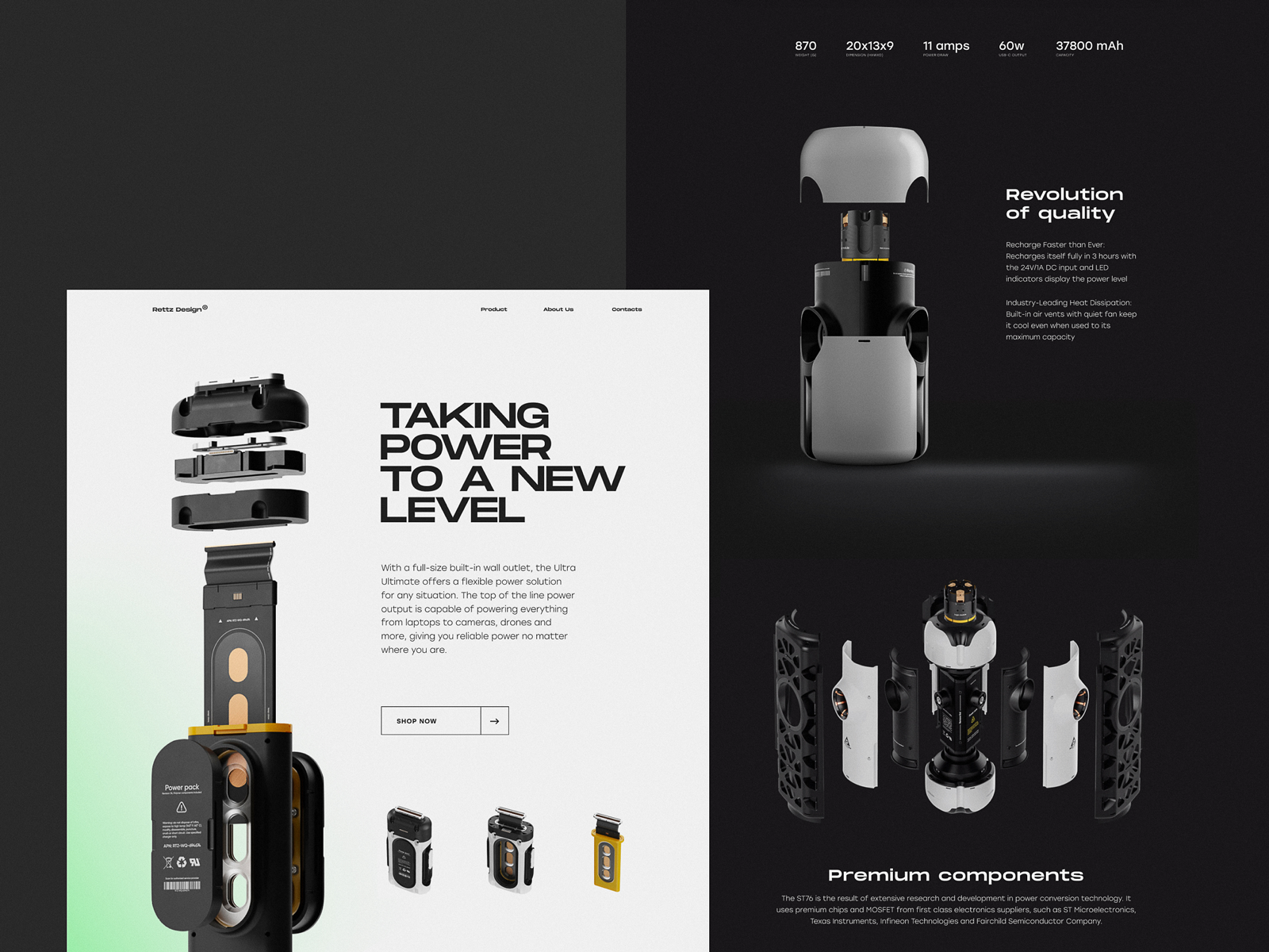
Landing page concept for an innovative charging station, inspired by the 3D concept created by concept designer Rettz Schmettz.
If the offer is quite complex and it’s hard to describe all its benefits shortly, a good solution can be dividing the page into several theme blocks with separate interactive elements (buttons, fields, links, etc.), enabling users to get further information or help quickly but on the other page.
Responsiveness
The part of interactions with websites from mobile devices and tablets is growing steadily year by year. To let the visitors have a seamless experience from any device, it’s crucial to make the landing page mobile-friendly and reconsider the layout to make the interface convenient and navigable for any case of use.
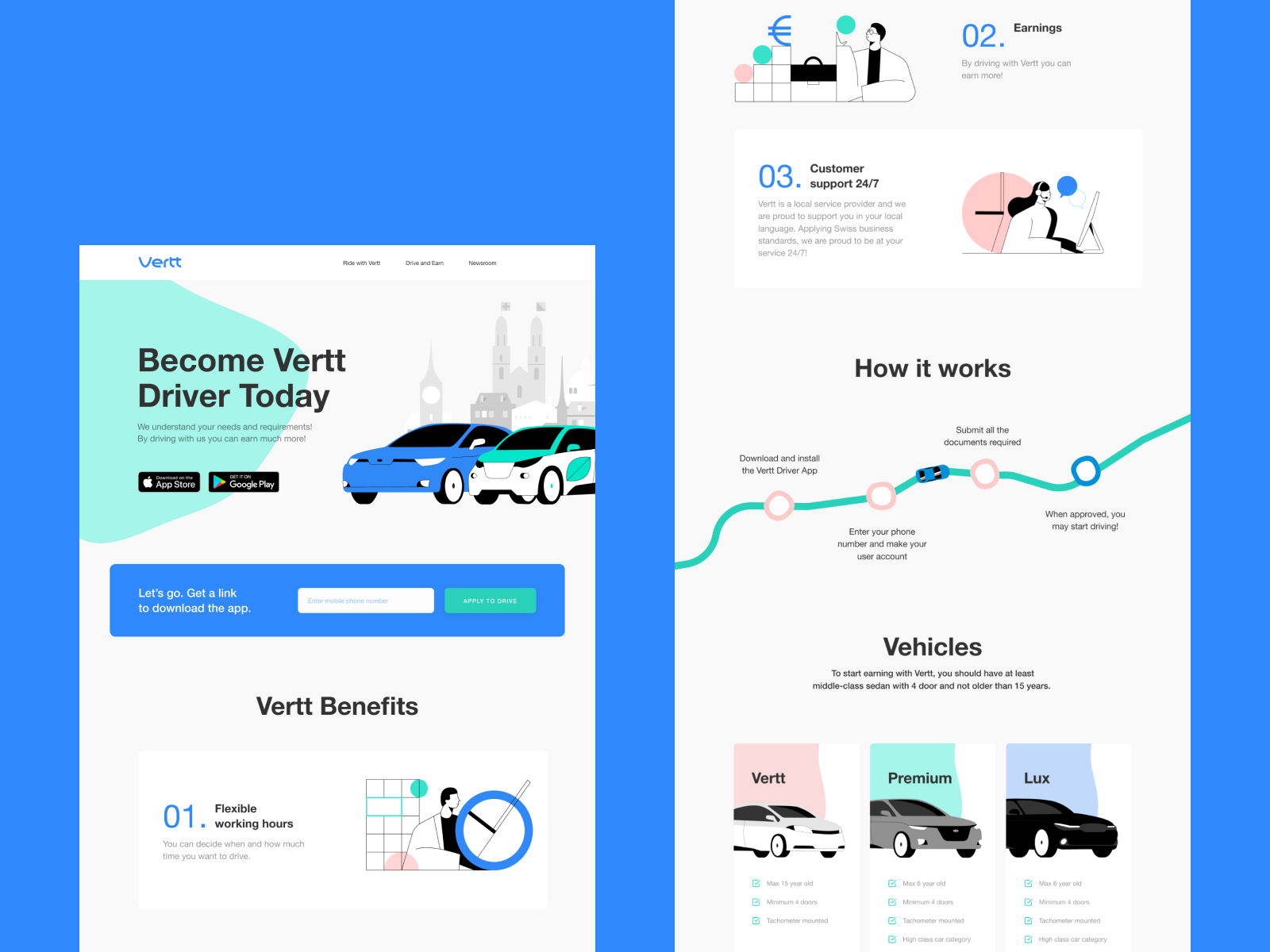
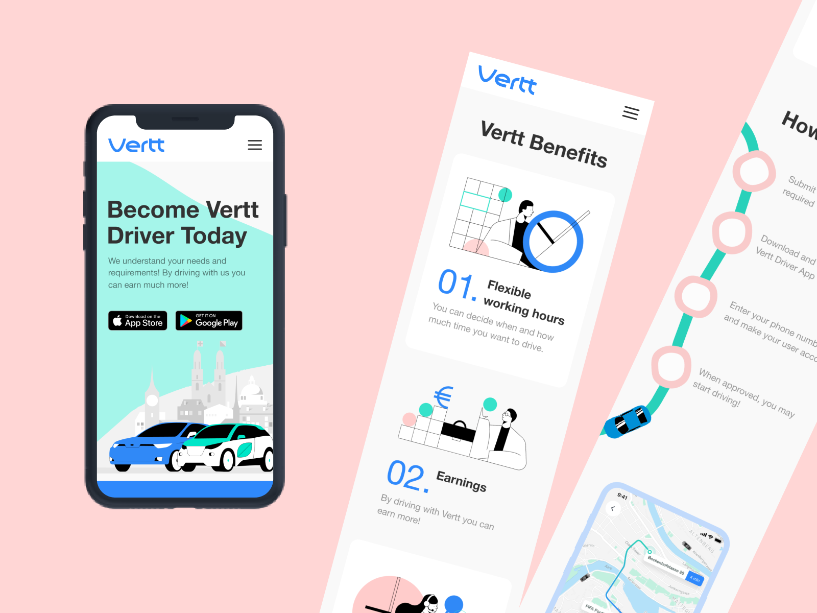
Responsive landing page for Vertt application
Does this article mean that all the elements should be imminently present on any landing page? Certainly, it doesn’t. Any specific case needs its own analysis and its own design approach. Some landing pages do great work without any images; some use super minimalist text; other ones feature no testimonials as their offer is new and hasn’t got ones yet. However, the checklist above will help designers, developers, and businesses to get an overview of what they could use to enhance the presentation of their campaign and define what is not applicable for their particular case.
Useful Articles
Here’s a bunch of articles to dive deeper into the theme of usability and user experience design.
5 Basic Types of Images for Web Content
Types of Contrast in User Interface Design
How to Make Web Interface Scannable
The Anatomy of a Web Page: Basic Elements
How to Design Effective Search
Web Design: 16 Basic Types of Web Pages
Directional Cues in User Interfaces
Negative Space in Design: Tips and Best Practices