The task of logo and identity development seems to be not really simple today. More and more companies and products are filling the market with branding designs of various complexity and quality. Whatever is the business or charity, it needs the original and recognizable image to support brand awareness and promotion. On the other hand, is that so easy to get original stepping into the ocean of various and diverse competition? This is the time for designers to come into play.
Today we offer you another case study showing the way in which a brand passes to get its face designed. In one of the recent projects, the Tubik team had the task of creating a logo for a landscaping business with further stretching the style and visual presentation on a number of items promoting the corporate identity. This challenge was assigned to graphic designer Denys Boldyriev.

Project
Redesign of corporate identity for landscape firm LunnScape.
Process
LunnScape is a company based in Florida, USA, and specializing in landscaping services to commercial properties like office and courtyard spaces, parks, etc. The firm was founded by Steven Lunn in 2009: it’s easy to see that the brand name presents the harmonic combination of the founder’s name with the keyword “landscape”. Being already established and known on the local market, the company strived for refreshing the visual identity and putting its promotion to the next level. The client came to us with a very basic branding they already used and wanted a new design corresponding to the modern trends and requirements and enhancing the connection with the customers.
We had already had a chance to create a brand identity for a landscape firm – it was shared here in the case studies on logo design and corporate branding for Andre. That made the challenge even more interesting, as the companies providing similar services had different approaches and vision of their brand images and needed new original looks. There is always the place for a creative perspective in design, which makes the job so cool.
For this project, we accomplished a set of tasks according to the client’s marketing strategy:
- landscape company logo
- slogan
- theme illustrations
- corporate letterhead, envelope, and business cards
- stationery
- corporate vehicle
- style guide.
Logo
Brainstorming ideas on the task to design a logo for a landscaping business, most people will imagine something connected with plants, flowers, or their elements. That’s a natural and very quick association. Actually, that approach had also been followed in the previous version of the logo presented with a simple stroke image featuring a leaf. However, keen on getting fresh stuff that would distinguish the company from the competitors, the client stated the wish to step aside from the traditional associations and try other creative directions. They wanted the brand sign to be dynamic, immediately connected to the theme of nature but moving away from ideas and patterns typical for landscaping logo design.
As well as in the previous case study on identity for Reborn restaurant, early ideas were visualized in the quick pencil sketches to catch the possible silhouette of the future logo and discuss possible directions of creative search with the stakeholders. After that, the set of basic digitized options were offered. To make the picture full and ensure how far the logo should move from the common associations set, the designer provided a variety of options, as you can see below. Some of the options were visually connected to the plants and greenery, for example, the lettermark made of leaves, the image of a flower, the shapes of landscape site patches also resembling the flower petals. Also, there were shown the shapes of trees presented in balanced geometric forms giving the room for flexibility in a landscape logo design. The other options in this set were focused on dynamic images of living creatures like insects or birds.
![]()
So, it’s easy to see that in general, the creative search moved around two global themes, flora and fauna, both effective to set the instant connection to the theme of nature and land care. Thinking about the number of factors, the client put their preference on the image of a dragonfly as a mascot. Here’s the next stage of the logo design process – construction of a symbol image.
![]()
For the variety of usage options, the mascot image was added with the wordmark featuring the company name and accomplished in a style harmonically corresponding to the mascot. So, the final LunnScape logo is designed as a mascot of a dragonfly in an aqua circle depicting one of the fauna symbols which habitats in Florida nature. The dragonfly visualizes a bright creature on a green lawn, besides, its wings look like flower leaves. Turquoise circle with a dragonfly gives a solid stamp effect as well as looks playful due to the color palette. The wordmark typography complements and also unveils the core brand services of the company.
![]()
Both the brand mark and wordmark go hand in hand to keep an ultimate balance for user’s perception and brand recognition. Having agreed and polished all the details in the landscape logo design, the creative team moved to the work on the slogan and corporate identity development.
Slogan
The next step of the creative process was to support design with copywriting: the company needed a new slogan, so the copywriter was also engaged in the project. Short and catchy, the slogan had to support the idea of the beauty made by people but rooting in natural harmony. What’s more, the slogan had to set the tight link with the logo, so that in combination they effectively supported each other.
The company name uses the altered version replacing the keyword “land” with “Lunn”, but still preserves the general structure of the word so that the word “landscape” could be easily restored in mind. Among several directions for the slogan, we developed the one which used the word “land” actualizing its double meaning: land as an object of services the company provides and land as the action of coming down through the air and rest on the ground or another surface. This approach allowed for setting the link with the logo featuring the dragonfly so that together they presented the clear message.
After discussing the several sets of variants, the final version of the slogan was agreed upon “Landed on nature beauty”.
Branded Items
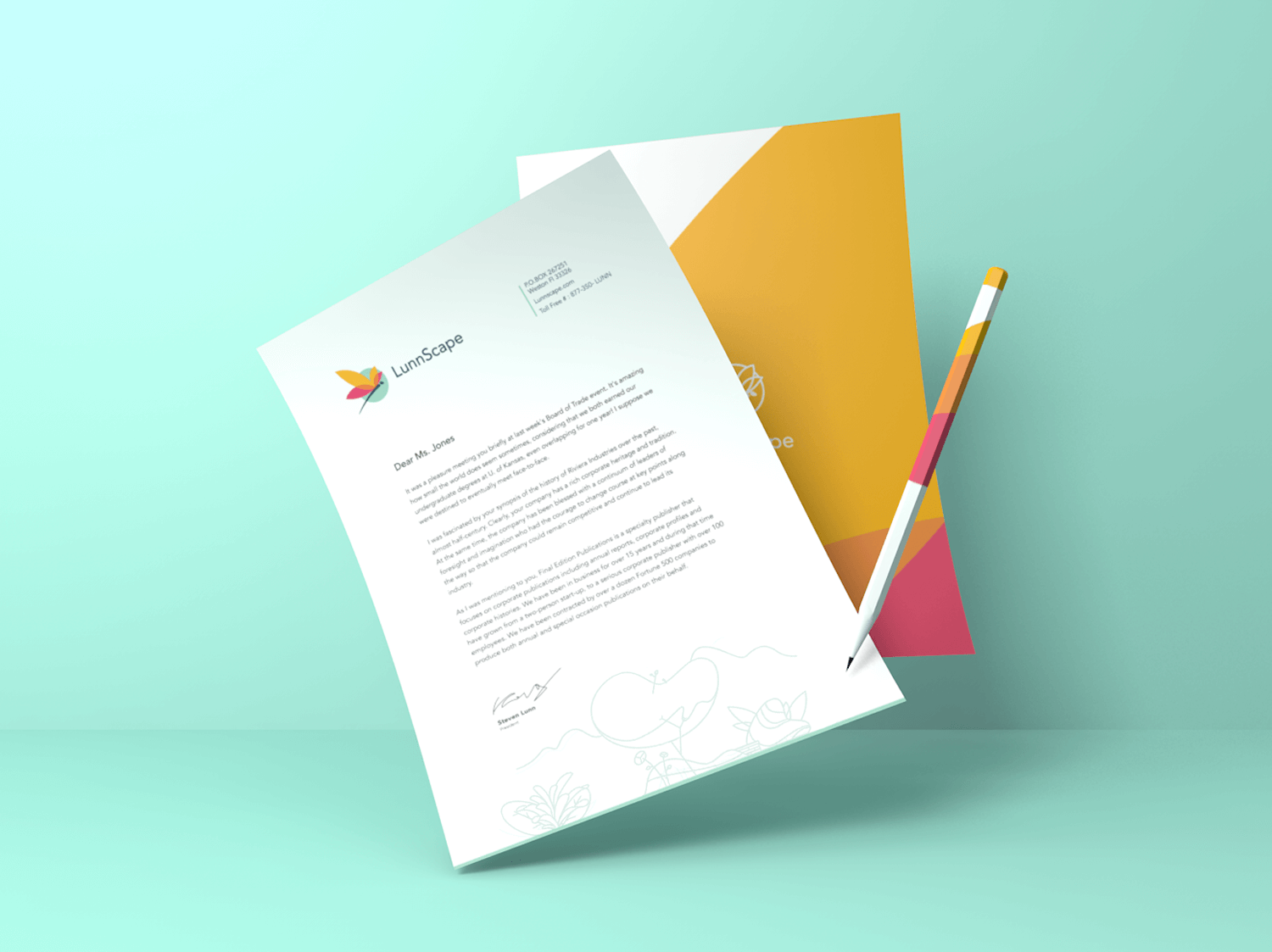
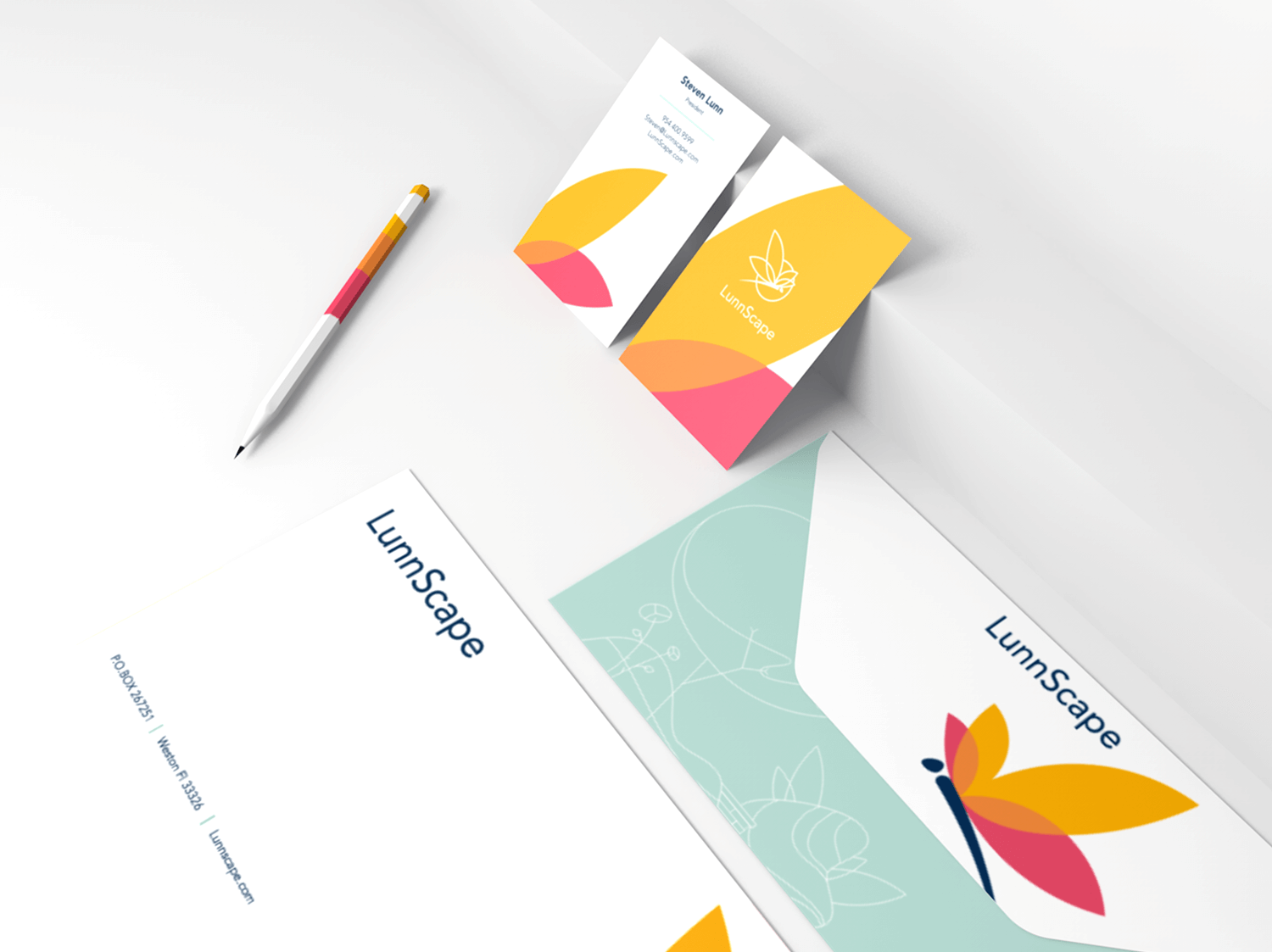
Stationery and business cards
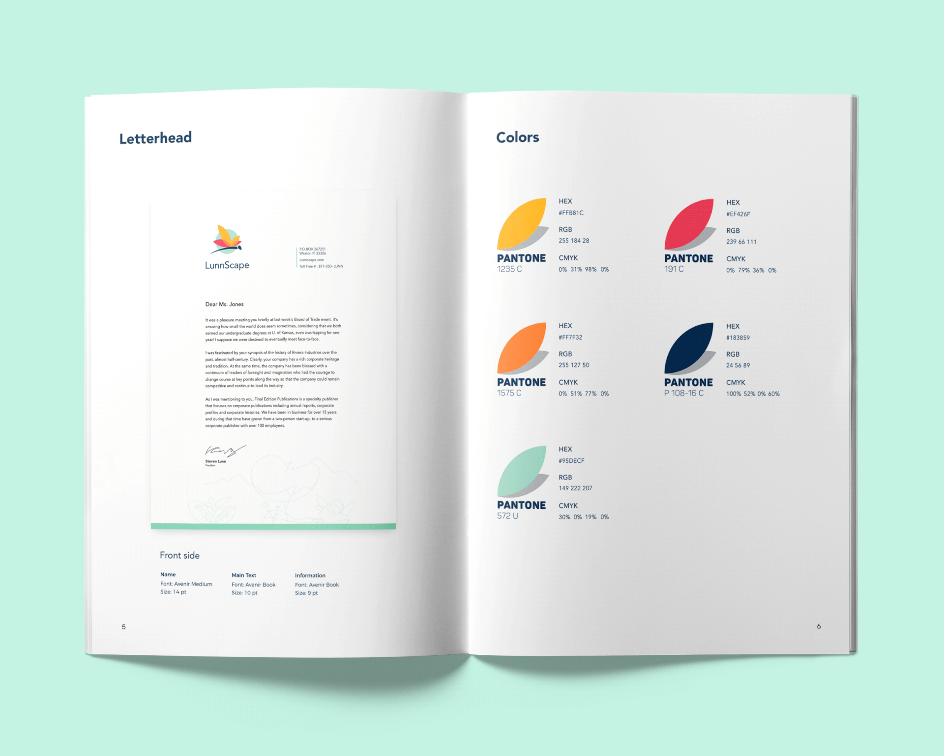
The designer prepared a set of templates for company documents, including business cards, letterhead, and envelopes, that reflect the brand identity in an elegant, non-distracting way. It enabled to stretch the design solutions of logo design for the landscape company and give them flexible ways of usage for different business purposes. As you can see below, business cards and the title page of a letter blank used the stroke version of the logo applied to the combination of corporate colors.
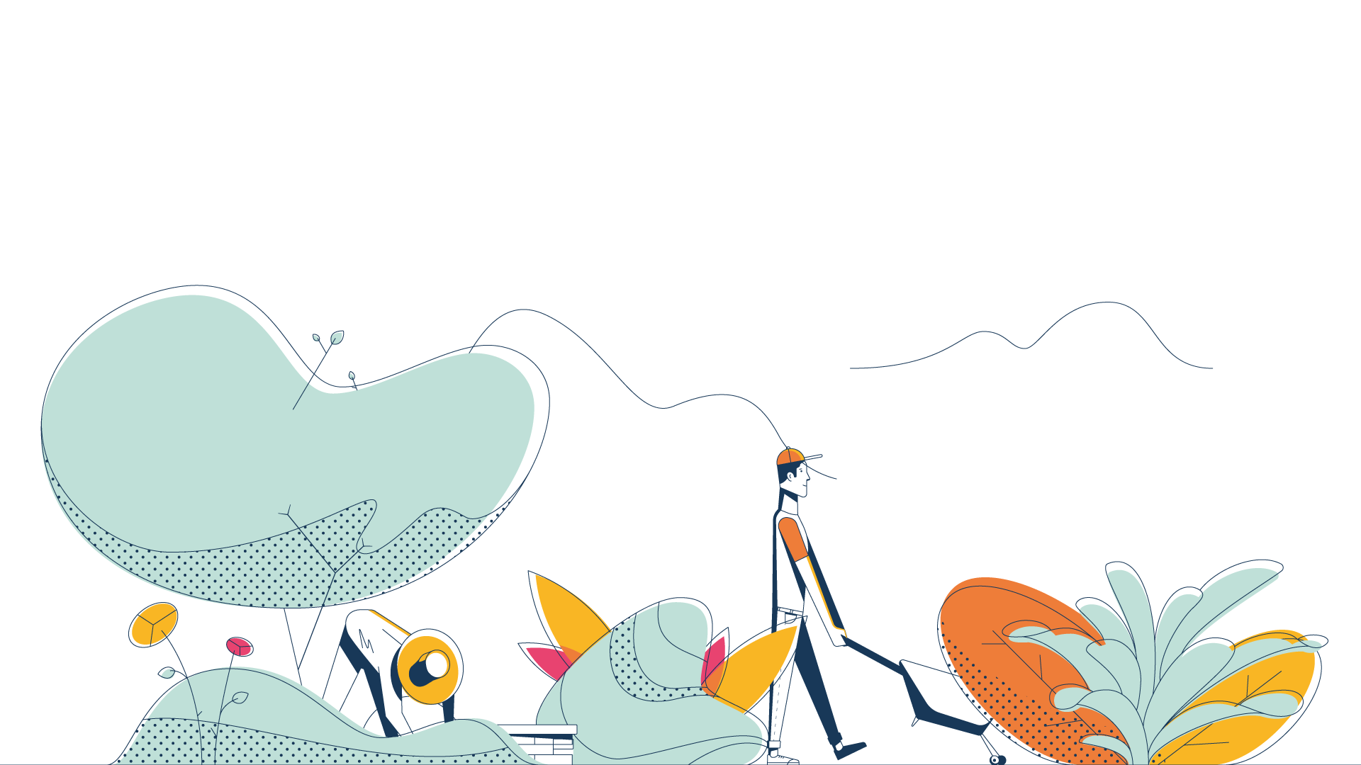
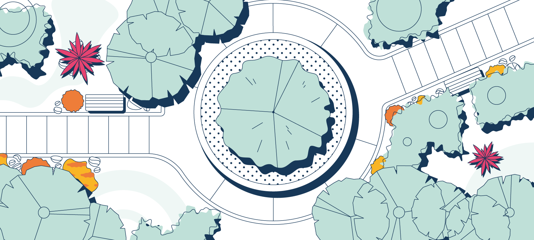
Illustrations
Another task was theme illustrations which could be used for marketing needs in social networks and on the website. Creating landscaping identity, marketing and design specialists of today know that custom graphic assets used for online sources of communication play a crucial role in strengthening solid online presence and recognizability. After a bunch of experiments, the designer came up with graphics in an airy style applying soft pastel colors and light strokes. One of the illustrations features people busy with gardening while the second reflects the airy view on the public space with landscape design. Illustrations immediately set a precious connection with the theme of the landscaping.
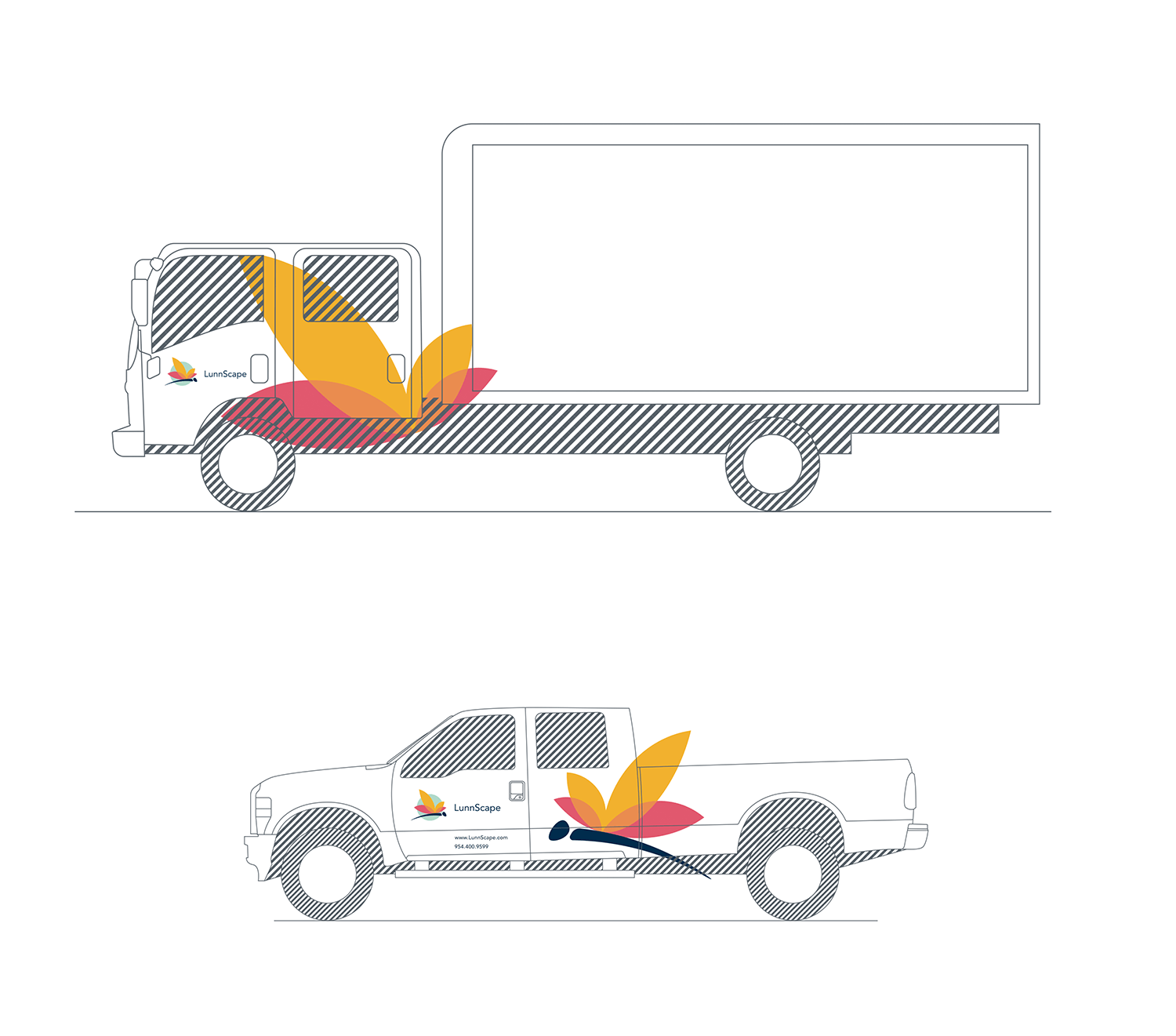
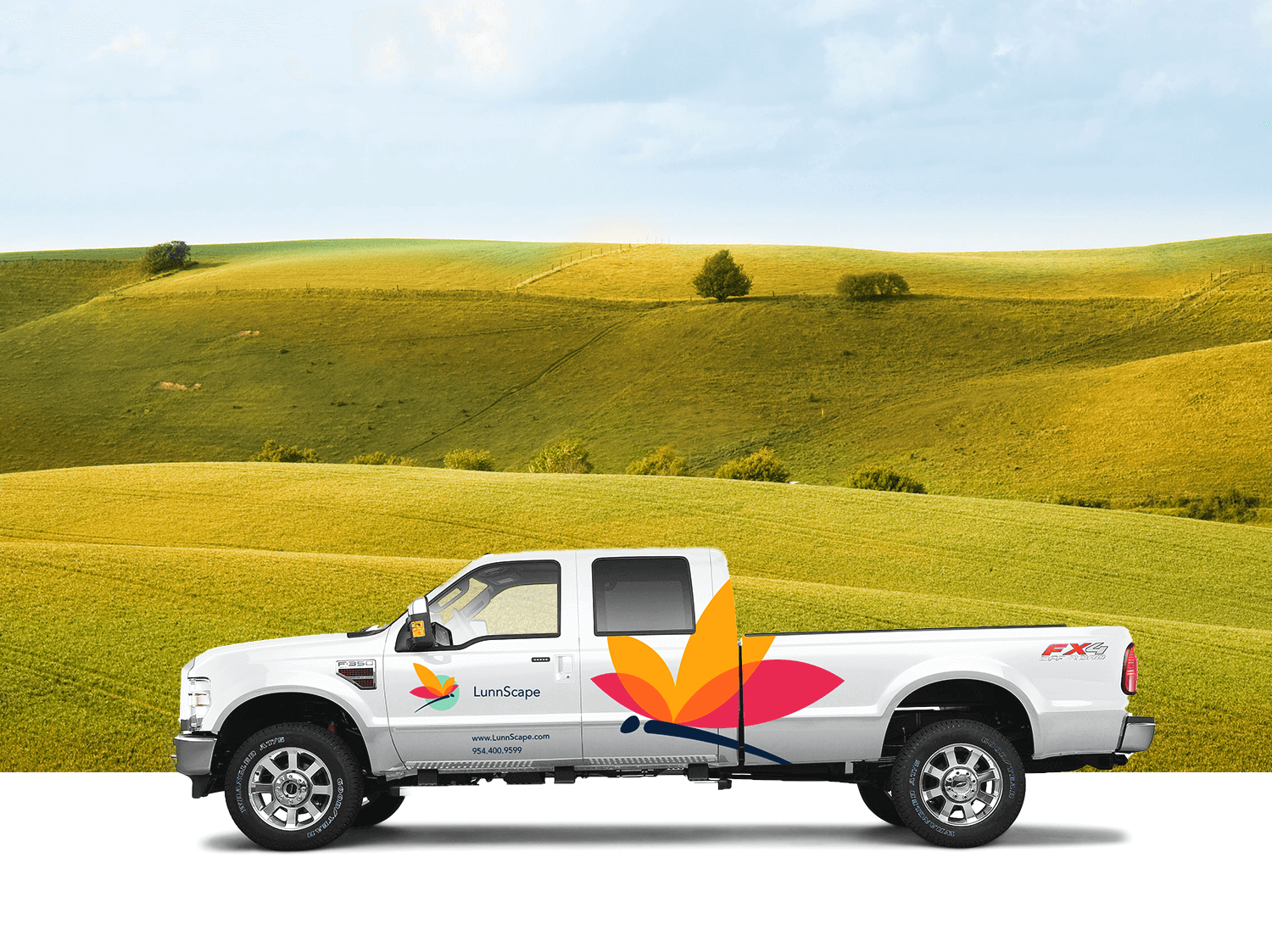
Vehicle
At the next stage, the identity design process for LunnScape was carried through to other company assets, including the corporate truck livery, which features easily recognizable branding.
Style guide
The client was also provided with a full set of guidelines for the logo and identity use, including color palettes, fonts, and placement. Practice shows that style guides play a strategic role in brand development: all the further contributors will get clear instructions about correct and wrong ways to use the graphics created for this project. The document included several sections and informed about the idea which became the basis of a logo, its structure and specifications, color and monochrome versions which could be used for a wide range of purposes. Also, it showed examples of incorrect usage in order to avoid poor visual performance. In addition, all the branded items were included in the guidelines and described in detail.
The challenge of creating a logo for a landscape company definitely is not a step into the blue ocean: the competition in this field of services is quite high and diverse. However, the red ocean is always the chance for designers to boost creativity and dive deeper in search of original decisions.
Useful Case Studies
For those, who are interested to see more practical case studies with creative flows for logo and identity design, here is the set of them.
Binned. Brand Identity Design for Cleaning Service
Reborn. Identity Design for a Restaurant
Andre. Logo Redesign for Landscape Firm
Andre. Corporate Identity Design for Landscape Firm
SwiftyBeaver. Logo for Mac Application
Saily. Logo for Local C2CE-commerce Application
PassFold. Logo for a Mobile App
Ribbet. Logo for an Online Photo Editor
If you want to know more about the creative stages of the design process for logos, welcome to read our free e-book «Logo Design»