The logo design process has already been presented by us in previous case studies: we told about the logo for the photo editor in the Ribbet case study, PassFold logo for the mobile application for tickets/passes storage and management as well as our own Tubik logo. All the previous cases show how thorough and sophisticated should the work on an efficient logo be. A logo is the sign with the deep symbolic meaning that is an important part of UI design, branding, and therefore the successful promotion of the product.
This time we are going to tell about one more logo design process which was accomplished by Tubik Studio designer Arthur Avakyan for the Saily app.
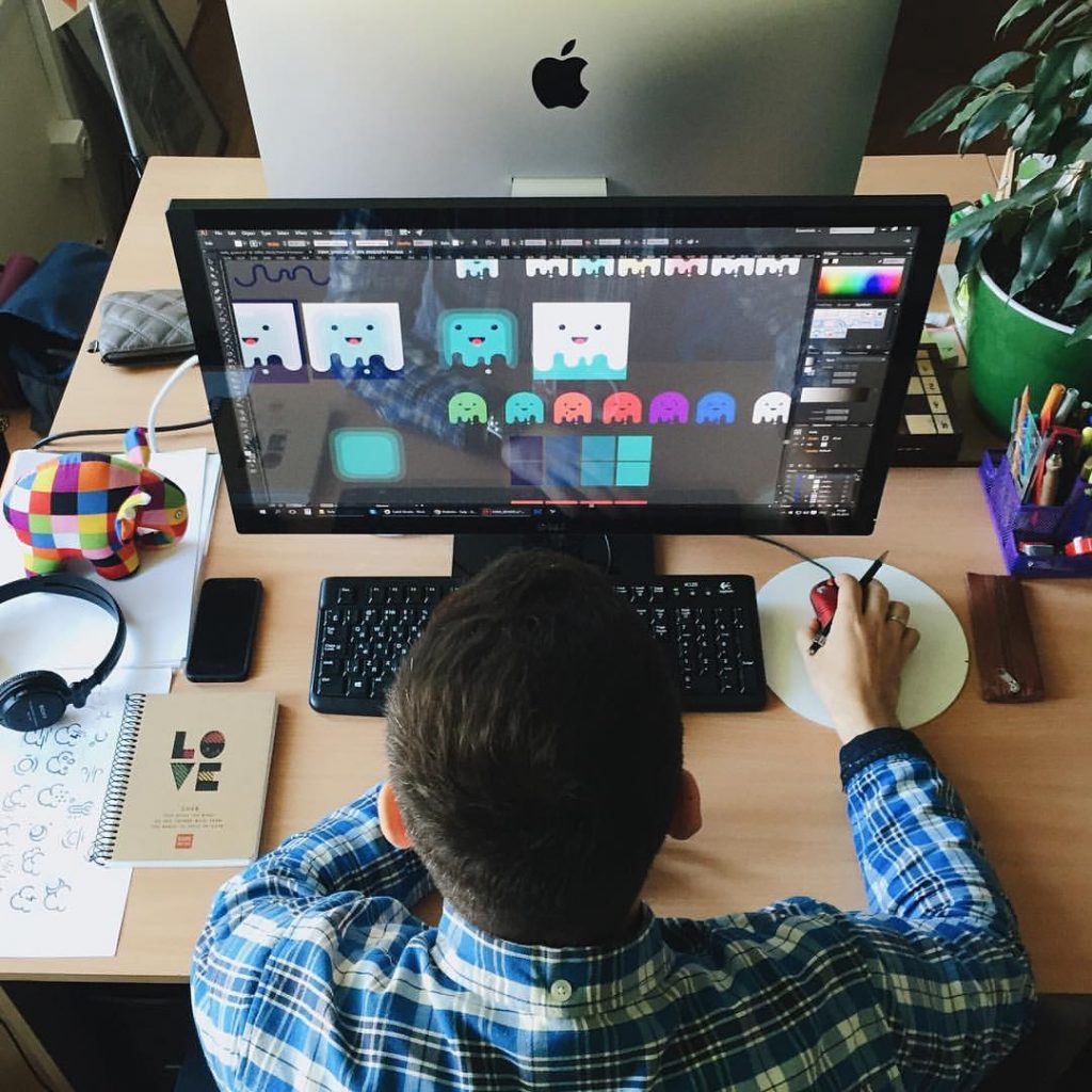
Arthur Avakyan creating variants of logo for Saily app
Task
Designing a logo of the mobile application for local user-to-user e-commerce.
Tools
Pencil sketching, Adobe Illustrator
Process
Lettering
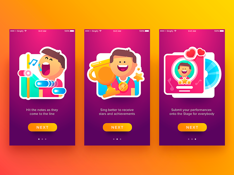
Saily is a local community app allowing neighbors to buy and sell their used stuff. Therefore it is a kind of e-commerce app but with a solid communication feature. It is important to mention that the team which created the application puts a deep focus on design and culture at the core of everything they do. For the general UI design of the app, which was provided by Tubik Studio designer Tamara, the client set the task of a fun and entertaining feel and look. So, the logo had to follow the same requirements to create harmony with the general design concept.
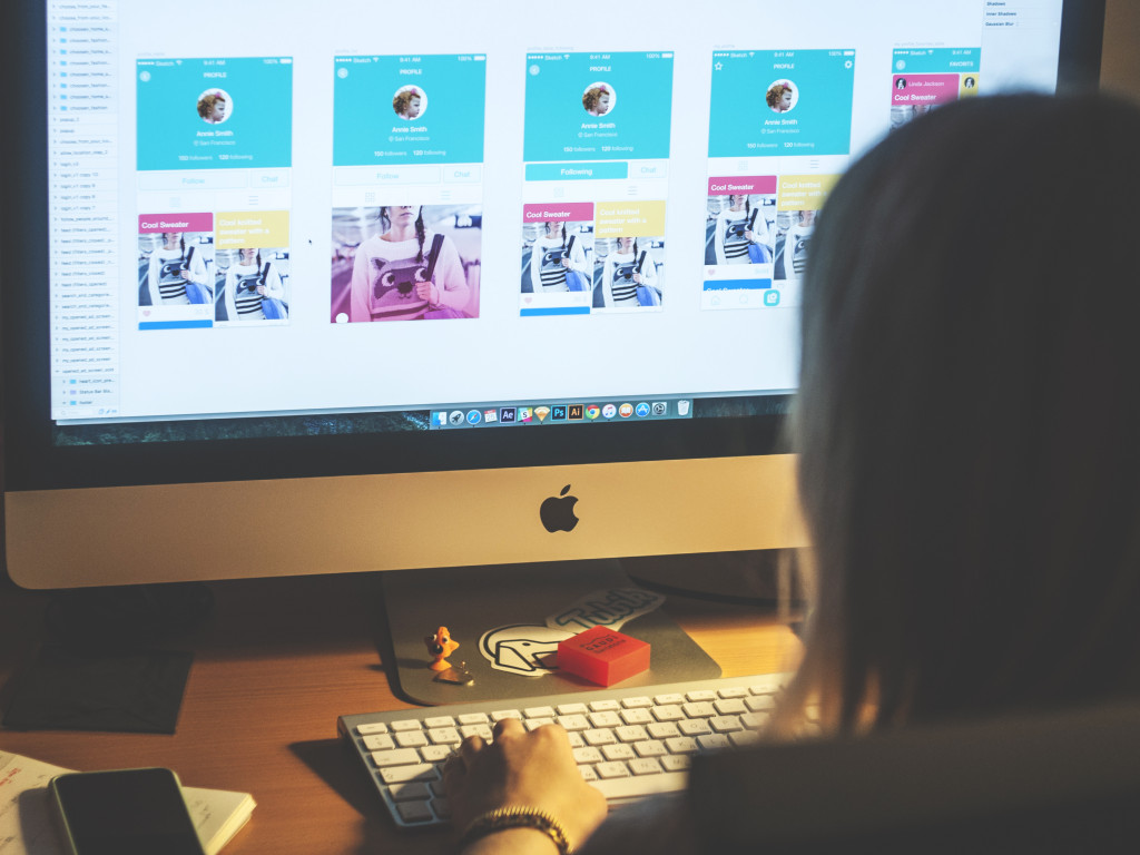
Tamara working on UI design for Saily app
In this case of the design process, designer Arthur Avakyan started with the variants of lettering as it was initially the basis of branding for the app. Traditionally the process started with handcrafted lettering versions in which special attention was paid to the initial capital letter S as it could potentially be further used for the application icon.
![]()
![]()
Although the lettering looked nice and the designer tried to keep the consistent and harmonic image, the customer wanted to continue the search of the concept which would look more funny and cool to create the feeling of the user-friendly and far-from-formal product. So, the next versions provided by the designer tried the variants of new letter combinations, connections and styles.
Here are the intermediate versions of digitized lettering which uses rather complex and elaborate lines and connections of all the letters into one integral image.
![]()
![]()
The next version presented lettering of the other style with simpler lines, less integral connection, which was provided in the previous version by linking the initial and the last letters. This version featured the initial letter S standing separate from the rest of the letters which was more logical in case of a decision to use this letter on the icon or another logo variant.
![]()
The client decided on the last version as the most readable and legible as well as flexible for developing further design solutions. The designer tried it in different colors and sizes to ensure that the font is easy to read and recognize in various environments.
![]()
Mascot
The second step of work on branding was the design of the corporate character as well as in our previous case studies for Ribbet and Tubik logos. This time the mascot was a ghost and it had the amazing legend behind it, supporting and explaining the aim of the application for the target audience in a funny and entertaining way. According to the original idea set by the creators of the Saily app, the friendly ghost is called Casper and he really suffers from the clutter in the people’s houses that doesn’t allow him to find a comfortable place to sleep. So, with the help of Saily app users are offered to sell their stuff which is unused anymore and free some space to make Casper happy.
![]()
Understanding the nature of the app and following the main requirement to make the mascot as cute as possible, the designer offered the first version, based on rounded forms and smooth lines, with a friendly and cute look, big eyes and wide smile as the most prominent details, having outlined body and hands. The image was inscribed in the square-shaped icons with various colors of backgrounds and mascot itself.
![]()
Although the general idea was caught, the client wanted to continue the search and try other forms and options to achieve a not only cute but also trendy look. One more variant presents other forms and images of the ghost, removing such details as hands and making the icon look simple and clear.
![]()
For another iteration, it was decided to try the version in which the ghost took all the form of the icon. In this case, the designer also tried different color options as well as another type of facial expression.
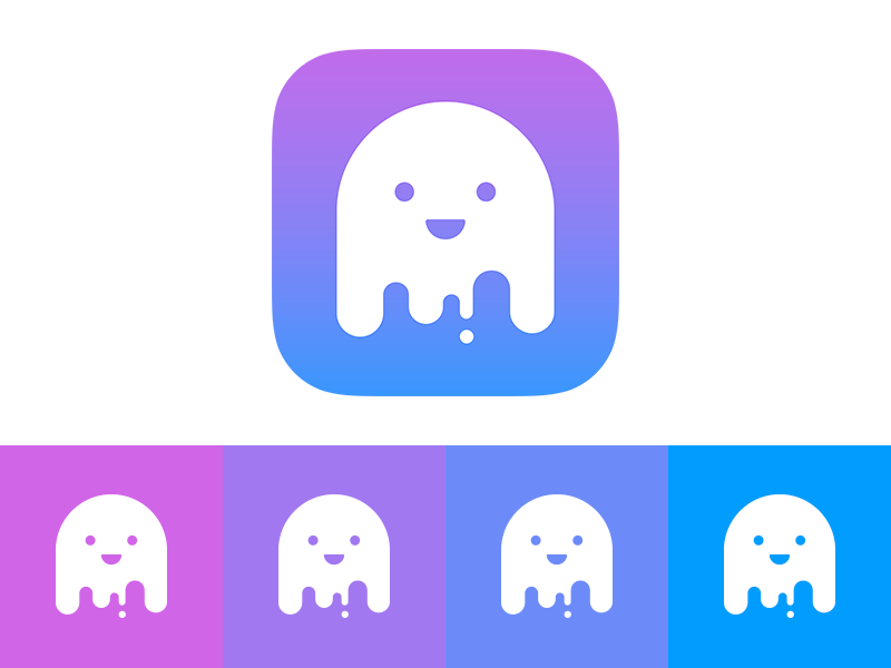
The images looked stylish and interesting, however, one more iteration was included in the process. The creators of the app made a decision to feature not only e-commerce functions but also the strong element of gamification and a wide variety of illustrations to support the fun, cute and cool brand image. Considering this factor, the designer offered one more variant, which could be used in numerous and different backgrounds, fulfill diverse functional aims and also be used in the game with the same easily recognizable form. Thus, this version of the ghost was simplified, flat and rounded, and looked nice and stylish both inscribed inside the icon form and as the separate elements of any environment. This solution was accepted as the most universal and flexible for different aims.
![]()
To make sure that the mascot is efficient, it was tried on different backgrounds and with various color filling.
![]()
The accepted design solution for the corporate mascot was further applied in numerous illustrations used on the screens and in the game featured in the app. The design process for them will be described in more detail in our next case study devoted to UI design for Saily app.
![]()
![]()
Saily app mascot ghost featured in the game
This case of logo design witnessed bright and diverse work on variants which would be not only bright and reflecting the nature of the whole app, but also flexible and for numerous aims, following the latest design trends and original to make the app branding easily stand out of the crowd.
Useful Case Studies
For those, who are interested to see more practical case studies with creative flows for the logo and identity design, here is the set of them.
AppShack. Logo Design for a Digital Agency
LunnScape. Identity Design for a Landscape Company
Binned. Brand Identity Design for Cleaning Service
Reborn. Identity Design for a Restaurant
Andre. Logo Redesign for Landscape Firm
Andre. Corporate Identity Design for Landscape Firm
SwiftyBeaver. Logo for Mac Application
PassFold. Logo for a Mobile App
Ribbet. Logo for an Online Photo Editor
Welcome to read about UI design process for Saily app