The design of an app icon is essential for App Store and Google Play Store optimization. Unlike text descriptions and screenshots that are aimed at making people want to install the app, icons have a broader scope of responsibility. An icon is a small branding element that should attract at first glance, stand out from the crowd of similar icons, communicate the essence of your app, and be memorable and easy to recognize. A bit too much for a small visual element, isn’t it?
To help you meet the goals listed above, we’ve gathered the best recommendations on app icon design in this article. Enjoy reading!
![]()
An app icon for Lion, the accountability browser
Start with what’s important
Сolor combination and harmony of shapes are certainly important and we’ll discuss it later; however, it’s not the starting point. At the very beginning, you should choose business over design. Learn business components of the app you’re going to design an icon for. Ask for marketing-related information like the value proposition, target audience, market characteristics, and pricing. Ignoring this information is akin to attempting to hit a target blindfolded. We’ll never tire of repeating how important business data analysis is for design. Good preparation is key to success.
Learn guidelines
Although your creativeness with icon design isn’t limited, you still have to follow the requirements set down by the platform where the app is going to be submitted. Your design should look harmonious among other app icons on users’ screens. That’s why Android and iOS have their own guidelines on formats, sizes, and even styles.
Make sure you follow not only technical recommendations but also stylistic ones since it’s important for app submission and further optimization on App Store and Google Play Store.
Pick software
To make an icon for a mobile app pick software that allows you to export files in PNG format. Here are some of the most popular tools for app icon design:
- Adobe Illustrator CC is a good old tool to create complex vector designs.
- Adobe Photoshop CC is used to create raster designs with such effects as reflections and shadows.
- Sketch has a user-friendly interface and multiple plugins, however, it may not be the best solution for complex designs.
- Affinity Designer is a vector drawing tool with a clean UI and is great for beginners.
![]()
Pay attention to details or, rather, the lack thereof
Look at your icon and ask yourself if there are any details that can be removed. Although it’s well known that an image with a large number of elements becomes a mess after resizing, icons with unnecessary texts and photographic details keep merging on App Store and Google Play Store. Minimalism is the best solution for small elements. Focus on one main idea and implement it in a clear and easy-to-remember design. Bear in mind that the majority of multinational corporations give preference to straightforward designs.
Mind the brand style guide
An app icon should follow the overall branding design in terms of color and style. In this way, users will associate the icon with your product or service and easily recognize it across different platforms and devices.
![]()
Foxygenic app icon
Let your icon speak for the app
What is the first visual association with mailing services that comes to your mind? An envelope, right? This is what you see when searching “inbox” on the App Store: dozens of envelopes in different styles, shapes, and colors. On the one hand, using obvious strongly associated visual signs is a winning technique, but on the other hand, this approach makes it harder to shine among competitors. Here is probably the biggest challenge designers face when creating app icons: they need to balance between originality and versatility.
![]()
Elephun app icon
Audit your competitors
Allow enough time for competitor research. Analyze the functionality of app competitors to identify how designers have implemented distinctive features into visual forms. This will inspire you to work on your own technique without risk of making designs that are similar to competitors’.
Some businesspeople prefer to pick graphical elements that are almost identical to ones that the major players in their niche use. This approach helps to provoke a sense of trust and sympathy for a little-known app. But let’s not get carried away with this approach. Eventually, if the design looks similar to competitors’, users will perceive your app as a clone that has nothing unique in its functionality.
Pick the right colors and forms
Designers try to make their icons stand out with color contrast, which makes sense. However, when you start adding colors it can be hard to stop. Since you don’t want your icon to look like a modern piece of art with a color explosion on it, limit yourself with a certain palette aligned with branding design and guided by color psychology.
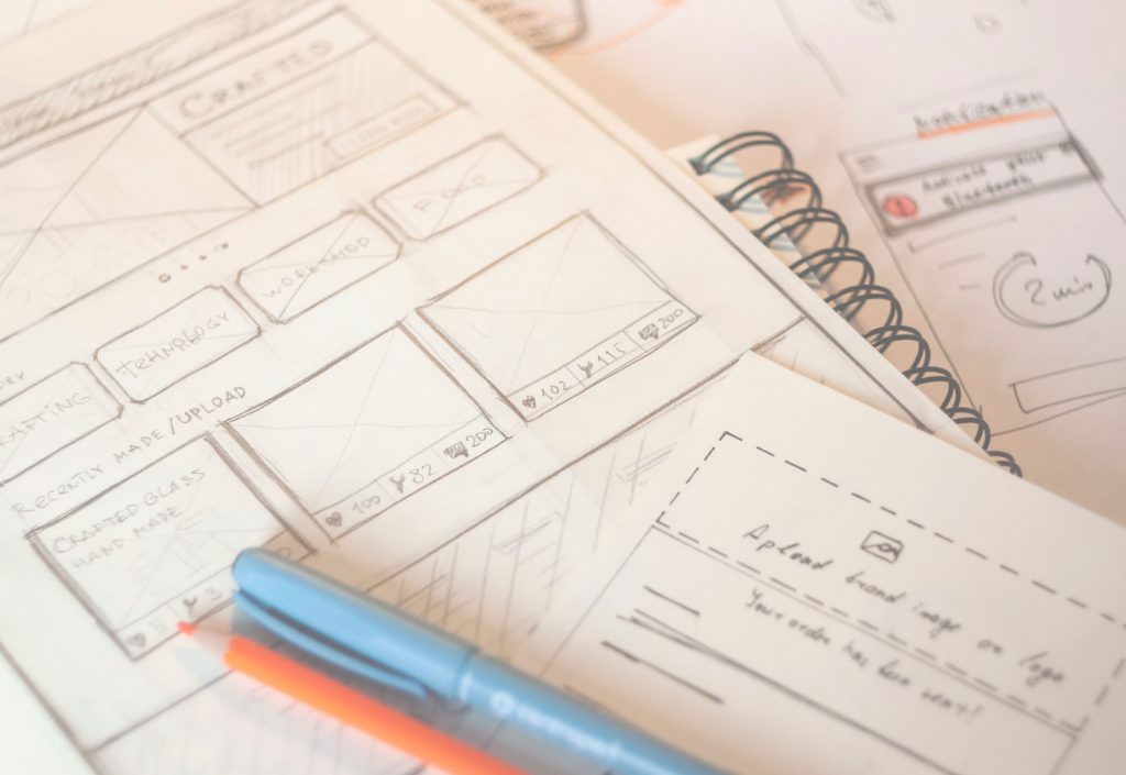
Paper sketches are great for a creative search on the way to an original and attractive shape. Draw a few sketches and experiment with associations that come to your mind. Use the basic geometric forms — circle, square, and triangle — to create the main icon blocks. Remember that any complex icon design can be created with simple shapes.
![]()
App icon for App Shack
Test
Wherever your app icon shows up, you want to make sure it’ll look nice. Test your design in a variety of circumstances.
- Check your app icon in different sizes to see if it’s readable in smaller sizes and clear in larger sizes.
- Play with multiple backgrounds to see if your app icon design has enough contrast in it.
- See how it looks in different resolutions.
- Test the app icon appearance not only among competitors on the App Store and Google Play Store but also among random icons that can be on users’ screens.
![]()
App icons designed for Reborn restaurant app
Useful articles
Small Elements, Big Impact: Types and Functions of UI Icons
Shape and Color in Logo Design. Practical Cases
Mobile App Design: Big Guide into Types of Mobile Applications
Mobile App Branding: Tips, Strategies, and Examples
Visual Perception. Icons vs Copy in UI