Each company from the small to large has its own history along with specifics of services and that is a powerful base for identity designers to find bright ideas. An original logo is a good tool for setting a connection with potential customers by transferring the company character and mood.
It may seem difficult to design an absolutely unique symbol because there are so many brands around. However, skilled and experienced designers can find a way to creating a brand sign which will stand out among thousands of others.
Today we share a case study showing the creative process of a logo design for a digital agency from Sweden. The designer assigned to this case was Arthur Avakyan, whom you may remember from identity design case studies for Binned, Andre, Passfold, Tubik, Saily, Ribbet, and SwiftyBeaver.

Task
Logo redesign and branded items for a full-service digital agency.
Process
Recently, we provided branding services for a digital agency called App Shack. The team from Sweden specializes in web and mobile product development for companies of different sizes. They made a request for the redesign of the already existing sign. The client set the task to renovate the logo since it looked old, plain, and weak with a poor color palette. A new brand sign was expected to modernize the appearance of the current company profile so that it could correspond to the peculiarities of the target audience which includes tech-savvy people.
The client liked the idea of the previous logo and asked to improve its styling and color palette. The style chosen for it then had to be developed into a set of branded items such as a business card, envelope, T-shirt, and stickers. The major client’s request was to keep the present logo symbol — a shack illustration. It wasn’t random and had a history. The thing was that the agency started their way as a business in a building similar to a shack so they had lots of warm memories with that which had become a starting point for a new experience.
Logo
The creative process of branding for a digital agency set off with logo redesign. It started with brainstorming and analyzing the client’s vision of a new symbol. As they wanted modernization, a new brand sign was expected to be more playful and fresh still simple with abstract elements. In addition, the client asked to keep a blue color palette as it corresponds to their vision of the brand image.
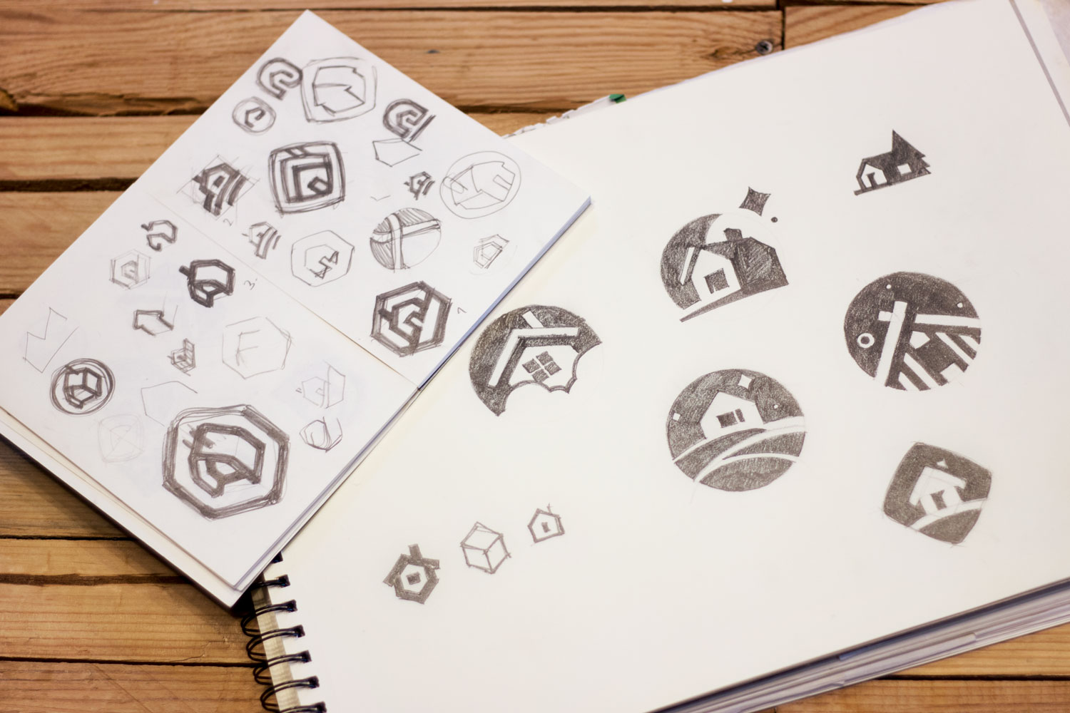
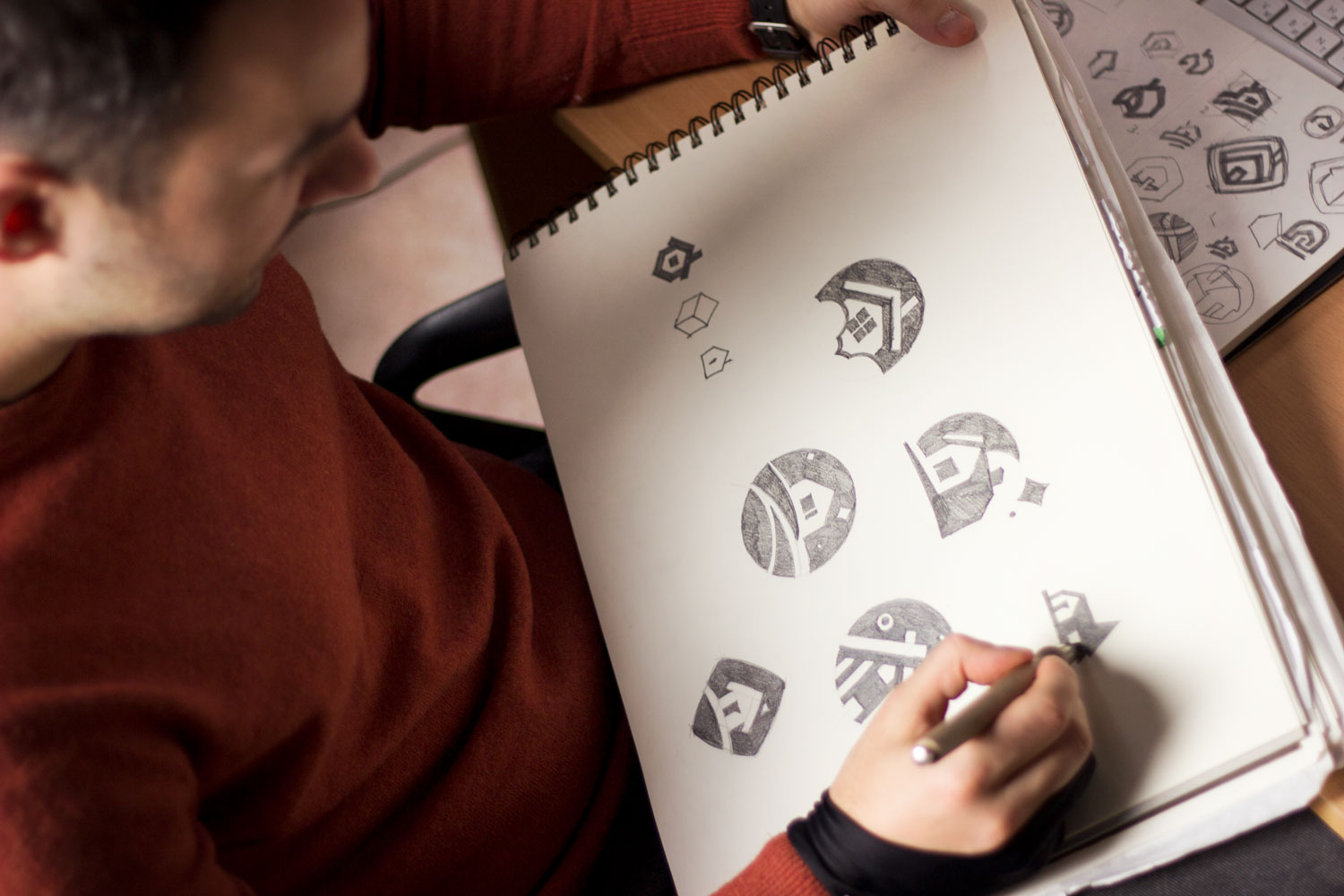
When all the tasks were considered and the direction was chosen, the designer started the creative process. The first stage was silhouette searching. The pencil sketching technique was applied to quickly visualize the first ideas on the paper. Such an approach allows for picturing various concepts without significant efforts and within a short time. Moreover, sketches make the communication much more effective helping clients and managers to understand designers’ ideas. In addition, if clients want to make some changes, it’s much easier to make them at this creative stage than in a digital version with elaborate details. Here are quick sketches for the App Shack logo.
Also, one of the client’s requests was adding abstract shapes in their brand sign. So, the designer experimented with vector forms trying to illustrate a shack. Flat vector graphics gained huge popularity a long time ago and remain one of the basic directions for logo design. Simple geometric shapes are elegant and transparent so they are pleasant to our eyes. Considering all the aspects, the designer created several variants in an abstract style followed by the wordmark.
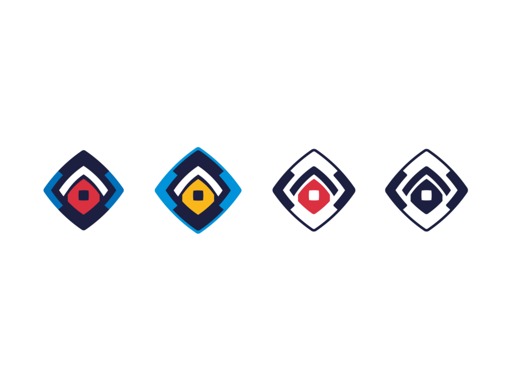
Geometric options based on rhombus
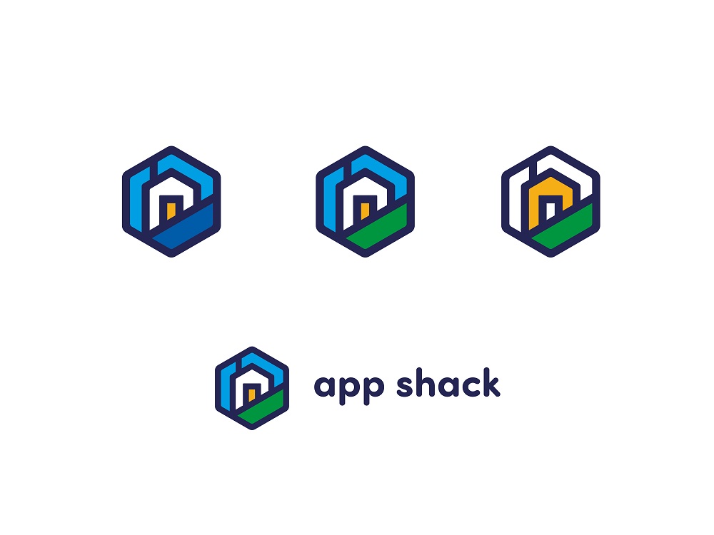
Geometric option based on a hexagon with rounded angles

Geometric option based on a hexagon with sharp angles
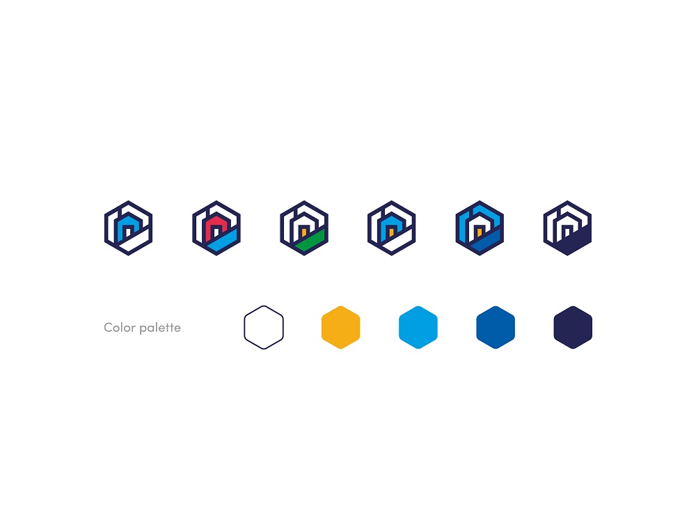
Options offered to agree upon a possible color palette
After some discussions, it was decided to step back to a less abstract shape with a minimum of details.
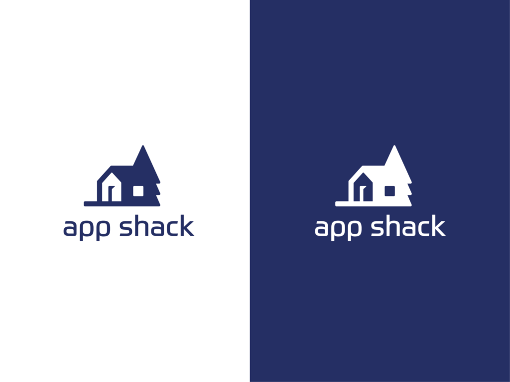
Iteration featuring a less abstract logo with an easily recognizable shape of a house and playing with negative space
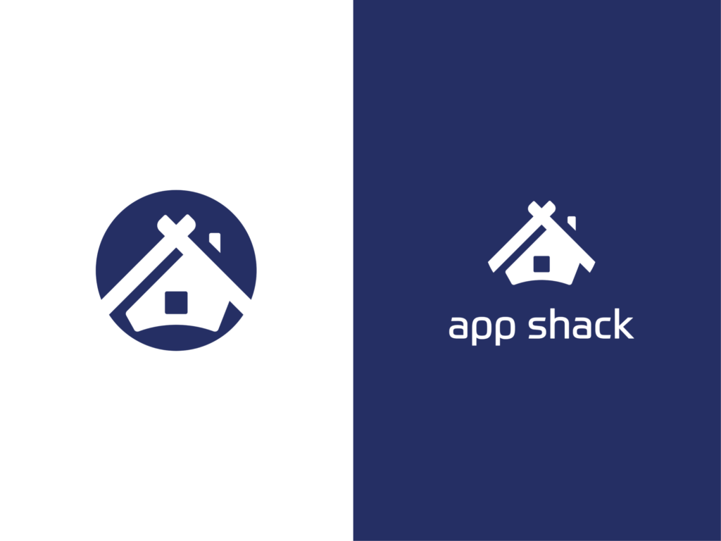
Iteration featuring less abstract logo with easily recognizable shape of a house and playing with negative space
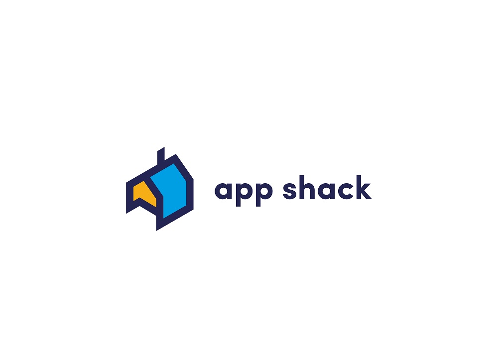
Iteration featuring a less abstract logo with a recognizable shape of a house with sharp angles
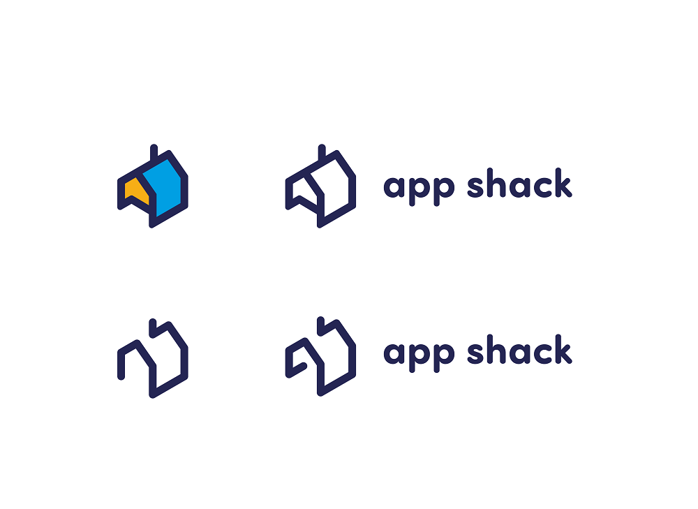
Iteration featuring a less abstract logo with a recognizable shape of a house with rounded angles
App Shack team liked the minimalistic option of a shack which is shown the second in the set above, so the designer moved to the next stage which requires working with colors and polishing the details.
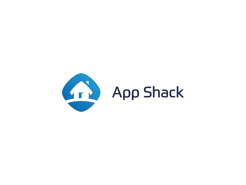
The final logo was completed in a flat minimalistic style. A symbol represented a shack in a rhombic frame. This way designer managed to combine both the illustration of a shack and an abstract element. In one of our previous articles, we’ve mentioned that shapes applied in symbols have a significant influence on the human mind. The psychology of shapes states that our mood can be changed according to the shapes we are looking at. Rhombus is usually associated with clarity and wisdom so such a frame may work effectively for the positive brand image.
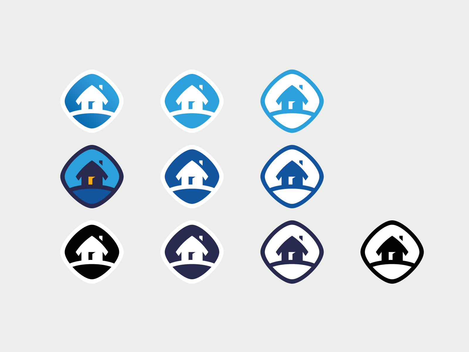
The color palette was chosen according to the clients’ expectations. The light blue color gave the feeling of stability and the slight gradient made the logo more playful and modern-looking which responded to a current brand strategy. Also, a monochromatic variant was provided to be used in cases when color couldn’t be applied.
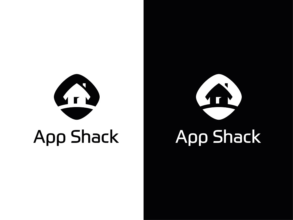
The wordmark typography was chosen that way so it could work in harmony with the brand sign and represent a brand character.
Icon
When the logo was accomplished, the designer started another task — an icon. To support brand recognizability, the icon was based on the brand symbol. The icon frame is wider than in the logo which makes it look clickable. The white symbol on the blue gradient background created enough of contrast so the icon would be noticeable on the different digital screens.
![]()
Branded Items
After the key elements of brand identity were approved and tested, the designer continued to work on branded items design. The items included a business card, an envelope, a T-shirt, and stickers.
Business card
For many years, this component remains quite important for successful business communication. Moreover, an effective business card creates a positive image for people in the business community as well as shows the reliability of the company to the customers.
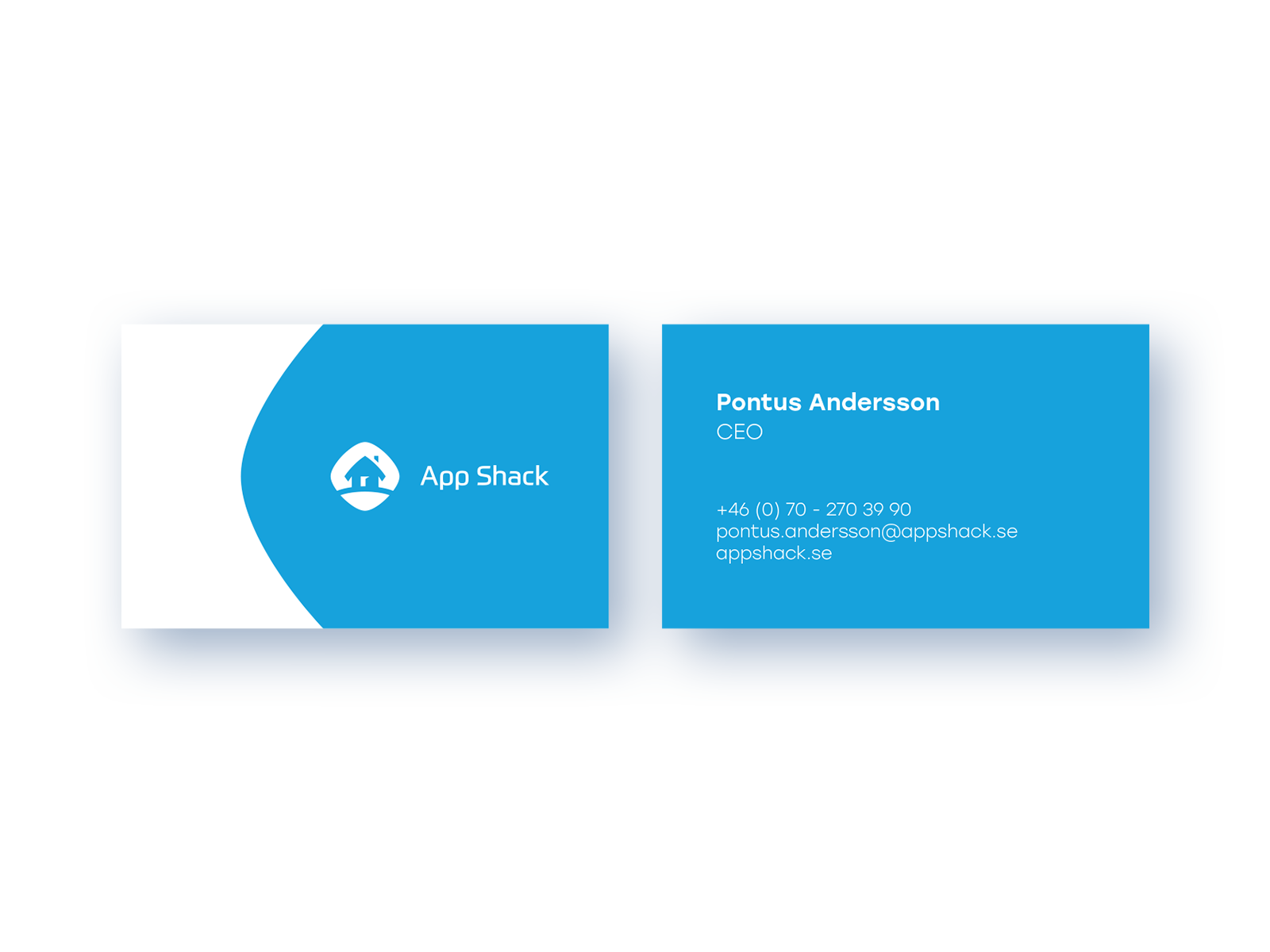
The designer created a business card applying the same color palette as in logo design to support brand recognizability. One side includes the core signs of brand identity — a symbol and wordmark, and the other side provides short information about the person and the contacts. Due to the minimalistic design, the card looks stylish and easily readable.
Envelope
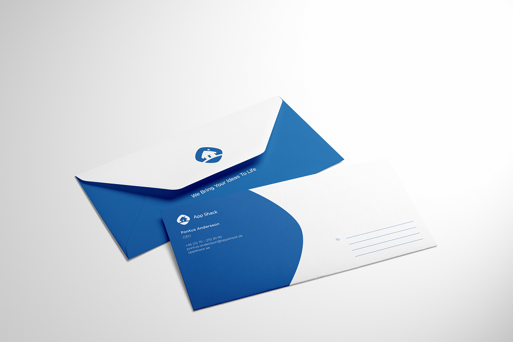
Envelopes are important elements of business correspondence so they should have a substantial and official design. An envelope for App Shack is created in consistency with the overall brand identity. It features a branding sign and corporate color palette. Blue is darker than in the logo aiming at elegant looks on both physical and digital letters creating deeper contrast and ensuring readability.
T-shirt
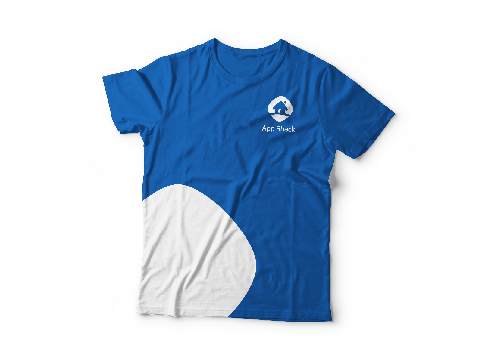
Сlothes featuring brand identity elements are used to evaluate corporate spirit within a team as well as mark out the employees of the company on exhibitions, conferences, etc. The T-shirt includes a small white logo placed on the blue background with an additional white spot making the T-shirt less official.
Stickers
Stylish stickers are the right choice for brand recognizability. They can be used for various marketing needs. The designer optimized the logo turning it into modern stickers in both monochromatic and colorful versions.
When you design a logo for a full-service digital company, it may be challenging since there are a lot of competitors in this field and it’s hard to create something unique. Nevertheless, creativity and communication with clients can make this process productive and easy.
Useful Case Studies
For those, who are interested to see more practical case studies with creative flows for logo and identity design, here is the set of them.
LunnScape. Identity Design for a Landscape Company
Binned. Brand Identity Design for Cleaning Service
Reborn. Identity Design for a Restaurant
Andre. Logo Redesign for Landscape Firm
Andre. Corporate Identity Design for Landscape Firm
SwiftyBeaver. Logo for Mac Application
Saily. Logo for Local C2C E-commerce Application
PassFold. Logo for a Mobile App
Ribbet. Logo for an Online Photo Editor
Collection of Creative Logos for a Variety of Brands
Logofolio: 16 Logo Designs for Different Business Goals
If you want to know more about the creative stages of the design process for logos, welcome to read our free e-book «Logo Design»


