Creating a logo that is going to become catchy and fast-recognized is a real challenge. We have already told you in detail about the whole path of logo creation in one of our case studies before.
Today’s case study is going to be a little different from the others because this time we are going to share the work we have done for ourselves. So let’s go along the way of memories of Tubik logo creation.
Task
Creation of a logo for a design studio that works on UI/UX, responsive web design, interface animation, logo, and branding design.
Tools
Pencil sketching, Adobe Illustrator
Process
The latest version of the symbol and lettermark for Tubik, which you can see today, is actually the third version of the studio logo. Being a design studio, which works not only on UI/UX and RWD but also on logo and branding design, means being attentive and sensitive to the trends of the market and feeling the time for the wind of change. Well, for our studio history this wind brought changes three times.
The first version of such an essential branding element as a logo was created by Sergey Valiukh and Valentyn Khenkin in the form of lettering with the main aim of making the studio name recognizable and easy to remember. It was accomplished according to the trends of that time when skeuomorphism was widely developed. It contained letters of the studio name which were separated from each other and each one had its own visual solution. Therefore, they followed the same style, and simultaneously every letter was a kind of separate visual element being the original form of a letter with its own unique features. After the stage of sketching and processing the result in Adobe Illustrator, two variants were developed: the black-and-white one, in which the greatest accent was put on the unusual form of the letters, and the colorful one, which used a variety of colors. The colored version looked like a set of letters, each made distinct with a different color background.
![]()
The first Tubik Studio logo lettering, black and white version
![]()
The first Tubik Studio logo lettering, colored version
However, the time was changing, the team of designers was getting stronger, the trends in design were changing even faster. When the name of the studio was already recognized, the designers decided to create a new version that would contain both lettering and the mascot.
It should be said that the studio name has a history and there was a real mascot of the team. Tubik was the name of the dachshund dog belonging to the family of the studio founder and CEO Sergey Valiukh. Therefore, there wasn’t any discussion of what image was going to be used as a mascot. It was decided to be a dog, moreover, the breed had to be as recognizable as possible. So, after the short brainstorming session, the designers agreed upon the round shape for the mascot part of the logo and the lettering being strict and geometric. And since that moment the process of search started. Mostly, the job was done by studio designer Ludmila Shevchenko. She carried out the research of the competition and took into account the actual trends of design as a pitch for studio representation.
So, in the first versions of sketches, the designer did her best to work out as many different variants as possible in order to find the general concept.
![]()
![]()
![]()
![]()
The process of working out the concept of the logo
![]()
The full set of sketches for different stylistic versions of the logo image
As you can see from the set of sketches shown above, it contains solutions that are stylistically different. There was the option of showing the attempt to combine the image of a dog with the image of starting letter of the studio name (top left corner). Then there were variants trying the whole image of the dog, with its body and legs featuring the idea of movement. Some of them were fully inscribed into the shape of a circle while the others showed the movement of the animal with some elements out of the circle. Also, there were the variants trying the idea to show only the head of a dog in the logo. As you can find in the bottom row, there was the variant with the naturalistic image of the dog’s head. And some variants in a more geometric manner with strict and solid strokes were also developed.
Having discussed all the options and their potential to represent the company among loads of others, be recognizable, catchy, and legible in different sizes, the designers opted for the geometric version of the dog’s head. It corresponded to all the aims and it successfully involved the elements making the breed of the dog clear. When all the details and nuances were agreed-upon, the technical work on the digital version of the logo started.
The lettermark created to be combined with the logo also needed to be solid, geometric, and easy-to-read both big and small.
![]()
Digital version of Tubik Studio logo mascot and lettermark
The logo was successfully used by the studio and being clear and simple it corresponded to any cases to be used for. Mostly the studio used a black-and-white version of the logo, allowing coloring only in rare exceptional cases when it was unavoidable.
Following the latest trends of web design and working on loads of tasks for the design and redesign of different websites and applications, the CEO of Tubik Studio Sergey Valiukh also launched the demanding process of the thorough redesign of the studio website. When most decisions for the website were made on UX/UI, styles, color palette, and visual details, it became clear that logo and lettering also needed the redesign. They worked efficiently for the company, however, they didn’t correspond with the general style and concept of the website. Therefore, the third edition of the Tubik logo had to be born.
This time lettering was the first element to be worked out. Tubik Studio designer Arthur Avakyan being already experienced in creating lettermarks for logos got this part of the sophisticated job. The version on which the team stopped was absolutely different from the previous. This time the lettering was smooth and rounded with graceful connections of all the letters into one integral composition. After accepting the general concept and style, the lettering was checked in different colors, sizes, and resolutions to make sure it was legible in any case.
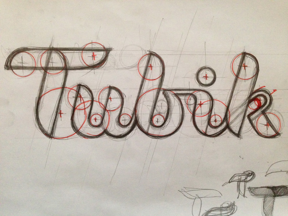
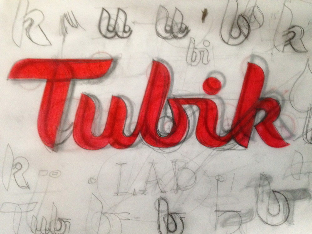
Working out new lettering composition for Tubik Studio logo: from rough sketching to clean digital version
Due to these changes, the mascot logo part also had to be reconsidered. Being very important for the company, these changes brought all the team together in the big brainstorm session where various options and details were discussed by the whole team. It was real teamwork and after that, all the designers worked on various sketches and styles to work out as many variants as possible. Although in search there were interesting solutions reflecting the whole dog image or some new elements such as the dog’s paw trace, in the process the team decided not to change the general idea of using the dog’s head for the mascot representation in the logo.
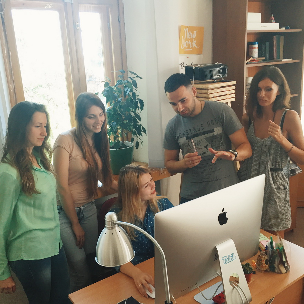
Brainstorm session at Tubik Studio
There was also the attempt of combining the shapes so that the shape of the dog image reflected the shape of the capital letter T in the lettering.
![]()
T-concept of the mascot image
Although this variant was interesting and original, it was somehow losing the elements reflecting the breed. Moreover, testing showed that in smaller sizes, for example, used in the header of the site, it could be even hard to recognize the animal as a dog immediately. The option could be confusing and that didn’t correspond with the company’s aims and wishes. So, the path of the search had to be continued.
Working on the final version, the designer Arthur Avakyan tried different versions of the dog heads. The strokes of the image had to reflect the smooth and graceful character of the lettering so keeping that track, the designer tried variations of shapes and length for noses, ears, and other visual elements. All the variants were tried in colors used as the basic ones for the website.
![]()
Trying new variants of the mascot in colors of Tubik Studio site
Finally, having a more or less clear vision, the designer also decided to try the variant which would make the image more dynamic. That’s how the image with the head directed a bit upwards was created.
![]()
The dynamic version of the mascot image
The designers of the studio tested the version in different color schemes, sizes and resolutions both separately and together with lettering. Thorough testing showed that this version worked the best that’s why this variant was accepted as the final one.
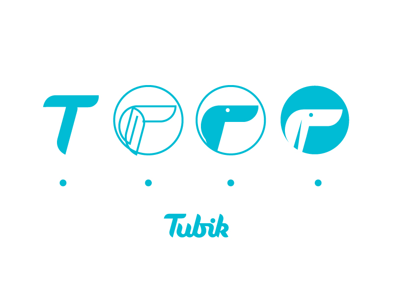
![]()
A new and previous version of the logo in comparison
![]()
The final version of the Tubik Studio logo
The process of creating a logo is always highly creative and intensive. The designer has to go through loads of ideas to create the one which would satisfy multiple needs. The creation of the Tubik logo was a result of great teamwork and deep attention to detail. It is always vital to remember that logo is not just the image, it’s a symbolic representation of the company, therefore, its design needs not only inspiration and art, but also research, analysis, hard work, and rigorous testing.
Useful Case Studies
For those, who are interested to see more practical case studies with creative flows for the logo and identity design, here is the set of them.
AppShack. Logo Design for a Digital Agency
LunnScape. Identity Design for a Landscape Company
Binned. Brand Identity Design for Cleaning Service
Reborn. Identity Design for a Restaurant
Andre. Logo Redesign for Landscape Firm
Andre. Corporate Identity Design for Landscape Firm
SwiftyBeaver. Logo for Mac Application