In our previous case study, we have told you about the process of creating UI design for PassFold project by Tubik Studio designer Tamara. As we mentioned in the story, one of the important elements influencing UI solutions was the logo created by the other Tubik Studio designer Arthur Avakyan. Earlier we have already told you about all the stages of the logo creation process for Ribbet and Tubik logos which were accomplished by Arthur. And today we have decided to support this set with one more bright story about the logo for the PassFold project.
![]()
Arthur Avakyan working on the PassFold logo
Task
Logo design for a mobile application for tickets (passes) storage and management.
Tools
Pencil sketching, Adobe Illustrator
Process
As it was mentioned in the task, PassFold is the application for storage and management of tickets and passes bought online. Therefore, it was totally predictable and logical that customers wanted if possible to see the logo which would somehow feature this idea, preferably through visual connection with the shape of a ticket. Also, the customer and the designer agreed upon the direction of trying a combination of this shape with the P letter as the initial letter of the application name. So, these preferences and wishes were the starting point for the designer in this case of logo design.
As usual, the first stage of the process included the research of logos in this sphere of activity and business in order to avoid repetitions and feel the trends. The first variants included pencil sketches showing the process of creative search.
![]()
As you can see, the variants show different combinations of the capital letter P and a ticket in vertical and horizontal placement. Even in the first sketches, the designer tried using colors so that the customer could imagine how it works. There were used basic colors such as red, green, and blue, as well as some black-and-white versions.
Then there were three basic variants picked out for consideration, all being the combination of the capital letter with the ticket form. All three versions included a white letter and colored ticket: the green ticket was drawn right into the big letter, the red ticket was placed horizontally and creating the natural line for lettering put into the general composition, and the black-and-white version with a bit different also horizontally placed ticket to see how it will work without other colors.
![]()
![]()
The customer liked the ideas of combinations but asked to try the other style of a different direction, closer to the origami concept, to compare and decide. That is how the origami sketches were made, also trying different colors and forms of tickets.
![]()
Even though this version was attractive and cute, the customer decided they wanted to have a more flat and strict structure of the logo, so the designer continued the search for developing the initial approach. It provided the concept of letter-and-ticket combination and finally gave the version which put all elements in the vertical combination featuring legible and clear capital letters but at the same time distinctly echoed with the ticket form. It worked successfully in different color combinations as well as in the clean stroke version.
![]()
The customers were satisfied with this version. To make it clear how it will look in different expressions, the designer also provided two mock-ups, both using the white version of the image. One of the mock-ups showed the stroke variant of the logo on the paper and featured it on the mobile screen with a colorful background.
![]()
![]()
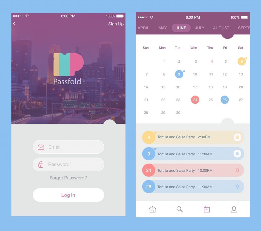
The general concept was agreed upon and the logo got its basic image and idea. However, at this point, the process hasn’t stopped but paused for the time of general UI design. As we have mentioned in the case study devoted to PassFold UI design, the solution made about the logo had an influence on general UI elements. And in their turn UI solutions, especially about the color palette of the screens had influenced further design work on the logo, as it was tried in different colored versions so that it could correspond with other elements of the layout and look natural and nice.
Also, the logo was presented as the app icon according to different variants of operational systems the application was adapted for.
![]()
This time all the logo design process passed in one breath. It was full of discussions and remarkably fruitful cooperation of the customers and the designer in search of the optimal version. Also, this case showed the importance of the tight connection between a logo and the other elements of the user interface as well as the general concept of the product. High attention to all the details provides the result which makes the pleasant-looking and efficient design of the whole product.
Useful Case Studies
For those, who are interested to see more practical case studies with creative flows for the logo and identity design, here is the set of them.
AppShack. Logo Design for a Digital Agency
LunnScape. Identity Design for a Landscape Company
Binned. Brand Identity Design for Cleaning Service
Reborn. Identity Design for a Restaurant
Andre. Logo Redesign for Landscape Firm
Andre. Corporate Identity Design for Landscape Firm
SwiftyBeaver. Logo for Mac Application
Ribbet. Logo for an Online Photo Editor
Welcome to read the case study on how UI design for PassFold app was created