The more brands rise in the markets, the more logos and identity designs are created to support their image. Recently, our team has worked on a bunch of logos for various brands, from physical products and services to digital platforms and applications. So, here we’ve collected some of them to unveil the details of creative search and process. As well, this set can work well as a pack of examples on logo design inspiration for those who need it. Let’s start!
Logo for a tea brand
![]()
This logo was designed for a tea brand Bennett selling various types of high-quality tea. The symbol presents a combination of shapes based on the visual metaphors of a teal leaf, an eye, and a tea cup seen from above. The sign is harmonically combined with a brand name presented in an elegant and minimalist manner. The logo became the foundation for geometric packaging design created for a brand.
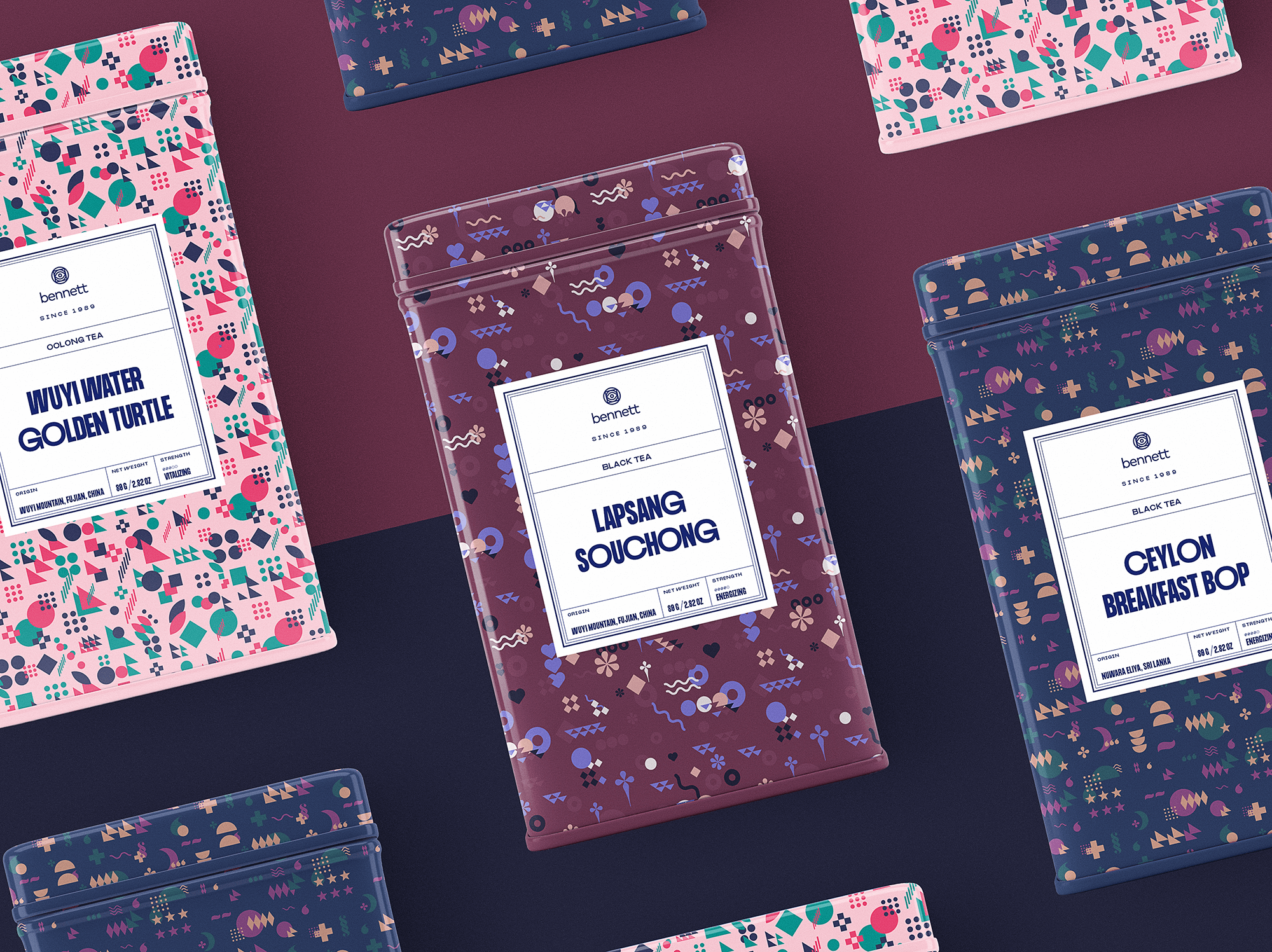
And then it was applied to an e-commerce website design for the brand.
The web layout uses only the typography part of the logo for better readability and concentration; still, the full version of the logo is featured on product demonstrations.
Logo for an educational creative studio
![]()
Moon Creative is an educational facility for children and teens studying design and animation. Original typography, a creative symbol of a double moon and bold contrast colors make the logo catchy and playful.
What’s more, this case is a great example of identity integration into UI design for building a strong app branding. The color palette, animated logo, interactive elements and animations inside the app feature a consistent approach to the company brand and mission.
Logo for a digital marketing service
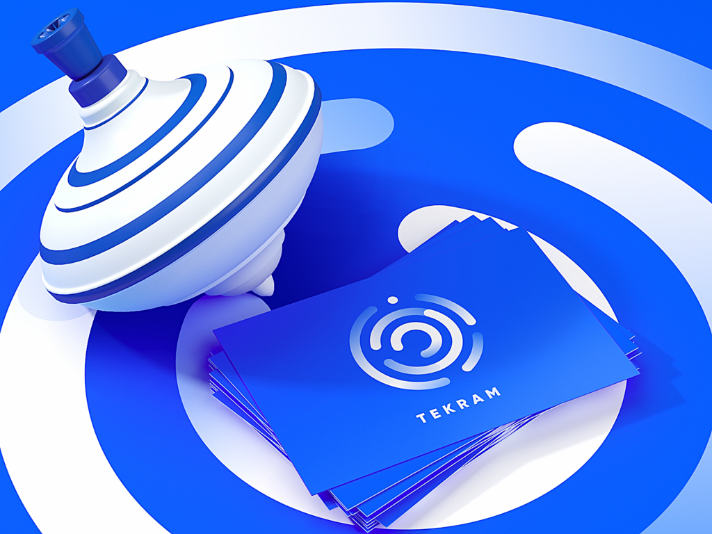
Here’s a logo design on a piece of identity presentation. It’s made for Tekram, a platform providing tools and live support of digital marketing for products and services. Bold and catchy for those who know how to rock and roll in business.
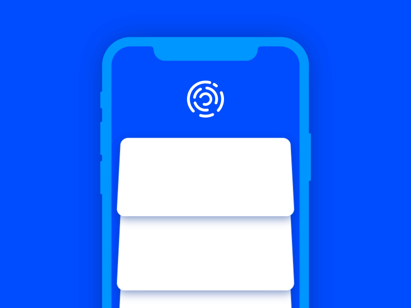
Here how the logo is integrated into the mobile app interface as a graphic element of pull-to-refresh animation.
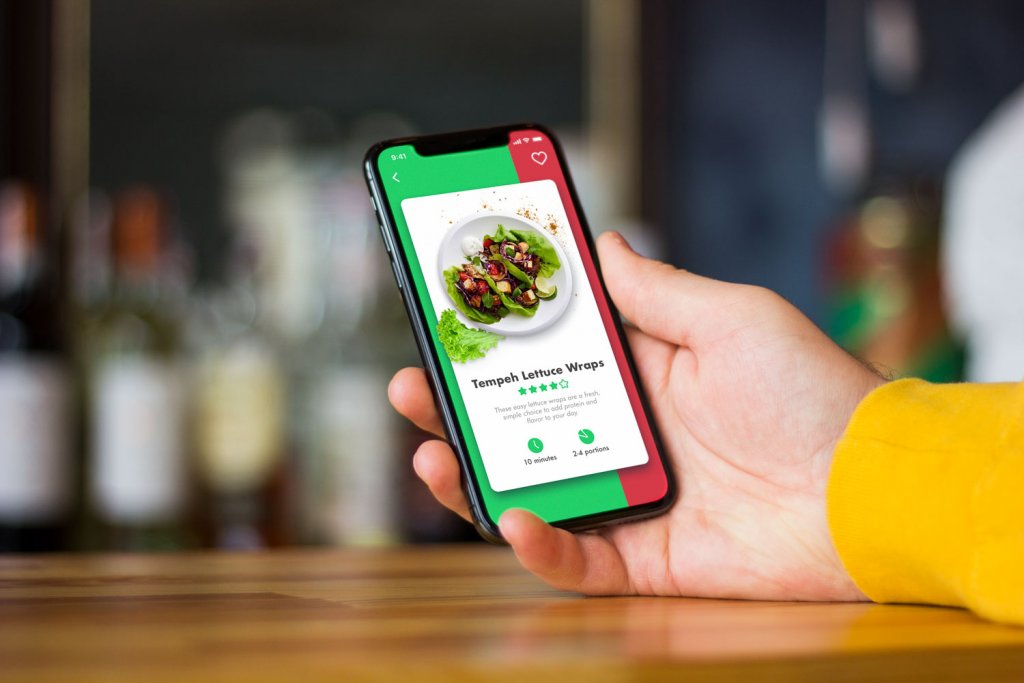
Logo for a concentration app
![]()
Here’s an animated logo for Focus, a simple app blocking notifications for the specific period to let the user focus on important tasks. Warm colors transferring the associations of energy, activity and power, smooth but bold lines, double geometry showing the idea close focus inside the shape with open corners, and friendly elegant font – all that creates a trendy logo for a digital product. What’s more, catchy animation on a splash screen is a good way to entertain users while the app is loading.
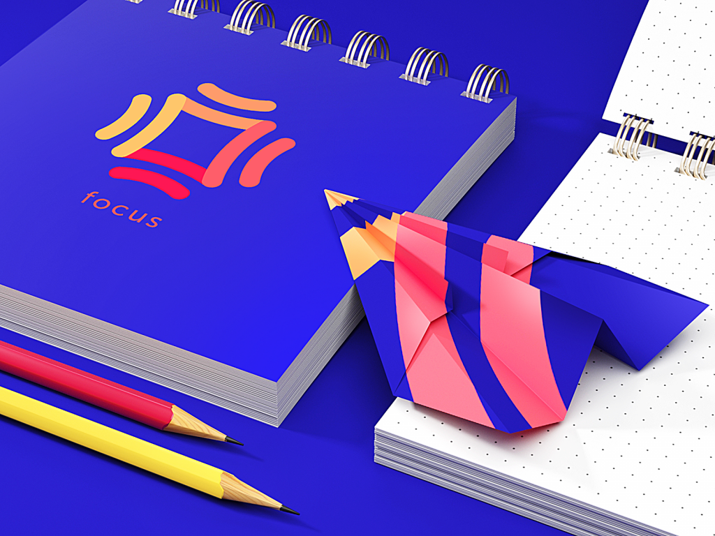
Also, the logo became the basis for further identity development of a brand image.
Logo for a clothes brand
![]()
Here’s a sign designed for a brand of exclusive clothes aimed at teens and young adults. Nobody will have the same outfit, you are the one – that’s the idea to transfer. The choice turned next to a wordmark harmonically combining the word and the number 1. Bold letters and contrast colors make the logo design emotionally appealing, trendy and easily readable.
Logo for a virtual stylist
![]()
Here’s a logo designed for Inspora, a virtual stylist chatbot integrated into Facebook messenger. The target audience of the product is girls and young women, so the logo design reflects an easily decoded image of a girl. It immediately connects users to the theme of fashion. Human image instead of an abstract sign was found an effective choice for the product based on deep personalization. The logo is based on white as a base color and two bright accent colors that together make a catchy and trendy combination. The lines are smooth and curvy to make the image feminine but bold. Another thing to mention is the use of negative space that makes a logo look elegant and light. The typographic part of the logo presents the brand name: the designer chose a simple, highly-readable and lean font that would combine harmonically with the sign in both horizontal and vertical scheme.
Logo for an AI-based design platform
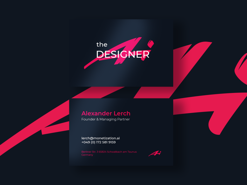
This one was made for The Designer AI, a digital service that connects fashion design to the power of artificial intelligence.
![]()
It allows fashion designers and brands to communicate with the relevant consumer base, gain knowledge of their needs and preferences and create what buyers want.
Logo for a talent platform
![]()
Here’s a logo based on a mascot: it’s designed for Whizzly, the social network for showcasing talents and sharing creative projects. This cool monkey knows the taste of fame – users catch the message from the first seconds. Its animated version makes a website or web promotion lively and catchy.
![]()
The process of creative search also resulted in a variety of options for trendy color palettes which makes the brand even more flexible for future marketing campaigns.
Logo for an address directory app
![]()
Here’s a logo created for Pinner, an app that allows users to create a personal address directory. It uses a sign associated with a pin symbol typically associated with maps. addresses, locations, and routes.
Logo for a bot for buyers
![]()
Here’s the logo design we made for one of our projects called ForceCop. It’s a digital product that helps its users to buy limited-edition goods. The logo presents a lettermark in minimalist color palette and dynamic shapes to make the brand look stylish and recognizable.
Logo for a record label
Here’s a sneak peek on logo and identity designed for a record label. The bright and catchy palette in combination with smooth lines and minimalist typography build up the sophisticated brand image.
Logo for a digital agency
![]()
Here’s a logo for AppShack, a digital agency specializing in development. It is completed in a flat minimalistic style. A symbol represented a shack in a rhombic frame. This way designer managed to combine both the illustration of a shack and an abstract element. In one of our previous articles, we’ve mentioned that shapes applied in symbols have a significant influence on a human mind. The psychology of shapes states that our mood can be changed according to the shapes we are looking at. A rhombus is usually associated with clarity and wisdom so such a frame may work effectively for the positive brand image.
The color palette was chosen according to the clients’ expectations. Light blue color gave the feeling of stability and the slight gradient made the logo more playful and modern-looking which responded to a current brand strategy. Here’s how it looks as an app icon and an identity marking sign for T-shirts.
![]()
![]()
If you want to see all the design stages and development of identity design on the basis of this logo, check the case study.
Logo for a landscape company
![]()
Here’s the logo for a landscape firm LunnScape. It is designed as a mascot of a dragonfly in an aqua circle depicting one of the fauna symbols which habitats in Florida nature. The dragonfly visualizes a bright creature on a green lawn, besides, its wings look like flower leaves. Turquoise circle with a dragonfly gives a solid stamp effect as well as looks playful due to the color palette. The wordmark typography complements and also unveils the core brand services of the company.
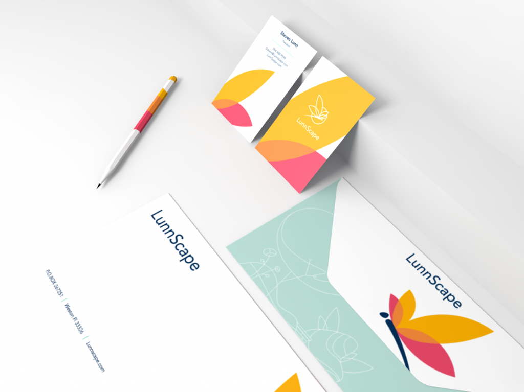
If you want to see all the design stages and development of identity design on the basis of this logo, check the case study.
Logo for a Chinese restaurant
![]()
The logo designed for an innovative restaurant Reborn is a combination mark that consists of the lettermark and custom lettering for the brand name. The core symbol presents the first letter of the company name for better brand awareness. The overall look of the symbol reflects the form of an inseparable silk ribbon featuring the slight movement which portrays the principal service philosophy – bringing in the modern way of automated ordering food in the restaurant industry and setting the link between traditions of healthy food and innovations. The chosen style gives the visual idea of an elegant and simple form reflecting the core benefits of the product. The letter is easily associated with both the brand name and the word “restaurant” showing the kind of service.
![]()
If you want to see all the design stages and development of identity design on the basis of this logo, check the case study.
Logo for a cleaning service
![]()
Here’s the logo designed for Binned, the cleaning company The lettermark design most closely matched the business brand: the final version of “B” was developed as a visually appealing “splash” in watery blues. Also, the client was provided with the combination mark combining lettermark with the entire brand name in a simple yet bold font. These brand identifiers strongly evoke a sense of water, cleanliness, and fun. As well, the animated logo version allowed for making the brand sign even more lively and vivid for the website and promo video.
![]()
If you want to see all the design stages and development of identity design on the basis of this logo, check the case study.
Logo for an app for runners
![]()
Another app logo following the trends of identity for digital products. This is the brand sign designed for Tracker, a simple mobile app for runners and joggers. The lettermark is based on the harmonic combination of the running track shape with the letter T presenting the brand name. Check the details in the style guide below.
![]()
![]()
Again, the animated version was created to make the splash screen of the app engaging and even hypnotic a bit.
Today’s list is over but studio practice is full of many other interesting examples of design concepts for different purposes and needs. Don’t miss new presentations in our future posts.
Useful Articles
Here’s a set of articles for those who search for insights into logo design and brand identity creation.
Remember Me. Basic Types of Efficient Logos
Shape and Color in Logo Design. Practical Cases
Design Me Live: The Power of Mascots in UI and Branding