The new creative story is up: welcome to check another identity design case study. In this project, the task for our team was to create a bright brand identity for Uplyfe, the new health app that employs the power of medical science, innovative technologies, and artificial intelligence to help users get healthier and feel better.
The creative team for the project from the tubik side was represented by Arthur Avakyan, Sergey Valiukh, and Olya Zakharyan.
Project
Branding design and marketing graphics for a health application.
Product
Uplyfe is an AI-powered health app that reacts to your behavior in nutrition and exercise and provides personalized recommendations. The app is designed to help users improve their health, as well as prevent or manage non-communicable diseases (NCDs). Founded by specialists with medical and healthcare backgrounds, the product shares the philosophy that a healthy lifestyle is the best medicine. The product team is based in Switzerland.
Research and Design Approach
Creating a brand image, the creative team has to consider all the major ways the brand employs to communicate with its users and customers. Even an excellent logo design may not work effectively if it’s designed in a creative vacuum without a clear understanding of where and how the brand will use it, what environment it will be integrated into, and how it will be distributed. That’s why the first stage of design is all about deep research, asking tons of questions, and building up a great deal of communication between the brand team and the design team. This process is vital as not only do designers get a more comprehensive view, but also, brand holders start looking at their product from different perspectives and asking themselves new questions. You can read more about the tubik design process for branding in one of the earlier articles: together with the client, we discuss and define ‘the soul’ of a client’s brand. That helps us to create strong branding and identity, ‘the face,’ for products and companies. From the brand model to the design system, we build the identity that translates the product values.
The essential point to take into account about Uplyfe’s brand image was that, in a nutshell, it is not a product solving a narrow circle of specific health problems but a comprehensive eco-system of building a healthy life, adapting its recommendations to users’ goals and performance. What’s more, it’s based on a scientific approach but simple and accessible for the broad target audiences of different ages, from youngsters to the elderly. The app aims at being used by both people with NCDs and healthy people who want to improve their lives. As the team is based in Switzerland and that’s its core market at the moment, the research phase included the analysis of what kind of health services and apps are demanded and popular in this area.
To define the design approach, user personas were developed and analyzed as well as mood boards were created and discussed to determine the compelling visual design perspectives.
Based on that, our team created a complex brand design for Uplyfe.
Brand Graphics
Logo
The final logo design is a combination mark made up of a symbol and a typographic part presenting a brand name. The elegant and curvy symbol is balanced by the simple, solid, and highly readable font chosen for the text part. The color palette is based on a combination of pure colors that provide good contrast and work well both in digital and analog spaces.
As for the symbol, it employs a triangular shape. According to the psychology of shapes, a triangle is an energetic and dynamic shape always associated with motion and direction. The lines are placed so that human eyes automatically move to the triangle’s top or in the direction it is placed. An upright triangle brings feelings of stability and balance.
Also, the symbol intentionally doesn’t feature any visual triggers or prompts that are typical for the medical theme. The major goal in identity design for Uplyfe was to step aside direct associations with medical treatment, hospitals, and the like, as the application goes beyond that and is positioned as a helper in supporting a healthy lifestyle in general. What’s more, for many people with NCDs, their states of health are a matter of everyday life, like, for example, those who have diabetes, so the app would rather avoid day-by-day connection to that from the medical perspective and focus on helping users make their life better in those conditions. As well, a part of the target audience consists of people who have no specific health issues but would like to enhance their general physical conditions, so the logo directly connected to the medical theme could create confusion about the nature of the Uplyfe service and lead to losing a part of the audience. Instead of associations with medical treatment, the logo had to transfer the strong message of a bright, healthy, and well-balanced life.
![]()
To increase the logo’s flexibility for different visual design goals, the designer developed a set of variations, including a black-and-white version, monochrome variants on light and dark backgrounds, and options with gradient backgrounds based on the corporate palette.
![]()
Digital touchpoints: app graphics, favicon, logo animation
But brand design goes much further than well-crafted and tested logo design. Together with the client, we defined the touchpoints and channels via which the brand communicates with its customers to create an appealing and balanced visual style covering them all. This way, the brand image looks and feels consistent, and brand recognizability increases.
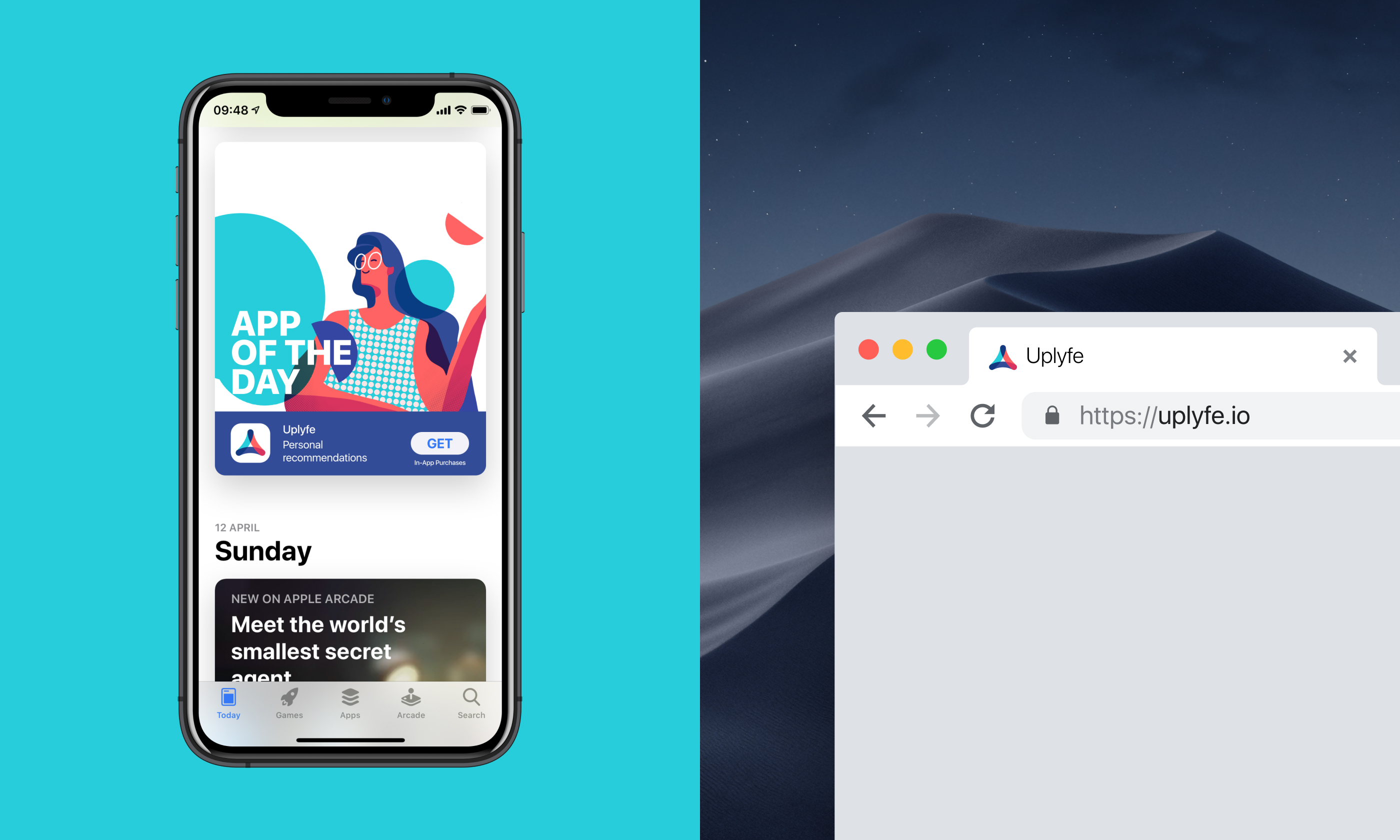
First, let’s take a look at how branding was integrated into the digital product. Here’s the logo animation for the splash screen: it gives a clear visual connection with the brand from the first seconds and, at the same time, makes waiting bright and dynamic while the app is loading. Also, below, you can see how the branded app icon looks for the Uplyfe application.
And here’s a glance at the favicon for the app landing page. Favicon, also known as a URL icon or bookmark icon, is a particular type of symbol representing the product or brand in the URL line of the browser and in the bookmark tab. It allows users to get a quick visual connection with it while they are browsing. Although small and not prominent, this interface element is essential for effective web promotion; it contributes much to web usability and good recognizability of the brand’s visual identity.
The concept of the custom branded illustration was also developed to experiment with the general style of brand graphics that could be used for social networks, banners, and other marketing goals.
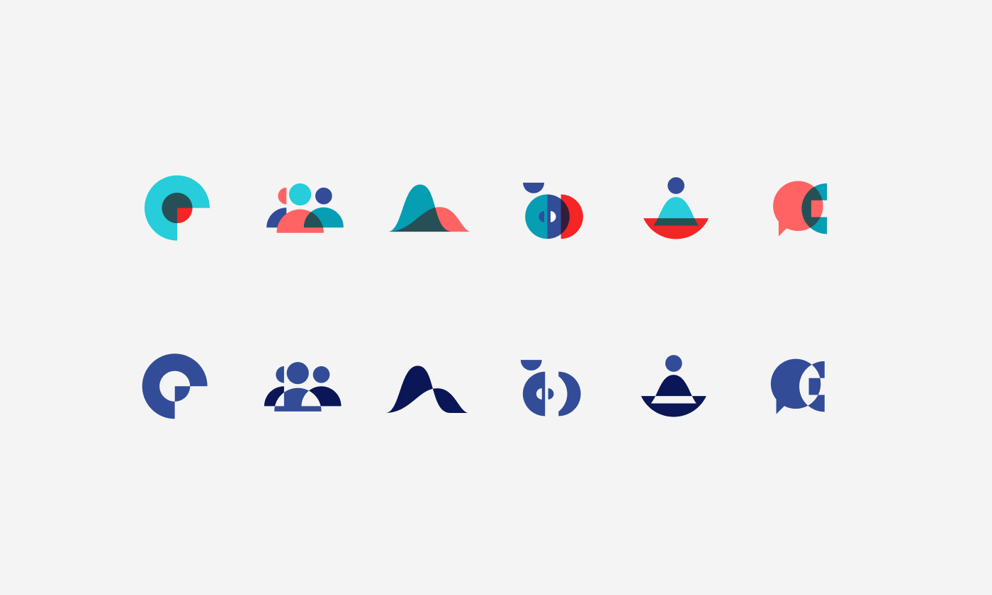
Going further, the extensive set of neat icons, both in corporate colors and in monochrome versions, was designed to support visual consistency for diverse branding and user experience goals behind the application and its pages in social networks.
Landing page design
One more important channel of app promotion is a landing page. For mobile applications, it is a web page created to set another touchpoint that informs users about the nature and benefits of the app, engages them to try it, and provides shortcuts to downloading it. Moreover, sticking to the brand style and color palette, the landing page strengthens the brand image’s web presence and recognizability.
Here are different design concepts for the landing page of the Uplyfe application.
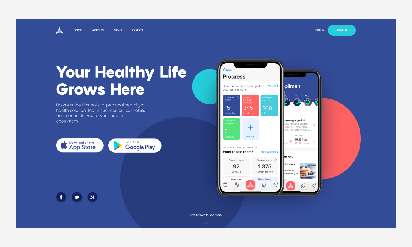
Landing page employing dark background, prominent app demonstration screens, and bright color accents
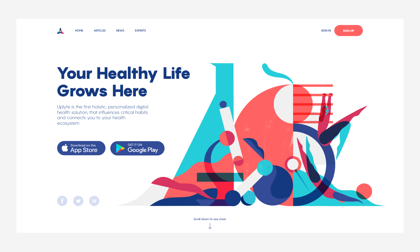
Landing page design based on light, airy background and big custom illustration in brand style
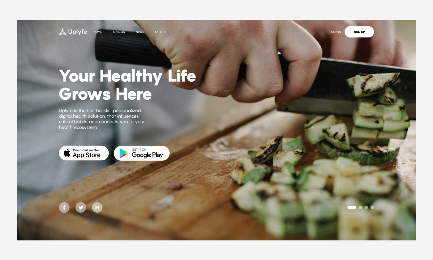
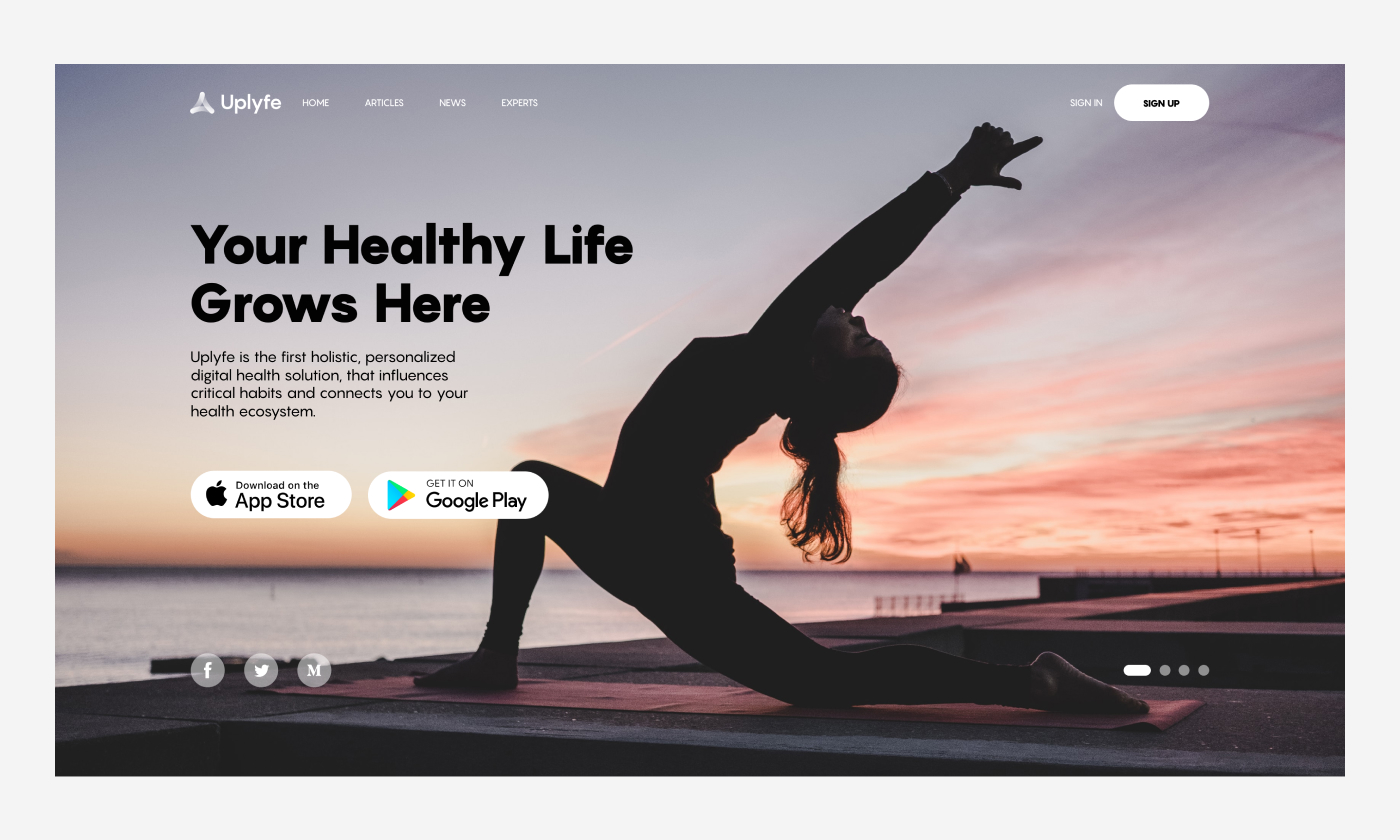
Landing page design concepts with atmospheric background photo content setting the visual connection with the theme of healthy life. The photo also works as a gaze-directing directional cue: on the slide with yoga, the woman’s fingers direct users’ eyes to the CTA element in the header.
Social networks
Naturally, digital products are mainly promoted via digital channels of communication, so the next step of brand design for Uplyfe was considering its consistent identity in social networks.
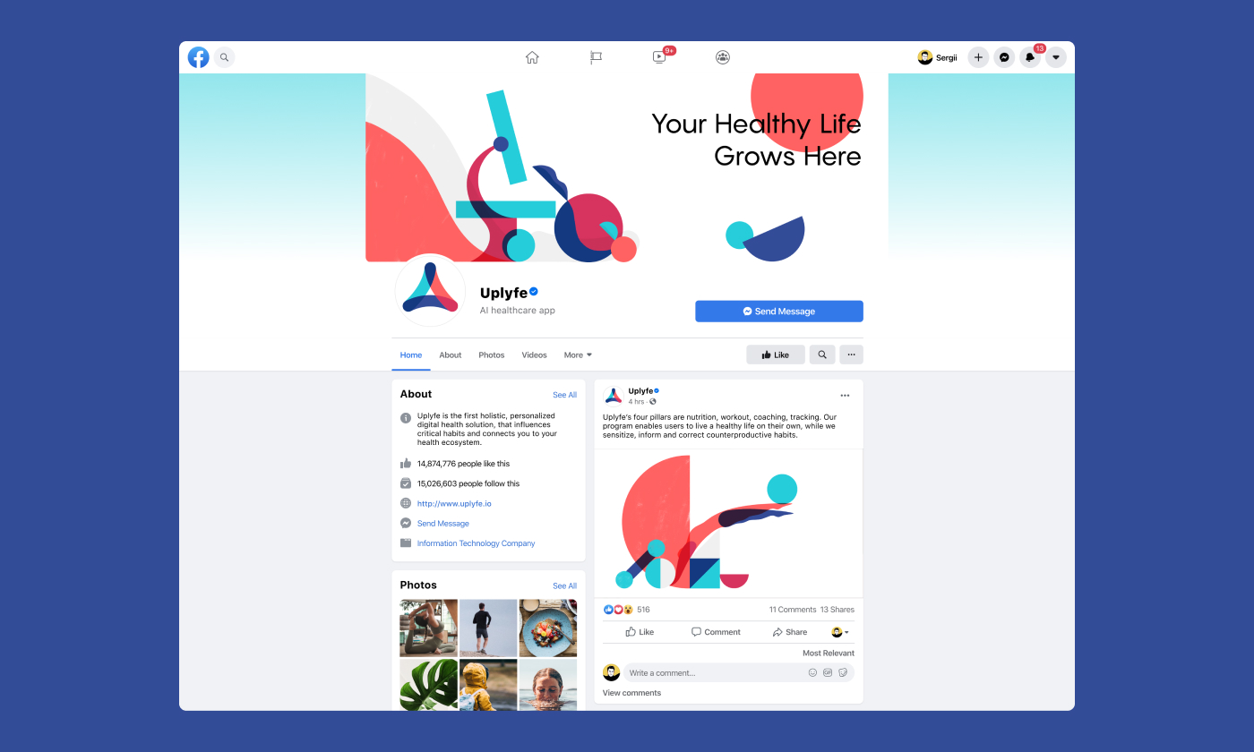
Here’s how the Facebook page for the app looked. The concept features custom header images based on graphics combining abstract shapes and recognizable objects like a microscope, providing a quick visual connection with the brand style, the theme, and the goals of the service. Also, another illustration is shown as an example of theme graphics for posts.
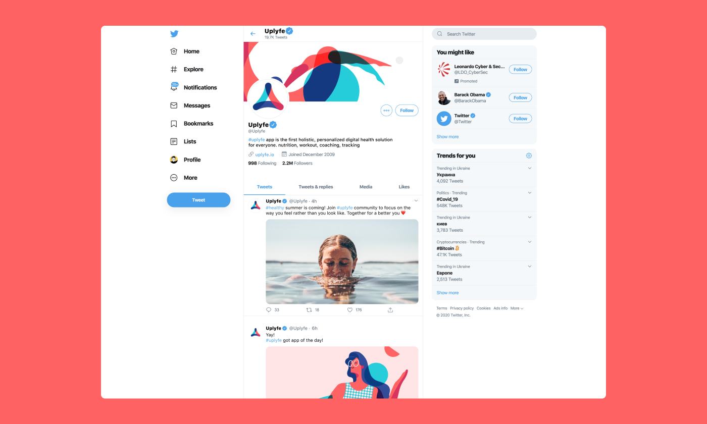
Here’s how the same approach is adjusted for the Twitter page.
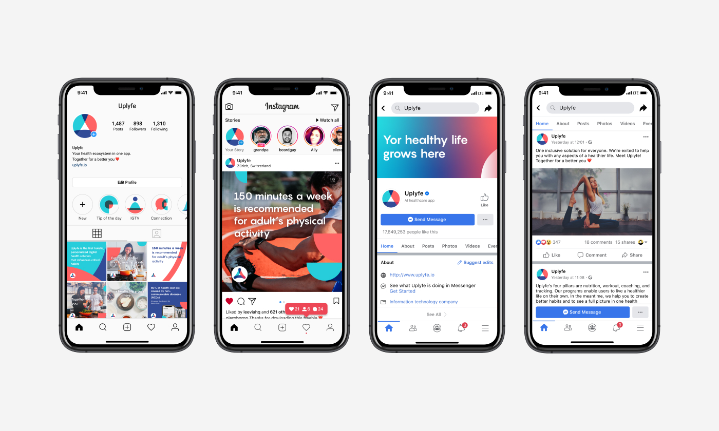
And here’s a look at the brand image concept on Instagram and Facebook for mobile. The system of icons works effectively as the covers for Instagram highlights. Also, the general style of brand graphics for Instagram posts is offered to make them consistent, attractive, and recognizable, sharing the brand mission and valuable information for the followers.
Printed stuff: business cards, posters, lightboxes, billboards
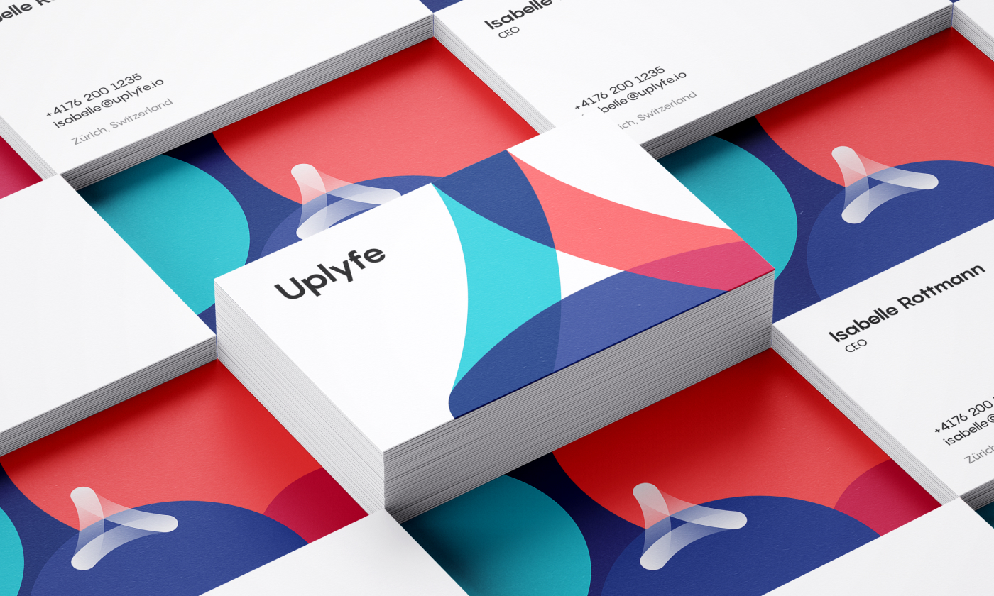
Talking about the more tangible side of branding, here’s how the business card design looked.
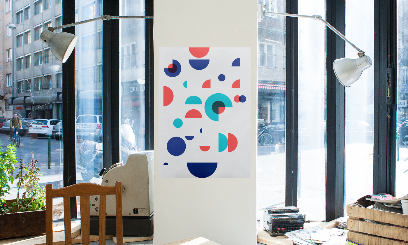
What’s more, the style, curvature, and shapes used in the process of design exploration for icons let the designer develop the design system for brand posters and other stuff or merch that could be involved in marketing.
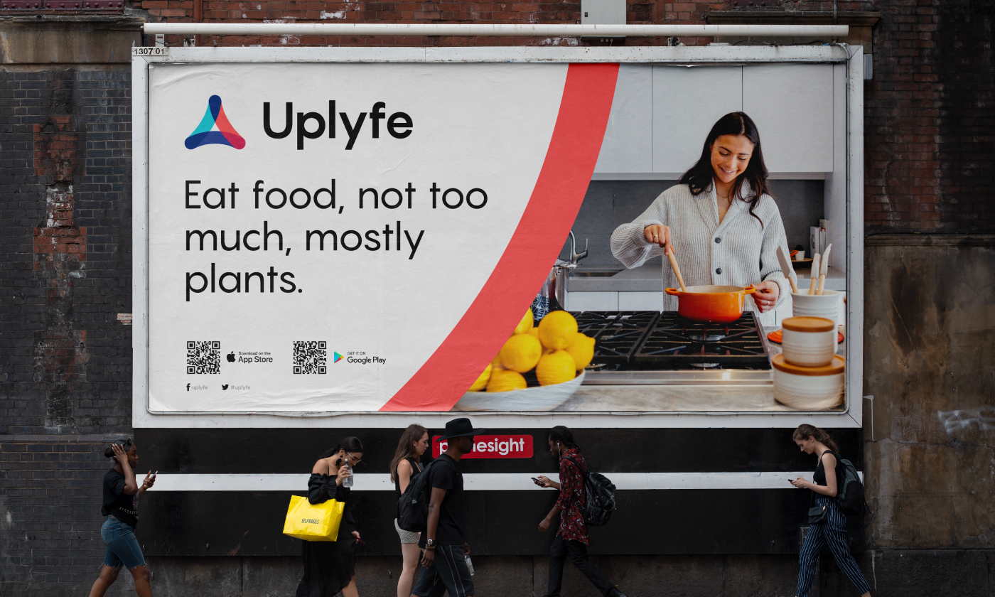
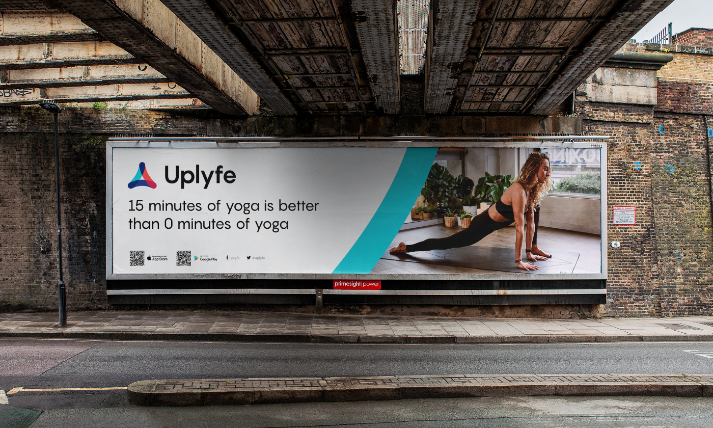
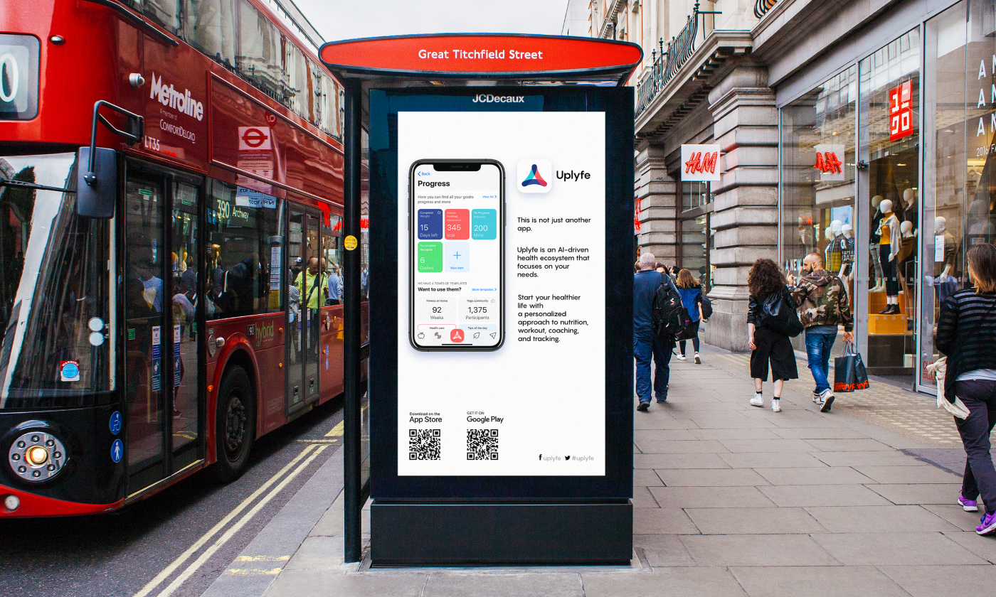
Another direction to take into account was the design of outdoor advertising to spread the word about the application in various urban spaces, such as billboards with motivational taglines or lightbox ads informing about the app’s benefits.
This project demonstrates how the comprehensive design approach covers different aspects of the ways the brand uses to connect with its customers and how much more should be done to develop an attractive and informative brand identity than just logo design.
New design case studies are coming soon; keep up with the updates.
More Design Case Studies
Here’s a set of more case studies sharing the design solutions and approaches for some of the design projects done by the tubik team.
ShipDaddy. Identity and Web Design for Shipping Service
Credentially. Website Creation with Webflow
Dicey. Logo and Mascot Design for Party Game
Branding Design Process in Tubik: FAQ from Clients
HUAWEI. Icon Design for EMUI 10
ABUK. Custom Book Cover Design for Audiobook App
Illuminating Radioactivity. Interactive Web Design for Education
Lumen. Website for Museum of Mountain Photography
GNO Blankets. Branding and Web Design for Ecommerce