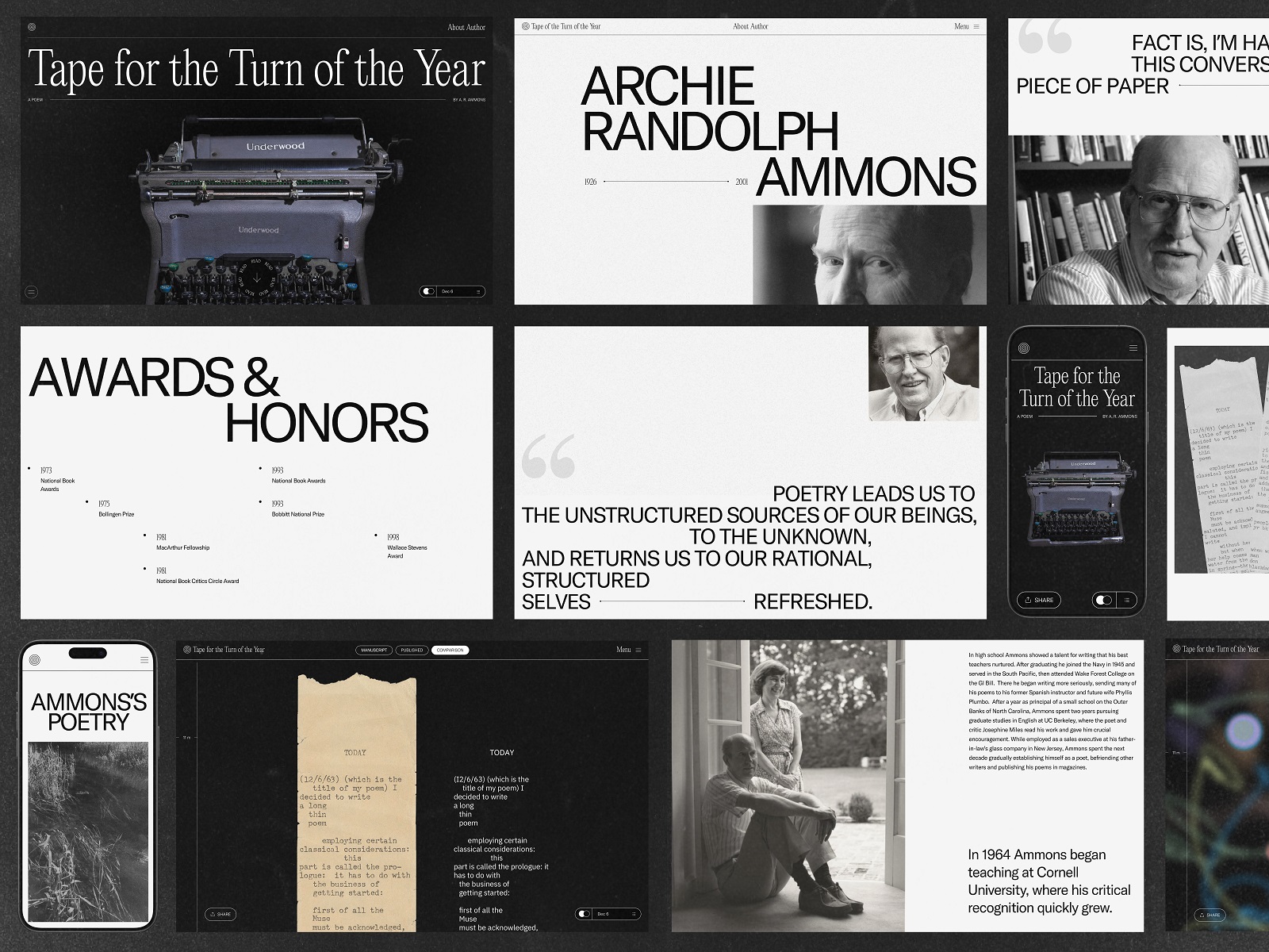
This case study invites you to enjoy the web design project filled with the vibes of poetry and the art of words. Look at the website called Ammons’ Poetry, an elegant and minimalist resource capturing poetry by Archibald Randolph Ammons and unveiling his life moments.
Project
The creative project’s objective was to honor and commemorate the poetic heritage of Archibald Randolph Ammons, a known American poet of the XX century and professor of English at Cornell University. Throughout his lifetime, Ammons published about 30 poetry collections and became well-recognized for his essential impact on American romantic poetry. The recognition also resulted in Ammon’s receiving several significant awards for his work, including two National Book Awards for Poetry, one in 1973 for Collected Poems and another in 1993 for Garbage.
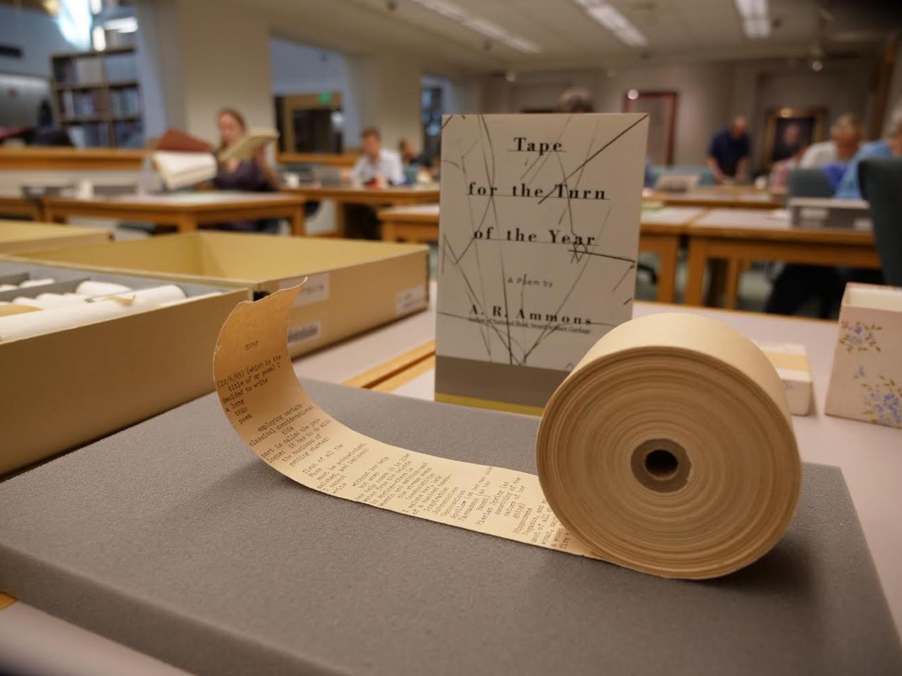
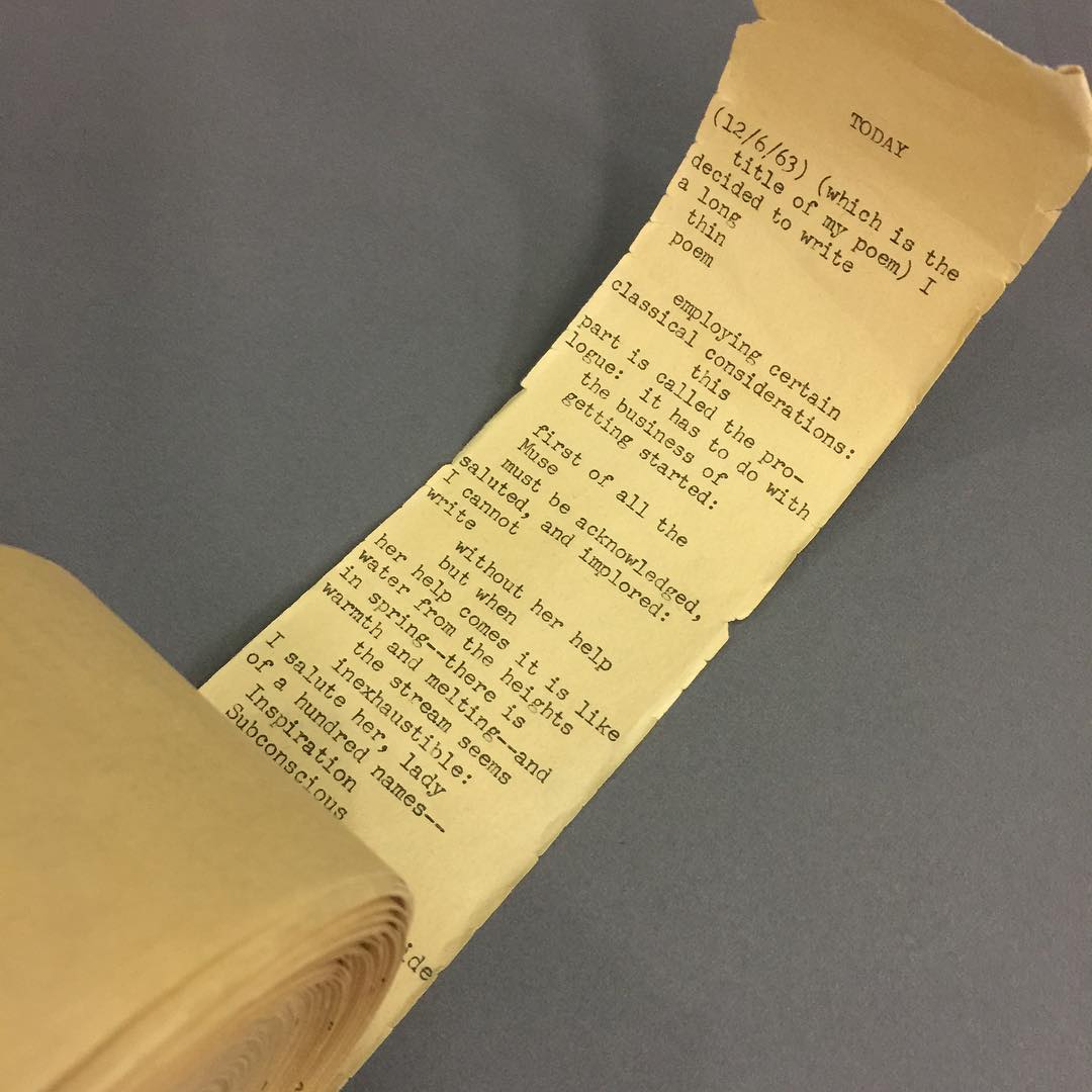
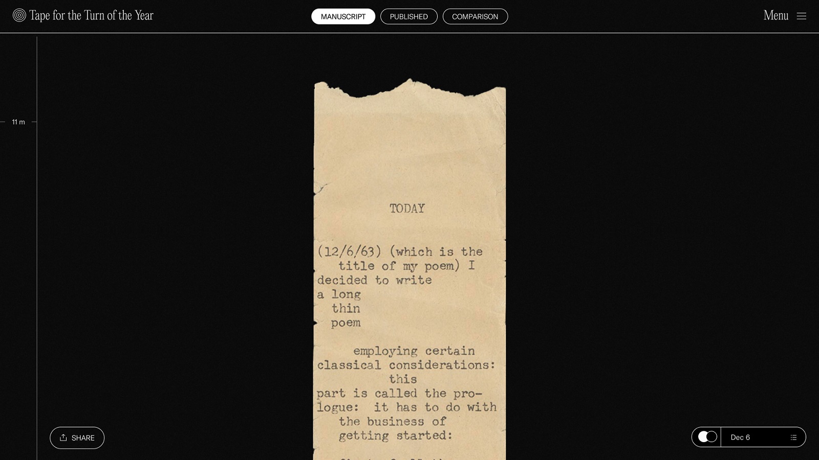
On December 6, 1963, the poet wrote, “I decided to write a long thin poem” on a roll of adding machine tape that he had loaded into his typewriter, and so began his book-length poem, Tape for the Turn of the Year. The tape, an experiment about “making a poem adapt to something outside of itself,” was transcribed and transferred foot by foot to the manuscript and eventually published in book form by the Cornell University Press. The poem, written in the form of a journal, documents Ammons being hired by Cornell. Copies of the book, the tape, and related manuscripts are now a part of Archie Ammon’s archive in Cornell University Library’s Rare and Manuscript Collections. And it became the central subject of the website we had to create.
The creative team from the tubik side included Oksana Lashko, Vlad Taran, Natalka Mamchur, and Olga Syrotkina.
Web Design
The general style for the website design was chosen based on a minimalistic approach with an ultra-limited color palette, bold typography, creative asymmetry, and solid visual hierarchy, allowing the arrangement of text blocks in an elegant way. The pages introducing the reader to the poet’s biography and poetic legacy present a stylish mixture of text and visuals, such as archive photos and book covers.
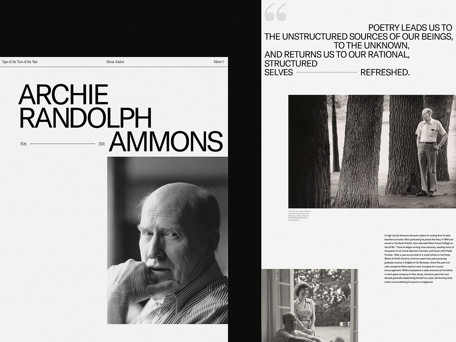
Biography page
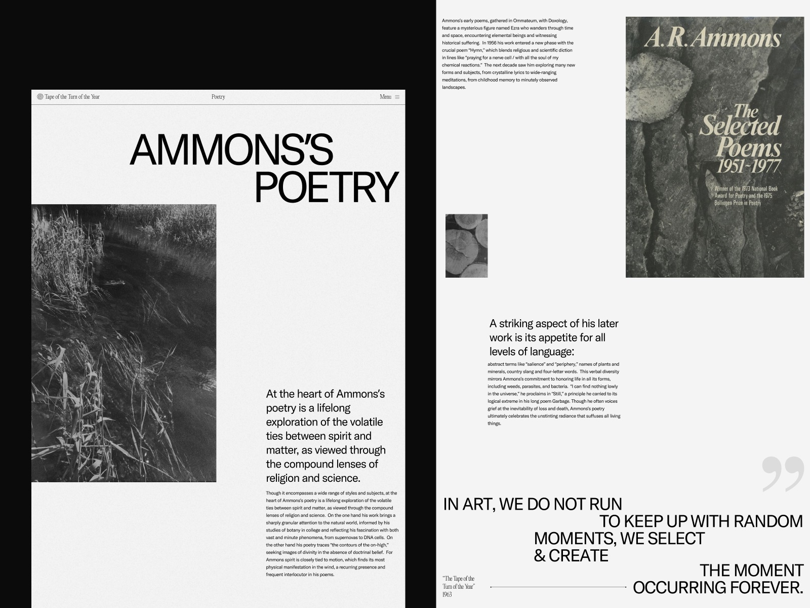
Poetic legacy page
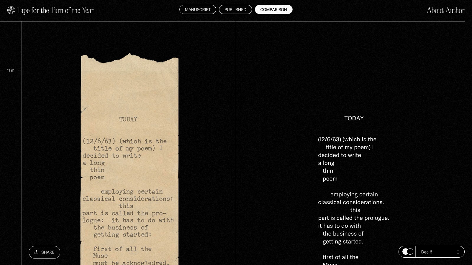
Still, the most significant creative challenge was to present the central piece of poetry, the original poem Tape for the Turn of the Year. The creative team got a vision and requirements from the client about this stage: the design had to feature the original tape-typed image of the poem manuscript and present a long-read, long-scroll web user experience. At the same time, the modern digital version of the text had to go in line with the image of the original manuscript tape.
As the text is long and thin, the essential feature required to be integrated into the user experience was the ability to highlight the particular episode read at the moment or to see it with a progress tracker. Here’s the basic concept with which the client came to us.
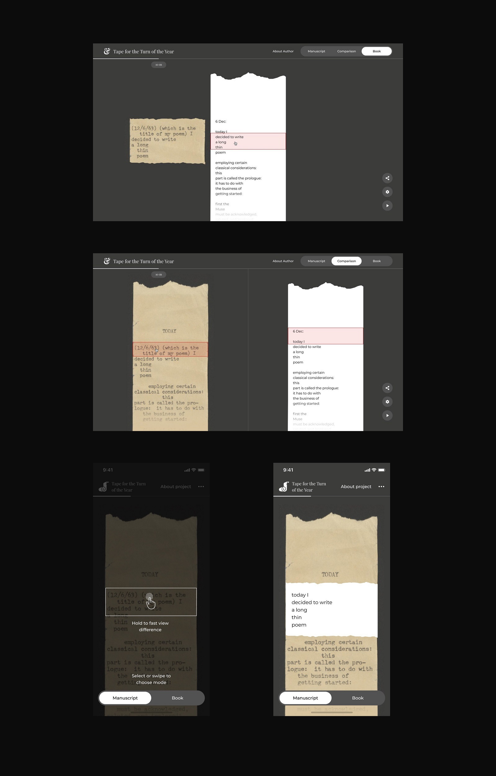
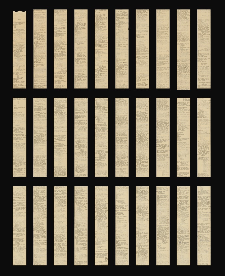
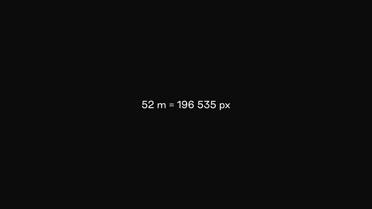
To be presented in the digital web format as one smooth long-read experience, the scanned image of the original 52-meter tape with the poem was divided into multiple pieces.
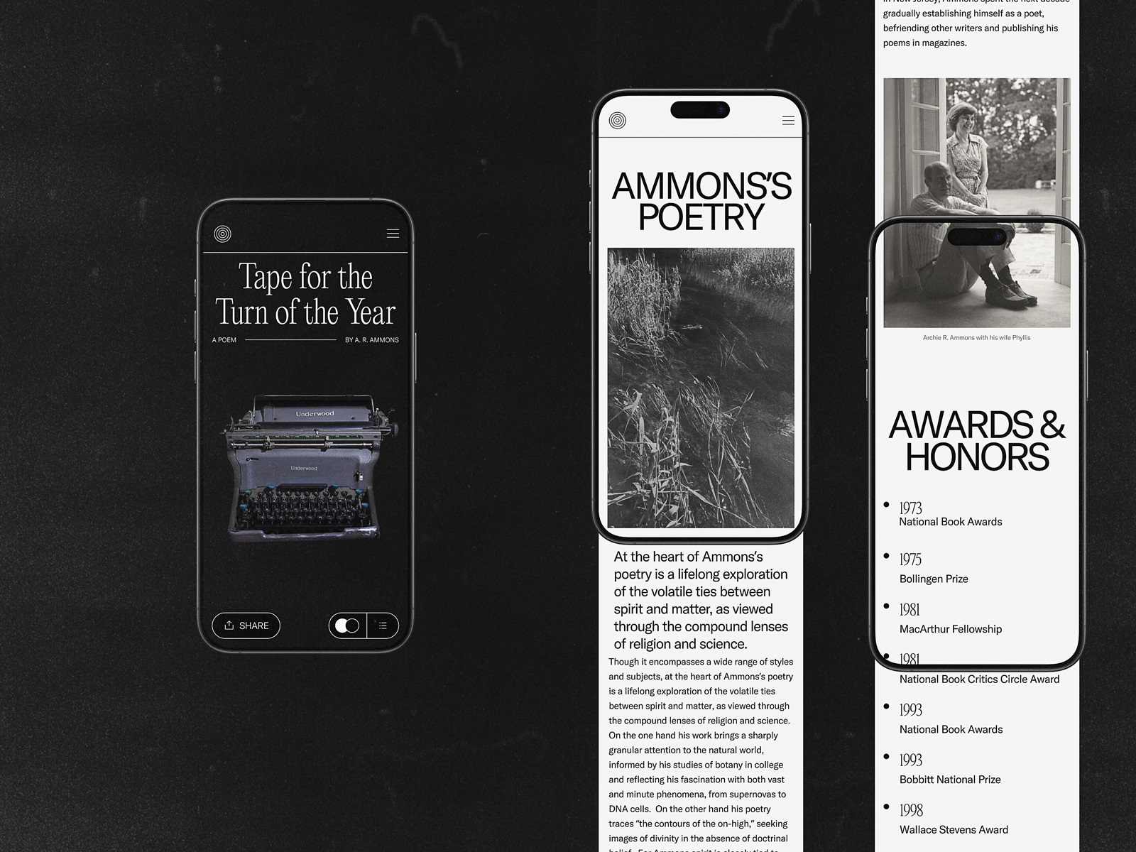
The starting screen of the poem’s page stands out, using a dark background in contrast to other light, airy pages and employing an image of the typewriter that immediately adds emotional and aesthetic appeal to the page. It’s essential to mention that this was not a random image but an actual photo of that very typewriter, which belonged to the poet and was used to create the original manuscript of the poem.
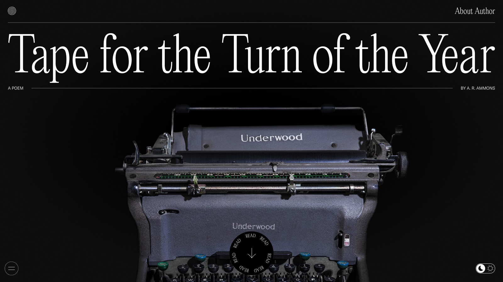
The poem’s page looks clean, uncluttered, and minimalistic due to well-arranged and thoughtfully designed interactive elements. Focusing readers’ attention on the piece of poetic writing, the interface also features:
- a progress tracker showing the actual place of the shown episode in the manuscript
- the date which the author marked in the current episode
- the share button that allows readers to share the particular episode to their social networks
- the buttons that offer a reader different modes of text view
- the switch for choosing between the dark and light backgrounds on the page depending on what is more convenient for readers.
The poem is presented in three view modes: manuscript mode, published (digital text) mode, and comparison mode. Here’s a glance at the manuscript view mode in which the reader sees the actual piece of the original tape typed by the author.
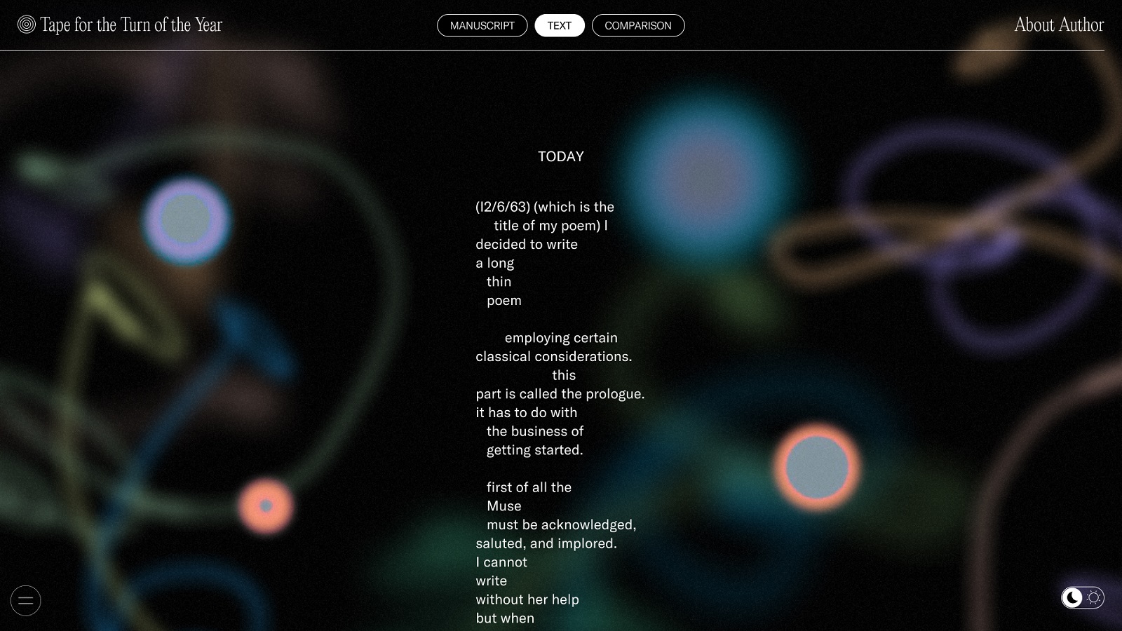
The published mode presents the poem in the form of digital text saving the structure of the lines and poetic presentation of the original text. For this mode, the creative team tried two background options: the one featuring abstract graphic elements echoing Ammons’ painting artworks and the plain dark one.
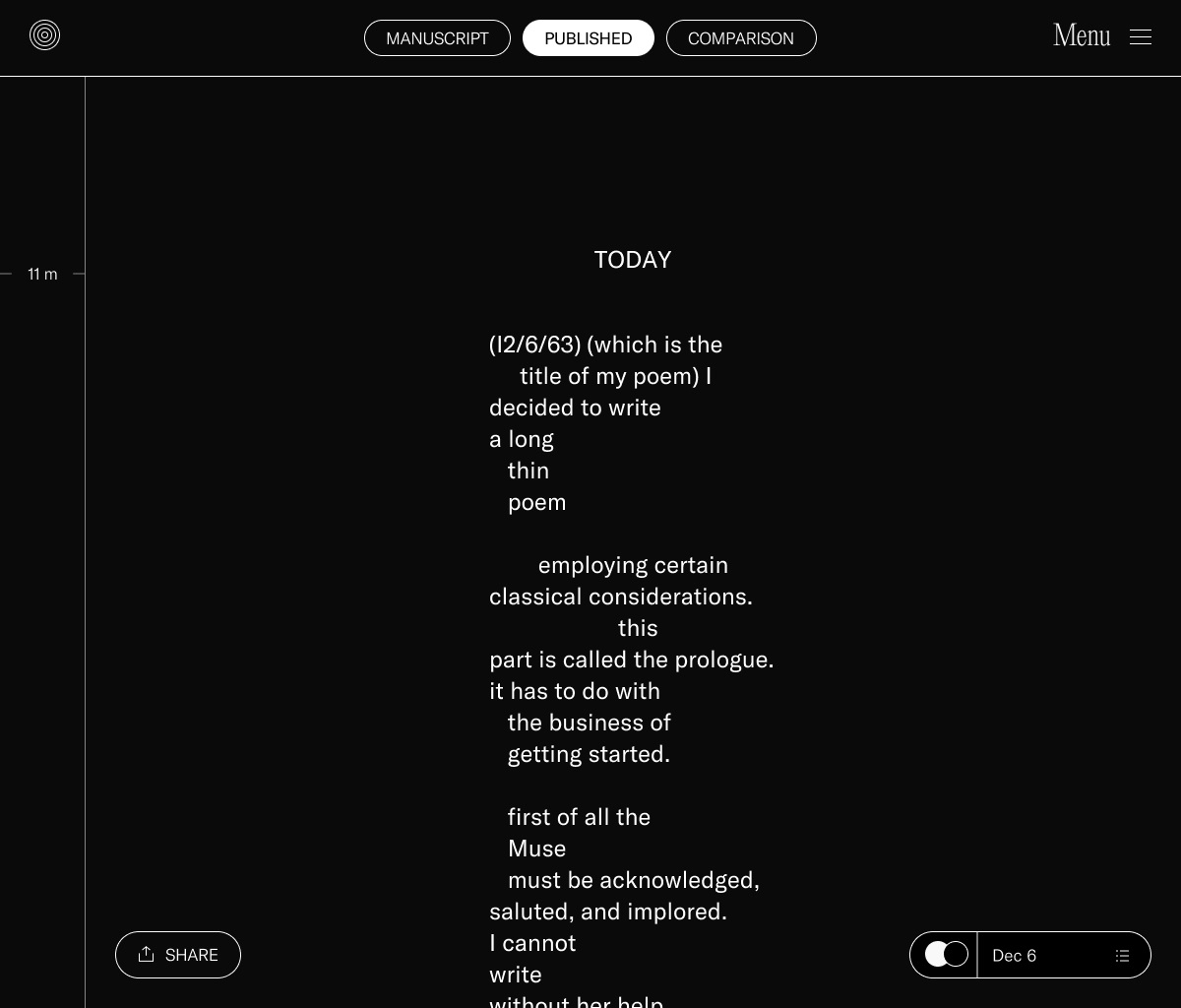
Finally, the comparison mode allows readers to see two options together.
And here’s a look at the small piece of web animation, adding a pinch of liveliness and engaging readers to learn more.
After agreement on all the details of the website design, the mobile version was also created to ensure that the website is usable and attractive on whatever device a reader uses.
This project has become an exciting and uncommon creative challenge, which we were glad to participate in and find new ways of presenting educational and artistic content.
New design case studies from our team are coming soon. Stay tuned!
More Design Case Studies
Here’s a set of more case studies sharing the design solutions and approaches for some of the design projects done by the tubik team.
Opera Browser Explainer Videos. Animated Video Production
Drug Test Innocence. Website for Socially Impactful Online Resource
Web Design Case Studies: 4 Smart Websites for Various Business Goals
Advocacy Through Walls. Website Creation for Advocacy Guide
Serra. Identity and Product Design for Financial App
UI Design Process for Web and Mobile: 3 Detailed Video Cases
MOVA Brewery. Ecommerce Website Design for Beer Producer
HP23. Website and 3D Animation for Prostheses Producer
FluxWear. Web Design and Development for Health Tech Product


