Our new design case study invites you to dive into the world of education, which is both useful and exciting. Let’s review the website design process for Magma Math, the educational platform that combines educators’ experience with innovative technology and approaches to broaden the horizons of learning and training.
Project and Client
Magma Math (earlier known as Matteappen) is an ed-tech company that offers the mathematics platform established to support teachers in making more informed instructional decisions in the classroom and create opportunities for more profound student-driven discourse and collaboration.
The project has been set up by a global team of educators, tech innovators, life-long learners, and self-proclaimed math mavericks. They believe in mathematics as a creative subject that serves as both a window and a mirror for students worldwide and set a mission for Magma Math to enable educators to create dynamic, student-centered classrooms where all students are challenged and supported appropriately.
The client approached us with the request to do the UX audit of their product, namely in the aspect of teachers’ interaction with it, and get their website redesigned. Initially, the platform was based in Sweden and on the Swedish educational approach to maths programs; however, at that stage, they were already expanding their presence on the American market as well.
The creative team engaged in the project from the tubik side included Anton Chyrskyi, Ernest Asanov, Roma Chornyi, Ivan Shvindin, Kyrylo Yerokhin, Natalka Mamchur, Oleksandra Mykhalyk, and Olga Syrotkina.
In this case study, we will focus on the web design and graphic design part of our collaboration.
Web Design
The client came to us with an already working product, visual identity style, and a clear understanding of what audience they target and what impression they want their website to make on visitors in Sweden and the USA. The primary goal was to find the golden medium and make the websites reflect the consistent and integral brand image in both targeted markets to enhance usability, visual and emotional appeal, informativeness, and engaging user-friendly communication. That’s what we started with.
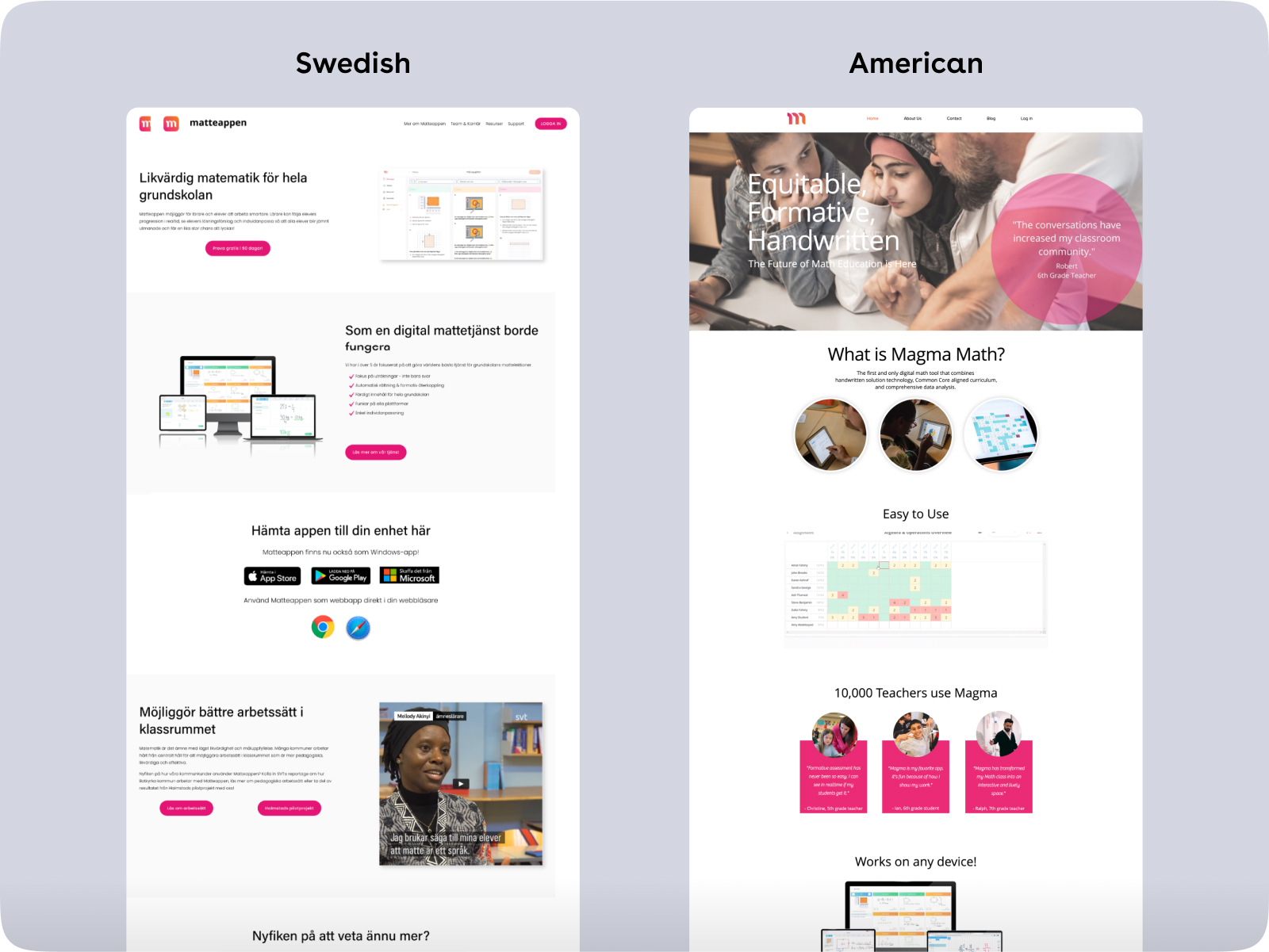
After having done a detailed deep review of the existing product user experience and visual style, having analyzed the target markets and clients’ vision and values based on the current branding, the creative team, in deep collaboration with the client’s team, developed a set of recommendations for visual identity enhancement steps that would unite all the communication touchpoints and channels via which the brand communicates with its audience and offers the solution to its problems. Moreover, these steps had to adapt the existing branding and product to appeal to the American educational services and technologies market. So, the recommendations also formed the foundation of the website design.
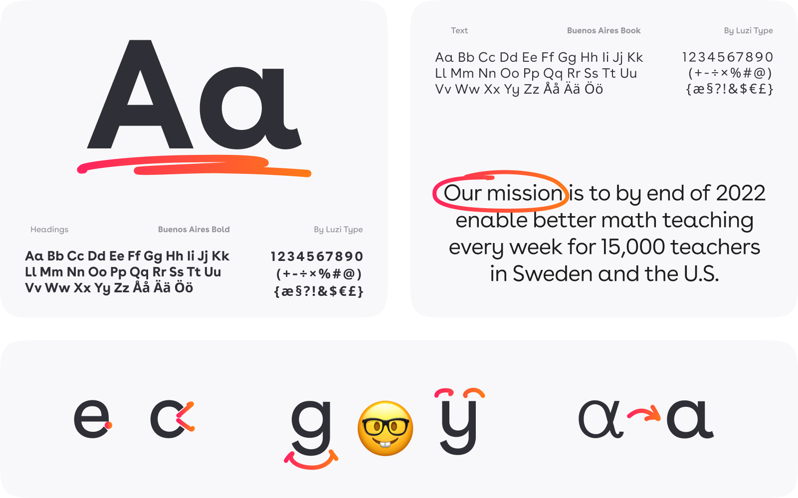
The typography choice for web design fell on the Buenos Aires typeface, showcasing solid readability and a friendly aesthetic with subtle and playful elements. As the creators of the fonts, Luzi Type, mentioned, the open forms of this typeface make it well-suited for both body text and titles, and even more, the font includes an alternate set of lowercase a and l, adding versatility while maintaining consistency.
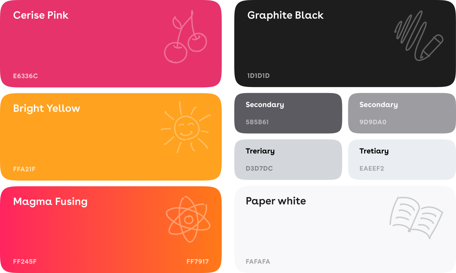
The color scheme for the website uses the power of color contrast, with the combination of traditional black, paper white, and gray setting a solid basis for the effective presentation of text content and bright, cheerful shades of pink, yellow, and orange providing great color accents and adding liveliness and positive vibes to the general design style.
Having discussed the general strategy and all essential details, we moved to the UX wireframing stage, at which the structure of the website and particular pages, as well as content arrangement, are thought out to make everything work most efficiently. At this stage, together with a client, the team can play out and test most user scenarios, prioritize content presentation and performance, and see what kinds and amount of media content will fit those needs and support the text and interactions successfully.
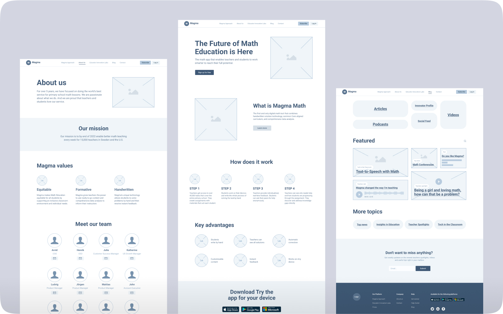
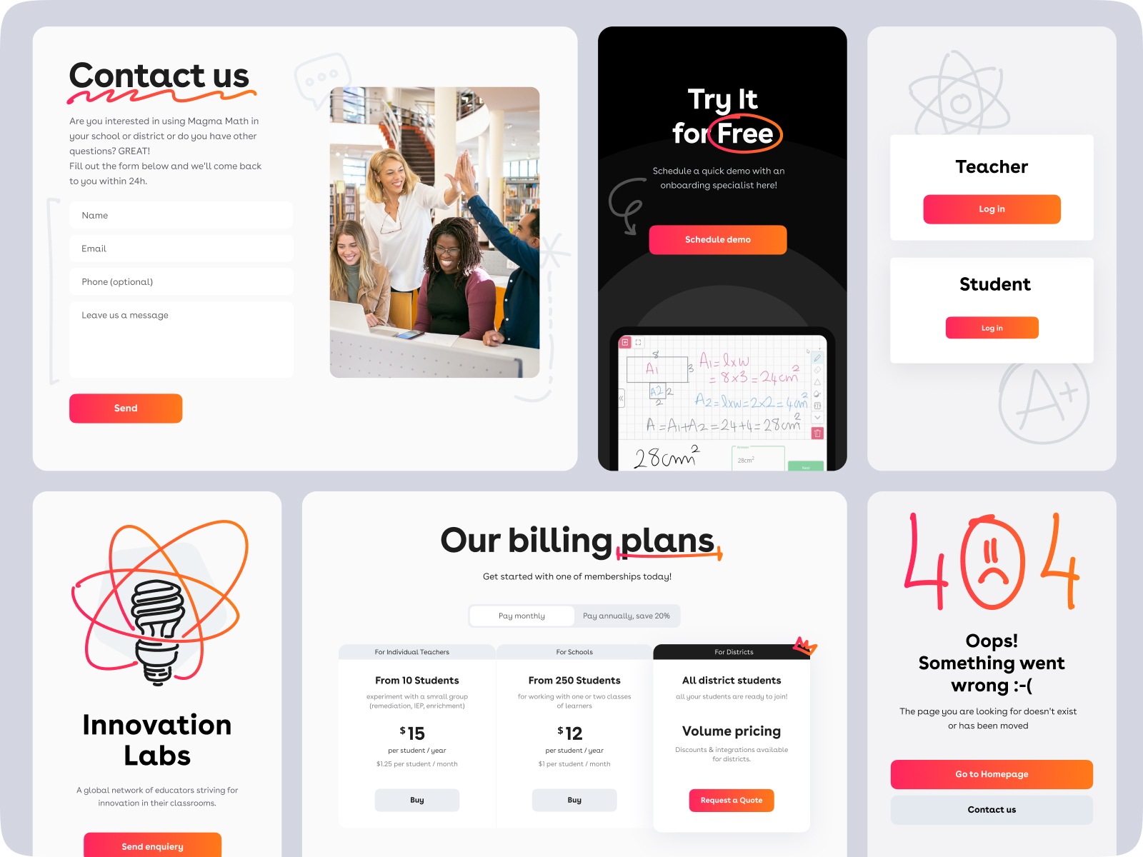
The light and airy home page for the website sets the instant association with the student’s textbooks and notebooks. It allows for an effective combination of different types of content on the page: text, maths problems and formulas, videos, photos, custom graphics, and interactive elements. Solid visual hierarchy lets a website visitor quickly skim and scan the pages, moving smoothly from one section to another and diving into the service’s functionality and benefits to the teachers and students. The primary navigation is quickly noticeable and reachable in the website header, using dropdown menus for each section to extend the navigation opportunities without overloading the page, and can be accessed easily from any point of interaction with the website as the header is sticky. Take a look at the layouts and interactions for some of the web pages below.
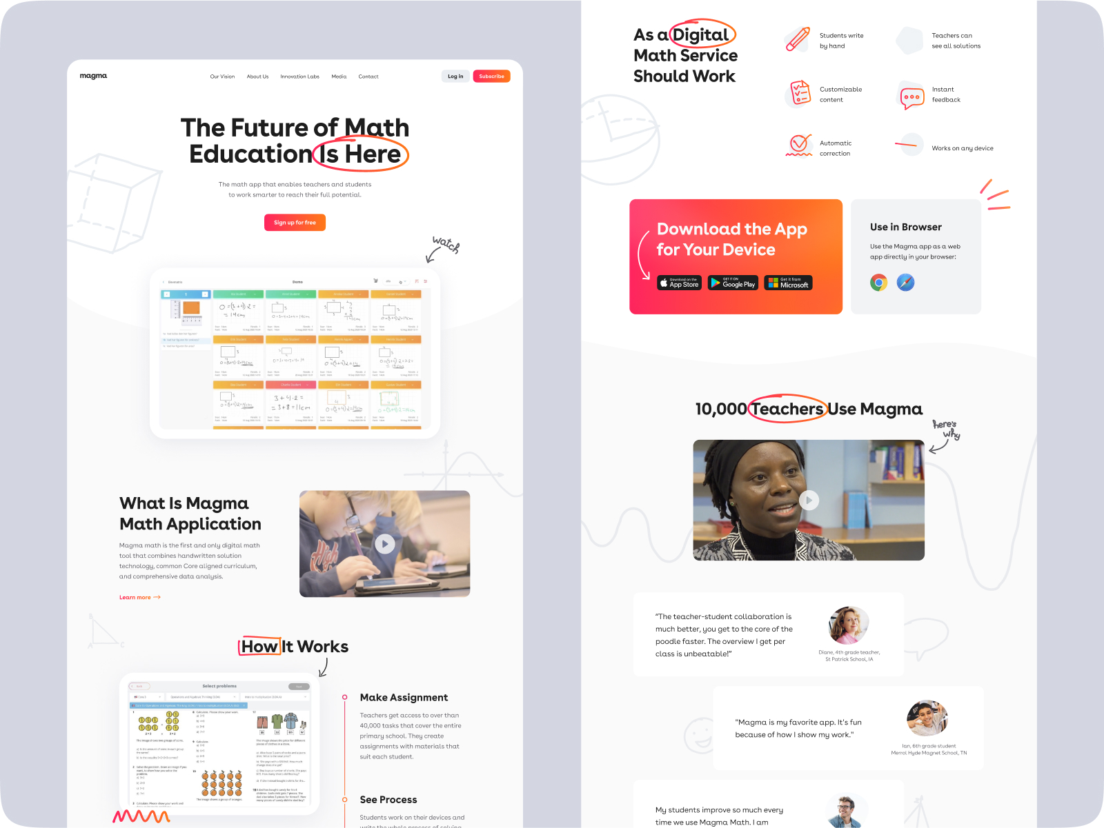
The website plays with color contrast, using a dark background for some sections or tabs. Both light and dark backgrounds make the CTA elements instantly visible and obvious, presented in bright accent color with a slight stylish gradient.
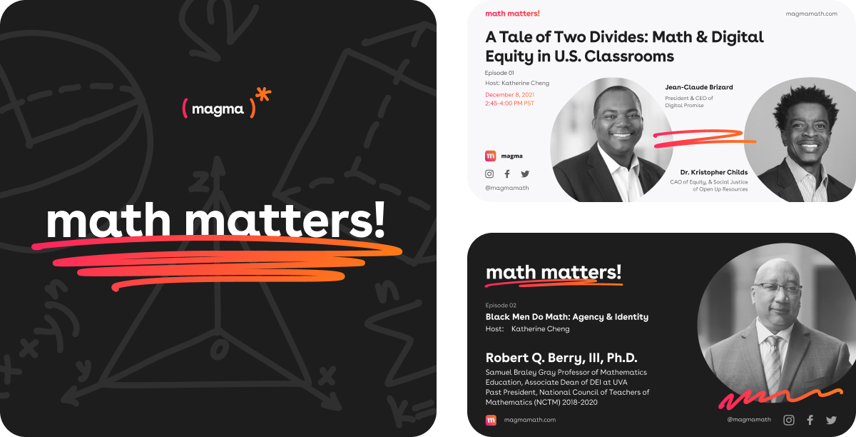
Also, we used the same style and approach to stretch on various marketing graphics that would consistently echo the product and website, for example, podcast covers or images to be used for social networks and digital marketing goals.
After approving all the design solutions and website layouts, our team implemented the website on Webflow. Hence, Magma Math is one more project for our team in which the client got not only a well-crafted design but a live working website finely tuned to all the details of visual style created at the UI/UX design stage.
Website Graphics
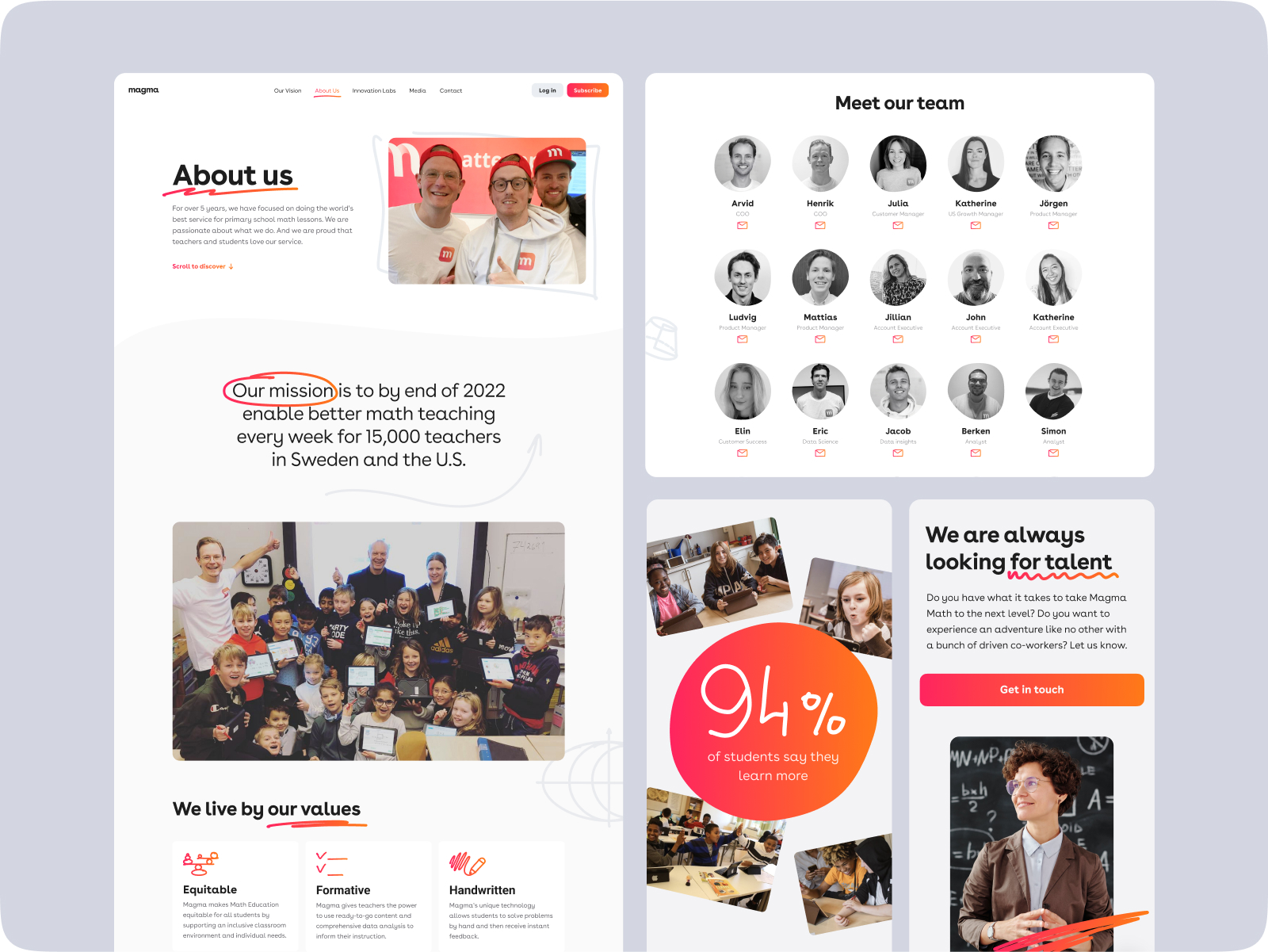
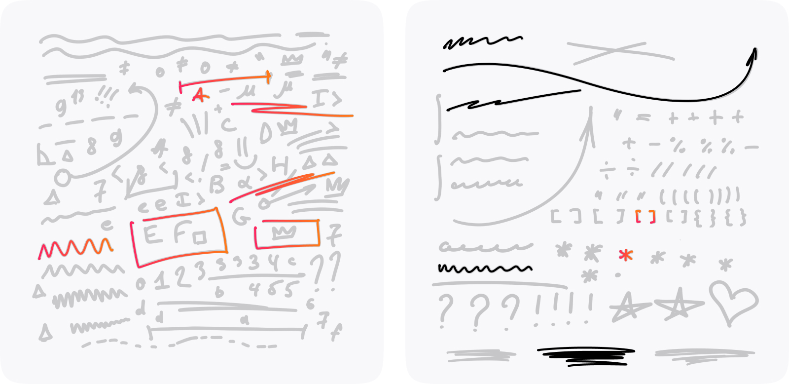
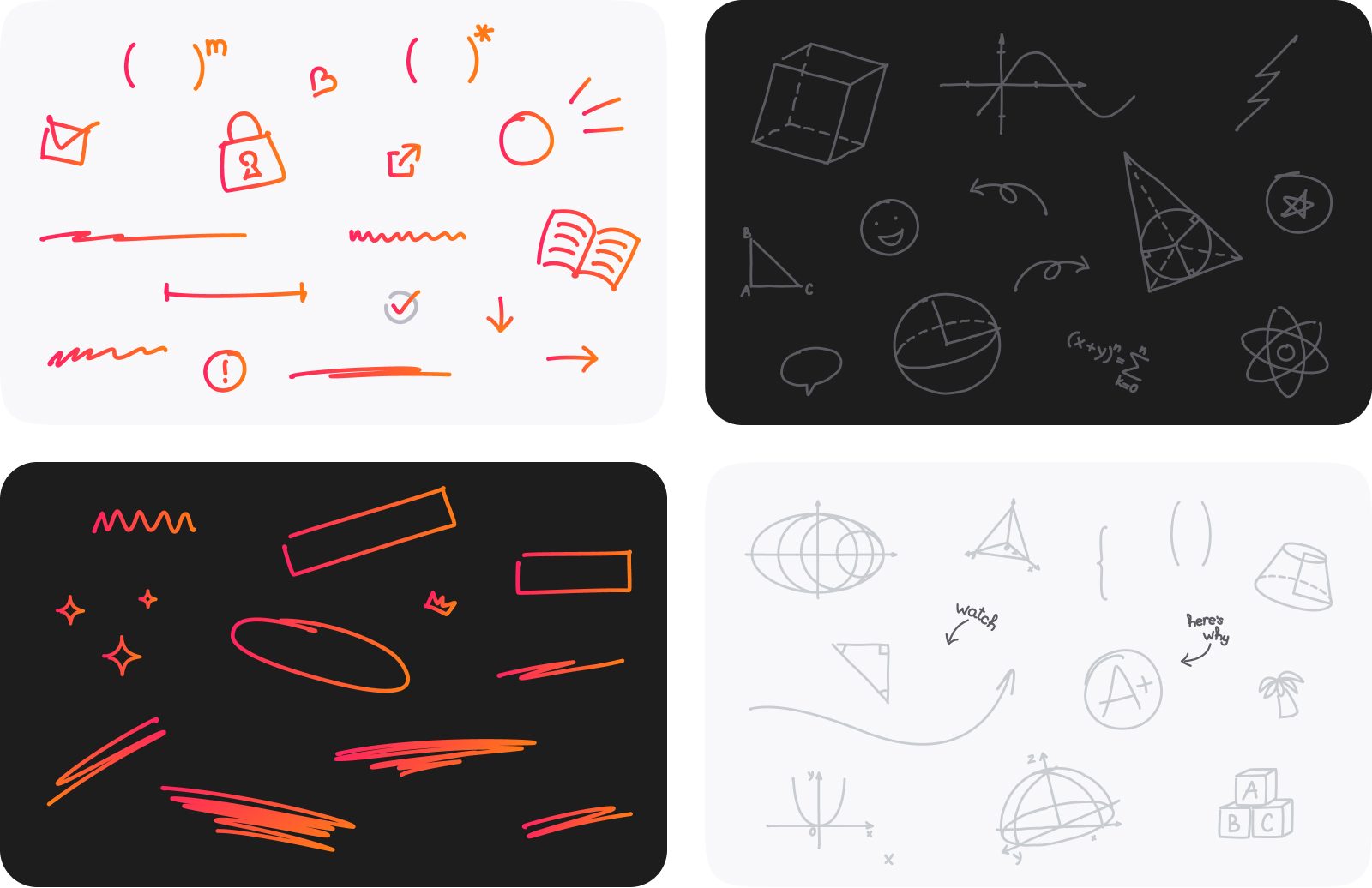
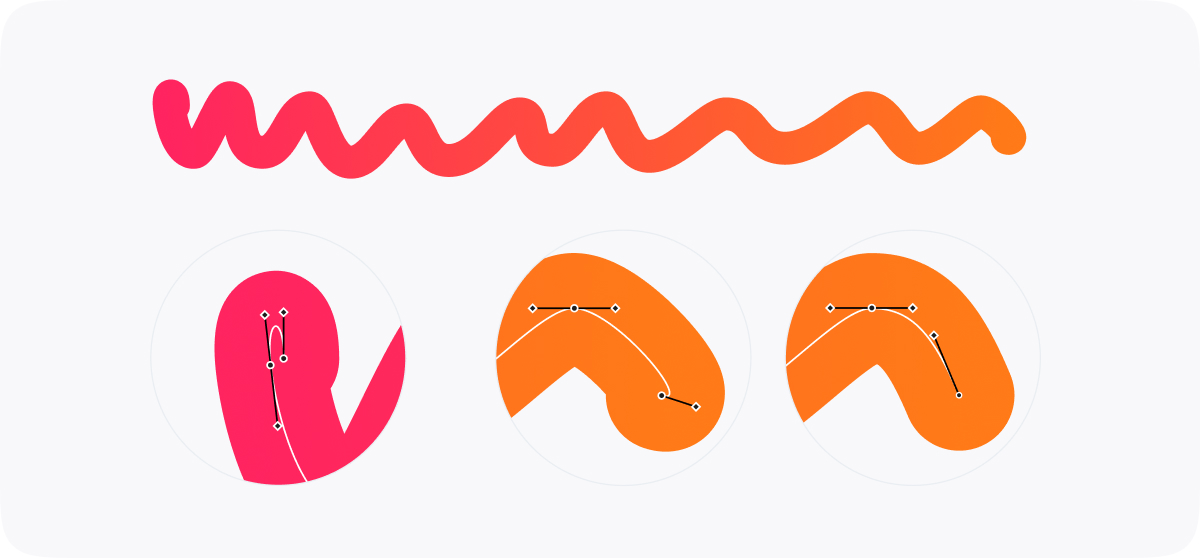
Let’s look closer at the playful, artistic, and cheering graphics created for the Magma Math website. In the early stages of discussing the website design and visual style approach, the client team shared that they loved the idea of integrating some graphic elements of handwritten style, reminding scribbles, squiggles, doodles, handwritten maths symbols, characters, imperfect lines, arrows, brackets, and other kind of stuff teachers and students daily see and do in the process of educational activities. So, the design team transformed the idea into the whole design system of graphic elements, which were easy to adapt and integrate into any web page section, which you could easily spot on the web pages presented above.
The graphic elements of this kind added the element of playfulness and emotionality to the web layouts. Also, they supported the general idea behind the brand name: the graphics found across the web pages worked as splashes of educational magma produced by the platform continuously, igniting the flashes of modern, effective, and positively built educational processes and eureka moments. But beautification and emotional appeal aren’t their only functions. They also work effectively as directional cues, highlighters, or visual triggers and accents, drawing users’ attention to particular elements, sections, taglines, and keywords, making interaction even more intuitive and smooth.

One more funny way to use custom graphics of this kind was offered for the team page, where each team member’s image on hover got animated and showed a funny doodle on their photo and easily moved from serious and business-like images to cheerful and friendly ones.

The same style and design approach was stretched onto the extended set of custom icons created for various web design needs. Simple and straightforward, icons of this kind improve visual perception of the text blocks and interactive elements.
![]()
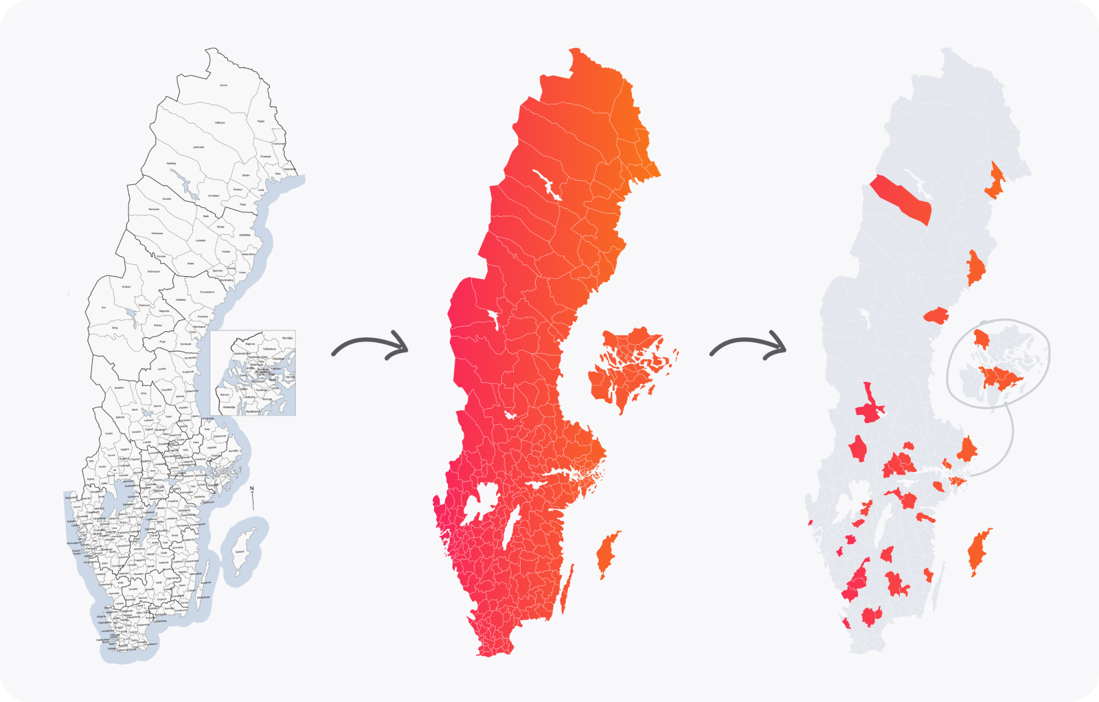
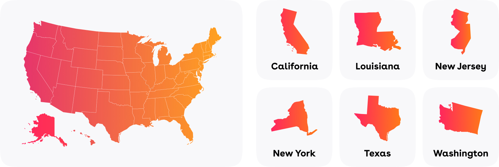
Another interesting task for the creative team in this project was working on interactive maps of Sweden and the USA, which had to reflect all the districts or states as interactive elements and color them in brand colors to feature the platform presence there.
Collaboration with Magma Math gave our team a precious experience of working with modern educational methods and technological advancements and participating in making this experience enhanced for all sides of the process: teachers, students, and the company that enables them to use the innovative platform.
Indeed, the best result was to see the website live and know that our work positively influenced the company’s processes and achievements, increasing traffic and amplifying the brand’s online presence, as it was mentioned in the client’s public review of our work on Clutch: “Tubik’s work on the new website has positively impacted an increase in traffic and inbound leads. A responsive partner, the team provides accurate timelines, is fast in addressing issues, and communicates effectively through Google Meet and Slack. The value for money they offer sets them apart. They’re very responsive, accurate in providing timelines, and good at keeping their promises.”
New design case studies from our team are coming soon. Stay tuned!
More Design Case Studies
Here’s a set of more case studies sharing the design solutions and approaches for some of the design projects done by the Tubik team.
HotelCard. Brand Identity for Hotel Offers Service
Nova Post Advent Calendar. UI/UX Design and Christmas 3D Art
Nibble Health. Identity and UX Design for Healthcare Fintech Service
Physica Magazine. Web Design and Graphics for Scientific Blog
CSConnect. Website Design for Immersive Experience Marketing Platform
Ready Set Recover. Web Design and Illustrations for Surgery Recovery Platform
ProAgenda. Identity and Website Design for Golf Management Service
BlockStock. Brand Identity and Website for Minecraft Models Resource
Kaiten. Identity and Product Design for Food Marketplace
THT. Website Design for Electrical Engineering Service