Getting a helping hand at the most challenging periods of life is crucial to go against all the odds and recover, and that’s the idea behind one of the projects we had a chance to work on. Let us give you a glance at the website design and a set of illustrations our team created for Ready Set Recover, a supportive online program empowering people to prepare for and recover from surgery with less stress and, therefore, faster and more effective recovery.
Client and Project
Ready Set Recover is a groundbreaking online program that supports people who have to experience surgery, from the preparation to the recovery, so that to help them go through is better and faster. Facing surgery, a person also meets the need to become an active participant in their own health, and this service becomes a caring and supportive friend on the way. Ready Set Recover’s team combined the gold standards of stress reduction and cognitive behavioral therapy with the specific challenges of surgery to create a framework of action that leads to incredible results. The program complements the medical side of surgery by empowering a person to take control of the “human” side, things that patients may miss thinking about. Still, they make a big difference in the recovery.
The story of this product started from the personal experience of its founder’s experience, Heather Campbell. She had to go through the surgery and realized the importance of actual, appropriate, friendly, and relevant support, including the preparation stage, much earlier than the actual surgery takes place. Having considered the lack of such a program and the reality that plenty of people just suffer through this kind of experience alone, she asked herself the question that determined the future of Ready Set Recover: “With millions of people having surgery every year, how could there be nothing out there to help them during one of the most critical times in their lives?” So, she accumulated all the knowledge and experience into an email program guiding people through that hard stage of their lives to better and healthier days. The feedback was so active and positive that she took a further step and brought in a dedicated, mission-driven team to turn the email project into a fully-featured, interactive program specifically designed to provide the help for others she wished existed when she needed it.
The team approached tubik with the request for an informative and easy-to-use website design that would make the user experience solid, intuitive, and supportive. What’s more, it was important to employ design power to make the platform emotional and set an optimistic mood, and the visual performance had to distinguish the website from the diversity of medical platforms, as Ready Set Recover is a support program rather than a healthcare or medical product. That was the design case when the client had a clear vision and deep understanding of the product and the audience that would use it and participated in all the creative process steps.
The creative team from the tubik side included Anastasia Zhyltzova, Yaroslava Yatsuba, and Anastasiia Iliashevych.
Web Design
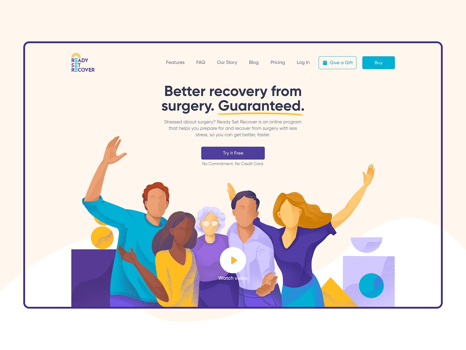
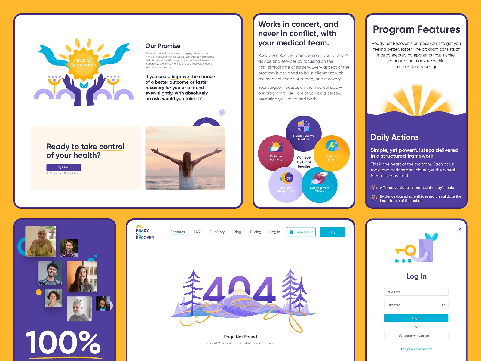
The web design is built around a balance of easy-to-reach and well-arranged information and encouraging emotional appeal, sharing the vibes of friendly support and belief in a better future for everyone undergoing surgery. The former aspect is reached via a solid visual hierarchy of the pages, thoughtful content organization, different ways of data visualization, and intuitive navigation with clear CTA elements. And the aspect of emotional and aesthetic appeal is supported by an extensive and diverse bunch of eye-pleasing illustrations and a color palette. The airy pastel layout with light background on most pages and highly readable typography makes the content easily scanned and skimmed. At the same time, bright color accents help quickly find essential elements on the page. The sticky header makes all core navigation reachable from any point of interaction. Here’s a glance at the hero section of the home page, with a bright and cheerful hero illustration, tagline, and short description readable in split seconds, and an immediately noticed CTA button.
The features page uses the technique of contrasting color backgrounds to visually separate different sections and applies the checklist to visualize various features and benefits of the program. Screenshots of some screens make the page demonstrative, and custom graphics effectively support the text blocks, clarify the information and contribute to the emotional part.
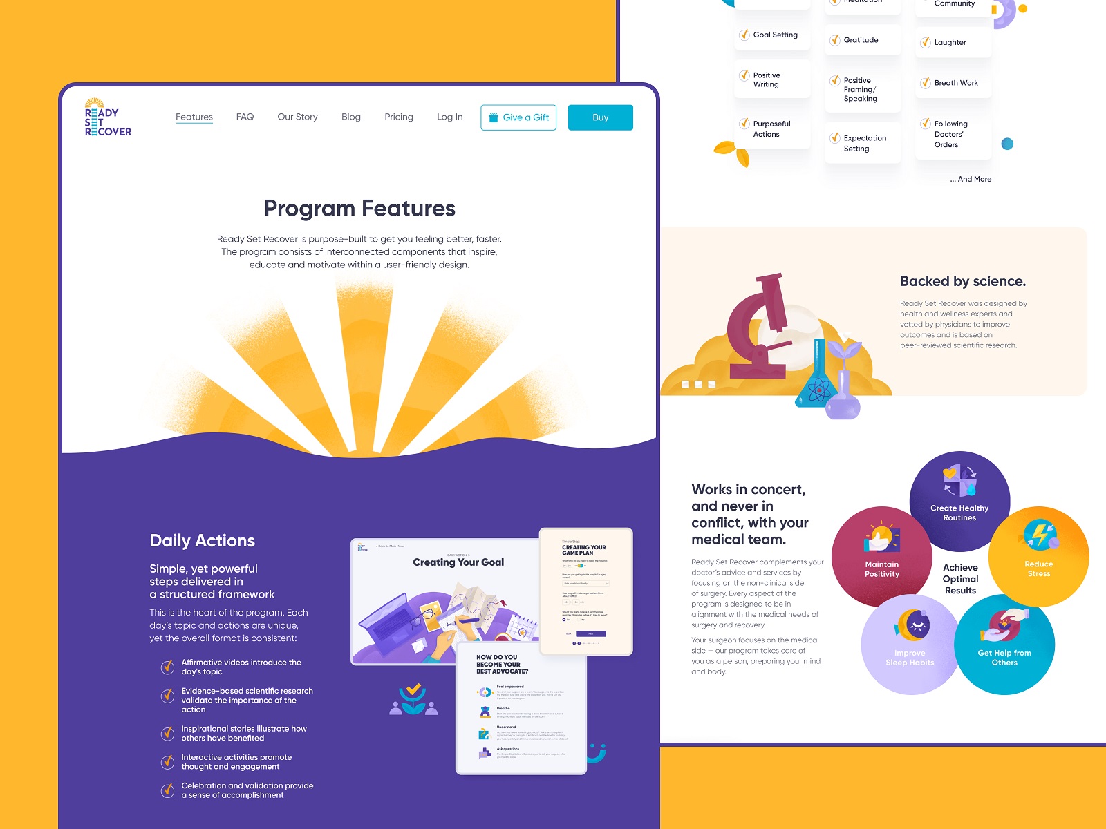
Graphics and illustrations of different kinds and complexity are seamlessly integrated into the pages, making the whole user experience feel united and smooth, as well as making the points and pages more memorable and appealing due to bright visual details. The illustrations also support an element of gamification, for example, marking users’ achievements and celebrating their progress.
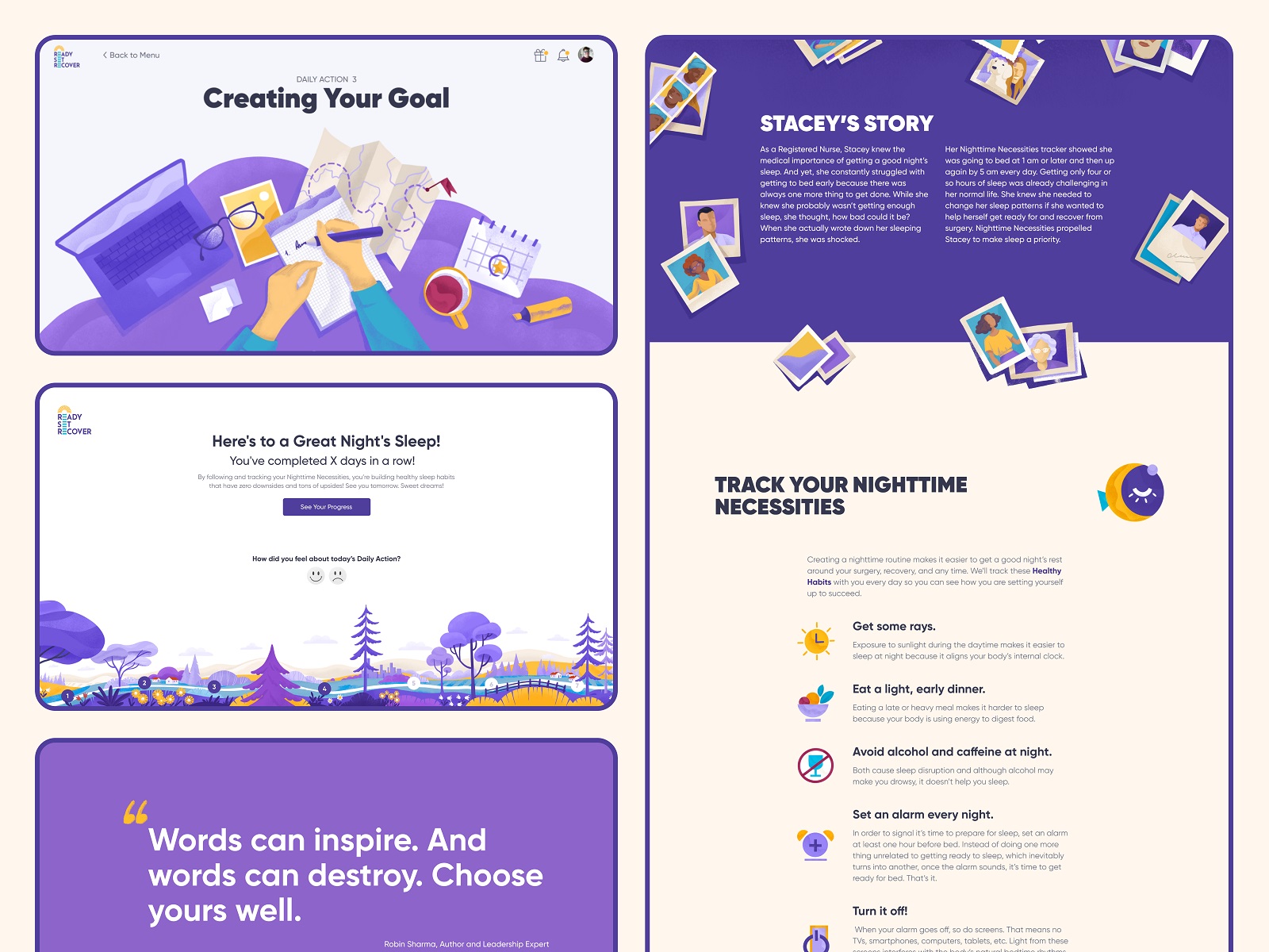
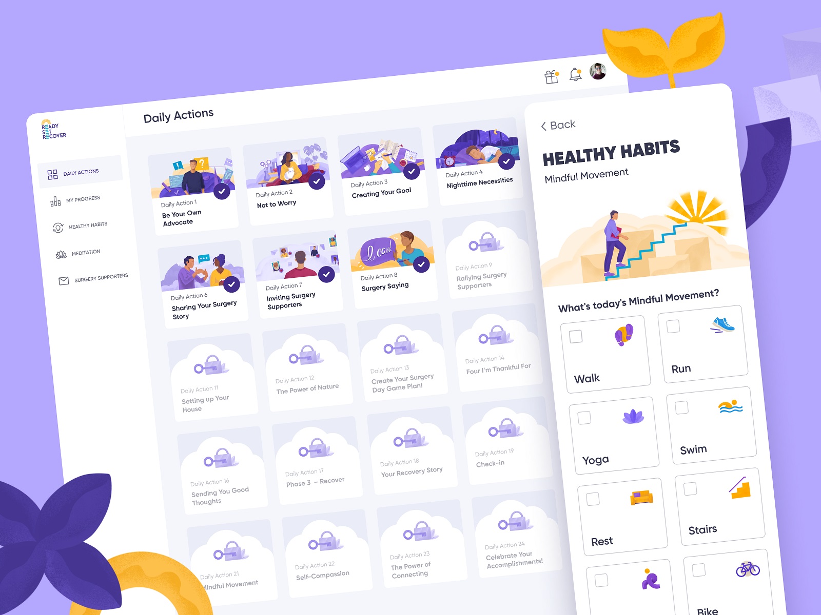
And here’s what a Daily Action page looks like, functional and straightforward. Day by day, the user unlocks one Daily Action, and it gets a colorful illustrated title image, while the Healthy Habit functionality helps to track and mark the little things that make a significant impact on self-care and physical and mental support.
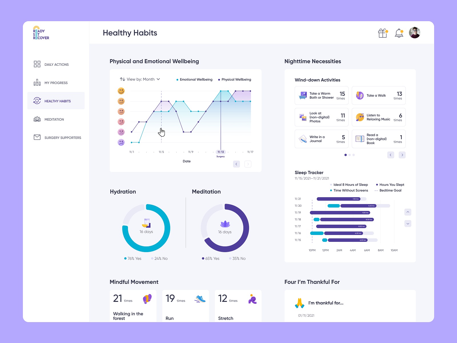
The Healthy Habits screen provides the users with stats that allow for keeping track of many essential everyday details and help the users be consistent and encouraged.
Here’s a brief glance at the thorough website adaptation to mobile and tablet, which lets it stay functional and look beautiful on any device that is convenient for the program users.
Indeed, the above is only a part of the extensive range of diverse tasks done for the project, just to briefly introduce the design approach and major solutions, so you can see more on the live website of Ready Set Recover.
Illustrations
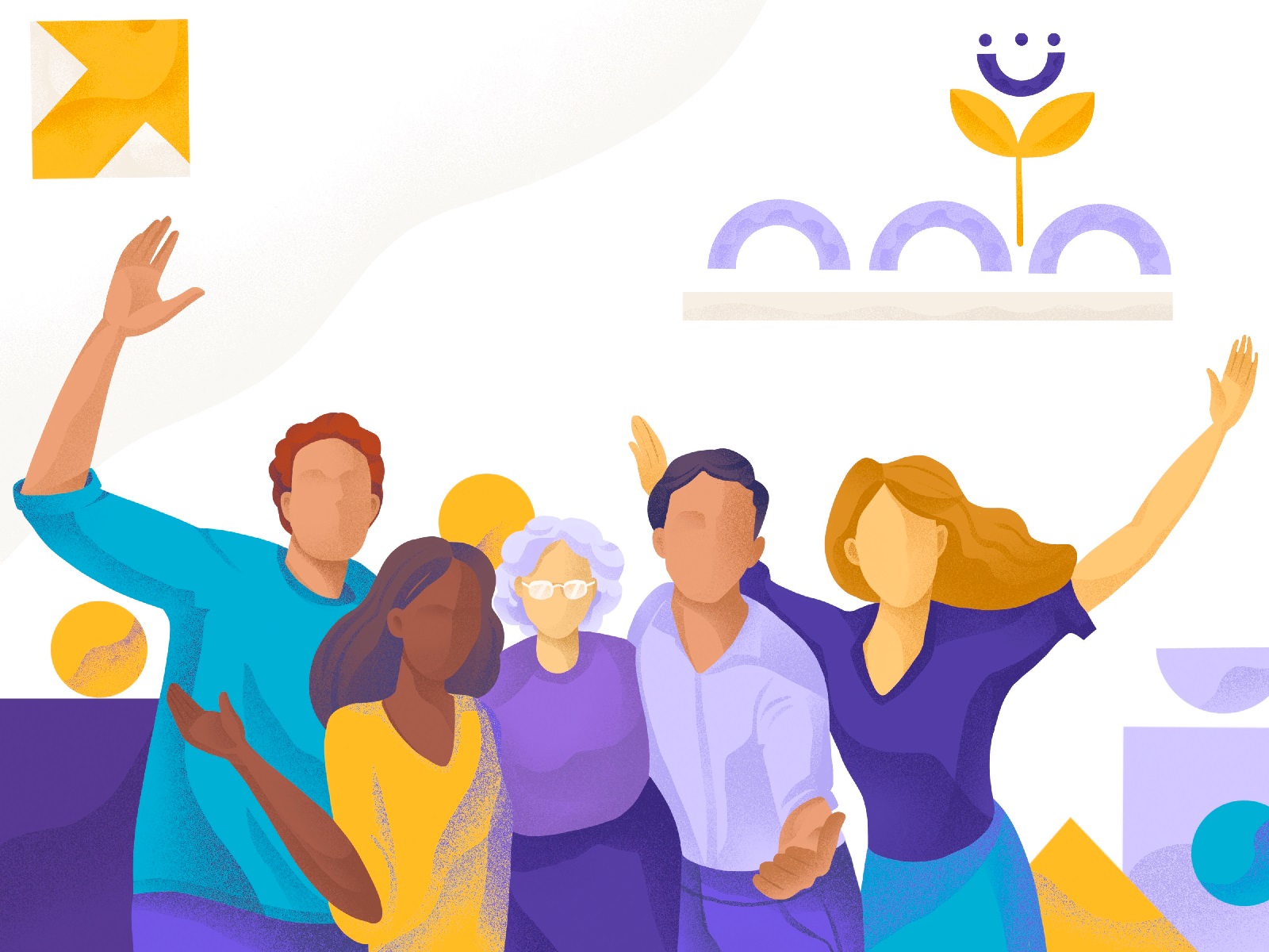
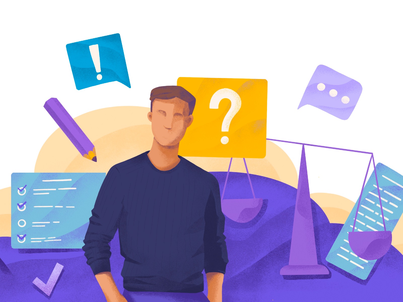
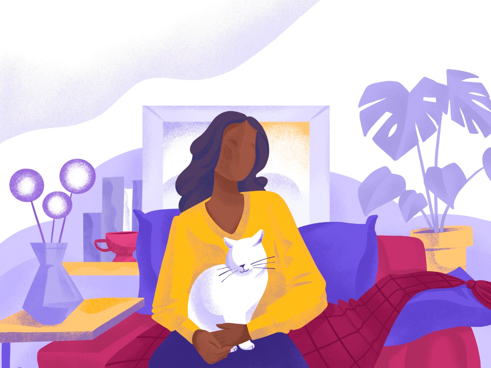
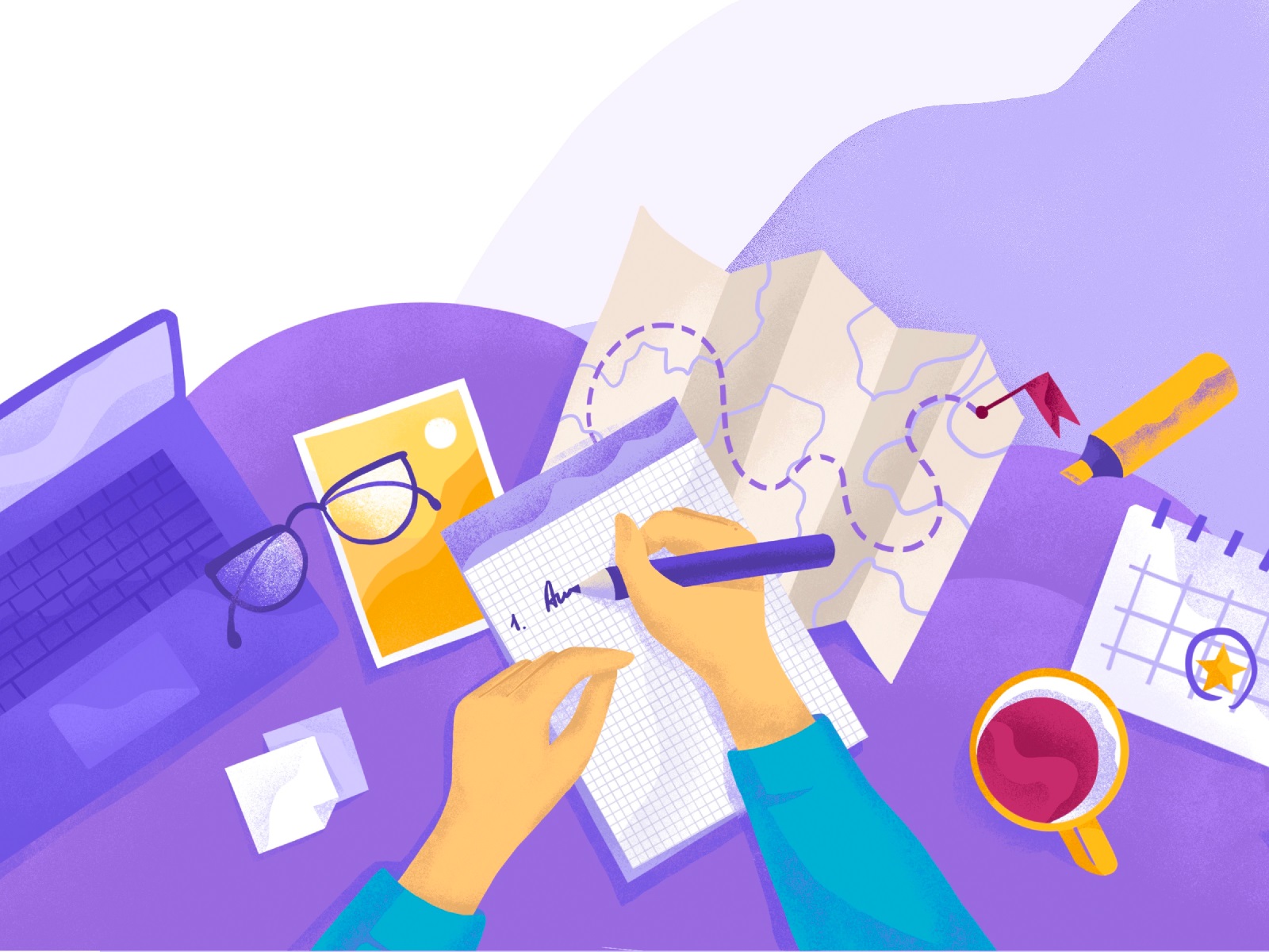
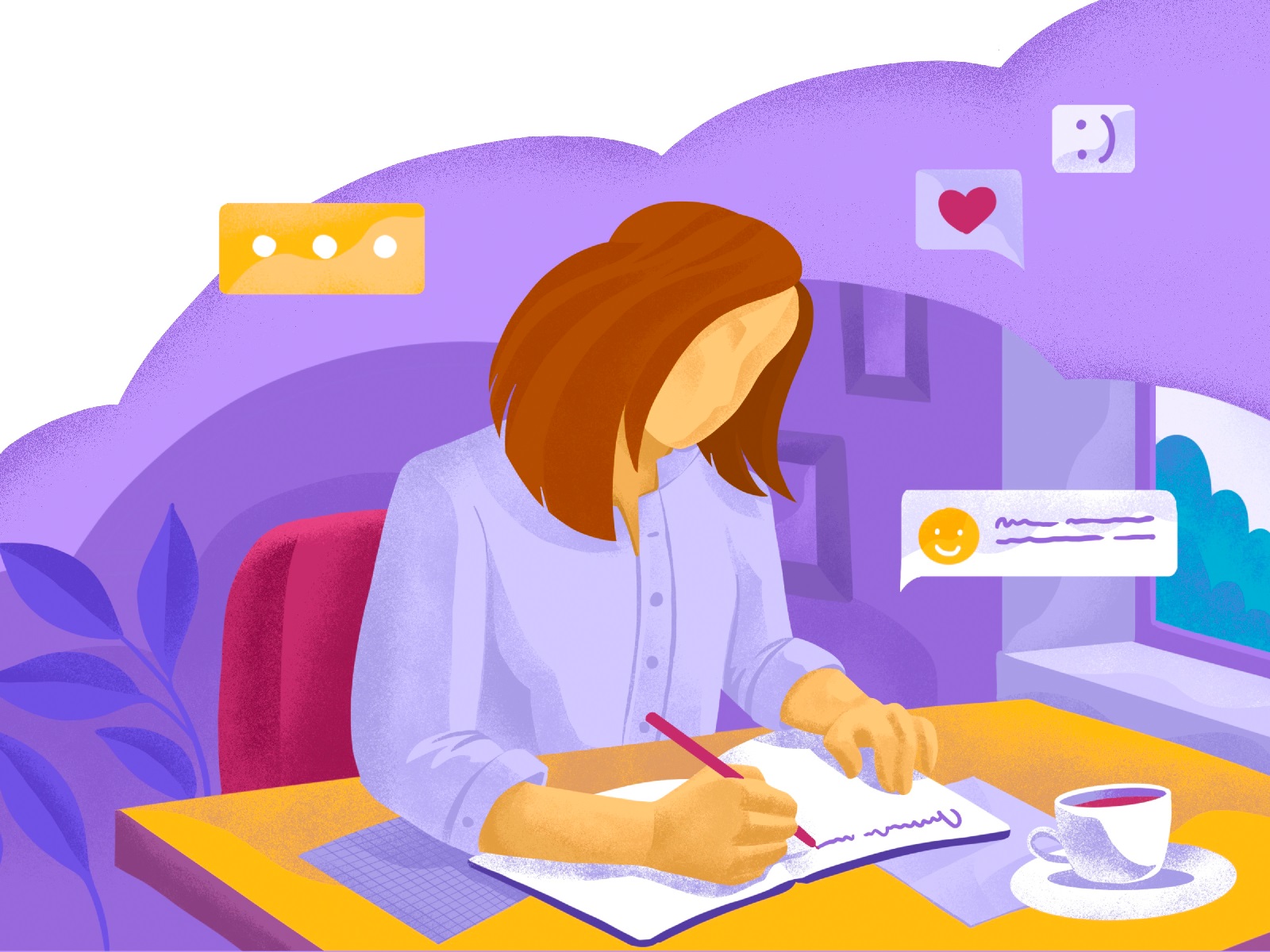
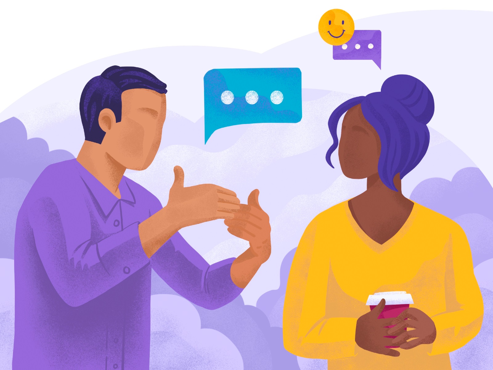
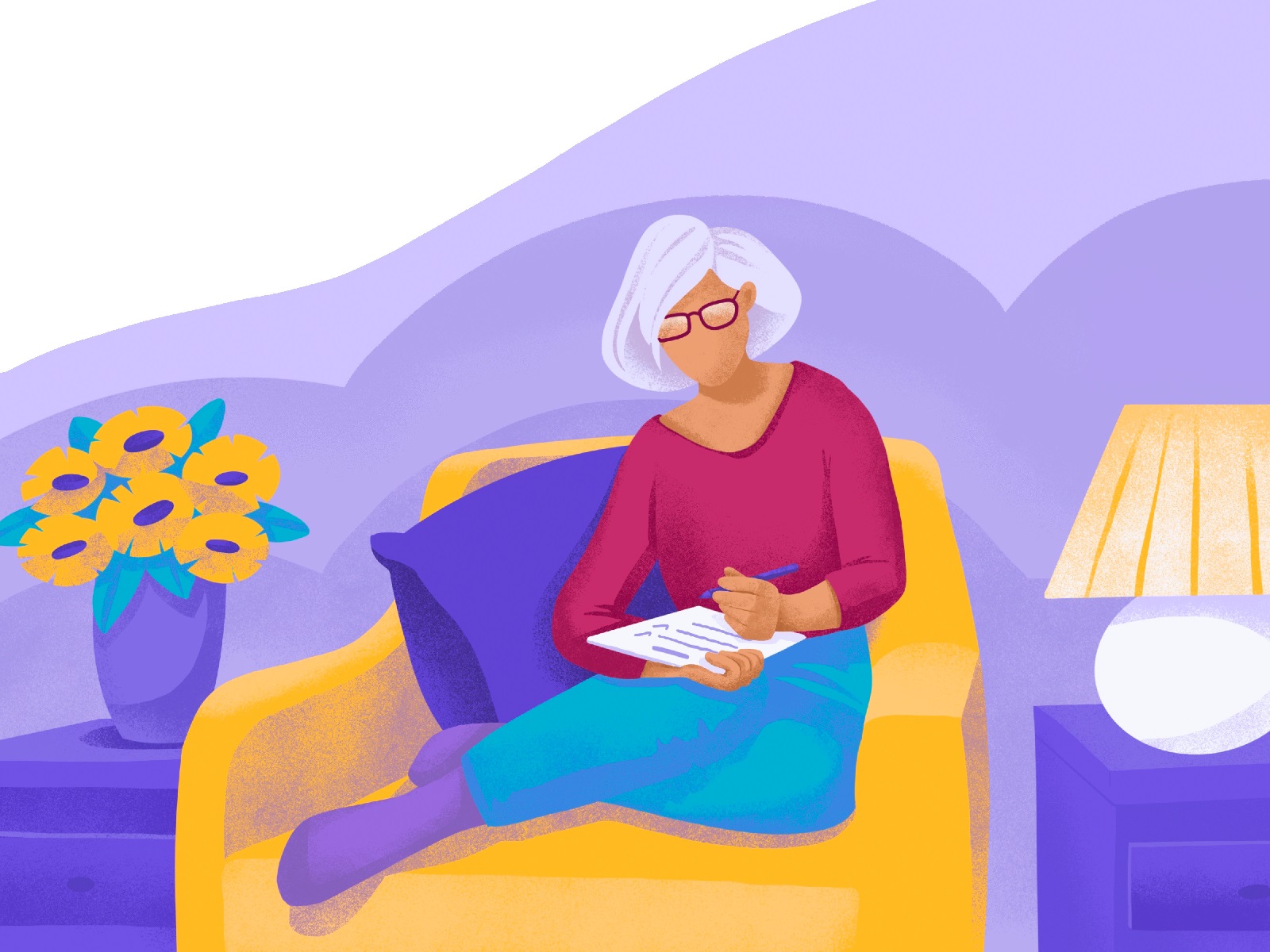
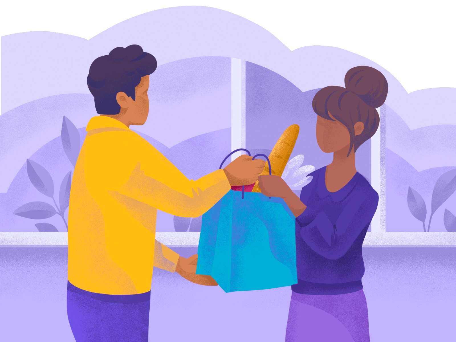
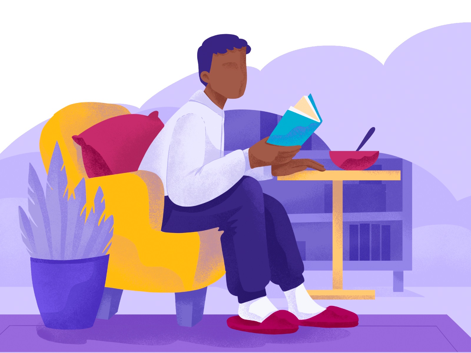
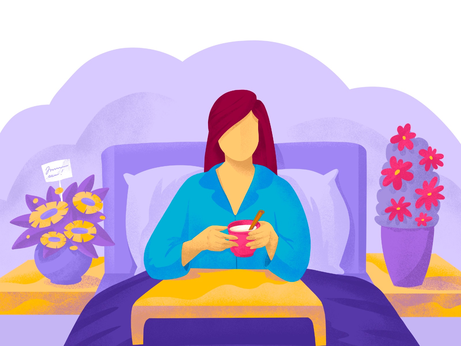
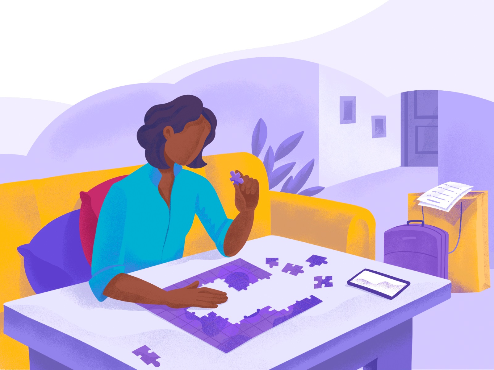
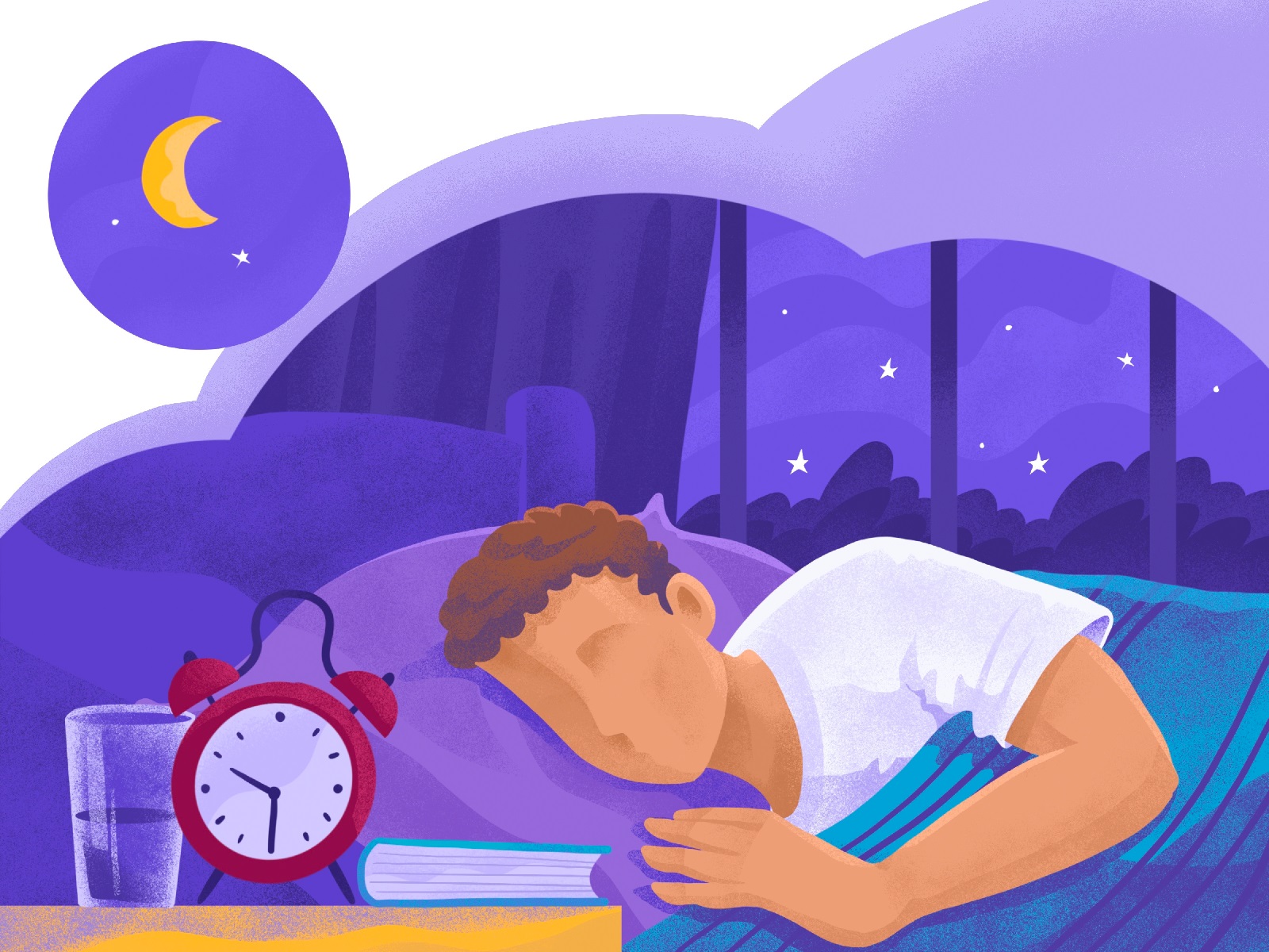
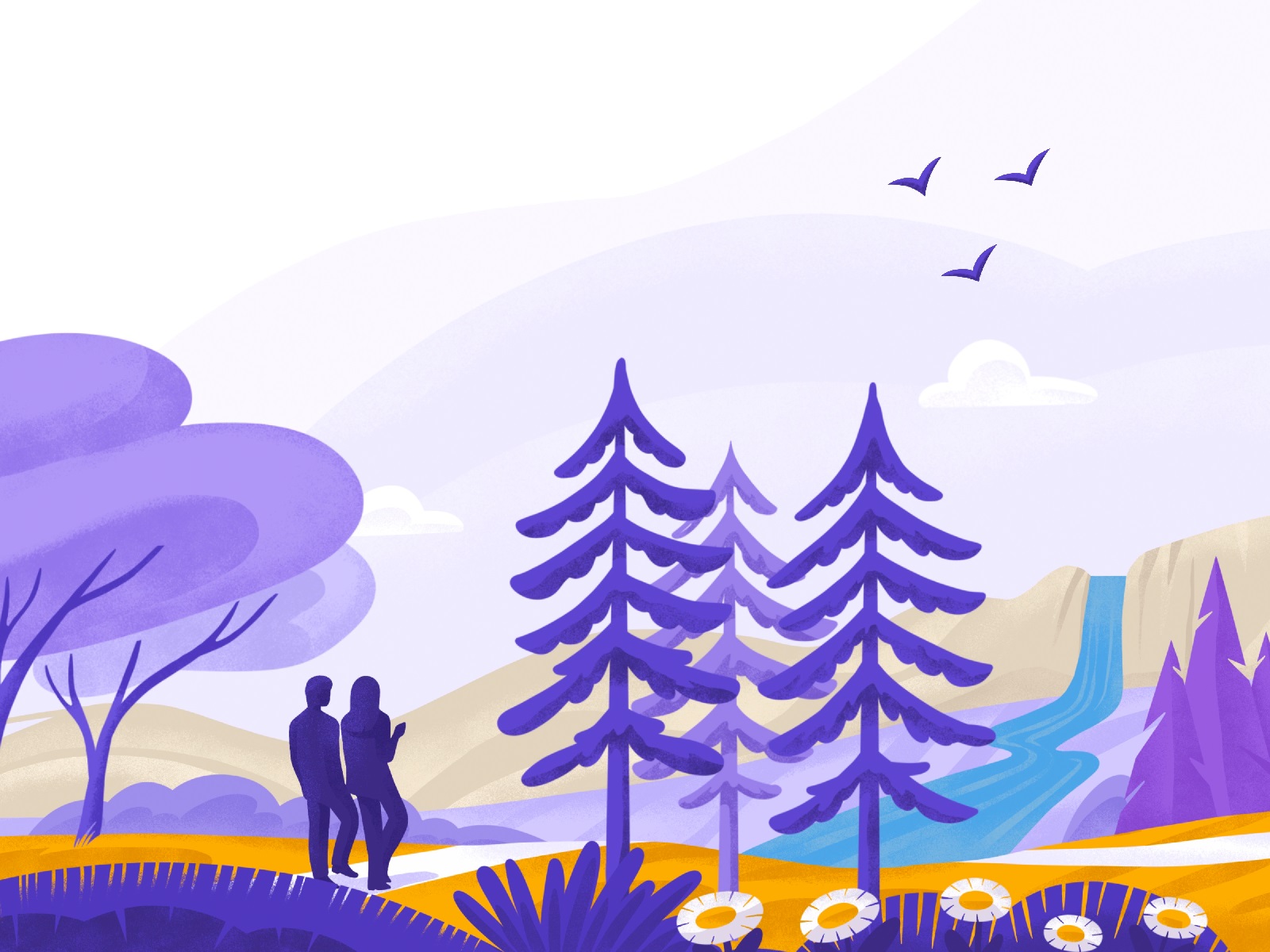
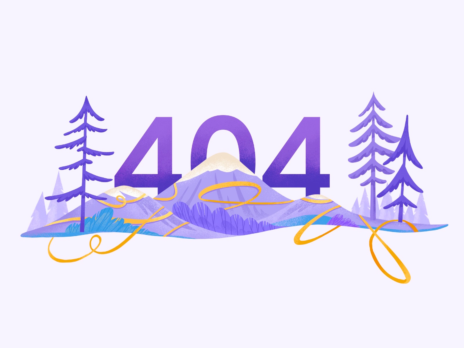
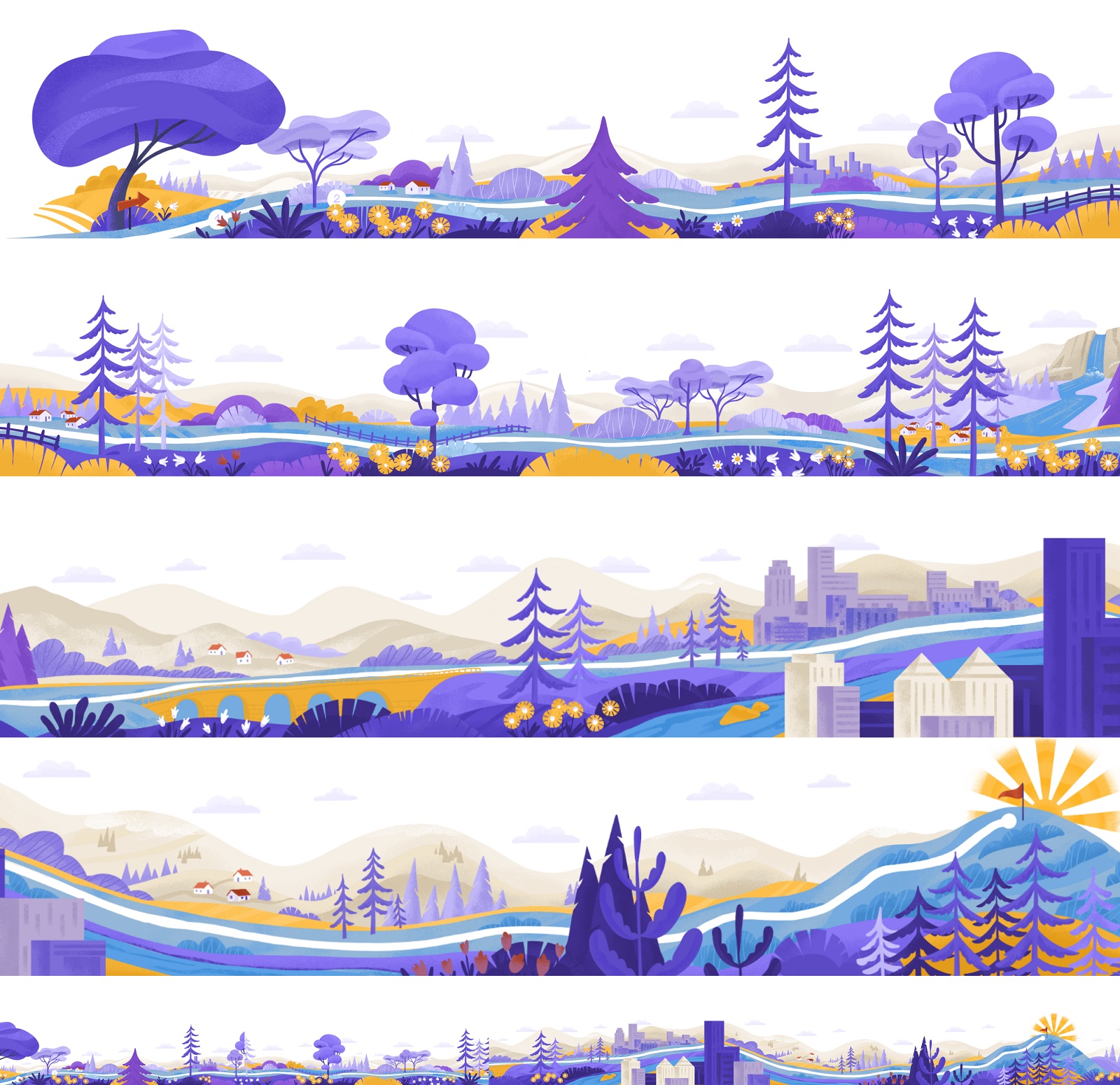
Another important task for the project was to create a consistent set of original illustrations that would become a foundation of visual storytelling and support both the general message of the program and specific parts of it. Also, the pictures add a powerful human element to the brand’s communication with the users, as most feature people characters.
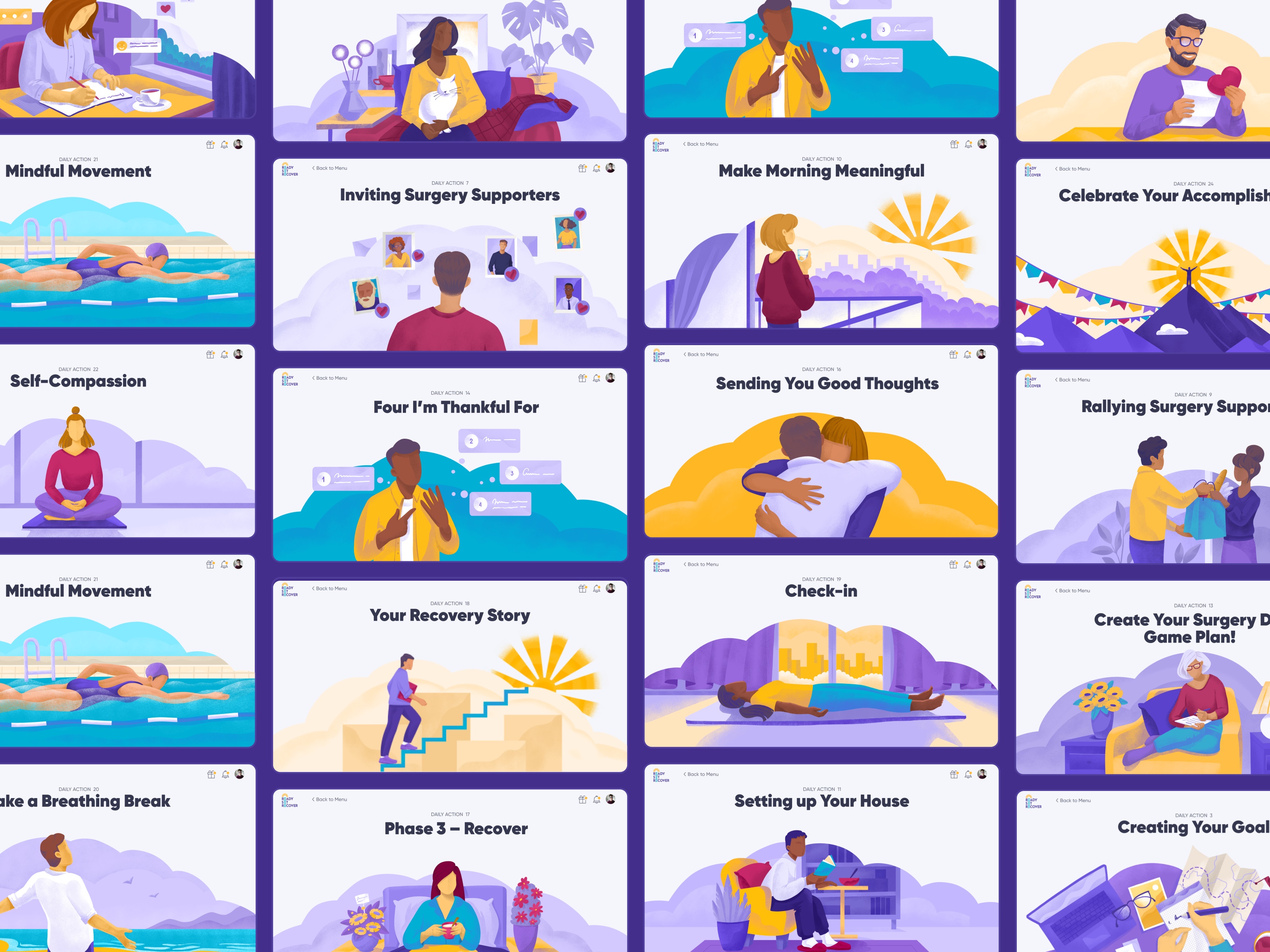
Let’s take a closer glance at some of the artworks created to illustrate the features and Daily Actions of the program and doing a great job in visualizing different stages of preparation, surgery, and recovery process.

New design case studies from our team are coming soon. Stay tuned!
More Design Case Studies
Here’s a set of more case studies sharing the design solutions and approaches for some of the design projects done by the Tubik team.
Nibble Health. Identity and UX Design for Healthcare Fintech Service
ProAgenda. Identity and Website Design for Golf Management Service
BlockStock. Brand Identity and Website for Minecraft Models Resource
Kaiten. Identity and Product Design for Food Marketplace
THT. Website Design for Electrical Engineering Service
Komuso. Website Design for Wellness Tool
Nonconventional Show. Website Design for Podcast
Fulfill. Illustrations and Web Design for 3PLs Marketplace
Glup. Delivery App Branding and UX Design
BEGG. Brand Packaging and Web Design for Food Product Ecommerce
Crezco. Brand Identity and UI/UX Design for Fintech Service
FarmSense. Identity and Web Design for Agricultural Technology
Carricare. Identity and UX Design for Safe Delivery Service
The graphic content in our articles is the object of copyright, belongs to its legal owners, and cannot be used by the third side for any goals.