A new design case study is up, and this time it’s literally delicious and spiced with the timeless human love of food. Welcome to check the creative story behind brand identity design and product design for Kaiten, the place where food makers and food lovers meet to enjoy the art of tasty life.
Project and Client
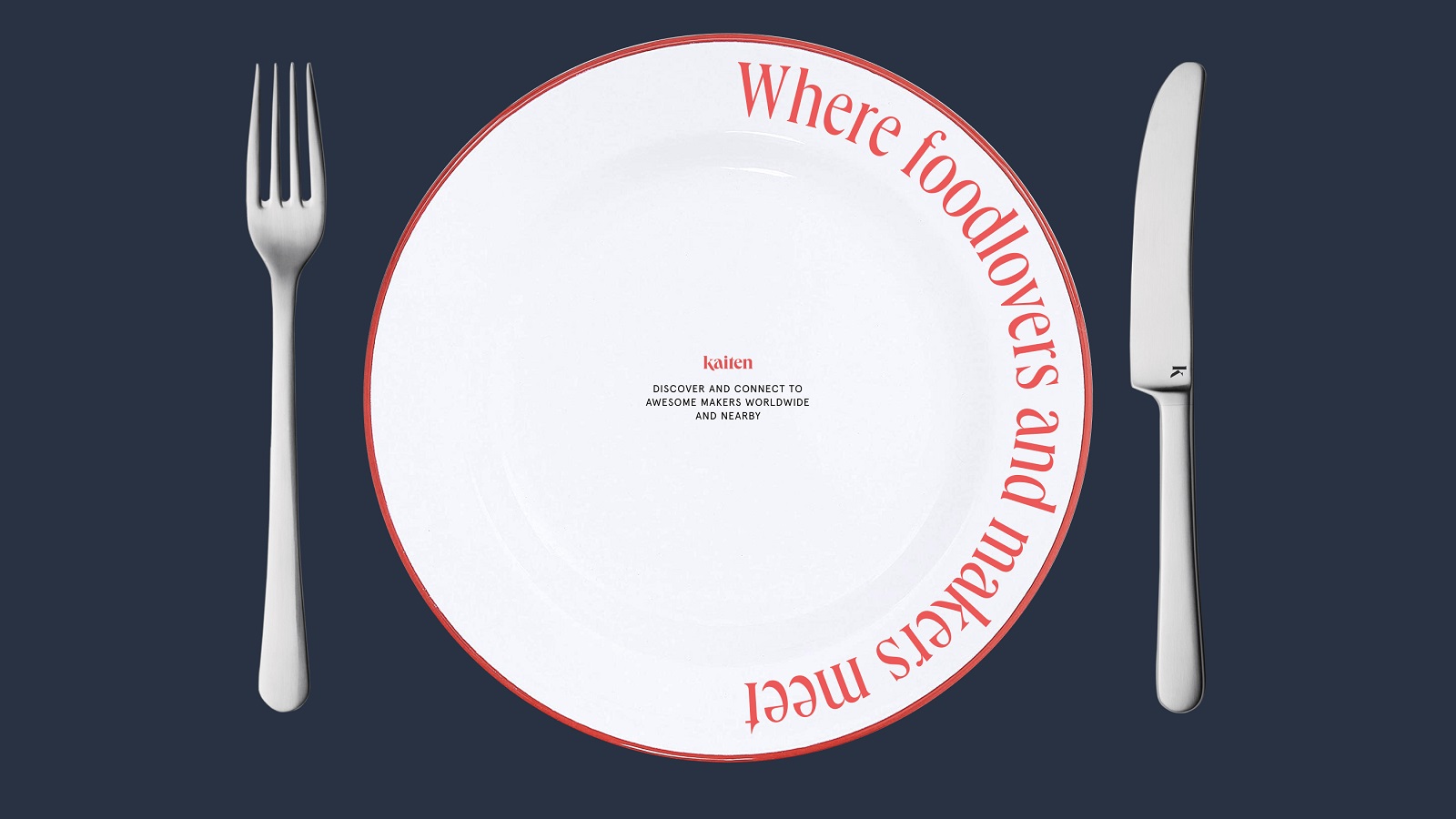
Kaiten is an online marketplace that connects food lovers and food makers. It achieves this objective by helping makers tell the stories behind their craft and setting shortcuts to enjoy their products for food lovers. The primary goal behind the project is to connect makers of great food and beverage products everywhere with people who appreciate them anywhere. Driven by the idea that food and beverage are living art that brings the world together, the creator of Kaiten believed that the makers of this industry deserve a better and more equitable stage and a better connection with their customers and strived to set it so that the makers of food and beverage should meet their customers in more ways and more places. The marketplace aimed to cover quite a diverse audience and become a spot where food and beverage makers (restaurants, chefs, mixologists, bakers, farmers, etc.) could share stories about themselves, their products, and their philosophy for people who love the culinary world to explore and be able to buy or join in.
The client approached the tubik team with a range of design tasks: we worked on creating a solid and flexible identity for the diversity of marketing goals and channels, UI/UX design for the mobile application to make the marketplace user-friendly, easy-to-use, functional, consistent, and attractive, and website design to support and enhance its online presence.
From the tubik side, the creative team for the project included Ernest Asanov, Ivan Shvindin, Yulia Kobzar, Roma Chornyi, Andrey Drobovich, Kirill Erokhin, Olya Zakharyan, Natalka Mamchur, and Olga Syrotkina.
Design Process and Solutions
Having deeply researched and analyzed the market segment and the target audience, the creative team developed several significant points to keep up with Kaiten’s identity:
- warm palette and clean colors
- expressive and functional color contrast
- emphasized visual accents
- bold pattern
- traditional typography with a high readability level, pairing serif and sans serif fonts
- photo content as the primary type of visuals
- merging typographic and photo elements
The logo designed for Kaiten is an elegant, recognizable, and readable wordmark, flexible to be used in both online and offline environments for different marketing and advertising objectives.
![]()
The color palette is inspired by the food itself to make the visual design approach look natural and tasty, eye-pleasing and mouthwatering.
Another essential and original element of Kaiten’s brand identity is a set of abstract graphic patterns, also inspired by the art of food and drinks: looking closer, you’ll see there a slice of fresh bread, a bowl of veggies or fruit, a piece of tasty meat or fish, all united into a kaleidoscope of delicious life.
The brand identity design had to effectively cover both digital and traditional real-life environments where the marketplace could reach its audience as the brand uses digital scape and technologies to set the connections between food lovers and food makers. So, it was important to consider how to make the visual design work effectively and consistently in indoor and outdoor advertising, on the website and mobile application, in social media communication, and in other brand communication channels.
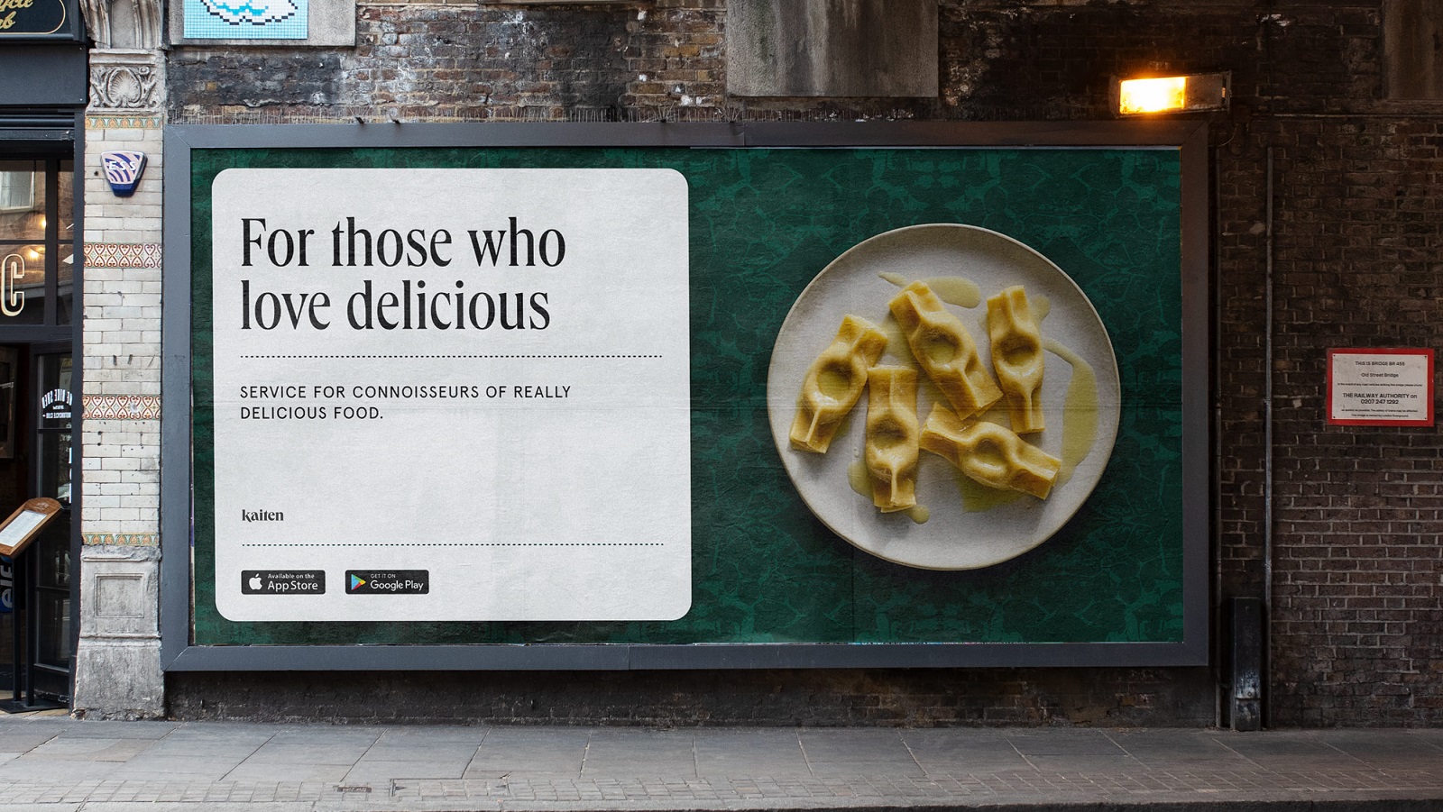
Outdoor advertising billboard design
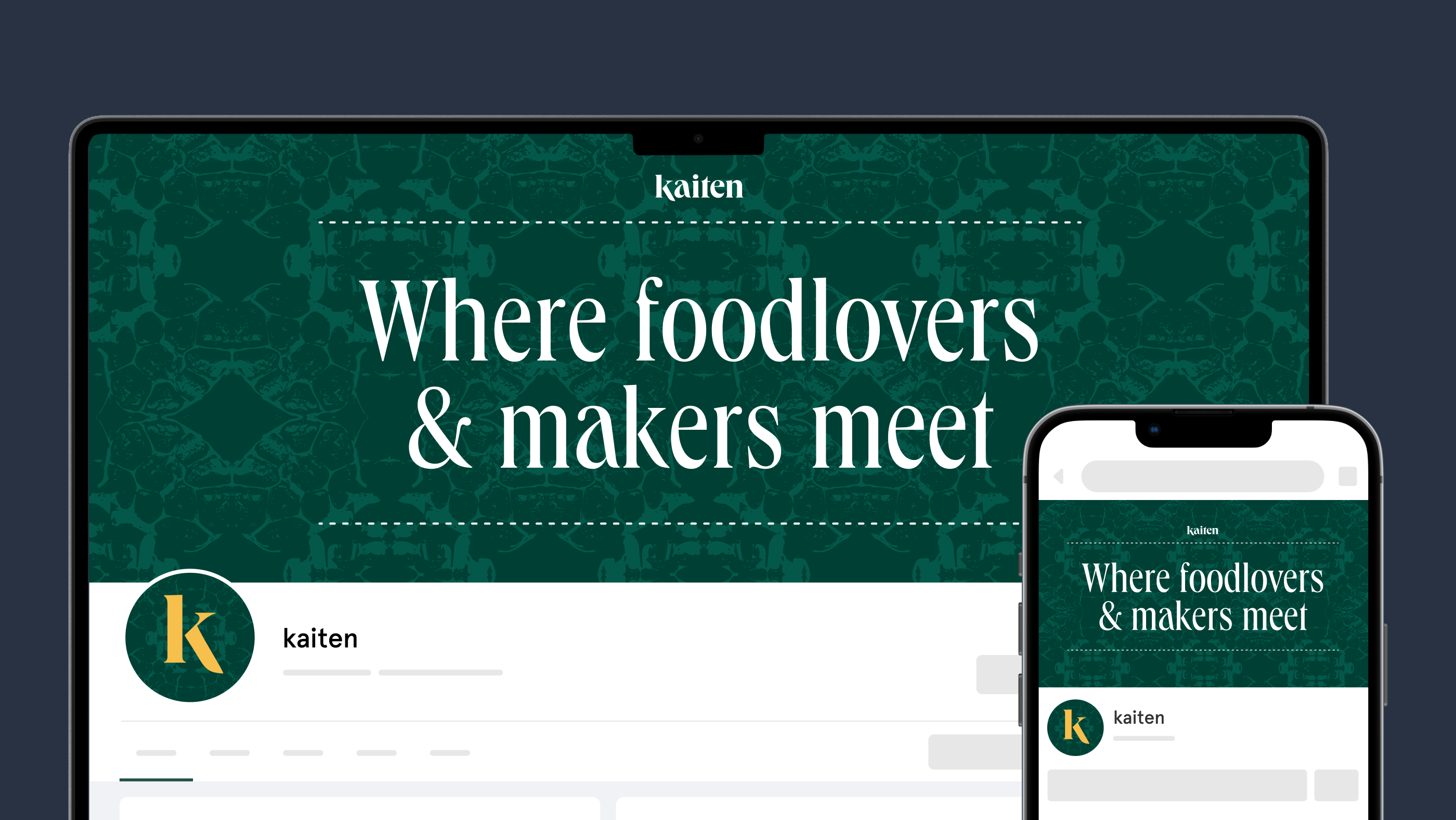
Social media page header image and avatar design
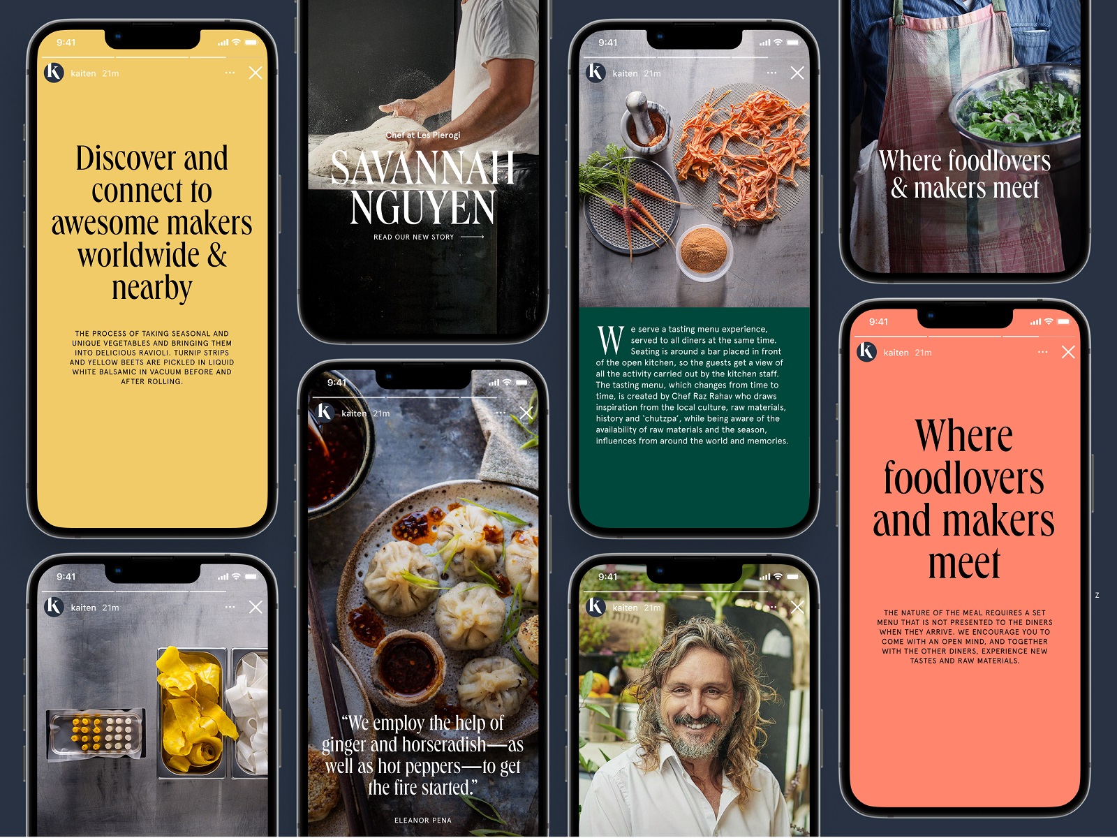
Social media posts templates
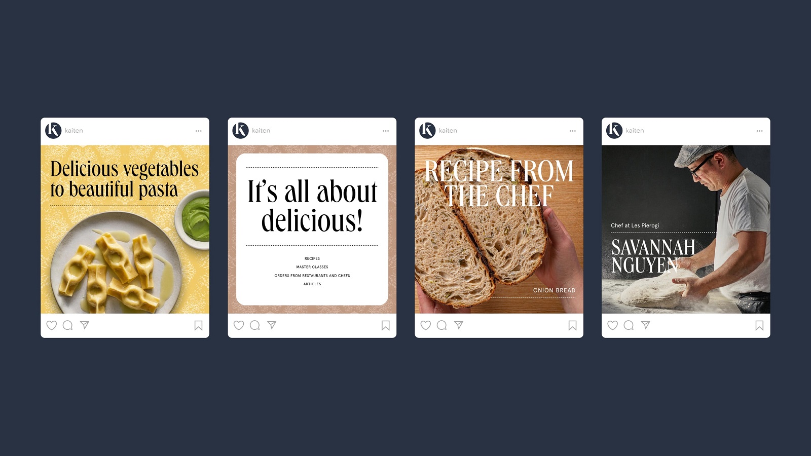
Social media posting design ideas
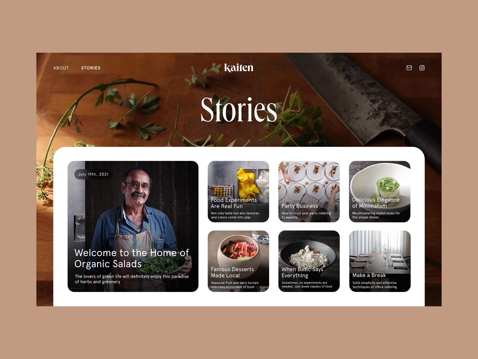
Mobile application echoes the identity design approach, putting functionality, elegance, and intuitiveness as major features. The screens are atmospheric and quickly set the emotional connection due to photo and video content taking up most of the space. At the same time, they are easily scannable and readable as the text content is present on background tabs with well-tested contrast allowing for comfortable reading in different environments or on the go. Tags and extended search help users quickly navigate and find what they want. The tab bar with neat minimalistic icons echoes the same rounded shape of tag buttons and the search field and uses only a part of the space at the bottom of the screen, keeping the feeling of an integral interaction experience and allowing the photo and text content to use more space and take up visually all the screen.
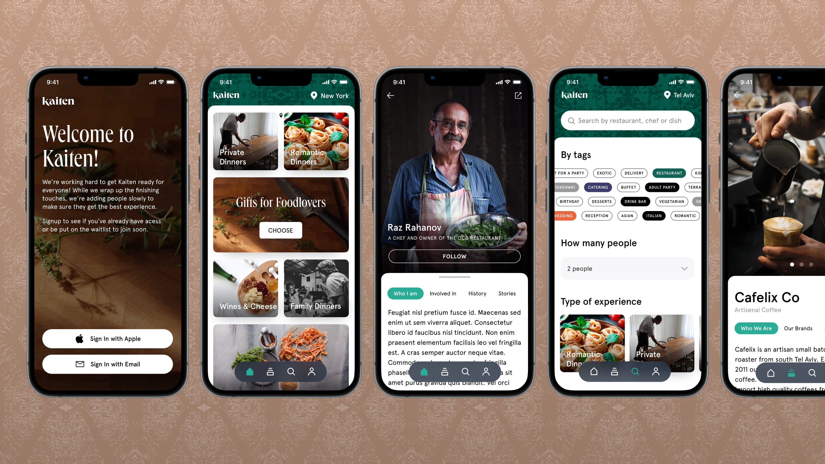
Here’s a look at the private beta mode landing page, inviting those interested to join the waitlist via the subscription form. The page follows the brand style and uses a full-screen background video to immediately set the mood and atmosphere and make the layout look deep and dynamic. The text part is presented on the light, airy tab to be easily read in split seconds.
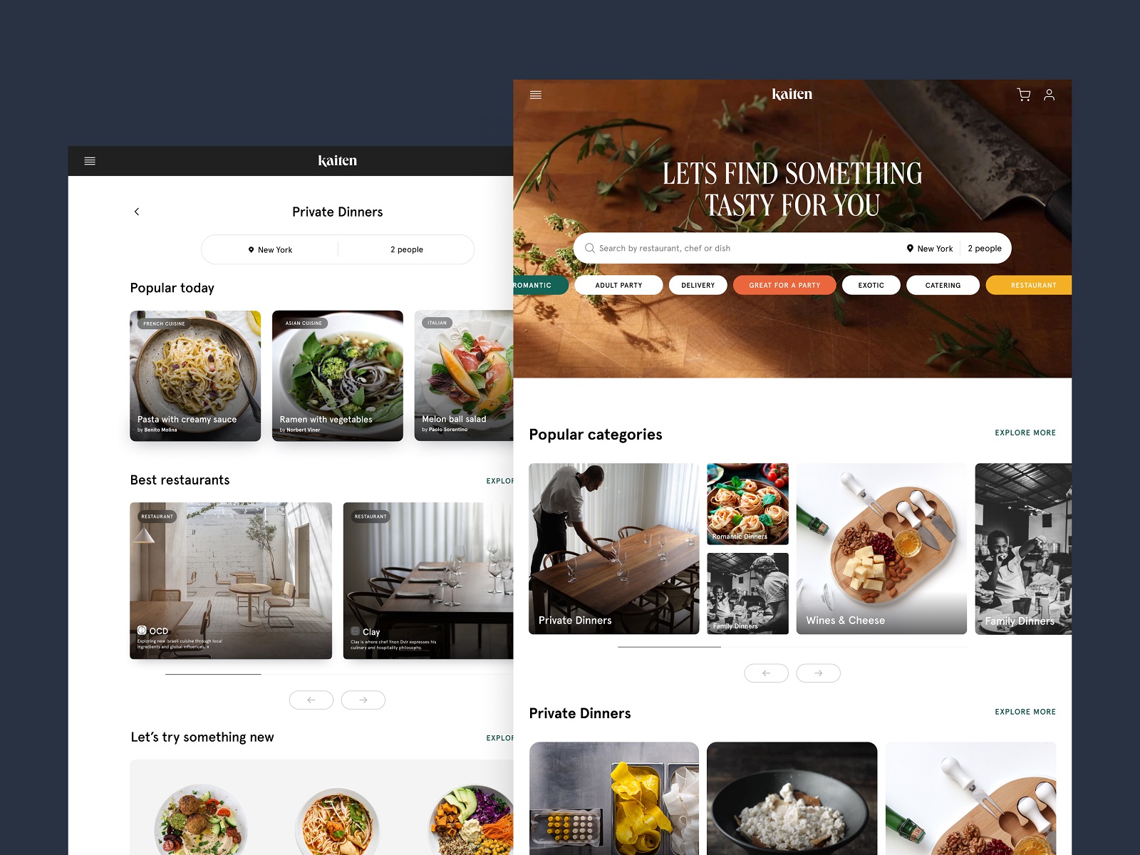
And here’s a glance at the website, neat and informative, with a smart grid and an adjustable search field allowing visitors to tune the search results according to location and number of people.
For our team, this project was a great case of developing the design for the range of brand communication tools and channels for the service that connects innovative digital experience and the eternal love for food and cooking humanity keeps through generations.
And sure, we were happy to get positive feedback from our client. “In Tubik’s team, we found a wealth of talent and disciplines that helped us take a lot of raw concepts, photography, and video into a full-fledged brand and digital presence. They helped us develop a brand and visual language that was distinct enough to stand out and represent us, but at the same time, was also versatile and let us create many different implementations under one roof. They remain a great partner that evolves with us and our products needs,” said Daniel Shein, CEO/Founder of Kaiten.
New design case studies from our team are coming soon. Stay tuned!
More Design Case Studies
Here’s a set of more case studies sharing the design solutions and approaches for some of the design projects done by the Tubik team.
Glup. Delivery App Branding and UX Design
THT. Website Design for Electrical Engineering Service
Komuso. Website Design for Wellness Tool
PointZero25. Identity and Website Design for Event Agency
Nonconventional Show. Website Design for Podcast
uMake. Branding and Website for 3D Design Tool
BEGG. Brand Packaging and Web Design for Food Product Ecommerce
Crezco. Brand Identity and UI/UX Design for Fintech Service
FarmSense. Identity and Web Design for Agricultural Technology
Carricare. Identity and UX Design for Safe Delivery Service