Welcome to glance at the design story filled with vibes of party fun and the hiss of beer cans opening. In this case study, we share the details of tubik collaboration with Heineken Mexico on brand identity design and mobile application design for Glup, a cool and functional delivery app.
Challenge and Client
To broaden its ways of reaching the audience and set an effective sales channel using mobile technology, Heineken Mexico strived to launch a mobile application that would allow users to buy beer and associated stuff like snacks, cups, and the like and get the orders delivered quickly. This is how the Glup application started.
The clients approached tubik team with a range of design tasks: we worked on logo audit and tweaks, extended brand identity development, delivery application UI/UX design from scratch, website design, and creating custom 3D icons and 3D illustrations for marketing and user experience objectives.
The creative team for the project from the tubik side included Sergii Valiukh, Sergii Kucherenko, Anastasiia Kutnia, Arthur Avakyan, Dmytro Kravchenko, Lada Kunitsa, Andriy Drobovich, and Kate Baikova.
Process
The creative process included two major directions: developing a flexible identity and consistent functional UX design for the application.
Brand Identity Design
Firstly, it was essential to work on powerful branding that would be effectively applied to both marketing goals and mobile interactions, providing the integrity of the customer experience.
The brand already had a logo, but it had to be enhanced to get a more attractive and trendy look appealing to the target audience and become more pliable for a variety of brand advertising and marketing objectives.
![]()
Original logo color variations
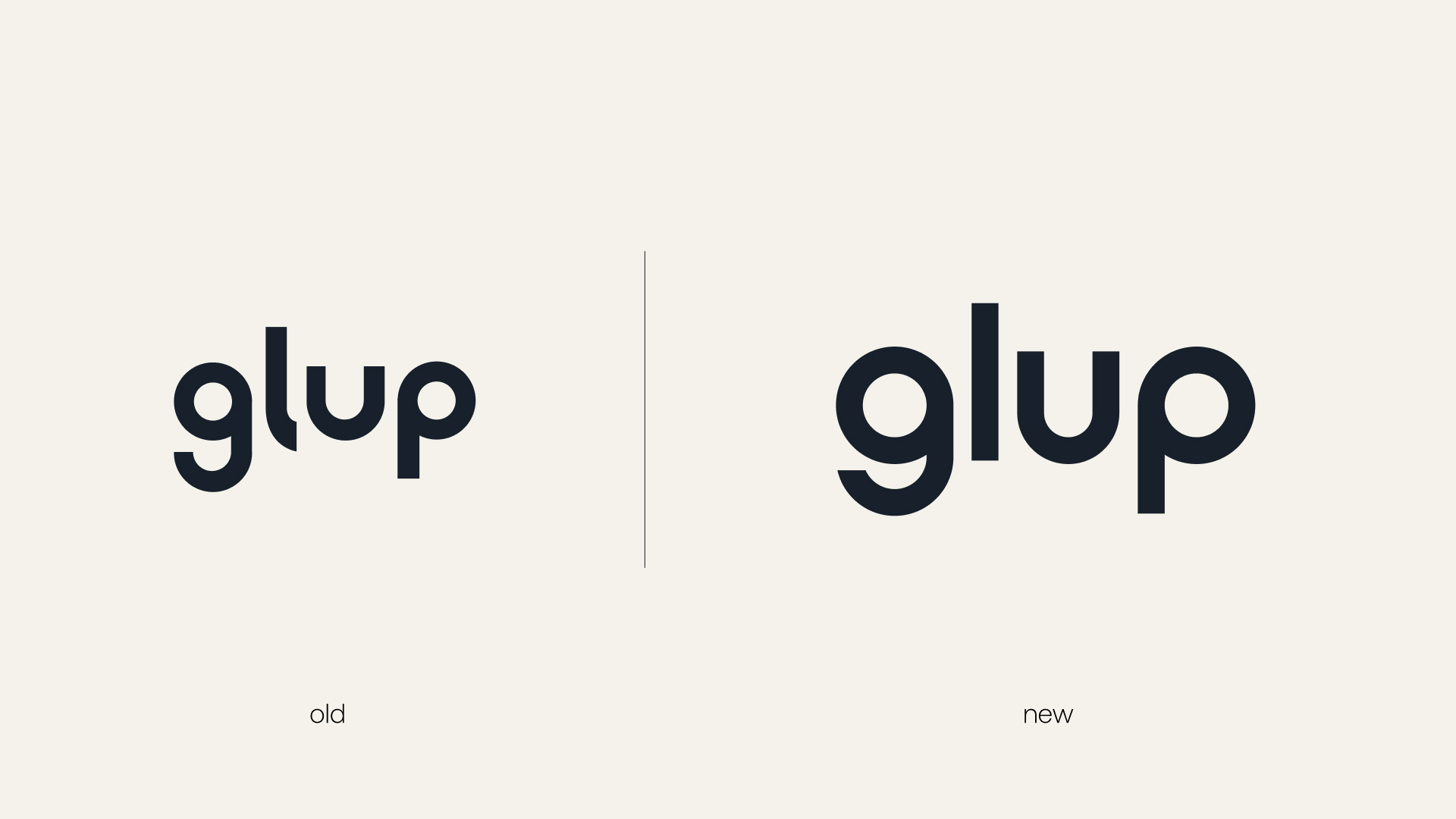
Glup logo redesign
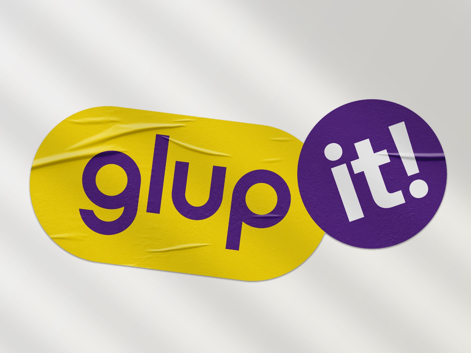
Certainly, the team took advantage of color power and its remarkable ability to set the needed mood in split seconds. The primary brand colors were yellow, setting the cheerful spirit and giving instant association to the beer theme, and deep purple, setting the effective contrast and playfulness and supporting the flexibility of the palette for the defined objectives. Also, an extended palette for different ways of product presentation was developed.
![]()
![]()
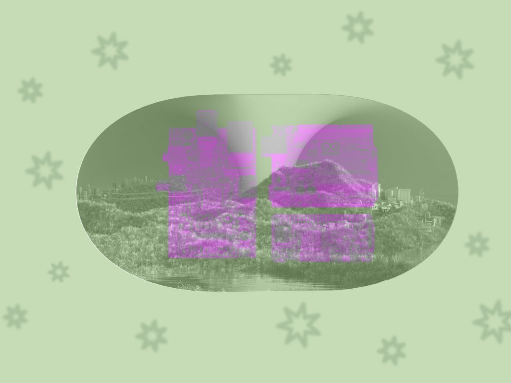
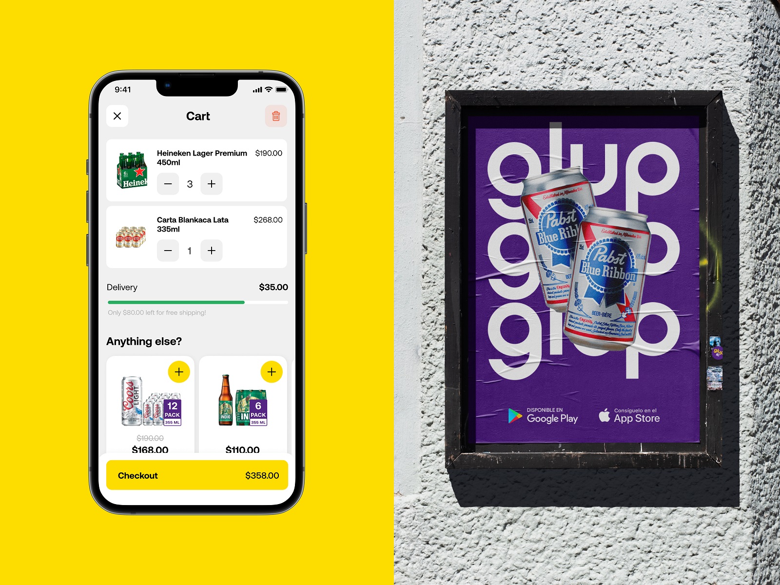
Another element of visual branding was the set of abstract geometric shapes to be consistently used across various branded items, advertising materials, delivery bags, social networking, and mobile application screens. What’s more, these shapes reflected the parts of the clock face setting a solid association with the speed of delivery as one of the key features. Take a look at the variety of branded items and advertising design.
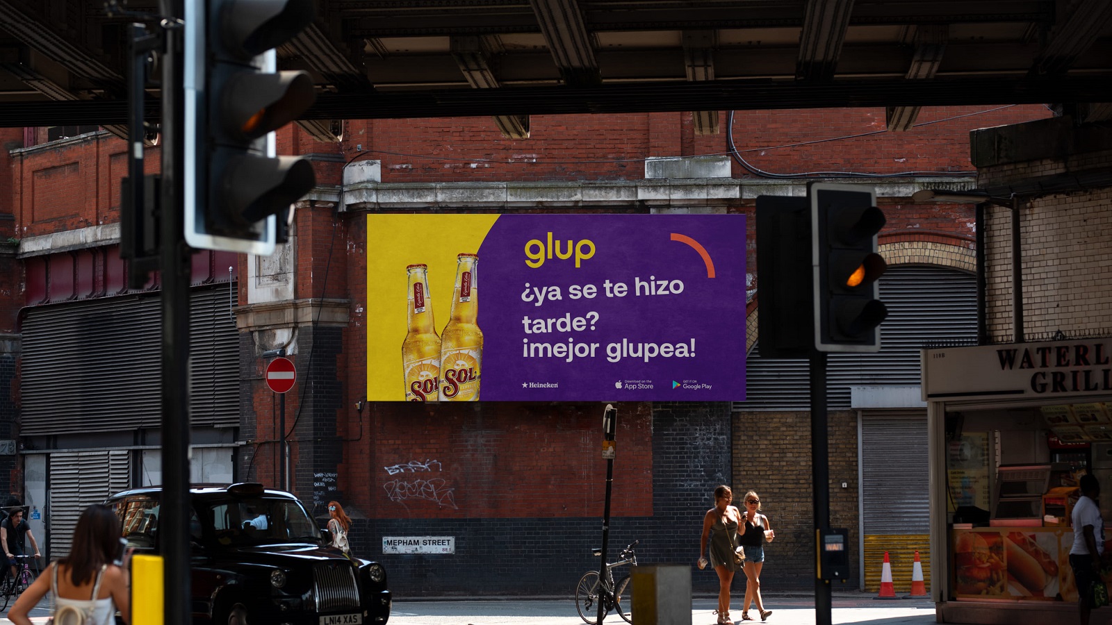
Outdoor advertising
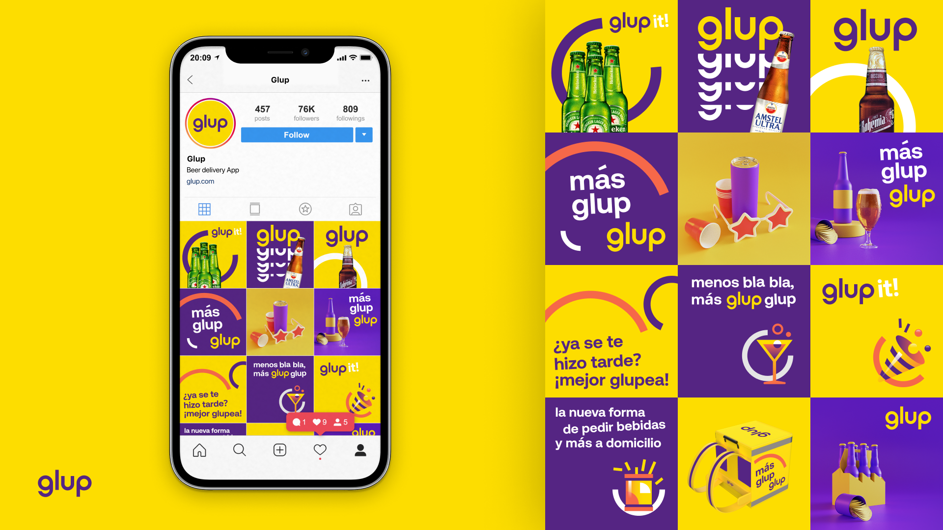
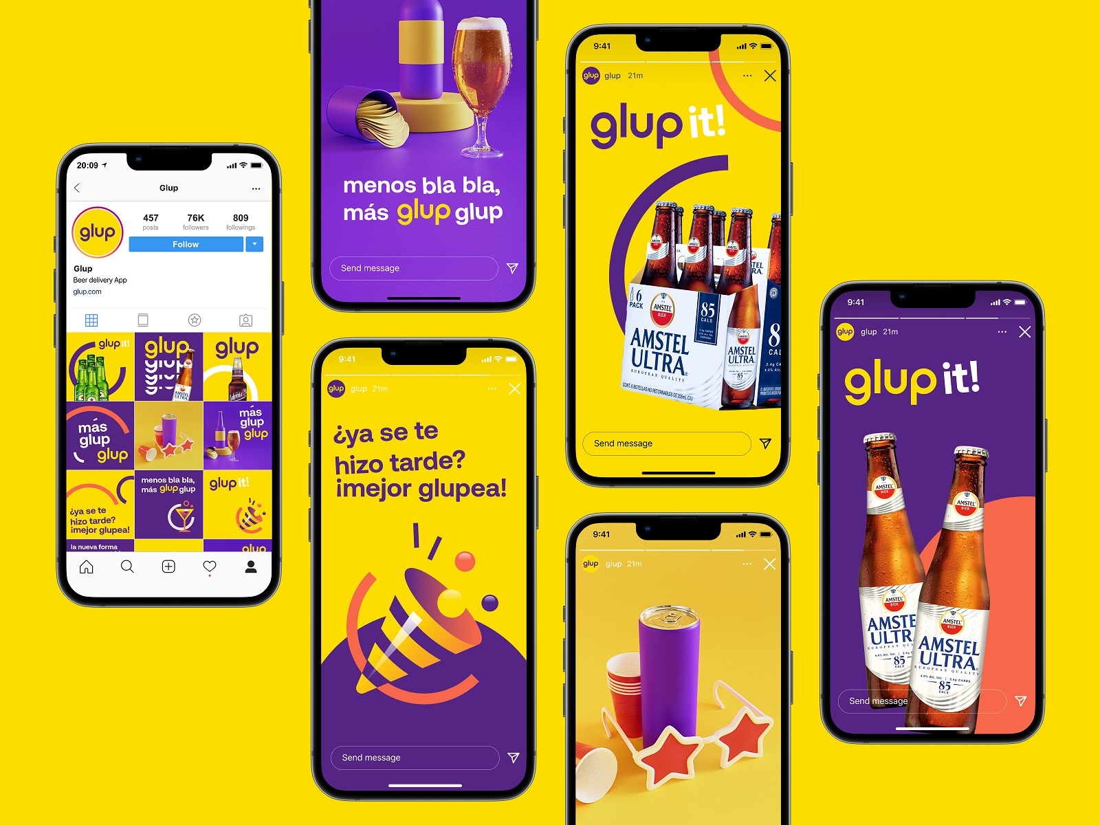
Social network posting templates
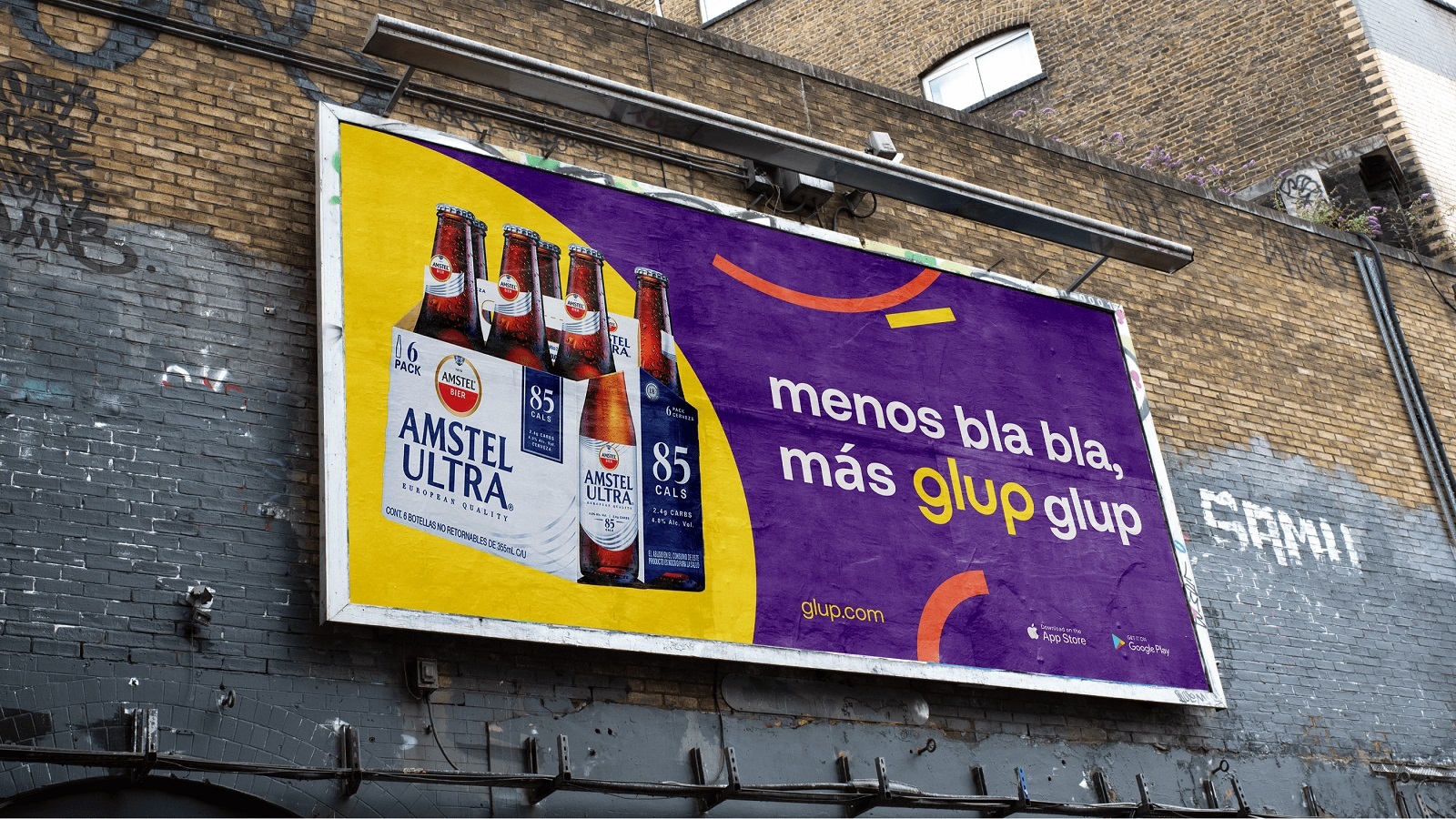
Billboard design
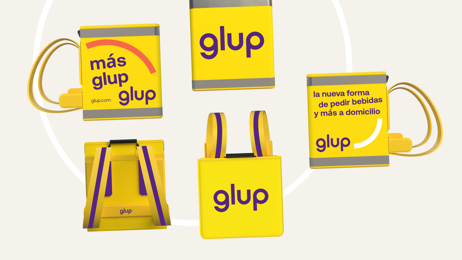
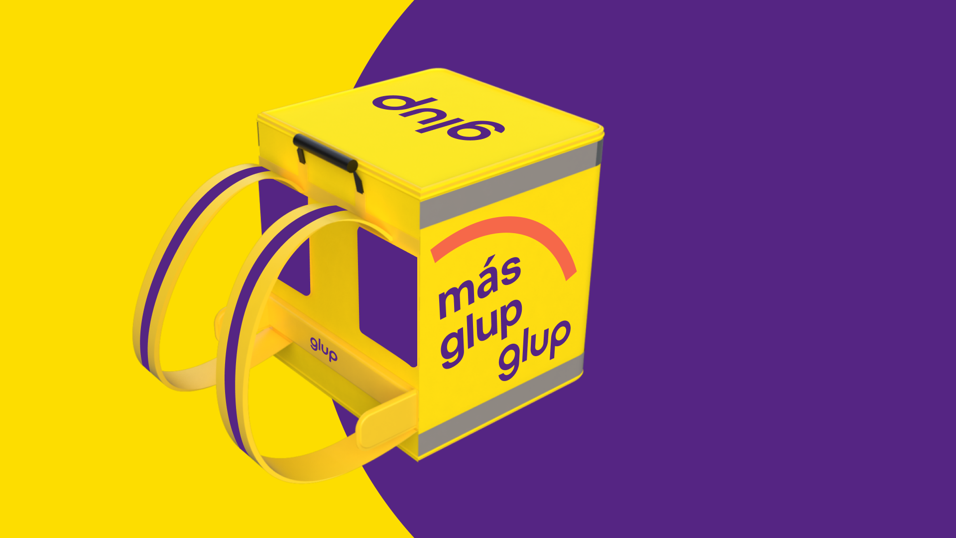
Delivery backpack design
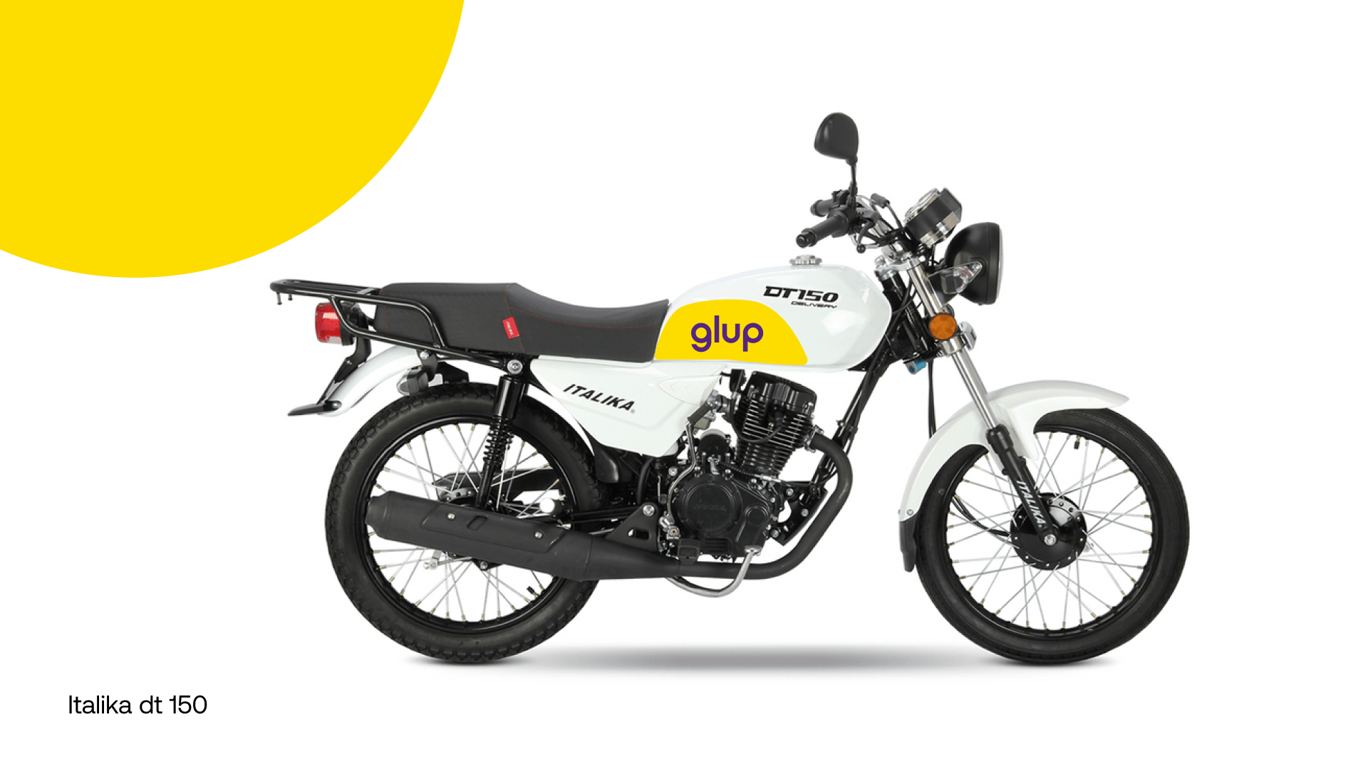
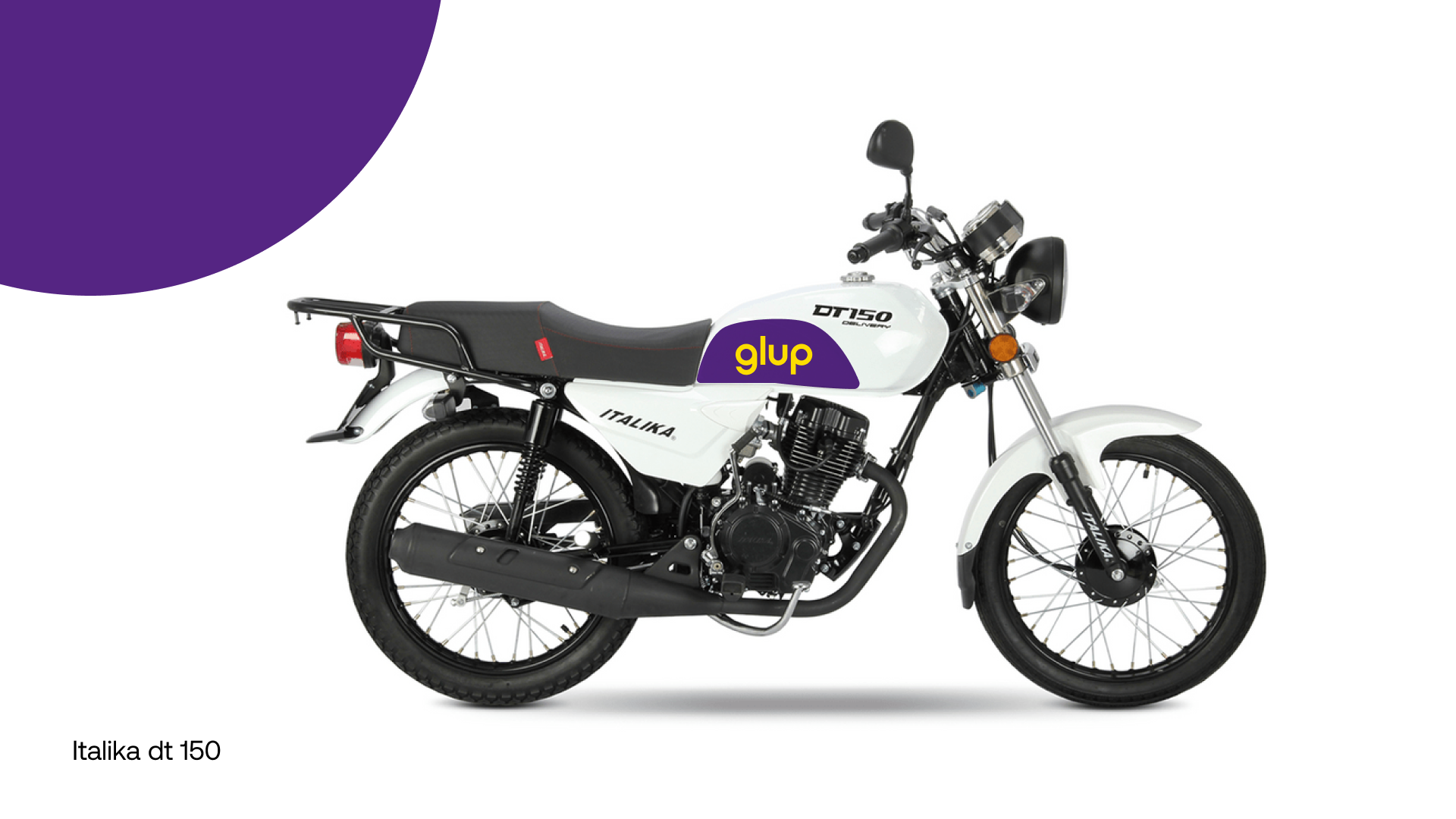
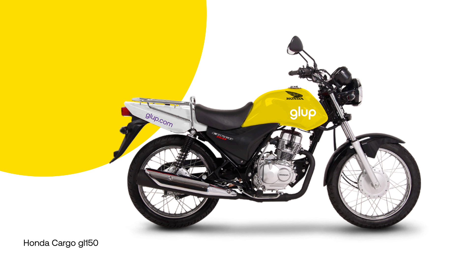
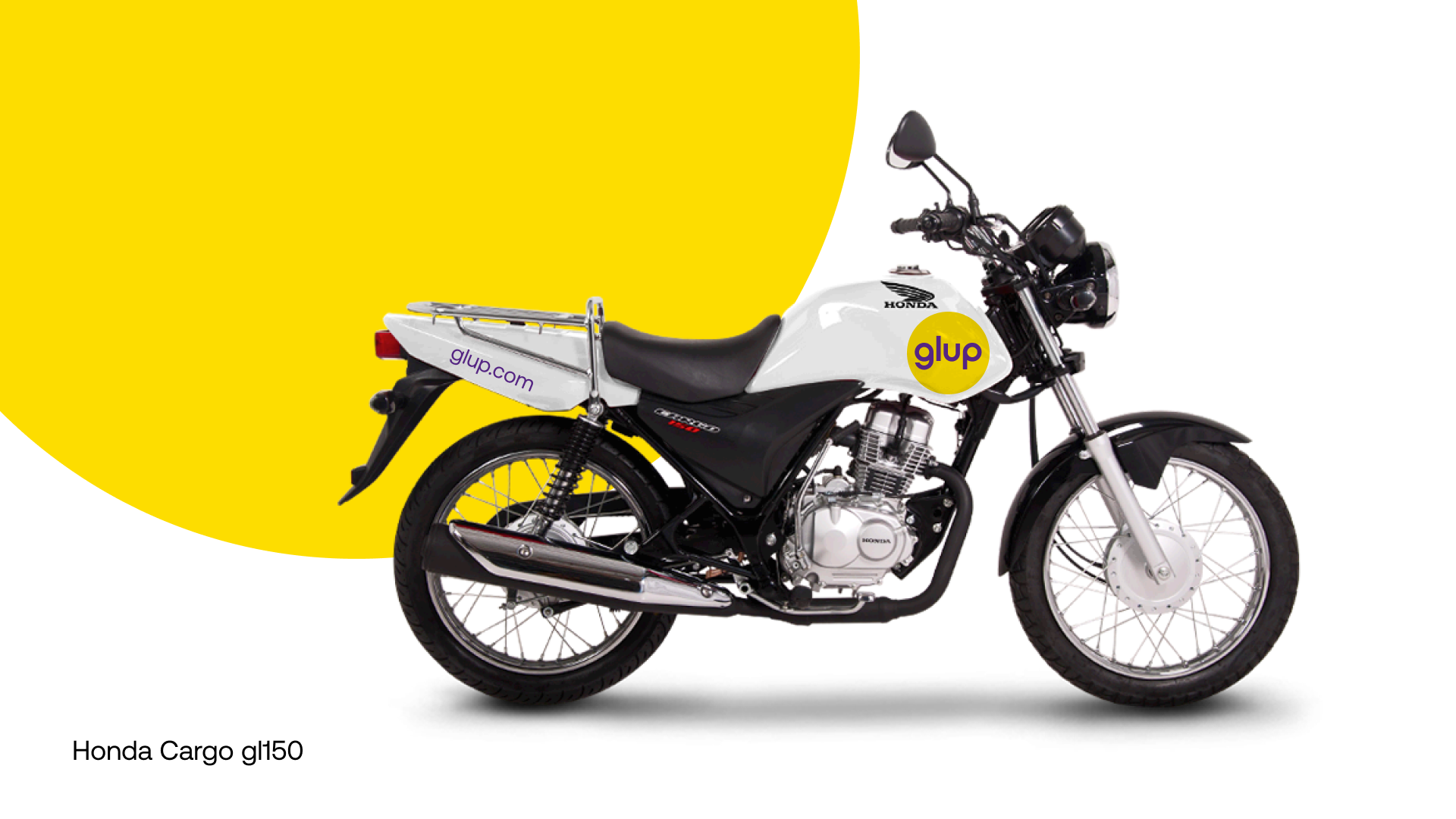
Range of variants for delivery motorbike branding
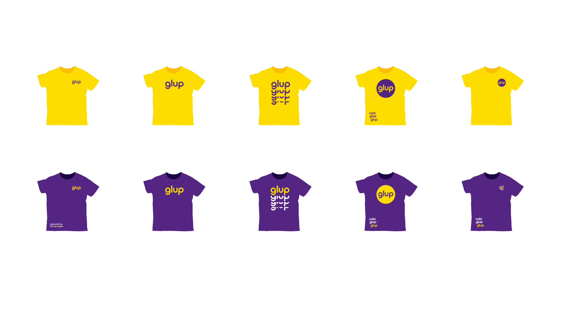
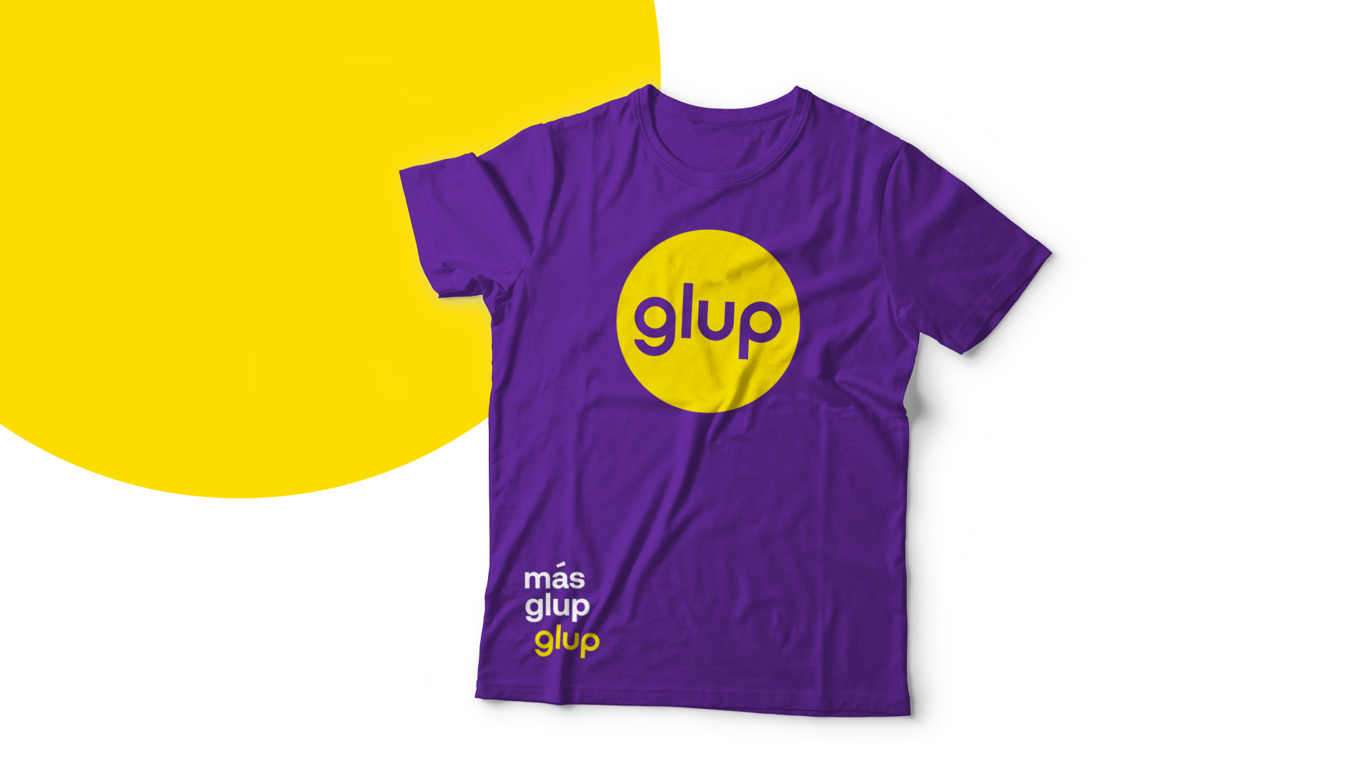
Branded T-shirts design
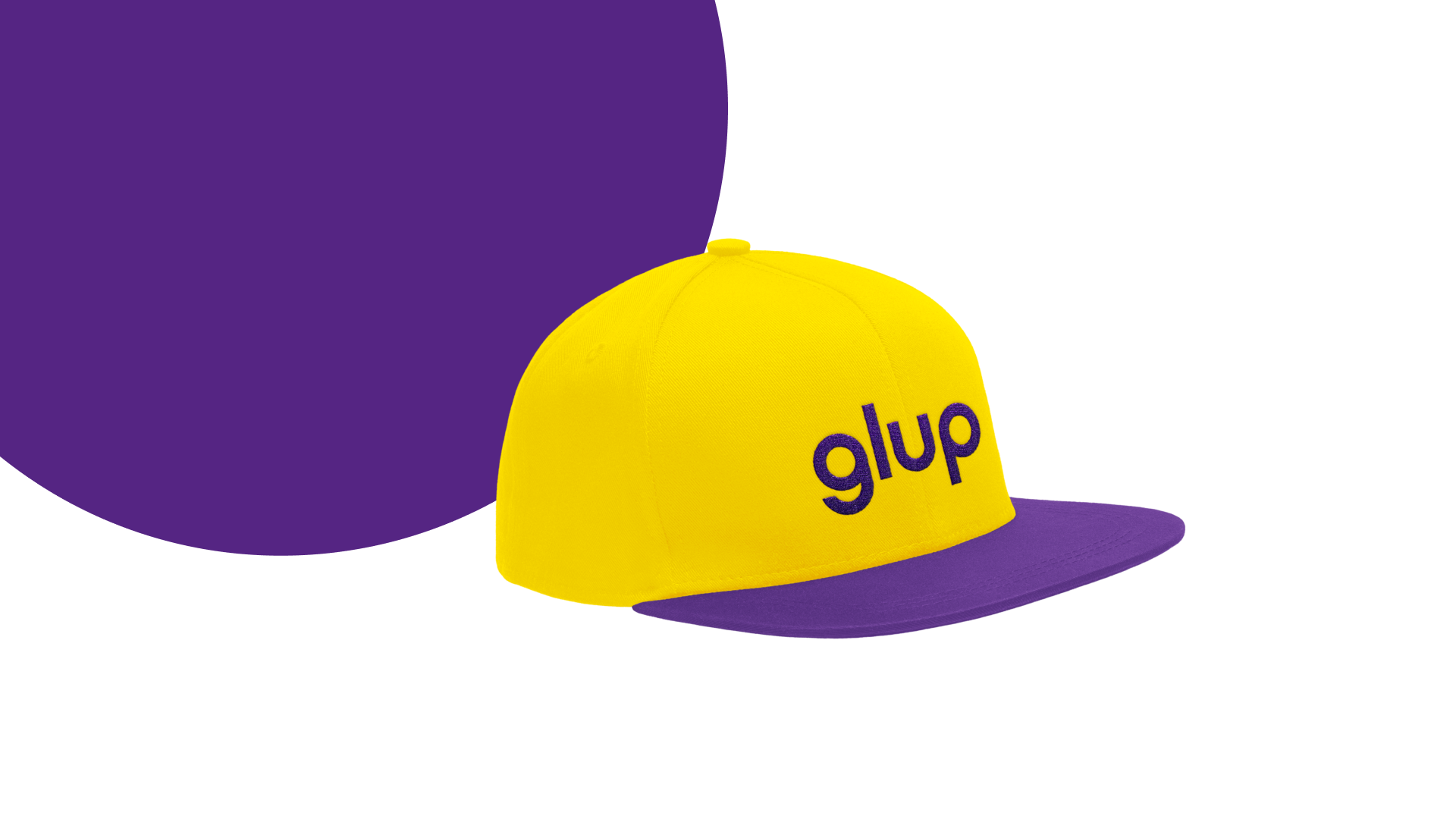
Branded cap design
User Experience Design
The second direction of work was to think over the flawless and intuitive user experience for the mobile application. The interaction design was thoroughly thought-out to make the sales funnel work successfully and let the users move through the whole purchase flow smoothly.
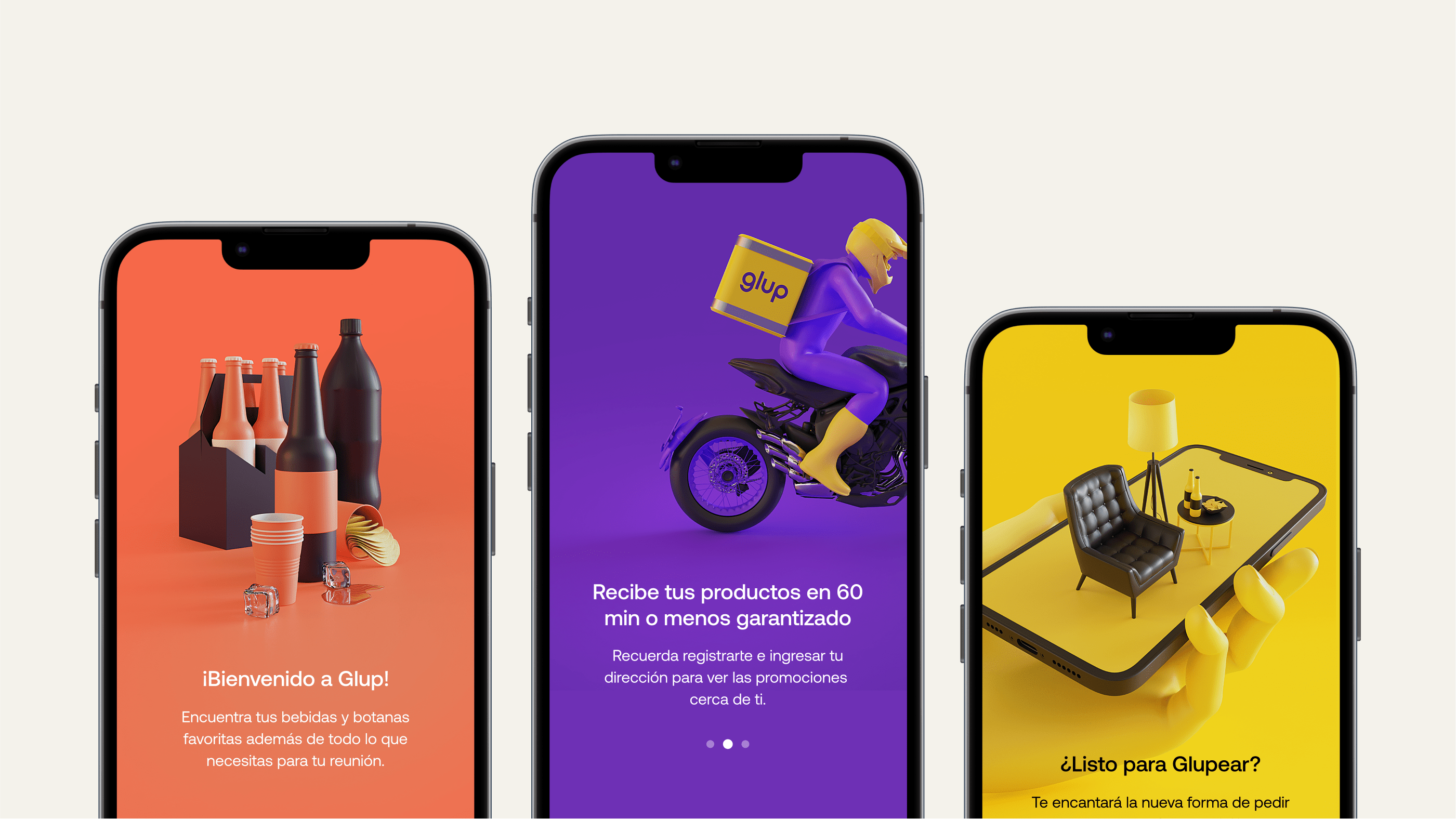
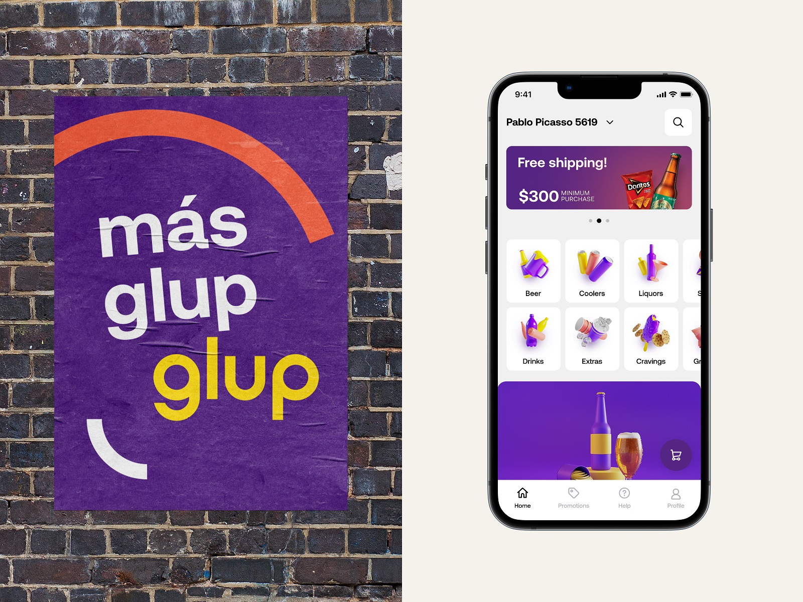
The onboarding screens and categories use trendy and balanced 3D graphics presenting the products and setting friendly communication. Having a different visual style, these original graphics don’t distract users’ attention from the offered items.
The icons working as visual illustrative markers for the different categories of items in the application also moved through several iterations and evolved from 2D graphics consistent with the general concept of visual branding and echoing its graphic elements to the big set of 3D icons following the style of 3D illustrations used across the app and in the onboarding process. Here’s a quick glance at the stages of the process.
![]()
![]()
![]()
![]()
![]()
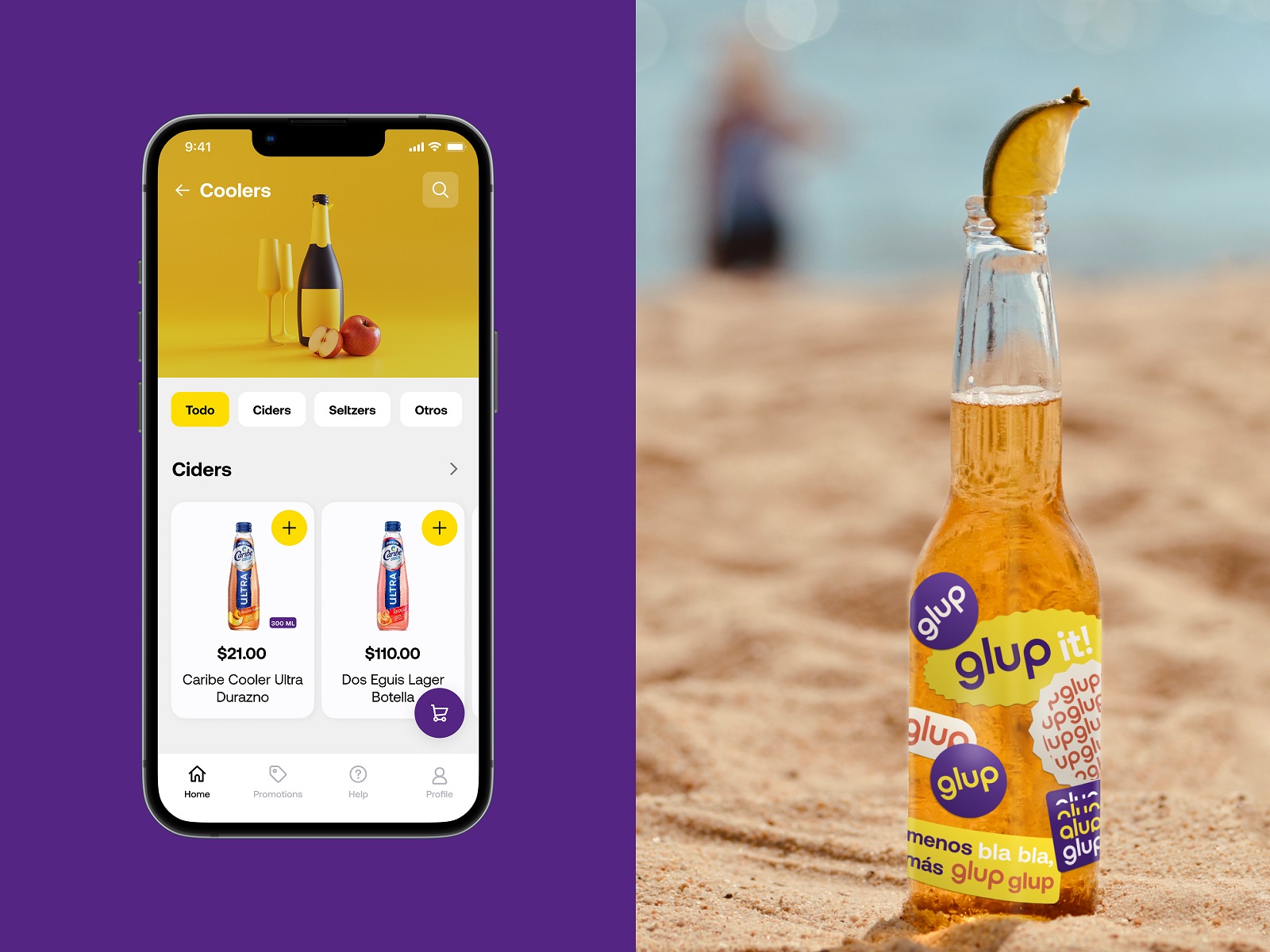
Airy light screens of the application effectively show the products, while branded colors, graphics, and eye-pleasing gradients help to set attractive color accents for interactive elements, making navigation clear and intuitive. Custom icons in the interface also echo the brand palette, supporting both usability and consistency of brand performance. The customers are offered several ways to surf the range of provided items, including browsing the entire catalog, using filters to customize it, or using the internal search to quickly find the needed item. Plus button on each card on the catalog screens sets the shortcut to add the items directly to the basket without opening a card, which saves time and effort in cases when users have some faves and order the same items multiple times.
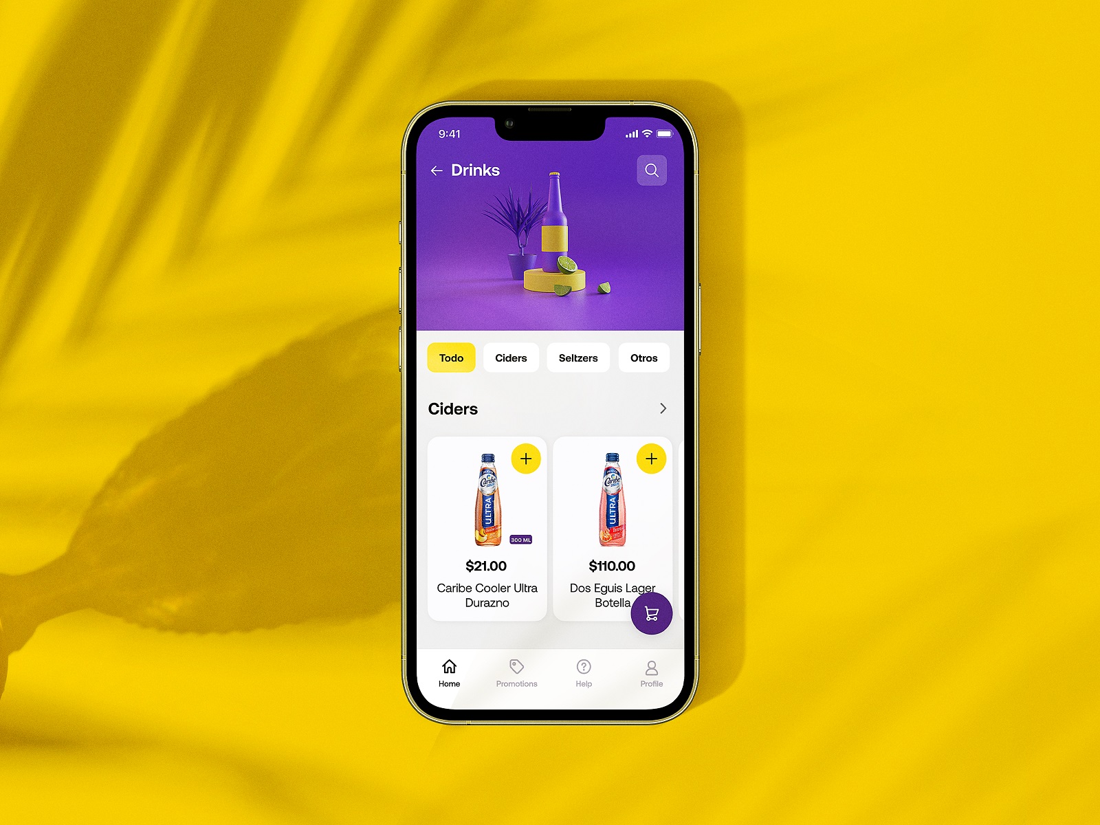
Here’s a quick look at the category screen. All categories are illustrated with stylish theme 3D graphics that instantly set the theme but do not overload the screen with too much detailing.
The shopping cart screen is informative and functional, based on the principles of external consistency and well-recognized mental models so that users can finalize their orders easily and effortlessly. A special progress bar with the text hint is used to visualize the ability to get free shipping for the order.
The home screen and promotions screen also feature sliders with banners for special offers or hot sales to attract more attention to them immediately.
![]()
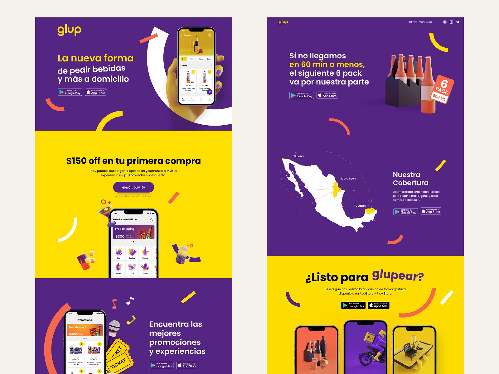
One of the essential elements of building a solid mobile app brand and enhancing its online presence is supporting it on the web with a concise and informative landing page that uncovers the benefits and engages new users to try it. The landing page for the Glup application echoes the design approach of visual identity for the brand. It’s based on bright background in primary brand colors separating different content sections, a solid visual hierarchy of text blocks, clear and visible call-to-action elements, and prominent visuals that present the balanced mixture of app screens and thematic 3D graphics to instantly set the connection with the essence of the offered service. Smooth web animation makes the user experience even more lively and dynamic.
So, as a result of the project, the Glup brand obtained a solid and effective sales channel via the easy-to-use mobile application, consistently reflecting brand identity and making the customer experience integral, engaging, and smooth.
New design case studies from our team are coming soon. Stay tuned!
More Design Case Studies
Here’s a set of more case studies sharing the design solutions and approaches for some of the design projects done by the Tubik team.
Komuso. Website Design for Wellness Tool
PointZero25. Identity and Website Design for Event Agency
Nonconventional Show. Website Design for Podcast
uMake. Branding and Website for 3D Design Tool
BEGG. Brand Packaging and Web Design for Food Product Ecommerce
Crezco. Brand Identity and UI/UX Design for Fintech Service
FarmSense. Identity and Web Design for Agricultural Technology
Carricare. Identity and UX Design for Safe Delivery Service
OOP. Brand Identity Design for Online Flea Market