The ability to keep mind and body in peace and balance is crucial for living a balanced and full-scale life. Today’s case study article is devoted to the design ideas for the product helping people reach this vital life balance. Welcome to take a glance at the creative story of elegant, informative, and eye-pleasing website design for Komuso, the team working on tools and ways of natural relaxation.
Client and Project
Komuso is a team working on natural and effective ways of relaxation and wellness improvement, and that’s what their product, Shift, is about. The Shift was created by Todd and Vanessa Steinberg, the husband-and-wife team and co-founders of Komuso Design. They were both very stressed out and feeling disconnected, so they invented a way to make a difference. The Shift is the world’s first wellness tool that makes you breathe better to help you feel better, calm your nervous system, and increase peace of mind.
The task for the tubik team in this project was to create a neat and stylish website design and landing pages that would effectively present the essence and benefits of the product, have solid emotional appeal, and transfer the mood of relaxation and balance. We also worked on custom graphics, 3D animation, and consistent social media posting templates for efficient brand communication strengthening its online presence.
The creative team from the tubik side included Vladyslav Taran, Denys Koloskov, Ira Shaposhnyk, Roma Chornyi, Arthur Avakyan, Andrey Drobovich, and Kirill Erokhin.
Process and Result
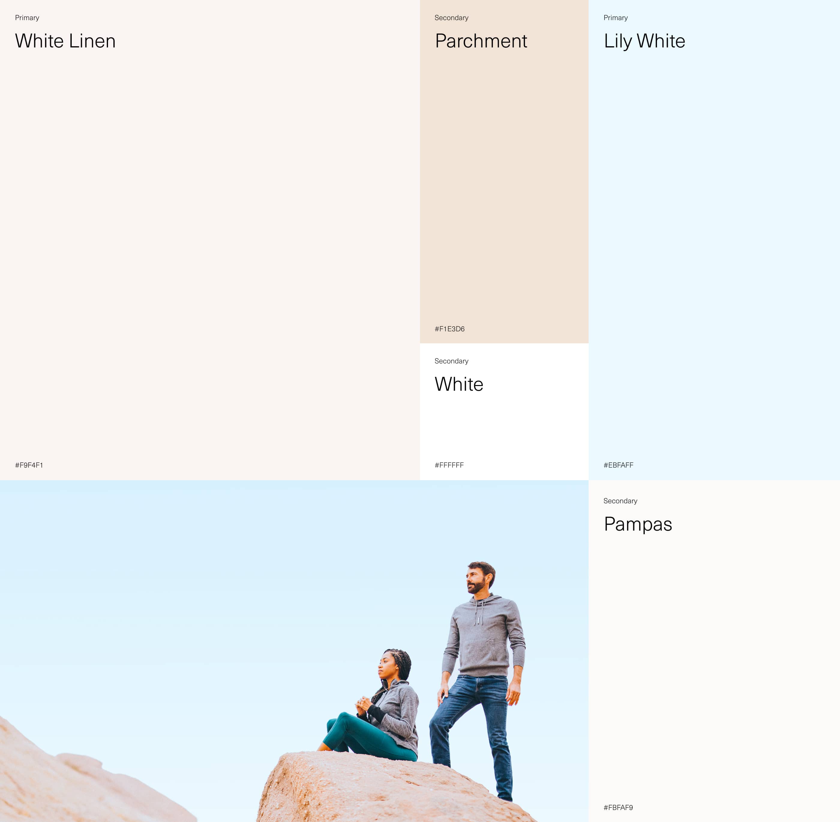
The main objective behind the website design for the product was to transfer the feeling of balance, harmony, and natural relaxation from the first second and across all the web pages. As color is one of the strongest tools for creating the needed emotional background and mood, it was essential to activate its power at full for this goal. So, the color palette reflects the brand message and philosophy, full of natural shades, light, pastel, neat, and airy. Such a color set also works perfectly with product photos which reflect the deep connection of the mind balance with nature both outside and inside a person.
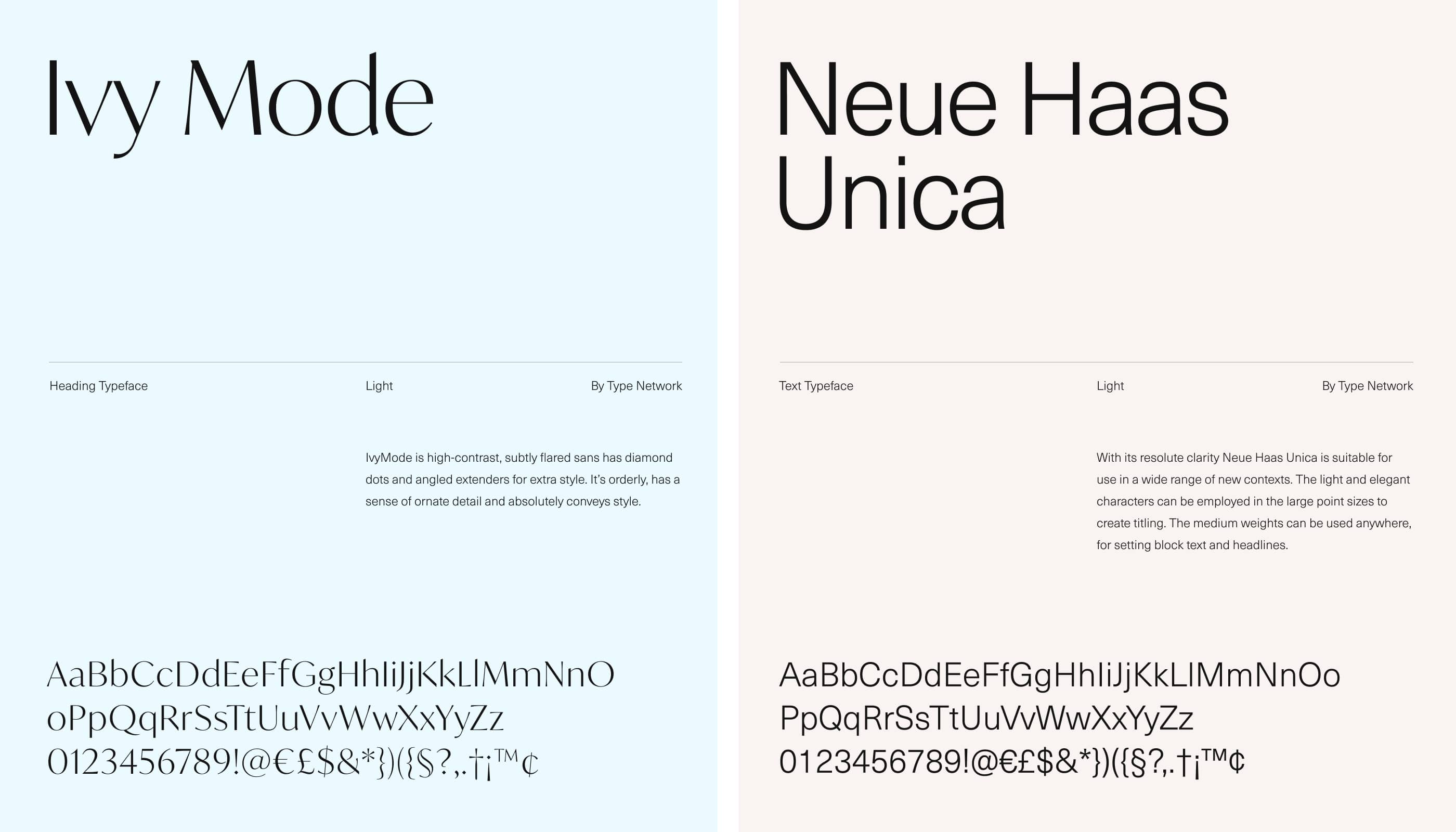
The typographic pair for the Komuso website features neat and sophisticated Ivy Mode as a heading typeface, orderly, with a sense of ornate detail, conveying the necessary style that’s also readable and easy on the eyes. For the text type. Neue Haas Unica was chosen, a versatile geometric sans serif typeface that works equally effectively with both large text arrays and small sentences.
The website’s home page is based on prominent and atmospheric photo content, neat but explicit call-to-action elements in every content section to allow for conversion from any stage of the interaction, and concise, readable text blocks. As well in some sections, photos can also work as implicit directional cues, in particular using the gaze direction of the model to naturally attract the visitor’s eye to text blocks or taglines. Smooth web animation makes the experience of scrolling the page even more dynamic and eye-pleasing. As for the graphics, the page also features minor abstract line illustrations to visually support text pieces reflecting the major benefits of the product.
Striving to make the website convincing and informative to support the effective communication of the brand with its target audience, the designers use the techniques to help make the user experience effort-saving and increase trustworthiness. For instance, the big infographic-like numbers help to improve scannability and provide information quickly. Readers subconsciously associate numbers with facts, stats, sizes, and distance — potentially valuable data. The balanced integration of product reviews framed and made noticeable, as well as the neat presentation of testimonials or collaborations with big brands and resources, is the way to set the bond with the potential customer and enhance the feeling of trust.
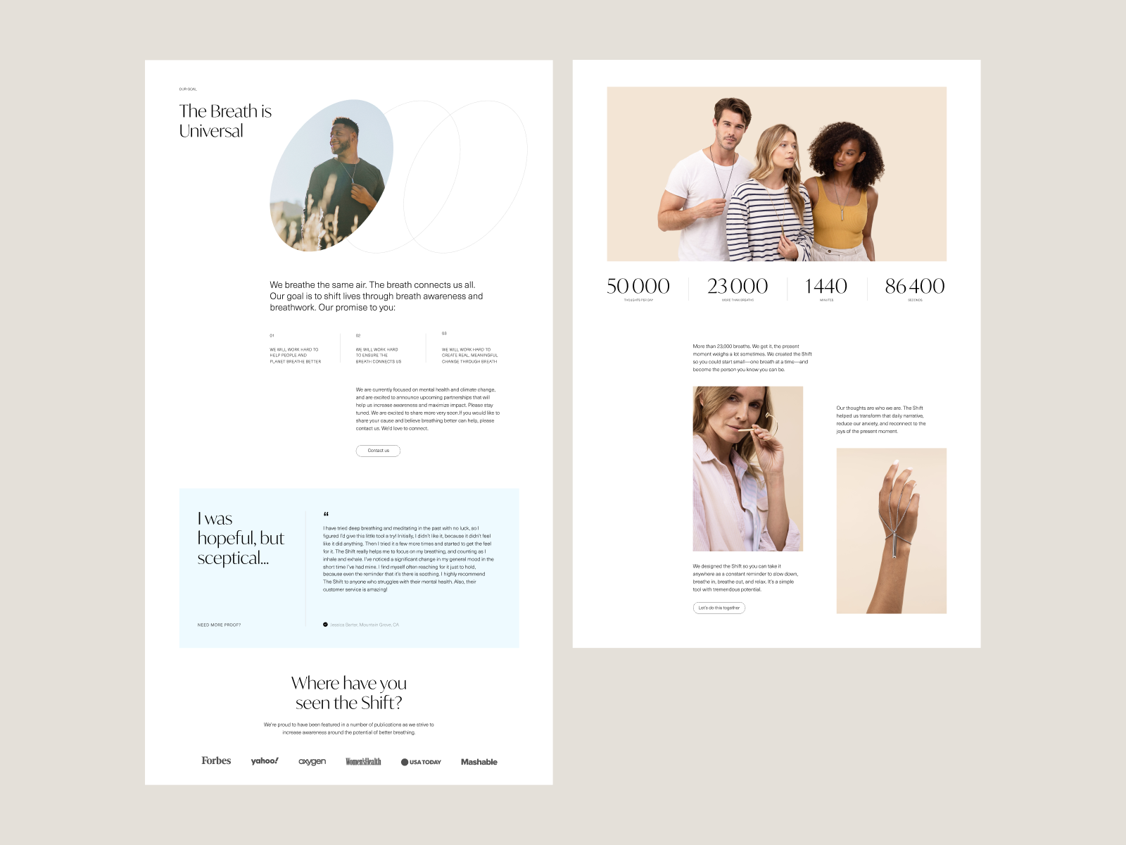
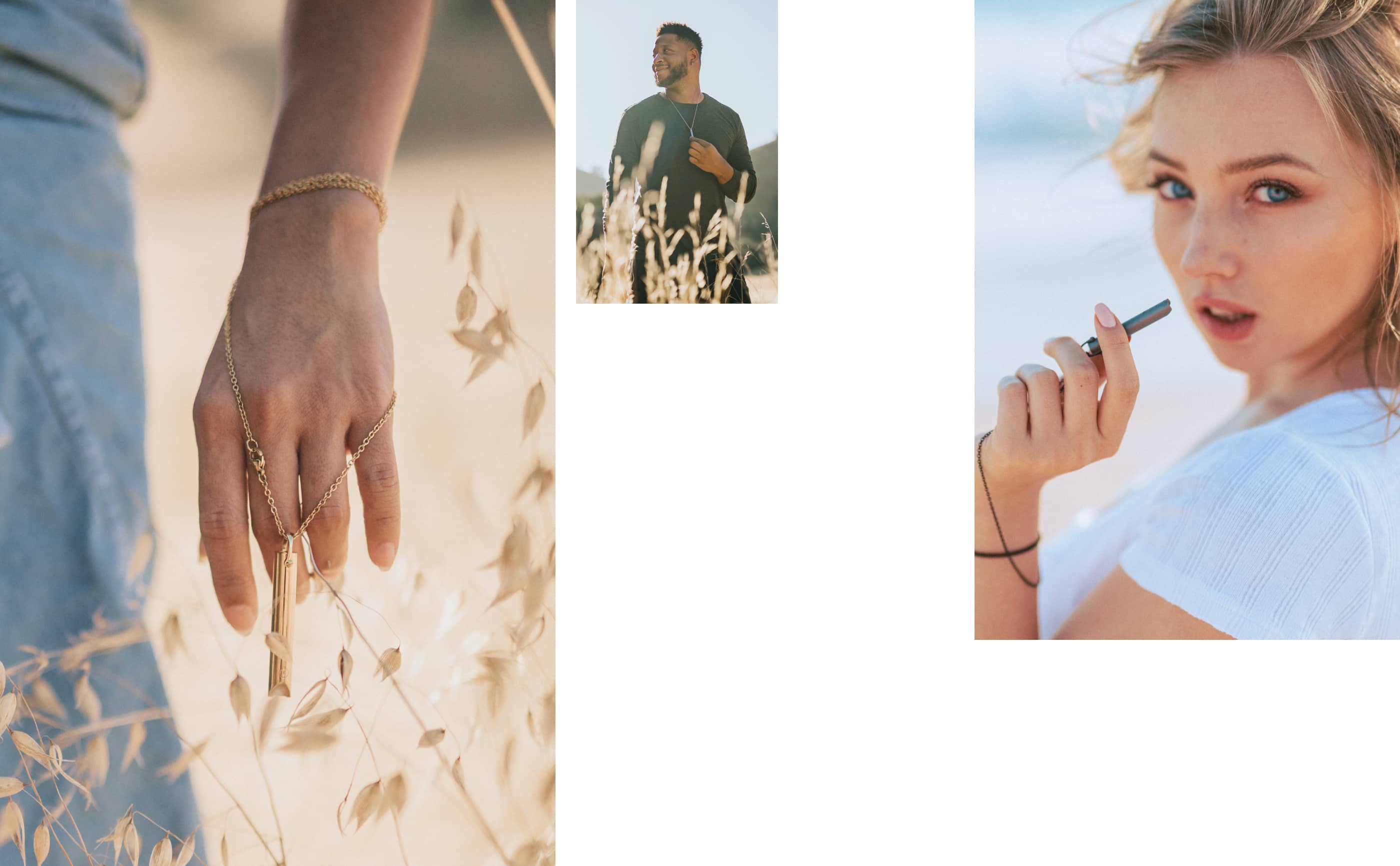
Here’s another web page allowing visitors to dive deeper into the essence of the Shift: it shows the product, tells how it works and helps to breathe better, and gives the ability to check it in different colors and options. Animated line illustrations amplify the visual demonstration. Also, one of the sections of the page is formed of the asymmetric and artistic set of product photos featuring the diversity of people using it and adding a deep and emotional human element to the design.
Another type of visual used in the Komuso design project is a custom 3D model of the product made by our team to open even more flexible and diverse opportunities for its presentation and strengthen the impression made on website visitors. Also, it becomes a basis for a special effect of engaging interactivity added to the scrolling experience: while scrolling the page, the visitor sees how the tool is moving from the product page onto a special pad near the page as if making it ready to be packed and delivered to the customer.
Here’s the webflow implementation of this concept in case you want to try how it works and see how our clients got it presented in the design process.
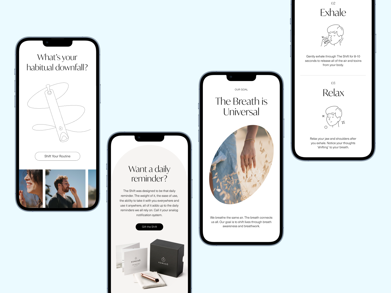
The mobile version of the website was also well-thought-out and tested to keep it elegant and effective on any device people connect it from.
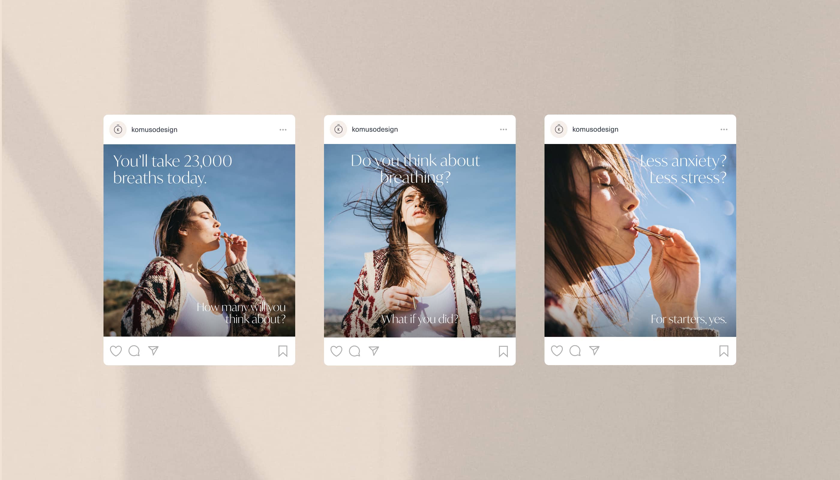
And here’s a look at the templates for the social media posting keeping the consistency of visual performance and solid connection with the brand presentation on the web.
New design case studies from our team are coming soon. Stay tuned!
More Design Case Studies
Here’s a set of more case studies sharing the design solutions and approaches for some of the design projects done by the Tubik team.
PointZero25. Identity and Website Design for Event Agency
Nonconventional Show. Website Design for Podcast
uMake. Branding and Website for 3D Design Tool
BEGG. Brand Packaging and Web Design for Food Product Ecommerce
Crezco. Brand Identity and UI/UX Design for Fintech Service
CUBE. Illustration Set for Video Production Company
FarmSense. Identity and Web Design for Agricultural Technology
Carricare. Identity and UX Design for Safe Delivery Service
OOP. Brand Identity Design for Online Flea Market