The new case study is ready to unveil one of our recent projects: we worked on the bright brand identity design and informative easy-to-use website for FarmSense, the technology built on the crossroads of hardware and software, tangible and digital, and dealing with innovations in agriculture.
Project
New brand identity, website design, and custom illustrations for agricultural technology monitoring insects on the crop fields.
The creative team from the tubik side for this project included Arthur Avakyan, Olga Bazyaieva, Marina Solomennikova, Olya Zakharyan, Sergii Valiukh, and Kate Baikova.
Client
FarmSense is a USA-based innovative tech product that helps growers reduce losses from insect pests and lower dependence on pesticides to take the uncertainty out of pest management for better farming and a brighter future.
Why is it important, and how does it help? The agricultural industry loses more than $220 billion in crop damage each year because of insects. For decades, farmers have been stuck with few options for pest management. Most use sticky traps – a time-consuming and inaccurate method, followed by a broadcast spray of selected pesticides and insecticides. Still, sadly, these traps can also affect beneficial bugs that pollinate more than 70% of the global crop supply.
So, the FarmSense team formed by scientists and innovators developed a better way. Using computational entomological models, they created a real-time sensor that can help farmers make better decisions for pest management, saving time and potentially boosting crop yield. The team believes that leveraging the power of machine learning and computational modeling can help save lives, reduce hunger and help developing countries achieve food independence.
The target audience they aim at is diverse, from big agricultural corporations to small family farms, from innovators and advisors with high tech-literacy levels to farmers that spend most time right in the fields and have no broad experience or tight connections to different software and applications. So, the team worked on affordability and accessibility of the technology and strived to reflect that in the branding approach and website, helping them communicate with their clients and uncover the product’s benefits.
Identity Design
The branding design process started with extensive research covering the agriculture and ag-tech current state in the USA, the existing presence of the sector on the web, the pain points of the target audience, and the touchpoints of the brand communication.
Based on everything mentioned above, the key advantages of the product that branding had to transfer were defined as:
- sustainability
- affordability
- accuracy of real-time data
- rich information
As well, the team aimed at making a visual branding design system that would have a range from more strict and business-like to more illustrative and emotional.
One of the core tools supporting both emotionality and usability in brand design for FarmSense is color. The palette features bright contrast shades of natural colors employing the psychology of color and giving instant visual connection to the topic of agriculture, summer, soil, fields, insects, and plants: green, orange, yellow, and blue. The latter is also traditionally associated with tech-related and digital products.

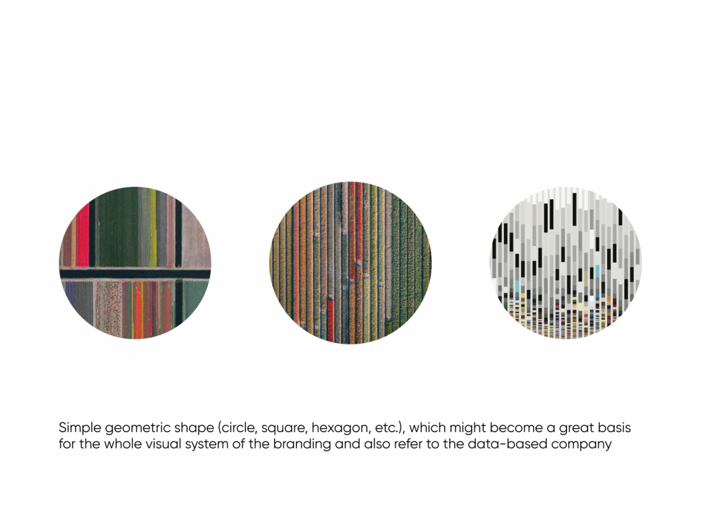
Having agreed upon colors, the team started working on the logo. The initial logo design approach was based on data as a core of the problem-solving power of the product. The creative search based on that resulted in a set of brand sign options reflecting that idea via lines and dots forming abstract shapes and building association with digital data processing and statistics visualization as well as fields seen from the bird-watch perspective. The basic shape chosen for the brand symbol was a circle.
![]()
Here’s a glance at the logo design process, from sketches through variations to the polished sign. The first version of the symbol developed in this direction was an abstract round sign consisting of vertical lines.
![]()
![]()
First sketches to think over the idea and find the composition
![]()
Digital symbol development
![]()
Testing the symbol with brand name typographic part
![]()
Monochrome version of the combination mark
![]()
The version of the symbol with soft edges
![]()
Icons designed to test how the symbol can be further developed into other types of graphics
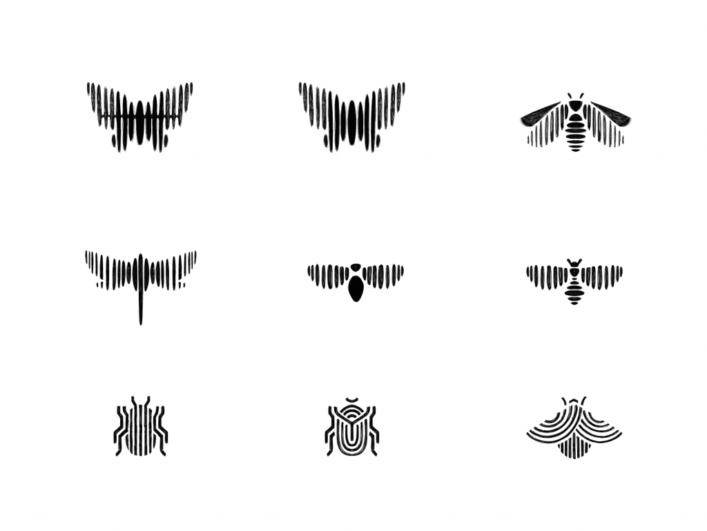
Another idea for the symbol on this stage of the creative search was to transfer the visual metaphor of the insect or the sun rising above the field, shaped by the lines. The latter was taken into deeper consideration.
![]()
Logo symbol sketching stage
![]()
Digital logo symbol development
![]()
Combination mark for the brand identity
![]()
Monochromatic version of the combination mark
The set of branded items was also presented to show how this version of the logo and color palette could work for various marketing goals: banners, printed advertisements, social media posting, business cards, etc.
Although the general idea looked effective, after discussions with clients and deeper testing, we together made the decision to move to another iteration, as this version of the symbol, even looking different, could bring up associations with some political campaigns that took place earlier in the USA. So, the second approach was also based on aerial views on the fields of crops, but this time irregular and asymmetric, cut by roads in various directions.
![]()
For this version, the color palette excluded blue, and the basic shape was square. The creative search was done on the sign composition and detailing.
![]()
The idea development resulted in the bright three-color symbol with a moderate level of detail and bold, readable typographic part.
![]()
![]()
And here’s how it could be developed into the design system for branded items.
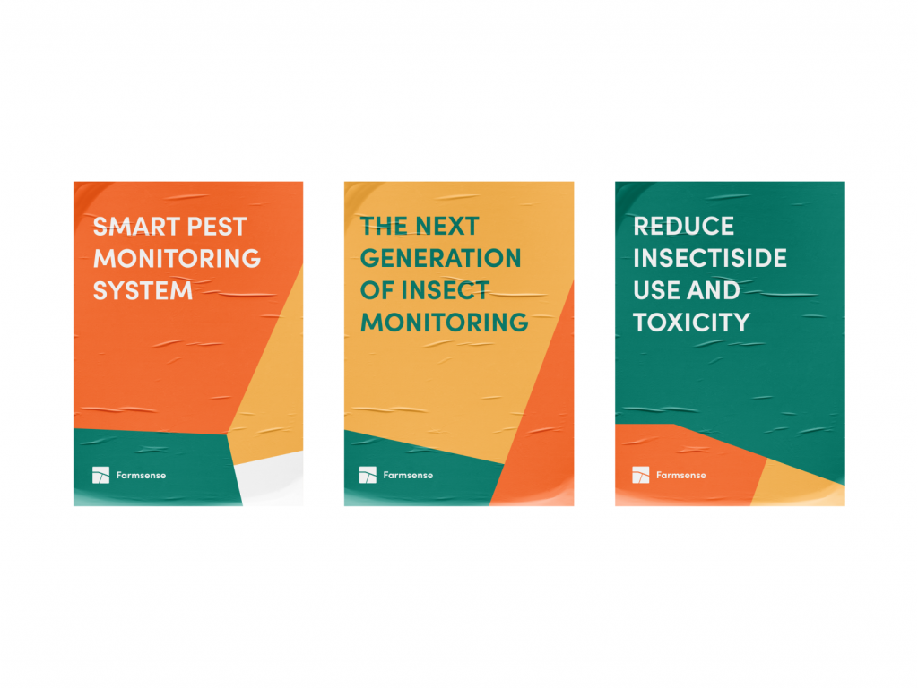
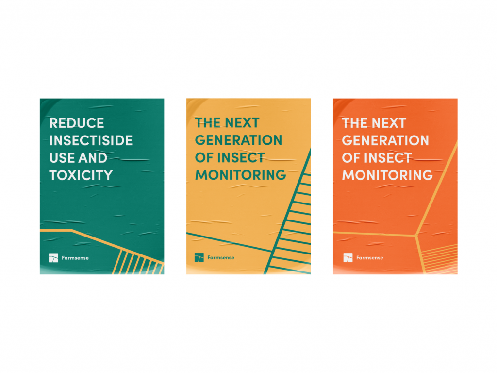
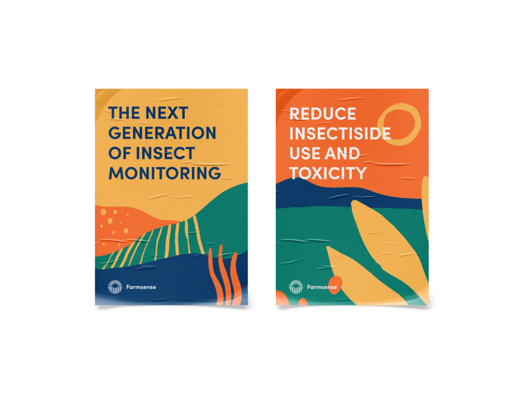
Posters design
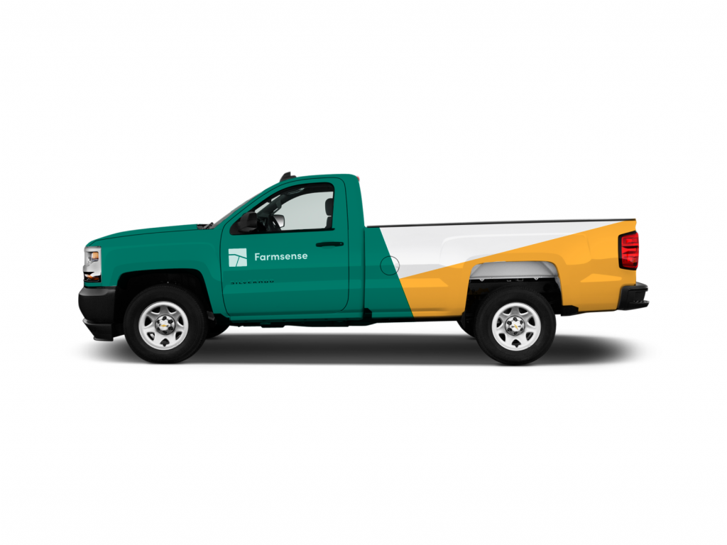
Truck livery design
However, the deeper the team dived into the visual concept for the FarmSense brand, the more the client’s team got certain that they would like to combine the discussed approach and palette to their existing logo and reconsider it to make its design bright, up-to-date, and recognizable as well as flexible for various communication objectives.
![]()
The previous FarmSense logo
So, the final iteration started at the intersection of the existing logo and the ideas considered in the previous versions. The logo had to become simpler and less detailed to stay clear and informative in various sizes and get packed into a new color palette giving a quick connection to both agriculture and digital technology. Again, it started from basic sketching to think over the idea and moved to the polished logo.
![]()
![]()
Finally, the option with strict thin lines and a thin, elegant sans-serif typographic part was chosen as an approved brand sign.
![]()
![]()
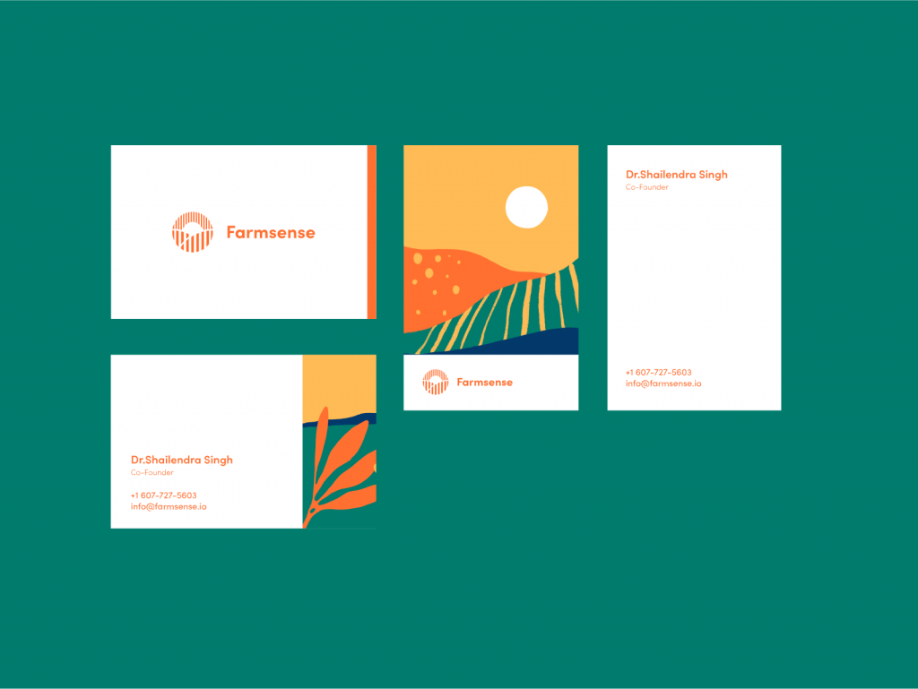
So, based on that solution, the consistent set of branded items was designed for indoor and outdoor advertising and brand communication.
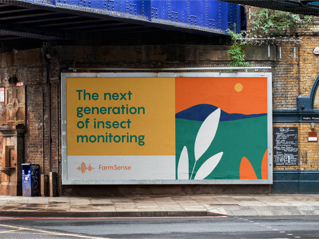
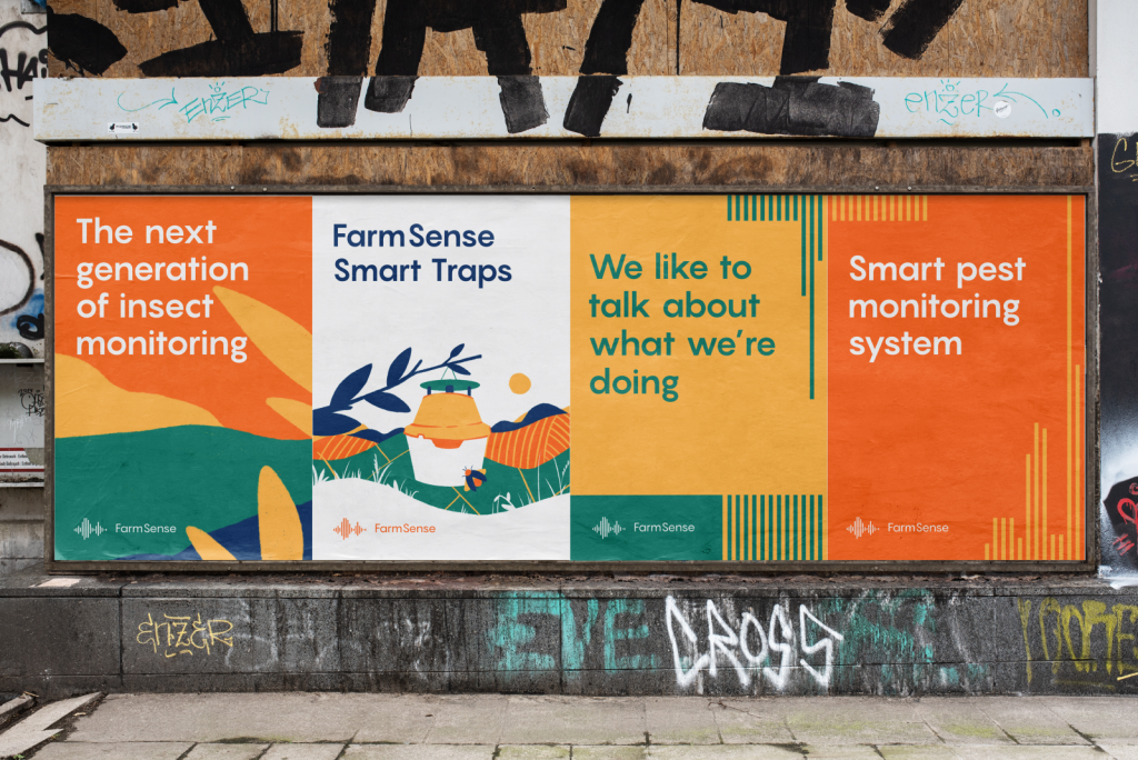
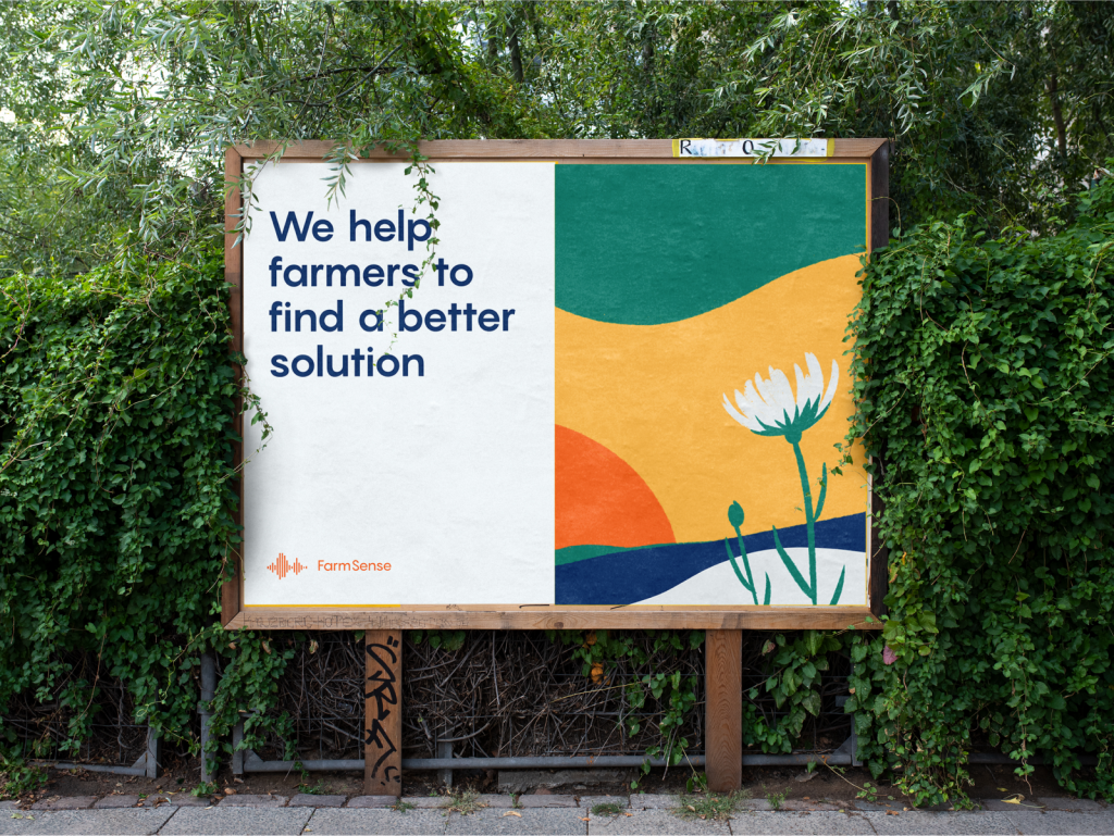
Billboards and banners designed for outdoor advertising
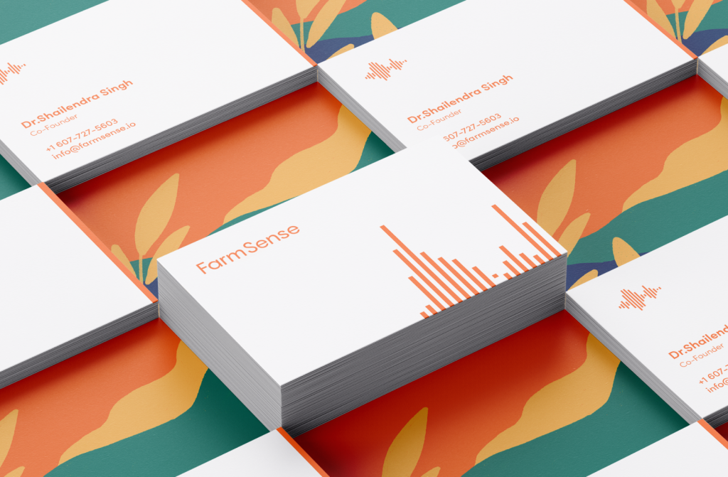
Business card design
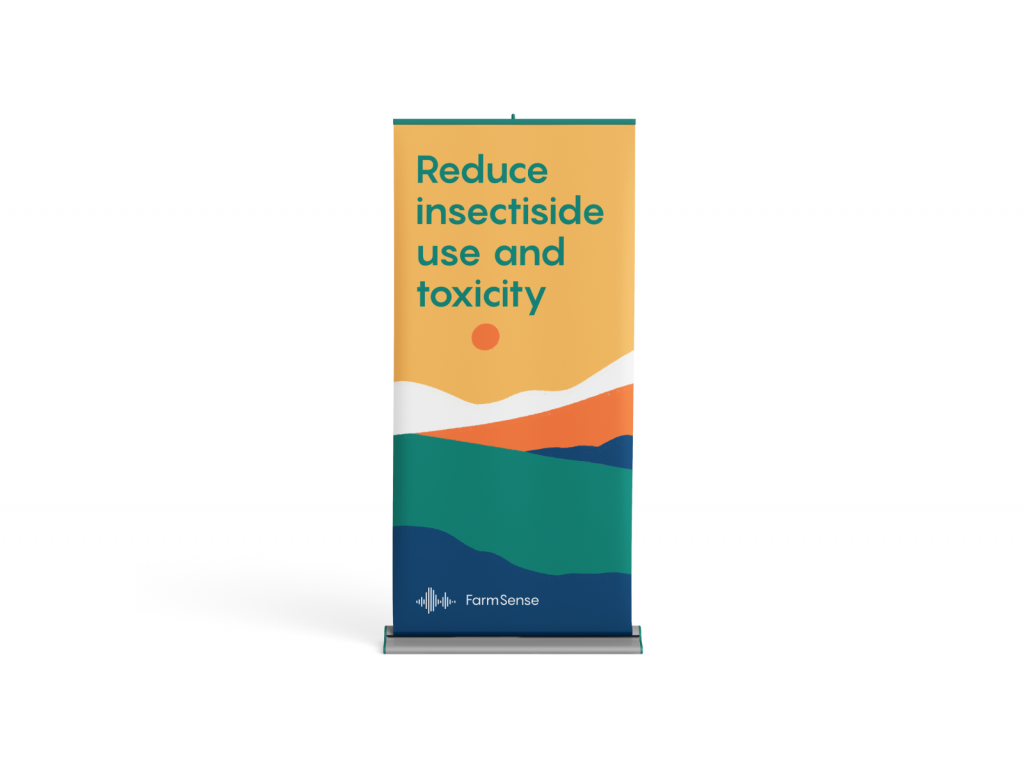
Rollup design
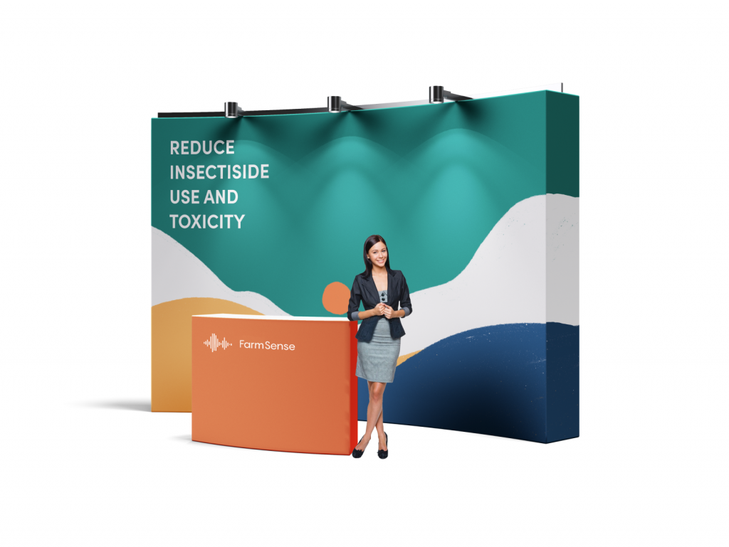
Exhibition stand design
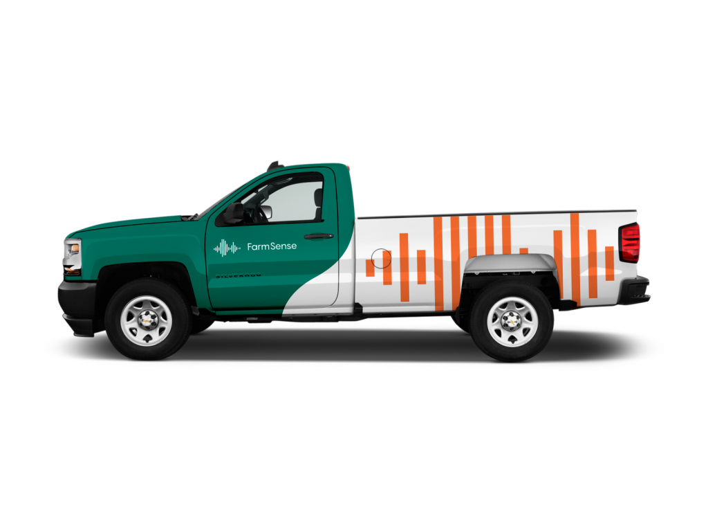
Truck livery design
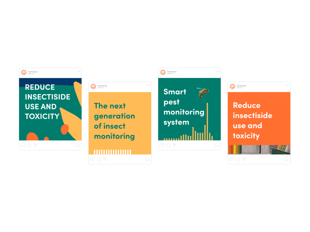
With the brand graphics above, it’s also easy to see that another important aspect of identity design for FarmSense was creating custom illustrations. They covered four major goals:
- pictures set the atmosphere and apparent association with the agricultural theme
- specially created graphics helped to visualize the flow and benefits of highly-technological processes which are hard or even impossible to show via photos or videos
- custom graphics helped the brand to stand out of the crowd among the players in the agricultural sector, mostly using photo content which is often quite generic and just setting the theme
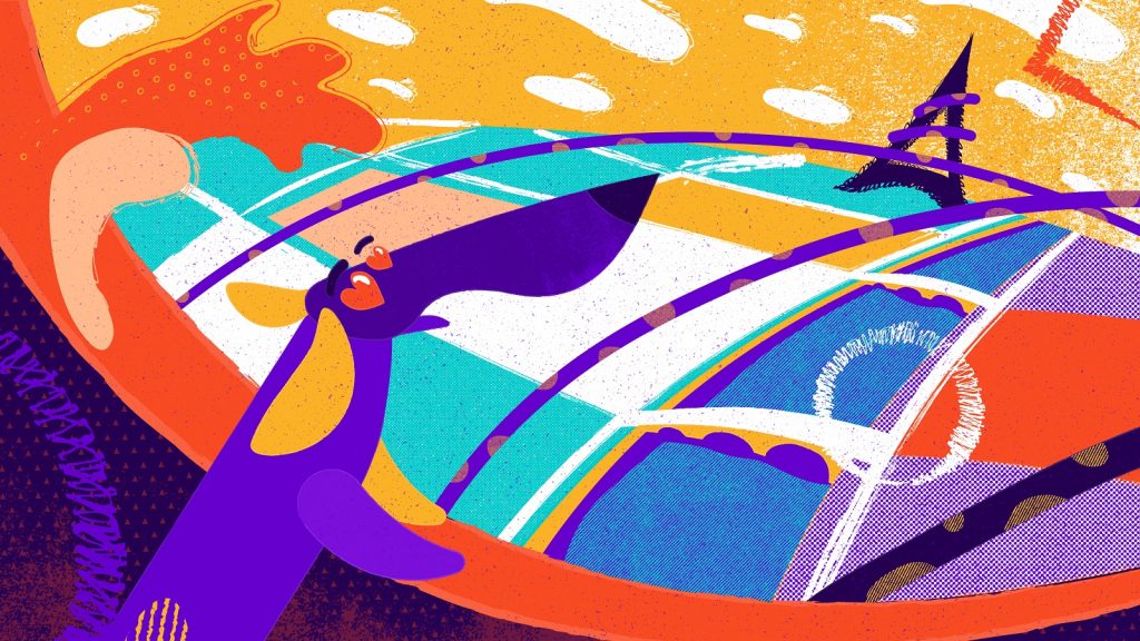
- the hero illustrations featuring people added powerful human element and made brand communication more friendly and emotional
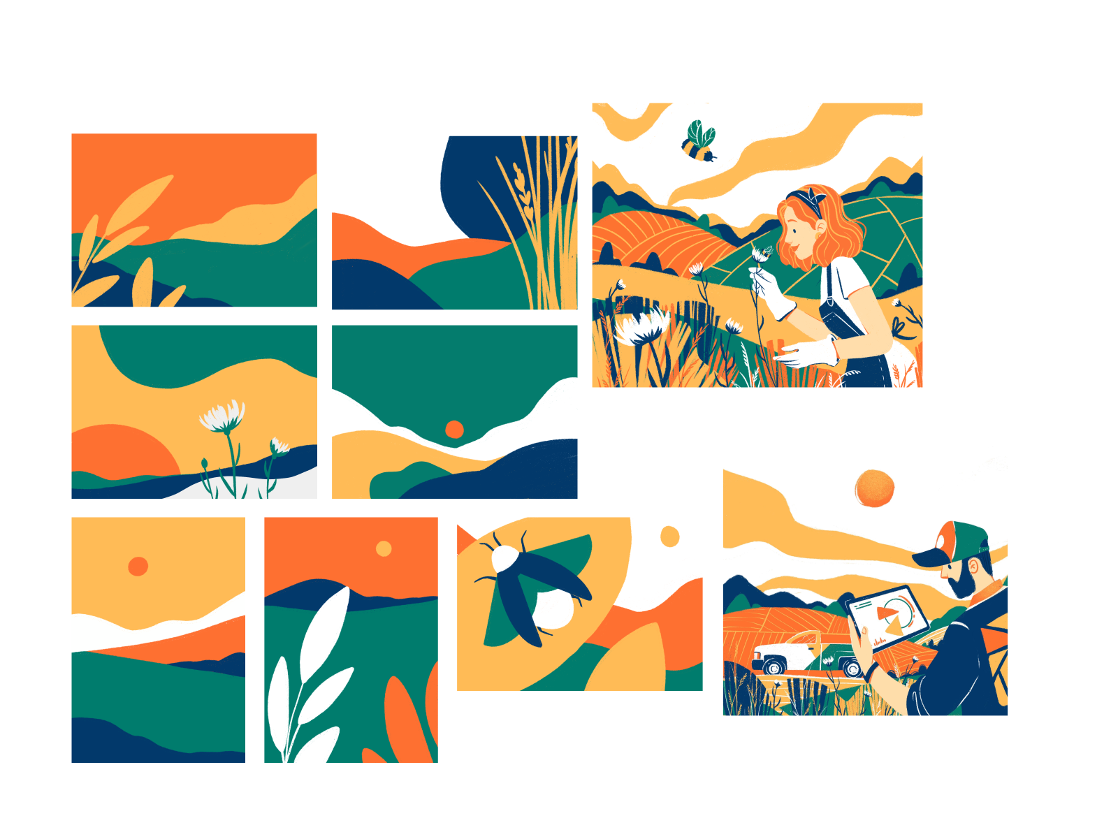
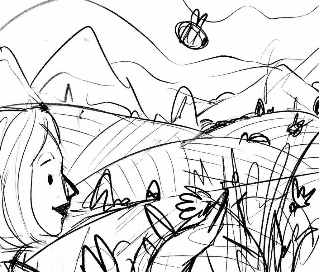
The creative process for the illustration also moved from rough sketches to present the idea and discuss it with the clients to the transformation of the approved ideas into bright digital artworks. Here’s a glance at the process for hero illustrations which had to become one of the first visual touchpoints of the product introduction on the website as a channel of communication.
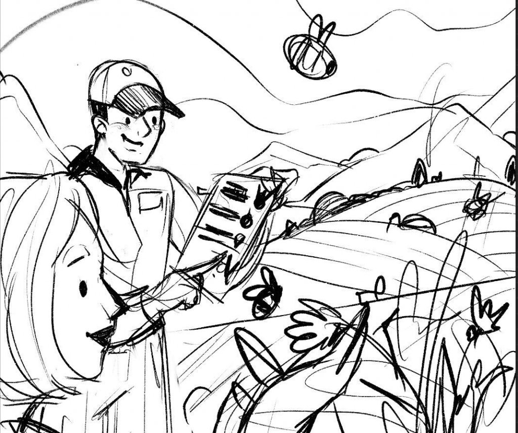
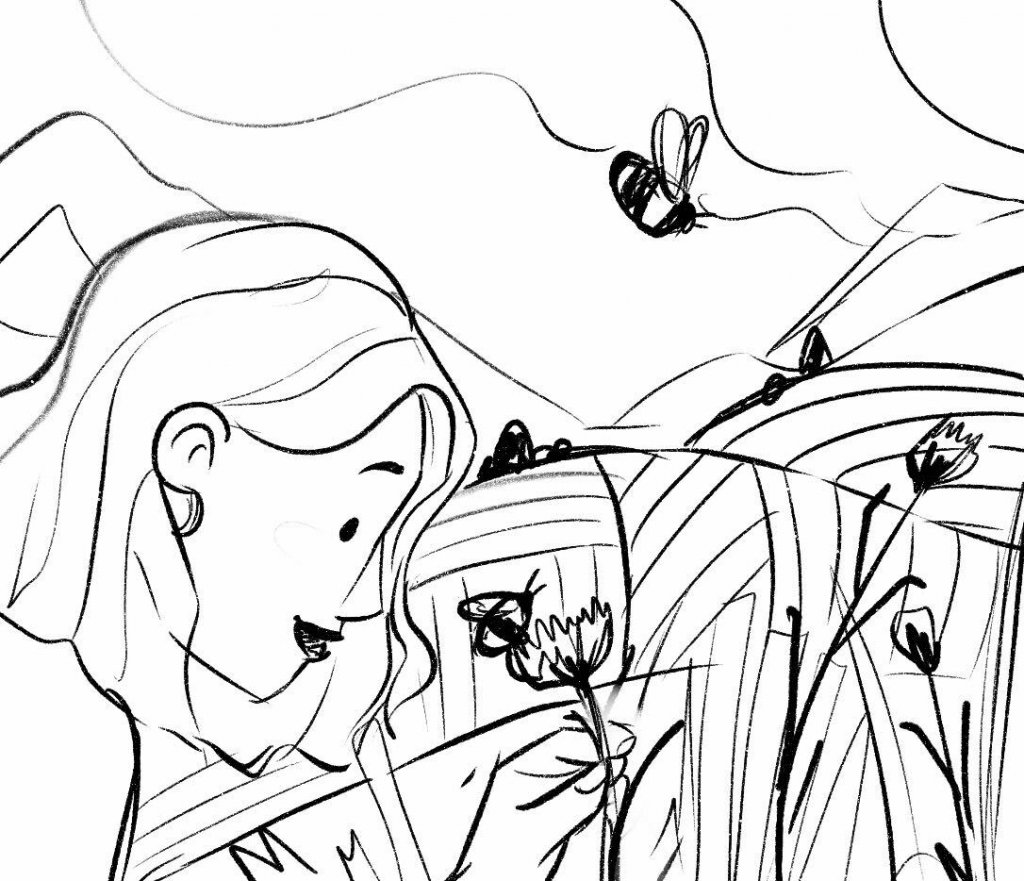
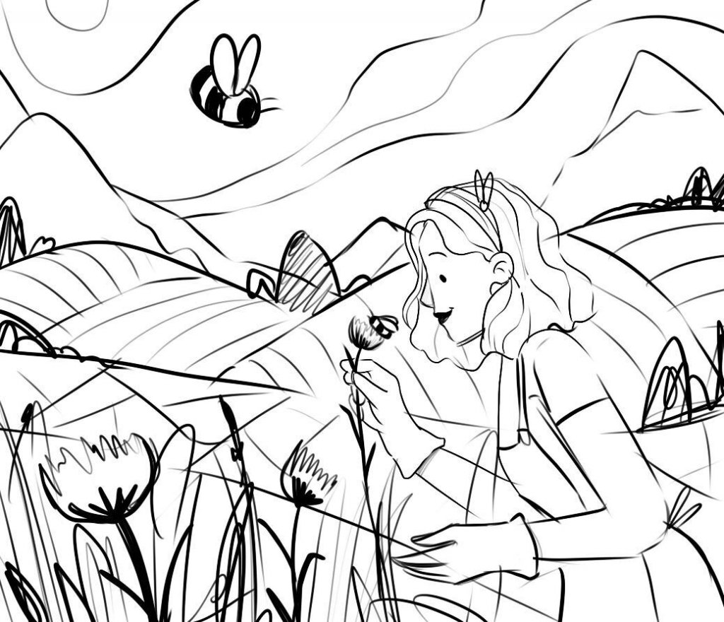
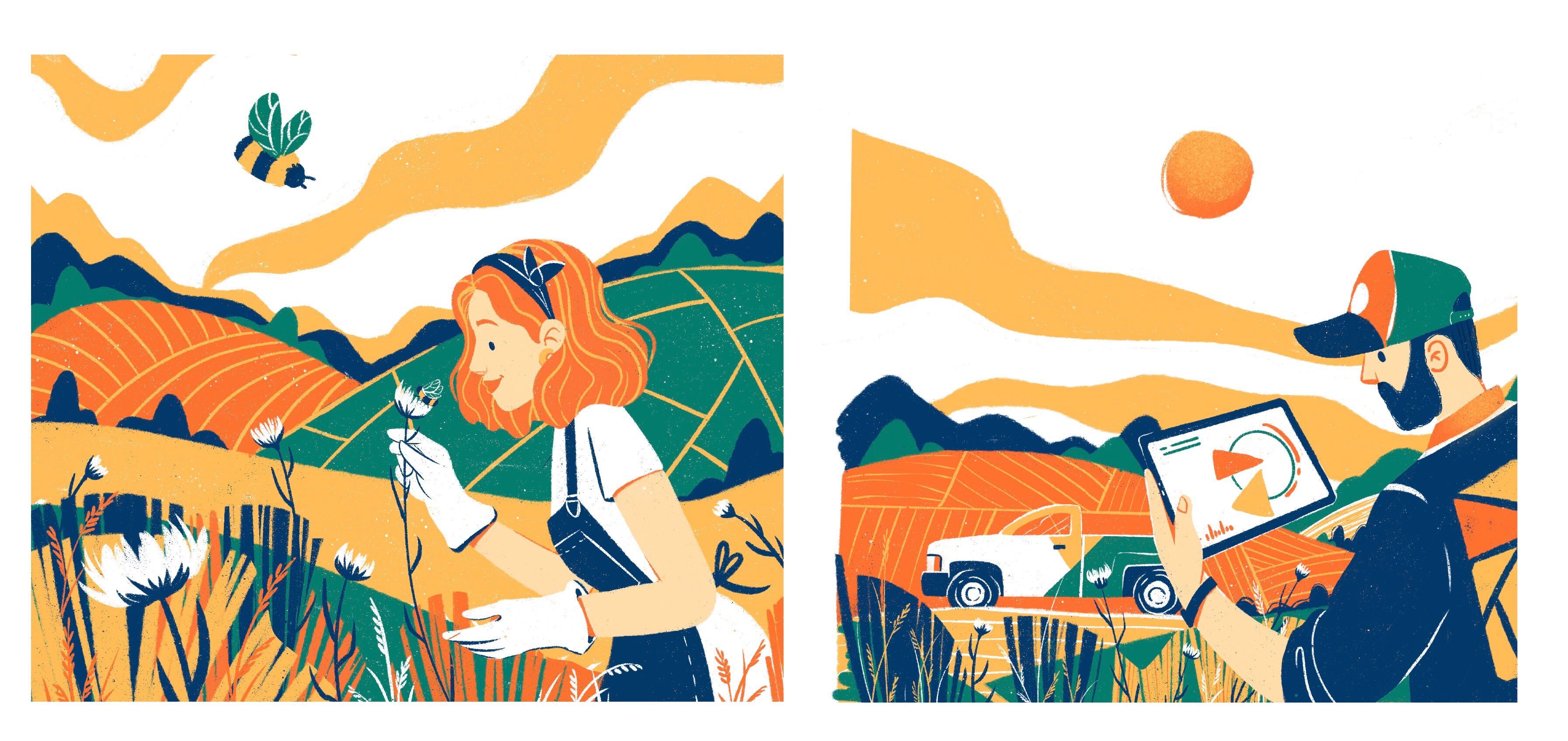
And here’s the process for creating custom graphics reflecting the main benefits of the FarmSense technology.
![]()
![]()
Web Design
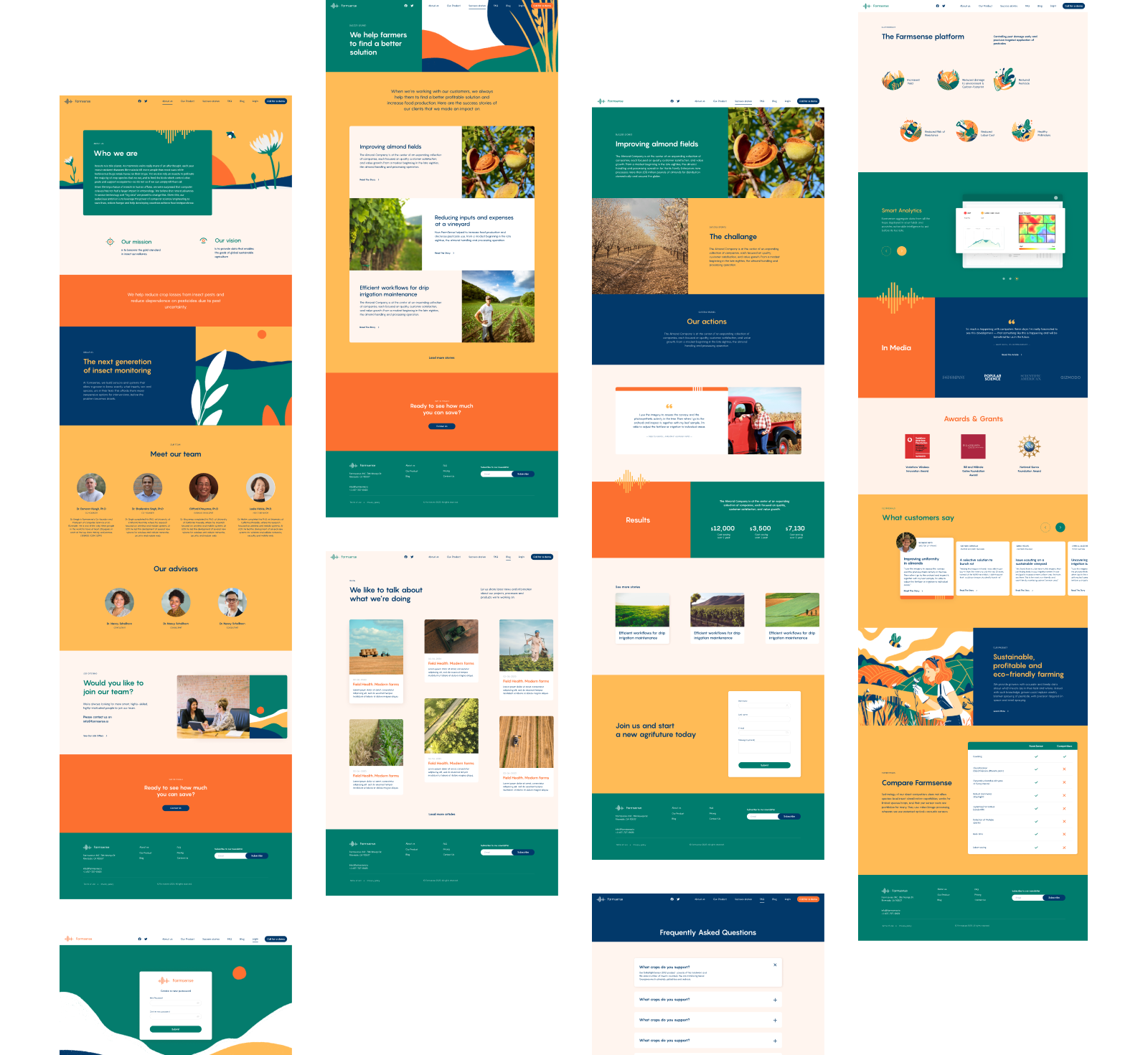
The next stage of customer experience design extending the efficiency of the product presentation and amplifying brand communication online was redesigning a website. At the initial stage, the team worked on developing a structure that would be effective and straightforward for the diverse target audience of the product.
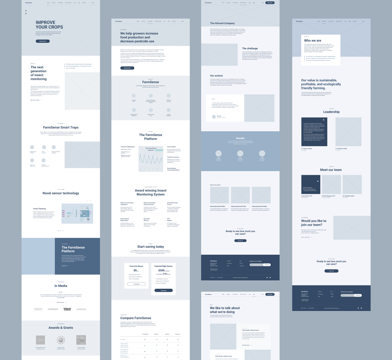
Overview of the UX wireframing stage to consider the solid and straightforward website structure and navigation
At the UI design stage, the bright branded colors were used not only for illustrations and other graphics but also as background colors for different website sections, supporting usability, scannability, and readability of web pages.
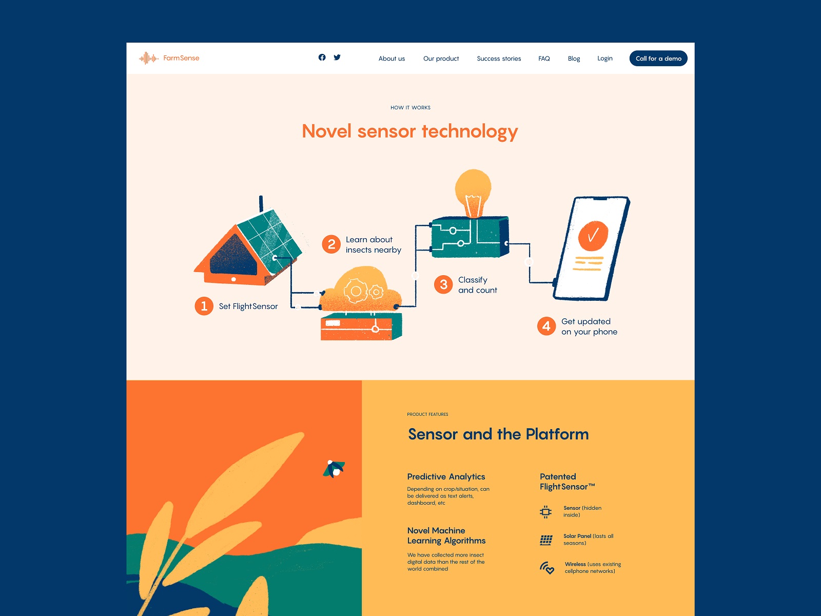
Here’s a glance at the home page of the website, catchy, friendly, and informative, amplifying the message with hero illustration sharing the peaceful, sunny, and positive atmosphere and giving instant connection to the topic of farming that employs modern technology.
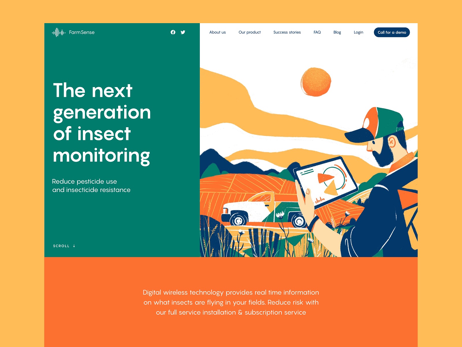
The set of original illustrations used across the website pages proves itself as a powerful tool of visual communication and storytelling. It supports the text content, sets the mood, and helps establish consistency and integrity of the website performance.
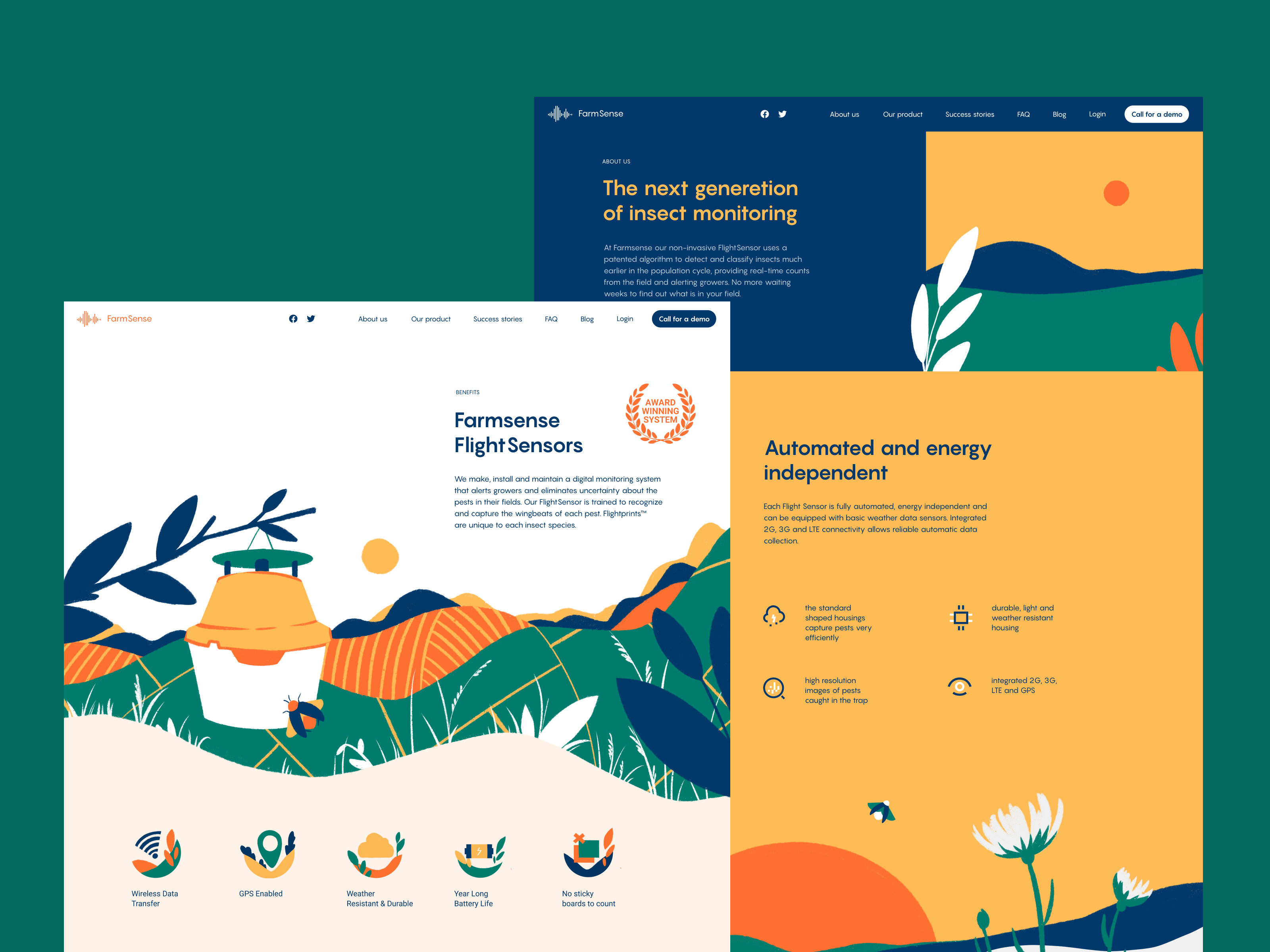
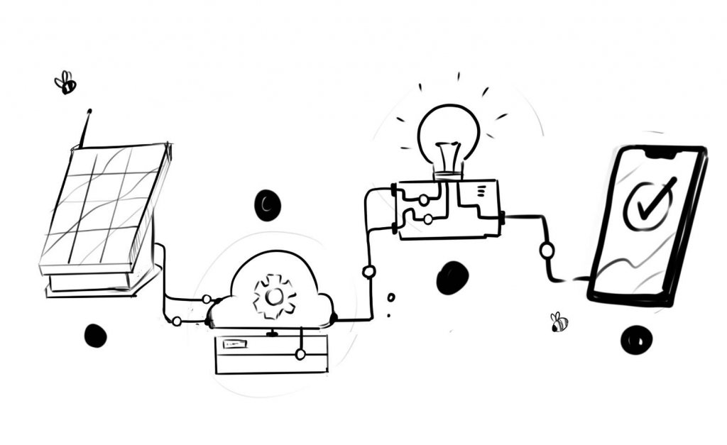
Also, an infographic with custom illustrations was created to visualize how the technology works and make its benefits more accessible.
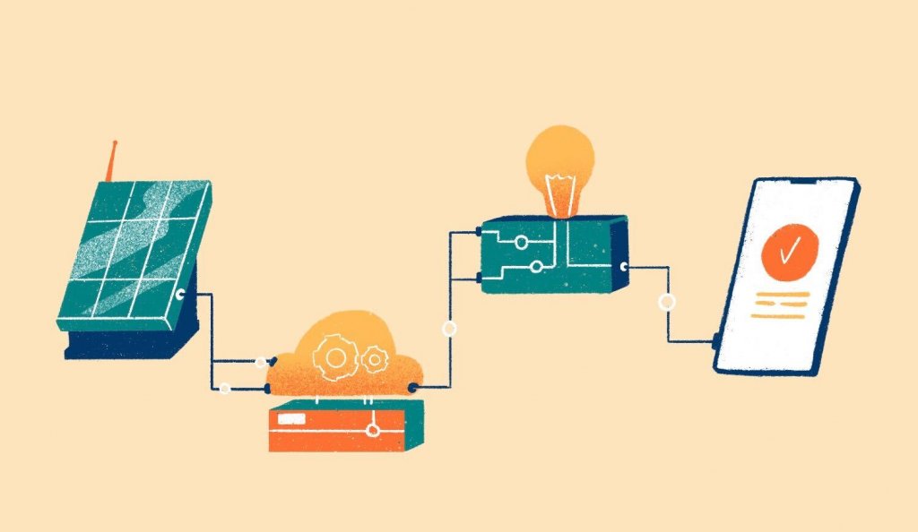
Here’s a closer glance at the set of artistic color icons supporting different text messages and creating visual triggers for essential functions or benefits to make them more noticeable and well-organized for website visitors.
![]()
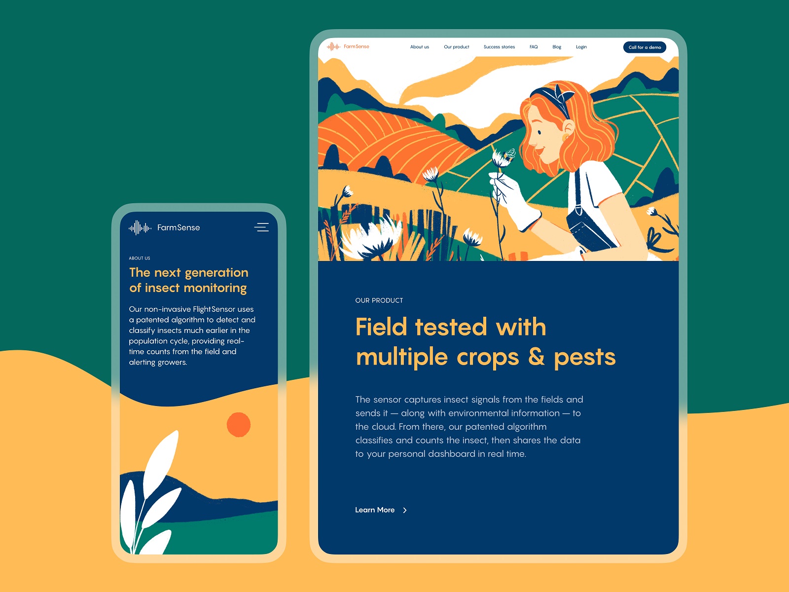
To make the website work effectively and look attractive from any device, the tablet and mobile versions were also well-thought-out. They were arranged to provide a smooth and integral user experience at any stage of interaction.
For our team, the FarmSense project was a great chance to collaborate with the representatives of the modern ag-tech industry developing with a rocketing speed now and utilizing innovations to improve farming experience and outcome, crucial for the whole world.
New design case studies from our team are coming soon. Stay tuned!
More Design Case Studies
Here’s a set of more case studies sharing the design solutions and approaches for some of the design projects done by the Tubik team.
Carricare. Identity and UX Design for Safe Delivery Service
OOP. Brand Identity Design for Online Flea Market
Otozen. Mobile App Design for Safe Driving
Uni. Landing Page Design for Fintech Service
Uplyfe. Identity Design for Health App
Real Bitcoin. Creating Website Illustrations
Devpost. Hero Illustrations for Hackathons Platform
Vinaty. Website Illustrations for Wine Service
Bennett. Identity and Website Design for Tea Brand