Let us uncover one more web design project, this time for the product from the sphere of finance and payments. In this case study, you will find a creative story of the landing page design for the fintech service Uni designed by tubik team.
Client and Project
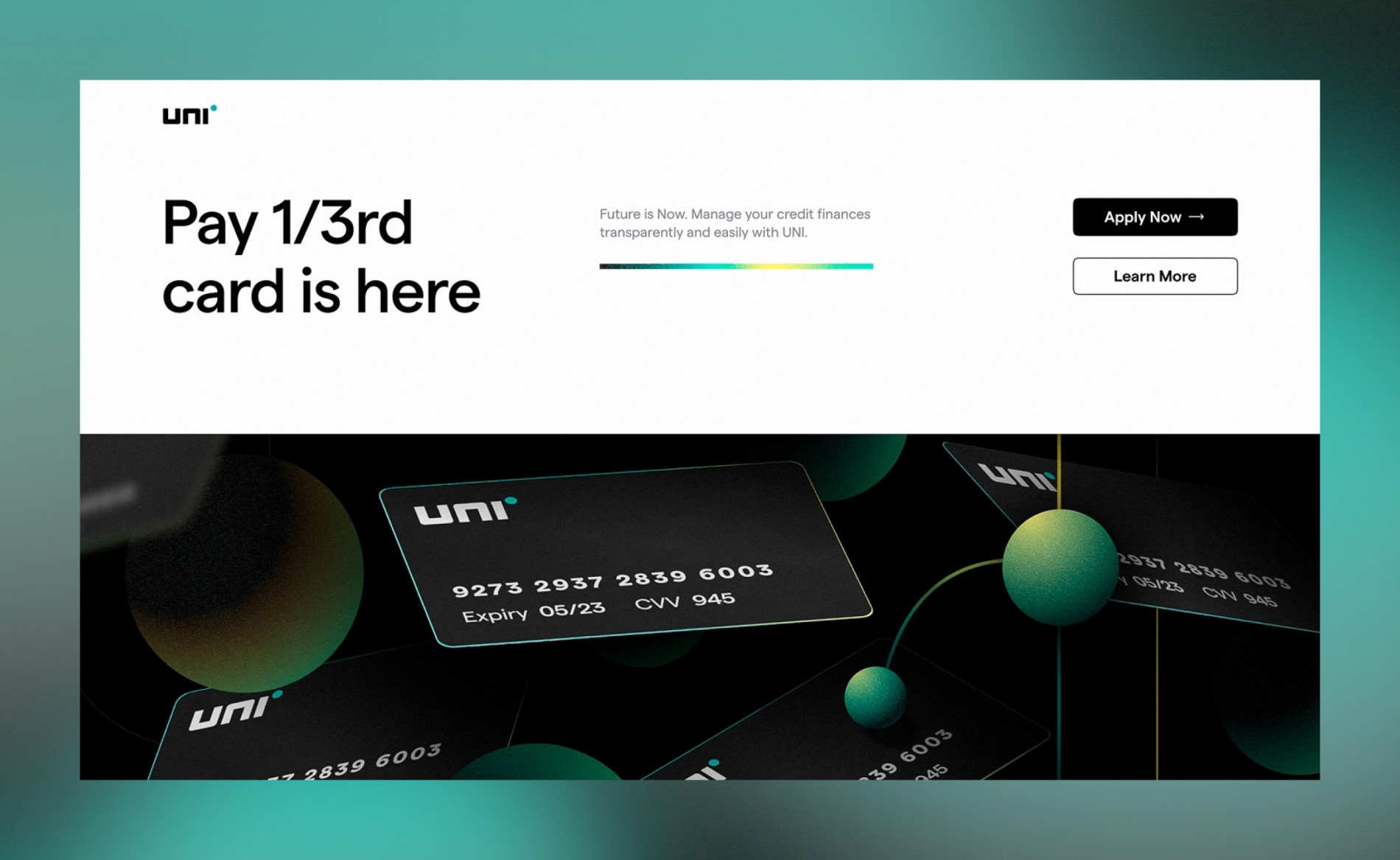
Uni is an innovative fintech service building an enhanced credit experience and operating in India. It allows the clients to use a special card for any kind of payment and to pay only 1/3rd every month.
Our task was to work on an elegant and informative landing page to support the brand’s effective web presence. The creative team from tubik side included Ksenia Lashko, Valeriia Honchar, Anastasiia Kutnia, Kateryna Baikova, Natalka Mamchur, Andrey Drobovich, and Kirill Erokhin.
Web Design
The first stage of the creative process was the research of the market and the target audience for two main objectives: to find the stylistic concept which would allow the brand to reflect the idea and stand out and to think over the proper content presentation to make the landing page both informative and concise. There were several other points to consider, such as:
- echoing the already existing general brand image and identity
- considering the nature of the highly-competitive fintech market
- presenting the quite abstract financial processes via visuals that would enhance the message and clarify the benefits.
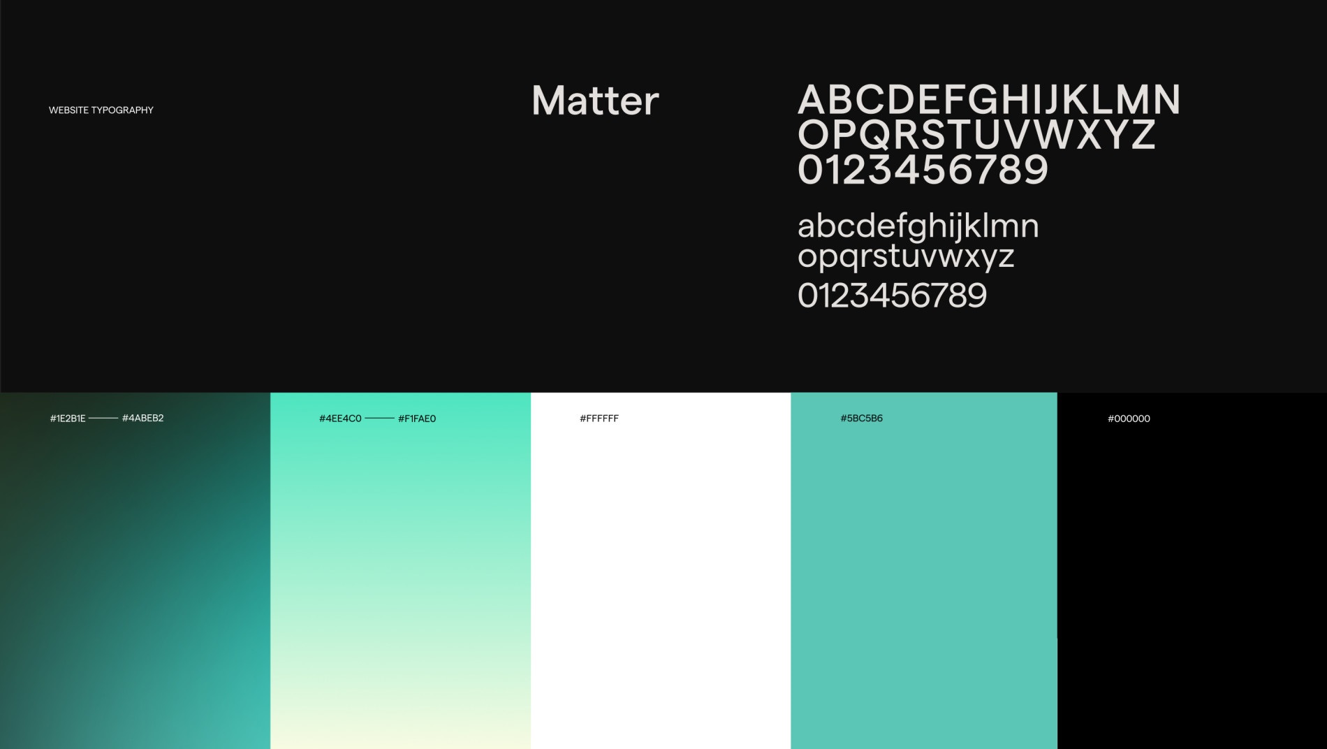
After the analysis and some creative search, the team based the general visual approach on the deep dark color scheme with color accents and slight stylish gradients that worked well with an elegant sans-serif font Matter, a grotesque typeface with a subtle, warm touch that was already a part of Uni’s brand identity. That ensured readability and scannability of content, really important for landing pages of this kind.
The hero section of the page captures visitors’ attention with trendy and somehow hypnotizing 3D animation. The credit card image gives an instant visual connection to the service offered and supports the message wrapped in the tagline. The call-to-action elements are contrast and noticeable.
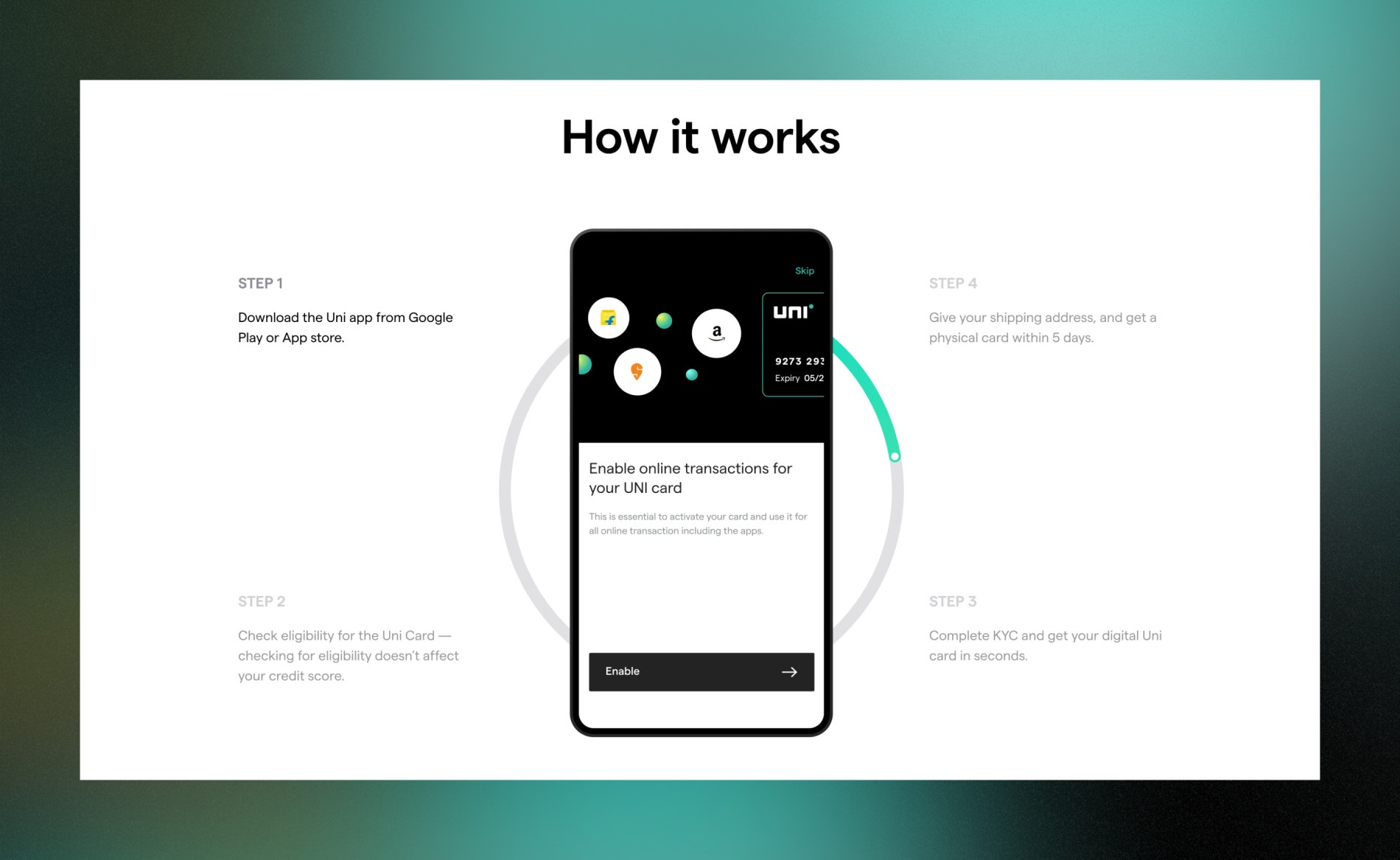
The landing page structure is based on organizing the information into several sections, each using its own way to present the product. Diversity visualization methods are applied: the visitors see the application’s interface in connection with a cards image, a scheme, and cards helping potential users understand how 1/3 payment flow works. Reviewing the page, it’s easy to see how the approach of 3 elements works: it was inspired by the idea of one-third payment rooting in a popular three-month installment plan in India. So, the integration of number three can be found all across the page: three-piece animated pie chart, three levels of payment, three cards reflecting payment stages, etc. Also, the page uses smooth motion and geometric elements echoing the branding and supporting the integrity of the user experience, as they are found on different page sections.
The Uni landing page design effectively employs color contrast to attract attention to the essential informative zones or creative elements.
One of the vital sections of the landing page is visualizing the step-by-step flow of joining Uni and trying its benefits. It focuses visitors’ attention on the prominent image of the mobile screen and the round of four essential steps allowing for getting access to the Uni card.
Another important task was to keep the landing page’s power, beauty, and informativeness on any device, so the mobile adaptation was also well-thought-out.
New design case studies from our team are coming soon. Stay tuned!
More Design Case Studies
Here’s a set of more case studies sharing the design solutions and approaches for some of the design projects done by the Tubik team.
Pass-On. Landing Page Design for Delivery App
Carricare. Identity and UX Design for Safe Delivery Service
Real Bitcoin. Creating Website Illustrations
PackYak. Mascot Design for Shipping Service
Uplyfe. Identity Design for Health App
Devpost. Hero Illustrations for Hackathons Platform
ShipDaddy. Identity and Web Design for Shipping Service
Bennett. Identity and Website Design for Tea Brand