A new case study is up, and this time, it tells the creative story of design for the helpful service operating at the crossroads of sports and business. Welcome to check the process and outcome for identity redesign, graphic design, and website design for ProAgenda, the platform created by golf professionals for golf professionals to connect the needed dots and support their business in this sports sphere with effective management and communication.
Client and Project
Altogether, with over 50 years of teaching golf and golf management experience, the ProAgenda team set the goal to create a platform to help professionals retain clients and build an online client database. The idea of integrating an online booking/coaching platform was born in 2011. These days, ProAgenda is active in 18 countries, servicing more than 1,500 golf professionals and handling more than thousands of bookings daily. The primary goals of the platform are based on the founding ideologies and aim at:
- maximizing booking retainment
- building a client database and interacting with it
- saving time and effort on administrative work
- managing automated services and reporting
The task for the tubik team was to create a bright, energetic, functional, and engaging website that would present the service’s benefits effectively and amplify its communication with users, as well as would be actual and appealing to diversify the target users and attract a younger audience which showed a growing interest in playing golf in pandemic times. Also, we worked on a logo redesign for the platform and a consistent set of elegant custom illustrations used across the website to add another pinch of beauty and strengthen the informativeness of the web pages.
The creative team from the tubik side included Vladyslav Taran, Anastasiia Zhyltsova, Vlad Radionov, Arthur Avakyan, Ladamyra Kunytsia, Natalka Mamchur, and Ira Shaposhnyk.
Logo Redesign
The creative process traditionally started from the deep research of the market and the analysis of the business goals and target audience to make the design solutions well-grounded and supporting objectives of both the business and the users of the service.
The company has come to us with an already established brand identity and vision, so with the redesign, it was essential to set the changes that would help reflect the brand’s evolution, keeping a solid connection with the original foundation. So, the first interaction of the redesign process showed the existing logo tweaks to make it more flexible for different marketing goals, neat and actual. Take a look at the first stage in the following steps:
- Existing logo
- Cleaning the wordmark by removing small details such as shadow and “.com”
- Redrawing characters to provide even thickness and balancing the proportions. The constructions of the letters remain the same.
- Tightening up letter spacing to make wordmark bold and prominent.
![]()
![]()
Considering and discussing these options, the clients decided they were open to trying even more expressive changes in the logo redesign. Hence, the creative search and graphic design process moved further and resulted in a bunch of examples, also featuring the offer to renew the core brand colors combination. Several options saved the initial idea of the wordmark with emphasized orange letter A, while most variants presented the combination marks featuring a graphic symbol and a typographic part.
![]()
The final shortlist of variants to discuss and choose from included two font-based wordmarks, two combination marks, and the wordmark based on hand-written lettering echoing the same style as the bunch of custom illustrations created for the website.
![]()
Eventually, the decision was made on the logo presented with the combination mark whose elements use contrastive colors: a bright orange abstract symbol echoing both golf balls and the idea of networking, and the solid typographic part presenting the brand name.
![]()
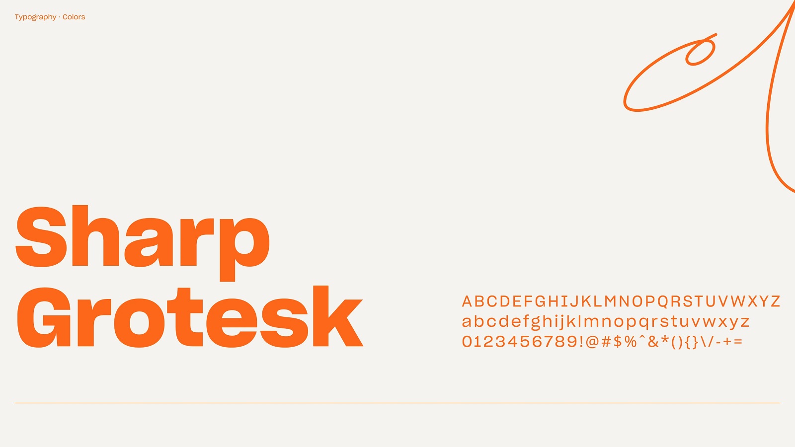
The brand typography choice for the identity design and online presence of the platform via website fell on Sharp Grotesk, an elegant and flexible sans-serif typeface designed by Lucas Sharp and released through Sharp Type in 2017, with the design inspired by nineteenth-century wood type combined with Adrian Frutiger’s technical design process.
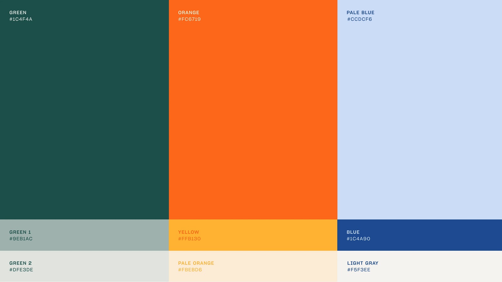
The color palette keeps the original orange brand color but extends the approach and expands it with an eye-pleasing combination of colors with an optimal level of a color contrast which enables to use it effectively for various objectives of visual identity and brand communication as well as web design. As well this color palette looked not only friendly and energetic but also original and helped the website stand out from the competition in the given sphere.
Graphic Design and Illustrations
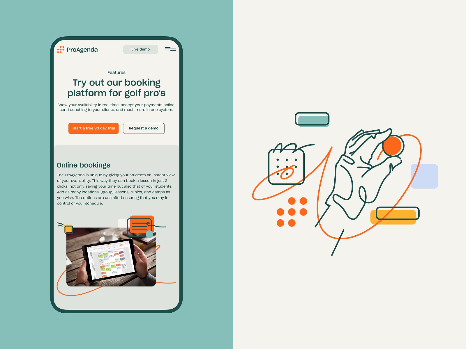
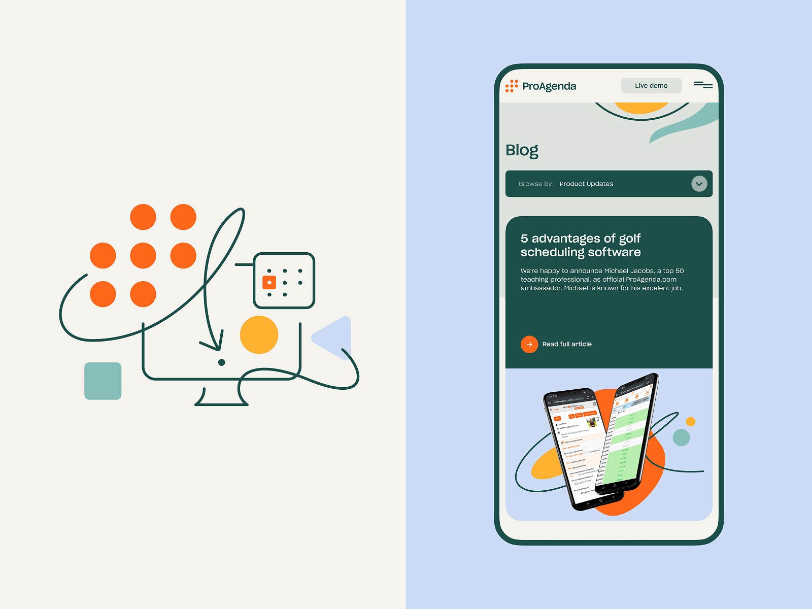
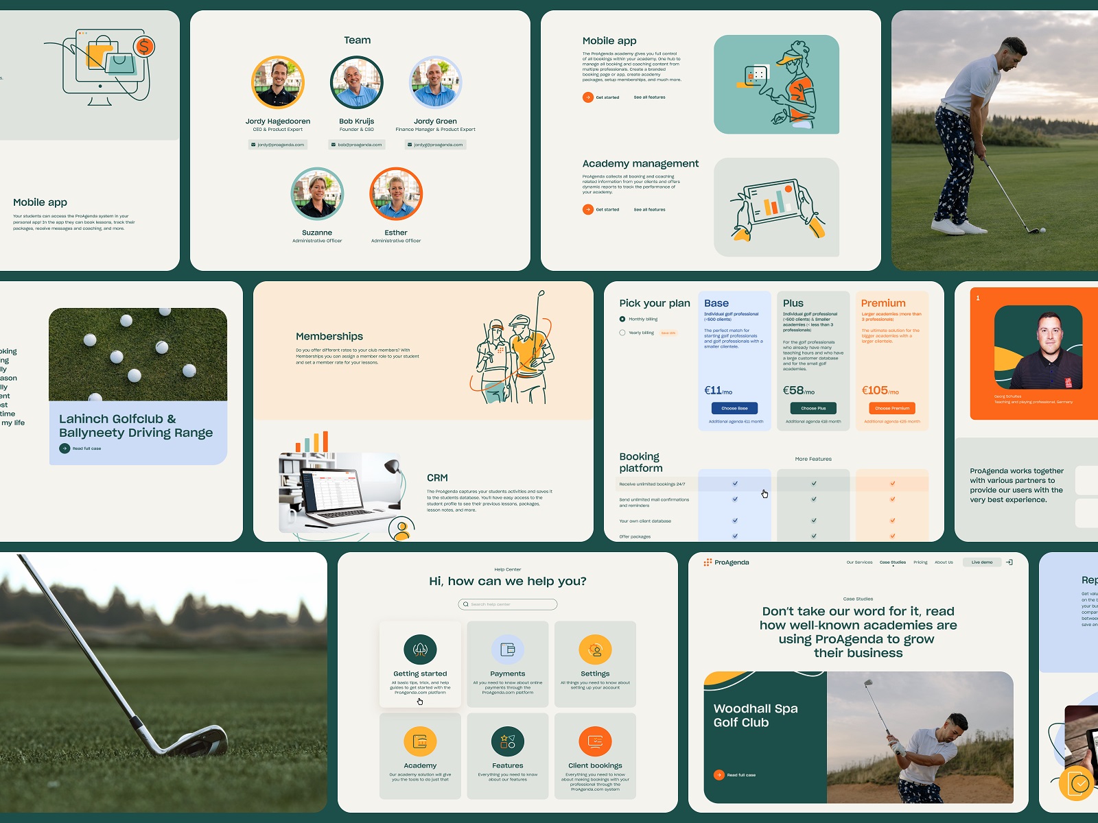
Considering the visuals for the website and brand communication, based on a closer look at the websites in the sphere, the creative team came to the conclusion that photos and video should not be used as the only types of media content in the web presence of the service. Combining high-quality, real-life photos with the original illustrations was seen as the direction maximizing the essence of the product and creating an original style that helps to distinguish the brand from the competition and make it more recognizable and memorable. The suggested visual direction was based on using a line art illustration style to set a consistent, unique, and user-friendly manner for the website. That style of illustrations supported the emotional brand communication and spoke the same language as the user, not looking too formal and strictly businesslike. Here are some artworks using neat and curvy line art and attractive color accents.
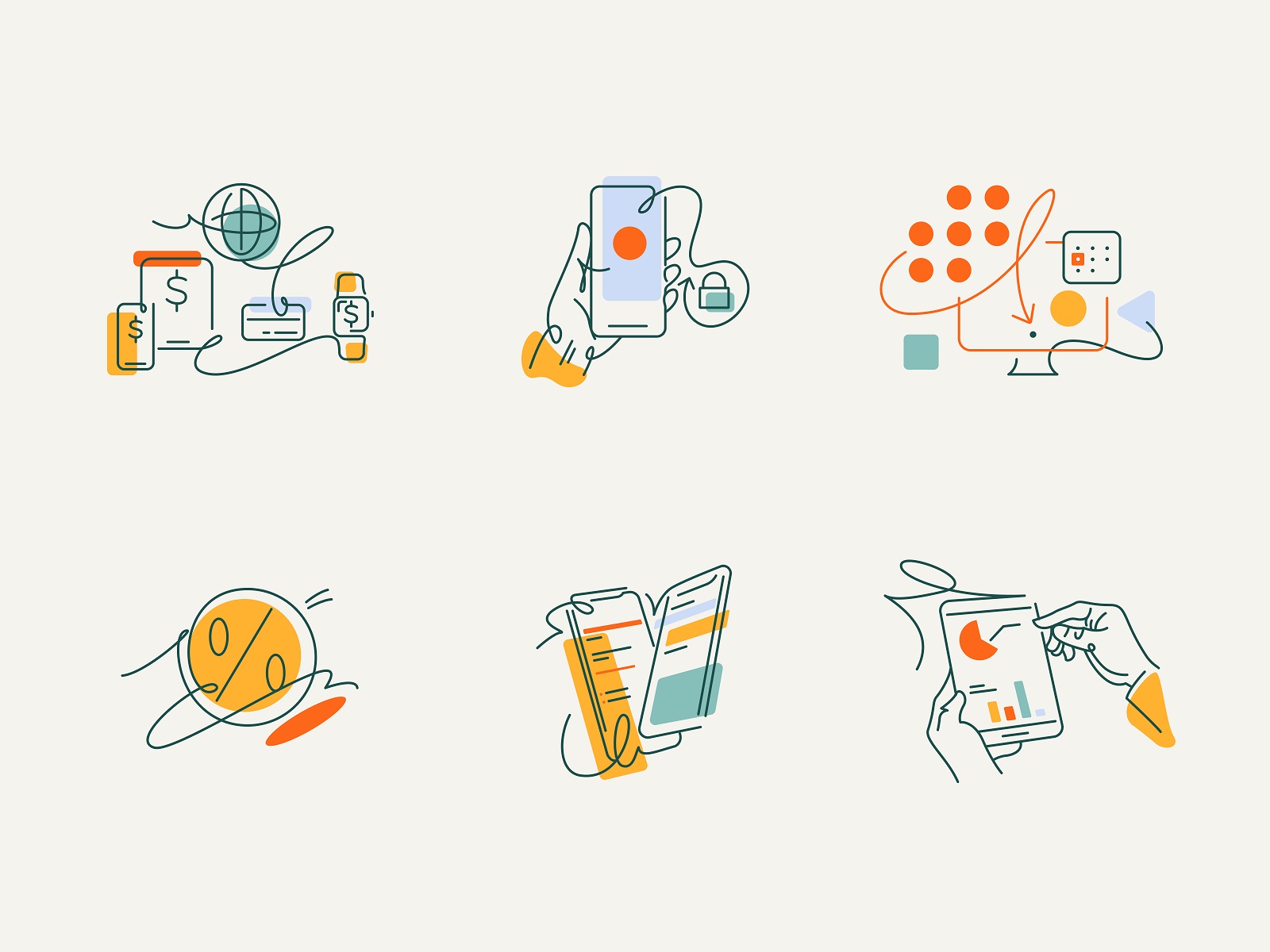
A pack of line icons was also developed for the website to visually support some benefits or functionality.
![]()
Website Design
In web design, the creative team focused on providing a web user interface with a clean layout and attractive graphics, making a bright first impression, using expressive typography, and setting the accents helping to guide users and make the navigation easy and straightforward.
Warm neutral color tones are used for the background, so the website looks more personal and enjoyable. Orange brand color combined with green and blue create the feeling of friendly and open business communication and transfer the emotional connection with the refreshing energy of sports and outdoor activities. Additional colors help focus on the needed elements to make navigation intuitive and ensure that the content is scannable, as well as make the layout look bright and catchy. The text content is organized in well-arranged digestible blocks supported by a solid visual hierarchy to make the pages skimmable and readable. Smooth web animation adds originality and makes interaction with the website dynamic and lively.
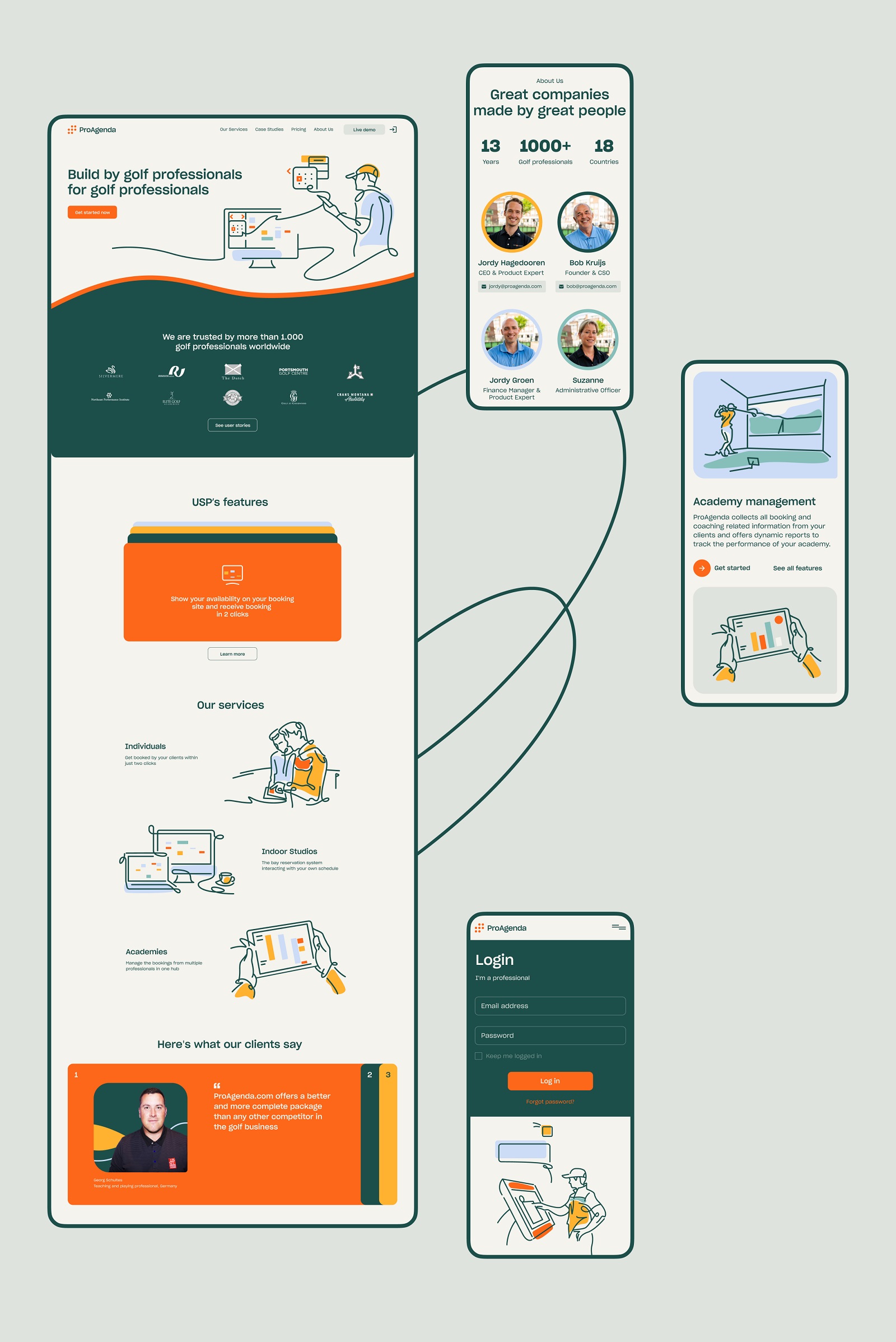
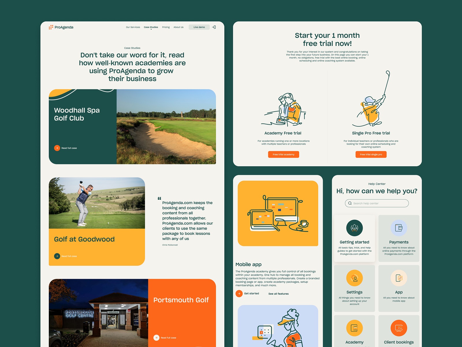
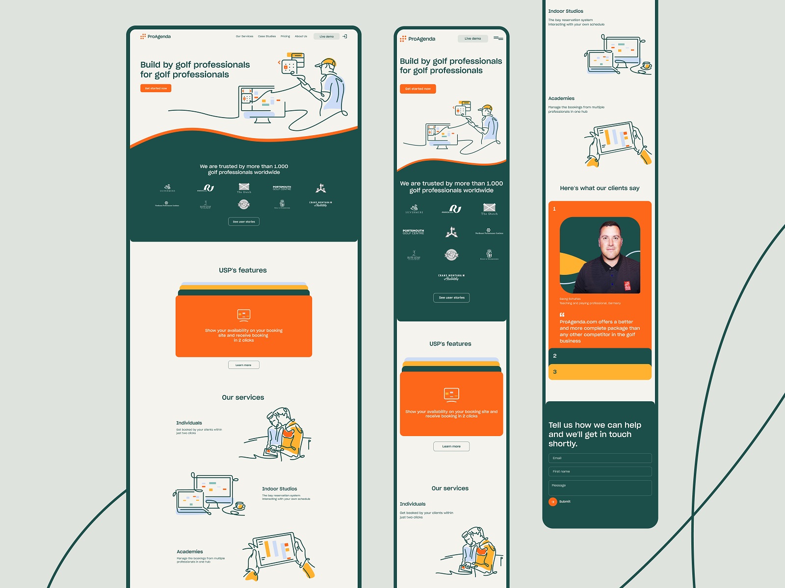
See how it works in the home page design for the ProAgenda website, with the prominent animated illustration used as a hero image.
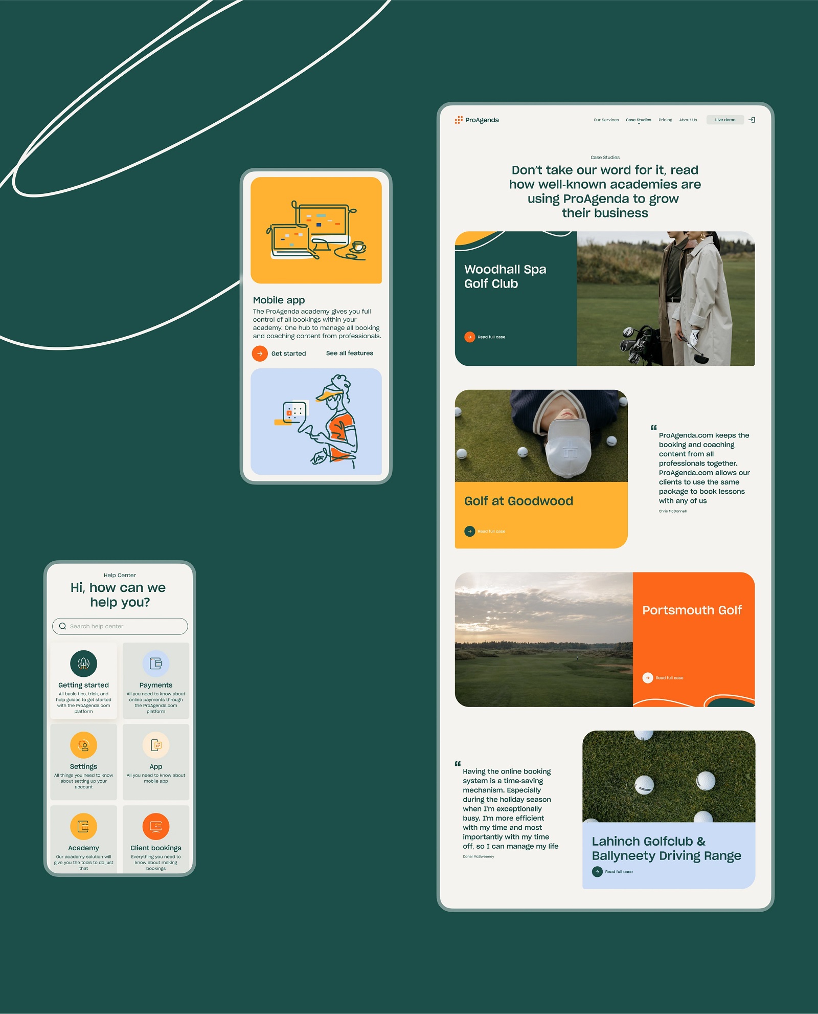
The well-balanced combination of illustrations and photos on the web pages, supported by bright color accents, makes the layout look distinctive, emotional, and informative.
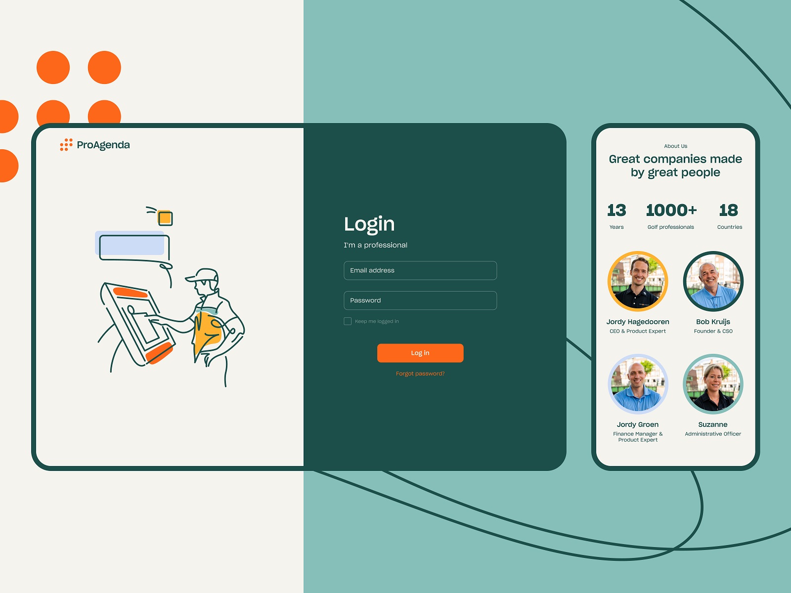
The log-in page uses the simple structure of a split screen with contrastive background colors with visual communication through an illustration on one half and an interactive zone for easy logging in on another.
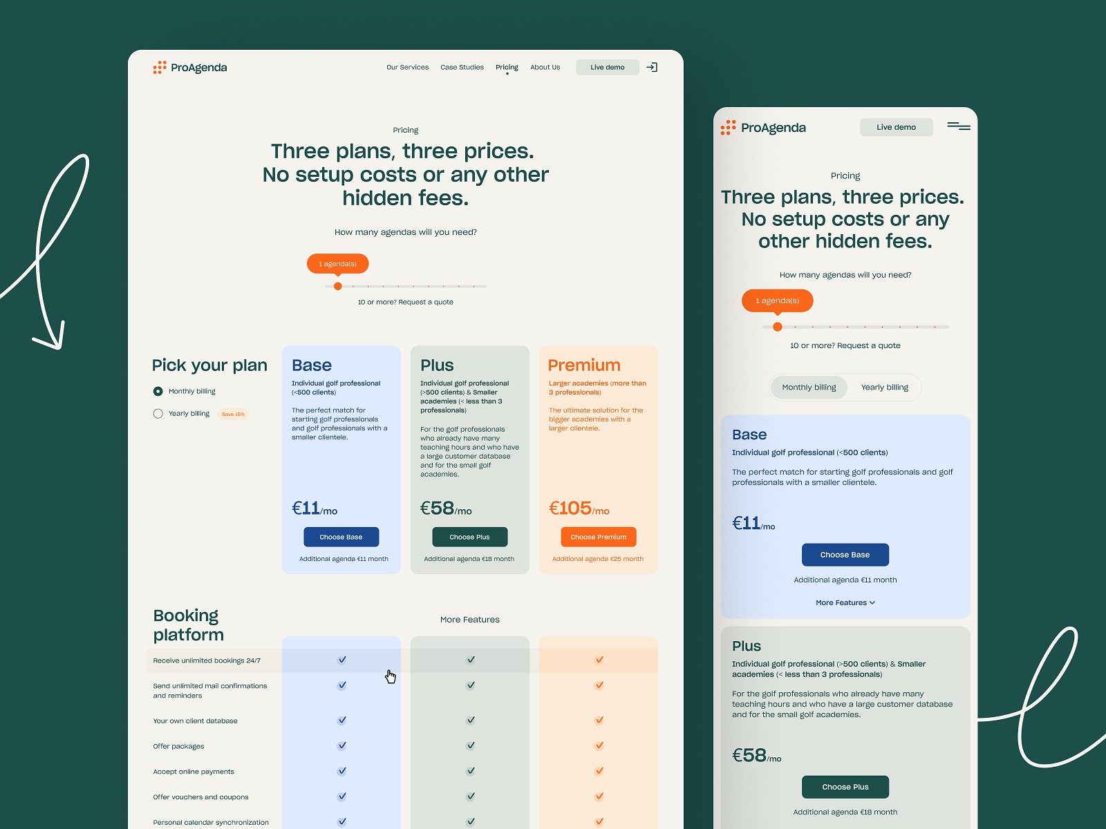
The major challenge for pricing page design was to organize a lot of information in a way that would be clear and straightforward for the website visitor. What’s more, the page also features interactive elements that help tune the preferences.
And here’s a look at the blog page, also demonstrating how illustrations and photos effectively work together in one layout.
Also, it was important to make the website look nice and work well on different devices, and diverse screen sizes, so mobile and tablet versions of the website were thought out and tested.
Our collaboration with the ProAgenda team didn’t stop after the website was designed: it successfully turned into a long-term and fruitful partnership, and now we are happy to be working on the next set of creative tasks for the platform.
New design case studies from our team are coming soon. Stay tuned!
More Design Case Studies
Here’s a set of more case studies sharing the design solutions and approaches for some of the design projects done by the Tubik team.
BlockStock. Brand Identity and Website for Minecraft Models Resource
Kaiten. Identity and Product Design for Food Marketplace
THT. Website Design for Electrical Engineering Service
Komuso. Website Design for Wellness Tool
Nonconventional Show. Website Design for Podcast
uMake. Branding and Website for 3D Design Tool
Fulfill. Illustrations and Web Design for 3PLs Marketplace
Bikker. Identity Design and Illustrations for Biking Service
Glup. Delivery App Branding and UX Design
BEGG. Brand Packaging and Web Design for Food Product Ecommerce
Crezco. Brand Identity and UI/UX Design for Fintech Service
FarmSense. Identity and Web Design for Agricultural Technology