Our new case study invites you to dive into the atmosphere of traveling, enjoying new places, seeing new horizons, getting inspired, and having fun. Welcome to check the creative story behind reconsidered brand identity for Hotel Card, the convenient service of discounted hotel offers.
Client and Project
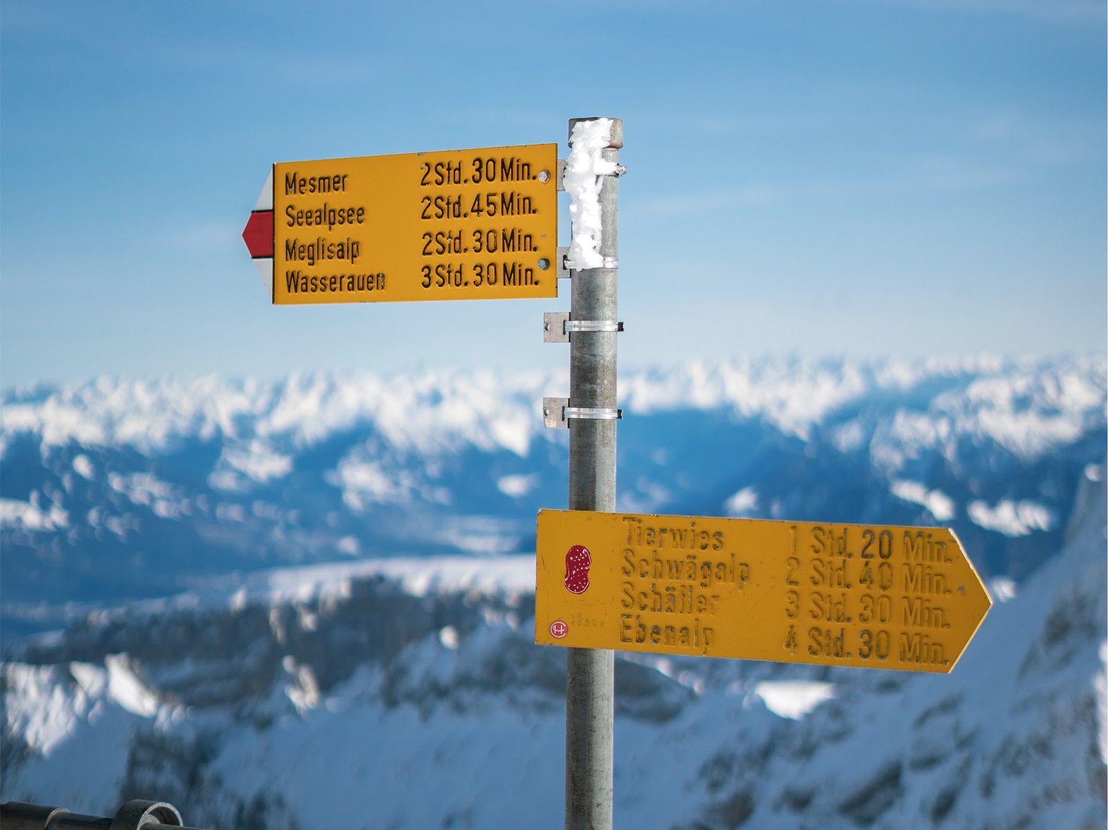
HotelCard is the market leader in discounted hotel offers in Switzerland, with a broad and diverse selection of hotel discounts and special offers. The service takes zero fees from hotels and, this way, supports hundreds of small and family-owned hotel businesses helping them to improve their occupancy. HotelCard stands for sustainable regional travel, consciously supports local independent hotels, and promotes travel diversity. Handy and straightforward, the service is a win-win for both local hoteliers and their clients.
As they tell about the brand history, the HotelCard idea was born in 2009, quite literally at the kitchen table, when young Swiss entrepreneur Ivan Schmid was thinking of ways to improve the occupancy rate of his father-in-law’s hotel in the Engadin Valley. The result was the “half-fare travel pass for hotels,” based on the idea of the popular half-fare pass for public transport. Quickly many hotels signed up as partner hotels, and the number of members increased rapidly over the coming years. 10 years after its launch HotelCard received new management at the end of 2019 / early 2020 with TWINT founder Thierry Kneissler appointed as new Chairman. It resulted in investments in improving the technology platform, and the business model was consistently adapted to the changing needs of hotels and members. The effort paid off, as HotelCard is now more popular than ever with members and hotels and also enjoys increasing popularity in nearby countries.
In this project, the client from the hospitality and tourism sphere approached the tubik agency team with the wish to reconsider the existing brand style to make it friendlier, more emotional, more consistent, and trendy, reflecting the brand evolution over the years. The new identity design aimed at strengthening brand recognizability and memorability and had to work effectively for loyal customers as well as attract and engage a new younger target audience.
The creative team from the tubik side included Vladyslav Taran, Vlad Radionov, Anastasiia Zhyltsova, Arthur Avakyan, Yaroslav Manzheliy, Mykyta Litinskyi, Andriy Drobovych, Maryna Solomennykova, Olya Zakharyan, Natalka Mamchur, and Olga Syrotkina.
Brand Identity Design
Looking back at the general scope of work done in the HotelCard design project, we can mention the following list of covered tasks:
- rebranding based on our deep market and audience research
- design of diverse branded items
- creating presentation templates
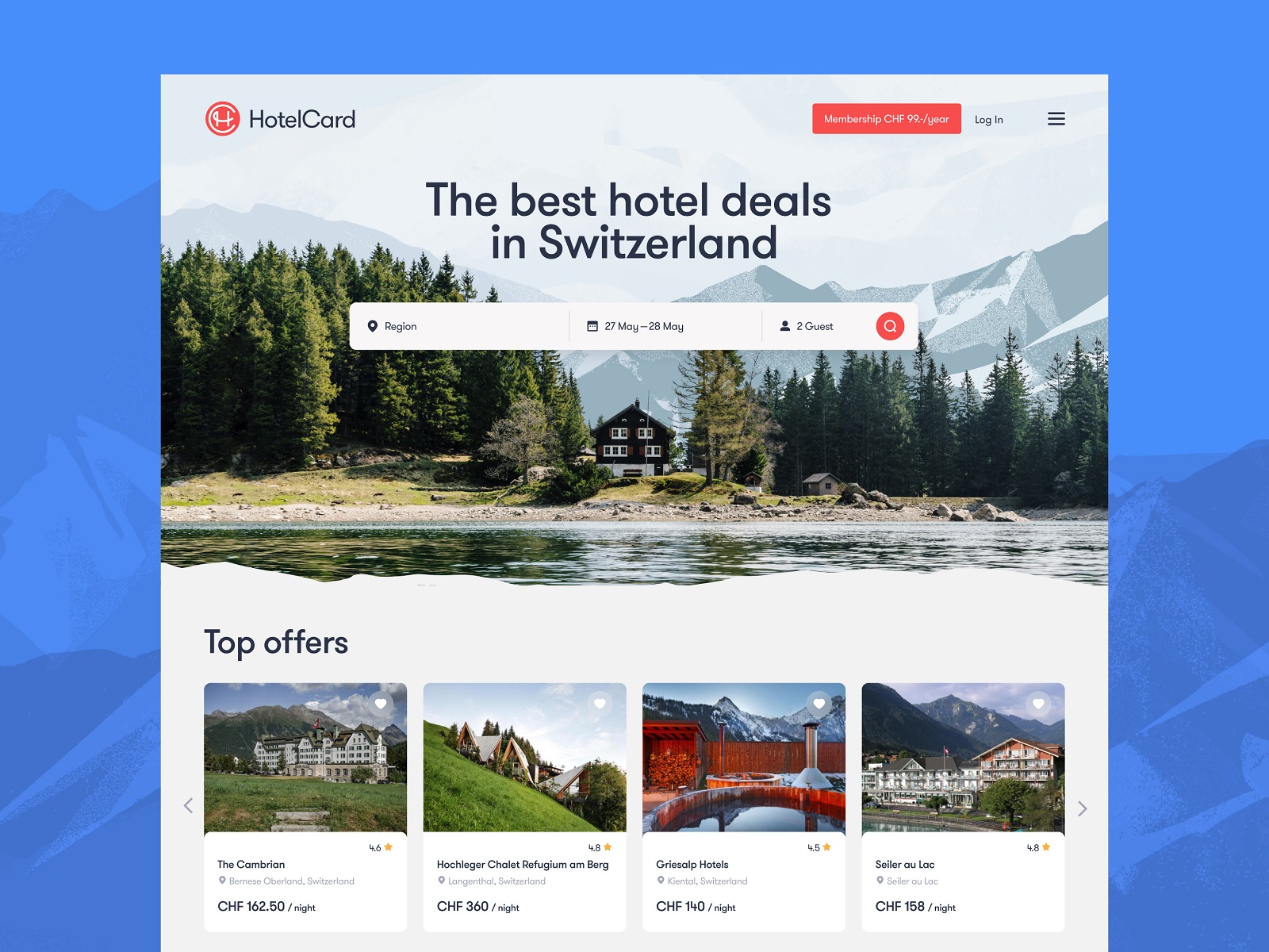
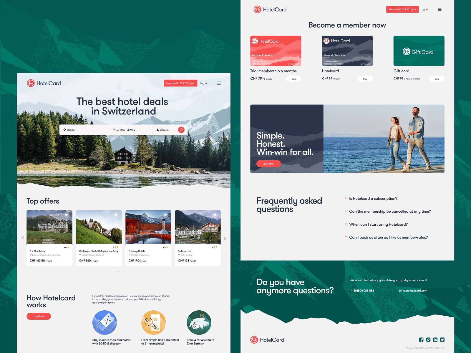
- UX design for landing page
- UX design for widgets
- custom icons design
Working on the rebranding for the already established and known business, it is always critical to make well-balanced and wise decisions that amplify already obtained achievements and broaden the horizons for new ones. That is why before any creative ideas were put forward, the team had made a profound and thoughtful analysis of the existing direct and indirect competition in the sphere and worked on customer profiles to better understand their wishes and pain points. Our experience with different identity design cases proves that the research phase is vital to develop the brand concept and approach that would set a solid foundation for the design solutions that helps the brand stay on the same page with its clients, be found where they expect to see it and communicate effectively at different environments and marketing channels.
The eye-pleasing color palette for the identity design was inspired by the diverse beauty of Swiss nature, and elegant, readable typography helped to make the customer experience aesthetic, atmospheric, and emotional at various points of contact with the brand.
For the primary typeface applied to identity and UX design for HotelCard, GT Walsheim was chosen, the friendly and precise typeface inspired by the lettering of Swiss poster designer legend Otto Baumberger from the 1930s.
The new logo design for HotelCard reflects the idea of the business which is serious and friendly, supportive and flexible in the constantly changing and evolving sphere of hospitality and traveling. The full version of the logo performs as a combination mark where the symbol is the eye-pleasing graphic presentation of H and C letters, the title ones from the brand name, inscribed into a circle, while the typographic part presenting the brand name is solid, straightforward, and easily readable. The logo was designed and tested to be flexible for different usage cases and work well not only in complete form but also only as a symbol where the environment demands it.
At the next stage, an extended pack of branded items and consistent graphics was provided for various marketing goals. Below you can take a glance at some of them, for example, welcome letters, printed and display ads, member cards, gift cards, presentation templates, custom icons, and the like.
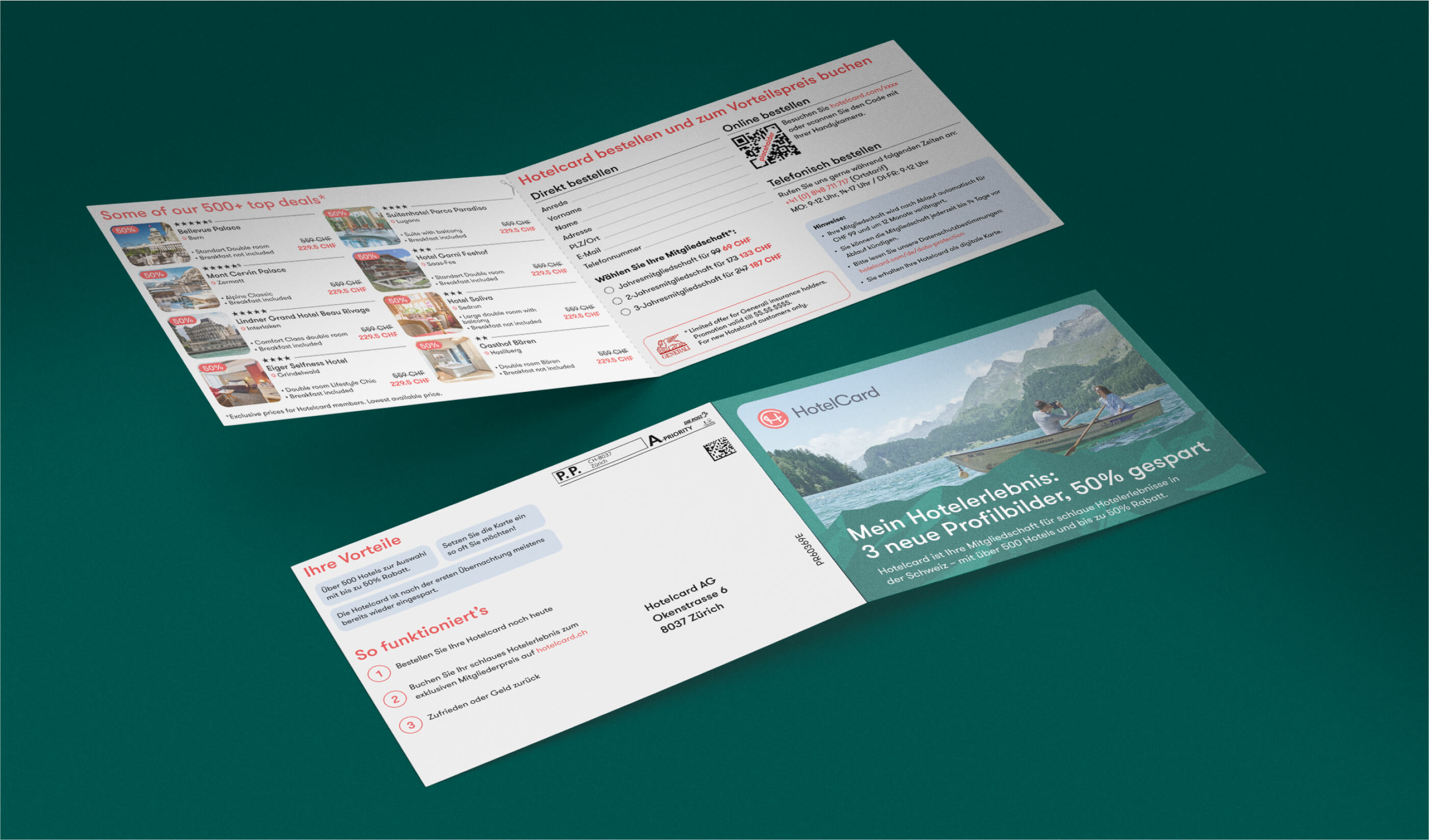
Branded leaflets design
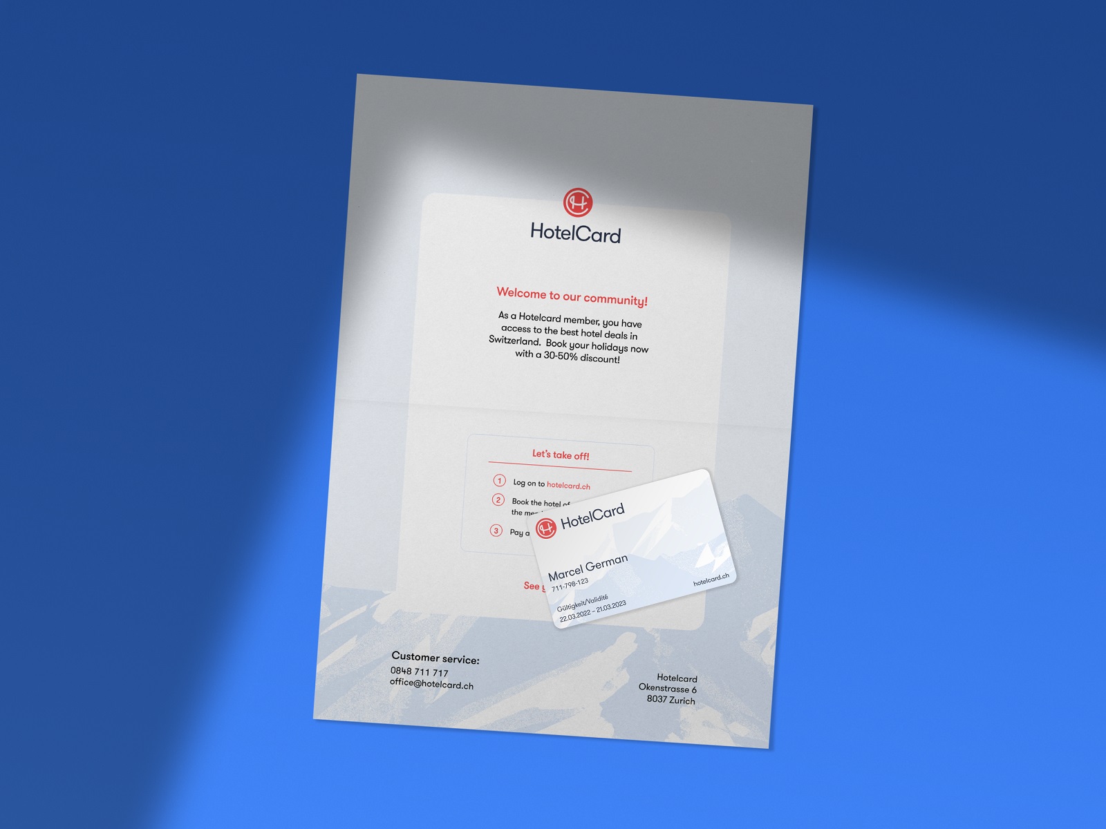
Welcome letter and member card design
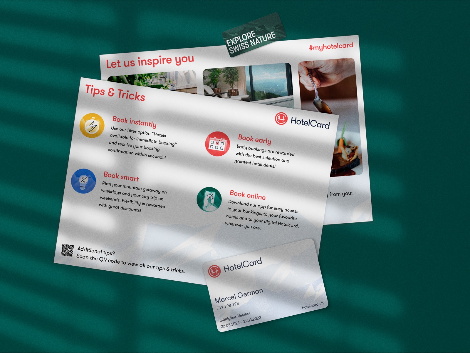
Branded leaflets design
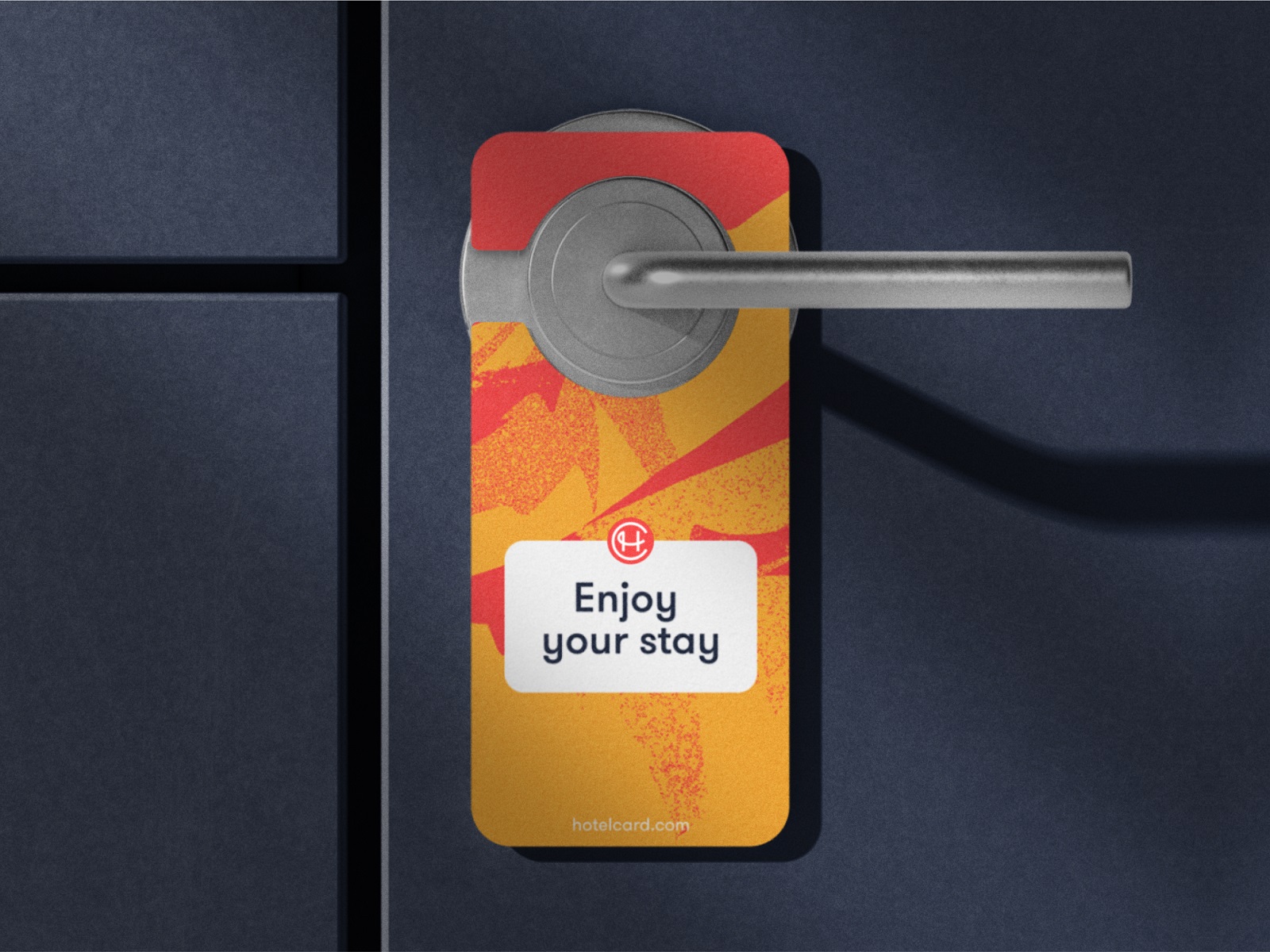
Branded door hanger design
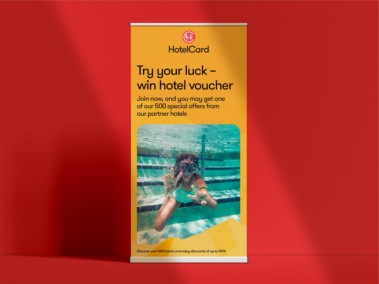
Advertising poster design
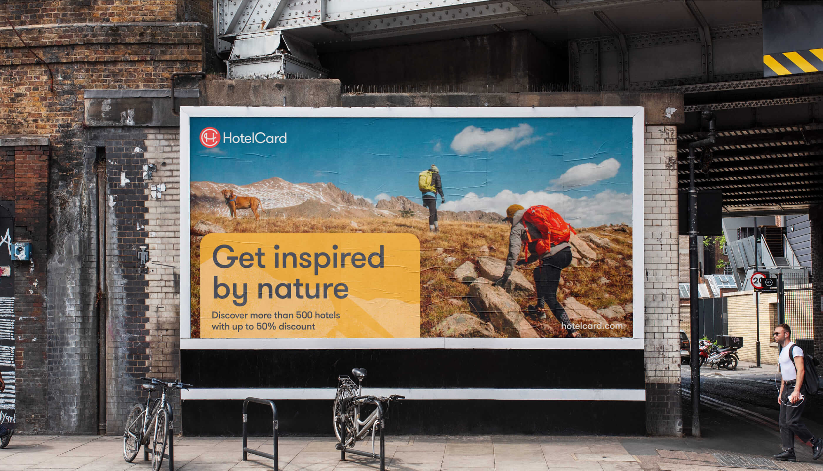
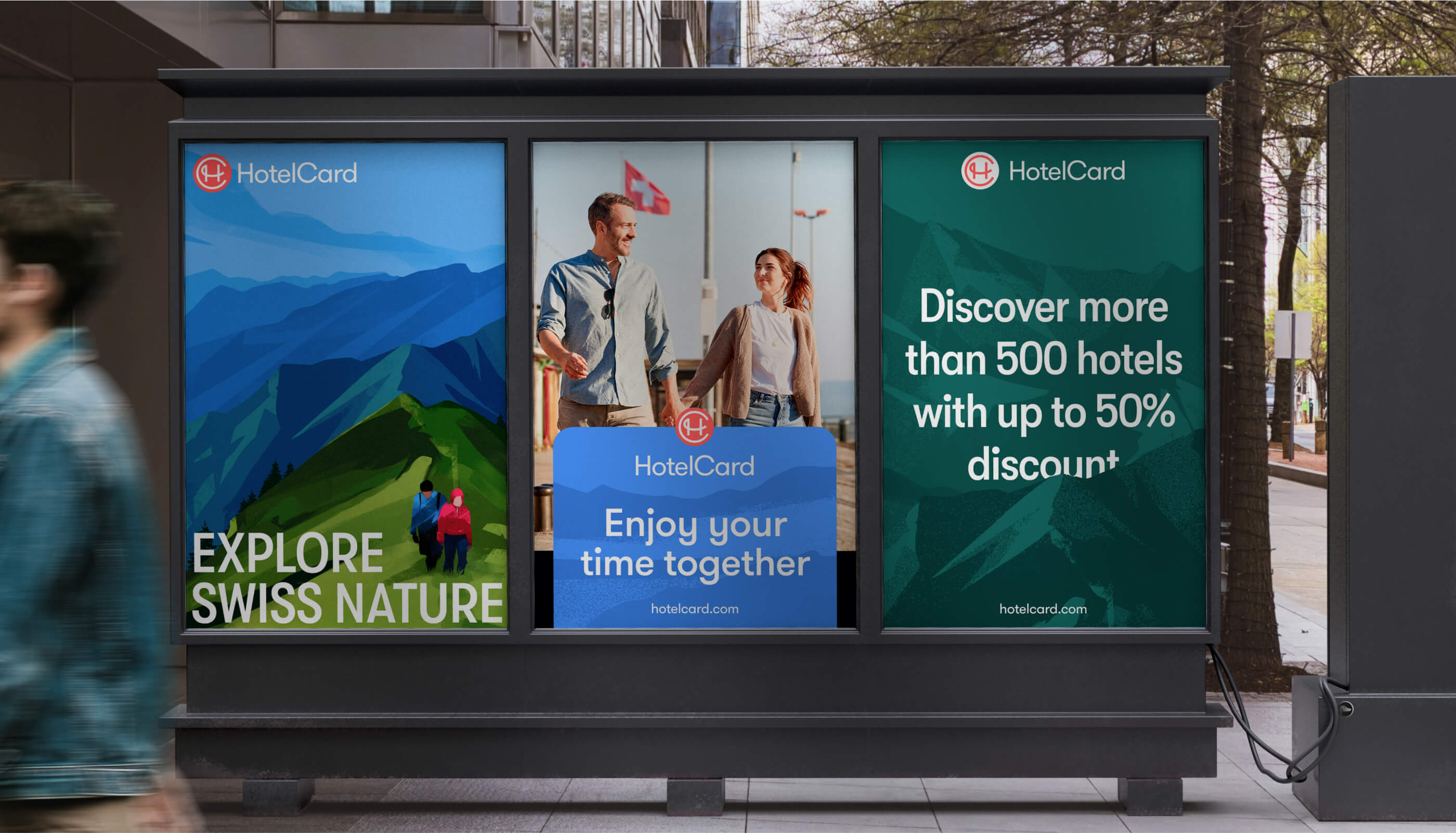
Outdoor advertising poster design
Posters design
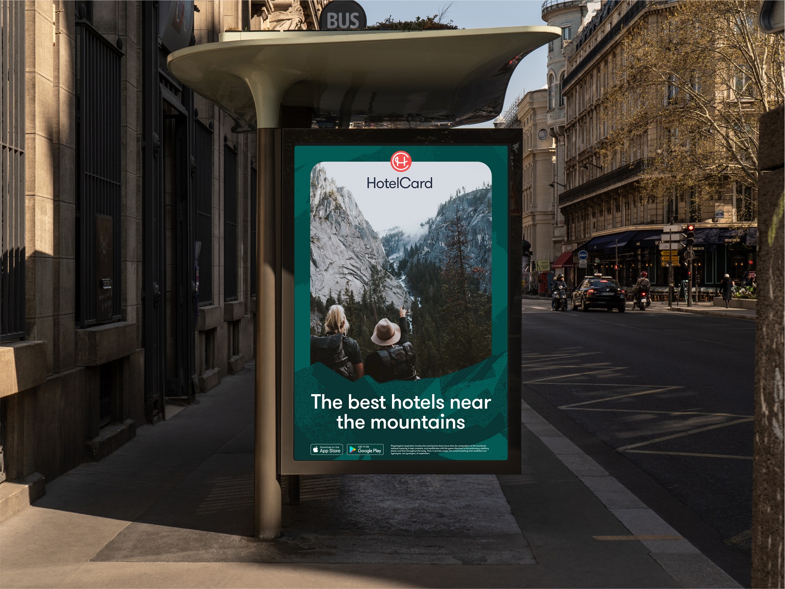
Outdoor advertising poster design
Outdoor advertising poster design
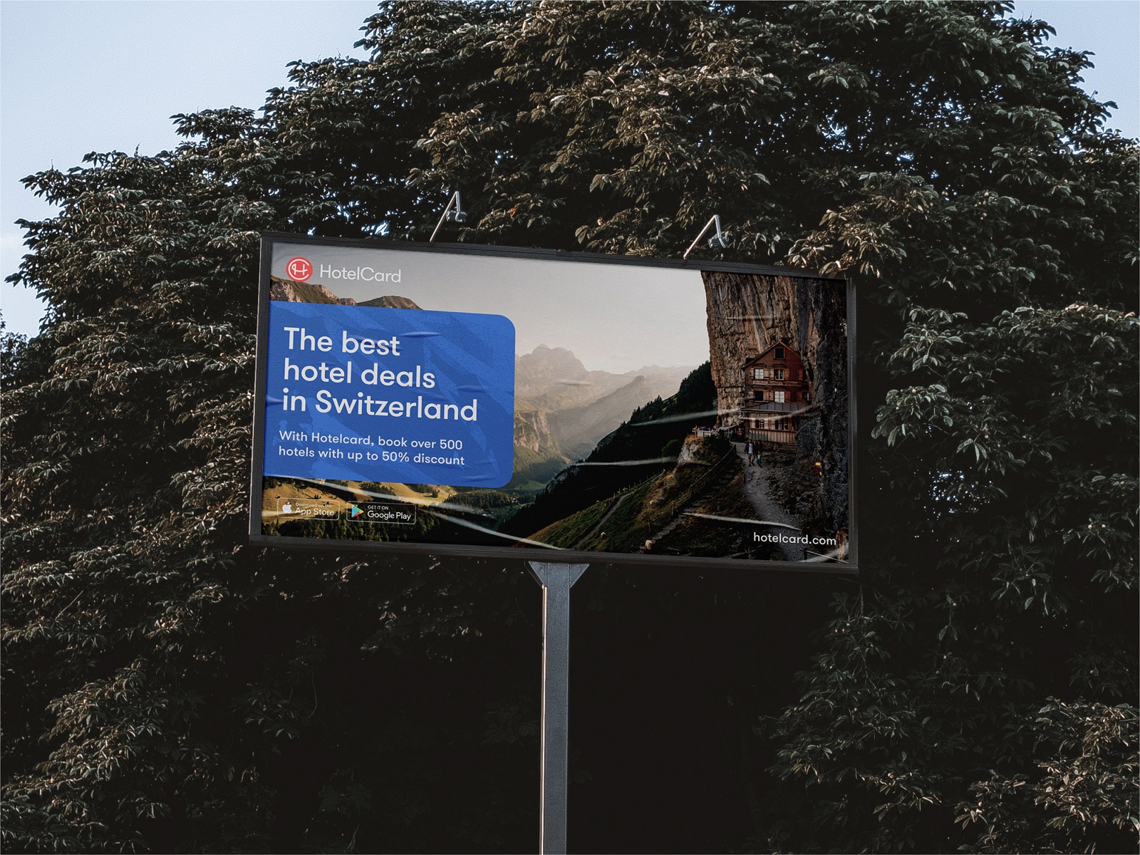
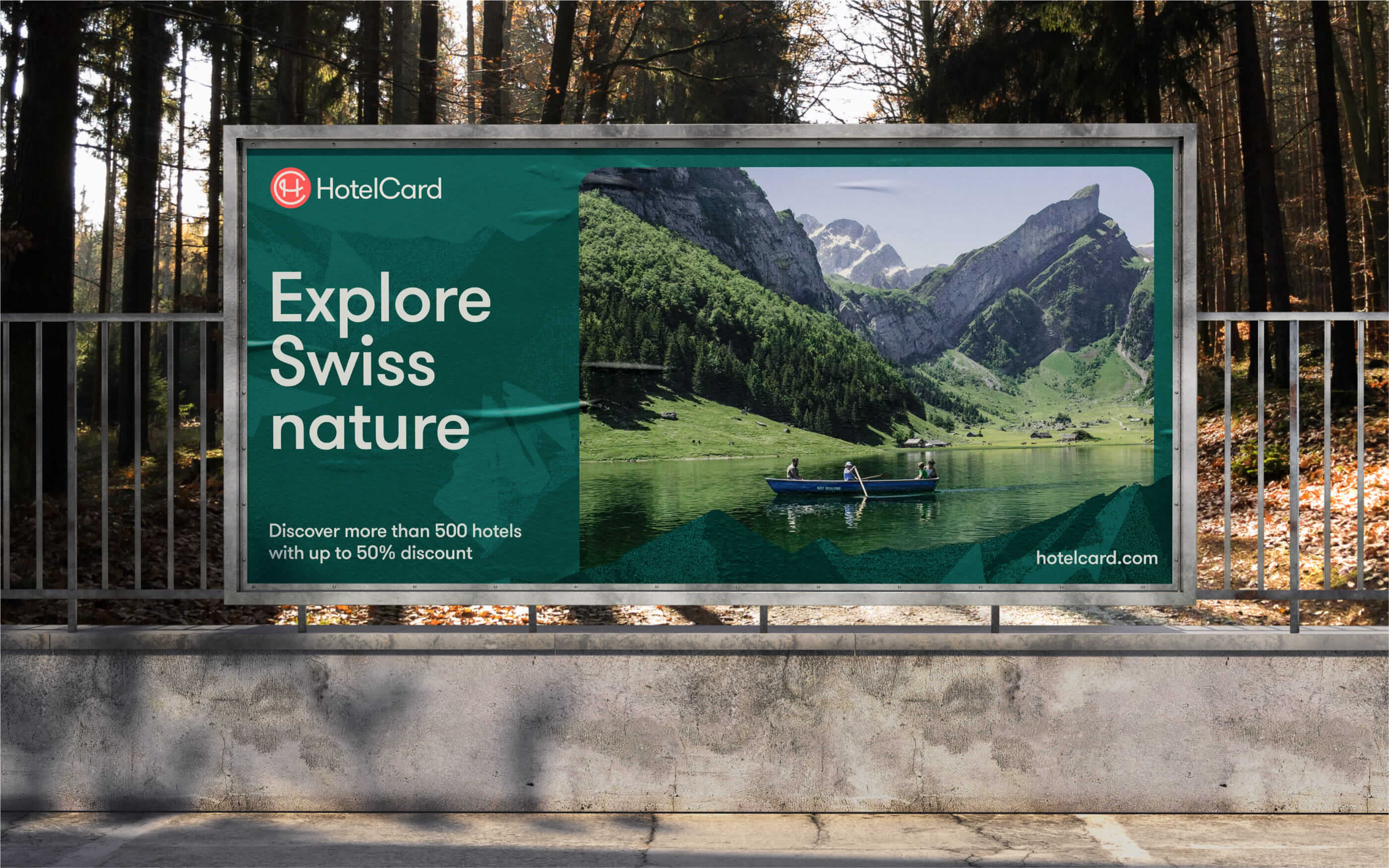
Advertising billboard design
Member cards design
Branded sticker design
Social media communication templates
Also, the user experience design for the landing page and widgets was improved to amplify brand communication with a visually and emotionally appealing style and clear, intuitive functionality. Airy and atmospheric, the landing page employs a well-balanced combination of photo and graphic content and instantly sets the mood for traveling.

Custom icons design
New design case studies from our team are coming soon. Stay tuned!
More Design Case Studies
Here’s a set of more case studies sharing the design solutions and approaches for some of the design projects done by the Tubik team.
Nibble Health. Identity and UX Design for Healthcare Fintech Service
Physica Magazine. Web Design and Graphics for Scientific Blog
CSConnect. Website Design for Immersive Experience Marketing Platform
Ready Set Recover. Web Design and Illustrations for Surgery Recovery Platform
ProAgenda. Identity and Website Design for Golf Management Service
BlockStock. Brand Identity and Website for Minecraft Models Resource
Kaiten. Identity and Product Design for Food Marketplace
THT. Website Design for Electrical Engineering Service
Nonconventional Show. Website Design for Podcast
Fulfill. Illustrations and Web Design for 3PLs Marketplace
Crezco. Brand Identity and UI/UX Design for Fintech Service
FarmSense. Identity and Web Design for Agricultural Technology