Our new case study unveils the project made at the crossroads of art and science: welcome to take a look at the creative process and solutions for Physica Magazine, the scientific blog wrapped in artistic, eye-catchy, and functional web design.
Project
Physica is an online scientific journal that unveils and highlights interesting news, discoveries, and research in the different fields of science, such as Physics, Maths, AI & Computer Science, Earth Science, and the like. Once in a while, it posts an issue uniting a set of articles under one theme. The articles are written by practicing scientists, but they step away from classic academic writing and get packed in the best journalistic art and storytelling traditions.
The task for the tubik team was to design a blog that would arrange the content elegantly and intuitively, engage readers, and set the mood with the custom graphics.
The creative team from the tubik side included Ernest Asanov, Anastasia Gurinenko, Sima Shpin’, Oleksandra Mykhalyk, Kyrylo Yerokhin, Oleksandr Petulko, and Kateryna Baikova.
Web Design
The primary objective behind the solution for the website design was to make it highly scannable, readable, and easily navigated, which is crucial for resources heavily packed with text content. What’s more, it was essential to think thoroughly about the way to arrange the content so that it was easy for visitors to find it in the constantly growing base of articles. Nevertheless, at the same time, another goal was to make it look modern, elegant, engaging, and trendy so that it could stand out from the crowd and wouldn’t look boring.
So, the general design approach featured the following points:
- the primary color palette of clean colors, with a light neutral background and bright contrastive color accents
- the combination of typefaces that together would keep a good balance of decorativeness and readability
- the solid grid of the web page flexible for various approaches to page layouts
- the creative approach to visuals that would contribute to the aesthetic appeal and consistency of the resource
- smooth and handy web animation supporting usability and making interaction more dynamic
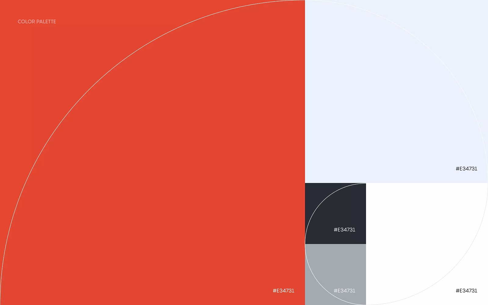
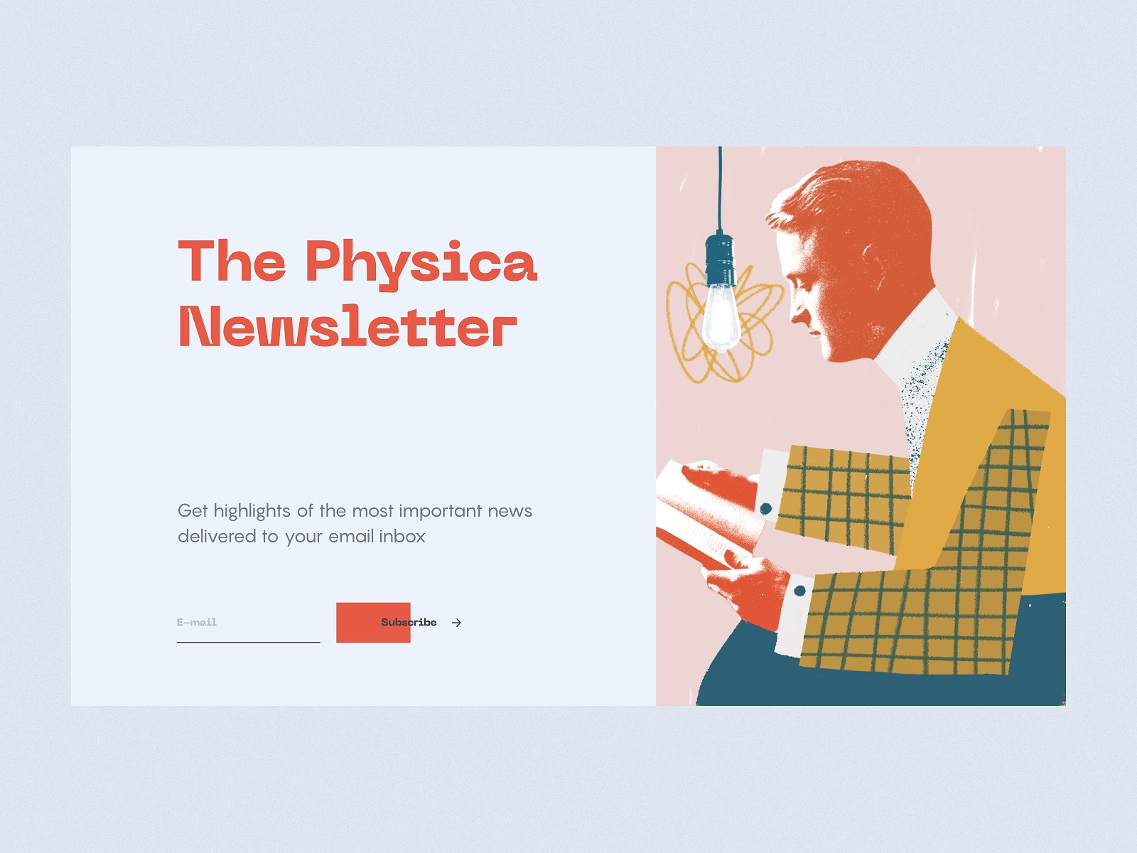
Based on that, the color palette presenting the basis for all the web pages is a combination of clean colors with proper contrast levels: white, gray, black, and red. However, it doesn’t mean there is no room for vibrancy and shades: they also fill the pages via a massive set of custom illustrations and collages integrated into the pages where the primary colors set the solid and aesthetic canvas.
The typographic solution for the blog is made of a combination of three typefaces covering the purposes of different text elements:
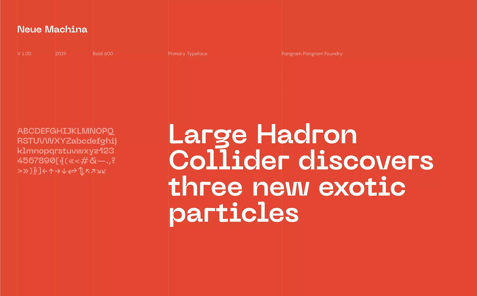
- Neue Machina, a bold typeface with monospace/geometric type features and decorative vibes, as well as apparent and deep ink traps in its heavier weights, inspired by the aesthetics of robotics and machines and setting the visual and emotional association with the theme of technology; it is used as a primary typeface, used for taglines, titles, and headings
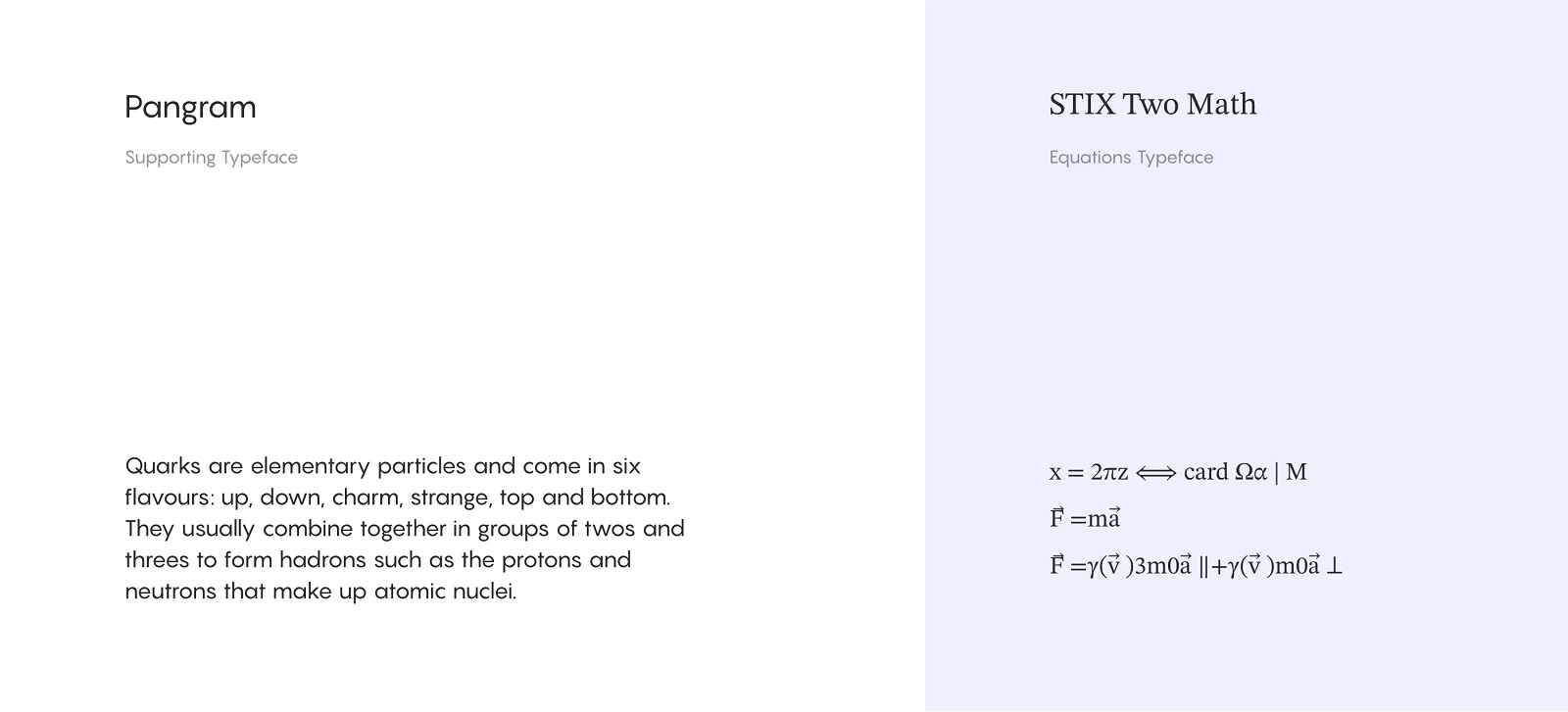
- Pangram, an elegant and highly readable sans serif typeface used for text blocks and articles
- STIX Two Math from the family of The Scientific and Technical Information eXchange (STIX) fonts, intended to satisfy the demanding needs of authors, publishers, printers, and those working in the scientific, medical, and technical fields; in Physica Magazine, it is employed as a typeface for equations and formulas.
All website pages keep their layout within the grid based on Fibonacci Sequence. It looks and feels solid and well-structured at the same time opening various options for layout compositions that are flexible to get adapted to multiple device screens.
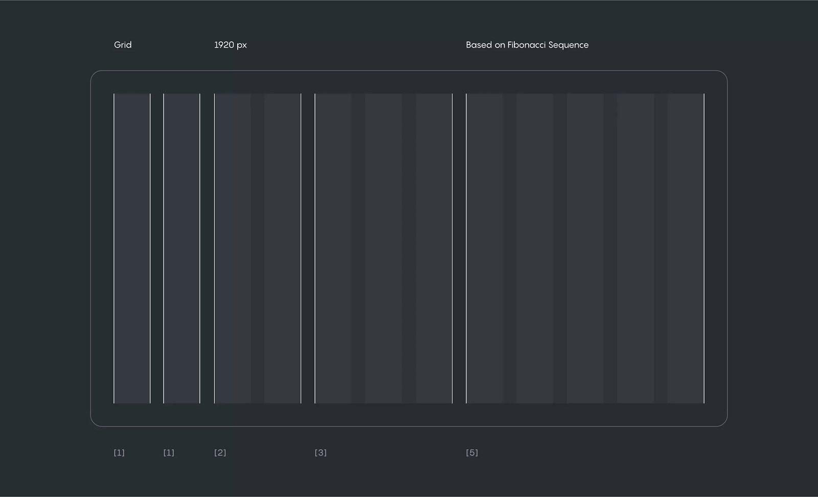
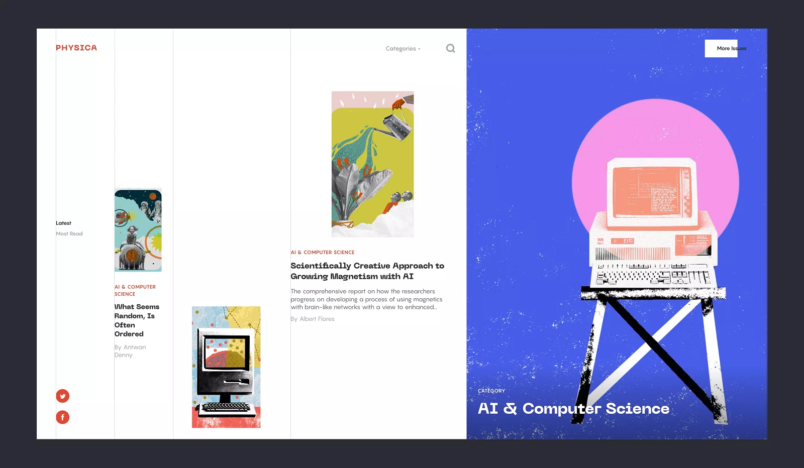
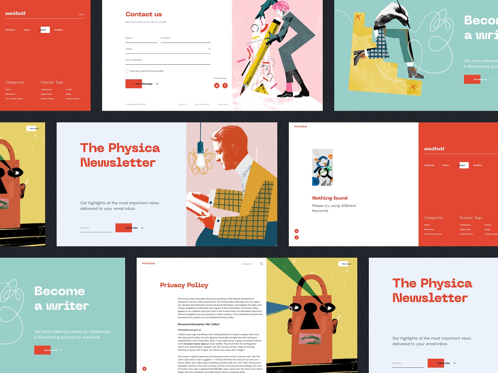
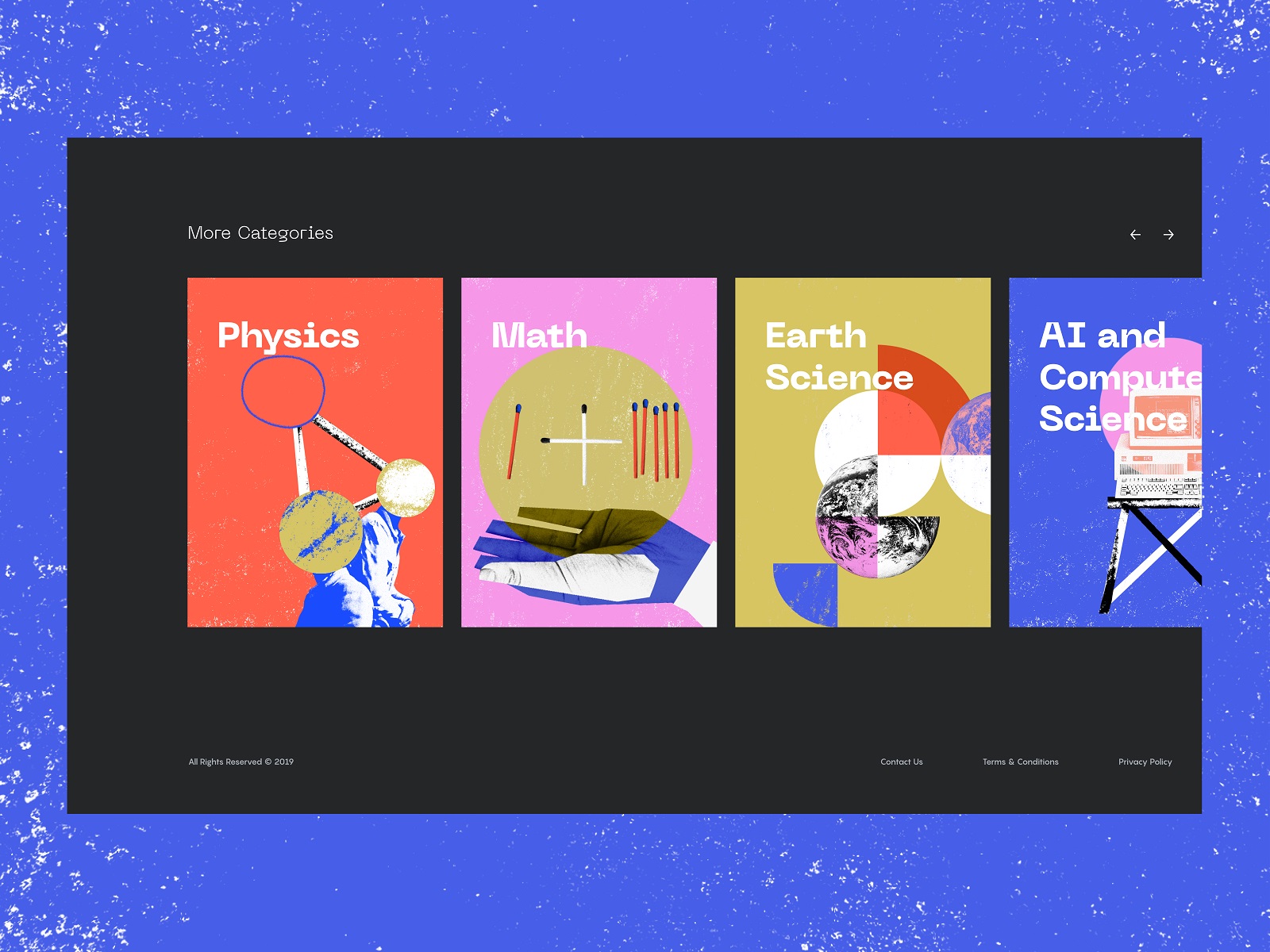
Let’s take a closer look at how the grid works for different pages. The home page sticks to a split-screen approach, where the light, airy left part of the screen presents the feed of articles and the right part is taken by the big colorful title image of the latest magazine issue. The navigation is minimalist and straightforward, with the header placing the logo and More Issues button into the top-scanned corner points of the page and the dropdown menu with the categories in the center. Also, the side menu on the left ensures quick access to the latest issues, most-read articles, and the subscription page.
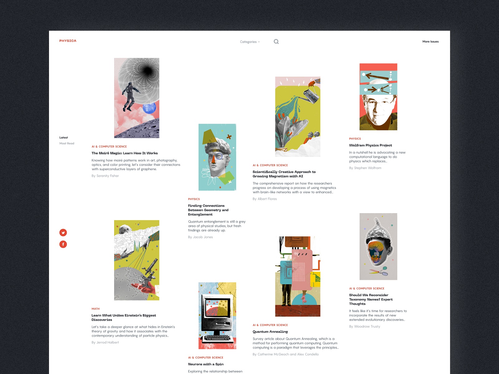
And here’s a glance at the page for contributing writers and the catalog of magazine issues, all with catchy collage illustrations.
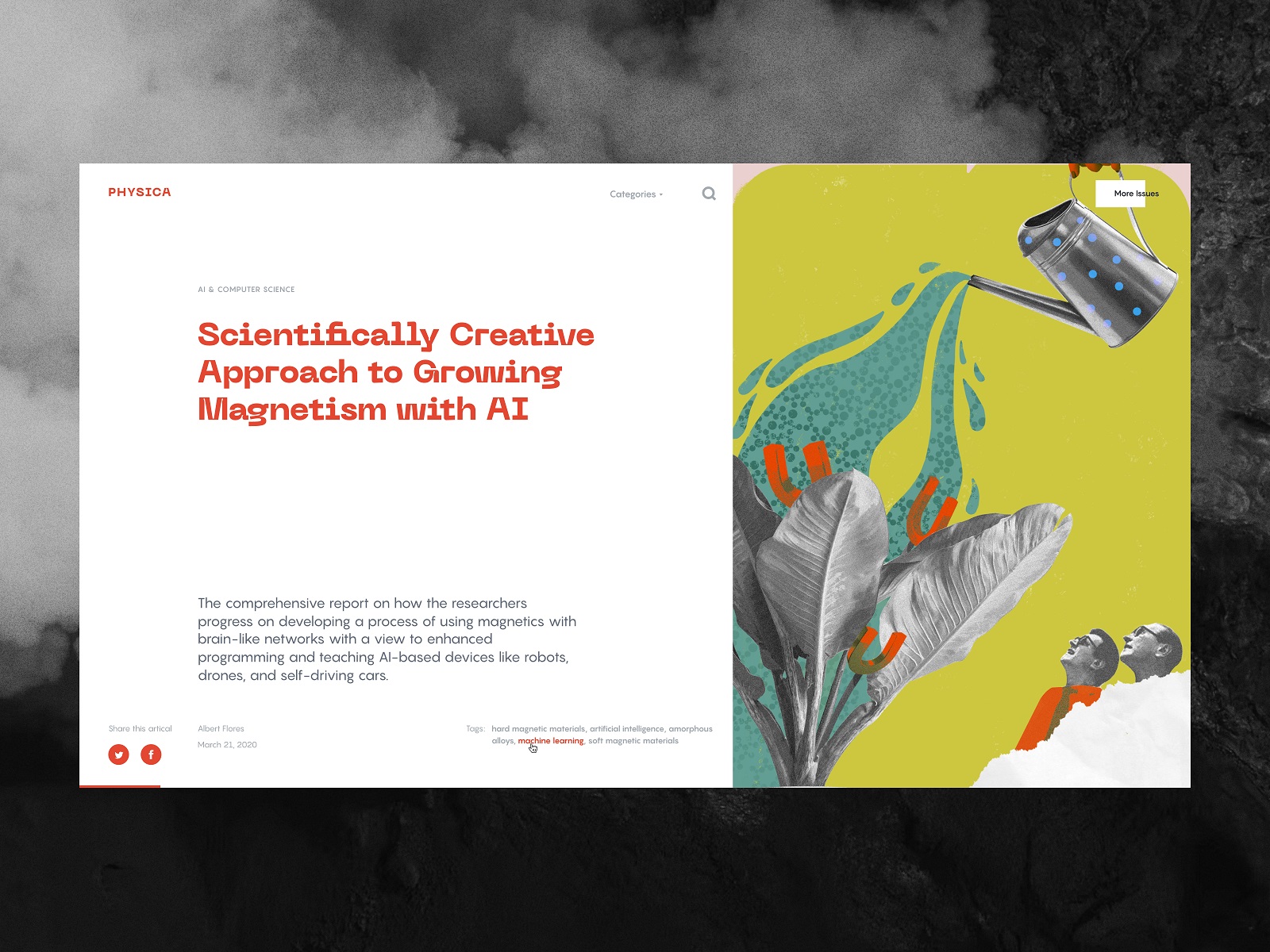
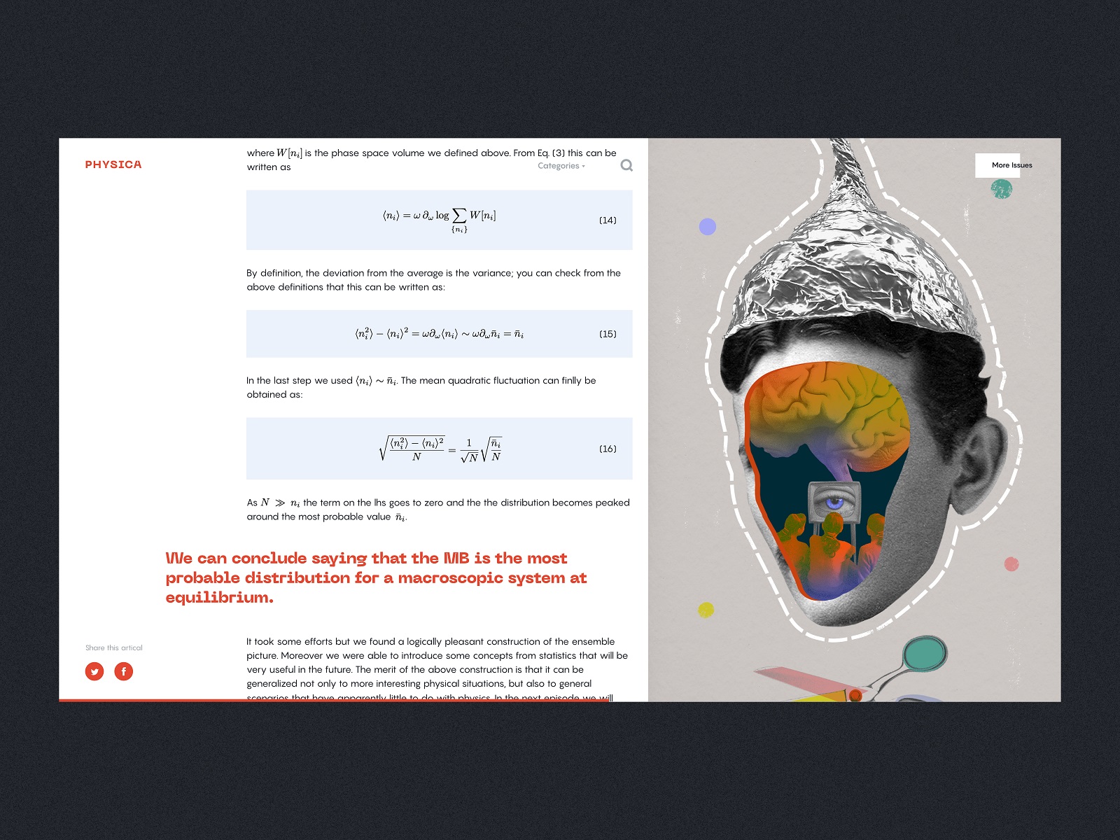
The article page also consistently uses the same split-screen composition where the left part is light and interactive while the right part is the static title image adding color and aesthetic appeal to the layout. The sections with equations and formulas use a different background color to be easily distinguished in the process of scanning and reading.
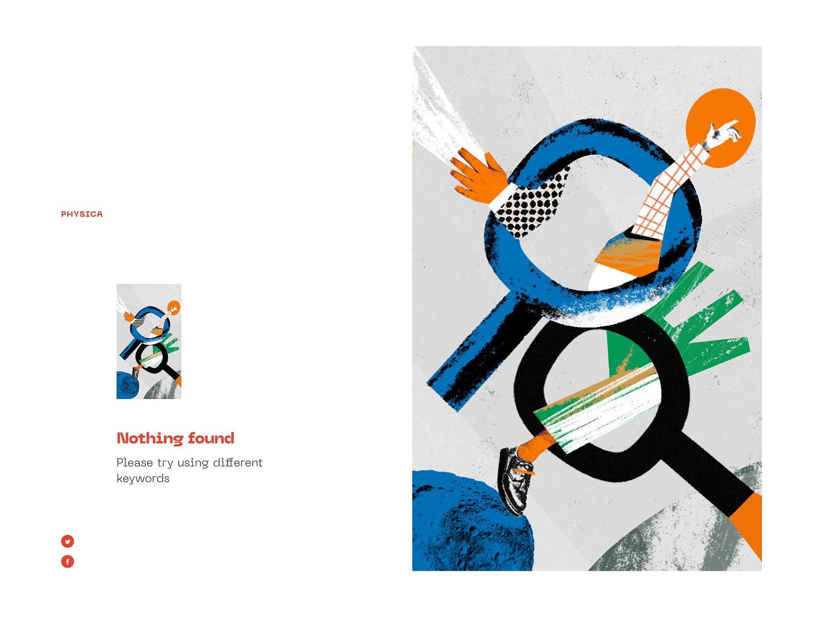
And the minimalist 404 error page also follows the same approach to the page layout employing a prominent illustration connecting to the search theme.
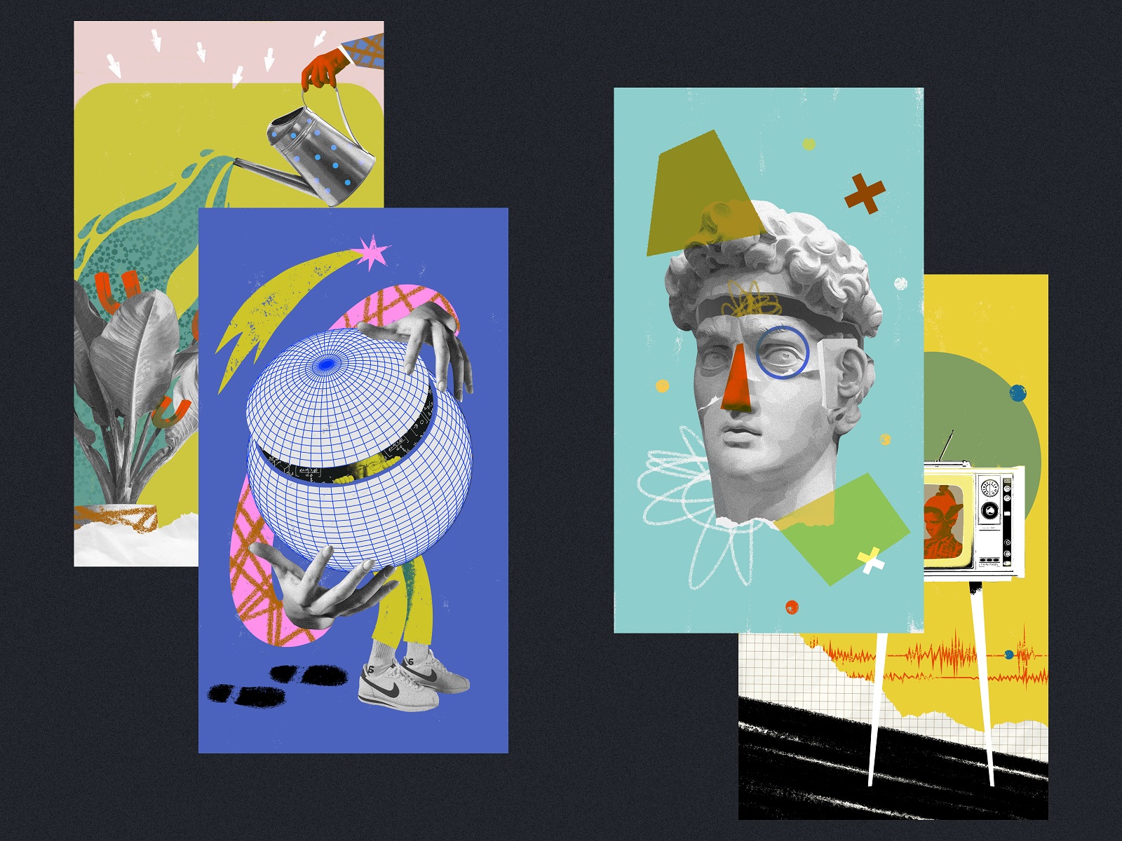
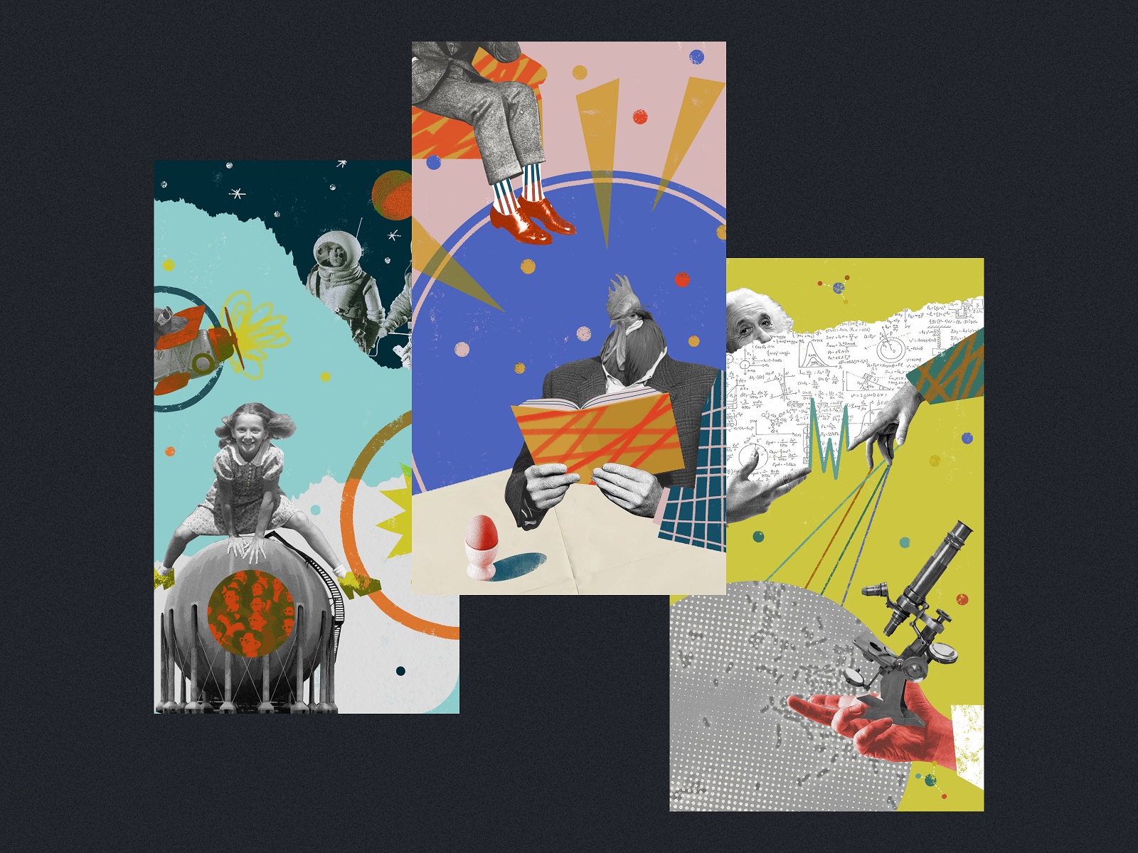
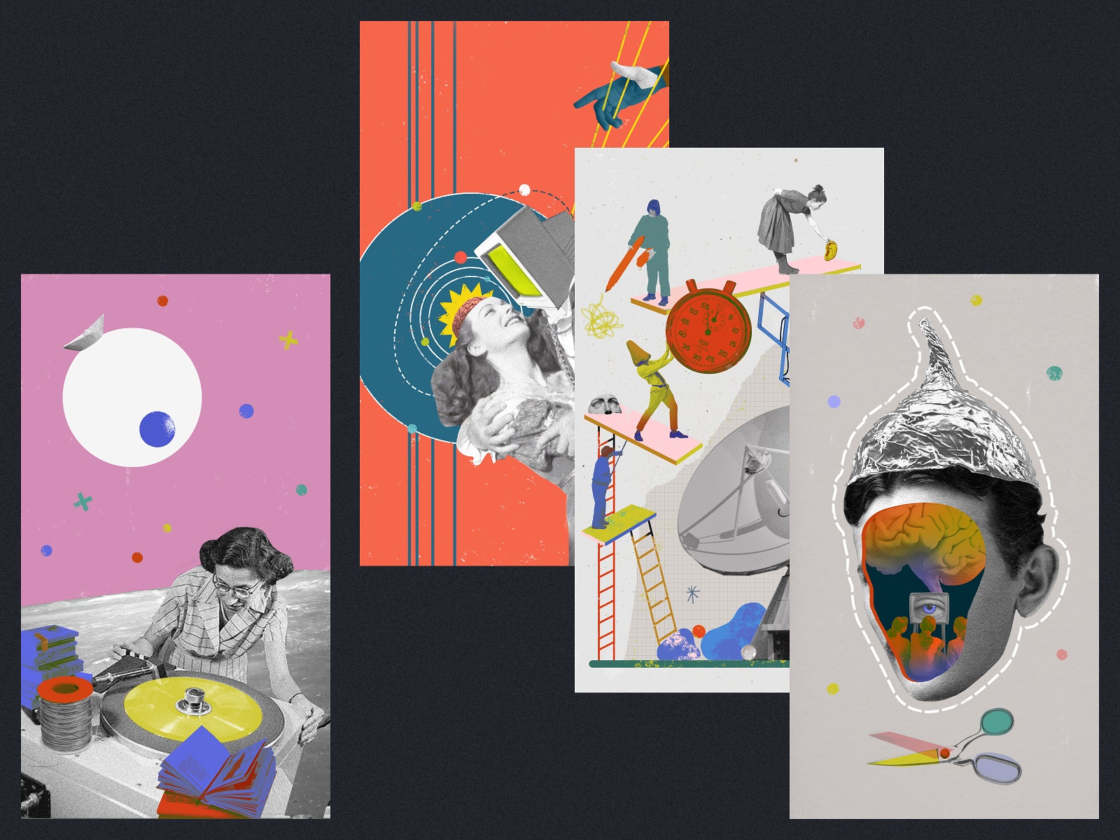
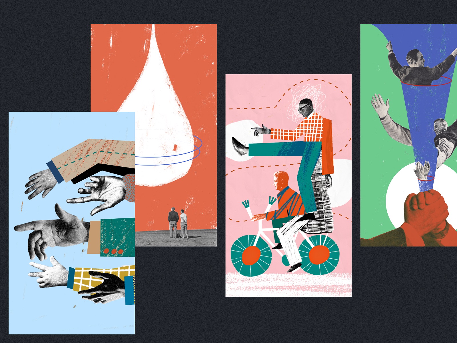
Graphic Collages
An extensive collection of original graphic collages created for Physica Magazine also deserves a deeper glance. With their help, the design team solved the issue of visualizing complex scientific processes and phenomena, for which there are often no accompanying photos or illustrations from authors.
Collages also broaden the horizons of perception and effectively assist in creating a clear visual image of the topic described in the article, not only for specialists but also for a broad range of readers. In addition, this solution supports the entire visual communication of the project setting a consistent general style and recognizable identity.
New design case studies from our team are coming soon. Stay tuned!
More Design Case Studies
Here’s a set of more case studies sharing the design solutions and approaches for some of the design projects done by the Tubik team.
Nibble Health. Identity and UX Design for Healthcare Fintech Service
CSConnect. Website Design for Immersive Experience Marketing Platform
Ready Set Recover. Web Design and Illustrations for Surgery Recovery Platform
ProAgenda. Identity and Website Design for Golf Management Service
BlockStock. Brand Identity and Website for Minecraft Models Resource
Kaiten. Identity and Product Design for Food Marketplace
THT. Website Design for Electrical Engineering Service
Nonconventional Show. Website Design for Podcast
Fulfill. Illustrations and Web Design for 3PLs Marketplace
BEGG. Brand Packaging and Web Design for Food Product Ecommerce
Crezco. Brand Identity and UI/UX Design for Fintech Service
FarmSense. Identity and Web Design for Agricultural Technology