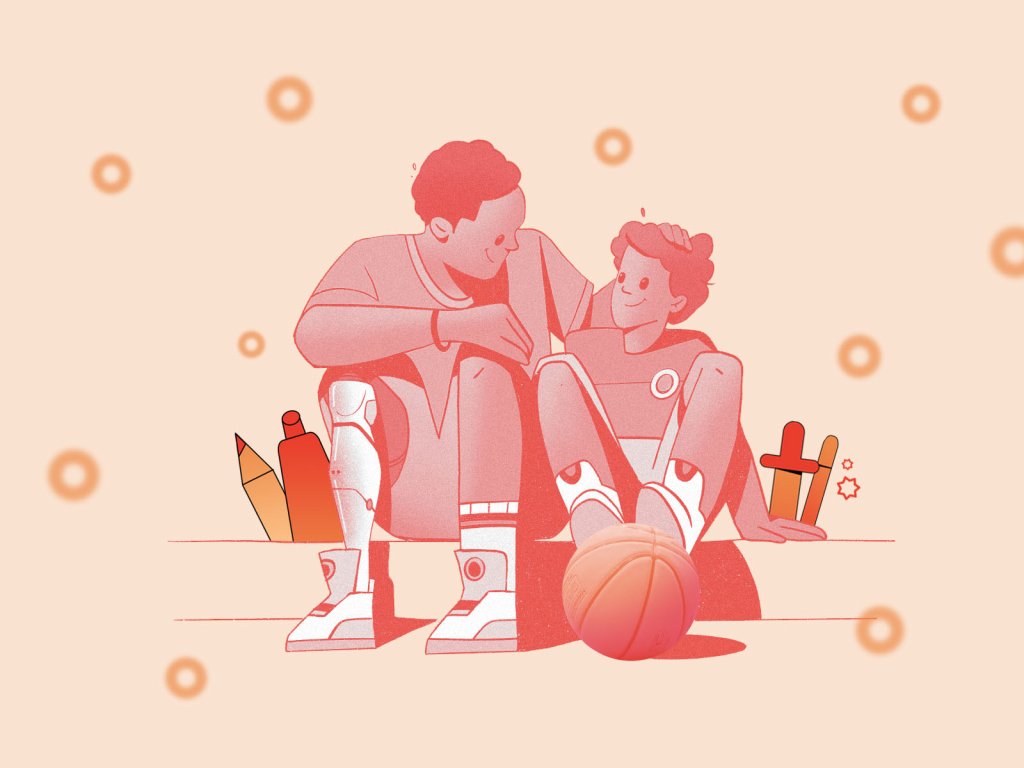
No secret, gaming is much more than just entertainment: well-organized and thought-out, it also becomes an influential factor in different educational processes and builds virtual universes supporting socialization and teamwork. Today, we would like to tell you about the design project we accomplished for the service, also touching and amplifying that diverse aspect of life. Welcome to check the case study on brand identity design and website creation for BlockStock, the resource helping developers and educators easily get cool models and assets in Minecraft style.
Client and Project
BlockStock is the home for high-quality, low-cost Minecraft models and assets. It supports beginner developers who plan their education, architecture, or entertainment projects in the Minecraft world. BlockStock provides hundreds of theme adaptive 3D models that make development fast and flexible, adding a pinch of real fun and beauty to the process.
The service was founded by Shapescape ApS, a video game development company mainly focused on Minecraft and integrating gaming into education. They have been creating various products focusing on education, immersion, and entertainment since 2013 and have collaborated with universities, governments, and multinationals such as The World Bank to develop projects tailored specifically to their needs. Shapescape approached our team in the early days of developing a platform store/website called BlockStock, aiming to distribute a variety of 3D assets they had created and gathered over the years and would like to share this catalog as open for contribution and browsing by the wider public.
The task for tubik was to create a clean and solid brand identity design that would appeal to the target audience, set an emotional connection, and adapt easily to different marketing goals, as well as a user-friendly, simple, and informative website that would allow the brand to reach its customers effectively.
The creative team from the tubik side for this project included Ernest Asanov, Anton Morozov, Roma Chornyi, Kirill Erokhin, Olya Zakharyan, Natalka Mamchur, and Olga Syrotkina.
Identity Design
Having discussed the client’s preferences, having done the market research, and having analyzed the target audience, the team started working on the brand identity design with the core choices: the brand colors, the typography, and the effective logo as a symbolic visual representation of the brand.
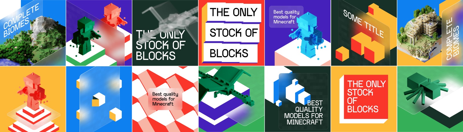
As the Minecraft universe is all about pixels and square shapes, the graphic designer started the ideation process by generating different ideas based on that essential distinguishing feature.
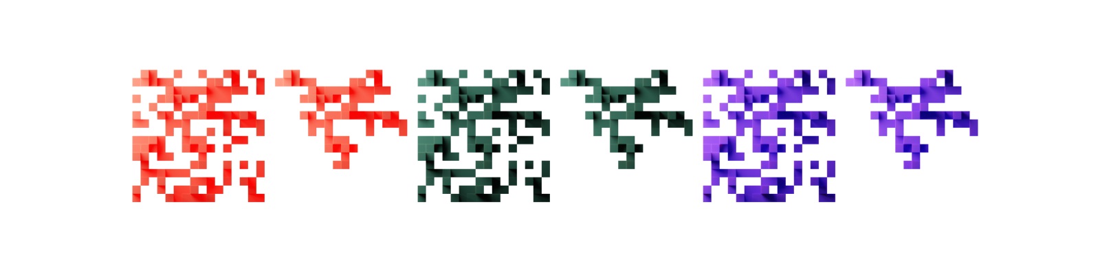
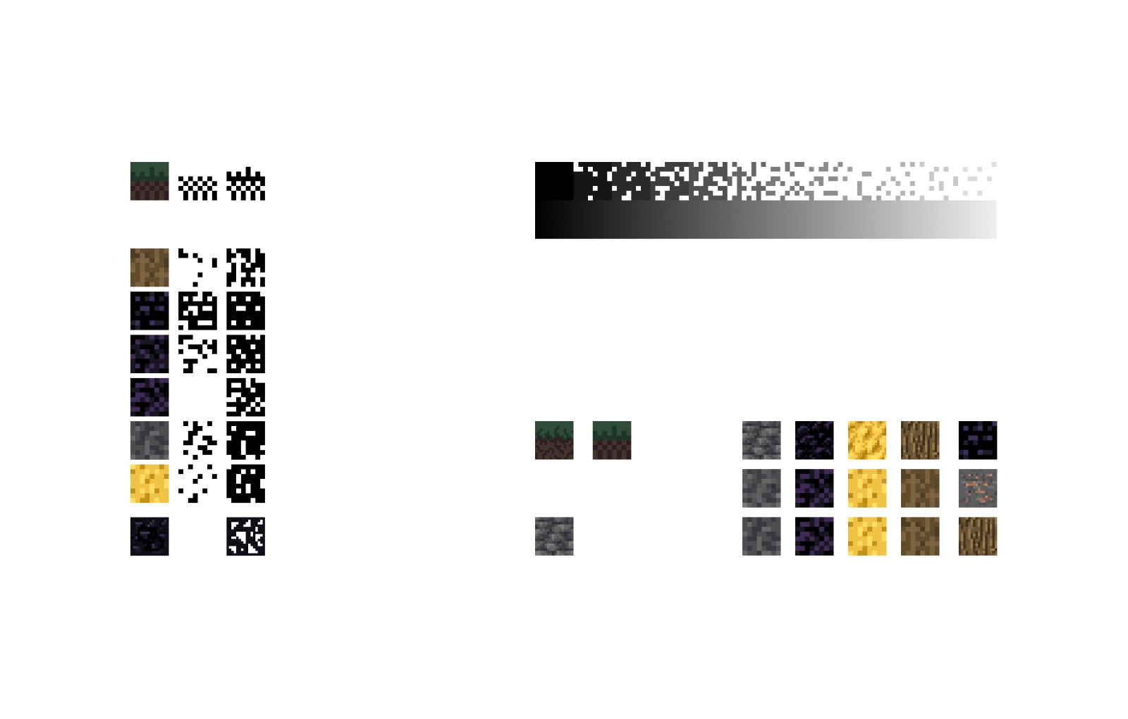
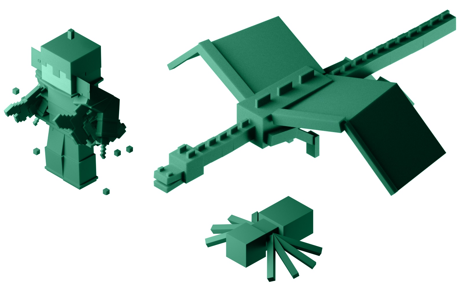
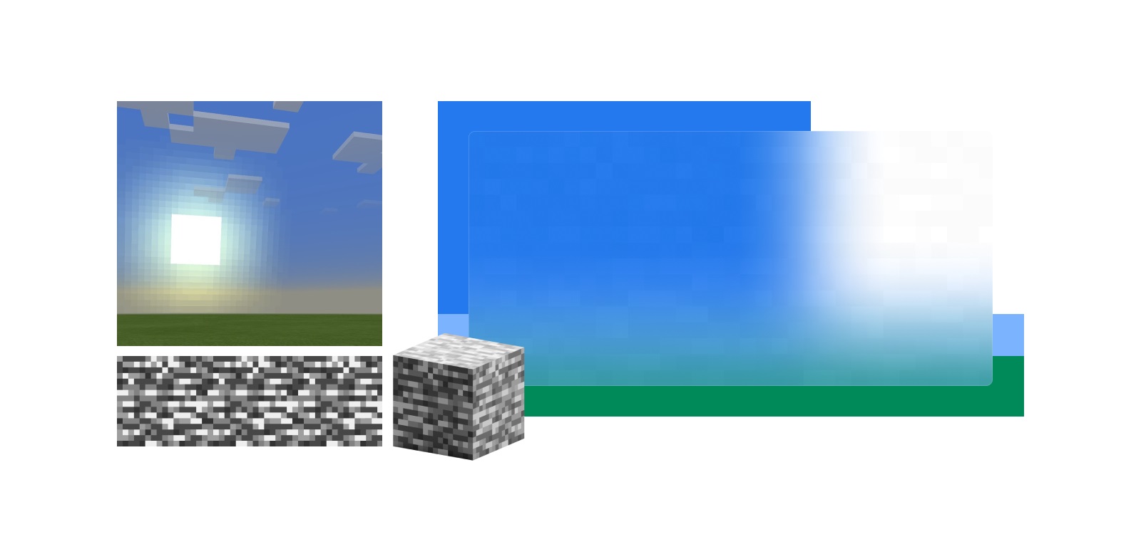
At the initial stage, he tried different variations of how to integrate pixelation and square or cubic elements as a major part of artistic direction into the brand’s visual style. In addition, it was essential to consider the aspect of textures presented in the broad diversity in the Minecraft universe. Also, the set of custom models was created to dive deeper into the general idea of how Minecraft works and get a set of original handy graphics to integrate into the identity and web design process. Here’s a brief glance at the creative search stage.
![]()
![]()
![]()
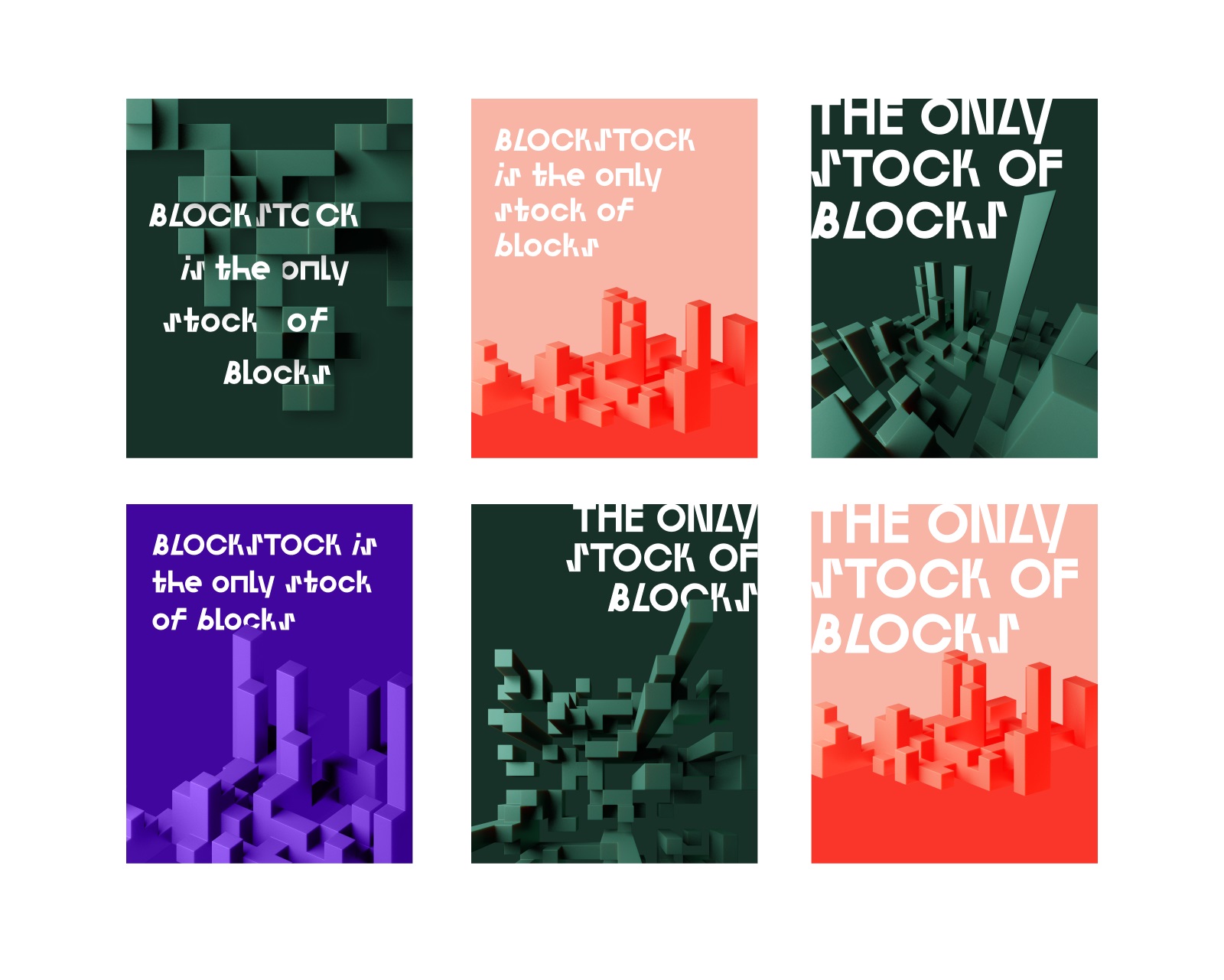
And here’s a glance at the search for typographic, colors, textures, and imagery ideas that could have become the basis of the design system for BlockStock.
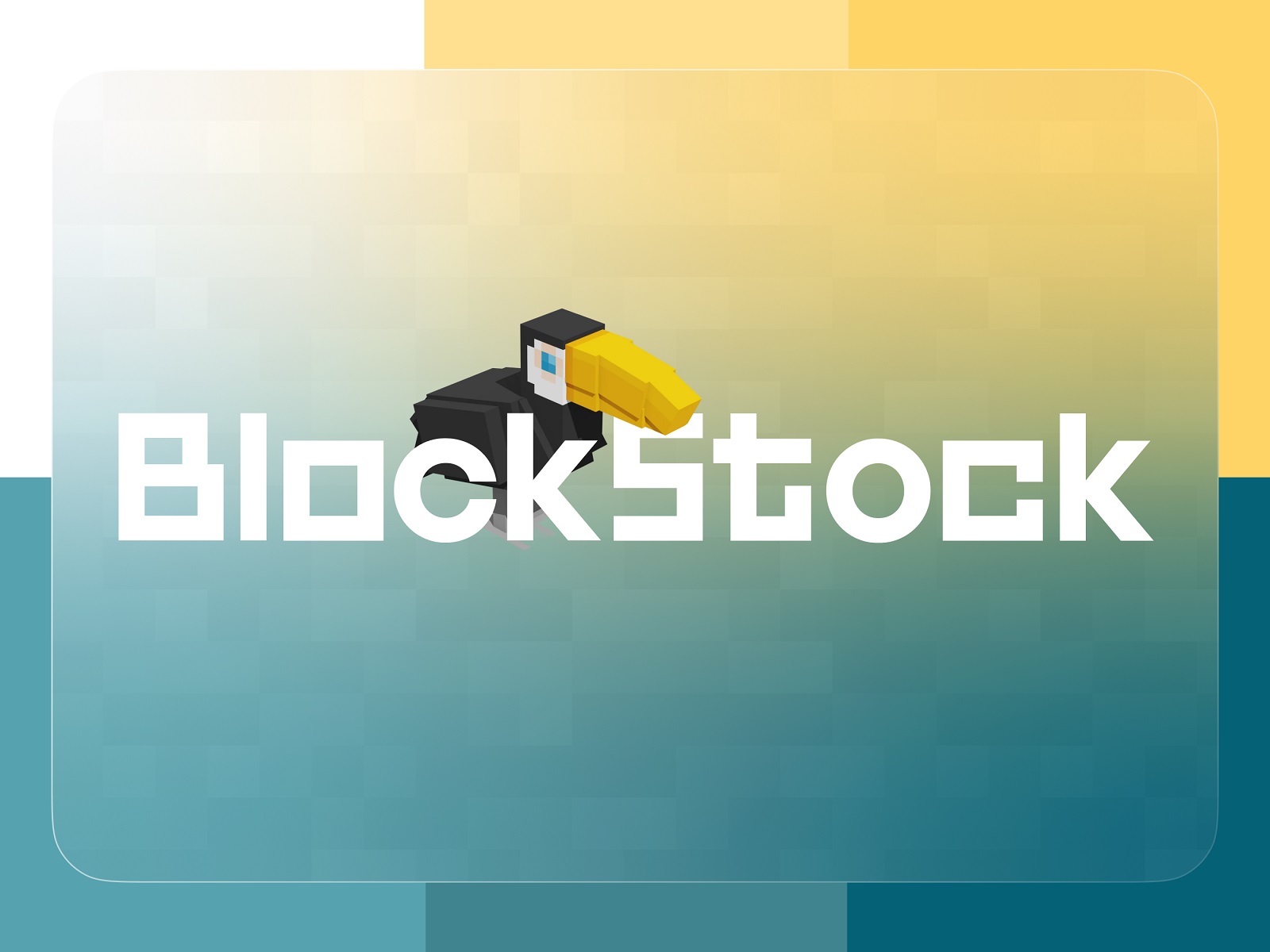
After long and detailed discussions with the clients and trying different options, the team moved to the identity concept that was the closest to serving the established objectives. So, the final logo of the service is a wordmark echoing the squared shapes in the font used for it. The typographic approach of the logo design is based on a slight and stylish contrast, original and catchy combination of curves with squared shapes of some letters.
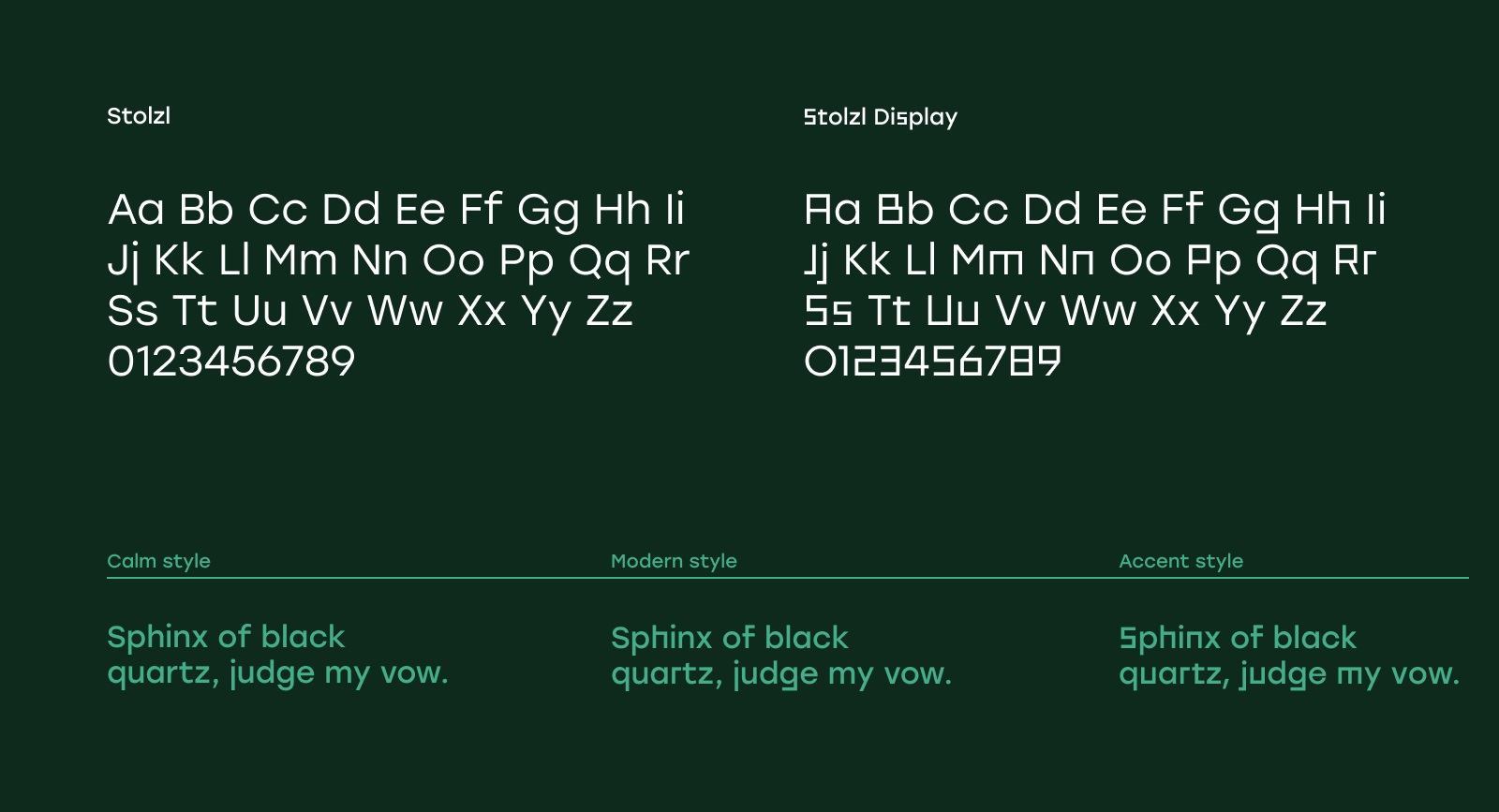
Here’s a deeper look into font choice for the project, simple, moderately curvy, and readable Stolzl and decorative Stolzl Display featuring squared shapes for taglines, headings, and accent text elements. Belonging to one font family, the pair creates a nice contrast and, at the same time, a harmonic combination, which allowed the designer to create interesting and unique typography elements in marketing materials and branded items. And Inter font was used for the body text to make it super easy to scan and read.
Other essential elements of the design system for the visual brand identity were two elements inherent in each Minecraft in-game biome: the sun/moon and the Bedrock block with recognizable texture. The texture of the block served as a transparent base to place the content on, whatever it could be, a 3D model or text block. From the sun and its glowing segments, the designers made the Simplified background whose goal was to create the feeling of space and natural lighting.
The palette of the project is bright and multicolored, easily adapted to be used both clean and on textured surfaces or in gradient expression.

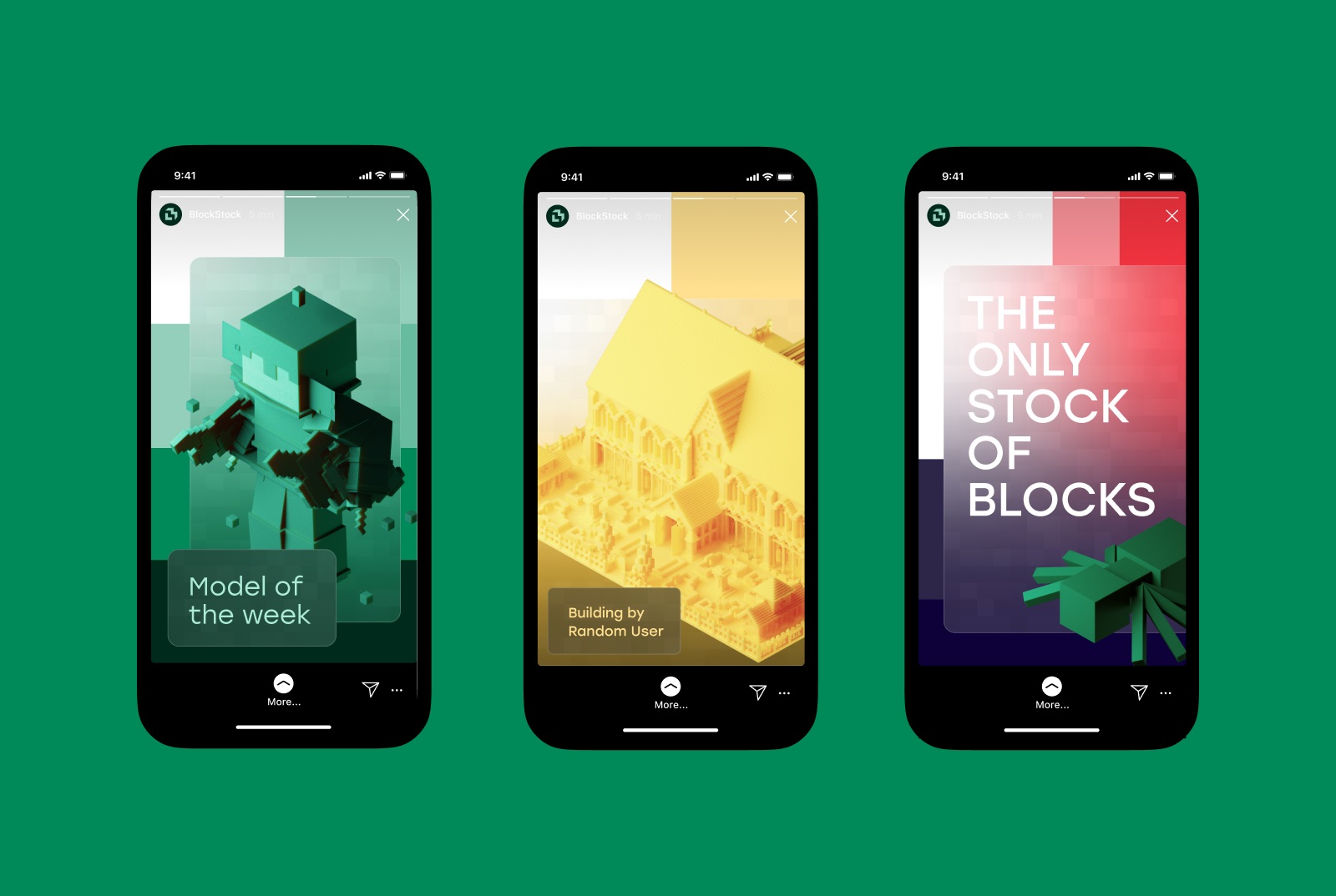
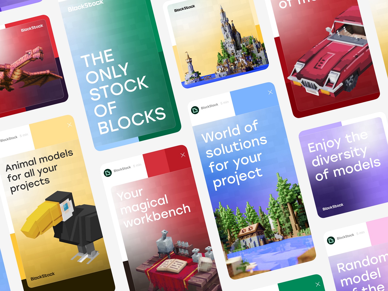
Another important task of the effective identity design for BlockStock was to create a symbol that could work as a visual hint of the brand in the places where the full wordmark was not convenient to use or efficient, for example, the favicon of the website, or avatar image in the social network accounts. The ideation stage for this objective resulted in a big bunch of diverse variants, and choosing one was a real challenge. Finally, the choice fell on the green symbol, whose shape visually reminded the letter B and at the same time, a building block. Check how it works for different brand communication goals.
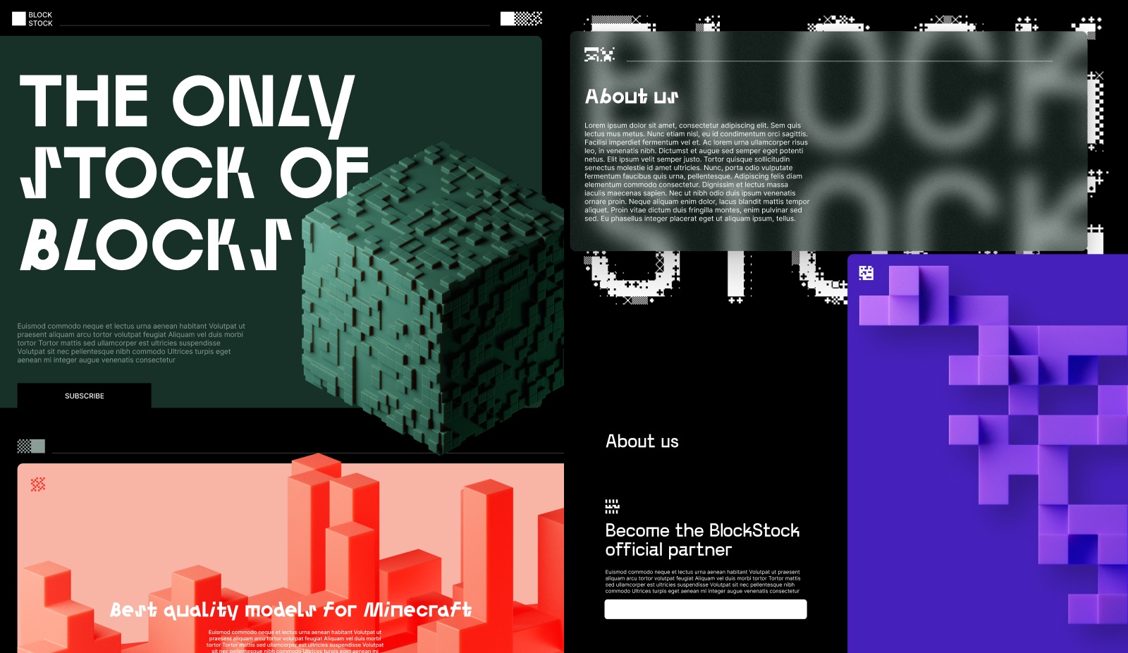
![]()
![]()
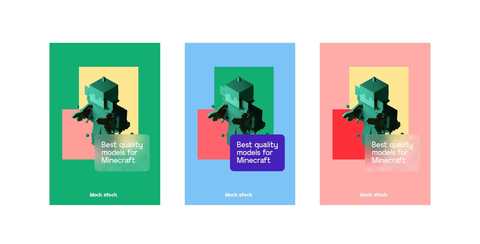
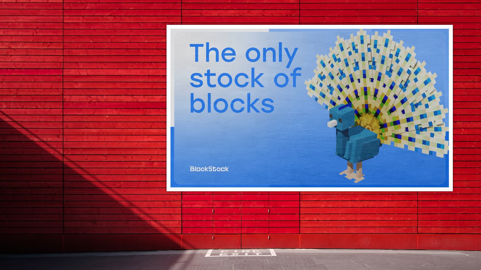
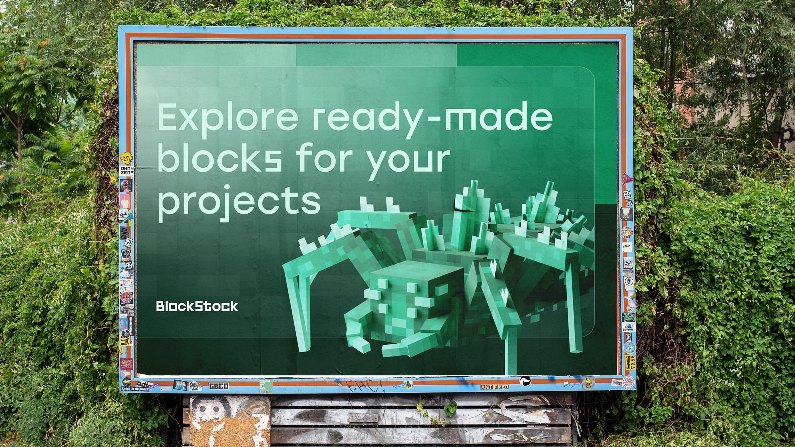
And here’s a glance at the marketing and advertising graphics, such as posters and billboards, using the offered identity design approach.
Website Design
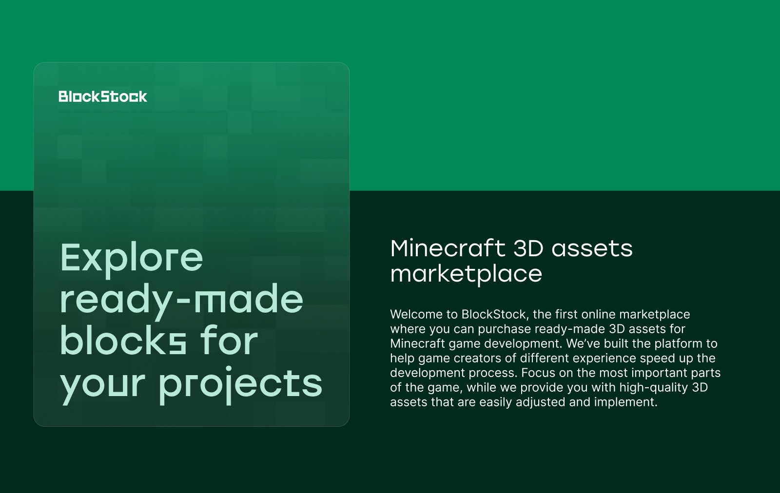
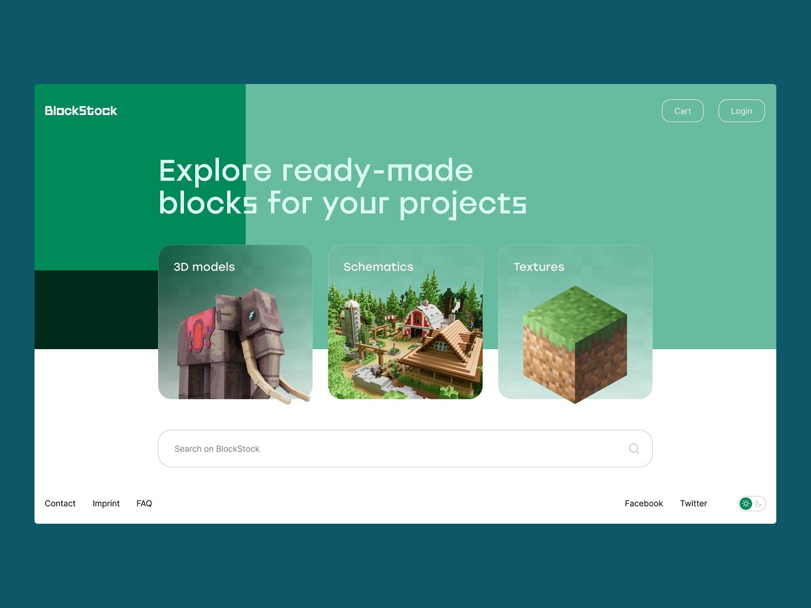
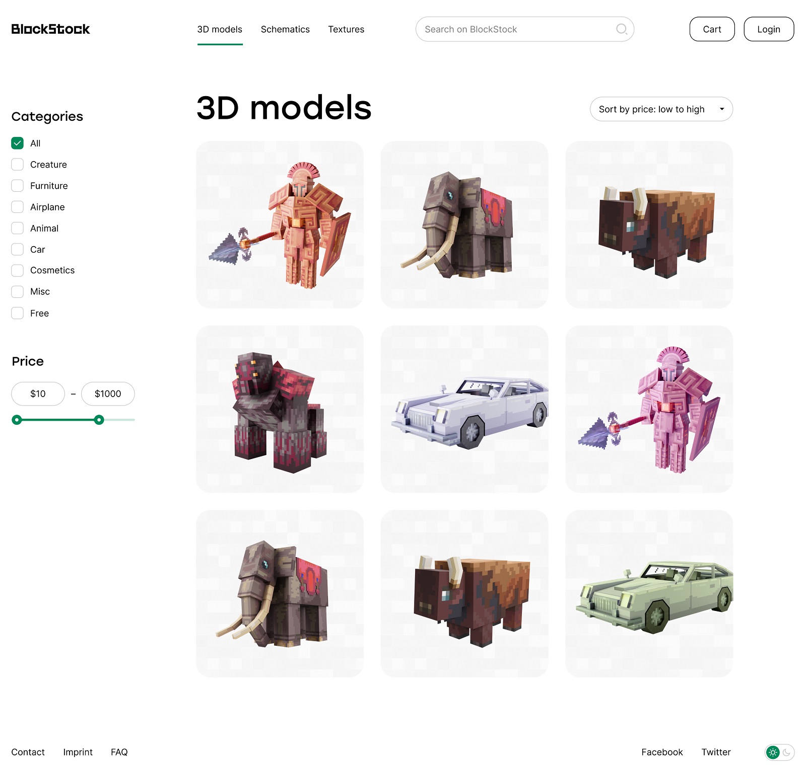
The website design for BlockStock is based on the central pillars of an effective e-commerce website: clarity, functionality, engagement, and a simple way to purchase. So, the home page was made to be not only attractive and emotionally connected to the Minecraft universe but also straightforward, scannable, and uncluttered to let the visitors see the essence and quickly find the needed assets rather than overwhelm them from the first seconds. Actually, the content of the home page fits the above-the-fold area and doesn’t demand any scrolling from the visitor. The customers can proceed with one of three major categories of the offered assets choosing from three tabs, or they can instantly use the internal search typing the keywords into the big and noticeable search field.
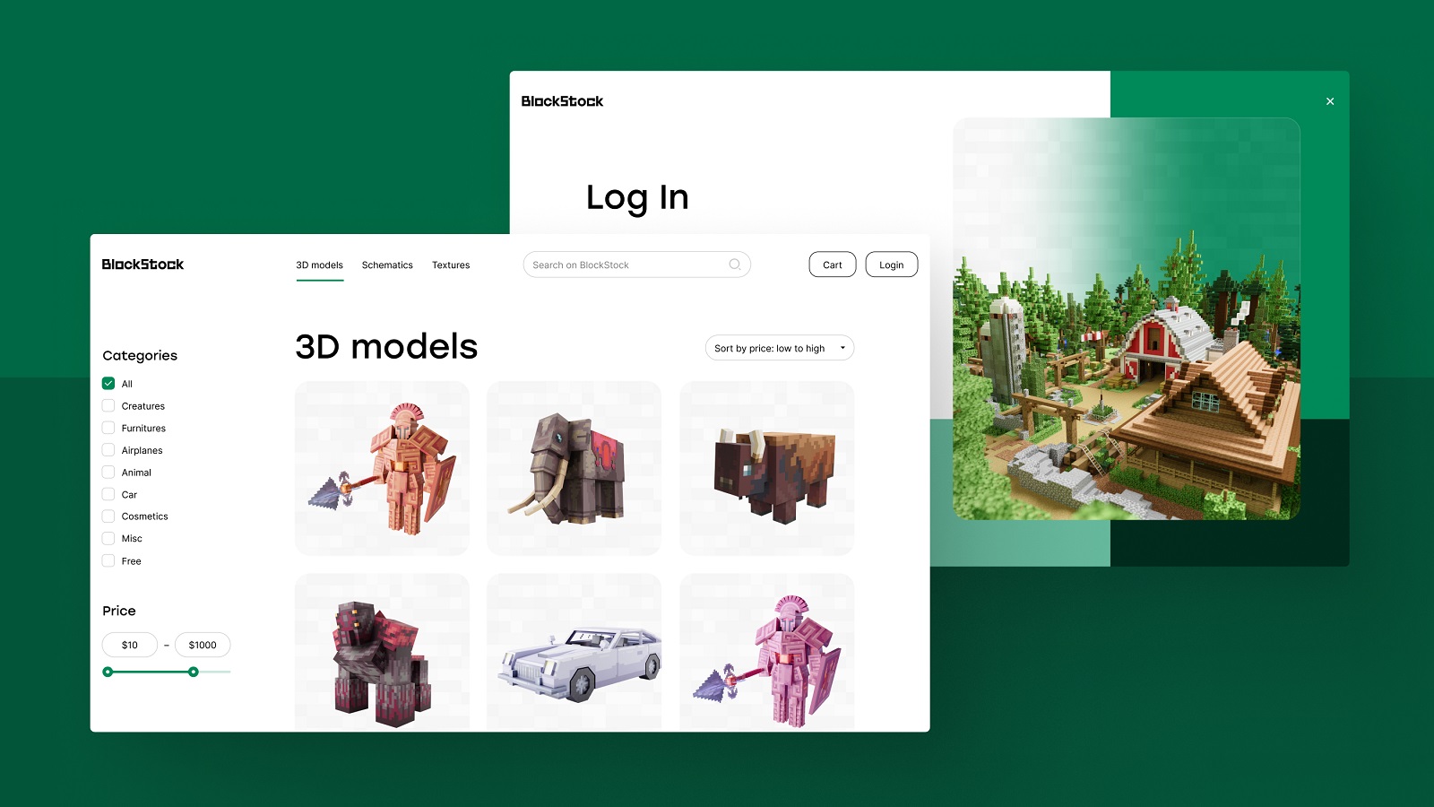
The functional pages of the website are nice and clean in the best traditions of e-commerce design, with a solid focus on the visual of items for which the rest of the page plays the role of light and airy canvas.
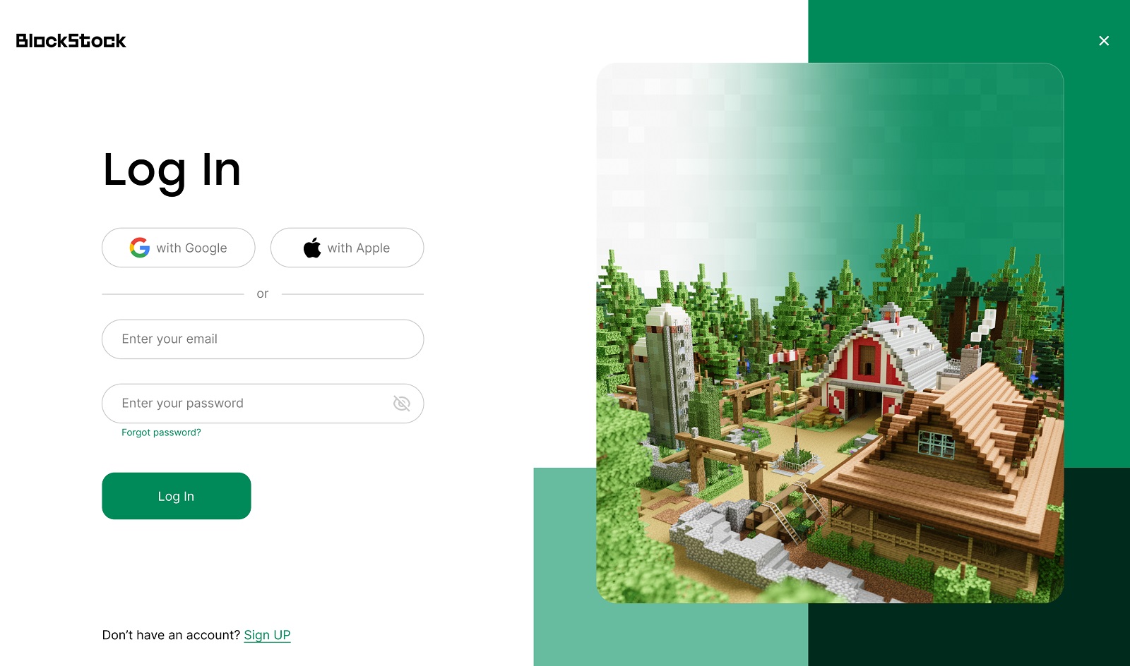
The login page employs the idea of a split screen, with an impressive big image setting the instant emotional and visual connection to Minecraft style in the right half of the screen and airy, easily skimmed interactive left half of the page enabling visitors to log in either via quick registration with their existing Google/Apple accounts or via the short registration form to use email.
The catalog page organizes the items of a particular category into a set of cards, which can be tuned by using the checklist on the left part of the page to mark the desired types of assets. Also, the visitors can regulate the list of items shown to them, setting the wanted price range or sorting the items by price.
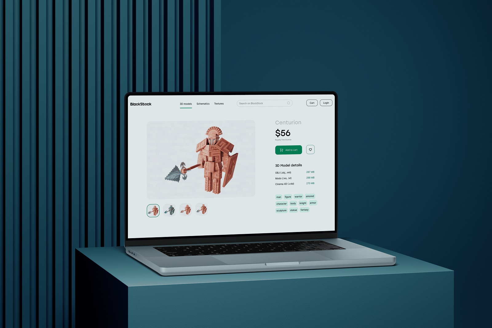
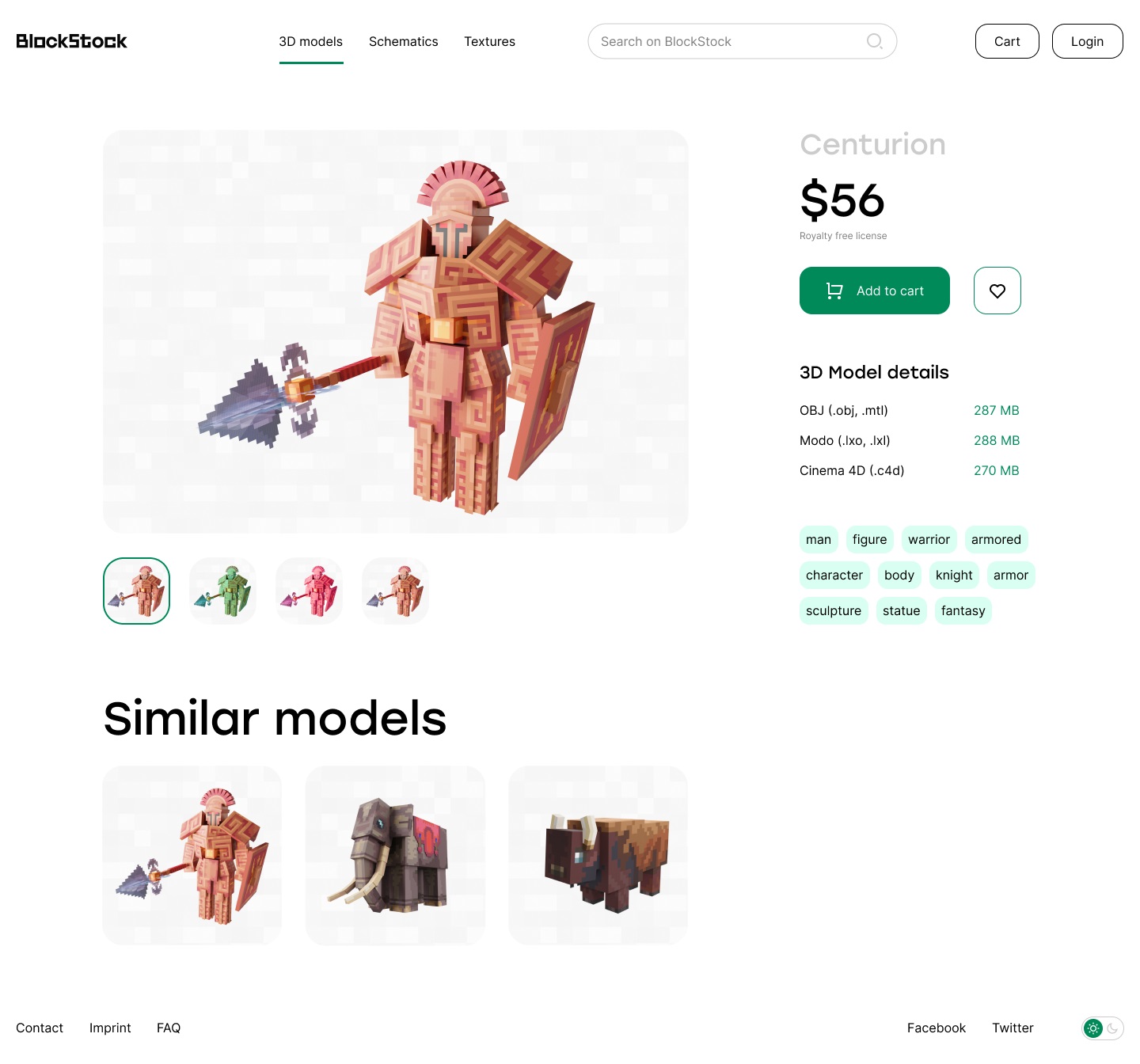
The product page features a thoughtful approach to the variety of details in one united system based on a solid visual hierarchy, allowing the customer to see a lot of information about the item without feeling overwhelmed.
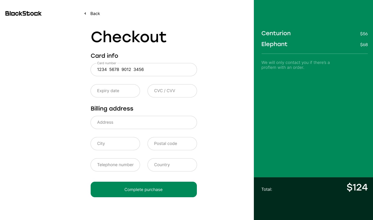
The checkout page also effectively uses the split screen approach based on the color contrast, with the light-background part of the page for filling the form supporting the flow with text hints in the fields and the bright green part on the right to visualize the content of the cart and the total sum of money to be spent on the purchase.
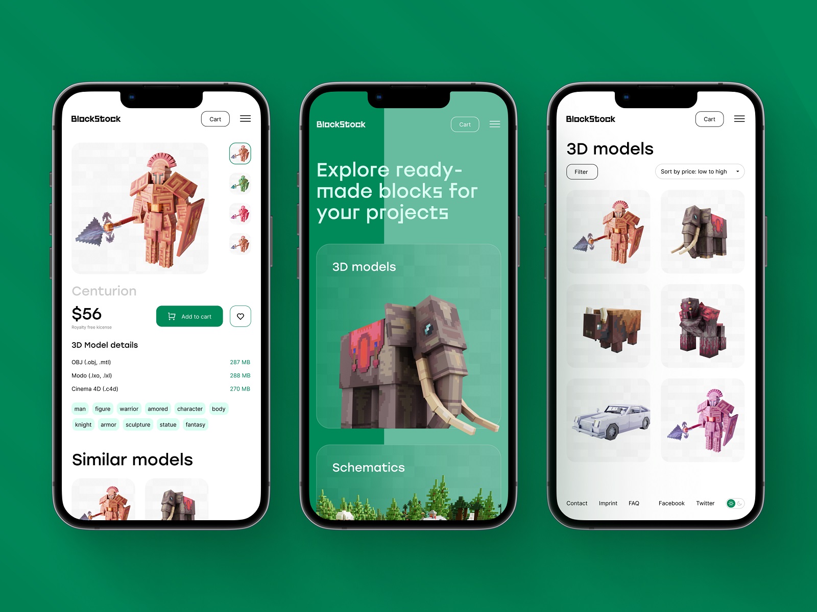
And here’s a glance at the mobile version of the website designed to make the user experience positive and efficient for any kind of device visitors want to use.
Indeed, the interaction design hides some engaging details to make the experience even more dynamic and lively for the customers. For example, here’s the stylish hover animation used on catalog pages for each card and generating the original textured background based on the colors of the item.
Also, to give the buyers a more personalized experience and add more comfort to their interaction with the website, the dark theme version was created for those who like dark backgrounds more.
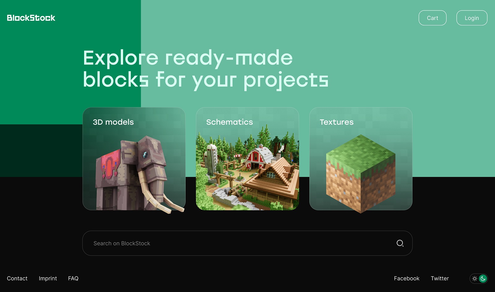
Home page
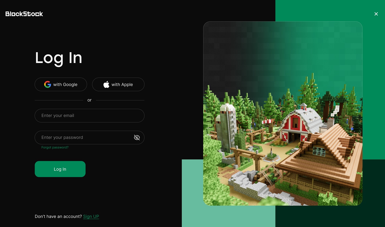
Login page
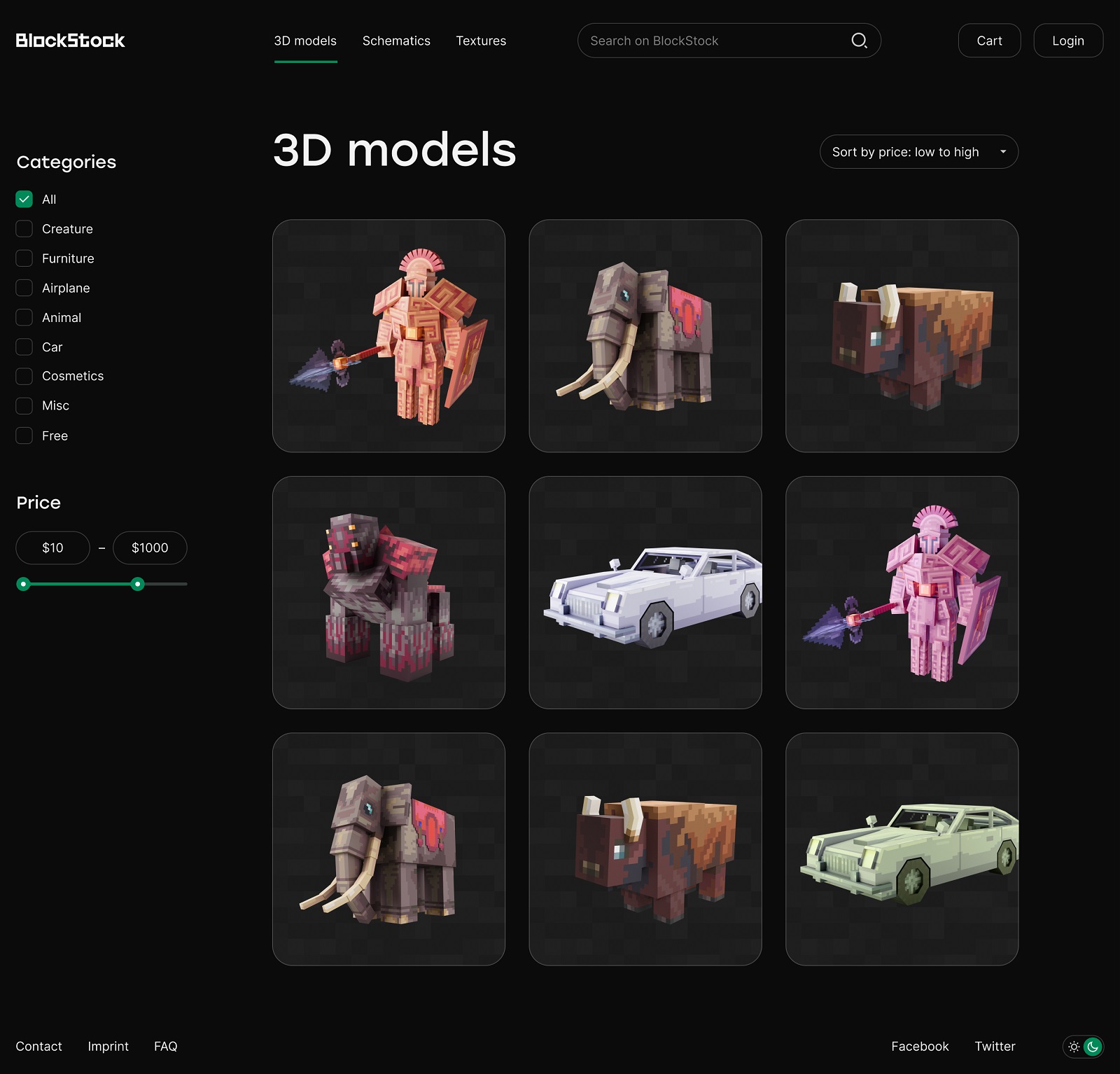
Catalog page
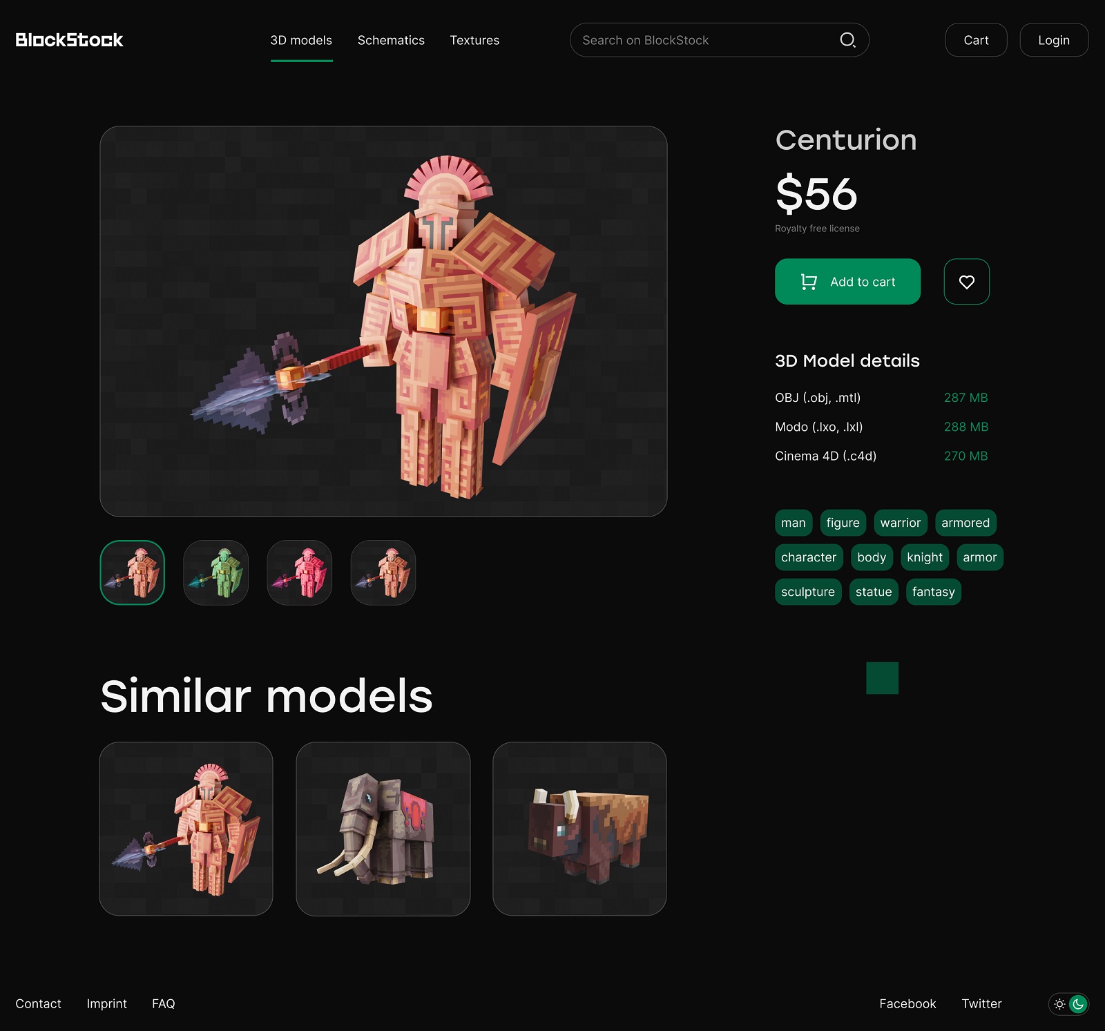
Product page
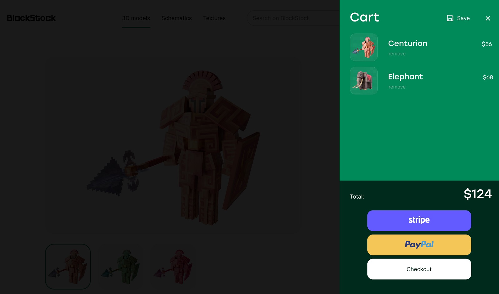
Cart page
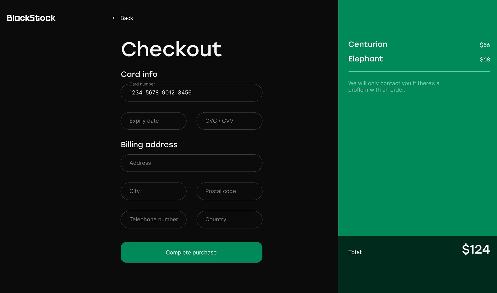
Checkout page
The collaboration with BlockStock was a great experience for our team and a cool example of the whole way from the idea to brand identity and then the user experience design, all created as one integral and efficient system, from the business goals and customers’ wishes to the design solutions fulfilling them elegantly and beautifully.
New design case studies from our team are coming soon. Stay tuned!
More Design Case Studies
Here’s a set of more case studies sharing the design solutions and approaches for some of the design projects done by the Tubik team.
CSConnect. Website Design for Immersive Experience Marketing Platform
Fulfill. Illustrations and Web Design for 3PLs Marketplace
Roebuck. Mobile Design and Illustrations for Educational App
Kaiten. Identity and Product Design for Food Marketplace
Glup. Delivery App Branding and UX Design
THT. Website Design for Electrical Engineering Service
Komuso. Website Design for Wellness Tool
PointZero25. Identity and Website Design for Event Agency
Nonconventional Show. Website Design for Podcast
uMake. Branding and Website for 3D Design Tool
BEGG. Brand Packaging and Web Design for Food Product Ecommerce
Crezco. Brand Identity and UI/UX Design for Fintech Service
FarmSense. Identity and Web Design for Agricultural Technology